10,000 search results
(0.032 seconds)
- Linotype Agogo by Linotype,
$40.99Linotype Agogo is part of the Take Type Library, chosen from the contestants of Linotype’s International Digital Type Design Contests of 1994 and 1997. Designed by British artist Ed Bugg, the font is reminiscent of the elegant 1920s and 1930s. It is a calligraphy font with five weights, one regular and four swash. The regular weight alone is clear and legible enough even for longer texts, although when used with swash characters, the texts should be shorter or headlines. - Timeless Radiance by Letterhend,
$14.00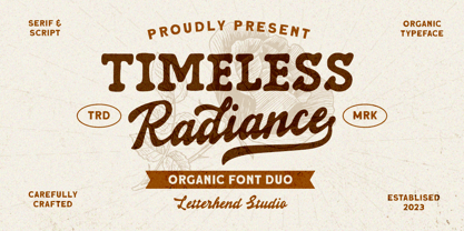 Timeless Radiance is an organic font duo consist of a bold script paired with a slab serif with a touch of classic look and feel. This type of font perfectly made to be applied especially in logo, headline, signage and the other various formal forms such as invitations, labels, logos, magazines, books, greeting / wedding cards, packaging, fashion, make up, stationery, novels, labels or any type of advertising purpose. Features : Uppercase & lowercase Numbers and punctuation Alternates/Ligatures Multilingual PUA encoded
 - Linotype Dharma by Linotype,
$29.99Linotype Dharma is part of the Take Type Library, chosen from the contestants of the International Digital Type Design Contests of 1994 and 1997. G. Jakob and J. Meißner designed this font with an ornamental character, for example, with diagonal slashes as umlauts or dots on the i and j and the triangular serifs on the upper left of both letters and numerals. Such details make for a restless font, best used for short headlines in large point sizes. - Spooktacular by Aiyari,
$20.00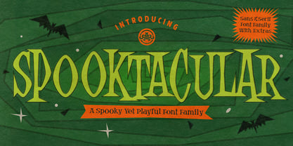 Spooktacular font family is the fusion of beatnik movement on 1950's, vintage horror movie, and vintage comics. The typeface offer the magics of open type features such contextual alternate and stylistic alternate which make the typeface looks more playful. Spooktacular comes with extra doddle dingbats to make your design looks perfect. Spooktacular Font Family best uses for headings, Logo type, quotes, apparel design, invitations, flyer, poster, greeting cards, product packaging, book cover, printed quotes, cover album, movie, etc
 - Gargamoth by Letterhend,
$17.00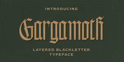 Introducing, Gargamoth - A modern blackletter typeface. This type of font perfectly made to be applied especially in logo, and the other various formal forms such as Logo, Clothing, Fashion, Headline, or any type of advertising purpose. Features : uppercase & lowercase layered fonts numbers and punctuation stylistic alternate multilingual PUA encoded We highly recommend using a program that supports OpenType features and Glyphs panels like many of Adobe apps and Corel Draw, so you can see and access all Glyph variations.
 - Victualia X by Dawnland,
$13.00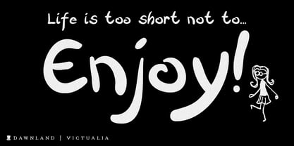 Victualia - casual, hand drawn (Wacom, illustrator) brush font. "Ligatures" have been created for some double letters to enhance the illusion of handwritten text. (TT, tt, ff, oo, OO, mm, MM, ll & LL - open type version of the font and open type compatible layout application required). Victualia was initially created in 2005 as part of a course that I attended to At Berghs , but has now been given a face lift as well as a full set of special characters.
 - Pentagram by Fauzistudio,
$12.00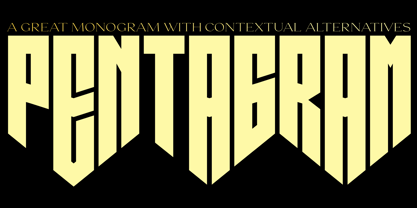 Pentagram is a typeable three-letter Pentagon monogram font. You can type Monogram a pentagram with a mapped border on the numbers 0-9. With the support of alternative contextual features It works automatically so all you can do is just type. If you liked this feel free to show your appreciation by giving this project a simple like, I will be making a font with a similar feature in the future. Hope you enjoy. Intuisi Creative
 - Solomon Sans by Fontfabric,
$40.00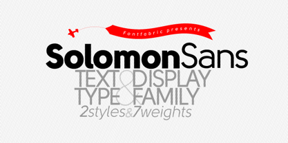 The new Solomon Sans type family includes 14 unique design styles. The font family is characterized by excellent legibility, well-finished geometric designs, optimized kerning etc. Solomon Sans is most suitable for headlines of all sizes, as well as for text blocks that come in both maximum and minimum variations. The font styles are suitable for any type of graphic design - web, print, motion graphics, etc, and perfect for t-shirts and items like posters and logos.
 - ReadMyHand by Linotype,
$29.99Linotype Read My Hand is part of the Take Type Library, selected from contestants in Linotype’s International Digital Type Design Contests of 1994 and 1997. It is the digitalized handwriting of its Dutch designer, Leon Hulst. As is common of handwriting fonts, the forms of the letters seem spontaneous and individual. Read My Hand is a dynamic font suitable for texts with point sizes larger than 12 and particularly good for documents which should have a personal touch. - P22 Torrone by IHOF,
$29.95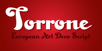 Precursors to Torrone, the fonts are found among the type experiments of Art Deco artists in 1930’s Europe. Fonts of this type with chunky, geometry-driven lower case letters combined with somewhat flamboyant, brush-influenced upper case can be found in the logotypes for Mignon Chocolate Factory in Germany and Baci bon-bons still in use today by Italy’s Perugina Candies. Torrone includes alternate lower case characters and full Central European glyph sets with over 550 characters included!
 - Antique by Storm Type Foundry,
$26.00The concept of the Baroque Roman type face is something which is remote from us. Ungrateful theorists gave Baroque type faces the ill-sounding attribute "Transitional", as if the Baroque Roman type face wilfully diverted from the tradition and at the same time did not manage to mature. This "transition" was originally meant as an intermediate stage between the Aldine/Garamond Roman face of the Renaissance, and its modern counterpart, as represented by Bodoni or Didot. Otherwise there was also a "transition" from a slanted axis of the shadow to a perpendicular one. What a petty detail led to the pejorative designation of Baroque type faces! If a bookseller were to tell his customers that they are about to choose a book which is set in some sort of transitional type face, he would probably go bust. After all, a reader, for his money, would not put up with some typographical experimentation. He wants to read a book without losing his eyesight while doing so. Nevertheless, it was Baroque typography which gave the world the most legible type faces. In those days the craft of punch-cutting was gradually separating itself from that of book-printing, but also from publishing and bookselling. Previously all these activities could be performed by a single person. The punch-cutter, who at that time was already fully occupied with the production of letters, achieved better results than he would have achieved if his creative talents were to be diffused in a printing office or a bookseller's shop. Thus it was possible that for example the printer John Baskerville did not cut a single letter in his entire lifetime, for he used the services of the accomplished punch-cutter John Handy. It became the custom that one type founder supplied type to multiple printing offices, so that the same type faces appeared in various parts of the world. The type face was losing its national character. In the Renaissance period it is still quite easy to distinguish for example a French Roman type face from a Venetian one; in the Baroque period this could be achieved only with great difficulties. Imagination and variety of shapes, which so far have been reserved only to the fine arts, now come into play. Thanks to technological progress, book printers are now able to reproduce hairstrokes and imitate calligraphic type faces. Scripts and elaborate ornaments are no longer the privilege of copper-engravers. Also the appearance of the basic, body design is slowly undergoing a change. The Renaissance canonical stiffness is now replaced with colour and contrast. The page of the book is suddenly darker, its lay-out more varied and its lines more compact. For Baroque type designers made a simple, yet ingenious discovery - they enlarged the x-height and reduced the ascenders to the cap-height. The type face thus became seemingly larger, and hence more legible, but at the same time more economical in composition; the type area was increasing to the detriment of the margins. Paper was expensive, and the aim of all the publishers was, therefore, to sell as many ideas in as small a book block as possible. A narrowed, bold majuscule, designed for use on the title page, appeared for the first time in the Late Baroque period. Also the title page was laid out with the highest possible economy. It comprised as a rule the brief contents of the book and the address of the bookseller, i.e. roughly that which is now placed on the flaps and in the imprint lines. Bold upper-case letters in the first line dramatically give way to the more subtle italics, the third line is highlighted with vermilion; a few words set in lower-case letters are scattered in-between, and then vermilion appears again. Somewhere in the middle there is an ornament, a monogram or an engraving as a kind of climax of the drama, while at the foot of the title-page all this din is quietened by a line with the name of the printer and the year expressed in Roman numerals, set in 8-point body size. Every Baroque title-page could well pass muster as a striking poster. The pride of every book printer was the publication of a type specimen book - a typographical manual. Among these manuals the one published by Fournier stands out - also as regards the selection of the texts for the specimen type matter. It reveals the scope of knowledge and education of the master typographers of that period. The same Fournier established a system of typographical measurement which, revised by Didot, is still used today. Baskerville introduced the smoothing of paper by a hot steel roller, in order that he could print astonishingly sharp letters, etc. ... In other words - Baroque typography deserves anything else but the attribute "transitional". In the first half of the 18th century, besides persons whose names are prominent and well-known up to the present, as was Caslon, there were many type founders who did not manage to publish their manuals or forgot to become famous in some other way. They often imitated the type faces of their more experienced contemporaries, but many of them arrived at a quite strange, even weird originality, which ran completely outside the mainstream of typographical art. The prints from which we have drawn inspiration for these six digital designs come from Paris, Vienna and Prague, from the period around 1750. The transcription of letters in their intact form is our firm principle. Does it mean, therefore, that the task of the digital restorer is to copy meticulously the outline of the letter with all inadequacies of the particular imprint? No. The type face should not to evoke the rustic atmosphere of letterpress after printing, but to analyze the appearance of the punches before they are imprinted. It is also necessary to take account of the size of the type face and to avoid excessive enlargement or reduction. Let us keep in mind that every size requires its own design. The longer we work on the computer where a change in size is child's play, the more we are convinced that the appearance of a letter is tied to its proportions, and therefore, to a fixed size. We are also aware of the fact that the computer is a straightjacket of the type face and that the dictate of mathematical vectors effectively kills any hint of naturalness. That is why we strive to preserve in these six alphabets the numerous anomalies to which later no type designer ever returned due to their obvious eccentricity. Please accept this PostScript study as an attempt (possibly futile, possibly inspirational) to brush up the warm magic of Baroque prints. Hopefully it will give pleasure in today's modern type designer's nihilism. - EDB Sweatin' It - Unknown license

- dearcycle - Unknown license

- Talismanica - Unknown license

- HWDP by Borutta Group,
$10.00HWDP is heavy letterpress type. HWDP has two style: bold and bold italic. This type looks great in headlines and longer text. CHEERS! - SF Automaton Extended - Unknown license

- SF Automaton - Unknown license

- SF Pale Bottom - Unknown license

- SF Shai Fontai - Unknown license

- SF Slapstick Comic - Unknown license

- SF Automaton Condensed - Unknown license

- SF Minced Meat - Unknown license

- SF Intoxicated Blues - Unknown license

- SF Slapstick Comic - Unknown license

- SF Minced Meat - Unknown license

- SF Speakeasy Outline - Unknown license

- SF Shai Fontai - Unknown license

- SF Chrome Fenders - Unknown license

- SF Intoxicated Blues - Unknown license

- SF Square Root - Unknown license

- SF Proverbial Gothic - Unknown license

- SF Chrome Fenders - Unknown license

- SF Square Root - Unknown license

- TwyliteZone - Unknown license

- Dederon Serif by Suitcase Type Foundry,
$75.00Dederon Serif has been specifically designed for book setting. Preliminary sketches were drawn in 2004. Its inspiration – particularly its weight and width proportions – can be traced to the Liberta typeface from the TypoArt type foundry in former Eastern Germany. After a careful study of the model, the design of Dederon branched off into its own direction, finding its distinctive voice and becoming a wholly original type family. Dederon Serif kept most of the elements typical for the Old Style Roman lettering, such as the angle of the stress, the medium x-height, and lower contrast. In large sizes, the typical shapes of the letters stand out – the calligraphic feel characteristic for the Czech typefaces by Oldrich Menhart, the unusual serifs hinting at the angle of the pen, the shapes of the stems, or the terminals of dots and ears. Upon finishing the serif version, a Serif-serif variant called Dederon Serif was added. The construction principles are also derived from the Old Style Roman model, which lends the lettering its open, humanist feel. Yet the design also conforms to the rules of the modern Serif serif. Most characteristics of Dederon Serif match the serif version – the weight of individual cuts, the width proportions, x-height, ascenders' and descenders' length, and the slope of the italics. Each version of Dederon Open Type Std contains the standard Western Latin character set and the Central European characters; a number of basic and accented ligatures, small caps; old style, small caps and caps, table, fraction and superscript numerals; expert glyphs and alternative characters. This brings the total to a comfortable 820 glyphs per weight, permitting truly professional use in the most demanding projects. - Dederon Sans by Suitcase Type Foundry,
$75.00Dederon Serif has been specifically designed for book setting. Preliminary sketches were drawn in 2004. Its inspiration — particularly its weight and width proportions — can be traced to the Liberta typeface from the TypoArt type foundry in former Eastern Germany. After a careful study of the model, the design of Dederon branched off into its own direction, finding its distinctive voice and becoming a wholly original type family. Dederon Serif kept most of the elements typical for the Old Style Roman lettering, such as the angle of the stress, the medium x-height, and lower contrast. In large sizes, the typical shapes of the letters stand out — the calligraphic feel characteristic for the Czech typefaces by Oldrich Menhart, the unusual serifs hinting at the angle of the pen, the shapes of the stems, or the terminals of dots and ears. Upon finishing the serif version, a sans-serif variant called Dederon Sans was added. The construction principles are also derived from the Old Style Roman model, which lends the lettering its open, humanist feel. Yet the design also conforms to the rules of the modern sans serif. Most characteristics of Dederon Sans match the serif version — the weight of individual cuts, the width proportions, x-height, ascenders' and descenders' length, and the slope of the italics. Each version of Dederon Open Type Std contains the standard Western Latin character set and the Central European characters; a number of basic and accented ligatures, small caps; old style, small caps and caps, table, fraction and superscript numerals; expert glyphs and alternative characters. This brings the total to a comfortable 820 glyphs per weight - Sella Sionisa by Gatype,
$12.00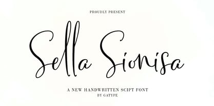 Sella Sionisa is an elegant smooth script font. With bold contrasting strokes, a playful character with a bit of binder and alternatives. To give you extra creative work. This font is great for logo esigns, Social Media, Movie Titles, Book Titles, short text even long text fonts and is great for your secondary text fonts. Create stunning masterpieces with the Sella Sionisa font. contains a full set of lowercase and uppercase letters, a wide variety of punctuation marks, numbers, and multilingual support. Alternative characters are divided into several Open Type features such as ,Alternative Style. The Open Type feature can be accessed using intelligent Open Type programs such as Adobe Illustrator, Adobe InDesign, Adobe Photoshop version of Corel Draw X, and Microsoft Word. And this Font has provided PUA unicode (custom coded font). so that all alternative characters can be easily accessed in full by a craftsman or designer. Thank you for your purchase.
 - Mogetson by Gatype,
$12.00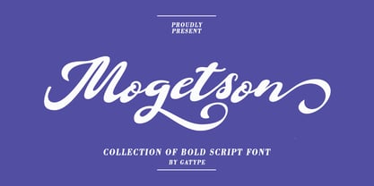 Mogetson is a cursive script font. With bold contrasting strokes, a playful character with a bit of binder and alternatives. To give you some extra creative work.. This font is great for logo designs, Social Media, Movie Titles, Book Titles, short text even long text fonts and is great for your secondary text fonts with sans or serif. Create stunning masterpieces. mogetson fonts contains a full set of lowercase and uppercase letters, a wide variety of punctuation marks, numbers, and multilingual support. Alternative characters are divided into several Open Type features such as ,Alternative Style. The Open Type feature can be accessed using intelligent Open Type programs such as Adobe Illustrator, Adobe InDesign, Adobe Photoshop version of Corel Draw X, and Microsoft Word. And this Font has provided PUA unicode (custom coded font). so that all alternative characters can be easily accessed in full by a craftsman or designer. Thank you for your purchase.
 - Migoes by Gatype,
$14.00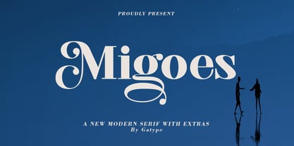 Mogetson is a cursive script font. With bold contrasting strokes, a playful character with a bit of binder and alternatives. To give you some extra creative work.. This font is great for logo designs, Social Media, Movie Titles, Book Titles, short text even long text fonts and is great for your secondary text fonts with sans or serif. Create stunning masterpieces. mogetson fonts contains a full set of lowercase and uppercase letters, a wide variety of punctuation marks, numbers, and multilingual support. Alternative characters are divided into several Open Type features such as ,Alternative Style. The Open Type feature can be accessed using intelligent Open Type programs such as Adobe Illustrator, Adobe InDesign, Adobe Photoshop version of Corel Draw X, and Microsoft Word. And this Font has provided PUA unicode (custom coded font). so that all alternative characters can be easily accessed in full by a craftsman or designer. Thank you for your purchase.
 - Tufuli Arabic by NamelaType,
$29.00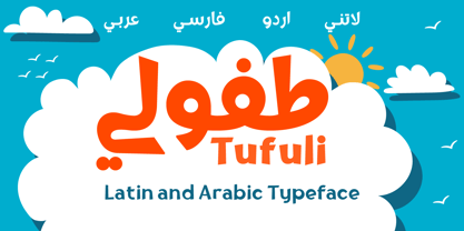 Tufuli is a harmonized Arabic - Latin font with childish characters. The sloping geometric terminal shapes gives Tufuli a playful feeling.


