10,000 search results
(0.512 seconds)
- Dark Side (BRK) - Unknown license

- Perfect Dark BRK - Unknown license

- Ink Tank BRK - Unknown license

- Duquesne Dark Woodcut by Greater Albion Typefounders,
$18.00 Duquesne Dark Woodcut is a new typeface in the spirit of 19th century American wood cut typefaces. There is an almost rustic simplicity to its heavily serifed letter forms, ideal for capturing the spirit of the mid-west, or early Victorian Britain. Long live the era of the Cowboy and the Steam Navigation Canal!
 - Dance Number JNL by Jeff Levine,
$29.00 Vintage sheet music for the song "Just Once for All Time" (from the United Artists release "Congress Dances") provided the bold sans that served as the model for Dance Number JNL. This 1932 film was the English language version of the German comedy "Der Kongrefl tanzt" The movie's plot is based around the Congress of Vienna. There, an Austrian commoner is mistakenly thought to be the Tsar of Russia.
 - Fancy Dancing JNL by Jeff Levine,
$29.00 The 1938 movie musical "Carefree" starring Fred Astaire and Ginger Rogers featured the song "Change Partners" by Irving Berlin. A copy of the sheet music for this song had the title hand lettered in a wonderful tri-line design that has been recreated in the digital typeface Fancy Dancing JNL.
 - After Dark BB by Blambot,
$20.00All good things happen After Dark! This handwritten font has delicate, long lowercase characters and huge, care-free caps. Both dangerous and feminine, perfect for signing your signature, After Dark has a large assortment of European characters to assist in your late-night adventures. - KG Dark Side by Kimberly Geswein,
$5.00 This thick and thin mixed handwriting is perfectly legible and neat but still full of fun!
 - Dark Night AOE by Astigmatic,
$19.95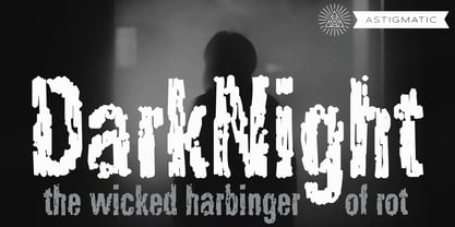
- Bank Stencil EF by Elsner+Flake,
$35.00 - Dance Time JNL by Jeff Levine,
$29.00 The words “Benny Goodman & His Orchestra” on an appearance poster for the band from 1936 were rendered in a beautiful semi-script style of hand lettering.
 - Bank Script SB by Scangraphic Digital Type Collection,
$26.00Since the release of these fonts most typefaces in the Scangraphic Type Collection appear in two versions. One is designed specifically for headline typesetting (SH: Scangraphic Headline Types) and one specifically for text typesetting (SB Scangraphic Bodytypes). The most obvious differentiation can be found in the spacing. That of the Bodytypes is adjusted for readability. That of the Headline Types is decidedly more narrow in order to do justice to the requirements of headline typesetting. The kerning tables, as well, have been individualized for each of these type varieties. In addition to the adjustment of spacing, there are also adjustments in the design. For the Bodytypes, fine spaces were created which prevented the smear effect on acute angles in small typesizes. For a number of Bodytypes, hairlines and serifs were thickened or the whole typeface was adjusted to meet the optical requirements for setting type in small sizes. For the German lower-case diacritical marks, all Headline Types complements contain alternative integrated accents which allow the compact setting of lower-case headlines. - Bank Of England by K-Type,
$20.00 Bank of England is loosely based on the blackletter lettering from Series F English twenty pound banknotes introduced in 2007. The font takes inspiration from German Kanzlei (Chancery) typefaces and the English calligraphers John Ayres and George Bickham. For designers using OpenType-aware applications, Bank of England includes Swash versions of all uppercase letters and ampersand, Alternates for nine lowercase letters and capital Z, and sixteen ornamental flourishes. Western European accented characters are included, and also a simplified St. Edward’s Crown (Elizabeth II’s coronation crown) at the Section (§) and PlusMinus (±) keystrokes (Windows Alt-0167 and Alt-0177).
 - Bank Statement AOE by Astigmatic,
$19.95A typeface made from vintage typewriter samples and meticulously compiled into a complete character set. - Barn Dance JNL by Jeff Levine,
$29.00 The hand lettered title on the 1945 sheet music for the song "Louisiana Hayride" is an Art Deco design with a nod to the preceding Art Nouveau era. It is now available as Barn Dance JNL, which is available in both regular and oblique versions.
 - Prince Of Darkness by Comicraft,
$19.00 The 52 characters assembled by this Gothic font, Prince of Darkness, were once interred in coffins onboard the Russian cargo ship Demeter, when it set sail for the sleepy shores of Whitby, Northern England ages ago. Hunted down by Vampire Hunters for century after century, this noble Transylvanian set has hidden for years in England and Eastern Europe. Now, Prince of Darkness is available as a font with more Layers than Dracula has Lairs.
 - Dance Hall JNL by Jeff Levine,
$29.00 The hand-lettered title of a vintage piece of sheet music is the basis for Dance Hall JNL.
 - Bank Sans EF by Elsner+Flake,
$35.00 With its extended complement, this comprehensive redesign of Bank Gothic by Elsner+Flake offers a wide spectrum for usage. After 80 years, the typeface Bank Gothic, designed by Morris Fuller Benton in 1930, is still as desirable for all areas of graphic design as it has ever been. Its usage spans the design of headlines to exterior design. Game manufacturers adopt this spry typeface, so reminiscent of the Bauhaus and its geometric forms, as often as do architects and web designers. The creative path of the Bank Gothic from hot metal type via phototypesetting to digital variations created by desktop designers has by now taken on great breadth. The number of cuts has increased. The original Roman weight has been augmented by Oblique and Italic variants. The original versions came with just a complement of Small Caps. Now, they are, however, enlarged by often quite individualized lower case letters. In order to do justice to the form changes and in order to differentiate between the various versions, the Bank Gothic, since 2007 a US trademark of the Grosse Pointe Group (Trademark FontHaus, USA), is nowadays available under a variety of different names. Some of these variations remain close to the original concept, others strive for greater individualism in their designs. The typeface family which was cut by the American typefoundry ATF (American Type Founders) in the early 1930’s consisted of a normal and a narrow type family, each one in the weights Light, Medium and Bold. In addition to its basic ornamental structure which has its origin in square or rectangular geometric forms, there is another unique feature of the Bank Gothic: the normally round upper case letters such as B, C, G, O, P, Q, R and U are also rectangular. The one exception is the upper case letter D, which remains round, most likely for legibility reasons (there is the danger of mistaking it for the letter O.) Because of the huge success of this type design, which follows the design principles of the more square and the more contemporary adaption of the already existing Copperplate, it was soon adopted by all of the major type and typesetting manufacturers. Thus, the Bank Gothic appeared at Linotype; as Commerce Gothic it was brought out by Ludlow; and as Deluxe Gothic on Intertype typesetters. Among others, it was also available from Monotype and sold under the name Stationer’s Gothic. In 1936, Linotype introduced 6pt and 12pt weights of the condensed version as Card Gothic. Lateron, Linotype came out with Bank Gothic Medium Condensed in larger sizes and a more narrow set width and named it Poster Gothic. With the advent of photoypesetters and CRT technologies, the Bank Gothic experienced an even wider acceptance. The first digital versions, designed according to present computing technologies, was created by Bitstream whose PostScript fonts in Regular and Medium weights have been available through FontShop since 1991. These were followed by digital redesigns by FontHaus, USA, and, in 1996, by Elsner+Flake who were also the first company to add cursive cuts. In 2009, they extended the family to 16 weights in both Roman and Oblique designs. In addition, they created the long-awaited Cyrillic complement. In 2010, Elsner+Flake completed the set with lowercase letters and small caps. Since its redesign the type family has been available from Elsner+Flake under the name Bank Sans®. The character set of the Bank Sans® Caps and the Bank Sans® covers almost all latin-based languages (Europe Plus) as well as the Cyrillic character set MAC OS Cyrillic and MS Windows 1251. Both families are available in Normal, Condensed and Compressed weights in 4 stroke widths each (Light, Regular, Medium and Bold). The basic stroke widths of the different weights have been kept even which allows the mixing of, for instance, normal upper case letters and the more narrow small caps. This gives the family an even wider and more interactive range of use. There are, furthermore, extensive sets of numerals which can be accessed via OpenType-Features. The Bank Sans® type family, as opposed to the Bank Sans® Caps family, contains, instead of the optically reduced upper case letters, newly designed lower case letters and the matching small caps. Bank Sans® fonts are available in the formats OpenType and TrueType.
 - Dance Records JNL by Jeff Levine,
$29.00 A record album entitled “Calypso” by the Talbot Brothers had a hand lettered cover with a free form style reminiscent of the early 1960s. This inspired Dance Records JNL, which is available in both regular and oblique versions.
 - Dance Moderne JNL by Jeff Levine,
$29.00 A small book entitled “Portfolio of Alphabet Designs for Artists, Architects, Designers & Craftsmen” [published in 1938 by Irene K. Ames] contained a number of pages displaying hand lettered alphabet examples. One sample in particular stood out for its bold Art Deco look and unusual design. This is now available as Dance Moderne JNL, in both regular and oblique versions.
 - Dance Partner JNL by Jeff Levine,
$29.00 The unusual mix of Art Deco lettering with a smattering of Art Nouveau characters found within Dance Partner JNL comes from a movie poster for the 1935 RKO picture "Roberta" starring Fred Astaire and Ginger Rogers. The musical was based on the hit 1933 stage play that introduced the song "Smoke Gets in Your Eyes". The play itself was based on the Alice Duer Miller novel "Gowns by Roberta".
 - Dancing Marathon JNL by Jeff Levine,
$29.00 The hand lettered title found on the cover of the 1932 sheet music for “Dancing Marathon” inspired the digital revival of this unusual lettering as well as the font’s name. This eccentric Art Deco design (with a slight bit of Art Nouveau mixed in) is a thin, monoline typeface. Dancing Marathon JNL is available in both regular and oblique versions. Dance marathons got their start during the Great Depression as people desperate to earn a few dollars would enter into contests that went on for hours until the last couple remained standing on the dance floor.
 - Dark Razoor Graffiti by Sipanji21,
$13.00 This Fonts designed so that users can use it more easily and make graffiti designs easier. Dark Razoor is very suitable for use in various media such as; packaging, logos, labels, posters, shirt designs, bulletins, typography, and many other media, especially with graffiti look. Features: All Caps PUA Encoded open Support for MAC or PC Simple installation for Adobe Illustrator, Corel Draw, Photoshop, or Procreate (New Updated) That's it! If you have any questions don't hesitate to ask! Stay Classy!
 - Dancing Girl JNL by Jeff Levine,
$29.00 The poster for the 1930 film “Show Girl in Hollywood” had the title hand lettered in a squared Art Deco style with some angled cross strokes. This became the basis for Dancing Girl JNL, which is available in both regular and oblique versions.
 - Dark Blow Swash by Gatype,
$10.00 Dark Blow Brush Font is a new font with textured stroke detail, also provided some ligatures and swashes extra. Perfect for projects posters, logos, product packaging, invitations, greeting cards, brands, news, blogs, everything including personal charm etc. Thanks so much for looking and please let me know if you have any questions.
 - Banks and Miles by K-Type,
$20.00 K-Type’s ‘Banks & Miles’ fonts are inspired by the geometric monoline lettering created for the British Post Office in 1970 by London design company Banks & Miles, a project initiated and supervised by partner John Miles, and which included ‘Double Line’ and ‘Single Line’ alphabets. The new digital typeface is a reworking and extension of both alphabets. Banks & Miles Double Line is provided in three weights – Light, Regular and Dark – variations achieved by adjusting the width of the inline. Banks & Miles Single Line develops the less used companion sans into a three weight family – Regular, Medium and Bold – each with an optically corrected oblique. Although the ‘Banks & Miles Double Line’ and ‘Banks & Miles Single Line’ fonts are based on the original Post Office letterforms, glyphs have been drawn from scratch and include numerous adjustments and impertinent alterations, such as narrowing the overly wide Z and shortening the leg of the K. Several disparities exist between the Post Office Double and Single Line styles, and K-Type has attempted to secure greater consistency between the two. For instance, a wide apex on the Double Line’s lowercase w is made pointed to match the uppercase W and the Single Line’s W/w. Also, the gently sloping hook of Single Line’s lowercase j is adopted for both families. The original Single Line’s R and k, which were incongruously simplified, are drawn in their more remarkable Double Line forms, and whilst the new Single Line fonts are modestly condensed where appropriate, rounded letters retain the essentially circular form of the Double Line. Many characters that were not part of the original project, such as @, ß, #, and currency symbols, have been designed afresh, and a full set of Latin Extended-A characters is included. The new fonts are a celebration of distinctive features like the delightful teardrop-shaped bowl of a,b,d,g,p and q, and a general level of elegance not always achieved by inline typefaces. The Post Office Double Line alphabet was used from the early 1970s, in different colours to denote the various parts of the Post Office business which included telecommunications, counter services and the Royal Mail. Even after the Post Office was split into separate businesses in the 1980s, Post Office Counters and Royal Mail continued use of the lettering, and a version can still be seen within the Royal Mail cruciform logo.
 - Formal Dance JNL by Jeff Levine,
$29.00 A vintage Canadian-published music book circa the 1940s had the title "Strauss Waltzes" hand lettered in a bold Art Deco sans serif that featured block style letters with rounded corners. This was the working model for Formal Dance JNL, which is available in both regular and oblique versions.
 - Dance Lesson JNL by Jeff Levine,
$29.00 Dance Lesson JNL is a reinterpretation of the popular "Latin Bold" typeface. The font's name is a reference to the Latin dance craze of the 1950s, when the Cha-Cha, Meringue, Tango, Mambo and even the "Chalypso" - a hybrid of Cha-Cha and Calypso rhythms had everyone moving to the beat of Central and South America.
 - MC Dark Dragon by Maulana Creative,
$15.00 Dark Dragon gothic display typeface. Bold stroke, fun character with a bit of ligatures and alternates. To give you an extra creative work. Dark Dragon gothic display typeface support multilingual more than 100+ language. This font is good for logo design, Social media, Movie Titles, Books Titles, a short text even a long text letter and good for your secondary text font with script or serif. Make a stunning work with Dark Dragon gothic display typeface. Cheers, Maulana Creative
 - Dark Blades Steel by Tadiar,
$19.00 !!! Please note that the font works in Photoshop CC2017 and higher and in Illustrator CC 2018 and higher only. !!! DarkBlades Steel is an unique vintage color gradient vector SVG font you may use in your projects just typing a text in Illustrator or Photoshop. DarkBlades Steel is derivative from DarkBlades Font Family: https://www.myfonts.com/collections/dark-blades-font-tadiar Designed for: - Vintage branding (Clothes, Alcohol, Bikes, Games) - Horror - Music branding - Myth: Vampires, Zombie, Halloween, Werevolves, Magic, Fantasy - Medieval style Well use in vintage labels, headers & titles, Posters, Street Signs and other Outdoor, Package Design.
 - Dance Band JNL by Jeff Levine,
$29.00 Sheet music for the song "I'm the One That Loves You" has the title hand lettered in a narrow, Art Deco-influenced sans serif, which is now available digitally as Dance Band JNL in both regular and oblique versions. The 1937 composition was popularized by Tommy Dorsey and Sammy Kaye.
 - Brush Besh by Gassstype,
$25.00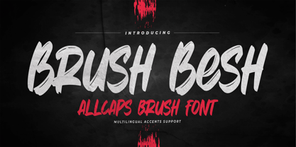 Hello Everyone, introduce our new product Font Brush Besh is AllCaps Brush Font.This is a Textured Natural Style and classy style with a clear style and dramatic movement. This font Brush Besh is great for your next creative project such as logos, printed quotes, invitations, cards, product packaging, headers.
 - Southern Accent Belch - Unknown license

- Golden Beach JNL by Jeff Levine,
$29.00 Art Deco monogram initials on a vintage business card from the Miami area inspired Golden Beach JNL. The font was named for a small upscale South Florida residential community located between Sunny Isles Beach in the Northern part of Miami-Dade County and Hallandale Beach in Southernmost Broward County.
 - Beach Please Vintage by Resistenza,
$39.00 Beach Please Vintage Is a font family designed with pointed brush and watercolours adding a grunge-rough texture.After the success of Beach Please, we release a new version, keeping the relaxed and tender brush, a bit inspired by sign painting. The caps have a bizarre look because of the reversed contrast on some letters. We have a slanted, wide version for each weight. More about Opentype Features: https://bit.ly/opentype-rsz
 - DB Beach Doodles by Illustration Ink,
$3.00Capture your favorite beach moments with DoodleBat Beach Doodles. Remember the fun vacation and playing in the ocean with these fun DoodleBats. - Anke Calligraphic FG - Unknown license

- C Dans L'air - Unknown license

- Dans Le Jardin by Latinotype,
$29.00 Dans Le Jardin is a continuation of Dan Le Cuisine dingbat. Their wild and crazy curves give a very special vintage language. Can be used to create patterns or compositions for posters,websites, etc..
 - Dans Le Noël by Latinotype,
$29.00 Dans Le Noël is a Christmas dingbat. Perfect for use as ornament greeting cards, patterns, posters, websites and visual compositions that need Christmas show in a language full of personality, inspired by vintage illustrations. Dans Le Noël is part of the serie Dans, with Dans Le Cuisine and Dans Le Jardin. You can combine them as you like. Enjoy!


