10,000 search results
(0.036 seconds)
- Stiana by WDC Fonts,
$30.00 Stiana font is a venetian serif in modern design. The general idea was inspired by beautiful masterpieces of Nicolas Jensen and William Morris. Stiana holds fine, balanced readability of venetian serif, and both 21st century trends. Letterforms are expressive and bold enough to use font as display, but it also fits nicely for text. Stiana supports Western Europe, Cyrillic and Greek languages. Stiana is surely a good choice both for screen applications and print media. Its multipurpose spreads over package design, logos, headlines, body texts, stationary and back labels. Also very good for books and magazines.
 - LHF Broadway Panels 3 by Letterhead Fonts,
$53.0036 expertly-crafted and unique panels from Golden Era Studios. Typing each letter generates a different design. Special Note: Due to the large file size of these fonts, they will not convert for use in Gerber Omega. Instead, Omega users may wish to use an alternate program to type the characters and import them into Omega as .eps files. CorelDraw users should use the "Weld" command rather than "Convert to Curves" command to convert these fonts to vector outlines. Otherwise, the program may crash due to the sheer number of points in some of the panels. - Kaikoura by Hanoded,
$15.00 Kaikoura is a small town on the east coast of the South Island of New Zealand. It is a very pleasant, laid-back place where the mountains meet the sea. Kaikoura is also the best place in the world to spot sperm whales. Kaikoura font is quite similar in appearance: it is laid-back and beautiful, has sharp peaks and generous curves. I am still trying to find out how to add whale watching to this description… Kaikoura is an all caps font with a lower case alternative for the o and y. It comes with an ocean of diacritics.
 - Sondela by Scholtz Fonts,
$19.00Sondela is a gently rounded, informal font, whose name means "welcome" or "come closer". It echoes the openhearted tradition of the Zulu people, where all who come are welcome. The font is available in regular and display (Pizazz) versions. Sondela Pizazz incorporates the zig-zag pattern that has been used in traditional Zulu beadwork for generations. It is highly effective when used in conjunction with the unadorned Sondela regular. The numerals are mono-spaced so that they will line up correctly in columns of figures. The letters of the alphabet are correctly kerned so that they appear correctly in text. - Suco De Laranja by Hanoded,
$20.00 I like orange juice. Come on, who doesn't? Orange juice is the drink of heroes; it's the elixir of life; it's the gods' own ambrosia. Suco De Laranja means orange juice in Portuguese and I named this font thus, just because I love the stuff! Suco De Laranja is a very narrow, very gentle typeface with a rough edge. It comes in a variety of languages and guess what? I have added Cyrillic as well. Just to be complete. So there you have it: a font named after a juice. Take a sip and enjoy! На здоровье!
 - Rainbow Pancake by Yumna Type,
$15.00 Looking for a font with playful style? This is it. Rainbow Pancake is a display font that generates fun and cute feels. What's particularly nice about this font is the readability and the weight that bring strength when you apply it. This font makes designing look easy to do. As a special extras you will get 15 illustrations that you can to beautify your designs. Features: Stylistic Sets Multilingual Supports Uppercase and lowercase PUA Encoded Numerals and Punctuation It is can be used on your branding, logos, social media quotes, stickers, posters, wall art, merchandise, social media, and many more. Get more inspiration about how to use it by seeing the font preview. Thank you for purchasing our fonts. If you have any further questions, don't hesitate to contact us. Happy Designing.
 - Lafemme Vibe by Jolicia Type,
$27.00 LaFemme Vibe is a conceptual serif font that exudes a modern and elegant aesthetic, tailored specifically for women. Featuring uppercase characters with distinctive curly signatures, LaFemme Vibe combines the following elements to create a unique visual experience: Classy Serifs: LaFemme Vibe boasts serif characters with soft, graceful serifs that add an element of sophistication to each letterform. Asymmetrical Charm: This font is intentionally imperfect in its symmetry, as if crafted by a gentle, artistic hand. It radiates an inviting and charming quality. Curly Signature Flourish: The curly, signature-like embellishments that adorn the letterforms in LaFemme Vibe infuse a personal and artistic touch. This imparts the sense that each word written with this font is a unique work of art. Modern Harmony: Despite its classical elements, LaFemme Vibe maintains a modern sense of harmony. The letters appear assertive yet gentle, making it perfectly suited for contemporary women seeking timeless elegance. Elegance and Chic: LaFemme Vibe embraces an elegant and chic aesthetic that is particularly fitting for products or designs targeted towards women who aspire to exude luxury and style. LaFemme Vibe is a typographic masterpiece created to bring a modern and elegant sensibility to women who appreciate beauty in every detail. It’s a font that effortlessly blends classic charm with contemporary allure, making it an ideal choice for a wide range of design projects aimed at celebrating the essence of femininity.
 - Autovia by Santi Rey,
$25.99 Autovia is a condensed sans-serif based on the typeface created for the US Highway signs in the 50s. Autovia comes in 6 weights. Has more than 350 glyphs and 8 stylistic sets, and supports all the Latin based languages. A new and more casual addition for the Highway fonts sub-genre ideal for big headlines.
 - Bodoni Egyptian Mono by Shinntype,
$39.00 As an ironic gloss on the unsophisticated “typewriter” genre, the Bodoni Egyptian Mono typeface channels the classic dignity of early 19th century letter forms, presenting a quite proper family of OpenType fonts, with a copious range of OpenType features—small caps, fractions, superior and inferior figures, alternate old style figures—rendered throughout five weights in both roman and italic.
 - NewModern by Sawdust,
$35.00 Introducing NewModern: Sawdust's inaugural typeface release, now making a comeback from our exclusive archives through the esteemed MyFonts foundry. Originally crafted for the renowned 'HypeForType' type foundry, this font represents a seamless blend of tradition and innovation. With a fresh perspective on the classic Didone genre, often referred to as 'Modern,' NewModern encapsulates the essence of contemporary design.
 - Hanalei Pro by Stiggy & Sands,
$29.00 For the Polynesian Fan Inspired by the bamboo lettering of the iconic Mai Kai restaurant logo, Hanalei Pro has all the flavor of the genre without compromise. Great for titling and larger typesetting, and the added true SmallCaps & Lining/Tabular figures and limitless fractions give more range of use. The Hanalei Pro family contains 628 characters per font.
 - P22 Shibumi by IHOF,
$24.95 Shibumi is a brush-titling face that has an "Eastern" feel. It was designed with a Speedball B (round nib [heavily manipulated]). Its sheer weight exudes authority while the Eastern influence and gentle curves lend a sense of grace.
 - Zaragoza by ITC,
$29.99Zaragoza is the work of British designer Phill Grimshaw, a bold and beautifully rendered script which incorporated an internal zigzag decoration. Generous capitals harmonize with a lowercase that should be set close to reproduce the look of true handwriting. - Defect Scam by PizzaDude.dk,
$12.00 Defect Scam could easily have been a name for a punk band. But it's not - it's the name of my stencil wannabe font. But, it was inspired by a combination of some punkband's LP cover and the vibes of that genre of music - but not overdoing it by making an obvious punk font! Well, you get 4 different versions of each letter in the Regular, Black and Fill versions, as well as multilingual support!
 - Neon Goo by Hanoded,
$16.00 I’m a bit of a sucker for neon lights, especially in big cities. My favourite city is Tokyo, with its brightly coloured billboards and its back alleys full of neon-lit eateries. At first sight, Neon Goo is a slightly warped font, with some funny looking glyphs and a generous spacing. When you start using it, you’ll find out that the glyphs do complement each other! Neon Goo comes with all diacritics and a set of alternates for the lower case letters.
 - FXMachina by Comicraft,
$19.00 YES! Seemingly insoluble lettering challenges can now be resolved by Comicraft’s uneFXpected and eFXceptional new font, FXMACHINA! Generate Enormous Threatening Sound Effects or Sinister Spikey Logos and Titanic Title Lettering with this Nefarious Machination designed by John Roshell. Crossover Events between Parallel Universes will instantly become Darker and more Secretive with the application of this Apocalyptic Omega/Alphabet. It’s like a Celestial Intervention! FXMachina features upper and lowercase characters, Western & Central European accents, and “Spike Mode” in Opentype Stylistic Alternates.
 - Caslon Titling by Monotype,
$29.99Monotype Caslon Titling was made available for hot metal casting in 1932. The capital Monotype Caslon Titling letters were based on types from the Stephenson Blake Foundry, previously the Caslon Foundry. Originally designed by William Caslon in the eighteenth century, Caslon is considered an old face although it has characteristics which were later found in the transitional typefaces. The Monotype Caslon Titling font has a distinctive style, generous width and strong color, ideal for use in advertising, magazines and on book jackets. - P22 GD&T Geometric Dimensioning and Tolerancing by P22 Type Foundry,
$24.95 Geometric dimensioning and tolerancing (GD&T) is a system for defining and communicating engineering tolerances. It uses a symbolic language on engineering drawings and computer-generated three-dimensional solid models that explicitly describe nominal geometry and its allowable variation. This highly specialized symbol font is designed specifically to be used by engineers to describe CAD produced outside the CAD environment. Included is a chart featuring character names and keyboard placement. Complies with ASME Y14.5M-1994. Updated to include 2009 addition of ‘unilateral’ symbol.
 - Athaar by MysticalType,
$12.00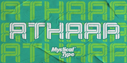 Athaar is a bold, modern sports font with dramatic movements and a strong feel for your latest project that requires a modern sports look. It is perfect for branding projects, logos, wedding designs, social media posts, advertisements, product packaging, product design, labels, photography, watermarks, invitations, stationery, and any project that requires a modern sport style. Athaar comes with uppercase, lowercase letters, numbers, punctuation, and many variations of each character, including OpenType alternatives and general binders to allow you to customize your design.
 - Bronkoh by Brink,
$30.00 Bronkoh: A Subtly Softened Sans. Bronkoh aims to give a friendly face and soft touch to type both on screen and in print. Humanist forms and generous apertures make this a sturdy and legible face while its softened curves and terminals give it an approachable and welcoming spirit. The large character set and extensive latin language support make Bronkoh a highly functional font; This in conjunction with eight weights from thin to heavy, and matching italics add to its versatility.
 - American Beauty by Bilberry Create,
$17.00 Meet my new AMERICAN BEAUTY calligraphy script. This handwritten script has been attentively written, with gentle curves to produce a font thats completely distinctive and original. Perfect for adding a elegant and unique touch to your lettering projects and branding Also with their help, you can create a Wedding lettering or beautiful frame for your home. Or just use for your small business, book covers, stationery, marketing, magazines and more. Zip included: - American Beauty OTF - American Beauty TTF - American Beauty MULTILINGUAL
 - Ceramika by Santi Rey,
$25.99 Ceramika is a modern tribute to Old Style typefaces. This design is inspired by the letterforms of the serif faces found in history books from the beginning of the 20th-century. Its sturdiness and generous X-Height makes it bold and compact; while the high-contrast strokes and recognisable shapes makes it extremely readable. All this makes Ceramika a really versatile font, perfect for logos, headlines and even body copy. It comes in 6 different weights and 2 styles — Standard and Italic.
 - Happy Easter by Trim Studio,
$15.00 **Happy Easter **A cute script font that's perfect for Easter-themed moments is whimsical and playful. It has flowing, organic lines that resemble the curves of an Easter egg or the curling petals of a spring flower. The letters are so airy, with a gentle bounce that gives them a sense of movement and liveliness. --- File Include: - Readme.pdf Thank you for let us be your design partner, If you have any questions please don't hesitate to drop me a message
 - Carnero Variable by Monotype,
$209.99Carnero™ is a feisty hybrid of precise geometry and calligraphic flair; a design that walks that fine line between being sensible and a standout. In an increasingly monotone typographic landscape – Carnero has a unique pulse that moves the reader along with a new energy. Carnero gives life to simple utility with kinetic letter shapes, open apertures, and generous counters Drawn by Steve Matteson for the Monotype Studio, Carnero’s versatility is its strength. From digital ads and applications to packaging and branding, Carnero is comfortable and contemporary. The lightest and boldest weights create inviting headlines, while the middle weights read well for body copy. Used together, they build a lively brand and a clear hierarchy. Matteson infused Carnero with a modernist exterior resting on a 10th century calligraphic foundation. Delightful flourishes on the capital R and K, and lowercase a, k and l, give the design a distinctive demeanor; while the alternate italic swash caps are a saucy nod to the scribes. The result is a design that is warm, approachable – and a bit lighthearted. Matteson describes Carnero as, “transcending the static posture of the geometric sans genre.” The Carnero family is a compact collection of six distinct weights, ranging from an engaging light to an authoritative black, each with an italic counterpart. Its extended Latin character set ensures worry-free localization for eastern/western European languages. This is a design that will prove its value many times over. Matteson has drawn over 80 distinctive typeface families for major corporations, branding firms and retail sales. His passions for the outdoors and performing music balances an intense focus on work – and subtly finds its way into typefaces like Carnero. Matteson has designed custom fonts for three generations of the Microsoft Xbox® game console, the original core fonts for the Android® mobile-phone platform, in addition to branding typefaces for Toyota®, Rocket Mortgage®, and Google®. He also drew the Kootenay™ family, Monotype’s proprietary branding typeface. Matteson’s retail designs range from the elegant and utilitarian Open Serif™ (a companion to Google’s Open Sans), to a growing series of Frederic Goudy revivals. Carnero Variables are font files which are featuring one axis and have a preset instance from Light to Black. - Carnero by Monotype,
$50.99 Carnero™ is a feisty hybrid of precise geometry and calligraphic flair; a design that walks that fine line between being sensible and a standout. In an increasingly monotone typographic landscape – Carnero has a unique pulse that moves the reader along with a new energy. Carnero gives life to simple utility with kinetic letter shapes, open apertures, and generous counters. Drawn by Steve Matteson for the Monotype Studio, Carnero’s versatility is its strength. From digital ads and applications to packaging and branding, Carnero is comfortable and contemporary. The lightest and boldest weights create inviting headlines, while the middle weights read well for body copy. Used together, they build a lively brand and a clear hierarchy. Matteson infused Carnero with a modernist exterior resting on a 10th century calligraphic foundation. Delightful flourishes on the capital R and K, and lowercase a, k and l, give the design a distinctive demeanor; while the alternate italic swash caps are a saucy nod to the scribes. The result is a design that is warm, approachable – and a bit lighthearted. Matteson describes Carnero as, “transcending the static posture of the geometric sans genre.” The Carnero family is a compact collection of six distinct weights, ranging from an engaging light to an authoritative black, each with an italic counterpart. Its extended Latin character set ensures worry-free localization for eastern/western European languages. This is a design that will prove its value many times over. Matteson has drawn over 80 distinctive typeface families for major corporations, branding firms and retail sales. His passions for the outdoors and performing music balances an intense focus on work – and subtly finds its way into typefaces like Carnero. Matteson has designed custom fonts for three generations of the Microsoft Xbox® game console, the original core fonts for the Android® mobile-phone platform, in addition to branding typefaces for Toyota®, Rocket Mortgage®, and Google®. He also drew the Kootenay™ family, Monotype’s proprietary branding typeface. Matteson’s retail designs range from the elegant and utilitarian Open Serif™ (a companion to Google’s Open Sans), to a growing series of Frederic Goudy revivals. Carnero Variables are font files which are featuring one axis and have a preset instance from Light to Black.
 - Thalweg by Ani Dimitrova,
$35.00 Thalweg serif typeface is a project focused on the digitalization and development of the Thalweg font. The font was originally designed in 1993 by the Bulgarian artist Ivan Kyosev. In 2018 Ani Dimitrova began the revival of the Thalweg font and converted the drawings into a digital form. The existing set of characters required some necessary expansions such as the development of capital letters, alternative symbols and many other functions. Furthermore, some additional weights were developed which aimed to make the font more complete. Thalweg was completed in 2020 with 16 weights ranging from Thin to Black with extra drawn italics and small caps versions, each style containing more than 1100 glyphs. The font comes with an extended coverage of the Latin, Cyrillic and Greek Scripts. All of the weights are specifically equipped for complex, professional typography with Open Type Features. These features include: Small Caps, Ligatures, Discretionary Ligatures, Superscript, Subscript, Tabular Figures, Old-Style Figures, Circled Figures, Arrows, Matching currency symbols and fraction. The Thalweg serif typeface is a perfect choice for body text, branding design, web design, editorial design and more. Ivan Kyosev (1933-1994) was one of Bulgaria’s most famous artists whose work influenced several generations of bulgarian designers. He was born on February 5, 1933, in the city of Burgas. In 1957 he graduated in illustration at the National Academy of Art in Sofia led by Prof. Iliya Beshkov. Mr. Kyosev was a member in the management of the “Graphics and Illustration” section in the Union of Bulgarian Artists, member of the UBA board, artist in the publishing houses “September” and “World”. Together with Boris Angelushev, he worked on the layout design of the “Literary Front” newspaper. Furthermore, in 1963 - 1964 he was the main artist in the publishing house “Prosveta”. Ivan Kyosev excelled in the field of illustration, book design and library layouts in various genres (classics, children's literature, poetry, journalism, memoirs, etc.). He is also the author of many fonts.
 - MPI No. 510 by mpressInteractive,
$5.00 No. 510 is a friendly, slim gothic face. Strokes have a gentle inward curve at the median with the tops and bottoms of the letters slightly wider and thicker. The design was first introduced by William H. Page & Company around 1887.
 - PM Eckmann Initials by Paper Moon Type & Graphic Supply,
$15.00 PM Eckmann Initials is our chromatic (layered) version of Otto Eckmann's Eckmannschrift Initial Cap typeface designed to work with his typeface Eckmannschrift. Our version can be used for general Art Nouveau initial caps or combined with our PM Eckmannschrift typeface.
 - Bindweed by Solotype,
$19.95From an old wood type owned by a San Francisco printer. Wood types were customarily given somewhat generic names (Antique Tuscan) or, more frequently, numbers to identify them. Our clients liked colorful, easily-remembered names better, and so did we. - Teen - Unknown license

- Rose Avenue by Set Sail Studios,
$26.00 Introducing Rose Avenue, an extra bold serif font with soft, charming rounded edges and curves. Rose Avenue brings chunky retro typography to the modern era, and includes 70 additional special characters with additional flair and flourishes - providing you with a variety of captivating custom text arrangements. Whether it's a fancy retro-inspired logo, or engaging bold header text - Rose Avenue is able to deliver. Accessing Alternate Characters • Many letters of this font have multiple alternate versions (see final image). In order to access each one, simply make sure 'Standard Ligatures' are enabled, and follow your letter with a number. For example, typing 'A1, A2, A3, A4, A5' will generate the 5 alternate versions shown for capital A. Accessing Ligatures • There are 10 lowercase ligatures (double letters) included. In order to access these, simply make sure 'Standard Ligatures' are enabled, and the ligatures will automatically generate as you type. All special characters can also be accessed via a Glyphs panel. Language Support • Rose Avenue supports the following languages; English, French, Italian, Spanish, Portuguese, German, Swedish, Norwegian, Danish, Dutch, Finnish, Indonesian, Malay, Hungarian, Polish, Croatian, Turkish, Romanian, Czech, Latvian, Lithuanian, Slovak, Slovenian
 - Larken by EllenLuff,
$42.00 Larken is a confident serif. Designed to reflect nature, it creates a sense of natural softness and expressiveness. We pushed the concept into a usability focused direction, to work as a bold tool and beautiful communicator. Larken variable allows fluid design across 7 weights, italics and major latin based languages. True italics advance the aesthetics, bringing energy and making it suitable for modern design. The type family melds organic curves and gentle repetition into powerful and harmonious type. At large point sizes you can appreciate the letter shapes, whilst the same restraint and focus creates an even texture for small point sizes and long reading. The font broadens its use by supplying weights all the way from thin to black. The natural curves, swells and sloping trunks, grow in character as the font gains weight. Whilst the thinner weights have lowered contrast and optical corrections to create a warm and gentle appearance. The Larken character set incorporates additional symbols, stylistic alternates, unique ligatures and case sensitive punctuation - producing a stable workhorse family ready to tackle projects of any size.Check out Jeko which is a great pair for Larken.
 - Wicked Hearts by Set Sail Studios,
$26.00 Wicked Hearts Is a chunky Serif font with an edge - it's a cool modern take on a retro classic, and it's ready to make a lasting impression on your merchandise, quote designs, header text, logos & branding, advertisements and much more. It's packed with plenty of alternates and ligatures to really bring it to life, and give you a wide range of customisation options. FAQs; Accessing Alternate Characters • Many letters of this font have multiple alternate versions (see image). In order to access each one, simply make sure 'Standard Ligatures' are enabled, and follow your letter with a number. For example, typing 'A1, A2, A3, A4' will generate the 4 alternate versions for capital A. Accessing Ligatures • There are 12 lowercase ligatures (double letters) included. In order to access these, simply make sure 'Standard Ligatures' are enabled, and the ligatures will automatically generate as you type. Standard Ligatures are supported by most desktop graphics & text software (not just the fancy ones!), including Photoshop, Illustrator, InDesign, Word, Pages & Keynote. Language Support • Wicked Hearts supports the following languages; English, French, Italian, Spanish, Portuguese, German, Swedish, Norwegian, Danish, Dutch, Finnish, Indonesian, Malay, Hungarian, Polish, Croatian, Turkish, Romanian, Czech, Latvian, Lithuanian, Slovak, Slovenian
 - Brix Sans by HVD Fonts,
$40.00 It took Hannes von Döhren and Livius Dietzel two years to develop and complete the Brix Sans family – the companion of the well-known Brix Slab . The approach was to design an independent type family following the rules of the “Sans-Serif” genre, harmonizing with its older sister Brix Slab from the “Slab-Serif” genre. The result is a family of 6 weights with matching italics, which works perfectly for corporate design & editorial design. Combined with Brix Slab, high and complex typographical challenges can be solved. The Brix Sans OpenType fonts feature small caps, five variations of numerals, arrows and an extended character set to support Central and Eastern European as well as Western European languages.
 - BR Sonoma by Brink,
$30.00 BR Sonoma is a new geometric grotesque built for the 21st century with a finely tuned modern aesthetic. BR Sonoma builds on the foundations laid by the classic Swiss grotesques such as Helvetica and Univers but combines their features with a stronger geometric base usually found in other early classics such as Avant Garde, Futura and Avenir.
 - California Starlight by Cititype,
$17.00 California Starlight is a monoline signature font. Look like natural strokes using a roller pen. This is an upright font with a gently stroke follows the flow of the text. The uppercase size is higher, it's intended for a unique and prominent impression when used for 'branding', Tall and prominent yet integrated in the gentle flow of the lowercase. We propose this font for branding, logotype, photography caption, wedding invitation cards and merchandices, quote writing, craft projects, and various other unique prints. Stylistic Set Alternate (SS01 and SS02) is a swash at the beginning and end of the lowcase, also equipped with ligatures to add a unique impression and natural strokes. modern, sophistics and natural make this font a must have.
 - Pasquinade by Protimient,
$29.99 Pasquinade is a blackletter/roman hybrid. The general look, feel and graphical styling of Pasquinade is that of a blackletter font, however, the underlying letter construction is of a traditional serifed roman. This produces a font with that familiar 'gothic' feel but has the inherent legibility of a roman, due, in part, to the discrete openness of the characters. The presence of roman serifs also lends to this legibility without detracting from the blackletter appearence because of their particular construction. When used in a text setting the font produces an eminently readable, even texture. However, it is when used as a titling font, that the letters reveal themselves to have a contemporary, geometrically calligraphic, blackletter appearance that makes it suitable for any and all uses.
 - Pradock Sans by Genesislab,
$100.00 Pradock The newest geometric Sans-Serif font for a family is easy to use almost anywhere on your website, be it in the header or as smaller text with the Variable concept. A font with a bold aesthetic that is energetic and youthful, this is an excellent choice for the millennial demographic - which is why it is so well suited to use by digital and creative agencies. - 18 Font +1 Variable Fonts Family, Opentype Feature - Free updates and added features - Multilingual support for various languages including: French, Spanish, Swedish, German, Italian, Portuguese, Dutch, and more ... Software support (Adobe, MS Word, Pages, etc.). if you want to take advantage of additional OpenType features and style alternatives, use OpenType-savvy software (such as Adobe applications etc.).
 - Axion by Type Innovations,
$39.00 Axion is an original design by Alex Kaczun. It is a display font not intended for text use. It was designed specifically for display headlines, logotype, branding and similar applications. The entire font has an original look which is strong, dynamic, machine generated and can be widely used in publications and advertising. Axion is a futuristic, techno-looking and dynamic typeface with elements of machined-like parts containing sharp and rounded edges. This attractive display comes in roman with lower case and lining figures. The font is also available with true-drawn slant italics. Other design style variations include small capitals with old style figures. The large Pro font character set supports most Central European and many Eastern European languages.
 - Linotype Sansara by Linotype,
$29.99Linotype Sansara, from Swiss designer Grégoire Poget, is part of the TakeType Library, chosen from the entries of the Linotype-sponsored International Digital Type Design Contest 1999 for inclusion on the TakeType 3 CD. This fun font is a type experiment behind whose oriental facade hide Arabic letters, recognizable only at second glance. This font displays generous, pointed ascenders and descenders as well as a bar-like emphasis on the upper third of the figures which connects lines and words and gives them a decorative look. Linotype Sansara reveals an astounding variety of details which bring to mind 1001 Arabian Nights, flowing gowns and snake charmers. This font is best for display in point sizes of 14 or larger.
