10,000 search results
(0.04 seconds)
- Brooklyner by Hanoded,
$15.00 Brooklyner font is based on the typeface used for The Brooklynite, a magazine which saw its heyday in the 1920's. The typeface before you is an all caps affair, making it a perfect choice for headlines, posters and ads. Since I had to work with just a handful of glyphs (11 to be precise), it took me a while to design the rest. Brooklyner font is loose, cartoonesque and very legible - and it comes with extensive language support.
 - Chipperly by Greater Albion Typefounders,
$16.95 Chipperly is a brand new face inspired by the art of the Edwardian poster, especially travel posters. It’s good for clear ad legible headings which need a gentle and unobtrusive period touch, and is the latest is Greater Albion’s line of faces to explore the ‘small capitals’ idea. In its regular weight, Chipperly’s glyphs are semi-shaded within an outer outline giving a distinctive look, while the Heavy weight maintains the separate outline but is completely filled. The Light form is an outline alone. All forms unite period elegance with the modern need for clear readiility.
 - Schism One by Alias,
$55.00 Schism is a modulated sans-serif, originally developed from our Alias Didot typeface, as a serif-less version of the same design. It was expanded to three sub-families, with the thin stroke getting progressively heavier from Schism One to Schism Three. The different versions explore how this change in contrast between thick and thin strokes changes the character of the letterforms. The shape is maintained, but the emphasis shifts from rounded to angular, elegant to incised. Schism One has high contrast, and the same weight of thin stroke from Light to Black. Letter endings are at horizontal or vertical, giving a pinched, constricted shape for characters such as a, c, e and s. The h, m, n and u have a sharp connection between curve and vertical, and are high shouldered, giving a slightly square shape. The r and y have a thick stress at their horizontal endings, which makes them impactful and striking at bolder weights. Though derived from an elegant, classic form, Schism feels austere rather than flowery. It doesn’t have the flourishes of other modulated sans typefaces, its aesthetic more a kind of graphic-tinged utility. While in Schism Two and Three the thin stroke gets progressively heavier, the connections between vertical and curves — in a, b, n etc — remain cut to an incised point throughout. The effect is that Schism looks chiselled and textural across all weights. Forms maintain a clear, defined shape even in Bold and Black, and don’t have the bloated, wide and heavy appearance heavy weights can have. The change in the thickness of the thin stroke in different versions of the same weight of a typeface is called grading. This is often used when the types are to used in problematic print surfaces such as newsprint, or at small sizes — where thin strokes might bleed, and counters fill in and lose clarity, or detail might be lost or be too thin to register. The different gradings are incremental and can be quite subtle. In Schism it is extreme, and used as a design device, giving three connected but separate styles, from Sans-Didot to almost-Grotesk. The name Schism suggests the differences in shape and style in Schism One, Two and Three. Three styles with distinct differences, from the same start point.
 - Schism Three by Alias,
$55.00 Schism is a modulated sans-serif, originally developed from our Alias Didot typeface, as a serif-less version of the same design. It was expanded to three sub-families, with the thin stroke getting progressively heavier from Schism One to Schism Three. The different versions explore how this change in contrast between thick and thin strokes changes the character of the letterforms. The shape is maintained, but the emphasis shifts from rounded to angular, elegant to incised. Schism One has high contrast, and the same weight of thin stroke from Light to Black. Letter endings are at horizontal or vertical, giving a pinched, constricted shape for characters such as a, c, e and s. The h, m, n and u have a sharp connection between curve and vertical, and are high shouldered, giving a slightly square shape. The r and y have a thick stress at their horizontal endings, which makes them impactful and striking at bolder weights. Though derived from an elegant, classic form, Schism feels austere rather than flowery. It doesn’t have the flourishes of other modulated sans typefaces, its aesthetic more a kind of graphic-tinged utility. While in Schism Two and Three the thin stroke gets progressively heavier, the connections between vertical and curves — in a, b, n etc — remain cut to an incised point throughout. The effect is that Schism looks chiselled and textural across all weights. Forms maintain a clear, defined shape even in Bold and Black, and don’t have the bloated, wide and heavy appearance heavy weights can have. The change in the thickness of the thin stroke in different versions of the same weight of a typeface is called grading. This is often used when the types are to used in problematic print surfaces such as newsprint, or at small sizes — where thin strokes might bleed, and counters fill in and lose clarity, or detail might be lost or be too thin to register. The different gradings are incremental and can be quite subtle. In Schism it is extreme, and used as a design device, giving three connected but separate styles, from Sans-Didot to almost-Grotesk. The name Schism suggests the differences in shape and style in Schism One, Two and Three. Three styles with distinct differences, from the same start point.
 - Schism Two by Alias,
$55.00 Schism is a modulated sans-serif, originally developed from our Alias Didot typeface, as a serif-less version of the same design. It was expanded to three sub-families, with the thin stroke getting progressively heavier from Schism One to Schism Three. The different versions explore how this change in contrast between thick and thin strokes changes the character of the letterforms. The shape is maintained, but the emphasis shifts from rounded to angular, elegant to incised. Schism One has high contrast, and the same weight of thin stroke from Light to Black. Letter endings are at horizontal or vertical, giving a pinched, constricted shape for characters such as a, c, e and s. The h, m, n and u have a sharp connection between curve and vertical, and are high shouldered, giving a slightly square shape. The r and y have a thick stress at their horizontal endings, which makes them impactful and striking at bolder weights. Though derived from an elegant, classic form, Schism feels austere rather than flowery. It doesn’t have the flourishes of other modulated sans typefaces, its aesthetic more a kind of graphic-tinged utility. While in Schism Two and Three the thin stroke gets progressively heavier, the connections between vertical and curves — in a, b, n etc — remain cut to an incised point throughout. The effect is that Schism looks chiselled and textural across all weights. Forms maintain a clear, defined shape even in Bold and Black, and don’t have the bloated, wide and heavy appearance heavy weights can have. The change in the thickness of the thin stroke in different versions of the same weight of a typeface is called grading. This is often used when the types are to used in problematic print surfaces such as newsprint, or at small sizes — where thin strokes might bleed, and counters fill in and lose clarity, or detail might be lost or be too thin to register. The different gradings are incremental and can be quite subtle. In Schism it is extreme, and used as a design device, giving three connected but separate styles, from Sans-Didot to almost-Grotesk. The name Schism suggests the differences in shape and style in Schism One, Two and Three. Three styles with distinct differences, from the same start point.
 - Rauda by Graviton,
$12.00 Rauda font family has been designed for Graviton Font Foundry by Pablo Balcells in 2017. It is a display, sans serif, geometric typeface, with sharp angles that provides a strong and solid appearence. Rauda consists of 8 styles. Each containing glyph coverage for several languages.
 - Baseface by Attractype,
$9.00 Baseface is a sans serif font family with a basic shape, simple and clean design. With a choice of six font styles, it is suitable for various typography designs, general text, text effects, logos, web pages, lettering, laser cutting, t-shirt design and others.
 - Horas by Yukita Creative,
$14.00 Horas Sans Serif Geometric is a stunning and modern font, designed with a touch of minimalism and attractive geometrics. This font combines the beauty of serif-free design with the boldness of geometric shapes, creating a fresh, clean look for a variety of design projects.
 - Matita Informal by Trine Rask,
$30.00 Matita Informal is part of a larger type family developed from 2005-2019 with handwriting in mind. A humanistic informal sans serif in five weights containing swashes, alternative characters, old style, lining, tabular & proportional figures. The family share proportions and weights to ensure all fonts (family members) work together well. Matita Informal is a very friendly typeface suitable for many purposes.
 - Digital Kauno - Unknown license

- Wolf's Bane - Unknown license

- Ben-Zion - Personal use only

- The Country Blues by Vintage Voyage Design Supply,
$10.00 The Country Blues it's a cool fancy font family inspired by the good old vinyl records / movie covers, bowling and golf aesthetics and good old Rock'n'Roll melodies such as "Runaround Sue" was. The sans comes in five widths from light to black. Each letter has a stylistic alternate to get your typography more individuality. Especially it looks good with all caps and bouncing baseline. But it still good with normal block texts with straight line. The script has also stylistic alternates for each capitals and some lowercase features as awesome underlined 'g'/ 'j' / 'y' or special 't' with long stroke. All these fonts come as Clear or Raw (roughen) style if you want to add some "Horror" mood. As a dessert you'll get the graphic font with a lot of vintage sign shapes. 78 graphic elements total. The PDF graphic navigation file is include. Multilingual.
 - Game Rules JNL by Jeff Levine,
$29.00 While this bold, chamfered typeface may look like a sports font, it actually came from the opening credits for the 1955 Western film “The Man from Bitter Ridge”. Game Rules JNL is available in both regular and oblique versions.
 - Saddlery by FontMesa,
$25.00Saddlery includes the first font that you can use alone or add the optional second fill font behind the first using different colors for a more decorative look. You will need an application that works in layers in order to use the fill fonts that come with FontMesa fonts. - Vistr by Kobuzan,
$18.99 Vistr is a reverse-contrast display typeface inspired by western movies, infused with the tension of classic horror films. Powerful serifs, smooth curves, sharp details and an impressive contrast of strokes are unusually combined with each other. This creates a dramatic, eye-catching effect. Which is ideal for use in large sizes in titles and headlines to create a gloomy mood. This is an ALL-CAPS font. There is support for extended Latin, basic Cyrillic, and Greek. Features: – Total glyph set: 351 glyphs; – 1 style; – Support 210+ languages; – Latin Extended; – Cyrillic Basic + Bulgarian letters; – Greek; OpenType features: – Uppercase; – Proportional numerals; – Punctuations and symbols; – Arrows; – Stylistic alternates (ss01).
 - Slim James JNL by Jeff Levine,
$29.00Tall, condensed and square in shape... Slim James JNL balances well against bolder Deco-style sans or novelty type faces. - La Charly by Typebae,
$19.00 La Charly is an exquisite and delicate handwritten script font that exudes elegance. It features captivating letter alternatives and enchanting tails at the beginning and end of each stroke. The font's distinctive attribute lies in its heart-shaped connecting tail, which adds a touch of romance and charm. To use alternates, heart connector, beginning and ending swashes, you don't need to use software that supports opentype, because we have made it separately so it's very easy to use. Files included: La Charly-Regular La Charly-Tail La Charly-Heart Feature: Ligature, Multilingual and PUA encoded.
 - KT Nirma by Kotivoro Lab,
$14.00 KT Nirma Sans Nirma is a typeface with 9 Weight Sans Serif from thin to Black, inspired by Founders Grotesk, This project start from April 2022 and start from the stretch until shaped the solid character to represent the Dynamic Sans Serif. Nirma has total 462 glyph and 218 Support language. Nirma support Latin Basic, Latin-1 Supplement, Latin Extended A-B, Spacing Modifier Letters, and Combining Diacritical Marks. The Solid Character has multi function Display Sans & Body text based on Display Grotesk. Especially in te Thin to Regular is more legible for body text and the black one good for Display Sans, with dinamyc shape and more wide.
 - Salome by Canada Type,
$24.95 Salome is a revival, normalization and elaborate expansion of a 1972 film face called Cantini. The original film type, released by a tiny independent outfit called Letter Graphics, looked like it was hand drawn with little consideration for consistency in essential lettering flow measurements, like angles, stroke widths, and vertical metrics. All these issues have been resolved in this digital version, and the original character set, including the whole lot of alternates, was entirely redrawn and expanded to include even more alternates and many useful ligatures, as well as extended support for Latin-based languages. Combining elements of early 20th century art nouveau with common 1960s and 1970s signage and poster lettering flair, Salome uses curls and curves to wave its fantastic shapes in a most hypnotic dance. Salome simply cannot be unseen. Just like its namesake, the female seduction icon, it does not hesitate to put all of its natural beauty and energy on display in order to get what it wants. Salome comes in all popular font formats. The OpenType version, Salome Pro, combines the main font with the alternates one, and contains convenient features for push-button alternation and ligature substitution in supporting software programs.
 - ITC Stone Humanist by ITC,
$40.99 Type designers have been integrating the design of sans serifs with serifed forms since the 1920s. Early examples are Edward Johnston's design for the London Underground, and Eric Gill's Gill Sans. These were followed by Jan van Krimpen's Romulus Sans, Frederic Goudy's ITC Goudy Sans, Hermann Zapf's Optima, Hans Meier's Syntax and Adrian Frutiger's Frutiger. Now, ITC Stone Humanist joins this tradition. It is a careful blend of traditional sans serif shapes and classical serifed letterforms. ITC Stone Humanist grew out an experiment with the medium weight of ITC Stone Sans, a design that already showed a relationship to these sans serif-serif hybrids. ITC Stone Sans has proportions based on those of ITC Stone Serif, and its thick-and-thin stroke contrast suggests the bloodline of humanistic sans serif typefaces. But other aspects of ITC Stone Sans are more closely aligned to the gothics and grotesques, a tradition that accounts for the largest portion of sans serif designs. Enter ITC Stone Humanist. During his experiments with the earlier design, Sumner Stone recalls, I was actually quite surprised at how seemingly subtle changes transformed the face," moving the design firmly into the humanist tradition. "The form of the 'g,' 'l,' 'M,' 'W,' and more subtly the 'a' and 'e' are part of the restructuring of the family," he explains. The top endings of vertical lower case strokes have been cropped on an angle, as have the ascender and descender stroke endings. ITC Stone Humanist is a full-fledged member of the ITC Stone family. It has been produced with the same complement of weights, and the x-heights, proportions, and underlying character shapes are completely compatible with the three original designs. The original ITC Stone Sans is a popular typeface, in part because of its notable versatility. ITC Stone Humanist shares this virtue, and can be used successfully at very small sizes, in long passages of text copy, and even as billboard-sized display type."
 - TessiePuzzlePieces by Ingrimayne Type,
$9.00 After exploring tessellations for several years, I decided to see how many ways I could tessellate puzzle pieces. I began with a square template and used the same asymmetrical shape for all four edges. By flips or rotation each edge could be fitted in four ways. Eventually I discovered that, given this way of forming tiles, there were 15 distinct shapes that tessellate and these shapes can take a total of 96 orientations. (A note in the November 2016 issue of Mathematical Gazette has the proof for the 15 shapes.) This typeface contains those 15 shapes and 96 orientations. A pdf note here shows some of the tilings possible using only one shape in a pattern. An unlimited number of patterns are possible if shapes are mixed. There are two members of the family, a solid style that must have different colors when used and an outline style. They can be used separately or they can be used in layers with the outline style on top of the solid style. For rows to align properly, leading must be the same as point size. (Earlier tessellation fonts from IngrimayneType, the TessieDingies fonts, lack a black or filled version so cannot do colored patterns.)
 - Sutro Initials by Parkinson,
$20.00 A two-font chromatic (or layered) set. The Primary font, which is the old Sutro Inlined Initials. Salvaged from the wreckage of my Type1 font library, the inlined initials have been in the shop for some repairs and detailing. I just added the fill font to support the inlined version. Each font works on it’s own but they work very well together. Caps only. Open Type.
 - Praha Nouveau by Matt Frost,
$30.00 I found this type specimen on the statue of Jan Hus in Prague’s Old Town Square. The statue was designed in 1903 by Ladislav Saloun, and its writing is the cutest Nouveau font I've ever seen. Filling in the blanks, I realized the need for a standard lower case because the caps are so wild. The result is a very type-able and dynamic Nouveau. I encourage you to mix up your upper and lower cases for curious results. Use the lower case for running type. Go to http://facebook.com/frostfoundry to share this and see more!
 - Ariergard Rondo by ParaType,
$25.00 AriergardRondo is supplemental to Ariergard by the same author. It differs with sharp geometrical letterforms and with circular shapes of round letters. The face includes antique Cyrillic letter shapes: N has diagonal stroke, uppercase Y and Ч are equilateral. Both lc г and т have ascenders. For use in advertising and display typography.
 - Displayer by Tour De Force,
$30.00 Displayer font family is modern, wide and sans serif family available in 7 weights and Variable type file. It’s strong, stable, compact, futuristic family with some specific letter design and generous ink-trap. With it’s display charm, Displayer fits perfectly into any branding project – use it in posters, package, website, logo, video games, magazines. Contains fractions and standard ligatures with Extended Latin character map.
 - JetJaneButton by Ingrimayne Type,
$15.00 JetJaneButton has letters on a design that looks like a computer button. Its letters are from JetJane Mono, a sans-serif monospaced font. The typeface contains characters that can add color to letters. There are two ways to do this. One uses layers and the other a combination of characters, some with zero width. This pdf file explains the how this can be done.
 - ZT Yaglo by Khaiuns,
$16.00 ZT Yaglo is a dynamic and expressive display font, from the first impression you may have noticed that this font is a fishing rod-like concept, with a consistent rhythmic curve that gets sharper at the ends. The ZT Yaglo typeface is framed in a sans theme and added a serif feel to produce a bold, geometric typeface in all thicknesses. ZT Yaglo mixes a simple sans style for extra bold serif energy with the feel of calligraphic shapes. The thicker your choice of style, the more striking the flow of changes in shape becomes spiky. ZT Yaglo is a cool alternative for you to create branding projects, Logo designs, Apparel Branding, product packaging, magazine headers or just as a stylish text overlay onto any background image. ZT Yaglo has 9 Styles, 1 Free for Commercial, and one Variable font. each face has 457 glyphs. Includes Standard Ligature, and the "&" character has an alternate letter in each Weight. I hope you have fun using ZT Yaglo. Thanks for using this font ~ Khaiuns X zelowtype
 - Rudge by Adam B. Ford,
$9.00 Rudge is an intentionally rough sans-serif font. It was designed to share the look and feel of many “antique” fonts, although it lacks the standard serif look of those fonts. The corners are slightly rounded, the edges are wobbly, and the kerning is tight. It could be used as a faux “sloppy printing” font or just a more regularized hand-drawn font. It comes in six flavors: Light, Regular, and Bold, with italic versions of each.
 - Mores by Graphicfresh,
$19.00 Mores - Minimal Sans Introducing a minimalist style font. Fonts that are suitable for branding, packaging, logos and others. This font comes in regular and medium formats. Including italics in it. If you like this font, don't forget to collect it and share it with your loved ones. If there are things you want to ask or problems you face with this font. Don't hesitate to ask us. Because we are very happy to help you. Thanks Graphicfresh
 - Goodnight London by Ronny Studio,
$20.00 Goodnight London is a Duo Font with a blend of 2 fonts, namely the Sans & Script font. A luxurious font, with thick and thin sizes with a combination of handwritten script fonts, so that it adds an elegant, luxurious and classy impression. This typeface is perfect for logos, branding, travel promotions, social media posts, magazine layouts, product packaging, quotes, or simply as a stylish text overlay onto any background image. 5 Style Font : Regular Sans Italic Sans Bold Sans Bold Italic Sans Regular Script Goodnight London Features : Uppercase Lowercase Numbers & Punctuation Alternates Ligatures Multilingual Support Simple installation All of features and special characters of this font are included in one file. So it is easy to accessed by using program or software that support the opentype like Adobe Illustrator, Adobe Photosop, and Adobe Indesign). This font also very easy to use because compatible for all software even for non-opentype supported. Please comment us if you have any questions Thank you and have a nice day. thank you
 - The Morille by Wildan Type,
$15.00 The Morille is display bold serif typeface. The shape is classic and unique style. You can also get more elegant serif in alternate and ligature. With vintage fill It's great for logotypes, wedding invitations, romantic cards, labels, packaging, spelling of names and others. Add to your most creative ideas and watch how they bring them to life!
 - Concasse by Lillan Team,
$9.90 The family comes in five weights from Thin to Black, all with true italics; and a variable file in weight and slant. Concasse is multi-purpose and reads well in body copy, the open shapes ensure excellent legibility in even the smallest text sizes, while the lightest and boldest weights deliver impact to headlines and other display uses.
 - Winter Airs by Maulana Creative,
$13.00 Winter Airs is a natural feel script font. With rough stroke, fun character with a bit of ligatures and has a two files lowercase alternates. To give you an extra creative work. Winter Airs font support multilingual more than 100+ language. This font is good for logo design, Social media, Movie Titles, Books Titles, a short text even a long text letter and good for your secondary text font with sans or serif. Make a stunning work with Winter Airs font. Cheers, MaulanaCreative
 - Adamslor by Maulana Creative,
$13.00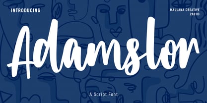 Adamslor is a handwritten script font. With high contrast bold stroke, fun character with a bit of ligatures and has a two files lowercase alternates. To give you an extra creative work. Adamslor font support multilingual more than 100+ language. This font is good for logo design, Social media, Movie Titles, Books Titles, a short text even a long text letter and good for your secondary text font with sans or serif. Make a stunning work with Adamslor font. Cheers, Maulana Creative
 - Greastly by Maulana Creative,
$12.00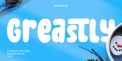 Greastly is a cute handwritten display font. With bold stroke, fun character with a bit of ligatures and has a two files lowercase alternates. To give you an extra creative work. Greastly font support multilingual more than 100+ language. This font is good for logo design, Social media, Movie Titles, Books Titles, a short text even a long text letter and good for your secondary text font with sans or serif. Make a stunning work with Greastly font. Cheers, Maulana Creative
 - MC Inversa by Maulana Creative,
$14.00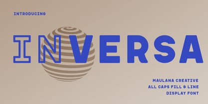 Inversa is a Display sans font with two style. Regular Fill and Outline stroke, fun character with a bit of ligatures and alternates. To give you an extra creative work. Inversa font support multilingual more than 100+ language. This font is good for logo design, Social media, Movie Titles, Books Titles, a short text even a long text letter and good for your secondary text font with script or serif. Make a stunning work with Inversa font. Cheers, Maulana Creative
 - Shadyspeed by Maulana Creative,
$13.00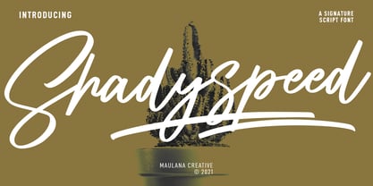 Shadyspeed is a signature script font. With contrast regular stroke, fun character with a bit of ligatures and has a two files lowercase alternates and swashes. To give you an extra creative work. Shadyspeed font support multilingual more than 100+ language. This font is good for logo design, Social media, Movie Titles, Books Titles, a short text even a long text letter and good for your secondary text font with sans or serif. Make a stunning work with Shadyspeed font. Cheers, MaulanaCreative
 - Sobiah Written by Maulana Creative,
$14.00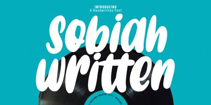 Sobiah Written is a bulb handwritten display font. With bold stroke, fun character with a bit of ligatures and has a two files lowercase alternates. To give you an extra creative work. Sobiah Written font support multilingual more than 100+ language. This font is good for logo design, Social media, Movie Titles, Books Titles, a short text even a long text letter and good for your secondary text font with sans or serif. Make a stunning work with Sobiah Written font. Cheers, MaulanaCreative
 - Nastyflashy by Maulana Creative,
$11.00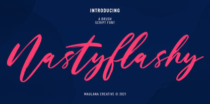 "Nastyflashy" is an expressive brush script font. With regular brush stroke, fun character with a bit of ligatures and has a two files lowercase alternates and swashes. To give you an extra creative work. "Nastyflashy "font support multilingual more than 100+ language. This font is good for logo design, Social media, Movie Titles, Books Titles, a short text even a long text letter and good for your secondary text font with sans or serif. Make a stunning work with "Nastyflashy" font. Cheers, MaulanaCreative


