10,000 search results
(0.046 seconds)
- Street Tag Vol 2 by Tomatstudio,
$19.00 Street Tag vol 2 is the second version of Street Tag fonts. Inspired from realistic caligraphy tagging style in many big cities. This style is more bold and readable, perfect for your “street art” designs style. I combined the real graffiti experiences into computer fonts, I think it will be different with other fonts if you can feel it, cause I draw graffiti, tagging and throw ups since I was high school. The real tagging style is never be tidy, but don’t worry, I already adjust the kerning and spacing in the best possible way. You’ll find the better result when you adjust the kerning, and edit baseline manually, especially for the alternates font, if you unfamiliar with these one, you can find many tutorials in youtube, for the example https://www.youtube.com/watch?v=251cTL029M4. what will you get You’ll get some alternates in several alphabet, see that in the font preview, some sample fonts I change the dot in “I” to stars, and I add ‘ into “O”, sometimes we do that in the real walls! You can explore more with this font!
 - Feisty by Fauzistudio,
$20.00 Feisty (2020) is a straight script bold using magic OpenType automatically at mimic real hand lettering. Use it for magazine, fashion, invitations, greeting cards, bussines card, logo, t-shirt, web banner, book cover, campaign and watermark photography. Feature Presents an advanced OpenType to automatically choose the appropriate letter shape as you type based on whether the letter appears at the beginning, middle or end of a word. The width of the bar in the lowercase "t" can be changed as desired. Has two different styles of caps: Normal caps, which are the same style as the lowercase; and a type of Comic font, plain caps for setting acronyms, roman numerals or any other case that calls for all caps. With extended language support for most Latin-based Western and Central European languages. Automatic all fractions. *Requires an application with support for OpenType advanced typography, such as Adobe Creative Suite and QuarkXPress.
 - Polate by Typesketchbook,
$55.00 Polate font is an extra large super family of 60 fonts! Polate has such a big abundance of contrast, styles, weights, X-Hight. Typesketchbook consists of a very usable, clean and modern sans typeface . The complete Polate type family includes 6 weights with italic and 5 X-Hights versions for each of them all in all 60 fonts for a multifunctional usage, especially for cooperative work, such as website, magazine, editorial, publishing , as well as packaging.
 - Circling Vultures BB by Blambot,
$6.00 Circling Vultures is an old west slab serif font offered in degrees of aging; Circling Vultures BB is clean, with sharp edges and lines, Circling Vultures Decay BB has rounded corners and distressed lines, Circling Vultures Rot BB is the most worn out option in the set, with flecks of missing "ink" apparent. Each option comes with two variants; a standard upper/lowercase, and an option with smaller caps in the lowercase keys for a total of six fonts in the set.
 - Delator by FedeBiagioli TypeFoundry,
$30.00 Delator font is a display typeface, inverted contrast, and condensed. Inspired by the personal experience of the designer who, with resilience and daily struggle, managed to get ahead. Its name is linked to the song of an Argentine rock artist called "Corazón delator", this means that it is a typeface that does not go unnoticed, it attracts attention for its shapes and its way of being and above all, when it is present, it automatically "gives itself away".
 - Color Paper by Artyway,
$16.00 New expressive font "ColorPaper". It was made using the negative space of letters and it looks amazing! This design captures you with its originality and simplicity. Thoroughly selected geometric shapes make a piece of art out of every symbol. Unfold the full potential of this font, experiment with the color and get pleasant impressions. Production of an original and expressive design of a poster, title, logo, emblem using this font is very simple and fascinating. Make sure yourself.
 - Silo Soft by TypeUnion,
$25.00 Designed and built in London by TypeUnion, Silo soft is a fluid sans serif typeface embodying energetic curves and a clean, functional structure. The Silo Soft Family is made up of 6 weights, which range from a delicate Extra-Light, all the way through to a punchy, loud Extra-bold and each carry a versatility for multiple applications and uses. Silo soft features open type alternate characters, and extensive language support to provide a flexible, substantial user experience.
 - Karlsen Round by TypeUnion,
$30.00 Designed and built in London by TypeUnion, Karlsen Round is a structured, functional typeface which embraces harmony, flow and versatility, but with a cheeky twist. The Karlsen Round Family is made up of 14 styles, which range from a delicate thin, all the way through to a substantial extra-bold and each carry a versatility for multiple applications and uses. Karlsen Round provides extensive language support to provide a flexible, substantial user experience. Please also see our Karlsen family.
 - Adventura by me55enjah,
$14.00 Handmade typeface inspired by permanent marker strokes. Simple, bold and casual shape strokes make this typeface easy to read event in a bunch of text. This can be useful for title, quotes, label, etc. Simple, casual and playful. All caps family comes with different style: Title, Outline and Stripes. Including handwritten style, Adventura Letter with uppercase & lowercase characters, make you have more option to create catchy design. All support basic multi language. Add Adventura Catchwords and Emo icons can gives more personal touch to your design.
 - Wafterby by Paramajan,
$8.00 Wafterby is a handsome sans serif typeface family. It comes in eight weights which have a minimal and clean feel. Its design is based on circle and line geometric shapes. It can be used as a cute minimal-style header display or as a stylish text for magazine, blog, corporate branding, packaging, wedding invitation project, etc.
 - Klop by Invasi Studio,
$19.00 Klop is a display typeface with a bloated and fat appearance. Combining this with round corners and a natural shape, Klop has a quirky and endearing appearance. You can use alternative glyphs to create a different appearance for your design. The Klop font is ideal for branding projects or packaging that need a modern and playful feel.
 - Shintosa Script by Picatype,
$12.00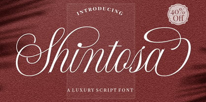 Shintosa Script is a stylish calligraphy font that features a varying baseline, smooth connections, classic and elegant touch. It's a classic decorative copperplate script with a modern twist. There are many stylistic alternatives for many letters. Can be used for various purposes such as headings, signatures, logos, wedding invitations, t-shirts, letterheads, signage, labels, news, posters, badges, and more!
 - Amersham by Greater Albion Typefounders,
$16.00 Amersham is a family of three copperplate display roman typefaces inspired by traditional sign writing techniques. The family consists of three typefaces which can also be overlayed to achieve multiple coloured typography. Use the Amersham family for headings, posters with a period theme and signage with flair. Just the thing for a retro-CD cover as well.
 - Kornasoft by OJR Design,
$20.00 Kornasoft is a typeface with hard corners, straight lines and smooth curves. The typeface is influenced by dance, movement and music culture. Kornasoft is a combination of a simple looking font, yet with personality and edge to it. Kornasoft is mainly designed to be a display font, but it can also be used as quantity text.
 - Shapectra by Hsan Fonts,
$24.00 Shapectra is a font family. It comes in 11 weights, you can use it . Designed with powerful opentype features in mind. Each weight includes extended language support (+ Cyrillic), fractions, tabular figures, arrows, ligatures and more. Perfectly suited for graphic design and any display use. It could easily work for web, signage, corporate as well as for editorial design.
 - Atomic Marker by Set Sail Studios,
$16.99 Inject some energy into your design with the ATOMIC Marker Font. This loud and proud all-caps font was hand-drawn with a real acrylic marker, maintaining the authentic high definition brush detail in each stroke. It’s an exhilarating font choice perfect for header text, poster designs, album covers, product designs, merchandise, logos & more. The Atomic Marker family includes 2 fonts; Atomic Marker • Includes 2 sets of uppercase characters, simply switch between upper & lowercase on your keyboard to access the 2 sets. Also included are 18 ligatures (double letter pairings), which can be accessed by turning on ‘Standard Ligatures’, and 6 Small Caps, which can be accessed by turning on Small Caps. (All characters can also be accessed via a Glyphs panel). Atomic Marker Extras • Includes 26 ‘doodles’ (see images), and 23 underlines, designed to perfectly pair with the Atomic Marker font letters. Simply install this as it’s own separate font, and type A-Z (doodles) or a-w (underlines) to access each design. Language Support; Atomic Marker supports the following languages; English, French, Italian, Spanish, Portuguese, German, Swedish, Norwegian, Danish, Dutch, Finnish, Indonesian, Malay, Hungarian, Polish, Croatian, Turkish, Romanian, Czech, Latvian, Lithuanian, Slovak, Slovenian
 - Sabon eText by Linotype,
$34.99 A clear and enjoyable reading experience hinges on the legibility of text copy, especially when reading on screen. This is why Monotype has developed the eText collection of fonts specifically tailored for the text-heavy display environments of e-readers, tablets, mobile devices, and the Web.
 - Pelin by Koray Özbey,
$9.00 The design of Pelin, which began as an experiment, inspired by the harmony created by the contrast between the soft, flowing movements and sharp movements found in Circassian dances. To capture this harmony, both curved and sharp lines were used along with stems that contrasting angles.
 - Amasis eText by Monotype,
$49.00A clear and enjoyable reading experience hinges on the legibility of text copy, especially when reading on screen. This is why Monotype has developed the eText collection of fonts specifically tailored for the text-heavy display environments of e-readers, tablets, mobile devices, and the Web. - Neue Helvetica eText by Linotype,
$42.99 A clear and enjoyable reading experience hinges on the legibility of text copy, especially when reading on screen. This is why Monotype has developed the eText collection of fonts specifically tailored for the text-heavy display environments of e-readers, tablets, mobile devices, and the Web.
 - Elecstrom by Typefactory,
$14.00 Elecstrom is a storm display font. Elecstrom has a bad weather feels so it has thrilling yet cool experience. Elecstrom is perfect for product cover, signpost, cover album, movie with disaster theme, game, and many more! Features: – Uppercase – Lowercase – Symbols & Punctuation – Numeral – Alternates – Ligature – Multilingual Support
 - Dante eText by Monotype,
$29.99 A clear and enjoyable reading experience hinges on the legibility of text copy, especially when reading on screen. This is why Monotype has developed the eText collection of fonts specifically tailored for the text-heavy display environments of e-readers, tablets, mobile devices, and the Web.
 - Ysobel eText by Monotype,
$99.00A clear and enjoyable reading experience hinges on the legibility of text copy, especially when reading on screen. This is why Monotype has developed the eText collection of fonts specifically tailored for the text-heavy display environments of e-readers, tablets, mobile devices, and the Web. - Palatino eText by Linotype,
$103.99 A clear and enjoyable reading experience hinges on the legibility of text copy, especially when reading on screen. This is why Monotype has developed the eText collection of fonts specifically tailored for the text-heavy display environments of e-readers, tablets, mobile devices, and the Web.
 - Lettering Project JNL by Jeff Levine,
$29.00 Lettering Project JNL was based on one of the many templates made by the Wood-Regan Instrument Company (also known as Wrico). Their sign making kits allowed anyone using the templates, special ink pens and alignment guides to create professional looking lettering with a minimum of experience.
 - Linotype Didot eText by Linotype,
$50.99 A clear and enjoyable reading experience hinges on the legibility of text copy, especially when reading on screen. This is why Monotype has developed the eText collection of fonts specifically tailored for the text-heavy display environments of e-readers, tablets, mobile devices, and the Web.
 - Chettos Script by Josstype,
$10.00 Introduce Chettos Script, Hand Lettered Calligraphy Font with beautiful waves and natural flow. has a unique letter style, with natural handdrawn, and has a softer and smoother character subtly connect all the characters. They have a simple elegant swashes in separate letters, you can use graphic design software to access the alternate letter. Chettos Script is perfect for weddings, invitations, greeting cards, quotations, posters, branding, business cards, stationary, title design, header blog, excerpts of art, the art of typography, letter envelopes modern or design books, occurred styles such as design handdrawn, title , letter marriage, pop vintage design, or purpose to make the project / art design we look beautiful and trendy. Chettos Script comes complete with 259 glyphs. This includes uppercase, lowercase, numbers, fractions, punctuation, multi-language support. and some other flying machines are variations that part of OpenType features such as; Standard ligatures, stylistic set, alternative style. If you have any questions, please feel free to contact me via email: joelpopon@gmail.com
 - Calligraphica by Monotype,
$49.00Calligraphica was designed because there are very few inline fonts, and even fewer inline calligraphic fonts. The original forms were written with a split pen in a single stroke. The minuscules have a rougher look and the capitals have a smoother shape to imitate hand written calligraphy with more formal, decorative initial caps. The Calligraphica family contains 6 fonts: Calligraphica Regular and Italic are the regular upright roman true italic version of the font. The ascenders on this font are a bit higher than the capital letters--this is standard for most fonts. Calligraphica LX Regular and Italic are similar to the first 2 fonts except their ascenders are longer and reach high above the capital letters--giving these fonts a taller appearance. Calligraphica SX Regular and Italic are similar to the first 2 fonts except their ascenders are shorter and are the same height as the capital letters--giving these fonts a shorter appearance. - P22 Phantasmagoria by IHOF,
$39.95 P22 Phantasmagoria is a stylized Celtic-meets-Futurist font has multiple variations as a geometric majuscule. The heads of beasts that cap each large Uppercase letter complement the thinner, lowercase letters that can function on their own as an effective and flexible titling font. The Pro version features all basic variations plus more.
 - Devils Crew by Gassstype,
$25.00 Hello Everyone, introduce our new product Font Devils Crew it is All Caps Horror Font.This is a Textured Natural Style and classy style with a clear style and dramatic movement. That is has charming, authentic and relaxed characteristic more natural look to your text. You can activate 4 Ligatures glyphs OpenType panel.
 - Archeologicaps - Unknown license

- Aougtron by Twinletter,
$17.00 Aougtron is a modern font that combines a dynamic slope with sporting event-inspired lettering and cutouts. Designed to apply to all professional sporting events, it can also be used to create modern logos and screen prints in text fields. Aougtron’s bold and powerful appearance is created by the strong horizontal strokes on each letter which contrasts sharply with the elegant strokes on the corners of each letter. Combine these fonts to create a maximum display effect on each of your projects. What’s Included : - File font - All glyphs Iso Latin 1 - Alternate, Ligature - Simple installations - We highly recommend using a program that supports OpenType features and Glyphs panels like many Adobe apps and Corel Draw so that you can see and access all Glyph variations. - PUA Encoded Characters – Fully accessible without additional design software. - Fonts include Multilingual support
 - Satero Serif by Linotype,
$29.99 Satero was designed by Prof. Werner Schneider in 2007. Never before have we had so much written material to consume; this is the age of mass-communication. Unfortunately, the decision of which typeface to use is too often made lightly. The typeface is one of the most elementary means of language, and it can play a major role in a text's legibility and the amount of time the reader needs for it. The Satero Type System offers a high degree of legibility due to its dynamic and forms. The individual characters have been based on classical concepts. They are clearly made, and leave all unnecessary elements behind. The type works to create an environment of extreme legibility. Essential parts of the a, c, e, s, and r are to be found at the x-height line, which is the most important area of a line of text in determining legibility. The Satero Type System includes two members whose basic forms are the same. The Sans Serif members are more horizontally differentiated than common grotesques, which aides their legibility. The Serif design employs asymmetrical serifs, avoiding elephant feet" altogether. Their dynamic is progressive. The condensed nature of the seriffed counterparts is optimal for newspaper and magazine applications, where space is at a premium and paper must be saved. All fonts in the Satero Type System include a number of alternate glyphs, as well as ligatures and proportional lining figures; all weights except the Heavy and Heavy Italic fonts are also equipped with small caps, small cap figures, and oldstyle figures as OpenType features. "
 - Satero Sans by Linotype,
$29.99 Satero was designed by Prof. Werner Schneider in 2007. Never before have we had so much written material to consume; this is the age of mass-communication. Unfortunately, the decision of which typeface to use is too often made lightly. The typeface is one of the most elementary means of language, and it can play a major role in a text's legibility and the amount of time the reader needs for it. The Satero Type System offers a high degree of legibility due to its dynamic and forms. The individual characters have been based on classical concepts. They are clearly made, and leave all unnecessary elements behind. The type works to create an environment of extreme legibility. Essential parts of the a, c, e, s, and r are to be found at the x-height line, which is the most important area of a line of text in determining legibility. The Satero Type System includes two members whose basic forms are the same. The Sans Serif members are more horizontally differentiated than common grotesques, which aides their legibility. The Serif design employs asymmetrical serifs, avoiding elephant feet" altogether. Their dynamic is progressive. The condensed nature of the seriffed counterparts is optimal for newspaper and magazine applications, where space is at a premium and paper must be saved. All fonts in the Satero Type System include a number of alternate glyphs, as well as ligatures and proportional lining figures; all weights except the Heavy and Heavy Italic fonts are also equipped with small caps, small cap figures, and oldstyle figures as OpenType features. "
 - Ticket Booth JNL by Jeff Levine,
$29.00 The opening title card for 1940's "Two Girls on Broadway" was the basis for Ticket Booth JNL. A typical Art Deco typeface, its features include a squared letter shape with rounded corners and a thin character weight.
 - BD Barbeaux by Typedifferent,
$25.00 BD Barbeaux is a condensed typeface, chic and fashionable with a touch of Art Nouveau. BD Barbeaux Numérique version features rounded corners. The BD Barbeaux fonts are great for fashion and lifestyle related headlines in blogs and magazines.
 - Marlivane by Keristyper Studio,
$14.00 Marlivane has a strong characteristic sports display font that is suitable for Esports or sports activity. This font is good for logo design, Social media, Movie Titles, Books Titles, short text even long text letters, and good for your secondary text font with sans or serif. Featured: Standard Uppercase & Lowercase Numeral & Punctuation Multilingual : ä ö ü Ä Ö Ü ß ¿ ¡ Alternate & Ligature PUA encoded We recommend programs that support the OpenType feature and the Glyphs panel such as Adobe applications or Corel Draw. so you can use all the variations of the glyphs. Hope you enjoy our fonts!
 - Symbolum by Type Fleet,
$9.00 Symbolum Croatian heritage awakened. Symbolum is the first ever contemporary interpretation of Glagolitic script. This rediscovered Croatian gemstone gleams again with its unique and glorious letter shapes that give this typeface an exceptional value and meaning. The letters of this contemporary slab serif are inspired with Glagolitic script, but it is not the revival. Some letters originally don’t exist, but are invented, so the font can cover the central European character set. It is suitable for branding, game design, art and conceptual projects, but also for longer texts and more complex designs. The italics are designed at an 10° angle.
 - Peridot PE by Foundry5,
$9.00 Peridot is not just another typeface – it's a multifaceted sans serif type system crafted with passion and precision by Foundry5. Painstakingly developed through long hours and a keen focus on every minute detail, this typeface boasts a high-quality 10 weight family with matching italics in 6 widths, and the highly versatile variable format. Brimming with character, Peridot invites you to experiment with its various stylistic variants, allowing you to tailor the typographic tone to fit your creative vision perfectly. The diverse range of widths and styles in Peridot offers a dynamic typographic toolbox, ready to inspire and captivate even the most innovative designers. Peridot PE supports Cyrillic, Greek, and Latin and covers over 370 languages. It includes all required localised variants, tabular numerals and currencies, fractions, clever discretionary ligatures and many more features. Peridot performs in varied environments – from branding, display, corporate use, editorial, advertising, poster, web, screen usage etc. Think of any other use case as well, and Peridot will perform. Peridot comprises 120 static fonts, family packages, and variable support. It is the gem you ought to have in your collection.
 - ITC Christoph's Quill by ITC,
$29.99ITC Christoph's Quill is just about everything you could want in a typeface: it's distinctive, beautiful, and exceptionally versatile. According to designer Russell Bean, ITC Christoph's Quill is the culmination of experimentation with a graphics tablet that spanned several years. Then one day, as if by magic, it all just fell into place. The design seemed to flow from my pen." Bean was born in Australia and, except for a brief stint with a photo-lettering firm in Southern California, has spent most of his career working down under. "I can recall a deep fascination for the written word," he says. "Even before learning to spell, read or write, I think I recognized that this was a means of visual communication." Bean's first job was in a small ad agency as a trainee in the production department, where he learned art techniques and how to handle print, as well as "the value of visual impressions," he says. His career path meandered from one design job to another, but always in the general direction of fonts and typefaces. Today, his workload consists of logo design commissions, font editing, typography and print production consultation to a select group of loyal clients - still leaving time, notes Bean, "to pursue my type design ambitions." ITC Christoph's Quill began life as a simple, visually striking font of caps, lowercase, punctuation and numerals. To this Bean added a bold weight, for when a little more strength is desirable. Next came a flock of alternate characters. Finally, Bean drew a set of decorative caps, a suite of logos, and a sprinkling of beginning and ending swashes. The net result is a type family that can add a signature flourish to a vast range of projects: from invitations and menus to logos, signage, packaging and more."
