10,000 search results
(0.2 seconds)
- URW Grotesk by URW Type Foundry,
$102.99 URW Grotesk was designed exclusively for URW by Prof. Hermann Zapf in 1985. At the same time, Zapf designed URW Antiqua to go with URW Grotesk. At that time, we were working with a large German publishing house (Axel Springer) on type design solutions to replace certain of their newspaper fonts. Test pages of large German newspapers (e.g. Bildzeitung) were printed with URW Grotesk and URW Antiqua font families. For reasons not disclosed to us, the project was dropped and Springer never used URW Grotesk and URW Antiqua for that purpose. Anyway, Zapf finished his designs and URW produced both families. Zapf’s intention for the two typefaces was to design two highly legible, open and classical fonts that could be used for any kind of typography, especially books, newspapers, magazines, etc. However, we realized later on, that URW Grotesk is very well suited for multi media applications on screen.
 - URW Antiqua by URW Type Foundry,
$89.99 URW Grotesk was designed exclusively for URW by Prof. Hermann Zapf in 1985. At the same time, Zapf designed URW Antiqua to go with URW Grotesk. At that time, we were working with a large German publishing house (Axel Springer) on type design solutions to replace certain of their newspaper fonts. Test pages of large German newspapers (e.g. Bildzeitung) were printed with URW Grotesk and URW Antiqua font families. For reasons not disclosed to us, the project was dropped and Springer never used URW Grotesk and URW Antiqua for that purpose. Anyway, Zapf finished his designs and URW produced both families. Zapf's intention for the two typefaces was to design two highly legible, open and classical fonts that could be used for any kind of typography, especially books, newspapers, magazines, etc. However, we realized later on, that URW Grotesk is very well suited for multi media applications on screen.
 - Lucidity by DogHead Studio,
$20.00 Lucidity is a condensed, handwritten font with emphasis on texture and default wide spacing. This makes it a versatile font for display, medium amounts of text, and T-Shirts.
 - Pantra by Nicolas Deslé,
$19.90 Pantra is a minimal and clear geometric sans. Pantra is clear, approachable, and effective in both headings and paragraphs and comes in 4 weights: light, regular, medium and bold.
 - Butcher by RodrigoTypo,
$25.00 Butcher is a Rough font with 2 styles, a medium and a black to play with the weights, it contains the Greek and Cyrillic alphabet, special for action titles
 - Plandscape by Akrtype Studio,
$19.00 Plandscape smooth monoline font is a beautiful and simple handwriting script font, contemporary and fashionable, Plandscape smooth monoline font looks elegant for a wide variety of designs. This elegant font can be read and looks good as a title or body text. This font will be perfect for many different designs for magazine headlines, social media, branding, wedding invitations, cards, etc. Plandscape smooth monoline font include ligatures, capital letters and alternate letters. They are easy to use and perfect for expressing your thoughts, posting quotes and simple daily updates on social media.
 - Bulgatry by Hishand Studio,
$15.00 Elegant look font of Bulgatry. a modern serif font family that drawn inspiration from the elegant of Bali, classy, modern but classic at the same time. just have a look at this beautiful handcrafted serif typeface. Perfect logo, branding, invitations, stationery, wedding designs, social media posts, and much more. Complete with - ligatures - alternates - regular - italic - icon - kerning - multilingual support
 - Avenir Next Thai by Linotype,
$79.00 Avenir Next Pro is a new take on a classic face—it’s the result of a project whose goal was to take a beautifully designed sans and update it so that its technical standards surpass the status quo, leaving us with a truly superior sans family. This family is not only an update though; in fact it is the expansion of the original concept that takes the Avenir Next design to the next level. In addition to the standard styles ranging from ultralight to heavy, this 32-font collection offers condensed faces that rival any other sans on the market in on and off—screen readability at any size alongside heavy weights that would make excellent display faces in their own right and have the ability to pair well with so many contemporary serif body types. Overall, the family’s design is clean, straightforward and works brilliantly for blocks of copy and headlines alike. Akira Kobayashi worked alongside Avenir’s esteemed creator Adrian Frutiger to bring Avenir Next Pro to life. It was Akira’s ability to bring his own finesse and ideas for expansion into the project while remaining true to Frutiger’s original intent, that makes this not just a modern typeface, but one ahead of its time. Avenir Next Variables are font files which are featuring two axis, weight and width. They have a preset instance from UltraLight to Heavy and Condensed to Roman width. The preset instances are: Condensed UltraLight, Condensed UltraLight Italic, Condensed Thin, Condensed Thin Italic, Condensed Light, Condensed Light Italic, Condensed, Condensed Italic, Condensed Demi, Condensed Demi Italic, Condensed Medium, Condensed Medium Italic, Condensed Bold, Condensed Bold Italic, Condensed Heavy, Condensed Heavy Italic, UltraLight, UltraLight Italic, Thin, Thin Italic, Light, Light Italic, Regular, Italic, Demi, Demi Italic, Medium, Medium Italic, Bold, Bold Italic, Heavy, Heavy Italic.
 - Avenir Next Rounded by Linotype,
$42.99Avenir Next Pro is a new take on a classic face—it’s the result of a project whose goal was to take a beautifully designed sans and update it so that its technical standards surpass the status quo, leaving us with a truly superior sans family. This family is not only an update though; in fact it is the expansion of the original concept that takes the Avenir Next design to the next level. In addition to the standard styles ranging from ultralight to heavy, this 32-font collection offers condensed faces that rival any other sans on the market in on and off—screen readability at any size alongside heavy weights that would make excellent display faces in their own right and have the ability to pair well with so many contemporary serif body types. Overall, the family’s design is clean, straightforward and works brilliantly for blocks of copy and headlines alike. Akira Kobayashi worked alongside Avenir’s esteemed creator Adrian Frutiger to bring Avenir Next Pro to life. It was Akira’s ability to bring his own finesse and ideas for expansion into the project while remaining true to Frutiger’s original intent, that makes this not just a modern typeface, but one ahead of its time. Avenir Next Variables are font files which are featuring two axis, weight and width. They have a preset instance from UltraLight to Heavy and Condensed to Roman width. The preset instances are: Condensed UltraLight, Condensed UltraLight Italic, Condensed Thin, Condensed Thin Italic, Condensed Light, Condensed Light Italic, Condensed, Condensed Italic, Condensed Demi, Condensed Demi Italic, Condensed Medium, Condensed Medium Italic, Condensed Bold, Condensed Bold Italic, Condensed Heavy, Condensed Heavy Italic, UltraLight, UltraLight Italic, Thin, Thin Italic, Light, Light Italic, Regular, Italic, Demi, Demi Italic, Medium, Medium Italic, Bold, Bold Italic, Heavy, Heavy Italic. - Bandidas by Vozzy,
$5.00 Introducing a vintage look label font named "Bandidas".Typeface includes five styles plus aged version, for sample look at 4th preview. This font will good viewed on any retro design like poster, t-shirt, label, logo etc.
 - Nikki by Galapagos,
$39.00This typeface was named for one of George's daughters, at her request, after she discovered that another of George's designs, ITC Kristen, bore an appellation strikingly similar to that of her sister. And then there was peace... - Arlen by Groteskly Yours,
$45.00 Meet Arlen, a funky, variable type family in 36 styles. Inspired by 20th century hand-painted signs and the visual culture of the 1980's, Arlen adds a little extra to this already charismatic mix. Arlen is a display sans serif that can be freely used for larger bodies of text. Among its most prominent visual features are high contrast, flaring stems and dynamic letterforms. With 860 characters in each font, Arlen supports most Latin-based languages and offers a large number of extra characters, dingbats, alternate glyphs, ligatures, and punctuation marks. Some of the most useful OpenType features are included too, such as Case-Sensitive Punctuation, Stylistic Alternates, Tabular Figures, Fractions, Localization, and a lot more. Some letters and characters come in two versions: thin and bold, and you can easily alternate between the two using a corresponding stylistic set. Arlen is a cheerful typeface that conveys kindness, good cheer, and only good vibes. It would feel at home both in digital and print mediums; it can be used in advertising, editorial design, social media, web design, packaging, or personal design projects. With versatility at its heart, Arlen would be a perfect typeface for large design systems that require multiple styles for typesetting.
 - Giulia by HVD Fonts,
$30.00 Giulia is a sweet type family consisting of 12 Fonts. It was created by Hannes von Döhren and published by HvD Fonts. Besides a fancy curly version there is a second version with a more straight architecture, still owning the same soft and friendly character. Informal and easy going at first sight and perfect for display settings, however the straight architecture of Giulia Plain also makes it nice for shorter to medium texts. This contemporary type family is ideal for use in retail, packaging, games, food, kids applications and advertising.
 - Radiant Extra Condensed CT by CastleType,
$59.00 I was commissioned by the Emporium (now Macys) to digitize Radiant Bold Extra Condensed (originally designed by Robert Middleton in 1940) for use in their Sunday supplement to the San Francisco Examiner. For several years, I stubbornly refused to add the lowercase letters to the font, because I thought it looked best just used with caps, but finally relented, added the lowercase letters and at the same time created two more weights as well: Light and Medium. Used very large and carefully, these faces can be quite elegant.
 - Enza by Neo Type Foundry,
$25.00 Enza is a display font designed by José José Villamizar. Its design stems from the typographic exploration for the realization of the identity of a company aimed at entrepreneurs in the millennium generation. It’s a family of five weights composed of 455 glyphs. includes Thin, Light, Medium, Bold and Black styles. It also includes stylistic alternates, fractions, and ligatures. Its use is recommended for titles, semicondensed texts or short, and elements of visual communication large phrases. It is also ideal for creating logos, in packaging, signboards and poster design.
 - African Textile by Scholtz Fonts,
$19.00The African Textile font had two major influences. The pattern is derived from the bogolan cloths from Africa, originally made using a traditional dyeing technique from Mali that uses bogo or clay as prime dye material. The character shapes are largely based on the Tabwa font. The font is best used as a heading or poster font, although the boldness of the design allows it to be useful at medium sizes, as subheadings as well. It is professionally letter-spaced and kerned and contains a complete character set. - Garoa by Just in Type,
$20.00 Inspired by the 70's design, specially on Herb Lubalin's work, the typeface Garoa is a rounded mechanical display font without optical compensations, ideal for large bodies. The medium weight has lower case for short texts, and the Bold versions have singular upper case glyphs, with some alternates (at least one alternate per letter – some with OpenType features some using caps on the keyboard). The Garoa Hacker Clube Bold version is free and contains no OpenType features, but the glyphs have the same design as on Garoa Bold.
 - Balmind by Letteralle,
$19.00 Introducing! Balmind Font! a casual aa cursive font that is natural and beautiful in every curve. The style of this font imitates wet ink strokes and creates a casual and relaxed feel. Balmind is very suitable to fill your design needs such as, branding, social media, merch, ads, book title, packaging, etc. Enjoy the Font, Thank You!
 - Grongert by Oleg Gert,
$25.00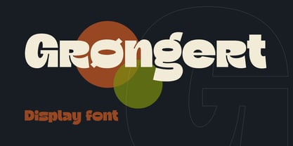 Decorative font Stonegert equipped with alternative characters, ligatures, and multi-language support. This font equipped with several features such as alternative characters, ligatures, and multi-language support that makes it easier for you to design. This font is perfect for your design needs such as poster design, logo design, branding, social media design, book, magazine, etc.
 - Carta S - Unknown license

- Brannboll Fet - Personal use only

- The World Is Yours - Personal use only

- Digifit - Personal use only

- YT Moon Latin by Yangtype,
$9.00 Letters have so many rules that it's boring. Even people who handle letters get tired. I wanted to make it very simple and humorous. This letter is like that. It is simple, has ample space, and is easy to understand the meaning of sentences.
 - Goudy Lombardy by CastleType,
$19.00 Based on drawings of Medieval versals (capitals used at beginning of verses in manuscripts) by Frederic W. Goudy. Works beautifully as initials with Goudy Text Oldstyle. Uppercase only, no numerals or punctuation; several letters have alternates. Framed, inversed caps are also included. This version of Lombardy Capitals is purposely less regular and clean-cut than some available to maintain a more hand-drawn look similar to the irregularities that would be found in a Medieval manuscript. The alternates help contribute to that look.
 - Mir by Juliasys,
$22.00 Мир is Mir. The Russian word Мир (Mir) means both World and Peace. The rendezvous of the two terms seems quite unique and utopistic today, but it is comforting to see that it was natural at some time deep down in Russian history. Bits of both meanings were going through my mind while I was designing this typeface. Mir’s character set is multiscript – Latin, Cyrillic and Greek – and extends to many parts of the linguistic world. In fact it covers more than 100 languages. Stylistic consistency between the language systems make typographic border crossings painless even where national borders are still closely guarded. And in regions where mathematics, physics or chemistry are to be expressed, a rich set of OpenType features lets Mir master also these situations. Serious things are best be said in a relaxed, unpretentious way. So Mir doesn’t put on a show. Mir has authority without being authoritarian, it is serious but not stern. It can explain difficult things and stay calm and down to earth at the same time. Mir Medium has another useful feature: It can be freely downloaded and used by anybody anywhere. You can test the Mir Family with free Mir Medium and get more styles when you need them. @juliasys
 - Berona by Alex Camacho Studio,
$15.00 Berona font family is a variable geometric sans serif with a modern display purpose. The dynamic sharp edges makes it ideal to be used in a medium and big scale.
 - Genesee JNL by Jeff Levine,
$29.00Genesee JNL is a medium-bold sans serif inspired by the letter shapes of Jeff Levine's Paper Stencil JNL, and named for the river valley that traverses Rochester, New York. - Goudy Catalogue by Bitstream,
$29.99Goudy Catalogue was designed by Morris F. Benton in 1919. A medium weight adaptation of the of the original Goudy design, it is about 15 percent heavier than the Oldstyle. - Ducatus by Scriptorium,
$12.00We wanted to make an ultra-thin, tall font with a rough, hand-drawn look and ended up with more than we bargained for. To get the font we wanted we started by developing a source font for the basic letter shapes and we ended up with a whole bunch of variations of the basic style. Thus was born the new Ducatus family of fonts, starting with Ducatus Light which developed into the Medium and Heavy versions, and the Medium weight was ultimately used as the basis for the Ducatus Rough font, which was the goal of the project in the first place. Ducatus Rough was created by modifying Ducatus Medium in Photoshop using Gallery Effects and several other filter packages, and then redoing the outlines from scratch in Fontographer. A lot of work, but the result is just what we wanted. - Madrigalle by Scholtz Fonts,
$36.00 Madrigalle was seven months in the making and may be described as a contemporary copperplate. When designers look for a font that is both elaborate and strong, they generally have to go back to styles of a previous period, possibly produced recently but not contemporary in their look and feel. In Madrigalle, I believe that I've produced a font that is contemporary but has the boldness and delicacy that mark the fonts of previous generations. I feel that most fonts that derive their style from the complexity of their characters place too much emphasis on upper case characters, and that lower case characters are very conservatively treated. I have tried, with Madrigalle, to redress this imbalance and to introduce informality and vigor to the genre. Madrigalle comes in three options: Two simpler options, Madrigalle Nocturne - slightly less elaborate, and Madrigalle Minuet - slightly more elaborate. Each of these options may be easily used in packages that don't support the Character Map OpenType feature. The Professional Option, Madrigalle Expert, combines all the features of Nocturne and Minuet and has a large number of additional opentype character alternatives. It takes full advantage of Opentype features to provide the designer with a wide range of options, enabling him to give an individual stamp to his work. I recommend that packages such as InDesign and Illustrator, which support Character maps, be used with Madrigalle Expert in order to make full use of this font’s OpenType features. (Just select GLYPHS from the TYPE palette, and set your creativity free!) All Madrigalle styles contain the accented characters used in the major European languages. Try Madrigalle, use it for invitations, advertising media, fashion media, music media, contemporary cosmetics, anything romantic... the list is endless!
 - Rosenberg Textile MF by Masterfont,
$59.00 A practical font family with 4 weights for all your day by day design needs: headlines, body text, signage etc. High legibility at small sizes. An extended sans serif typeface that provides unique softness appearance without losing legibility.
 - P22 Ridley by IHOF,
$24.95 Ridley is a calligraphic-influenced, decorative, medieval font combining Roman and Gothic forms. It is named for Nicholas Ridley and similar in style to Staunton’s Latimer font. Ridley and Latimer were protestants burned together at the stake in 1555 during the reign of Queen “Bloody” Mary.
 - Core Sans CR by S-Core,
$20.00 Core Sans CR family is a rounded version of Core Sans C; a part of the Core Sans Series, such as Core Sans N, Core Sans M, Core Sans E, Core Sans A, Core Sans D, Core Sans G, Core Sans R and Core Sans B. Core Sans CR is inspired by classic geometric sans (Futura, Avenir, Avant Garde etc.). It is based on geometric shapes, like near-perfect circle and square. It has a much higher x-height (height of lowercase letters), an effect which promotes readability especially at small print sizes. The Core Sans C Family consists of 9 weights (Thin, Extra Light, Light, Regular, Medium, Bold, Extra Bold, Heavy, Black) and Italics for each format. Core Sans C supports complete Basic Latin, Cyrillic, Central European, Turkish, Baltic character sets. Each font includes proportional figures, tabular figures, oldstyle figures, numerators, denominators, superscript, scientific inferiors, subscript, fractions and case features. Core Sans C is an ideal font family for use in magazines, web pages, screens, displays, and so on.
 - Mommie by Hubert Jocham Type,
$59.90 In the early 1980s, at the start of my career, I had the opportunity to work in a print shop with classic lead setting. In those days I would study issues of U&lc magazine from ITC. What really caught my attention were scripts in the Spencerian style. I’ve been fascinated by this American penmanship tradition ever since. A few years ago I developed a font. Boris Bencic used it when he was redesigning L’Officiel magazine in Paris. I took these initial forms and developed them into the font Mommie when I started my own foundry. Although I usually design text typefaces, working on Mommie taught me how complex it can be to create a script headline font. The biggest challenge in this process has been to keep it alive and fresh. The Regular weight is only made for very big headlines. The thin lines with the bold drops are very elegant. For smaller sizes use the Medium and Small weight. It won the TDC 2008 award and was Judges Choice of Christian Schwartz.
 - Geographica by Three Islands Press,
$29.00 Thomas Jefferys (ca. 1710–1771) was the best-known map maker in 18th-century England, chiefly because he won (and hyped) the title “Geographer to King George III.” Jefferys was really more an engraver/publisher than a geographer, since he mostly relied on the cartographic materials of others. Still, his maps of the North American colonies were well known. Geographica is a legible, four-style serif family modeled after the neat hand-lettered place names and peripheral text on Jefferys’s maps. With its long serifs, tall x-height, and robust curves, Geographica somehow combines classic elegance with a whiff of coastline and sea. The italic styles have the slant and warmth of the hand-drawn source materials. And the typeface comes with a slew of distinctive map-based ornaments—including compass wheels and sailing ships. This evocative serif works well in both display situations and long blocks of text, whether on paper or screen. OpenType features include small capitals, numerous ligatures, and two stylistic sets of titling caps. Geographica offers full support for Central and Eastern European languages—more than 1,200 glyphs in all.
 - Ravensara Sans by NaumType,
$19.00 Ravensara Sans — fashionable, high-contrast humanist sans. Ravensara family was born from the idea of taking the concept of Didone to weight extremes. Ravensara Sans is available in 7 weights, including Thin, Light, Regular, Medium, SemiBold, Bold and Black. Depending on weight, Ravensara Sans, like the other members of this font family, show quite different behavior. Heavy weights function above all as display fonts and work particularly great in all-caps. Medium weights of Ravensara Sans represent humanist grotesque, descended from the pages of fashion magazines. Thin weight perfectly complements the others if you need an especially wide choice of weights. Also, all the weights work great in all-caps. Ravensara Sans is a part of the Ravensara superfamily, united by the same anatomy, which currently also includes Ravensara Serif and Ravensara Stencil. If you need to achieve classic Haute Couture look — Ravensara Sans is a great choice. It’s a perfect choice for fashion logos, headlines, short texts, magazines, due to its simplicity looks great in oversize typography, branding, identity, website design, album art, covers, posters, advertising, etc. Ravensara Sans extends multilingual support to Basic Latin, Western European, Euro, Catalan, Baltic, Turkish, Central European, Pan African Latin and Afrikaans.
 - Cirkel Pro by Forte Type,
$4.90 Cirkel is a contemporary font family based on circles. Its geometrical and unusual forms gives us a nice feel of modernity and humor. Created by Jarbas Gomes, Cirkel family is composed by 3 weights (Light, Medium & Bold) and its respective ornamented fonts made of patterns (Stripes Light, Stripes Medium & Stripes Bold). The fonts also have a great set of ligatures and swashes that can be accessed in softwares with support to OpenType features. Cirkel is indicated for hype designs, on titles and short texts.
 - Riveta by JCFonts,
$30.00 Riveta is a sharp type family available in 18 styles, designed in 2021 by Joël Carrouché. Medium and medium italic styles are 100% free to use. The typeface features a simple and solid geometric construction, with straight terminals and a very discrete triangular serif that gives the font some extra spice in big size. Riveta is equipped for advanced typography, with features such as ligatures, tabular and proportional figures, arrows and icons, stylistic alternates, case-sensitive forms, fractions, scientific inferiors and superiors, and circled figures.
 - Pitriya by IbraCreative,
$17.00 Pitriya is a captivating display serif typeface that effortlessly blends classic elegance with a modern twist. Its unique character lies in the harmonious balance between thick and thin strokes, creating a distinct sense of refinement and sophistication. Each letter is meticulously crafted with precision and ornate details, making Pitriya a perfect choice for high-end branding, editorial design, and formal invitations. The serifs are gracefully extended, adding a touch of grandeur to the text, while the ample x-height ensures readability even at smaller sizes. Pitriya is a timeless typeface that commands attention and imparts an air of timeless beauty to any project it graces.


