10,000 search results
(0.153 seconds)
- Archive Antiqua Extra Condensed by Archive Type,
$19.95Extra condensed display typeface. - Mengelt Basel Antiqua Paneuropean by Linotype,
$103.99Inspired by the excellent serif fonts of the Basel printer of the 15th and 16 Century, Christian Mengelt designed the Mengelt Basel Antiqua. The typeface is a Renaissance Antiqua with stylistic reference to the historical model, but with the technical and typographic qualities of a modern text typeface with excellent reading quality. - Zapf Renaissance Antiqua SH by Scangraphic Digital Type Collection,
$26.00 Since the release of these fonts most typefaces in the Scangraphic Type Collection appear in two versions. One is designed specifically for headline typesetting (SH: Scangraphic Headline Types) and one specifically for text typesetting (SB Scangraphic Bodytypes). The most obvious differentiation can be found in the spacing. That of the Bodytypes is adjusted for readability. That of the Headline Types is decidedly more narrow in order to do justice to the requirements of headline typesetting. The kerning tables, as well, have been individualized for each of these type varieties. In addition to the adjustment of spacing, there are also adjustments in the design. For the Bodytypes, fine spaces were created which prevented the smear effect on acute angles in small typesizes. For a number of Bodytypes, hairlines and serifs were thickened or the whole typeface was adjusted to meet the optical requirements for setting type in small sizes. For the German lower-case diacritical marks, all Headline Types complements contain alternative integrated accents which allow the compact setting of lower-case headlines.
 - Zapf Renaissance Antiqua SB by Scangraphic Digital Type Collection,
$26.00 Since the release of these fonts most typefaces in the Scangraphic Type Collection appear in two versions. One is designed specifically for headline typesetting (SH: Scangraphic Headline Types) and one specifically for text typesetting (SB Scangraphic Bodytypes). The most obvious differentiation can be found in the spacing. That of the Bodytypes is adjusted for readability. That of the Headline Types is decidedly more narrow in order to do justice to the requirements of headline typesetting. The kerning tables, as well, have been individualized for each of these type varieties. In addition to the adjustment of spacing, there are also adjustments in the design. For the Bodytypes, fine spaces were created which prevented the smear effect on acute angles in small typesizes. For a number of Bodytypes, hairlines and serifs were thickened or the whole typeface was adjusted to meet the optical requirements for setting type in small sizes. For the German lower-case diacritical marks, all Headline Types complements contain alternative integrated accents which allow the compact setting of lower-case headlines.
 - Zapf Renaissance Antiqua EF by Elsner+Flake,
$35.00 - Derradeira - Personal use only

- Kifisia Antigua NF by Nick's Fonts,
$10.00This rough-and-ready display face is based on El Greco Antique, released by the Fundición Richard Gans of Madrid in the 1930s. Distressed but not distressing, rough yet charming, ragged around the edges but curiously refined. Named after a village in Greece which is the ancestral home of the forebears of the Curtii. Both versions of the font include 1252 Latin, 1250 CE (with localization for Romanian and Moldovan). - Neo Afrique Pro by Tondi Republk,
$17.00 Neo Afrique sans a neo-futuristic typeface with a modern decorative twist. This typeface design came out of further development and refinement on an original typeface that i created some time ago, Durango Sans. True in nature to it's predecessor, Neo Afrique was also born out of this desire to fuse two different aesthetics, the geometric Neo-Futuristic aesthetic, fused with flourishing decorative forms from Art Nouveau and the later Lubalinesque aesthetics. This typeface will form part of a larger body of work that is meant to be an exploration of Afrikan neo-futurism, using the immense power of visual-linguistic narratives to catalyse new cultural movement and perception.
 - Gans Antigua Manuscrito by Intellecta Design,
$14.95Gans Antigua Manuscrito is a revival font by Intellecta Design. researched at the rare catalogue from the extinct Fundicion Richard Gans, from Madrid. See also other font families inspired by Gans' original typefaces: Gans Tipo Adorno , Gans Lath Modern , Gans Titular Adornada , Gans Ibarra , Gans Antigua , Gans Fulgor and Gans Radio Lumina . - Bastardilla - Personal use only

- CAC Lasko Condensed - Unknown license

- BPscript - Unknown license

- Sprint - Unknown license

- Scrapes - Unknown license

- Scrapes - Unknown license

- Scrapes - Unknown license

- Sprint by Linotype,
$29.99Sprint is a forward-leaning display face that was created by the noted Italian type designer Aldo Novarese. The font is a perfect match for 1970s era racecars, or 21st Century e-commerce start-ups. Get with the speed today, and try out Sprint in a headline or two. - Scriptage by Wiescher Design,
$39.50Scriptage is a very weathered classic English Script, also known under the name of Artists Script. From your weathered typedesigner, Gert Wiescher. - Scripton by Tour De Force,
$25.00 Bouncy, slanted and urban brush typeface Scripton combines 2 different glyph weights within single font file which gives an specific rhytm and contrast to titles and paragraphs.
 - Stripes by profonts,
$41.99 Stripes is a caps only font and does not contain additional ligatures, because there is an easy way to create as many of them as you like. To form a ligature, convert your word or word string into vectors. Activate the corner points of the straight lines (not the round ones) of a letter and drag them over the next or the previous letter. This way you can create any ligature of your own. Beware of overkilling, it could decrease the legibility of your text. Besides the normal J, Stripes contains a stylistic alternate which should be used to avoid ugly gaps between critical letter pairs (see pdf document).
 - Scriptum by Eurotypo,
$34.00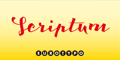
- Scriptelle by Jonahfonts,
$39.95 A script that has a freedom-ring to it, inspired by my personal feeling of liberty.
 - Scriba by ITC,
$29.99Scriba is the work of British designer Martin Wait, an informal, all caps open typeface embellished with an unusual shadow effect. With its strong, casual appearance, Scriba is excellent for use in large display sizes. - Inscription by ITC,
$29.99Inscription is the work of Alan Meeks, a bold copperplate script with a fine open line running throughout. The relatively restrained initial capitals are complemented by a lowercase which joins together in the style of true handwriting. Inscription will give any text a look of refined elegance. - Strikt by NaumType,
$25.00 Strikt is a variable modular font family with 2 axes, build on a 3x3 grid. It was designed by Peter Bushuev and released in August of 2020. It was inspired by the idea of utilizing the variable font technology to make a font with build-in animation potential. Strikt has 2 variable axes: weight and animation. The first one is self-explanatory, but the animation axis is the main feature of the font. It allows you to morph any glyph to a 3x3 dot array and back. In Strikt Plus modification, this array is the same for each letter, which gives the possibility to transform one glyph to the other. Strikt is also a very sturdy and unique display font. In "Plus" modification it gives even more sci-fi and techno vibes. And in light weights, Strikt becomes more architectural and gives the possibility to make unusual ornamental layouts. Get Strikt to jazz up your design! Try variable versions for kinetic typography and motion graphic. Strikt is a bold choice for posters, album covers, experimental identity and packaging, games, and editorial design.
 - Stripated by Aah Yes,
$6.95 Stripated is an informal funky font mainly for distinctive headlines and posters, or similar display work. There's still all the features you'd expect like Class Kerning and accented characters, ligatures for ffi, ffl and so on, and a few other extras. The four versions are set up as follows: Plain has all the letters and black stripes in the normal vertical alignment; Jumbled One has the lower case letters all jiggled about but the boxes still square and vertical; Jumbled Two has ALL letters, numbers, and virtually all punctuation jumbled up; and Wild has all that and the black boxes going slightly off square as well. There's 3 different Space characters and a few other character variations in Stylistic Alternates (fuller details in the zip).
 - Scriptone by Attractype,
$19.00 Scriptone is a attractive handwritten font with standard alphabet, punctuation and multilanguage support including ligatures and alternates to maintain a natural and artistic impression. Scriptone font is included right and left swash, so that it can add a beautiful art image to your work.
 - Sprint by SoftMaker,
$9.99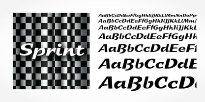 Sprint is a script typeface published by SoftMaker.
 - Scriptek by ITC,
$29.99 Scriptek was created by British designer David Quai in 1992, based on the constructivist forms which became popular after the First World War with the progressing industrialization in Moskow. Typefaces such as Scriptek were often used in the propaganda of totalitarian political systems and can still be seen on monuments like the central train station in Milan or political posters of the 1930s and 40s. The robust Scriptek has strong serifs in the upper left and lower right of characters and this, together with the diagonal strokes of many lower case letters, gives the font a dynamic feel. Scriptek is best used for headlines and display.
 - Scribe by Wiescher Design,
$49.50 Scribe is an elaborate typeface somewhere in between Bodoni and an English script. It has interwoven capitals and joining lowercase letters. I have tried to make something new that has this old, settled touch. I think I like it. Yours sincerely, Gert Wiescher
 - Elephants in Cherry Trees - Unknown license

- KR Oh Christmas Tree - Unknown license

- Fontazia Christmas Tree 2 by Deniart Systems,
$24.00 Add more flair to the holiday season with Fontazia Christmas Tree 2 featuring 62 elegantly simple tree illustrations. These stylish tree motifs are sure to add elegance to all your holiday designs.
 - 4 Point Greek Fret by Deniart Systems,
$20.00 A whimsical array of pointers designed with semi-traditional Greek fret pattern (up/down/left/right) - great for adding directions or pointers to documents, maps, posters, greetings, or simply used as decorative elements. See also 4Point Deco and 4Point Florals.
 - Kis Antiqua Now TB Pro by Elsner+Flake,
$99.00 In the course of the re-vitalization of its Typoart typeface inventory, Elsner+Flake decided in 2006 to offer the “Kis Antiqua” by Hildegard Korger, in a re-worked form and with an extended sortiment, as an OpenType Pro-version. After consultation with Hildegard Korger, Elsner+Flake tasked the Leipzig type designer Erhard Kaiser with the execution of the re-design and expansion of the sortiment. Detlef Schäfer writes in “Fotosatzschriften Type-Design+Schrifthersteller”, VEB Fachbuchverlag Leipzig, 1989: No other printing type has ever generated as far-reaching a controversy as this typeface which Jan Tschichold called the most beautiful of all the old Antiqua types. For a long time, it was thought to have been designed by Anton Janson. In 1720 a large number of the original types were displayed in the catalog of the „Ehrhardische Gycery“ (Ehrhardt Typefoundry) in Leipzig. Recently, thanks to the research performed by Beatrice Warde and especially György Haimann, it has been proven unambiguously that the originator of this typeface was Miklós (Nicholas) Tótfalusi Kis (pronounced „Kisch“) who was born in 1650 in the Hungarian town of Tótfal. His calvinistic church had sent him to the Netherlands to oversee the printing of a Hungarian language bible. He studied printing and punch cutting and earned special recognition for his Armenian and Hebrew types. Upon his return to Hungary, an emergency situation forced him to sell several of his matrice sets to the Ehrhardt Typefoundry in Leipzig. In Hungary he printed from his own typefaces, but religious tensions arose between him and one of his church elders. He died at an early age in 1702. The significant characteristics of the “Dutch Antiqua” by Kis are the larger body size, relatively small lower case letters and strong upper case letters, which show clearly defined contrasts in the stroke widths. The “Kis Antiqua” is less elegant than the Garamond, rather somewhat austere in a calvinistic way, but its expression is unique and full of tension. The upper and lower case serifs are only slightly concave, and the upper case O as well as the lower case o have, for the first time, a vertical axis. In the replica, sensitively and respectfully (responsibly) drawn by Hildegard Korger, these characteristics of this pleasantly readable and beautiful face have been well met. For Typoart it was clear that this typeface has to appear under its only true name “Kis Antiqua.” It will be used primarily in book design. Elsner+Flake added two headline weights, which are available as a separate font family Kis Antiqua Now TH Pro Designer: Miklós (Nicholas) Tótfalusi Kis, 1686 Hildegard Korger, 1986-1988 Erhard Kaiser, 2008
 - Kis Antiqua Now TH Pro by Elsner+Flake,
$99.00 In the course of the re-vitalization of its Typoart typeface inventory, Elsner+Flake decided in 2006 to offer the “Kis Antiqua” by Hildegard Korger, in a re-worked form and with an extended sortiment, as an OpenType Pro-version. After consultation with Hildegard Korger, Elsner+Flake tasked the Leipzig type designer Erhard Kaiser with the execution of the re-design and expansion of the sortiment. Detlef Schäfer writes in “Fotosatzschriften Type-Design+Schrifthersteller”, VEB Fachbuchverlag Leipzig, 1989: No other printing type has ever generated as far-reaching a controversy as this typeface which Jan Tschichold called the most beautiful of all the old Antiqua types. For a long time, it was thought to have been designed by Anton Janson. In 1720 a large number of the original types were displayed in the catalog of the „Ehrhardische Gycery“ (Ehrhardt Typefoundry) in Leipzig. Recently, thanks to the research performed by Beatrice Warde and especially György Haimann, it has been proven unambiguously that the originator of this typeface was Miklós (Nicholas) Tótfalusi Kis (pronounced Kisch) who was born in 1650 in the Hungarian town of Tótfal. His calvinistic church had sent him to the Netherlands to oversee the printing of a Hungarian language bible. He studied printing and punch cutting and earned special recognition for his Armenian and Hebrew types. Upon his return to Hungary, an emergency situation forced him to sell several of his matrice sets to the Ehrhardt Typefoundry in Leipzig. In Hungary he printed from his own typefaces, but religious tensions arose between him and one of his church elders. He died at an early age in 1702. The significant characteristics of the “Dutch Antiqua” by Kis are the larger body size, relatively small lower case letters and strong upper case letters, which show clearly defined contrasts in the stroke widths. The “Kis Antiqua” is less elegant than the Garamond, rather somewhat austere in a calvinistic way, but its expression is unique and full of tension. The upper and lower case serifs are only slightly concave, and the upper case O as well as the lower case o have, for the first time, a vertical axis. In the replica, sensitively and respectfully (responsibly) drawn by Hildegard Korger, these characteristics of this pleasantly readable and beautiful face have been well met. For Typoart it was clear that this typeface has to appear under its only true name “Kis Antiqua.” It will be used primarily in book design. Elsner+Flake added these two headline weights, which are available besides a separate font family Kis Antiqua Now TB Pro. Designer: Miklós (Nicholas) Tótfalusi Kis, 1686 Hildegard Korger, 1986-1988 Erhard Kaiser, 2008
 - Anti Grotesk by 60 KILOS,
$20.00 Anti Grotesk is a personal and internal fight. It tries to build elements capable of building personality, message, and introspection through their own shapes. How to escape from trends being part of them, how to design not establishing commercial and economical interests. Why you started designing and why are you designing today, are some of the concepts that build the universe of Anti Grotesk.
 - Anti Gravity by Epiclinez,
$12.00 Anti Gravity is a cute and funny handwritten font. It’s simple and playful style makes this design incredibly versatile, fitting a wide variety of creative ideas.
 - De Scripto by Prototype Fonts,
$20.00De Scripto is a flea market-inspired font borrowing letterforms from old letters, postcards and hand written notes. - Sans Skript by Felitasari Rekso,
$25.00 Sans-Skript is a display typeface that is inspired by Javanese Script (or Sanskerta in Bahasa Indonesia). Javanese script is one of Indonesia’s many traditional scripts that were commonly used by Javanese people from mid-15th CE to mid-20th CE. Though not commonly used anymore, it is still taught and used in cities across East and Central Java. Sans-Skript translates the high-contrast, modular and organic features of the Javanese Script into the Latin alphabet. (Hence the not-script naming) The typeface is aimed to be used for large format prints, above 100 pt, and can be used alongside Javanese script. Typefaces that pair nicely mimic features of Javanese script, and Hatton by Pangram Pangram Foundry is an example.


