10,000 search results
(0.044 seconds)
- Flat Pack by Fontmill Foundry,
$19.00Despite its name, Flat Pack is expertly constructed, easy to assemble and will not collapse after a weeks use. All OpenType features required for assembly included. - Road Racer by Creativework Studio,
$12.00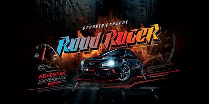 Road Racer is an esport style font that has a sporty character, very suitable for automotive design projects, sports and all products with a dynamic character.
 - Cashback by AVP,
$15.00 A rounded geometric font of uniform stroke weight. All strokes have rounded ends and with the exception of the math symbols, there are no diagonal strokes.
 - DF A Bit by Dutchfonts,
$33.00 DF A Bit is made for screen display which is the final form of a lot of information nowadays. But there is more in this BIT... in display sizes it unfolds it’s skin, a beautiful ink on paper structure caused by the letterpress printing of copper lines. Analogue BITS indeed. With all the wealth of the ‘non perfect’, to please the eye and to satisfy the mind.
 - Royal Style by Rizkimau,
$30.00 Royal Typeface is stylish copperplate fonts, combines from copperplate to contemporary font with a dancing baseline, classic and elegant touch. Can be used for various purposes. Such as headings, luxury, logos, wedding invitation, t-shirt, letterhead, lable, news, posters, badges etc. Royal Typeface features 1.500 glyphs. Support with Opentype: Unique glyphs, With cool Stylistic Alternates, Swash, Italics, Stylistic Sets 1-20, Ligatures, Multilingual characters, UPPERCASE, LowerCase, Numeric, Oldstyle Figures & Tabular Figures.
 - Burnest by Adam Fathony,
$10.00 In collaboration with Renov Olivian who was experienced with hand-drawn lettering for a project. We've decided to create Vintage Inspirated Fonts with strong identity for an outdoor design, camping, wild, journey, adventure, masculine, and etc. Burnest Comes with 3 Weight, Thin, Light and Regular. On each Weight have 3 different style, Clean (sharp corner), Round (Rounded Corner), and Rough (Rough Version). 9 Fonts in Total for completing your design style.
 - NewJune by Hubert Jocham Type,
$39.00 NewJune is a very strong unique character. It is already used in many magazines all over the world. Like Harvey Nichols magazine in London and later W magazine in New York. NewJune is the corporate typeface of the Academy of the Arts in Munich.
 - Apagah Reverse by Differentialtype,
$10.00 Apagah Reverse is a reverse contrast serif font with a contemporary concept and modern style. Equipped with an alternative with a reverse style too, you can use the uppercase with the lowercase style, and vice versa. This font also has four styles that you can mix and match, to complete the design you create. Crafted with high attention to detail, giving you the best designing experience. Most suitable for poster design, headlines, quote writing, pamphlets, greeting cards, product packaging, book covers, logo types, album covers, etc.
 - Tafel Sans by Sudtipos,
$39.00 Tafel is Sudtipos’ contemporary take on early- to mid-century geometric fonts; it has the intrinsic qualities of a geometric without following the strict rules they customarily employ. Tafel is notable for its versatility as it works well in both small and display sizes; its sophisticated elegance and refined simplicity make it ideal for corporate identities, street signage, fashion brands, luxury packaging and much more. From Thin to Black, Tafel is comprised of 8 weights, 3 sets of Small Caps with different x-heights (Big Caps, Small Caps and Petite Caps), many alternative glyphs and a complete range of figures including old-style figures with matching italics. The extended character set supports Central, Western and Eastern European languages.
 - Asbatun by Akifatype,
$15.00 Asbatun is a bold calligraphy font, featuring Arabic Style with Alternates and Ligatures. Designed expertly to make your project or work more modern, this font can be used for various projects such as: greeting cards, branding, logos, screen printing, and many others.
 - Border PI 1515-9 by Monotype,
$29.00This font consists of individual pieces that can be combined to make a wide variety of borders. For each border design, the pieces generally include four corners, a vertical section, and a horizontal section. - Fluse by Pesotsky Victor,
$10.00 «Fluse» is an accidental sans-serif font. It has an angular design but smooth and sleek shapes. The font is suitable for both active titles and medium-sized texts. It can also be an accent in a poster or the basis of a corporate identity. Fluse supportsBasic Latin, Cyrillic and more than 100 languages all together. The font was designed by Viktor Pesotsky.
 - Witthayakhom by Jipatype,
$27.00 วิทยาคม เป็นอักษรแบบคอนทราสเฉพาะส่วนเซอริฟเมื่อเปรียบเทียบกับเส้นแนวตั้งและแนวนอนที่มีขนาดใกล้เคียงกัน ดูกึ่งทางการ มั่นคง เรียบหรู มีเสน่ห์ เหมาะสำหรับการใช้ผาดหัว หรือรองผาดหัว มีทั้งหมด 9 น้ำหนักและตัวเอียงของแต่ละน้ำหนักรวมทั้งหมดมี 18 สไตล์ และมีฟีเจอร์อื่น ๆ อาทิเช่น Small Caps และฟีเจอร์อื่น ๆ พร้อมให้คุณได้เลือกใช้งาน รองรับหลากหลายภาษา Witthayakhom is a hight contrast only on serif compared to vertical and horizontal line which similar thickness. Semi-formal, stable, elegant, charming look. Suitable for headline and sub-headline. Comes with 9 weights and italics of each weight total 18 styles, and there are features such as Small Caps and many features available for you. Support multi-languages.
 - Risthiya Brush by Gatype,
$14.00 Themilan is a super casual handwritten script with a detailed brush texture, and a unique all-caps sans serif font, it also has dashing strokes across all letters to add style to your designs. It can be used for various purposes. such as titles, signatures, letterheads, nameplates, labels, newsletters, posters, logos, correspondence, wedding invitations, badges, etc. Themilan Brush Font is encoded with Unicode PUA, which allows full access to all additional characters without special design software. Mac users can use Font Book, and Windows users can use Character Map to view and copy any extra characters to paste into your favorite text editor/app. To enable the OpenType Stylistic alternative, you need a program that supports OpenType features such as Adobe Illustrator CS, Adobe Indesign & CorelDraw X6-X7, Microsoft Word 2010 or a later version. How to access all alternate characters, using Windows Character Map with Photoshop: https://www.youtube.com/watch?v=Go9vacoYmBw How to access all the alternate characters using Adobe Illustrator: https://www.youtube.com/watch?v=XzwjMkbB-wQ Thanks a lot for viewing and let me know if you have any questions.
 - Globet - Personal use only

- Prince And Princess Charming by Harald Geisler,
$68.34 Prince and Princess Charming are very extravagant and extroverted about their feelings. Prince Charming puts a heart on everything. If you're convinced that you love you've got to go with Prince Charming. Compared to the Prince, Princess Charming puts more hearts on every letter. Convince that you have to be loved: follow Princess Charming. As you would expect from Aristocrats the family members are fluent in many languages and have a surprising extensive character set that even covers Cyrillic. Prince and Princess Charming are a part of the Light Hearted Font Collection that is inspired by a recording of Jean Baudrillard with the title, "Die Macht der Verführung" (The Power of Seduction) from 2006. Further inspiration came from the article, "The shape of the heart: I'm all yours". The heart represents sacred and secular love: a bloodless sacrifice. by British writer Louisa Young printed in EYE magazine (#43) London, 2002.
 - MEORU GEND by Twinletter,
$17.00 Meoru Gend is a display font that presents superhero strength, courage, and modernity in every action. With a strong, bold, and futuristic style, this font is the perfect solution for creating action-packed and epic gaming experiences. In every letter, Meoru Gend brings life to your display with electrifying energy. From bold, sharply contoured typefaces to seamlessly blended modern elements, this font will bring immense visual power to your game projects. Meoru Gend offers not only impressive styles but also creative features that enrich your work. With the available ligatures and alternates, you can create unique and interesting variations of your style. Also, with multilingual support, this font can be used in multiple languages to reach a global audience. If you’re looking for a strong, bold, modern, and action-packed font for your game projects, Meoru Gend is the right choice. With benefits that include an impressive look, futuristic style, and creative features such as ligatures and alternates, this font will quickly catch the attention of your potential customers and bring you an extraordinary gaming experience in no time. What’s Included : File font All glyphs Iso Latin 1 Alternate, Ligature Simple installations We highly recommend using a program that supports OpenType features and Glyphs panels like many Adobe apps and Corel Draw so that you can see and access all Glyph variations. PUA Encoded Characters – Fully accessible without additional design software. Fonts include Multilingual support
 - Bowling Script by Sudtipos,
$69.00 There is plenty of lyric and literature about looking over one's shoulder in contemplation. What would you have done differently if you knew then what you know now? This is the kind of question that comes out of nowhere. When it does and whether its context is personal or professional make very little difference. It's a question that can cause emotions to rise and passions to run hot. It can trigger priority shifts and identity crises. It's never easy to answer. Three years ago, I published a font called Semilla. My aim with that was to distill the work of Bentele, a lettering artist from early 1950s Germany. Picking such an obscure figure back then was my way of pondering the meaning and efficiency of objectivity in a world where real human events and existences are inevitably filtered through decades of unavoidably subjective written, printed and oral history. And maybe to pat myself on the back for surviving surprises mild and pleasant. Having been fortunate enough to follow my professional whims for quite some time now, I took another, longer look at my idea of distilling Bentele's work again. I suppose the concepts of established history and objectivity can become quite malleable when personal experience is added to the mix. I say that because there I was, three years later, second-guessing myself and opining that Bentele's work can be distilled differently, in a manner more suited to current cultural angles. So I embarked on that mission, and Bowling Script is the result. I realize that it's difficult to reconcile this soft and happy calligraphic outcome with the introspection I've blathered about so far, but it is what is. I guess even self-created first world problems need to be resolved somehow, and the resolution can happen in mysterious ways. Bowling Script is what people who like my work would expect from me. It's yet another script loaded with all kinds of alternation, swashing and over-the-top stuff. All of that is in here. These days I think I just do all that stuff without even blinking. But there are two additional twists. The more noticeable one is ornamental: The stroke endings in the main font are of the typical sharp and curly variety found in sign painting, while the other font complements that with ball endings, sometimes with an added-on-afterwards impression rather than an extension of the actual stroke. In the philosophical terms I was mumbling earlier, this is the equivalent of alternate realities in a world of historical reduxes that by their very nature can never properly translate original fact. The second twist has to do with the disruption of angular rhythm in calligraphic alphabets. Of course, this is the kind of lettering where the very concept of rhythm can be quite flexible, but it still counts for something, and experimenting with angular white space in a project of a very dense footprint was irresistible. After playing for a bit, I decided that it would interesting to include the option of using optically back-slanted forms in the fonts. Most scripts out there, including mine, have a rhythm sonically comparable to four-to-the-floor club beats. So the weirdly angled stuff here is your chance to do the occasional drumroll. Everyone knows we need one of those sometimes. Bowling Script and Bowling Script Balls fonts comes with 1600 characters and features extended Latin-based language support. There are also a basic version of both fonts without all the alternates and extra OpenType features. Bowling family ships in cross-platform OpenType format. We also want to present “Mute”, a visual essay narated by Tomás García and Valentín Muro, about digital life created specially to introduce Bowling Script.
 - Explosion by Suomi,
$25.00 This font is an experiment in building dynamics into a typeface. Explosion has two variants to be put on top of each other for more dimension.
 - Digital Biz Bitz by Funk King,
$3.00 Digital Biz Bitz is a family of fonts and fontbats designed for use in business learning. Use these elements to enhance the learning experience you create.
 - Swede-Trauma - Unknown license

- Tarocco by MAC Rhino Fonts,
$18.00 Tarocco is a typical book face with good readability and rather tall x-height. The origin for this typeface is found in Nordisk Antikva. A typeface especially constructed with attention for the Swedish language. Waldemar Zachrisson was determined to realize his ideas and in 1906 he began to cooperate with the foundry Genzsch & Heyse, based in Hamburg. Some influences of Jugendt can be found and the typeface were released in 1910. It became rather popular until around 1930. The MRF version includes 7 weights all together.
 - PR Nouveau Ornaments 01 by PR Fonts,
$10.00 This is a set of ornaments inspired by the art nouveau style. Frames, corners, rules and flowers are included.
 - Kaviron by Graphicfresh,
$18.00 Kaviron is the name of a street in a Greek city. A city that has many civilizations. This font is designed in a more classic way. So it has its own experience in using it. This font is synonymous with 70s or 80s style design visuals, Bold and strong. I hope you enjoy using this font and can come up with clever and brilliant ideas in your designs.
 - Counte by NamelaType,
$19.00 This is our first experience of creating serif fonts. It resulted in a modern slab serif family designed with symmetrical bracketed serifs for uprights and cursive serifs for Italics. Crafted with low contrast strokes, it makes this font versatile and can be used for text and printing. Counte contains many International diacritics and OpenType Features. It consists of 9 weight, going from Thin to Black with matching italics.
 - Irritation by Ingrimayne Type,
$12.95 Have you ever had to read text from a cheap dot-matrix printer which is not aligned quite right, so that the tops of the letters are either darker or lighter than the bottoms? Now with IrritationOne and IrritationTwo you can relive that experience even though you no longer use a dot-matrix printer. IrritationOne has dark tops and fading bottoms, while IrritationTwo has the opposite. Naturally both are monospaced.
 - Taku by Thinkdust,
$10.00 Taku comes in two styles, Taku regular and Taku Solid. As one of the most creative faces to date, this is a beautiful piece aimed at a whole range of markets for print and digital work. Super creative, extremely eye catching, and almost obsessively accurate. Taku is a typographers dream, over 300 hours of work on aesthetics and technical details, so you can expect the most high quality typeface around.
 - Architectural Lettering by Outside the Line,
$19.00 This font is for architects everywhere. This all cap font was created for use with CAD programs. It gives the handlettered look of old to computer generated blueprints. Architectural Lettering Bold is the heavier weight for Architectural Lettering. This additional weight makes a best selling font even more versatile. It has all the international currency symbols. Architectural Lettering Regular was redesigned in 2006 to include the same. It can be found in the book “Indie Fonts 3, a Compendium of Digital Type from Independent Foundries”.
 - Enigmatic Pandora by Shakira Studio,
$17.00 Say hello to new serif font, Enigmatic Pandora! Enigmatic Pandora is a serif font that combines a psychedelic uniqueness with bold boldness in each letter. With its eye-catching psychedelic characteristics, Enigmatic Pandora exudes an aura of mystery and magic that is hard to describe. Enigmatic Pandora offers a great typography experience with bold bold characters. Its bold and striking design makes each letter a centerpiece in the design. Combining stunning psychedelic elements with strong, compelling contours, this font provides a unique and compelling visual dimension. Enigmatic Pandora is suitable for use in design projects that want to express visual uniqueness and tension. This font is ideal for titles, posters, illustrations, album designs, and other creative projects that need an extraordinary and bold look. Here's what you get: Enigmatic Pandora Regular All Multilingual symbol Opentype features ( ligature, alternate ) Accessible in the Adobe Illustrator, Adobe Photoshop, Adobe InDesign, even work on Microsoft Word. PUA Encoded Characters - Fully accessible without additional design software. Multilingual character supports : (Afrikaans, Albanian, Catalan, Croatian, Czech, Danish, Dutch, English, Estonian, Finnish, French, German, Hungarian, Icelandic, Italian, Lithuanian, Maltese, Norwegian, Polish, Portuguese, Slovenian, Spanish, Swedish, Turkish, Zulu) Follow my shop for upcoming updates, and for more of my work, Thank you!
 - ASTRALYS by Cerri Antonio,
$37.00 Astralys is a linear decorative font, works very well as a type of identity logo, poster and 3d works. It continues the tradition of precedent Xova but with a hard linear impact. Its interesting to note that with it its possible to play with straight corners to create endless couplings geometric styles and beyond. Caps only fonts.
 - Modal by Schriftlabor,
$42.00 Modal is a sans serif type family intended for corporate, editorial and web design. Each weight comes with around 800 glyphs and supports a large variety of features such as ligatures, small caps, figure sets, case sensitive glyphs and so on. With its two italics, Modal offers new possibilities for designers and creates an additional tool for distinct typography.
 - Manises by Eurotypo,
$32.00 Located in the Valencian Community, Spain, Manises is very famous for its pottery. In the Middle Ages and the Renaissance, Manises was the most important production center for Spanish-Moresca ceramics, which was exported throughout Europe. At the beginning of the 16th century, Manises tiles were very commercially successful, especially of the heraldic type. Much appreciated by the Aragonese crown, Manises ceramics was also exported to France, Italy, and especially to Naples. As a big fan of Paterna and Manises ceramics, Naples influenced other Italian courts. Calixto III and Alejandro VI continuously commissioned Valencian pieces and tiles for the halls of the Vatican. The export also extended to Sicily, Venice, Turkey, Cyprus and even Flanders and the Baltic countries. The palaces of all the courts of Europe were enriched with this art. Many painters reproduced it in his paintings. It can be seen in the work of Hubert and Jan Van Eyck, and in the central panel of a triptych by Hugo Van der Goes (Uffizi Gallery, Florence). In this city there are also some frescoes by Domenico Ghirlandaio in which the Arabic-Valencian earthenware appears. Manises font is inspired by a text written on a 16th century tile, but adapting it to our times and giving it a very modern air. It is characterised by being able to combine uppercase and lowercase letters in a conventional manner, or use only capitals, or only lowercase letters, or, a random combination of both. It comes with an extra of many ligatures, stylistic alternates, and a set of very useful catchwords, to give more modernity to your text. This OpenType features may only be accessible via OpenType-aware applications, or the Character Map to view and copy any of the extra characters to paste into your favourite text editor/app. Manises looks lovely on wedding invitations, greeting cards, logos, posters, labels, t-shirt design, logos, children's material, in ink or water-colour based designs, fashion, magazines, food packaging and menus, book covers and whatever your imagination holds!
 - Opal Bulgarian by Context Foundry,
$6.00 Opal Bulgarian is a humanistic sans serif typeface of a modern type, inspired by the famous Optima typeface (designed by Hermann Zapf). Opal Bulgarian consists of 2 weights and corresponding italics. Opal Bulgarian is suitable for body texts; for titles; for corporate identity. Opal Bulgarian continues the design of Opal BulgarianCYR, designed in 1992 by Zhivko Stankulov. In compare to Opal BulgarianCYR the new font family Opal Bulgarian has more glyphs and cover more languages. A number of shortcomings in the construction of the glyphs have been eliminated, and the design as a whole has been updated. Opal Bulgarian is available with active support and upgradeability. Licensees will receive all new versions of the font free of charge.
 - Lab Sans Pro by Vanarchiv,
$25.00 Lab Sans Pro is a geometric sans-serif typeface with a technological and minimalist look and is suitable for use in large sizes. It has eight versatile weights, (from Thin to Black) including true italics for each one, and a wide range of stylish alternate characters to improve its use in different graphic contexts. The name of this typeface was inspired by an experiment, mixing a structure with calligraphic influences and completely geometrical and structured drawings. Lab Sans Pro has a wide range of OpenType® features such as: small caps, old style/titling and small caps figures, fractions, superior and inferior scripts, scientific components and ligatures. Versatile but original, precise but lively, Lab Sans Pro is a carefully crafted technological typeface designed by Tiponautas.
 - Vulpa by Eclectotype,
$36.00 Vulpa is a charming serif family in regular, italic and bold, informed by the proportions of a personal favorite, Plantin. The quirky foxtail terminals (inspired in part by my script font, Gelato Script) can be seen across all three styles. These little details make the typeface very expressive at display sizes, but practically disappear at text sizes, making for a very versatile face. Across the three styles there are a number of useful OpenType features which make Vulpa capable of demanding typographic work, even though there are only three styles. Regular, italic and bold are all you really need anyway! The regular and bold weights both include small caps, and the italic features swash capitals for most letters. The italic also features quaint discretionary ligatures, and all styles include standard ligatures, automatic fractions, proportional and tabular, lining and oldstyle figures. If this isn't enough, the Vulpa family also includes Ornaments and Drop-Cap fonts. There is an ornament for A to B, a to b and 0 to 9. These have been carefully designed to match the feel of the text fonts, and many are influenced by ornaments and fleurons from the ATF 1912 Type Specimen book. The drop-caps have an engraved look, and two color versions can be made by overlaying upper and lower case. Despite the lack of weights compared to ‘workhorse’ faces, the charm and versatility of Vulpa make it a really useful typeface, that I hope you'll enjoy using as much as I enjoyed making.
 - Abrect by Hackberry Font Foundry,
$24.95 My first font for the summer of 2009, Abrect is a new sans serif font where I try to maximize the x-height and keep the design fresh and personal. It fits in with my continuing objective of designing book fonts that I can really use. Abrect is a tangent for me just taking an idea out to its end. In particular, it is a radical modification of my first font in 1993, Nuevo Litho. The hand-drawn shapes vary a lot, many pushing the boundaries of the normal character. With many of the new releases I see, the digital perfection is getting pretty extreme. It’s looking like a Rococo stage of development for many with decoration taking over from function. I'm consciously trying to head a different direction. This is not a normal font for me in that it has caps, lowercase, with the appropriate figures for each case, no small caps. This is the first time I have skipped small caps in over a decade. This font has all the OpenType features in the display set for 2009 except for the small caps. There are several ligatures for your fun and enjoyment: bb gg ff fi fl ffi ffl ffy fj ft tt ty Wh Th and more and many of them are experimental in form. Enjoy!
 - LudwigHohlwein - 100% free

- Gevher by Hurufatfont,
$23.00 Gevher is a grotesque based font family that the product of a meticulous work that spread over 2 years. It differs from other grotesque fonts with its very soft angular turns to the rounded forms and its daring ink traps. The rigid and stable structure is balanced by deep ink traps and unusual opposite angle at the joints. Thus it has a more humanistic expression. It has 3 widths: Condensed, Narrow and Normal. It consists of 8 main weights and their compatible italics, totally has 48 styles. Therefore, it provides a wide range of usage practices. It offers creative "contextual alternates" for the best reading experience. Ideal for every editorial design, packaging, corporate identity, brand, application, web and desktop usages.
 - Napzer by Craft Supply Co,
$20.00 Napzer - Geometric Sans Serif is the embodiment of modern typographic design, seamlessly merging precision and simplicity into a versatile typeface. With its sharp, geometric letterforms and clean lines, Napzer is the perfect choice for projects that demand a contemporary and professional aesthetic. This typeface ensures outstanding legibility in both digital and print media, making it suitable for a wide range of applications. Whether you're designing a website, creating marketing materials, or establishing a corporate identity, Napzer's clear and crisp design will enhance your content with sophistication and clarity. Choose Napzer - Geometric Sans Serif to bring a touch of contemporary elegance to your design projects. Whether you're working on branding, editorial design, or digital interfaces, Napzer offers a timeless and professional typographic experience.
 - Coffee Beans by Enes Atağan,
$15.00 Coffee Beans font is curly ended type font, great for strong headings and titles. Comes from all caps. You can use like Instgram posts, in logos for example CoffeeShop logos and designs design projects be it logos, art quotes or art headlines vs. If you want to stand out your design and need personality your projects. You must try Coffee Beans Font and see difference with other fonts.


