10,000 search results
(0.046 seconds)
- Academica Sans by Storm Type Foundry,
$53.00 Academica Sans was drawn with the aim of following the artistic features of Josef Týfa's fonts. It has the same proportions as the famous Academica, so both fonts can be successfully combined. It is suitable for all types of literature from scientific to poetry, but also for corporate identity and websites. It has a calm and timeless character.
 - Falheiz by Sign Studio,
$20.00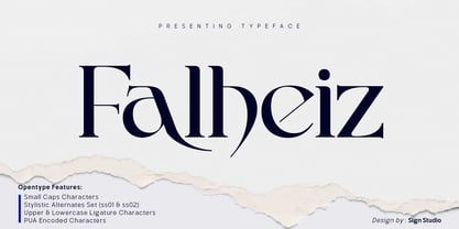 Falheiz is a stylish font that can bring classic memorial nuance. It's a mix between a classic serif and copperplate style. Falheiz comes with a full uppercase, lowercase, numbers, punctuation, ligatures and also some alternates. This font is perfect for poster, fashion magazine, branding or logotype design and displays both masculine and feminine qualities. All character are PUA encoded.
 - Urban Tags by Tomatstudio,
$15.00 Inspired from tagging graffiti marker in the streets and my real experiences in graffiti scenes, Urban Tags comes with iconic rounded tip marker, this style often used by several graffiti artist around the world because the style is very unique, very fun to write in markers. Perfect if you want realistic Street art style or hip hop for your designs, poster, props etc. Because this is real graffiti fonts, "urban Tags" is different like other fonts, the space letter is shorter, for perfect result the Kerning you can adjust manually, because it's impossible to setting kerning like other regular fonts. I put extra glyphs for make the fonts looks more street art, use "åß∂ƒ©˙∆˚¬Ω≈ç" you can see in the preview.
 - Variety by Studio K,
$45.00 Now that there are more Studio K fonts than there are characters in the alphabet it occured to me that I should produce a sampler font that showcased them all: hence Variety. The 'What the font' experts amongst you should enjoy identifying individual characters, but to start you off, the featured fonts in the font title are, in order of appearance: Alma Mater Outline Shadow, Aspidistra, Signpost, Cafe de Paris, Showbiz, Barrowboy and Soft Rock.
 - Garbata by Zetafonts,
$39.00 Garbata was designed in 2020 by Francesco Canovaro, looking for an approach to sans serif design that ignored the over-exploited grotesque and modernist models. It takes its skeleton from old style typefaces like Windsor or Cooper, keeping the quirky sloped shapes of some letters and adding to the historical smooth shapes a flat brush calligraphic sensibility. The result of these different historical influences is a humble yet distinctive sans serif typeface, developed in a wide range of weights, with finely-tuned differences between the medium, text-oriented cuts (with wider tracking and more regular design) and the more extreme, display-oriented weights. This play on subtlety allows Garbata to be surprising in all uses: humble and readable when set in body text, it shows all its elegant, whimsical qualities in logo design and display use. Equipped with all advanced OpenType features you expect from a production typeface, Garbata comes with an extended character set covering over two hundred languages with latin and Cyrillic glyphs. Designed with an Italian sensibility mixing craftsmanship and artistry, Garbata is ready to help you make your designs timeless, elegant and unusual.
 - Urban Black by Subectype,
$17.00 Urban Black is An Urban Font. This font was created to help you designing logotype with urban style for your Brand or your clients, and also you can use it for designing all of the graphic stuff such as badge, sign, Esport, headline, urban design, T-shirt/apparel, Poster, etc. Urban Black was designed for personal characters such as strong, confidence, dynamic, readable, Energic, dynamic, etc.
 - Lab Slab Pro by Vanarchiv,
$50.00 Lab Slab Pro is a geometric slab typeface with a technological and minimalist look and is suitable for use in large sizes. It has eight versatile weights, (from Thin to Black) including true italics for each one, and a wide range of stylish alternate characters to improve its use in different graphic contexts. The name of this typeface was inspired by an experiment, mixing a structure with calligraphic influences and completely geometrical and structured drawings. Lab Slab Pro has a wide range of OpenType® features such as: small caps, old style/titling and small caps figures, fractions, superior and inferior scripts, scientific components and ligatures. Lab Slab Pro is Lab's best and most powerful mutation designed by Tiponautas.
 - Okoye by XO Type Co,
$40.00 Okoye occupies a liminal space between the bonkers curviness of 19th-century grotesques and the sandblasted neutrality of 20th-century models. Both extremes are nice, but there’s something to be said for some neutrality with character left in place, yes? Okoye comes in 9 weights, Thin to Black. If you’re using it for interfaces, each weight lines up from 100-900 in the CSS specification you already know, with Regular sitting at 400 and Bold at 700. You’ll see what you expect to see without extra font-weight specification. There’s extensive Latin language support, a set of small caps which mirrors full-size caps (good for control labels), and arrows. Okoye will be your quirkhorse: hardworking, with personality.
 - Prozac by Barnbrook Fonts,
$30.00 Throughout the history of typography there have been countless attempts to simplify the alphabet. In the early 20th century, modernist designers experimented with reducing the alphabet to basic geometric shapes. Prozac pushes this utopian experiment further by reducing the roman alphabet to just six shapes. These shapes are then flipped or rotated to make up the 26 letters of the alphabet. Prozac is available without prescription in lite and max versions.
 - Belinsky Text by Tabular Type Foundry,
$32.99 Belinsky is a monospace sans serif typeface inspired by early 20th century geometric sans serifs, architectural letterings, and retro video games to some extent. Its exaggerated proportions and sharp details appear less harsh thanks to the corner rounding. It is comprised of a standard and text families, and the latter is especially suited for small text and programming, with wider spacing and more centralised gravity of certain letters like E. It still gives your codes a lot of personality. The typeface name is a reference to the designer�s favourite animated film, American Pop.
 - Belinsky by Tabular Type Foundry,
$32.99 Belinsky is a monospace sans serif typeface inspired by early 20th century geometric sans serifs, architectural letterings, and retro video games to some extent. Its exaggerated proportions and sharp details appear less harsh thanks to the corner rounding. It is comprised of a standard and text families, and the latter is especially suited for small text and programming, with wider spacing and more centralised gravity of certain letters like E. It still gives your codes a lot of personality. The typeface name is a reference to the designer�s favourite animated film, American Pop.
 - Collogue by Heyfonts,
$25.00 Collogue - Variable Font is a cutting-edge and versatile typeface that brings a new level of adaptability to display typography. Unlike traditional fonts with fixed styles, a variable font allows designers to manipulate various aspects of the typeface, such as weight, width, and slant, along a continuous spectrum. Here's a comprehensive explanation of the features and functions of the Display Variable Font: Key Features: -Adaptive Design Elements: The primary feature of the Display Variable Font is its adaptability. -Designers can seamlessly vary specific attributes of the font, including weight, width, slant, and more. -This flexibility empowers designers to fine-tune the typography to suit the visual aesthetics of their projects. -Single Font File, Multiple Styles: Display Variable Fonts consolidate multiple styles into a single font file. This eliminates the need for separate files for different styles, providing a streamlined and efficient solution for designers. -Smooth Transitions: Changes in the font attributes occur smoothly and continuously. Unlike traditional fonts that switch abruptly between styles, a Display Variable Font ensures a fluid transition, allowing for a more harmonious and visually pleasing typographic experience. -Precision Control: Designers have precise control over the variation axis, enabling them to adjust the font's appearance with granular precision. This level of control enhances the typographic customization possibilities and allows for fine-tuning based on specific design requirements. -Responsive Typography: Display Variable Fonts excel in responsive design. They adapt gracefully to various screen sizes and resolutions, ensuring optimal readability and aesthetics across different devices. Functions: -Dynamic Branding: For brands looking to establish a dynamic and adaptable visual identity, Display Variable Fonts offer the perfect solution. The font's ability to adjust seamlessly allows for a versatile and cohesive branding experience across diverse applications. -Editorial Freedom: In editorial design, Display Variable Fonts provide editorial teams with the freedom to experiment with typography. The font can be adjusted to suit different sections or emphasis points within publications, enhancing the overall visual appeal. -Web Design Innovation: Display Variable Fonts are at the forefront of innovation in web design. They enable designers to create dynamic and interactive typographic elements that respond to user interactions, contributing to a modern and engaging web experience. -Attention-Grabbing Displays: Whether used in signage, banners, or large-scale displays, Display Variable Fonts stand out with their adaptability. Designers can experiment with different styles within a single font to create attention-grabbing and visually dynamic displays. -Customizable Interfaces: In digital interfaces, Display Variable Fonts provide a customizable typographic experience. Designers can optimize text elements for different device sizes and orientations, ensuring a seamless and visually pleasing user interface. -Innovative Advertising: Display Variable Fonts offer a fresh approach to advertising typography. Brands and advertisers can leverage the font's adaptability to create visually striking and memorable campaigns across various media channels. In summary, Display Variable Fonts represent a groundbreaking evolution in typographic design, providing designers with unprecedented flexibility and control
 - Perspective Sans by Bülent Yüksel,
$29.00 The font primarily had a strong body. Family has a four layered experience. All and in harmony. This font has a strong personality, that makes it perfect for use in headline sizes. Also use for print, motion graphics, logo design, packaging design, t-shirts and more. By using layers, you can design different colors and sizes by repositioning lights and shadows. This will allow you to take your designs to the next level. Using this unique font, you'll have a lot of fun and produce beautiful materials. You can contact me at buyuksel@hotmail.com, pre-purchase and post-purchase with questions and for technical support. There is nothing as satisfying as to do a good quality and properly job. You can enjoy using it.
 - BD Gitalona Moxa by Balibilly Design,
$19.00 This is an Experimental typeface, a direct descendant of the BD Gitalona font family, which has a supermassive family with Variable technology. However, this version is more on the aesthetic aspect, which is experimental and exploratory. It complements the beauty of the primary typeface that we released separately. If you are a fan of Effectiveness and flexibility, please learn more about BD Gitalona and BD Gitalona Variable! Inspiration The world of entertainment moves non-stop. One by one, figures appeared and left. We expect to create something to entertain previous trends with packaging more relevant to the present. More specifically, we admire and are inspired by some of the world's leading and top singers with a segmented nature. We imagine so many figures that can affect every viewer. However, each artist or singer has a segment because almost all of them have characteristics. The Design The basic design of this typeface begins with a transitional serif shape with sharp, shapeless corners. Then in the middle of the invention, there was an opportunity to explore it further from the readability side by adding an optical variable that can adjust the serif thickness when used together between large, medium to paragraph text sizes for editorials. The shift from serif to sans-serif with the contrast initiated by the shift of the serif family form as a different variable also makes this font richer in terms of the features it contains. Parts are expected to add to the user satisfaction with the complexity of this font. The Features BD Gitalona consists of one sub-family intended for body text with nine weights from Thin(100) to Black(900) and four other display sub-families such as Display serif, Flick, Harmony Sans and Contrast Sans. Each consists of four weights Thin(100), Regular Weight(400), Bold(700), and Black(900). And again, there are also retailed separately; the BD Gitalona Variable font, which is designed to accommodate all Subfamily in 1 font file, and BD Gitalona Moxa, an experimental typeface. A total of 700+ glyphs in each style. Advanced OpenType features functionally and aesthetically, such as Case-sensitive forms, small caps, standard and discretionary ligatures, stylistic alternates, ordinals, fractions, numerator, denominator, superscript, subscript, circled number, slashed zero, old-style figure, tabular and lining figure. Supports multi-languages including Western Europe, Central Europe, Southeast Europe, South America, and Oceania.
 - LHF Classic Panels 2 by Letterhead Fonts,
$39.00 A vast array of 39 expertly-drawn decorative vector panels in the form of a single font. Each letter generates a different panel so you can simply insert your own text for a quick design your clients will love.
 - Ultimatum MFV by Comicraft,
$19.00 ALERT: Comicraft's Mad Font Scientist John Roshell and Lead Lab Assistant Drewes McFarling have applied an Unstoppable Force to our Immovable Font ULTIMATUM, successfully splitting it into a family of three fonts! Here’s the secret formula: ULTIMATUM MASS retains the dynamic details of the original with flat, angled corners; ULTIMATUM FORCE cooperates with your demands for a vertical slice of the action; and ULTIMATUM VELOCITY got tired of waiting for a compromise and cut across its horizontals. The complete family features three styles of eight weights for a total of 24 fonts, each with support for 221 languages including Western & Central Europe, Vietnamese & Cyrillic. Three Variable Fonts provide precise control of Weight & Italic slant. ULTIMATUM MASS FORCE VELOCITY is ideal for high performance car & truck branding, sports uniforms, video game graphics, college & university apparel, and any time you want to convey industrial strength and technological innovation.
 - Chilloxine by Owl king project,
$29.00 Chilloxine is a clean font with detailed edges combined with sharp corners and one side with rounded corners. font with 18 families that bring more varied thickness and slope, with many style choices in one family, the font is very good to use for logos, titles headlines, & can even work well for text. Chilloxine is very minimalist with a clean form and is more professional.
 - Nicolas Jenson SG by Spiece Graphics,
$39.00 It was the original work of fifteenth century designer Nicolas Jenson that formed the basis for this roman serif style developed by Ernst Detterer in 1923. Similar in spirit to other early twentieth century revivals such as Centaur, Cloister Old Style, and Italian Old Style, Nicolas Jenson is distinguished by its pristine and delicate nature. A gifted young apprentice to Detterer, Robert Hunter Middleton, greatly expanded the family. And by 1929, bold, italic, and open were part of the Ludlow Foundry’s beautiful Nicolas Jenson Series. It was reintroduced under a new name, Eusebius, in 1941. This digital version includes a new medium and extrabold weight with intermediate small caps and swash alternates throughout the family. There is also a regular expert version with a variety of currency symbols plus a regular petite caps (regular x-height small caps) and old style figures version. Nicolas Jenson is now available in the OpenType Std format. Small caps, old style figures, and swash alternates have all been combined into one style for ease of use. You will also find an additional regular petite caps version included with the regular style. Some new characters have been added as stylistic alternates and historical forms. These advanced features work in current versions of Adobe Creative Suite InDesign, Creative Suite Illustrator, and Quark XPress. Check for OpenType advanced feature support in other applications as it gradually becomes available with upgrades.
 - SG Gluper by Studio Gulden,
$25.00 SG Gluper - inspired by the OG Cooper Black typeface that is intended for display use. This retro serif font combination can handle many typographic uses but is best suited for headlines, branding, and logos. It has a multilingual feature that supports more than 200 languages. Gluper also has an alternate version including swashes and ligatures.
 - Gradl Zierschriften by HiH,
$10.00 Here is another design by jewelry designer Max Joseph Gradl. Zier is a verb, meaning to decorate, adorn or ornament; zierlich means decorative, elegant, fine, neat. Schrift means type. Zierschrift, therefore, means decorative type. Gradl Zierschriften is a decorative type in the Art Nouveau style, rather than the more ornate Victorian style. Very modern, very young, with an elegant simplicity of form. Maria Makela, in her book The Munich Secession (Princeton 1990) suggests that the frequent use of simple, flowing, organic forms that was so characteristic of Art Nouveau was a reaction against the growing complexity and rapid urbanization that resulted from 19th century industrialization. In keeping with that reaction is the hand-drawn quality that intentionally rejects a mechanistic mathematic precision of line rendering. Gradl Zierschriften preserves that hand-drawn quality. Designed with upper case only, this face was obviously intended for short headlines only and is best set at 18 points or larger. However, I don't think you really get to experience the grace of this design until you get to 36 points or more. In the larger sizes, it is simply stunning. Please note that while most of the uppercase letterforms are repeated in the lower case for convenience, the ‘F’,‘L’ and ‘T’ are rendered a little narrower than in the uppercase to provide for visual variety. The font also includes a generous supply of ligatures for just the right fit ... and just for the fun of using them. Three common ways of inserting a ligature, accented letter or other special character are: 1) Key in “ALT”+“0”+[ascii #]; for example ALT+0233 for the e-acute, 2) From within your application program, go to the INSERT menu and look for something like “Insert Symbol,” (this function is NOT available in all application programs) & 3) Cut & Paste from the CHARACTER MAP display that has been supplied by every generation of Windows Operating System that I can recall (All Programs>Accessories>System Tools). Isn't it amazing what you can do? Don't be afraid to experiment. If you back up your work, you have very little to lose and a lot to gain. Not only do you acquire a new tool, but by the very process you have learned how to continually expand your knowledge and skill base.
 - dob - Unknown license

- Sendica by RahagitaType,
$14.00 Sendica delivers a playful and charming script experience. It’s the ideal font for adding a dash of elegance to your next design project.
 - JH Lea by JH Fonts,
$45.00 JH Lea cursive is a school kids typeface; it is designed based on cursive handwriting , typical for children books, first hand calligraphy experience.
 - Picturama Founder by Mans Greback,
$59.00 Picturama Founder is a beautiful script font that elegantly bridges the gap between time-honored formality and contemporary innovation. Every curve and connection in this formal calligraphy type speaks of finesse, flowing with an unmatched grace reminiscent of vintage labels or classic vinyl covers. Yet, there's a modern twist that sets it apart: its bold stance and innovative touches redefine what we expect from formal script.
 - Poster by MP&A,
$22.00 Poster is the first type created by this team. Its an experiment. This geometric typeface is based on bold and clean rounded rectangles. It’s soft and friendly look lends itself to a number of applications. It´s a good choice for company logotypes, magazine headlines and, of course, posters applications. This font was designed to be used in large sizes, so you can appreciate the little details.
 - Longbranch by Solotype,
$19.95A modern cutting designed to give the appearance of an old wood type. The letters were cut as linoleum blocks about 2 inches high, then duplicated as copper electrotypes. Used for some Ringling Bros. circus work. - Bordonaro Spur by Estudio Calderon,
$35.00 Bordonaro Spur - Bordonaro Script’s partner - is a typography strongly influenced by old beer labels and includes some serifs based on Frederic W. Goudy’s Copperplate, but with some softened spurs adding an elegant and soft texture to the text. It is ideal to be used on large bodies and has a set of special ligatures ideal to be used in branding. Psss...Check out the NEW Bordonaro Spur with Rounded corners , same version but soft! FEATURES Co = company1 Co = company2 Estd = established Inc = incorporated Ltd = limited Mc = mac Rd = Road St = street And also from Adobe CC you can activate Style Sets (SS) and get ideal ligatures for ordinal numbers: 1st = st 2nd = nd 3rd = rd 4th = th Bordonaro Script and Bordonaro Spur are two typographic styles that were designed under the same characteristic features with the idea of combining them to obtain better results, for that reason, we recommend merging them in a creative way and you will realize everything you can design with them. The banners designs are based on old brands of beer labels, coffee packaging, sports logos and in some cases we use Copperplate Gothic but only as a complementary font in order to harmonize the layout of the elements in each banner.
 - Potpourri by Linotype,
$29.99 Potpourri was based on an energetic alphabet written by expert calligrapher Gottfried Pott. To create the elegant yet rugged strokes, Pott cut a pen with a unique fringed tip — from a drinking straw! He then produced an huge series of drafts before deciding on the final alphabet for digitization.
 - Liesel by Magpie Paper Works,
$26.00 What happens when historical calligraphy and modern lettering kiss? Liesel! This six-font, hand-lettered family is loosely based on traditional letterforms. Used alone, Liesel Regular reflects a warm, antique aesthetic. But when you pair her with Brush, Pencil, and Shadow - all of which were designed for layering - a modern, artistic look emerges! Experiment with textures, overlays and blending modes to create realistic water colored text. Both Liesel Printed & Liesel Shadow Printed are highly detailed, distressed versions of their solid counterparts, and can be layered to recreate an authentic letterpress or screen printed effect. Opentype features programmed into each text font include contextual alternates, stylistic alternates, swashes, true fractions, and old style numerals. Each Liesel font features PUA coding so all characters, including swashes and alternates, can be accessed with Character Viewer (Mac), Character Map (PC) or PopChar. For more information, including a complete PUA code listing, please review our user guide. We recommend pairing Liesel with Quimbly. Please note: because its outlines are complex & highly detailed, Liesel Printed and Liesel Printed Shadow may process slowly in some applications.
 - Sedid World by Fontuma,
$28.00 Sedid, “solidity; It is an Arabic term meaning “righteousness”. In particular, the correctness and soundness of a word is indicated by this word. The fact that I gave this name to the writing family is to point out its accuracy and robustness. This typeface, which is sans serif, consists of three families: ▪ Sedid: Font family containing Latin letters ▪ Sedid Pro: Font family including Latin, Arabic and Hebrew alphabets ▪ Sedid World: A family of typefaces including Latin, Cyrillic, Greek, Arabic and Hebrew alphabets Do you want a difference in your work? Then meet the Sedid World font family. This font will meet all your expectations in terms of the languages it supports and the variety of glyphs it contains. You can easily use the Sedid World font family in every project. Because this font has beautiful and soft lines. The font family includes open type features, as well as a large number of ligatures, small caps, modifiers, and currency symbols of many countries.
 - Pagewalker by Kostic,
$40.00 The name of the font is chosen to suggest its main purpose—setting multiple pages of text. All the features in this family were made with that in mind—legibility, distinct italics, small caps and various OpenType features, all make this font a useful tool for typographers. On the other hand, for packaging, posters, logotypes, etc. setting heavier weights in large size brings out its display qualities. Pagewalker is very legible and appears to be larger than other text typefaces. That is because the lower-case characters are made large compared to the capital letters. This means it can be used for setting text in, e.g. 9 pt size—while appearing to be 10 pt, but occupying less space. Pagewalker has a character set to support Western and Central European languages, and an extended set for monetary symbols which, in combination with tabular numbers, is perfect for financial reports. Each weight includes small caps, ligatures, proportional lining and oldstyle numbers, tabular figures, fractions and scientific superior/inferior figures.
 - Zomsenso by Pootis Type Corp.,
$31.99 Zomsenso is an angular, semi-modular typeface that supports OpenType alternates. The angular part means that the entire* font uses only angular segments and shapes. The alternate glyph shapes are under Stylistic Set 01. This font includes Seven Segment display (U+E000 to U+E07F) and arbitrary fractions (U+E1nd, n=numerator; d=denominator) that are mapped to the Private Use Area, so users can easily insert them via Unicode input. You can combine these fractions with the superscript and subscript numerals to create more fractions. This font can be used for essays, signs, logos, posters, commercial projects, videos, and many more. *except the circles in the Geometric Shapes block, which are still round
 - Child Rainy by Sipanji21,
$18.00 Child Rainy" is a charming and whimsical display font characterized by its cute and quirky nature, featuring sharp corners in every letterform. Fonts with sharp corners often exhibit a playful yet edgy design, adding a unique and distinctive touch to the characters. This font can be an excellent choice for various creative projects, especially those targeting children's themes, playful designs, or any context where a combination of cuteness and a touch of edge is desired. Its blend of adorable and sharp elements can lend a distinctive visual appeal to your designs.
 - Monitor by Device,
$29.00 Monitor is an early experiment in TV-wall pixeldom, and has the unique property of becoming easier to read the further away one gets.
 - Illuminati by Fatchair,
$9.95Originally designed as an experiment in monospacing (Illuminati Mono), Illuminati is a mixture of sans-serif and serif. The Italics have some cursive features. - Xenois Soft by Linotype,
$29.99Xenois is a sweeping suite of designs that will provide solutions for a multitude of projects. Annual reports, restaurant menus, business correspondence, corporate identity programs, movie credits and advertising campaigns can all be set with various faces from the family. Interrelating perfectly, the sub-families within the series include Xenois Sans, Serif, Semi, Soft, Slab and Super. The designs have a common and obvious design bond, yet each is able to stand on its own as a distinct typestyle. The Xenois typefaces are based on a common underlying model; they have the same cap height, the same lowercase x-height, the same stem weights, and the same basic character shapes. This unity of shape and proportion results in a remarkably complementary set of typeface designs. - Xenois Slab by Linotype,
$40.99Xenois is a sweeping suite of designs that will provide solutions for a multitude of projects. Annual reports, restaurant menus, business correspondence, corporate identity programs, movie credits and advertising campaigns can all be set with various faces from the family. Interrelating perfectly, the sub-families within the series include Xenois Sans, Serif, Semi, Soft, Slab and Super. The designs have a common and obvious design bond, yet each is able to stand on its own as a distinct typestyle. The Xenois typefaces are based on a common underlying model; they have the same cap height, the same lowercase x-height, the same stem weights, and the same basic character shapes. This unity of shape and proportion results in a remarkably complementary set of typeface designs. - Xenois Super by Linotype,
$29.99Xenois is a sweeping suite of designs that will provide solutions for a multitude of projects. Annual reports, restaurant menus, business correspondence, corporate identity programs, movie credits and advertising campaigns can all be set with various faces from the family. Interrelating perfectly, the sub-families within the series include Xenois Sans, Serif, Semi, Soft, Slab and Super. The designs have a common and obvious design bond, yet each is able to stand on its own as a distinct typestyle. The Xenois typefaces are based on a common underlying model; they have the same cap height, the same lowercase x-height, the same stem weights, and the same basic character shapes. This unity of shape and proportion results in a remarkably complementary set of typeface designs. - ZiGzAgEo - Personal use only

- CapitalisTypOasis - Unknown license


