10,000 search results
(0.088 seconds)
- Remopid by Keristyper Studio,
$14.00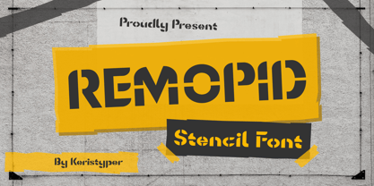 Introducing Remopid typeface, stencil display font with a strong personality. This font is good for logo design, Social media, Movie Titles, Books Titles, short text even long text letters, and good for your secondary text font with sans or serif. **Featured:** * Standard Uppercase & Lowercase * Numeral & Punctuation * Multilingual : ä ö ü Ä Ö Ü ß ¿ ¡ * Alternate & Ligature * PUA encoded We recommend programs that support the OpenType feature and the Glyphs panel such as Adobe applications or Corel Draw. so you can use all the variations of the glyphs. Hope you enjoy our fonts!
 - Park Slope JNL by Jeff Levine,
$29.00 The free-form geometric shapes of the lettering on a vintage piece of sheet music entitled "Four Pictures" is the basis for Park Slope JNL, named for a neighborhood in Brooklyn, New York.
 - Cabragio by Aah Yes,
$3.95Cabragio is a free-flowing informal font, very curvy and quite heavy. The free-flowing effect is especially apparent in the lower case letters, and this font is definitely something a bit different -- yet is highly readable and attractive. Original and distinctive! - Dragons Gravity by Illushvara,
$12.00 Hello, Happy to share our new fonts "Dragons Gravity" is a display font mix with a chinese color, consept like a dragons shape. It is ideal for Chinese gift, cards or invitation, film layout motorcycle, branding, quote, more product designs with your best styled. Features : Uppercase and lowercase Numbers Punctuation Multilingual Accent What you get : Dragons Gravity. OTF If you have any question, don’t hesitate to contact me. Happy Designing !!! Thank You, Bayu Suwirya
 - Spectre by Letteralle,
$23.00 Spectre is an allcaps display font. With bold and sharp shapes, this font is able to bring a fierce and bold impression to your designs. Spectre is perfect for editorial projects, Logo design, Music Album, Clothing Branding, product packaging, magazine headers, or simply as a stylish text overlay to any background image.
 - AJSHA by Fontex,
$49.00 AJSHA font, even though being our newest font, is inspired by ancient Japanese and Chinese culture, eastern style of life of about 5000 years before present day, when honor and a good sword were respected. Japanese special sword Katana is known to be handcrafted to be extremely sharp and deadly. Therefore, the shapes of the AJSHA font accompanies the moves of a Katana master when he uses the power of his sword. The font comes in two styles, light and medium. Medium is a bit bolder style while the exact bold or strong version lacks due to the fact that the font's lines needed to be sharp as a swordsman's cuts. We expect this font to be a great asset tool for top-notch designer companies that put quality before everything else.
 - GlOrY - Unknown license

- Sanity - Unknown license

- QUBE - Personal use only

- Dripps by Wiescher Design,
$39.50 Dripps is a handpainted, stenciled typeface with lots of drips and two different sets of capital letters – no lowercase. Sometimes I enjoy doing the rough stuff, your brutal type designer Gert Wiescher
 - Stencimilla by GRIN3 (Nowak),
$19.00 Stencimilla is a distressed stencil typeface with two different sets of capital letters - no lowercase. Language support includes Western, Central and Eastern European character sets, as well as Baltic and Turkish languages.
 - Rima by K-Type,
$20.00 Rima is a stencil display face with imposing slab serifs, designed to suggest strength, confidence, expertise and efficiency. Regular and Bold weights are included along with two handy italics (optically corrected obliques).
 - Fester by Fontfabric,
$150.00 Get inspired with Fester Behance presentation After several years of iterations, our brand new sans family of 16 styles is ready to take over with vector excellence! Fester is a semi-condensed Grotesque developed to beam big messages across the galaxy with a clear, bold voice. Emerging as if from the future, this low-contrast sans warps slick lines and sharp terminals into unexpected geometric shapes for extra flair. Ranging from Thin to Heavy, the typeface is loaded with 8 weights + italics, one variable style, over 760 glyphs, and Extended Latin + Cyrillic for flawless work at hyper-speed. Fester syncs with designs that feature big type, sharp layouts, interfaces, outlines, and raster images to help decipher any cutting-edge idea and make a memorable first contact. Family overview: 8 weights (from Thin to Heavy) + italics Extended Latin Cyrillic 760 glyphs Variable Font 1 free font - Fester-ExraLight 130+ languages OpenType Features: Localized Forms Subscript and scientific inferiors Superscript (Superiors) Numerators and Denominators Fractions Lining Figures Tabular Figures Oldstyle Figures Case-Sensitive Forms Standard and Discretionary Ligatures Stylistic Alternates Contextual Alternates Slashed Zero
 - Logisco by Ideabuk,
$16.00 Introducing Logisco - a sleek and versatile display font family that combines modern geometry with a retro-cool vibe. This six-font collection boasts soft, rounded corners that add a dash of playfulness to any project. Logisco Light, Regular, and Bold offer a range of weights to fit any typographic need, while the Stencil variations add a unique edge to your designs. Whether you're creating sleek logos or funky posters, Logisco has you covered with its stylish and versatile letterforms.
 - Andover - Unknown license

- Pickabilly - Unknown license

- Flat10 Fraktur by Dharma Type,
$14.99 The pixelated blackletter which called Fraktur, the most famous calligraphic letter in Germany. This 8-bit pixel font is designed with respect for 80s game designers and the pixel font pioneers in middle 90s. Use at size 10 pixels or multiples of 10 and anti-alias off is recommended. List of our Pixel Font Project. ·Flat10 Antique ·Flat10 Artdeco ·Flat10 Arts&Crafts ·Flat10 fraktur ·Flat10 Holy ·Flat10 Holly ·Flat10 Segments ·Flat10 Stencil ·Flat20 Gothic ·Flat20 Headline ·Flat20 Hippies ·Flat20 Streamer ·Behrensmeyer Vigesimals ·Civilite Vigesimals
 - Magnies by Arterfak Project,
$22.00 Feel the sweetness with Magnies, a minimalist serif font with clean stencil looks. The feminine letterforms which are perfect for logotype, fashion, and display. Magnies was designed with a high contrast of the strokes and cut the thinner line to get the optical effect but still keep the legibility. Great choice with over 100+ alternates characters, that you can create many variations for your design.
 - Stenblak by Ascender,
$29.99Stenblak is a rough, stencil blackletter design created by Terrance Weinzierl. There is just the right amount of grunge and texture to make Stenblak stand out from other formal blackletter designs. Stenblak would be great for any printed Halloween materials as well as posters, flyers and greeting cards. Stenblak is available in OpenType and TrueType font formats and is best used in medium to large headline sizes. - TextFace Type by Forme Type,
$9.99 The idea for this font family, derived from SMS text message faces (Emojis) and found photographs of faces collected over the last ten years. The concept for this project was to a create text-face characters using only the glyphes found in a standard version of a Sans Serif typeface. There are 36 different Textfaces. Available in three weights, Regular, Bold and a Stencil version.
 - Scape by Reserves,
$39.99 Scape is a precisely drawn, contemporary stencil face built from a single weight rounded end stroke. The fine, linear rounded forms create a subtle contrast to the raw utilitarian nature of the stenciled characters. Extremely versatile, Scape is highly legible due to it’s upright, consistently balanced sans letterforms. Stylistically, it exemplifies refinement and clarity with an distinct edge. Features include: Precision kerning Expanded ligature set Alternate characters (O, _, ®) Alternate zero Extended language support (Latin-1 and Latin Extended-A) *Requires an application with OpenType and/or Unicode support.
 - Lewis by Thierry Fétiveau,
$10.00 Lewis is a stencil typeface inspired by vintage sign painting. Lewis is designed for display use within printed publications as it has a high contrast of organic forms. Lewis consists of 3 styles; Classic, Display and Inline. Each style is based on the same skeleton but with a different personality. The Classic style is a simple and elegant stencil typeface which is also the original structure of Lewis. The Display style features intertwined flourish like parts and the last member of the family is the Inline style which features subtle internal details.
 - Sign Studio by Jeff Levine,
$29.00 The French lettering book Album de Lettres Arti (1949) displayed a number of examples of unique, stylized typefaces. One in particular features a multi-line sans serif in a classic Art Deco style with open-ended characters. This design is now available as Sign Studio JNL in both regular and oblique versions.
 - Lemon Smash by Krismagraph,
$21.00 Introducing our new font Lemon Smash!!! Lemon Smash is a modern & retro bold serif with a soft, rounded finish. Equipped with 123 alternates and unique ligatures, making it is very suitable for display, branding, packaging, logos, invitations, master heads, and others with a retro touch but still clean and elegant. What you get: Lemon Smash file Full alphabet with Uppercase and Lowercase Numbers, fractions Punctuation and symbols 123 Alternates Ligatures Multilingual support Feel free to follow, like, and share. Thanks so much for checking out my shop!
 - Architype Albers by The Foundry,
$50.00 Architype Konstrukt is a collection of avant-garde typefaces deriving mainly from the work of artists/designers of the inter-war years, whose ideals have helped to shape the design philosophies of the modernist movement in Europe. Due to their experimental nature character sets may be limited. Architype Albers draws on early grid-based attempts by Josef Albers, in 1926, to design an alphabet by reducing the forms to purely geometric elements – the square, triangle and parts of a circle – and in the process creating an unusual stencil effect typeface.
 - Foundry Fabriek by The Foundry,
$99.00 Foundry Fabriek was inspired by the concepts behind industrial fabrication, where and how parts of materials or structures are united. The systematic grid, formed by stencil shapes, is indicative of the work of Wim Crouwel, consultant on the development of this typeface. The compact character widths of Foundry Fabriek are consistent over the five weight progression, giving flexibility for a variety of applications. The characteristic letterforms have an extra dynamic in large scale, perhaps in cast concrete or laser cut metal, to form integrated components in architectural or signage projects.
 - Estrand by Firstype Studio,
$16.00 Hello, design enthusiasts! Allow me to present "Estrand" - a distinctive Display font with a penchant for sharp angles and bold character. Estrand features an edgy and angular design, characterized by rigid corners and a slightly condensed form that exudes a sense of precision and boldness. The font is crafted with sharp angles, giving it a unique and commanding presence. Its condensed nature ensures a sleek and modern aesthetic, making it an excellent choice for designs that demand a tinge of fierceness. Key Features: Sharp Angles and Bold Character: Estrand embraces a sharp design with well-defined angles, adding a touch of assertiveness to your typographic compositions. Slightly Condensed Form: The font's condensed structure contributes to a sleek and modern look, allowing for efficient use of space in various design applications. Distinctive and Commanding: With its firm personality, Estrand stands out as a font that commands attention and leaves a lasting impression. Versatility: Whether applied to branding, logos, or any design project, Estrand's unique characteristics make it adaptable to a wide range of creative endeavors. Estrand is your go-to font for designs that demand a sharp and distinctive edge. If you have any inquiries or require further information, feel free to reach out. Your feedback is highly appreciated. Thank you for considering "Estrand" for your design endeavors.
 - Sanity Wide - Unknown license

- Divided Highway JNL by Jeff Levine,
$29.00 The Narsinh Series (from the 1940 Gujarati Type Foundry of Bombay, India) is a modular metal font comprised of 32 basic shape pieces which would be assembled into any configuration to form various letters and numbers. Examples of the alphabet and numerals were set in an Art Deco, condensed sans serif and were the basis for this type revival. Strongly resembling a stencil design, the typeface was named after the revered 15th-century poet-saint of Gujarat, India Narsinh Mehta, and the foundry itself gets its name from the language and script of Gujarati [spoken by the Indo-Aryan residents of the Indian state of Gujarat]. Divided Highway JNL is the digital version of this design, and is available in both regular and oblique versions.
 - VTF Gladius by VarsityType,
$18.00 This dynamic athletic block has the need for speed. VT Gladius is a display typeface loaded with energy and ready to take off. Each letterform is built on a system of angles that generate a distinct rhythm, drawing the eye through the shape, making every word feel more dynamic. Further reinforcing this are the slightly thicker baseline-adjacent horizontal stems — alluding to the ink-pooling that lower strokes have in traditional penmanship — creating a “bounce” that gives each letter that much more personality. For further customization, the “Disable Speed Cuts” OpenType feature and discretionary ligatures serve as another fine-tuning tool. With five weights, a stencil version, and oblique styles for each, this 12-font family is ready to kick things in to another gear.
 - Redzone by VarsityType,
$10.00 “Redzone” is a versatile display family developed as the workhorse typeface for the “Ultimate Football League”, a fictional football league passion project. With a strong focus on the sports branding industry, “Redzone” has a voice that is competitive and sophisticated, its letterforms featuring angled terminals and sharp serifs across 5 weights and widths. Its generous x-height and overall build makes it especially capable for headlines, thought it serves well for shortened body type as well. The “Redzone” name was debuted in October of 2017 as a titlecase font (later refined and renamed “Redzone Classic”), redesigned in November of 2018 with sheared and stenciled styles, and is now presented in the most streamlined version yet with the same charming fearlessness still present. Enjoy!
 - Viennese Waffles by Anastasia Kuznetsova,
$19.00 Say hello to Viennese Waffles!! :) A nice, wobbly, playful pencil font with a handwritten inscription-with a fine texture built right into it!! Great for outstanding quotes, playful branding, children's books, fancy greeting cards, cooking recipes, menu design and more! Font Features A-Z; character set a-z; 1 language (English); numbers and punctuation marks, symbols A font containing uppercase and lowercase letters, numbers, and a wide range of punctuation marks. Fonts can be opened and used in any software that can read standard fonts, even in MS Word. No special software is required, and to get started. It is recommended to use it in Adobe Illustrator or Adobe Photoshop Made with love and magic ♡ Thank you for checking it out and feel free to send me a message if you have any questions! ~ Anastasia
 - Volga - Personal use only

- Vacation Mexicana JNL by Jeff Levine,
$29.00 An image for a travel poster for the resort of Tulum, Mexico with its 1970s-era highly stylized semi-stencil type design inspired Vacation Mexicana JNL; available in both regular and oblique versions.
 - Hand Stamp Slab Serif Rough by TypoGraphicDesign,
$25.00 The typeface “Hand Stamp Slab Serif Rough” was designed for the Typo Graphic Design font foundry in 2017 by Manuel Viergutz. It is a display font with a classic slab serifs based on real rubber stamp letters for a authentic, rough & dirty, stamped-by-hand appearance. It provides a vintage look through state-of-the-art Open Type features such as contextual alternates that cycle automatically through 5 different letter variants for each character to create a varied look, just as if the letters were stamped by hand. The font is intended for use in logos, magazines, posters, advertisements, and as a webfont for decorative headlines. The font works best for display sizes. There are 1031 glyphs with 5× A–Z, 0–9 & a–z and 70+ decorative extras like arrows, dingbats, symbols, geometric shapes, catchwords, and many alternative letters. A range of figure set options including oldstyle figures and additional decorative ligatures (type the word “love” for ❤ … ), Versal Eszett (German Capital Sharp S), symbols, and emojis. Have fun with this font & use the DEMO-FONT (with a reduced glyph-set) FREE!
 - Braves Factor by Ditatype,
$29.00 Brave Factor is a display font mixture of the script font features providing capital letters in round, adorable proportions. Such round letters express so smooth, warm, friendly nuances that it is suitable to create attractive, fun nuances. In spite of the big, round shapes, this font maintains the original script font features, which are still legible, such as the smooth curves elements and the unique scratches flowing in some of the letters. Such script elements can add beauty and personal touches to the font. Some of the letters may have curvy curves, while the others have sharp ones to show you interesting visual dynamics and to liven up the font. Furthermore, the font’s letters have been carefully crafted to be as legible as possible without ignoring its aesthetic parts. In addition, you may enjoy the available features here as well. Features: Ligatures Multilingual Supports PUA Encoded Numerals and Punctuations Brave Factor fits best for any design projects requiring prominent, yet friendly displays such as titles, logos, posters, brandings, advertisements, and so on. Find out more ways to use this font by taking a look at the font preview. Thanks for purchasing our fonts. Hopefully, you have a great time using our font. Feel free to contact us anytime for further information or when you have trouble with the font. Thanks a lot and happy designing.
 - Rundgotisch by HiH,
$10.00 One of my favorites. Rundgotisch is a easy to read for eyes that are accustomed to roman letterforms, yet keeps in touch with its blackletter roots. It was released around 1900 by Schelter & Giesecke of Leipzig, Germany. Can be used to set short text passages and pairs easily with many different decorative initials of the period. A very useful typeface. Don't leave home without it. According to Bringhurst, Schelter & Giesecke was formed in 1819 by Johann Gottfied Schelter and Christian Friedrich Giesecke. This old German printing house was sucked up by state-owned Typoart in 1946, after Marshall Zhukov and the Red Army had established Soviet dominion over East Germany.
 - Metaverse Display by Brenners Template,
$19.00 Metaverse Display Font Family The basic skeleton structure of this font family is based on block-shaped rectangles and arcs. Therefore, it contains the possibility of being simple, but free of transformation. Alternates are designed to give individual glyphs a special transforming effect, and can be used as a means to emphasize contextual characteristics. 94 Alternates are included, and it is designed to maximize the characteristics of glyphs through defiant and irregular free deformation, not just width deformation. These Alternates can be used in most apps that support Opentype. It is included in Stylistic Set 1 and 2 for uppercase and Stylistic Set 3 and 4 for lowercase. The function of the App to switch on Alternates, refer to the Opentype provided by each App.
 - African Shield by Scholtz Fonts,
$19.00African Shield is named for the cow-hide shields used by Zulu warriors. The shield was an essential part of the weaponry of the Zulu Nation. In the days of the great King Shaka, every Zulu warrior was armed with a shield, one or more throwing assegais (type of spear) and a stabbing spear. The high-contrast design of the shield has inspired a font that translates into exciting graphic designs. - Inkburrow - Unknown license


