10,000 search results
(0.047 seconds)
- Simplo by Durotype,
$49.00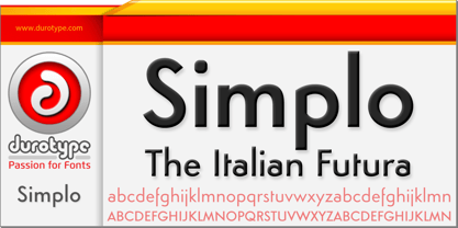 Simplo: the ‘Italian Futura’. Simplo is a geometric sans serif typeface, built in sixteen styles. It is a tribute to the 1930s typeface Semplicità, designed by Nebiolo’s Alessandro Butti. Although many details of Simplo differ from Semplicità, it preserves the spirit of the original. Simplo is ideal for use in display sizes. It is also quite legible in text, and is well suited for graphic design and corporate identity design. Simplo has sixteen styles, extensive language support, eight different kinds of figures, sophisticated OpenType features — so it’s ready for advanced typographic projects. The most notable characteristics of this typeface are the ‘t’ and the ‘f’. The ‘t’ is the culmination of simplicity: a vertical line with just a simple right-side crossbar. The ‘f’ also has just a right-side crossbar, and is really tall: it reaches both the highest and lowest vertical position of the typeface. The top of the distinctive ‘s’, is much narrower than its bottom. The ‘a’, ‘b’, ‘d’, ‘g’, ‘p’, ‘q’, and ‘u’ are spurless, and show a family resemblance with Hans Reichel’s 1990s typeface Dax. However, these letters are rounder and more geometric than Dax’s counterparts, because of Dax’s higher x-height and narrower design. In Paul Shaw’s Imprint article about typefaces that have been overlooked and/or underappreciated, “Overlooked Typefaces”, he concluded his discussion of Semplicità as follows: “These idiosyncrasies suggest that Semplicità might find a warm reception today, given the current love affair with Gotham, Neutraface and Proxima—and the resurgence of ITC Avant-Garde Gothic.” Free demo font available. For more information about Simplo, download the PDF Specimen Manual.
 - Pen Nouveau JNL by Jeff Levine,
$29.00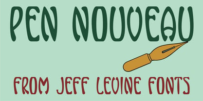 Pen Nouveau JNL is a perfect example of the fluid, free-form pen lettering popularized during the Art Nouveau era of the early 1900s. The type face was modeled from the lettering on the cover of a piece of sheet music from 1911 entitled "If You Talk in Your Sleep, Don't Mention My Name".
 - 1812 by Apostrof,
$40.00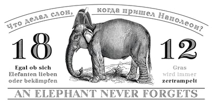 '1812' type family is a revival and further development of the typeface '1812' by Lehmann Type Foundry (St. Petersburg). It was created for the centenary of the French invasion of Russia, known in Russia as the Patriotic War of 1812 along the lines of decorative engraved inscriptions and ornamented typefaces of that time, presumably by the artist Alexandre Benois. It was used mainly for the decoration of luxurious elegant publications. Later, in 1917, this typeface was used on the Russian Provisional Government banknotes. In the Soviet period of time '1812' appeared to be one of the few typefaces included in the first Soviet type standard OST 1337. It was produced for manual typesetting until the early 1990s. This typeface could be seen on Soviet letterheads, forms, posters and even air tickets. The digital version development was launched in 2010. The original version was supplemented with lowercase letters and alternative symbols, the extended Latin and Cyrillic alphabets were fully supported. The font was evolved into a family of 14 decorative styles which can refine any design giving it a festive and elegant but at the same time strict and nostalgic look. Despite its decorative nature, '1812' is perfectly readable in small emphasized text blocks due to its classic shape and careful spacing.
 - MC Alpha Room by Maulana Creative,
$15.00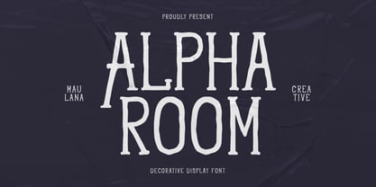 Alpha Room decorative display font. Bold stroke, fun character with a bit of ligatures and alternates. To give you an extra creative work. Alpha Room decorative display font support multilingual more than 100+ language. This font is good for logo design, Social media, Movie Titles, Books Titles, a short text even a long text letter and good for your secondary text font with script or serif. Make a stunning work with Alpha Room decorative display font. Cheers, Maulana Creative
 - Evening Paper JNL by Jeff Levine,
$29.00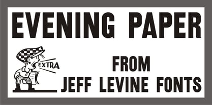 Evening Paper JNL, one could say, was "culled from the headlines". It was. The front page headlines from some 1938 newspapers archived online were the basic model for this font. The typeface design goes back to a font first issued by Ludlow in the 1920s.
 - Kanona JNL by Jeff Levine,
$29.00Kanona JNL is modeled from one of the numerous alphabets created by the late Alf R. Becker for Signs of the Times magazine from the 1930s through the 1950s. Thanks to a wealth of source material provided by Tod Swormstedt of ST Media (and who is also the curator of the American Sign Museum in Cincinnati, Ohio), Jeff Levine has been redrawing many of these alphabets and presenting them in digital form. The original variations in letter widths from Becker’s hand-painted alphabet have been left intact. - SJURecord by Ingrimayne Type,
$9.95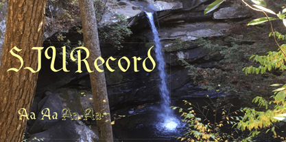 The inspiration for SJURecord was calligraphic lettering used for the title of a student newspaper, St. John’s Record, during the late 1920s and early 1930s. The three upper-case and nine lower-case letters were considerably different from any calligraphic lettering I had developed, so I thought creating a complete typeface around these twelve letters would be an interesting challenge. The SJCRecord family has four members: regular, oblique, shadowed, and oblique shadowed. There are alternate letters for A, J, L, S, V, W, and X.
 - Tarocco by MAC Rhino Fonts,
$18.00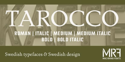 Tarocco is a typical book face with good readability and rather tall x-height. The origin for this typeface is found in Nordisk Antikva. A typeface especially constructed with attention for the Swedish language. Waldemar Zachrisson was determined to realize his ideas and in 1906 he began to cooperate with the foundry Genzsch & Heyse, based in Hamburg. Some influences of Jugendt can be found and the typeface were released in 1910. It became rather popular until around 1930. The MRF version includes 7 weights all together.
 - Van Dijk by ITC,
$40.99Van Dijk was designed by Peter O'Donnell in 1986 and is a zigzag typeface with a printed handwritten character. Angular forms and an emphasized slant to the right make it seem energetic and forward-reaching. The s forms with their rounded and softer forms contrast all the better with the rest of the alphabet. The strong figures of Van Dijk are reminiscent of advertisements of the 1940s. Van Dijk is best used for headlines or short texts in point sizes of 12 or larger. - Portmeirion No.6 by Greater Albion Typefounders,
$14.50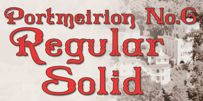 Portmeirion No.6 started life as an experiment by our designer, who was exploring the possibilities of a completely 'over-the-top' display Roman face, bringing in elements of Tuscan and 'Circus' design, along with anything else he felt like. He's instilled a little more discipline in the finished result...but just ever so little. We have Fred Stevens, a regular reader of our website to thank for the name. He's comment on seeing a preview of the design was 'Over the top, Italianesque decorative and intriguing. add some 60's TV and voila Portmeirion.' Why No.6-well you'd need to know a bit about 1960s television to understand that, but we'll give you a hint..."Where am I?"..."In the village".
 - JWX Western by Janworx,
$19.95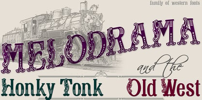 The term Old West conjures up memories of vintage movies and TV shows featuring saloons and dancehall girls. Old wanted posters and cowboys. Rowdy prospectors in the Goldrush, mountains and lots of wide open space. Many of the lettering styles of those days are still in use, reflecting the past, present, and probably the future here. Western style fonts appear in the signage of bars, restaurants, casinos and ski areas. It's a style that speaks of the way it once was in a nostalgic way. This family of three fonts pays tribute to the Old West and its colorful history, with a semi-plain style, a decorated style, and a really lively rendition of our gaudy and raucous history from a century or more ago.
 - Velvenda Megablack - 100% free

- Town by J Foundry,
$20.00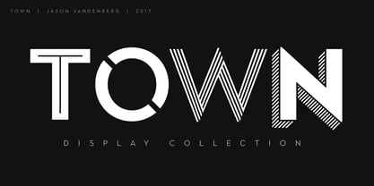 Town is a display collection inspired by art deco and contemporary lettering. The fonts have a classic feel, with contemporary proportions, styling and details. There are eight base weights and nine decorative styles in multiple weights. The variety of styles are designed to create bespoke brand marks, stylish liquor labels, unique restaurant menus, engaging websites and fresh magazine layouts. The fonts are built on the same foundations, so the display and decorative styles can be mixed and matched while maintaining a harmonious look. Several of the styles can also be layered together; add a subtle shadow to your headline or create a full dimensional look with an inline face. The collection is rounded out with two sets of accent fonts, and a set of text weights, with matching italics.
 - Collette by Scholtz Fonts,
$21.00Collette was named in honor of an art deco font called "Independent" designed in the 1930s by Collette and Dufour. Collette is influenced by the design of the original font, however, there are substantial differences: instead of small caps, a true lower case was created, the upper case character proportions and shapes have been greatly modified, and all missing characters have been created to make a truly modern font which nevertheless has all of the panache of the original. It is best used to create a retro feel and in headings, subheads and in short passages of text. - Burnic by Storictype,
$19.00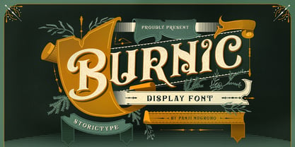 Introducing vintage classic display typeface its called Burnic Typeface. Inspired by antique, mix victorian and art deco period with decorative shapes*. Those all will make you work easily to create : Posters, Logos, Print, Quotes, Headers, Clothing, Labels, Packaging etc. Features : Character Set A-Z Numerals & Punctuations (OpenType Standard) Accents (Multilingual characters) Ligatures Above the description of this font, I hope you're satisfied with what I have created. Thanks and enjoy designing.
 - Bloody Murder BB by Blambot,
$20.00A classic, comic book sound effects font, inspired by 1970's horror books! Contains dozens of European characters! - Will - Unknown license

- Nuixyber Pro - Personal use only

- AS-VELASCA - Personal use only

- Blomster - Unknown license

- FLOWER GARDEN - Unknown license

- Bubble 1 - 100% free

- KG True Colors - Personal use only

- AL Cinderella - Unknown license

- Vademecum - Unknown license

- Ventilate - Unknown license

- Holitter Halfimp - 100% free

- Moonchild - Unknown license

- Les oeufs de Cassowary - Personal use only

- 3D LET (BRK) - Unknown license

- vtks squares - 100% free

- Big In America - Unknown license

- Down the Drain - Unknown license

- Spinstee - 100% free

- Mr Quicke - Unknown license

- Blown Droid - Unknown license

- Nervous Rex - Unknown license

- Patchwork Letter - Unknown license

- CROSS STITCH - Personal use only

- Chankenstein - Personal use only


