10,000 search results
(0.287 seconds)
- Wild & Brave by Krafted,
$10.00 do that. Make a statement! This bold brush font is perfect for anything indie, adventurous, and direct. A real head-turner for your presentation, designs, website illustrations, and much more. Enjoy the standard Latin characters along with multilingual character support, as well as numerals and punctuation characters. What you’ll get: Multilingual & Ligature Support Full sets of Punctuation and Numerals Compatible with: Adobe Suite Microsoft Office KeyNote Pages Software Requirements: The fonts that you’ll receive in the pack are widely supported by most software. In order to get the full functionality of the selection of standard ligatures (custom created letters) in the script font, any software that can read OpenType fonts will work. We hope you enjoy this font and that it makes your branding sparkle! Feel free to reach out to us if you’d like more information or if you have any concerns.
 - Dickybird Doodles by Outside the Line,
$19.00 Dickybird Doodles? A dickybird is an ordinary bird, not a raptor or game bird. This illustration font has 32 of them. Birds in a cage, on a wire, in a nest. A flamingo, toucan, sandpiper, cardinal, penguin, heron, chicken & rooster, hummingbird, swan. Some line, some reverse and one with polka dots.
 - Optic Art by Eurotypo,
$32.00 Opticart is a family of glyphs inspired by Op Art (Optical Art). They include 133 models -- each letter is a subfamily that can combine overlapping (A, a, a.salt and A.swsh) and thus generate more than 365 glyphs, or thousands if we combine different letters or symbols. Opticart is so easy to use, user does not need guidance, just repeat typing [aaaa, bbbb, etc.] or do overlap them and repeat [(a + A) (a + A) (a + A), etc.] You may overlay and combine shapes with colors as you please.
 - Cryptic by Jessie Makes Stuff,
$16.00 Cryptic is a font family of caps and small caps whose unique design was inspired by Morse Code. The traditional dots and dashes have been re-imagined as diamonds that you can read from top to bottom on the letters themselves. Secret code hidden within the letters, hence - Cryptic. This font family is truly versatile! The letters are all based on the character shapes of the Naked style, and all the diamonds have the same proportions, so you can stack and layer as many as you like to create a custom look for any project. Cryptic is perfect for website headers, posters, t-shirts, billboards, book covers, SVG cutting files, and anything else you want to add a little mystery, intrigue, or glitz to. Please note that some styles are better suited for larger scale projects to show off the fine details.
 - Blue Bridge by Asenbayu,
$14.00 Blue Bridge is a creative decorative sharp serif display font. This font is an experimental font by combining the aesthetic characteristics of serifs and decorative flow shapes. The combination of sharp serif feet and beautifully curved lines presents a new experience in an elegant and attractive class. You can use this font in both modern and vintage designs. This font is suitable for attractive packaging label designs, unique desired logos, trendy poster designs, fashion and many more.
 - MFC Phonograph Monogram by Monogram Fonts Co.,
$19.00 The inspiration source for MFC Phonograph Monogram is a vintage monogram specimen named “Kent” showing only a CBA sample. It was a style I could find no other reference for, but was desperate to recreate this record like styling of monogram. Finally, it all comes to life in MFC Phonograph Monogram. I even threw in a little dog and phonograph icons hidden in the font as decorative icons reminicent of old Victrola records. Phonograph Monogram supports two and three letter monograms, although the two letter style break from the circular record design and creates a zulu style shield design. MFC Phonograph Monogram uses the Ligatures feature, available in most OpenType savvy applications, such as Adobe Illustrator CS (see Fig. 1). The Ligatures feature is typically enabled automatically, but you may need to confirm this in your program if you are not certain. If any second lowercase letter typed does not automatically switch to form the right side of the rounded form, you do not have Ligatures enabled.
 - Garota Serif - Personal use only

- Hornbill by Eko Bimantara,
$19.00 Hornbill is a soft serif font family that inspired by the 70's retro styles. Hornbill give a clean and versatile letterform that fit not only for display, but also for reading purposes. Hornbill consist of 18 styles from thin to black with each matching italics.
 - La Carte Pen by AVP,
$19.00 La Carte Pen is a paper textured version of the popular La Carte font. Inspired by a series of handwritten menus produced in 1980, La Carte is a stylish but easy-to-read script that sets as well in body copy as it does in headlines.
 - Old Labels JNL by Jeff Levine,
$29.00 Old Labels JNL was inspired by the red and white gummed labels that were used for shipping parcels long before self-adhesive materials and desktop publishing rendered the older labels obsolete. The fifty-two glyphs include a generous supply of phrases such as ‘Air Mail’, ‘Do Not Bend’, ‘Rush’, etc. along with a number of blank label backgrounds and decorative frames. NOTE: Commercial replication of the images within this font for any resale purposes (including, but not limited to labels, t-shirts, stock designs, et al) requires a separate license which may be obtained by contacting the designer via the email address found within the End User License Agreement.
 - 946 Latin by Roman Type,
$35.00 946 is a multilingual techno-style family developed by Berlin-based type designer Roman Wilhelm (RomanType). While more and more text families have recently been extended to a multilingual and multi-script level, not so much attention has been given to the more decorative styles. The 946 family does exactly that. A lot of care has been given to the various diacritics: they were designed a little more brutal, a little more European than with some other fonts of this category. Do also watch out for the non-Latin legs of this family. 946 is inspired by electronic music. When Roman found a second-hand Roland TR-606 drum machine in a store in his hometown back in 1995, he started to hang out with would-be DJs and musicians, trying to play the beats that went around the globe. When he started to study visual communication three years later, he was assigned the matriculation number of 946, which has now become the name of this family. Language support: Afrikaans, Albanian, Catalan, Croatian, Czech, Danish, Dutch, English, Estonian, Finnish, French, German, Hungarian, Icelandic, Italian, Latvian, Lithuanian, Maltese, Norwegian, Polish, Portuguese, Romanian, Slovak, Slovenian, Spanish, Swedish, Turkish, Vietnamese, Zulu. Do also watch out for the other script versions of this family!
 - Debugger by Dharma Type,
$9.99 Debugger is a futuristic, sicentific, digital family of next-generation monospaced fonts for developing, programming, coding, and table layout. Some desirable features in monospaced fonts are listed below. 1.Easy to distinguish 2.Easy to identify 3.Easy to read Debugger has very distinguishing letterforms for confusable letters such as Zero&Oh, One&I, and Two&Z. A lot of ingenuity makes this family very distinguishable. Italics have somewhat large inclination angle to be distinguished from their Roman. For the same reason, Italics are slightly lighter than Romans. Italic is not cursive Italic. It is near the slanted Roman. This is an intentional design to identify Italic letters. Cursive is not suitable for programming font. Octagonal and diagonal letterform is good for sci-fi, digital projects. Common elements for each letterform makes harmony and a sense of unity. Debugger supports almost all Latin languages. Try this all-new experiment.
 - Jazm by Arabetics,
$34.00 Jazm is an Arabetic typeface design with connected glyphs. Jazm was the earliest, pre-Islamic, script style of the modern Arabic script, before branching into Kufi and Naskh styles. The initial script had a lot less, position-dependent shapes and ligatures, and was not strictly connected. It occasionally included minuscule dots to distinguish identical shapes. This font family design is a modern visualization by the designer of the historical Jazm letter shapes following the guidelines of the Mutamathil Taqlidi type style with one glyph for every basic Arabic Unicode character or letter, as defined in Unicode Standards, and one additional final form glyph for each Arabic letter that can connect with other letters from both sides in traditional cursive Arabic strings. Jazm employs variable x-height values. It includes all required Lam-Alif ligatures and selected marks. Tatweel (or Kashida) glyph is a zero width space. Keying it before any glyph will display that glyph isolated form, if desired. Keying Tatweel before Alif Lam Lam Ha will display the Allah ligature. Jazm typeface family includes both Arabic and Arabic-Indic numerals; all required diacritic marks, in addition to Standard English keyboard punctuations and major currency symbols. Jazm is available in regular, bold, black, and corresponding italic (slated to the left) styles.
 - Tudeprins by Bogstav,
$17.00 Tudeprins is not a really positive word - the font probably did deserve another name, but I was inspired after reading a children's novel, starring a "Tudeprins" The font is dedicated to children's books, adventures, comics or something related to that - but feel free to use "Tudeprins" for anything you like! Comes with multilingual support as well as contextual alternates!
 - Romantic Lovely by Sronstudio,
$18.00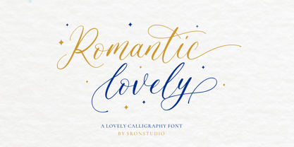 Romantic Lovely � Calligraphy Font with lots of alternate swashes. This font will perfect for adding a romantic and lovely touch to your design. Features: Uppercase and lowercase letters Swash alternates ( Beginning, Middle, Ending ) -Multilingual symbols, numerals, and punctuation How To Access Alternate Swashes? You can read this article: https://helpx.adobe.com/illustrator/using/special-characters.html Follow Instagram: @sronstudio Thank You!
 - Bandera Pro by AndrijType,
$45.00 This square serif typeface is a real workhorse. It is a modern tool for text design: extremely legible, pan-european multilingual (Latin, Greek and Cyrillic), well shaped. Bandera Pro has six weights with original italics, alternatives, small capitals and three sets of digits. It catches attention in headlines of posters and magazines or makes reading comfortable in plain texts. Bandera Pro shares main proportions with sans serif Osnova Pro typefamily so ideally can pair it. Bandera is Spanish for ‘flag’. And Bandera is a symbol of Ukrainian fighting for freedom for many years.
 - Qewek by Amir Asgari,
$50.00 The Qewek Font Face Family created according to the 20th Century's famous fonts structure adopted and recreated to use for today's platforms. The Font Family Supporting European Languages such as Spanish, French, German, Swedish, and Turkish. The Qewek family could be using postmodern, modern, surreal, and many design styles. Also, Qewek has a so unique and sweet look with a functional shape that is completely awesome for use in print base media and also digital base magazines and newspapers. Just imagine you reading a magazine with a font that is at the same time completely new and also has a classic shape.
 - Bookish by Hackberry Font Foundry,
$24.95 This all started with a love for Jenson. I know there're hundreds of variations on that theme. But, that is where I began, several years ago. How far it came, as usual as I wandered through the vagaries of font design, is not unusual. If you've read any of my font design books, you know my design processes are quite loose and spontaneous. I wanted the general feel of a favorite old font, but softer, easier, and more comfortable. I built these on the same vertical metrics as my Librum Publishing Group. However, this family is not part of that group. I used the metrics because that shows my current taste in fonts. This family does work with the Librum group—but to be honest, I haven't experimented enough to come up with a good companion. I suspect I'll need to make another companion family. I may need make a non-modulated bold version also. But, that remains to be seen. I'm pleased with this.
 - Highpath Signature by Nathatype,
$29.00 Are you looking for a signature font? Wanna make your branding spark? Do you sometimes have an appetite for a bit more wholesome typography? We give you the best solution. Highpath Signature- A Signature Font Highpath Signature is a lovely signature font designed with classic vibes. This font support multi languages to make your brand globally acceptable. It's a font with simple shapes, making it very suitable to be used on any purposes. A real head-turner for your presentation, designs, branding, quotes, invitation, website illustrations, and much more. Features: Ligatures Stylistic Sets PUA Encoded Numerals and Punctuation Thank you for purchasing premium fonts from Natha Studio. Happy Designing! If you have any questions, please feel free to contact us.
 - Happy Land by Yumna Type,
$15.00 It can be a real challenge to deliver messages through designs due to the very ordinary display fonts lacking prominent characters. Let us present you the Happy Land, a prominent display font to add firm touches to any of your designs. The letters made all in capital can enhance certain effects on your designs. The font’s simple shapes with strong contrasts affect the legibility. As a result, it is suitable to apply for big text sizes. In addition, this font provides a clipart bonus for you. Enjoy the available features available here. Features: Stylistic Sets Multilingual Supports PUA Encoded Numerals and Punctuations Happy Land fits best for various design projects, such as brandings, posters, banners, headings, magazine covers, quotes, printed products, merchandise, social media, etc. Find out more ways to use this font by taking a look at the font preview. Thanks for purchasing our fonts. Hopefully, you have a great time using our font. Feel free to contact us anytime for further information or when you have trouble with the font. Thanks a lot and happy designing.
 - Regatta Condensed by ITC,
$29.00Regatta is a bold, narrow sans serif designed by Alan Meeks in 1987. Its strong, robust figures makes it a particularly good font for headlines in larger point sizes. Regatta is distinguished by its diamond shaped dots on i and j as well as the slanted strokes of several figures. These characteristics relax the closed, static image of Regatta and let the font seem cheerful and friendly. - Blastand by ZetDesign,
$15.00 blastand is a display font created by combining sharp edges and curves for a unique shape. This font also adopts a handwritten shape at the end of the letter to present a bold writing yet still creates a classy and friendly impression. This font is also created in italic style and has open types such as ligature, stylistic alternate, etc. to provide options for designers to create awesome work.
 - Orange Flower by Anastasia Kuznetsova,
$18.00 Say hello to 'Orange Flower'!! A bold and beautiful font with a brush and a lot of additions! I am very pleased to present 'Orange Flower' - a versatile and artistic set of handmade fonts with a brush! The font comes with alternative uppercase and lowercase characters. Thanks to the very clear contrast in weight and authentic style made with a brush, 'Orange Flower' is guaranteed to give your text an individual, individual feeling - ideal for logos, printed quotes, invitations, postcards, product packaging, headlines and everything your imagination is capable of, use in ink-based drawings or watercolors or independently in the form of bold handmade inscriptions!! :) The font comes with a lot of great features to keep you busy :) Each character has its own alternative version, which allows you to create unique words and layouts. There is also a second font brush 'Orange Flower Brush', which contains brush strokes, underscores and brush splashes. This gives you the opportunity to create an artistic image of your text, which will give your design a sloppy realistic look :) Both fonts have a large selection of characters, including ligatures. 'Orange Flower' includes ligatures and stylistic alternatives for those who have software with opentype support (for example, Photoshop/Illustrator). I really hope you enjoy it, and please feel free to write me a message if you have any questions or concerns! :) Font Features: - A-Z; a-z character set; - 1 language (English); - numbers and punctuation marks, symbols. Fonts can be opened and used in any software that can read standard fonts, even in MS Word. No special software is required to get started. It is recommended to use it in Adobe Illustrator or Adobe Photoshop. Made with love and magic ♡ Thank you for reading it, and do not hesitate to send me a message if you have any questions! ~ Anastasia
 - Betabet by Elemeno,
$25.00Betabet was drawn using traditional serif fonts as a guideline. The scribbled style and serifs combine to make an unusual font. Betabet does not look like handwriting, but works well where handwriting or script fonts might seem too insubstantial. - School Hand by Scrowleyfonts,
$15.00 School Hand is a font designed for use with young children. There is the Dotted version, which is designed to be traced over with a larger dot to show where to start and automatic lines. Then there is the Regular version which can be used for reading or can be printed light grey for tracing. School Hand Cursive is a cursive font which is designed using contextual alternates. Contextual alternates cannot be activated in the Myfonts preview window so please see the gallery images which show how the smooth flow of letters is achieved. Contextual alternates are available in Adobe applications and MS Word 2010 or later. If you want to see how particular text will be rendered please contact me.
 - Westville by Nathatype,
$29.00 Are you ready to make your branding stand out? Do you dream of creating headings that stand out and inspire creativity, imagination, modernity, and endless fun? Looking for an elegant and stylish font? We've got what you want. Westville- A Blackletter Font Westville is an incredibly unique and distinct blackletter font. The style was influenced by many fonts and extra touch of urban street attitude. This is a timeless font that suits and fit perfectly in any timeframe or style you want. Well suited for you who needs for headline, logotype, apparel, branding, packaging, advertising, and many more. Our font always includes Multilingual Support to make your branding reach a global audience. Features: PUA Encoded Numerals and Punctuation Thank you for downloading premium fonts from Natha Studio
 - Glowing Midnight by Nathatype,
$29.00 Looking for a font that will make your branding stand out? Do you sometimes have an appetite for a bit more wholesome typography? Looking for a fabulous, stylish, and adventure font? We've got what you want. Glowing Midnight-A Script Font Glowing Midnight is a unique script font with retro touch. This font features thick and angular letters that easy on the eyes and nice to look while it’s also easy to read. Glowing Midnight becomes more special with extruding version option. Well suited to titles, poster designs, branding, logos, and many more. Our font always includes Multilingual Support to make your branding reach a global audience. Features: Ligatures Stylistic Set Swashes PUA Encoded Numerals and Punctuation Thank you for downloading premium fonts from Natha Studio
 - Sinah by Linotype,
$29.99Linotype Sinah is part of the Take Type Library, selected from the contestants of Linotype’s International Type Design Contests of 1994 and 1997. Designed by the German artist Peter Huschka, Linotype Sinah is a rounded, ornamental font with many strokes ending in teardrop forms. The letters of this wide-running font do not share a common base line. The capital S and the lower case l both drop under it although neither have descenders. Overall, Linotype Sinah has an almost Asian or Indian feel. The font must be used with generous line spacing and is intended exclusively for headlines or shorter texts in point sizes of 12 or larger. - Sinah Sans by Linotype,
$29.99Linotype Sinah is part of the Take Type Library, selected from the contestants of Linotype’s International Type Design Contests of 1994 and 1997. Designed by the German artist Peter Huschka, Linotype Sinah is a rounded, ornamental font with many strokes ending in teardrop forms. The letters of this wide-running font do not share a common base line. The capital S and the lower case l both drop under it although neither have descenders. Overall, Linotype Sinah has an almost Asian or Indian feel. The font must be used with generous line spacing and is intended exclusively for headlines or shorter texts in point sizes of 12 or larger. - Milford by SparkyType,
$19.00Milford is a font with its feet planted in several styles of design. It has aspects of Art Deco shapes and proportions, but has modern additions and tweaks that make it a handsome substitute for your tired heading fonts. Because of its tight spacing and filled, super-black forms, it responds nicely to treatments such as negative letter spacing and outlining. - Deerfield JNL by Jeff Levine,
$29.00Here's a clean, semi-condensed sans serif font with a square shape and an easy-to-read look: Deerfield JNL from Jeff Levine. Some of the varied uses of Deerfield JNL are labels, titling, short descriptions and headlines. The limit is your own imagination. Deerfield Bold JNL is a heavier weight of Deerfield JNL. Both fonts feature a hand-lettered look. - Mauline by Yukita Creative,
$14.00 a modern, stylish serif font that offers excellent legibility for a variety of applications. This font is ideal for use in any kind of graphic design or advertising work, from logo designs to web design and print projects. Its easy-to-read character shapes, distinct letterforms, and beautiful typographic details make this typeface perfect for creating impactful and captivating visual designs.
 - HWT Archimedes by Hamilton Wood Type Collection,
$24.95 Archimedes is a wood type design sometimes known as Mansard. This particular version was brought back to life as a wood type font by Virgin Wood Type. The variation with screw heads in the design was first seen in 1879 by the William H. Page Co. This new digital version is a simultaneous release with Virgin Wood Type and features a variety of styles including the standard screw head option—plus a Phillips head, Hex/Allen Wrench head, and even the vexing Apple® pentalobe tamper reistant star screw. The result is a sturdy and industrial font that has a certain “joie de vivre” and “bling” attitude. Not for every designer, but you know this is for YOU! As a bonus, the screwheads themselves are accessible via a glyph palette, so you can put the screws to Comic Sans, or any other font, if you so desire.
 - Andron 2 ABC by SIAS,
$44.90 Andron 2 ABC is a product developed especially for children’s literature. It is an ideal choice for primers and other books for the age when children are learning to read. The typeface has the same peak typographic quality as any other font of the praised Andron series—the very best is just good enough for our kids, is it not? As a difference from the normal glyph set (as in Andron 1 Latin or Andron Mega), the letters a, g and y have those simpler single-story shapes that resemble the forms usually taught in writing, which are sometimes called infant letterforms. Now, Andron 2 ABC is available in a full four-font family set.
 - FS Me Paneuropean by Fontsmith,
$90.00Mencap When most of us go about everyday tasks, we take for granted the reading that’s involved, on instructions, labels and so on. For people with learning disabilities, reading is made much harder by certain fonts. FS Me is designed specifically to improve legibility for people with learning disabilities. The font was researched and developed with – and endorsed by – Mencap, the UK’s leading charity and voice for those with learning disabilities. Mencap receive a donation for each font license purchased. Every letter of FS Me was tested for its appeal and readability with a range of learning disability groups across the UK. Inclusive Fontsmith were determined to design a font that was accessible to those with learning disabilities without standing out as such – one that was inclusive of all readers. It should comply with accessibility guidelines and work best at 12pt, but still have a character of its own that was warm and approachable. “So much accessible design is done separately to the main body of brand work,” says Jason Smith. “We wanted to make a typeface that covered both brand tone and neutrality, and that could be used legitimately as a brand font as well as in accessible design.” Me, you, everyone FS Me is about design that doesn’t patronise. People with learning disabilities are often treated as inferior by childlike design. FS Me is designed for adults, not children – a beautifully-designed font for everyone. Its features include very subtle distinguishing elements of each letter to aid the reading and comprehension of texts, and tails, ascenders and descenders that have been extended for extra clarity. What the people said... Here is a sample of comments from the extensive research groups that helped to shape the letterforms of FS Me: “I want something round, clear and friendly.” “We like movement in the letters but don’t want anything childish.” “The ‘b’ and ‘d’ need to be different as they can be confused.” “I prefer the handwriting-style ‘a’.” “It’s important to have an accessible ‘a’ and ‘g’. Teachers sometimes complain that learners cannot read or understand the inaccessible ‘a’ and ‘g’.” - FS Me by Fontsmith,
$80.00 Mencap When most of us go about everyday tasks, we take for granted the reading that’s involved, on instructions, labels and so on. For people with learning disabilities, reading is made much harder by certain fonts. FS Me is designed specifically to improve legibility for people with learning disabilities. The font was researched and developed with – and endorsed by – Mencap, the UK’s leading charity and voice for those with learning disabilities. Mencap receive a donation for each font license purchased. Every letter of FS Me was tested for its appeal and readability with a range of learning disability groups across the UK. Inclusive Fontsmith were determined to design a font that was accessible to those with learning disabilities without standing out as such – one that was inclusive of all readers. It should comply with accessibility guidelines and work best at 12pt, but still have a character of its own that was warm and approachable. “So much accessible design is done separately to the main body of brand work,” says Jason Smith. “We wanted to make a typeface that covered both brand tone and neutrality, and that could be used legitimately as a brand font as well as in accessible design.” Me, you, everyone FS Me is about design that doesn’t patronise. People with learning disabilities are often treated as inferior by childlike design. FS Me is designed for adults, not children – a beautifully-designed font for everyone. Its features include very subtle distinguishing elements of each letter to aid the reading and comprehension of texts, and tails, ascenders and descenders that have been extended for extra clarity. What the people said... Here is a sample of comments from the extensive research groups that helped to shape the letterforms of FS Me: “I want something round, clear and friendly.” “We like movement in the letters but don’t want anything childish.” “The ‘b’ and ‘d’ need to be different as they can be confused.” “I prefer the handwriting-style ‘a’.” “It’s important to have an accessible ‘a’ and ‘g’. Teachers sometimes complain that learners cannot read or understand the inaccessible ‘a’ and ‘g’.”
 - Polke by ArtyType,
$29.00 Polke is a single weight display face brimming with style and charm but simultaneously exuding impressive core strength and a vibrant personality. Floating ball terminals rub shoulders with contrasting sharp and rounded letterforms to produce a distinctively decorative headline font built on robust foundations. Polke's name is derived from the striking terminal dots which dominate the character set, creating a Polka-Dot effect throughout. I also had the artist Sigmar Polke in mind which explains the spelling, and so the two ideas simply morphed together.
 - Bloomer by Hanoded,
$15.00 A Bloomer is a crusty loaf of bread with rounded ends. I don’t know why I chose this name, but it may have to do with the fact that my wife signed up for a bread baking course. Bloomer is a rounded, hand made cartoon-ish font. It will look especially good on product packaging, but any design in need of some authenticity could do with a bit of Bloomer! Comes with ligatures and a light dusting of alternates.
 - Creepy Crawly by Comicraft,
$19.00There are worms in the earth, hairy bugs under the bed and strange bloodshot eyeballs peering at you from out of the closet. Lilou's Creepy Crawly font is perfect for scaring away Trick-or-Treaters, just install our font and print out your signs with the legend: WE EAT LITTLE CHILDREN HERE! - FROG1812 Sans by Frog1812,
$15.00 Introducing FROG1812 Sans, a beautiful, modern font. Ideal for logos and headings. FROG1812 Sans was developed in 2020 to make our projects look more diverse. Before that, we only used the geometric FROG1812 Sharp, which has ceased to meet all our requirements. Follow us in social media VK | Facebook | Instagram
