3,437 search results
(0.212 seconds)
- Virgin Roman by Monotype,
$29.99 - Greater Neue by NicolassFonts,
$40.00 The Greater Neue font family is a modern collection consisting of 16 weights, 8 uprights, and matching italics, as well as a Variable font with adjustable weight and slant. It is perfect for packaging, advertisements, headlines, and corporate identities. This font family is well-suited for graphic design and any type of display use.
 - Restora Neue by Nasir Udin,
$25.00 Restora Neue is an evolution of its precursor, Restora. While the Restora has an authentic imperfect letterforms, Restora Neue comes with a neater shape and higher contrast. It’s a mix of old-style roman serif styles. Its sharp and longer serif with a bit touch of medieval, makes Restora Neue a versatile type family that can be used in many different themes of design projects, from classic style to modern. It comes in nine weights from thin to black with matching italics. Its mixture of weights provide a wide range of styles that will help you find the best vibe for your projects, for headlines or a short paragraph. The set of special ligatures and stylistic alternates can be perfect mates for your brand. It is well suited for book covers, editorial, branding, advertising and more. To see the complete presentation please visit my Behance profile.
 - Neue June by Matt Chansky,
$21.00 Four years of development imbue Neue June with its uniquely crafted high x-height, enabling designers to literally and figuratively elevate layout designs. In today’s highly competitive brand marketplace, readability across communication platforms and memorability go hand in hand towards target audience retention. Neue June comes in six weights, from elegant thin to full-bodied emphatic bold, plus italics. You’ll find a robust selection of highly refined multilingual glyphs. In addition to a suite of ligatures, there are a number of extra characters, such as the estimated symbol, the number sign, and directional arrows. When the creative direction calls for sophisticated and memorable tactics—leverage the versatile 385 glyph count for big messages and easily consumable body copy.
 - Cervo Neue by Typoforge Studio,
$29.00 Cervo Neue is the new perfected and extended version of Cervo, containing 18 variants. It differs from the previous version with the higher accents over glyphs, enlarged punctuation, old-style numerals and the newly added varieties Semi Bold, Bold, Extra Bold and Black. Additionally, there is the variety of grotesque. Font Cervo is inspired by a “You And Me Monthly” published by National Magazines Publisher RSW „Prasa” that appeared from Mai 1960 till December 1973 in Poland.
 - Neue Schwabacher by RMU,
$25.00Neue Schwabacher is a revival of a revival. Albert Anklam modified the medieval letter forms of Schwabacher according to the fashion of the fin-de-siècle era, and his font was first released by Genzsch & Heyse in 1876. This most widespread font face of the 19th century was fresh redrawn and made fit for nowadays’ usage. To get access to all ligatures, it is recommended to activate both Standard and Discretionary ligatures. - University Roman by ITC,
$40.99University Roman font is based on Speedball hand-lettering. Designed at the Letraset Type Studio in 1983. University Roman is notable for its narrow capitals with crossbars that sit well above the median line. This unique roman design evokes a romantic air in display work such as packaging and advertising. - Almarena Neue by Almarena,
$29.00 Introducing Almarena® Neue Variable, the evolution of Almarena® Typeface, which we created in 2020. Almarena® Neue is a modern sans serif typeface that combines legibility, impact and contrast. This new version of Almarena is variable with 3 axes: Weight - Display - Slant. It is also available as a static version in 9 weights (+ italics) for each style (Classic & Display) with several alternatives. Almarena Neue® supports 94 languages and contains 565 glyphs for each weight.
 - Imperija Roman by Lewis McGuffie Type,
$39.99 Imperija Roman is a display typeface inspired by stone engraved lettering. Supporting west, central and east European languages it contains over one-hundred discretionary ligatures and a stylistic set for old style diacritics. The original letters were drawn from a memorial engraving in Ljubljana, Slovenia. Further development and several iterations later, Imperija Roman has a flowing organic feel while staying true to the rigid constraints of stone-cut letters. The alternative diacritics in stylistic set one were included to give the user more options for a historical feel to the lettering. The discretionary ligatures also offer a huge range of variation and were drawn based off of historical Roman sources and common frequency digraphs in major European languages.
 - Geometos Neue by Graphite,
$17.00 Geometos Neue is a geometric sans-serif typeface which comes in seven weights. An all caps display font family, Geometos Neue has a clean, sharp and emphatic form especially suitable for headlines, headings, branding, posters, packaging, titles and logos. There is a soft edged version of Geometos Neue as well, called Geometos Soft.
 - Roman Tyres by Red Rooster Collection,
$45.00An original design, based on a very early turn-of-the-century typeface from the defunct Keystone Type Foundry, Philadelphia. - Breathe Neue by Lián Types,
$37.00 Breathe Neue is not just an update of my renowned Breathe of 2010, this is something else... Many times I find myself looking for inspiration in my previous creations. The original Breathe has something on its essence: Something that almost 10 years later still caught my attention. Like its name suggests, letters seem to be breathing, moving, alive. Many years passed so I asked myself if there was still something I could do for it, something to get the most of that beautiful essence... Suddenly, I was already working on its curves: Many new loops, more polished, more refined. Also the proportion and spacing were altered to embellish the font. Breathe Neue’s swashes are addictive. I couldn't find another word. Irresistible? Maybe. Once you see some of its loops you want to see more. I believe this might be due to its very geometrical feel, which match well with the bodonian curves of the font. See also how well it works with Breathe Caps. And what if you combine them with Breathe Special? wow. I'm still young (yeah, sure) and I believe there're still many years ahead to enjoy this great profession, and to make many new (and astonishing, I hope) fonts. But I also think, it’s time to pamper my first creations. They deserve the best treatment, after all, they were once a success! This is what I did with my lovely Breathe. I hope you like it.
 - University Roman by Tilde,
$44.75 - HardTimes Roman by Wiescher Design,
$39.50 HardTimes has been hard work, designing a handmade typeface must always have the right balance between rough and smooth, specially with this Times-like face. It has the big European glyph-set, so that it can be used all over the continent I come from. I gave this font extensive kerning. Times are too hard for boring typefaces, so try this one for a change. -Your hardworking type designer, Gert Wiescher
 - Glyphic Neue by Typeco,
$29.00Glyphic Neue was inspired by the Op Art style of lettering in the United States that ran rampant in many photo type houses in the 1960's and 1970's. The Glyphic Series from the Franklin Photolettering group was an influence and spring board for this family of fonts, hence it's name. But Glyphic Neue departs from its unicase Franklin influence in several ways. Firstly the designer created both upper and lower case forms. The lowercase has been designed with barley protruding ascenders and descenders and with an x-height equivalent to the cap height, so that upper and lower can be exchanged indiscriminately for a quirky effect. Some of the letters take a cue from the original Glyphic series but many have been redesigned entirely to fit the designers vision. The italic forms differ enough from the upright version making it almost an entirely different display alphabet. Glyphic Neue is a versatile family of 6 fonts -- 3 widths, each with an accompanying italic that look equally at home when used on a party flier or a sports team visual identity. - Bookvarium Roman by Letterhead Studio-VV,
$19.99 A unique display font based on the research in vintage and old fonts from the beginning of the 20th century. Perfectly work for headlines in print or can be a spice to any other design.
 - Cyan Neue by Wilton Foundry,
$29.00 Cyan Neue is a substantial update variation to the original Cyan we launched in 2006. Most notably the contrast has decreased making it more contemporary. Many glyphs have been improved especially in the italics. The design of Cyan Neue was inspired by features found in classic Roman. It shows a preference for geometric Roman proportions while incorporating open centers (B,P,R) and compact serifs. The characters stay true to the same features as the capitals, resulting in an unusually distinctive style. There are many subtle details in Cyan Neue that become more interesting in display sizes, for instance the subtle curves in the serifs and the overall smoothness. Cyan Neue is a robust font that will exceed your expectations. Cyan Neue is clearly ideal for headlines, inscriptions, publications, annual reports, corporate identities, packaging.
 - Oxonia Roman by Greater Albion Typefounders,
$10.00 Oxonia Roman is a text family, offered in two weights and two widths, deriving it’s inspiration from classic Roman typefaces. It is intended for the setting of text legibly in quantity, and compliments our Anavio and Vectis faces particularly well.
 - Trooper Roman by DTrooper Foundry,
$30.00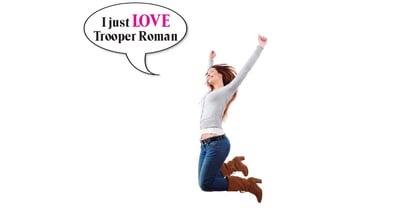
- Roman MF by Masterfont,
$59.00 - Steletto Neue by Jonahfonts,
$42.00 Condensed Gothic. Great for tight-fitting headlines and other condensed titling situations such as headlines, ads, invitations, captions, packaging, bulletins, posters, and greeting cards.
 - Merlo Neue by Typoforge Studio,
$29.00 Merlo Neue is the younger brother of Merlo. New family received refreshed, more square proportions and a new shape of many glyphs. However, what is the most important in new Merlo, is the wide range of instances – nine new weights, from Hairline to super dark Black – which allows to use the family in a complex way, depending on the user’s needs. Italic version has narrower and lighter proportions. Font has a glyph set for latin script and old-style figures. Merlo Neue would be a great choice for display use as well as for the longer texts. Font Merlo Neue is inspired by a “You And Me Monthly” published by National Magazines Publisher RSW "Prasa” from May 1960 till December 1973 in Poland.
 - Neue Latein by Spirit & Bones,
$33.00 This sans serif font carries the flair and mood our Schneidler Latein font family. The calligraphic appearance and the human sound are evident thanks to the preservation of some significant broad edged pen elements. The forms are reduced to the subtle level where they are simplified, but the essence still remains. The expressive and artistic expression of the Schneidler Latein continues to work like a background melody. Together they build a superfamily that works perfectly in combination with each other. More weights will follow soon.
 - Neue Plak by Monotype,
$57.99 Originally designed in 1928, Plak is something of a lost gem in the type world. Despite being drawn by Futura creator Paul Renner, it never achieved the same popularity and spent decades lacking a much-needed digital revival. Monotype designers Linda Hintz and Toshi Omagari have taken its existing three weights and, after extensive research into the original wood type, extended them into the vast Neue Plak family. The typeface is available in 60 weights that stay true to Renner’s intentions, and offer the same blend of “quirky” details and “German stiffness” – as Hintz describes it. The design is an unusual mixture, bringing together a defiant outer appearance that’s counteracted by more playful details found in the lowercase r, and the large dots of the lowercase i. Other distinctive details include open or strikethrough counters, and a set of hairline widths that reduce Renner’s original design to its bare bones. Neue Plak’s display weights are crying out to be used in editorial, on packaging or in logos, while its text weight works well in both print and digital environments. Neue Plak Text Variables are font files which are featuring one axis and have a preset instance from Thin to Black
 - Neue Frutiger by Linotype,
$71.99 The original Frutiger typeface was designed in the early 1970s by Adrian Frutiger and his studio for the way finding system of the Roissy Charles de Gaulle airport in Paris. Soon after the airport was opened, a huge demand for the typeface arose from companies wanting to employ it in other signage systems, as well as in printed matter. The Frutiger typeface came out as part of the Linotype library in 1977. Epitomizing functionality and clarity both in signage and as a bread-and-butter typeface in print, Frutiger became a modern classic. Neue Frutiger® is the 2009 version of the Frutiger typeface family. It was revised and improved by Akira Kobayashi in close collaboration with Adrian Frutiger. While Frutiger Next, the 1999 revision, introduced a new concept (including a larger x-height, a more pronounced ascender height, narrower letter-spacing and, most notably, an italic with calligraphic traits), Neue Frutiger returns to the original 1977 design. The result is a well-balanced range of 10 finely-graded weights. Despite the various changes, the ‘New Frutiger’ still fits perfectly with Frutiger and serves to harmoniously enhance the styles already in existence. Neue Frutiger Variable are font files which are featuring two axis and have a preset instance from UltraLight to ExtraBlack and Condensed to Extended. Featured in: Best Fonts for Resumes, Best Fonts for Websites, Best Fonts for PowerPoints, Best Fonts for Tattoos
 - Uni Neue by Fontfabric,
$29.00 Uni Neue is the whole new redesigned version (remake) of Uni Sans – one of the most recognizable and signature font families of Fontfabric type foundry. From major changes like proportions, widths and thickness (weights) to the smaller details, this new family enables us to feel and understand the font at a completely new level. Uni Neue is а modern sans serif with a distinctive character and geometric feel. The rounded corners give the typeface a friendly look, yet it retains a professional quality suitable for branding even the most serious corporate identities. The attention to detail paid during its development means that this typeface offers a vast range of design possibilities – it helps users create eye-catching designs and brands that really stand out. It is perfect for TV, screen, editorial and publishing, logos, branding, advertising and packaging. It supports a wide range of languages, including Extended Latin, Cyrillic and Greek. The family has seven weights, ranging from Thin to Black, with corresponding italics. The font was manually hinted to ensure great web and desktop performance.
 - Ames' Roman by Greater Albion Typefounders,
$16.00 Ames’ Roman is a stylish ‘New-Style’ Didone Roman family offered in divers weights and widths. It is designed to embody clarity combined with dramatic contrast between horizontal and vertical strokes. All typefaces include small capital forms, new and old style numerals (and indeed ‘small capital’ numerals for consistency). Ames’ is a Roman with the charm of the past and the spirit of the future! It’s ideal for headings and titles and anywhere else you need text of distinction. Watch out for the forthcoming Ames’ Text…
 - Bubbleboddy Neue by Zetafonts,
$29.00 Bubbleboddy Neue is the redesign of one of the first Zetafonts typefaces. It preserves the original round and chunky flavor and adds three new weights and a complete cyrillic and greek character set to infuse your design with an original 80s touch and all the juicy sweetness of a bubblegum. Born for logos and display use, the family has now got a complete facelift with better readability onscreen for web use and offline for text setting.
 - Jessi Neue by Nois,
$18.00 Jessie Neue in a new Serif typeface inspired by popular '70s fonts mixed with grotesque touches. It has ligatures that make it more elegant and grotesque elements that give it a modern look and make it more versatile. Jessi Neue has a great performance in large body texts and also in high impact headlines. The family has four weights and also a variable version to give more creative freedom. It has 667 characters that covers the following languages: Basic Latin, Western European, Central European, South Eastern European, Vietnamese, Pinyin and Basic Greek. The italic version will arrive soon.
 - Neue School by Daniel Brokstad,
$29.00 Neue School is a modern sans serif font with extra tight tracking & deep ink traps. Designed to maximize the available space, make impactful headlines. Inspired by old school narrow poster fonts, presented in a “neue”-way. The font consists of 8 weights, across 2 widths, plus italics. Symbols are fixed weight throughout, as a contrast to the font weights. There are 2 additional OpenType stylistic sets. Stylistic Set 1 adds more rounded edges to specific characters for a softer look. Stylistic Set 2 makes lowercase ascenders and symbol height equal to capital height, making it ideal for stacking type more easily with all same height.
 - Heavitas Neue by Graphite,
$20.00 Heavitas Neue is versatile and flexible all caps font family, with most of the upper case characters different from the lower case ones. By using either only upper case, or only lower case, or a mixed combination of upper and lower characters, a totally different look of the font can be achieved. Heavitas Neue has a strong and distinct character, suitable for, but not limited to, logotypes, headlines, branding, books, signage, motion graphics and packaging.
 - Elongated Roman by Aboutype,
$24.99An ultra light thins all caps Victorian design with a slight stroke contrast. Elongated Roman requires subjective display kerning and compensation. - Base Neue by Power Type,
$15.00 Base Neue is the reincarnation of the basic typography (adaptation) of modern civilization. InkTrap is applied and many variations that can be used for this typeface, from very narrow media to extra-large publications. Weights from thin to black and then there are widths from Super Condensed to Super Expanded, which of course are all used in various media, from heading or titles to body text. Base Neue provides a total of 108 styles consisting of 782 glyphs per style. 95 different languages are supported, and it also has access to alternative letters and interesting ligatures.
 - Old Roman by Mad Irishman Productions,
$6.00Intrigued by typefaces of the late 18th and early 19th centuries, the designer was surprised to find no digital renderings of the popular Old Roman typeface. This font is the designer's interpretation of this c. 1895 typeface designed by T.W. Smith. - Marble Roman by MADType,
$21.00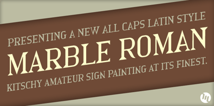
- Revx Neue by OneSevenPointFive,
$15.00 Revx Neue, an unsquared typeface is a modern sans serif. It contains 14 styles, 7 uprights, and the corresponding italics. The OpenType Latin Pro character set is crafted with powerful OpenType features, alternative glyphs, kerning pairs, and more which makes the font well featured. The typeface is suitable for all platforms (web, display, print, etc.). Revx Neue blends beautifully into your designs. Character request / Feedback: https://forms.gle/iY8Zswmsg689m95M8
 - SoftTimes Roman by Wiescher Design,
$39.50 Designing SoftTimes has been easy on my nerves after the strain of HardTimes. The harder the Times are the more do we need some soft typefaces, this one is the soft counterpart for HardTimes. -Your softspoken typedesigner, Gert Wiescher
 - Neue Alter by OzType.,
$30.00 Introducing Neue Alter: the harmonious blend of readability and dynamic details : With 4 weights and their corresponding italics, you'll find your ideal style. The regular weight showcases even strokes for effortless legibility, while the light and semibold weights offer a robust texture, ideal for impactful headlines and compelling paragraphs. It's perfectly proportioned and is an excellent choice for captions, navigation systems, and anything that requires concise, accurate language
 - Roman Wells by Wooden Type Fonts,
$15.00 A revival of one of the popular wooden type fonts of the 19th century, suitable for display, heavy stems, very thin serifs, short descenders. Heavily revised, very much improved, extensive kerning. Now in otf and ttf formats.
 - Elongated Roman by Red Rooster Collection,
$45.00 Elongated Roman is a Didone-style serif typeface. It was originally designed in 1950 by typographers at Stephenson Blake. After International TypeFounders, Inc. acquired exclusive licensing rights to the Stephenson Blake Collection, Steve Jackaman (ITF) digitally revived the typeface in 1997 for the Red Rooster Collection. Much like other Didone typefaces, Elongated Roman’s strong contrast between thick and thin strokes and hairline serif design strengthen its elegance as a “modern face.” Unlike other Didone typefaces in the Red Rooster Collection, Elongated Roman was designed with display size in mind thanks to its strong variance in stroke weight.