10,000 search results
(0.429 seconds)
- Dalychious by Good Java Studio,
$20.00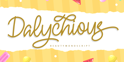 Dalychious - Beauty Monoscript Font is a monoscript font. I'ts Perfect for logo, invitation, stationery, wedding designs, social media posts, advertisements, product packaging, product designs, label, photography, watermark, special events or anything. This font include Ligatures and also Multilingual support.
 - Wataha by Soar Studio,
$22.00 Wataha (in polish - wolf pack) is a sharp, robust uppercase family of 3 fonts: Bold, Heavy and Black. Perfect for posters, headlines and logotypes. With a range of OpenType features you have access to alternative letter shapes, fractions, arrows etc. Wataha supports most Latin-based languages and few others.
 - Winner Sans by sportsfonts,
$19.00 Winner Sans™ and Winner™—Classic athletic aesthetics, finally as a versatile contemporary super family. Just when you thought there was nothing left to add to the classic sports design, we lifted it to a whole new level. Whatever you want to set in whatever space, with seven weights in seven widths both with or without serifs, you’ll definitely find the right proportions for it! Winner Sans supports not only most Latin-based languages but also Greek. Its extensive character set also contains currency signs, arrows, as well as a wide range of numerals from small figures to Roman numerals. Furthermore, its sophisticated OpenType layout features give you access to alternative letter shapes, fractions, tabular figures, and contextual alternates. With more than 24,000 glyphs in 49 fonts, Winner Sans leaves nothing to be desired. Grab Condensed Regular for free and give it a spin! (Stadium illustrations by Oskar Strauß)
 - Madrea by Craft Supply Co,
$20.00 Introducing Madrea – Friendly Sans Serif Unconventional Charm Madrea – Friendly Sans Serif is anything but conventional; it introduces a unique and friendly twist to your designs. Irregular Shapes What sets Madrea apart is its irregular shapes, which establish a welcoming and friendly atmosphere. This makes it the perfect choice for designs seeking to break free from formality and monotony. A Breath of Fresh Air In the realm of sans serif fonts, Madrea is indeed a breath of fresh air. Its non-uniformity and organic feel breathe personality and approachability into your projects. Breaking Formality Madrea excels at breaking the chains of formality. It’s an ideal choice for design projects that demand a friendly and informal touch, effortlessly transforming the mundane into something captivating. In Conclusion In summary, Madrea – Friendly Sans Serif is your gateway to a non-uniform, friendly design experience. Its irregular shapes infuse character, warmth, and a refreshing departure from conventional design, ensuring that your creations are brimming with life and far from monotonous.
 - Strong Heart by Sarid Ezra,
$13.00 Introducing my another font duo, Strong Heart! This is my newest font, I made two very different style that will compliment each other. Strong Heart contain two font, Script with lovely vibes, and Caps with strong form. The script also comes with ligatures that will make the signature font more real. This fonts are totally applicable in any project, like your social media post, merchandise, signature, etc. Font Features: Script Ligatures Number and Symbol Multi Language Support PUA Encoded
 - School Fiesta by Mvmet,
$12.00 School Fiesta is a cool font that will be perfect for your school festival theme or other event displays. The fun, festive, and happy vibe will be there when you use it. You can use it for anything ranging from t-shirts, other merchandise, kids’ book designs, and greeting cards to stickers and posters, or anything that needs a casual touch. Fall in love with its incredibly versatile style, and use it to create lovely designs!
 - Vicious Story by Mvmet,
$16.00 Vicious Story is a very cool and playful hand-drawn display font, it can be used for your kids friendly horror themed designs and many more. It works great for creating cool designs that scream for attention. It’s ideal for anything ranging from t-shirts, book designs, restaurant menu, blog writing, greeting cards to stickers, or anything that needs a casual touch. Fall in love with its incredibly cool style, and use it to create lovely designs!
 - Bokonon by Cool Fonts,
$24.00 Bokonon says this font looks like it could be used for anything from classic to grunge. It is a scripty conglomeration classic fonts and is sure to become one of your favorites. Pass the Ice 9 please.
 - New Way by Khalid Jassim,
$27.00 This font is good to use for any modern style magazine/posters etc. The letters in this font will give writing a nice look. It will be a perfect use for anything that needs to look fancy.
 - Bostroom by Lemonthe,
$14.00 Bostroom is a beautiful brush font. Bostroom Font is perfect for many different project such as logos & branding, invitation, stationery, wedding designs, social media posts, advertisements, product packaging, product designs, label, photography, watermark, special events or anything.
 - Adlm by Andfonts,
$14.00 Abxr is a cool, robotic styled display font. This font is ideal for logos\names and pretty much anything else that requires a unique touch. My opinion it can works perfectly in music, sport and art industry.
 - Quarkwell by TheTypeworks.com,
$12.99 Quarkwell™ by The Typeworks is a line based typeface ideal for use in designs that require a modern and highly legible appearance whilst still retaining a classic feel. The Quarkwell font family is inspired by lettering from twentieth-century pantograph engraving machines. The letterforms give a nod to the signature copy sets used on many computer mechanical keyboard keycaps and vintage typewriters, plotter engraved plastics signage fonts and others using modified Gorton lettering. Quarkwell font faces include many stylistic alternates for its uppercase and symbols characters sets. Need a different "Q" design? Use access all alternates or insert symbol to select a different "Q" form! Vector lines for plotting machines are also available to purchase on request at TheTypeworks.com So take Quarkwell home today! It's a perfect fit for all sorts of projects.
 - Weekly Bazaar NF by Nick's Fonts,
$10.00Here’s another nostalgic beauty from the Central Type Foundry of St. Louis, originally titled Harpers, designed for the popular newsweekly of the same name. Its bouncy, quirky letterforms will add vitality and visual interest to your headlines and subheads. All versions of this font include the Unicode 1250 Central European character set in addition to the standard Unicode 1252 Latin set. - Signs Of Yesterday JNL by Jeff Levine,
$29.00Signs of Yesterday JNL brings another twenty-six vintage signs inspired by a series of decals once made by the Duro Decal Company (now Duro Art Industries) of Chicago. This font complements the original twenty-six designs found in Too Much Information JNL. There are two blank sign panels on the parenthesis keys for use in creating custom retro signage. - Callistera Script by Sarid Ezra,
$15.00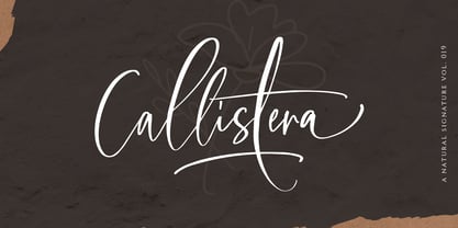 Callistera Script is a natural also expressive font that contain lowercase, uppercase, symbol, and also mult- language support. It comes with ligatures, contextual alternates, stylistic alternates, swashes, and also underline. Callistera Script also suitable for logo branding, beautiful fashion design, suitable for wedding invitations, or handwritten quotes. Also with PUA encoding. For another questions, please send a mail to saridezra@gmail.com. Thank You!
 - Turista Gorda NF by Nick's Fonts,
$10.00Here’s another offering from the Baltimore Type Foundry, originally called Airport Tourist, which was obviously influenced by Paul Renner’s Futura Display, designed in 1932 for Bauersche Gießerei. This version features tight sidebearings and aggressive kerning, so your headlines will pack a punch. This font contains the complete Latin language character set (Unicode 1252) plus support for Central European (Unicode 1250) languages as well. - Grumpy by Suomi,
$40.00 An extreme headline font with six optical variants. Black 24 is loosely based on ITC Grouch (1970) by Tom Carnase. It has some 2000 hand-adjusted kerning pairs for TNT (that’s Tight, Not Touching), a very popular type treatment from the seventies and eighties. Take your pick, or get them all, so you don’t have to buy another one later on.
 - Atlantic Doodles by Atlantic Fonts,
$26.00 Like another popular “doodle”, Atlantic Doodles can really liven things up. Give your scrapbooking, invitations, gift tags and other creative endeavors the attention they deserve with this versatile collection of 52 hand-drawn swashes, flourishes, spots, and decorations. Designed to coordinate with your favorite Atlantic Fonts. Atlantic Doodles shown with Catbird, Suntea, Rowboat, Mountain Goat, Merci, Once, Trailmap, Farmstand and Steamboat.
 - Parity Sans by Shinntype,
$19.00 The Parity concept takes the minimalist unicase alphabet and expands it in another dimension, that of the megafamily encompassing a variety of weights, optical sizes and styles (roman/italic, serif/sans, proportional/monowidth)—of benefit whether fine tuning a single, quite specific font for the task at hand, or harmoniously combining several in the hierarchy of a multi-formatted page layout.
 - Lily Hilo NF by Nick's Fonts,
$10.00This sometimes-top-heavy, sometime-bottom-heavy, sometimes-centered typecase is based on an old Photolettering face designed by the irrepressible Dave West, originally called "Nickelodeon". That name was already taken, so I chose another with a nod to the 1953 film starring Leslie Caron. Both versions of this font include the complete Unicode Latin 1252 and Central European 1250 character sets. - Bodoni Classic Bold Ornate by Wiescher Design,
$39.50 Bodoni Classic Bold Ornate is another puzzlestone in my ever growing Bodoni Classic family. This time the letters are ornated within the limits of the letter, this keeps the classic form of the typeface intact and still gives it ample decoration. Please use this font only sparingly to decorate text or use it as initials only. Your Bodonimaniac, Gert Wiescher
 - Gemina - Personal use only

- Digital Kauno - Unknown license

- Wolf's Bane - Unknown license

- Ben-Zion - Personal use only

- ASTYPE Ornaments Accolades A by astype,
$28.00 The astype series Accolades A offers the designer a fine balanced set of calligraphic swashes, swirls and floral ornaments. The shapes are in systematic order and harmonize in contrast and detail. The shapes can be combined easily and the advanced designer can build hundreds of sophisticated compositions. No matter, whether packaging lables, invitations or greeting cards - every assignment with the need of a delightful appeal will be served well. Accolades A and A2 share the same base set of ornaments but differ in some of the major shapes. Despite these differences, the total width of the shapes will be always the same. If you are looking for some good companion fonts, give Gracia and Adana a try. Every classic high contrast stroke design like Didot or Bodoni works well. Note: To look perfect, adjust the size of the ornament font to fit in contrast the design of the companion font. So if you use a Bodoni font as companion, try to match the thickness of the thinnest part of a upper case Bodoni letter with the thinnest part of a shape from the ornament. Note 2: Each package comes with a technical documentation and an InDesign2 sample file.
 - Regulaire by PizzaDude.dk,
$16.00 Regulaire is my laid back comic font, inspired by graffiti and my everyday regular handwriting. Works quite nice for kids products, comics, party posters - or anything that needs a casual comic look!
 - FWD Egyptian Tower by Fontwright Design,
$39.99 FWD Egyptian Tower is a designers stack-able Display family best purchased as one package. The four versions can be manipulated in your favorite graphics or sign making application to achieve the different effects as shown in the font family ad designs. All fonts are tightly spaced and are very often intentionally overlapped creating a balance for each very unique wider bottomed character. Being stack-able, the designer can duplicate the original text layer and by changing the font on the lower of the two layers to another of the family can then add another available effect. This can be repeated to add other of the available effects. Then by converting the text of the lower text layers to curves or outlines and welding the characters of the words together, the overlaps can be eliminated. This process is fairly common practice for a graphic designer and quite easy once done a few times.
 - Linea Nera NF by Nick's Fonts,
$10.00Here's another Disco-era darling, based on Wolf Magin's contemporary offering, originally called Black Line. It's a natural choice for sassy headlines with a cool Retro vibe. Both versions contain the complete Latin 1252, Central European 1250 and Turkish 1254 character sets. - Conners Corners NF by Nick's Fonts,
$10.00 Here's another collection of ornate border elements gleaned from the 1888 specimen books of James Conner's Sons United States Type Foundry in New York City. Refer to the PDF guide for detailed, yet simple, instructions for constructing nine delightfully different border patterns.
 - Bispo by Custom Types,
$- Bispo is a script typeface family made based on italic chancery calligraphy. After one year of it first launch, Bispo family now has another variant, a Bispo Pro version. The Pro version now contains more than 450 glyphs and new OpenType features, enjoy!
 - Dopamine by Luke Thompson,
$30.00 Dopamine is a friendly, flowing sans serif typeface. It works best for large headlines, particularly in packaging or editorial projects. Its most interesting feature is the flowing line across the top of many of the characters, creating smooth waves from one to another.
 - Ariergard Rondo by ParaType,
$25.00 AriergardRondo is supplemental to Ariergard by the same author. It differs with sharp geometrical letterforms and with circular shapes of round letters. The face includes antique Cyrillic letter shapes: N has diagonal stroke, uppercase Y and Ч are equilateral. Both lc г and т have ascenders. For use in advertising and display typography.
 - Hairy Blood by Mvmet,
$18.00 Hairy Blood is a cool ink drips font with bold characteristic inspired by vintage horror movies, comics, and Metal music that makes this font looks so cool and fun to use. It will be perfect for your horror and Halloween themed needs! You can use it for anything ranging from t-shirts and clothing, for your scary book designs, Halloween party needs, greeting cards, stickers, posters, banners, or anything that needs a horror touch. Try it to create fabulous designs and feel the horror and Halloween vibes with it!
 - Roundkey by 38-lineart,
$18.00 Roundkey Is the font sans serif family for branding and text. Comes with two basic characters, namely "sharp" and "soft", each character consists of 6 weight with matching oblique. A total of 24 fonts with basic condensed shapes and unique curves. the soft version has a different degree of softness. medium and bold have wider curves because they are suitable for displays, while thin to regular have smaller curves for easier reading. With these sharp and soft version make it can be applied more widely
 - RM True To Type by Ray Meadows,
$19.00 Throw away the carbon paper, ribbons and Tippex ... now you can get that typewritten look with RM True to Type. Legible at all sizes, it is available in regular and bold. That faithful old typewriter has given many years of valiant service, but now the keys are worn and blocked with ink. The Old styles replicate the wear and tear of years of use. Includes: Western European, Central European, Baltic & Turkish sets Due to the modular nature of this design there may be a slight lack of smoothness to the curves at very large point sizes (around 100 pt and above).
 - Deposit Pro by Mint Type,
$35.00 Deposit Pro is a wide slab-serif family with low x-height. In both headlines and paragraph text it creates a serious yet friendly texture between a typewriter and a contemporary slab-serif, making it particularly suitable for corporate communication design. Deposit Pro consists of 16 styles (8 weights and their corresponding italics) and features broad language support including all European Latin and Cyrillic languages. It also sports plenty of OpenType features including 6 sets of digits, fractions, small caps, ordinals, all-cap punctuation, and contextual forms for ‘f’, eliminating the need for too many ligatures.
 - Typewalk Mono 1915 by Typocalypse,
$49.00 Typewalk Mono 1915, the vintage typewriter grotesque that is branded by history. It is a tribute to the European sign painter and lettering tradition of the early 20th century. Typewalk Mono 1915 also speaks in the proto-rational and graphical language of the Werkbund Objectivity which was used around 1915. It works great for cultural, editorial and branding purposes. It is versatile in small printing sizes and works great on the web. Speaking with its unique voice. Typewalk Mono 1915 is the debut release by Sven Fuchs and was designed between 2012 and 2016. It has 8 distinctive weights from thin to bold.
 - Better Kamp by Ingrimayne Type,
$6.00 BetterKamp was originally constructed in 1995-6. It was not constructed to meet any specific purpose but out of curiosity, to see what the result would be if two quite different faces were blended. KampIngriana is the offspring of BetterTypeRight, which has characteristics of a typewriter face without the monospacing, and KampFriendship, which mimics a serifed face drawn by hand. The original blending had many oddities that I did not clean up until 2020 when I also added the semi-bold weights. BetterKamp lacks polish and elegance, but it is very readable at small point sizes.
 - Shady Lady NF by Nick's Fonts,
$10.00 The 1907 Barnhart Brothers & Spindler type specimen catalog called this unique typeface simply "Umbra". Since that name is already taken, it now has another. Due to the highly ornate nature of this face, the font has a limited character set (all accented characters, but no math operators or fractions). The Opentype version of this font supports Unicode 1250 (Central European) languages, as well as Unicode 1252 (Latin) languages.


