8,700 search results
(0.474 seconds)
- Bougainville by Type Associates,
$29.95 Bougainville was inspired by many of my favorites and has been on the drawing board in excess of ten years. Only this year I decided to expand the original 1994 design to include other weight variants. The quirky Binner Gothic-inspired high axis and its funky g, rounded e, angled stroke endings together with the influence of contemporary designs such as Officina Sans, Din Mittelschrift and MetaPlus, Bougainville exhibits a similar flavor and compactness to Bodega Sans. This typeface family has been named in honor of the renowned eighteen-century French mathematician and explorer Louis-Antoine de Bougainville to whom we owe the naming of South Sea Islands and colorful tropical flora he discovered along his journey. Bougainville makes for effective headings at any size and is equally readable at semi-display sizes.
 - Signature Script by Fenotype,
$25.00 Signature Script is a smooth pen script with large display capitals and small but legible lowercase letters. It’s ideal for logo, signature, poster, brochure or any display use. Signature Script is great for typing headlines or a restaurant logo - it’s stylish but legible enough due to its smooth shapes. Signature Script has at least three alternates for every basic lowercase letters that are automatically connected to next letter nicely. This feature is coded inside Standard Ligature so I recommend keeping that on. There’s also Stylistic Alternates for every standard Uppercase letter and Swash, Stylistic and Titling Alternates on certain lowercase letters that can be used to spice up your words. The font is PUA encoded so you can access extras in most graphic design softwares even without OpenType support.
 - Gatheraz by Rvandtype,
$9.00 Gatheraz Stylish Display font. Its elegant and cool look makes it the perfect choice for logos, branding, invitations, stationery, wedding designs, social media posts, and so much more. Gatheraz font is PUA encoded which means you can access all of the glyphs. Features : All Caps numbers and punctuation multilingual Alternate Characters PUA encoded
 - Pantera by Lián Types,
$39.00 ROARRR! THE STYLES -Pantera Pro is the most complete style, and although its default look is mono-rhythmic it gets really playful and crazy like the examples of the posters by just activating the Decorative Ligatures button in the Open-type Panel of Adobe Illustrator. However, I recommend using also the Glyphs Panel because there you'll find much more variants per letter. Pantera Pro is in fact, coded in a way the combination of thicknesses will always look fantastic. -Pantera Black Left, and Pantera Black Right are actually “lite” versions of Pantera Pro: They have very little Open-Type code, so what you see here is what you get. Pantera Black Left has its left strokes thick, while Pantera Black Right has its right strokes thick. -Pantera White is a lovely member in this family that looks lighter and airy, hence its name. With the feature Standard Ligatures activated (liga) the font gets very playful. -Pantera Caps is based on sign painters lettering and since it follows the same pointed brush rules as the other styles, it matches perfectly. -Pantera Claws like its name suggests, is a set of icons that were done by our dear panther. THE STORY It is said that typography can never be as expressive as calligraphy, but sometimes it can get close enough. I tend to think that calligraphic trials, in order to work well as potential fonts, need first to go through very strict filters before going digital: While calligraphy is synonym of freedom (once its rules are mastered), type-design, in the other hand, has its battlefield a little tighter and tougher. When I practice pointed brush lettering, there are so many things happening on the paper. And most of them are delicious. The ones who know my work may see that although many of my fonts are very expressive, my handmade brush trials are much more lively than them. With that in mind, this time I tried to go further and rescue more of those things that are lost in the process of thinking type when first sketches are calligraphic. I wondered if I could create something wild, hence its name Panther, by understanding the randomness that sometimes calligraphy conveys and turning it to something systemic: With Pantera, I created an ordered disorder. Like it happens a lot in many kinds of lettering styles, in order to enrich the written word the scribe mixes the thickness of the strokes and the width of the letters. Like one of my favorite mentors say (1), they make thoughtful gestures Some lively strokes go down with a thick, while some do that with a thin. Some letters are very narrow, meaning some of them will need to be very wide to compensate. Why not?. The calligrapher is always thinking on the following letters, and he/she designs in his head the combination of thicks and thins before he/she executes them. He/she knows the playful rhythm the words will have before writing them. It takes time and skill to master this and achieve graceful results. Going back to the font, in Pantera, this combination of varying thicknesses and widths of letters were Open-Type coded so the user will see satisfactory results by just enabling or disabling some buttons on the glyphs panel. I'm very pleased with the result since it’s not very easy to find fonts which play with the words' rhythm like Pantera does, following of course, a strong calligraphic base. I believe that if you were on the prowl for innovative fonts, this is your chance to go wild and get Pantera! NOTES (1) Phrase by Yves Leterme. In fact, it’s the title of a book by him. EPILOGUE Esta fuente está dedicada a mi panterita
 - PF Das Grotesk Pro by Parachute,
$79.00 Das Grotesk was inspired by earlier nineteenth-century grotesques, but it is much more related to American gothic designs such as those by M.F. Benton. Due to their pure geometric structure, most grotesque typefaces tend to have a rather monotonous and lifeless appearance, thus failing to express the ideals of the modern creed. Das Grotesk on the other hand is a lively design with several distinguishable characteristics which attract attention when set at large sizes, whilst they become subtle and blend evenly at small sizes, fostering a neutral identity. This is a very legible and space-saving typeface with a narrow structure. It was designed with slanted curved ends and sheared terminals applied on several straight strokes. It has two-storey ‘a’ and ‘g’ but includes single-storey alternates. The family consists of 14 weights ranging from Extra Thin to Black (including true-italics). It provides simultaneous support for Latin, Cyrillic and Greek and is loaded with several advanced typographic features such as small caps. Download its complehensive PDF Specimen Manual for further details.
 - Norwich by AVP,
$29.00 Norwich is a grungy version of the font Tenison and provides real blobby pen handwriting.
 - Mister Dorky by PizzaDude.dk,
$20.00Mister Dorky is a grungy, jumpy and warm handwritten font made with an inky pen! - Resalaty Arabic by NamelaType,
$19.00 This is Resalaty added Arabic features with a pen handwriting style, for more fun text
 - Square Line Icons Coffee by Howcolour,
$17.00 Coffee and tea related, pixel perfect, editable stroke, up scalable square line vector icon set.
 - Notebug by PizzaDude.dk,
$15.00 Notebug looks like there was a bug playing around with an inky pen. Notebook with a bug = Notebug! Made with a hefty inky pen and quick strokes. You got 3 layers to play around with: Regular (the outline) Fill (The "inside" of the Regular version and Layer (best used as a background layer for Regular)
 - Invention by Create Big Supply,
$15.00 Invention Font is a unique, This will add a very unique and powerful touch to your design. This font is PUA encoded which means you can access all the glyphs and sweeps easily! Features: Uppercase & lowercase Numbers and punctuation Multilingual PUA Encoding Full Character Set !"#$%&()*+,-./0123456789:;=?@ABCDEFGHIJKLMNOPQRSTUVWXYZ[\]^_abcdefghijklmnopqrstuvwxyz{|}~ ¡¢£¤¥§©ª«®°±²³·¹º»¿ÀÁÂÃÄÅÆÇÈÉÊËÌÍÎÏÑÒÓÔÕÖ×ØÙÚÛÜÝÞßàáâãäåæçèéêëìíîïñòóôõö÷øùúûüýþÿıŒœŠšŸž–—‘’‚“”„†•‹›€−
 - Banegsa by Rvandtype,
$9.00 Banegsa is a sans serif font. Its elegant and cool look makes it the perfect choice for logos, branding, invitations, stationery, wedding designs, social media posts, and so much more. Banegsa Font is PUA encoded which means you can access all of the glyphs. Features : uppercase & lowercase numbers and punctuation multilingual Alternate Characters PUA encoded
 - Prospector JNL by Jeff Levine,
$29.00 Prospector JNL is based on a lettering example found in an old Speedball-pen lettering handbook.
 - ND Minion by NeueDeutsche,
$25.00 A whimsical and playful font that harks back to the charm of childhood toys and creative imagination. Inspired by classic peg and construction toys, this font brings a delightful twist to typography. It's as if each letter has been carefully sculpted from colorful pegs, inviting you to assemble words like a puzzle, creating your own visual narrative.
 - Hugio by Rockboys Studio,
$23.00 Hugio is a simple and casual serif font with an undeniably clean feel. With its neat and beautiful arrangement of letters, this typeface will look outstanding in both formal and non-formal designs. PUA encoded = Accessible in the Adobe Illustrator, Adobe Photoshop, Adobe InDesign, even work on Microsoft Word. PUA Encoded Characters - Fully accessible without additional design software.
 - Cliona by Create Big Supply,
$15.00 Cliona Bold Script. Perfect for all your design needs such as branding designs, logos, and more. This font is PUA encoded which means you can access all the amazing glyphs and ligatures easily Features: Uppercase & lowercase Numbers and punctuation Multilingual Ligatures PUA Encoding Full Character Set !"#$%&'()*+,-./0123456789:;?@ABCDEFGHIJKLMNOPQRSTUVWXYZ[\]^_`abcdefghijklmnopqrstuvwxyz{|}~¡¢£¤¥§¨©ª«®¯°±²³´¹º»¿ÀÁÂÃÄÅÆÇÈÉÊËÌÍÎÏÑÒÓÔÕÖ×ØÙÛÜÝÞßàáâãäåæçèéêëìíîïñòóôõö÷øùúûüýþÿ•†‹›‒–ˆˇ˜€“‘ŸœŒš˚”’ıžŠ„‚
 - Fabrice by Fabulous Rice,
$30.00 Fabrice is a font based on my handwriting, which has been reworked to be turned into a font. I write differently with each pen I use, and this font corresponds to my handwriting while using a pen I refill myself with special inks. It contains a wide range of characters, and will be readable anywhere, yet different!
 - Yasuragi by Hanoded,
$15.00 Yasuragi means ‘Peace of Mind’ or ‘Tranquility’ in Japanese. It is something I do not have a lot of since the corona lockdown…the ;-) Yasuragi is a handmade script font. It is quite neat, quite elegant and quite useful (in a tranquil, peace-of-mind kinda way). Yasuragi comes with double letter ligatures and all the diacritics you want.
 - Merry Deer by Yoga Letter,
$15.00 "Merry Deer" is a unique display typeface with a deer horn embellishment added to the font. This will add a unique and funny feel to any writing or work you make. "Merry Deer" is PUA coded which means you can access all the glyphs and sweeps easily! FEATURES: Uppercase Lowercase Swash Numbers & Punctuation Multilingual Support PUA coding open type
 - Wadgres by Rvandtype,
$15.00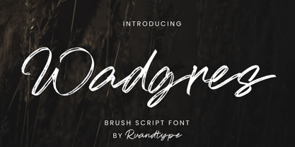 Wadgres is a Script Brush font. Its elegant and cool look makes it the perfect choice for logos, branding, invitations, stationery, wedding designs, social media posts, and so much more. Wadgres Font is PUA encoded which means you can access all of the glyphs. Features : – Uppercase & Lowercase – Alternate Characters – Numbers and Punctuation – Multilingual Support – PUA Encoded Thank You
 - Oddly Deco JNL by Jeff Levine,
$29.00 A quirky and unusual Art Deco monoline typeface can be found within the pages of the Esterbrook Drawlet Pen instruction book [circa the 1940s]. Drawlet was the direct competitor to Speedball Lettering pen nibs. This unusual type design of varying width and character shapes is now available digitally as Oddly Deco JNL, in both regular and oblique versions.
 - Technopen JNL by Jeff Levine,
$29.00 At first glance, the lettering style of Technopen JNL seems to emulate the computer-age fonts of the 1980s. In actuality, this font is derived from an alphabet sample found in an instructional booklet for the Esterbrook Drawlet Pens. The Drawlet line was Esterbrook's answer to the iconic Speedball pen points sold through their chief competitor, the Hunt Pen Manufacturing Company. So, what seems to be late 20th Century typography is actually from vintage source material. In fact, the entire contents of the instructional booklet were copyright 1929! A few minor changes were made to the original A-Z alphabet and additional characters were added. The name Technopen is a shortening of the term 'technical pen', which is both a nod to the techno age of the 80s and the technical instruments of the past utilized for drawing and lettering.
 - Political Graft Fill - Unknown license

- Stockscript by K-Type,
$20.00 An elegant yet down-to-earth script based on the pen lettering of the writer, Christopher Stocks.
 - As of my last update in 2023, there is no widely recognized or mainstream font officially called "Squid." However, the evocative name suggests a font that would embody characteristics inspired by the...
- Filistique by URW Type Foundry,
$39.99 Filistique is gracious, flexible, and stylish. In the first sketches of this typeface, the one-line drawing principle was the rule. This principal had to perish soon when more complex characters came up. But still the one-line rule was kept in tradition to maintain the behavior of the natural course of the drawing line. Once writing, the characters joined fluidly into words and slipped easily into sentences like they had always belonged there. They have these natural features maybe somewhat familiar on the first sight. Filistique approaches handwriting but likes to be straight up as well. Please, no Christmas card writing with this character! She is best in shape for finger licking good menus of classy restaurants, lyrics on an album cover of a renowned and utterly cool artist, for a letter to your precious loved one and of course for making a hell of an impression anyway!
 - skeemat - Unknown license

- Bridie - Unknown license

- BiscuitPunch - Unknown license

- China Doll JNL by Jeff Levine,
$29.00 A 1960 edition of the Speedball® Pen lettering instruction book yielded the model for China Doll JNL.
 - Ziggy by Jonahfonts,
$35.00 A free-spirited hand-script font. Very similar to pre-computer hand-written letttering with a ruling pen.
 - Joyosa by Autographis,
$39.50 Joyosa is an elaborate script written with a broad pen; it gives the impression of a flowing ribbon.
 - Bruce Belgina NF by Nick's Fonts,
$10.00 Patented in 1867, this face adds peaks and shadows to the Egyptian form so popular at the time.
 - Monologous by Comicraft,
$49.00 From A to B, or not to Z: that is the question mark: whether 'tis nobler in the mind to kern with the left and right arrows of outrageous keyboards, or to take arms against a sea of ' thought bubbles,' and by opposing, burst them? To sigh, with those little fireflies: to sleep; No more; and by sleep that is to say we end each line of dialogue with 'zzzzz;' The heart-shapes and the thousand drops of sweat popping off my forehead that sight of flesh is sure to produce, 'tis a consummation devoutly to be letter'd. To die with still at least five balloons of dialogue, to sleep; perchance to flashback to a scene in a previous issue while a picture of my head floats in the corner of each panel: ay, there's the rub; 'Nuff Said.
 - Pantoufle by Kitchen Table Type Foundry,
$16.00 Pantoufle is French for slipper. Not the flipflop variety (or thongs if you’re from Australia), but the one you wear indoors when it’s cold. I have some too; Spanish ones, made from recycled PET bottles. Here in Holland, we call them ‘Pantoffels’ and you don’t have to be a language expert to see the resemblance between the French and the Dutch word. That is because the French are probably more savvy when it comes to keeping your feet warm and the Dutch just borrowed the word, pronunciation and all! Pantoufle is a font I made with a big fat marker pen. My kids had used it to decorate some gifts for Sinterklaas (if you want to know what Sinterklaas is, look it up). Pantoufle comes with extensive language support and a full set of alternates for the lower case glyphs. Enjoy!
 - Bathysphere by Kickingbird,
$24.00 This steam era typeface, created by Gustav Schroeder in 1884, found popular use on soap box labels and tobacco tins during its initial release. Then, later, a successful and stout revival of Gustav's face, named Othello, was carried out by Morris Fuller Benton in 1934, and the typeface's appeal widened to include items such as broadside posters featuring Boris Karloff's Frankenstein. After metal gave way to film type, Gustav's creation experienced a brief fashion moment in the 1960's, but then disappeared entirely, never re-surfacing as a full digital typeface. With the release of Bathysphere, the typeface comes full circle, having been completely redrawn from scratch using Gustav's original specimens. The new extended language support establishes the typeface firmly in the modern era, while Bathysphere's refinement of subtle blunt corners restores a deep-sea grace to this iron giant.
 - Salted by PintassilgoPrints,
$22.00 Somewhat extravagant and yet quite useful? Yes, absolutely. Meet Salted family: two awesome styles and a way cool picture font. Deliberately free-spirited, Salted – the Regular, yet regular is not quite an appropriate adjective for it – brings alternates and also discretionary ligatures that completely transform the font mood, adding unexpected touches of cursive script here and there and thus creating sort of a wild feel. Salted Sweet also brings alternates: 3 for letters, 2 for digits, and is way more even-tempered than it’s playmate. By the way, they play truly nice together. Enter the picture font and the team is complete for an exciting time. It’s said that the cure for anything is salt water: sweat, tears or the sea. We totally agree. Perhaps the cure for a boring design lies in a salted font. Give it a go!
 - Flying Dutchman by FontMesa,
$25.00 In nautical folklore, the Flying Dutchman is a ship that can never go home and is doomed to sail the seas forever as a ghost ship. The story of the Dutchman appeared in print in the 1820s. With different versions written over the years, some date the legend to the 1640s or the early 1700s. The Flying Dutchman font is a revival of an 1876 font from MacKellar, Smiths & Jordan Co. The Truetype and OpenType formats include a larger extended character set with Central and Eastern European accented letters. Extra characters in this font are left and right pointing hands in place of the less than and greater than keys and a pirate flag is on the bracket keys. New to this style is the distressed version where the letters look like they've been hacked by a cutlass.
 - Tropicola by Krafted,
$10.00 You, me, sea, and Tropicola Handwritten font! This font is handcrafted with tropical palm trees and sunny vibes! Use this font on different projects, promotions, websites, banners, and even printed materials! Feel the tropical breeze with your audience, clients, or guests with this stylish font now! What you’ll get: Multilingual & Ligature Support Full sets of Punctuation and Numerals Compatible with: Adobe Suite Microsoft Office KeyNote Pages Software Requirements: The fonts that you’ll receive in the pack are widely supported by most software. In order to get the full functionality of the selection of standard ligatures (custom created letters) in the script font, any software that can read OpenType fonts will work. We hope you enjoy this font and that it makes your branding sparkle! Feel free to reach out to us if you’d like more information or if you have any concerns.
 - Abominio by Unio Creative Solutions,
$9.00 Abominio is a captivating display typeface featuring an innovative design of recurring chiseled forms. This font aims to capture the spirit of maximalism culture, offering a valuable asset for consumer-oriented designs, allowing them to stand out in a in a sea of competitors. With its bold and experimental appearance, Abominio remains true to the letters of the Latin alphabet. This unique characteristic is well-suited to capture and hold the attention of easily distracted viewers, extending their focus for a few more vital seconds. Designers now have the opportunity to explore their creativity, creating both refined and daring combinations for eye-catching headlines, titles, or graphic design projects that aim to convey strength and artistic innovation. Specifications: - Included: Abominio Regular, Abominio Oblique, Abominio Variable - Multi language support (Central, Eastern, Western European Languages) - OpenType Features Thanks for viewing, Unio.


