3,028 search results
(0.017 seconds)
- Pescadero by Ascender,
$29.99 Pescadero Pro is named for the valley in California's rugged central coast. Early Spanish settlers called the area Pescadero (fishing place) as they observed it was a favorite fishing spot for the local natives. Designed by Steve Matteson, Pescadero is delicate and detailed for attractive documents but robust enough for serious reports and titles. The design is based heavily on calligraphic inscriptional lettering. Pescadero Pro's OpenType features include proportional figures, tabular figures, old style figures and initial swash caps.
 - Kanyon by Hurufatfont,
$19.00 Kanyon is a family of typefaces created from basic geometric forms based on the equal width system. Its clean and neutral structure and 3 different widths provide ease of use in different design channels. With its rich OpenType features, multi-language support and small capital characters, it has a wider usage area than its counterparts. Ideal for packaging, labels, routing designs, mobile applications, brand designs, logos, all kinds of presentation and editorial designs, indoor and outdoor printing works.
 - Stonecrop by Andrew Harper Fonts,
$5.00 Stonecrop is a font unified by bold, imposing lines as well as its use of rounded rectangles as the central stylistic shape. Stonecrop loosely conforms to the monospaced font style, with near-equal widths for all letters and numbers (but not all symbols/punctuation), however it does incorporate kerning for all types of glyphs where appropriate to aid in legibility. A perfect font for usages that demand consistency and precision, while still maintaining a quirky and stylized handwritten effect.
 - Leitucy by Panatype Studio,
$16.00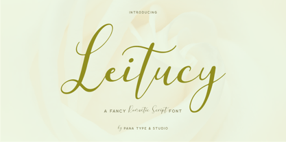 Leitucy is a casual slanted script font. With high contrast stroke, fun character with a bit of ligatures and alternates. To give you extra creative work. Leitucy font support multilingual more than 100+ language. This font is good for logo design, Social media, Movie Titles, Books Titles, short text even long text letters, and good for your secondary text font with sans or serif. Make stunning work with Leitucy font. LATIN EXTENDED ( Western European, Central European, South Eastern European )
 - Brer Rabbit by Kitchen Table Type Foundry,
$15.00 Brer Rabbit (or Brother Rabbit) is the central figure in an oral tradition passed down by African-Americans. Brer Rabbit is a trickster, just like the other popular trickster character in African stories called Anansi the spider. Brer Rabbit was based on an old font of mine called Rabbit On The Moon. It is a nice, cute children’s book font that comes with extensive language support and Brer Rabbit himself, in the shape of the alternative asterisk glyph.
 - Vasari NF by Nick's Fonts,
$10.00The pattern for this font was found in the 1906 specimen book for the Keystone Type Foundry under the name Ancient Gothic, which is a pretty accurate description of the particular appeal of this typeface. Use it liberally anytime you want to add an air of mystery or menace...or simply some quaint charm. Both versions of the font include complete Latin 1252, Central European 1250 and Turkish 1524 character sets, with localization for Moldovan, Romanian and Turkish. - JT Alvito by JAM Type Design,
$15.00 The JT Alvito family includes 5 weights with matching italics. It is ideally used as a dipslay typeface but can also be used in body copy. You will find that it works particularly well in advertising, packaging, logo design and branding. JT Alvito provides advanced typographical support with features such as ligatures, fractions, and super- and subscript characters. It holds most glyphs which are required for Western European, Central European, South Eastern European and Vietnamese languages.
 - Shababa by Okaycat,
$24.50 Shababa is a hand-drawn 3-D font. The linework is fairly relaxed, mostly smooth with some distressed edges. There is lots of texturing from the pen strokes which becomes more evident at larger point sizes. This looseness enhances the smooth technicality of the properly extruded forms. With extended codepages for Cyrillic, Romanian, Turkish, Baltic & Central Europe, Shababa is suitable for multilingual environments & publications. It also features West European diacritics, ligatures & a sprinkling of dingbats for extra fun!
 - Athlete by Talbot Type,
$12.00 Athlete is a highly legible, geometric text and display font. Inspired by classic sans-serifs Futura and Gill Sans, this elegantly minimal typeface blends traits of these twentieth century classics and is available in a comprehensive family of six weights. It includes old style non-aligning (lower case) numbers, both proportional and tabular, as well as accented characters for Central European languages. A versatile, contemporary sans-serif, Athlete is suitable for more-or-less any text or display purpose.
 - Config by Adam Ladd,
$25.00 Config was influenced by geometric sans with circular forms but the proportions have been condensed by incorporating straight sides for a design that is sturdy and efficient yet friendly. The neutral design with subtle details makes it functional for type setting in small and large sizes. Its clean nature makes it readable at small sizes but the touch of character—as seen in the notched joints, rounded details, and horizontal/vertical terminals—make it interesting at large sizes.
 - Filibuster NF by Nick's Fonts,
$10.00The Ayes have it! The 1909 specimen catalog from the H. C. Hansen Type Foundry of Boston contained a lovely decorative face named Congress, which is the pattern for this font. It's a winning choice for distinctive headlines, and the uppercase letters are also suitable by themselves for use as decorative initials. The PC Postscript, Truetype and Opentype versions contain the complete Latin language character set (Unicode 1252) plus Central European (Unicode 1250) languages as well. - Ziggy Stardust NF by Nick's Fonts,
$10.00Sheet music from the 1921 edition of the Ziegfeld Follies provided the blueprint for this sparkly, sprightly font. Upper and lowercase characters are identical, with the exception of the letter s, which offers a version of the letter with a big caboose rather than an overbite. Named for David Bowie’s 1972 breakthrough album. Both versions of this font contain the Unicode 1252 (Latin) and Unicode 1250 (Central European) character sets, with localization for Romanian and Moldovan. - Big George NF by Nick's Fonts,
$10.00Here’s another gem by Ross F. George from the Speedball Text Book. It was originally entitled simply Bold Display (Modern Alphabets on Parade) and had a graduated spatter pattern. This version omits the pattern, but keeps the bold, brassy lines. Use it whenever you need an unusual and dynamic headline with a strong retro vibe. Both versions include the complete Unicode Latin 1252, Central European 1250 and Turkish 1254 character sets, with localization for Moldovan and Romanian. - Bundle Of Joy NF by Nick's Fonts,
$10.00This in-yer-face kinda face is based on a broad brush font from "The New ABC of Showcard & Ticketwriting" by C. Milne, published in Australia in the late 1930s. Brought to my attention by Ms. Kat Black, and named in honor of Ms. Kat's grannie, to whom the book originally belonged. The Postscript and Truetype versions contain a complete Latin language character set (Unicode 1252); in addition, the Opentype version supports Unicode 1250 (Central European) languages as well. - Lunokhod by ParaType,
$25.00 Lunokhod type family (four weights) was designed by Oleg Karpinsky for ParaType in 2005. Lunokhod is an original wide sans serif with square shapes of oval glyphs. Several Cyrillic glyphs such as Í, Ó, ×, ã, ä, ò have alternate letterforms. For example capital H has two shapes: Latin one with diagonal central stroke and traditional Cyrillic with horisontal bar. Capital Ó and × have symmetrical and asymmetrical shapes. For use in display typography and for short text passages.
 - P22 Torrone by IHOF,
$29.95 Precursors to Torrone, the fonts are found among the type experiments of Art Deco artists in 1930’s Europe. Fonts of this type with chunky, geometry-driven lower case letters combined with somewhat flamboyant, brush-influenced upper case can be found in the logotypes for Mignon Chocolate Factory in Germany and Baci bon-bons still in use today by Italy’s Perugina Candies. Torrone includes alternate lower case characters and full Central European glyph sets with over 550 characters included!
 - Oblonga by Eurotypo,
$28.00 Oblonga shows thin, elegant lines. The continuity of the trace is only suggested through the curves of the letters, a soft effect of bonding that maintains the identity of each character. Oblonga is an Art-Déco font proposed in a modern key, a revival performed without aggression. More than three hundred glyphs (regular and Italic) that ensure legibility in Central-European and Slavic languages, enriched by some appropriate discretionary ligatures that enhance the charme of a time gone away.
 - Gunar by The Northern Block,
$39.00 A geometric sans serif with a square chiseled appearance. Precise curves are met with straight lines and tapered angles to produce a fresh, technical typeface. It’s large x-height and neutral width give it good legibility at small point sizes. These refined rectangular features make it ideally suited to a wide range of modern applications. Details include 550 characters with alternative lowercase a, e, g and y. 5 variations of numerals, manually edited kerning and Opentype features.
 - Heft by Device,
$39.00 Heft is a heavy slab serif that packs a powerful punch. Available in square-cornered and rounded versions, each with italics, plus two distressed variants — an inky version that evokes the urgency of cheap hot-metal printing, and a worn, distressed version that suggests vintage woodtype or photocopied text.
 - Landry Gothic by E-phemera,
$12.00Landry Gothic is inspired by a wood type alphabet by an unknown designer. It was digitized in order to make prop signage for movies and television. Its imperfect lines and rounded corners are meant to capture the feeling of real wood or metal type that's worn from use. - Rotham Industria by Greater Albion Typefounders,
$18.00 Rotham Industrial. Stylised lettering for industrial flavoured projects. Imagine, if you will letters shaped from metal tube, or perhaps from a solid rod, or perhaps made from brass handrails? You get the idea. A stylised and fun typeface for those occasions where you want to suggest an engineering influence.
 - P22 Allyson by IHOF,
$39.95 P22 Allyson is based on an old metal font by Barnhart Bros. & Spindler named Hazel Script. This font is perfect for elegant invitations and certificates and has been expanded to meet the needs of today's computer user to include a full character set. Allyson Pro contains OpenType features.
 - Valjean by Solotype,
$19.95Here is a wood type from Tubbs & Co., about 1900. Its lack of decoration reflects the changes that were rapidly occurring in the design of printed pieces at the beginning of the 1900s. There were several similar types in metal in the first decade of the 20th century. - Affiche by RMU,
$35.00 Based on the fin-de-siècle Helios Reklameschrift of the Klinkhardt foundry, Leipzig, Affiche preserves the beautiful art nouveau character of its hot-metal forerunner and was carefully extended to make it multilingual. For more historical authenticity, you can use the long s by typing [alt] and [b].
 - Rumbler by Ramen,
$25.00 Rumbler is a typeface inspired by old school car lettering, while trying to push it in a unique direction. Reflecting the limitations and constraints of shaped metal, the letter forms twist and contort to create a readable font that can evoke motion and speed, strength, and a retro feel.
 - Saw Mill Stencil JNL by Jeff Levine,
$29.00 A vintage metal stencil from a saw mill with the term "reusable skid" was the model for Saw Mill Stencil JNL. Although the original was what would be termed a semi-stencil (some letters did not have 'breaks' in them), the font was designed with a more traditional look.
 - Key Tab Metal is a distinctive font crafted by the creative mind of Michael Tension. This font stands out for its unique blend of industrial charm and mechanical precision, transporting its audience ...
- Times Eighteen by Linotype,
$29.00In 1931, The Times of London commissioned a new text type design from Stanley Morison and the Monotype Corporation, after Morison had written an article criticizing The Times for being badly printed and typographically behind the times. The new design was supervised by Stanley Morison and drawn by Victor Lardent, an artist from the advertising department of The Times. Morison used an older typeface, Plantin, as the basis for his design, but made revisions for legibility and economy of space (always important concerns for newspapers). As the old type used by the newspaper had been called Times Old Roman," Morison's revision became "Times New Roman." The Times of London debuted the new typeface in October 1932, and after one year the design was released for commercial sale. The Linotype version, called simply "Times," was optimized for line-casting technology, though the differences in the basic design are subtle. The typeface was very successful for the Times of London, which used a higher grade of newsprint than most newspapers. The better, whiter paper enhanced the new typeface's high degree of contrast and sharp serifs, and created a sparkling, modern look. In 1972, Walter Tracy designed Times Europa for The Times of London. This was a sturdier version, and it was needed to hold up to the newest demands of newspaper printing: faster presses and cheaper paper. In the United States, the Times font family has enjoyed popularity as a magazine and book type since the 1940s. Times continues to be very popular around the world because of its versatility and readability. And because it is a standard font on most computers and digital printers, it has become universally familiar as the office workhorse. Times™, Times™ Europa, and Times New Roman™ are sure bets for proposals, annual reports, office correspondence, magazines, and newspapers. Linotype offers many versions of this font: Times™ is the universal version of Times, used formerly as the matrices for the Linotype hot metal line-casting machines. The basic four weights of roman, italic, bold and bold italic are standard fonts on most printers. There are also small caps, Old style Figures, phonetic characters, and Central European characters. Times™ Ten is the version specially designed for smaller text (12 point and below); its characters are wider and the hairlines are a little stronger. Times Ten has many weights for Latin typography, as well as several weights for Central European, Cyrillic, and Greek typesetting. Times™ Eighteen is the headline version, ideal for point sizes of 18 and larger. The characters are subtly condensed and the hairlines are finer. Times™ Europa is the Walter Tracy re-design of 1972, its sturdier characters and open counterspaces maintain readability in rougher printing conditions. Times New Roman™ is the historic font version first drawn by Victor Lardent and Stanley Morison for the Monotype hot metal caster." - Times Europa LT by Linotype,
$29.99In 1931, The Times of London commissioned a new text type design from Stanley Morison and the Monotype Corporation, after Morison had written an article criticizing The Times for being badly printed and typographically behind the times. The new design was supervised by Stanley Morison and drawn by Victor Lardent, an artist from the advertising department of The Times. Morison used an older typeface, Plantin, as the basis for his design, but made revisions for legibility and economy of space (always important concerns for newspapers). As the old type used by the newspaper had been called Times Old Roman," Morison's revision became "Times New Roman." The Times of London debuted the new typeface in October 1932, and after one year the design was released for commercial sale. The Linotype version, called simply "Times," was optimized for line-casting technology, though the differences in the basic design are subtle. The typeface was very successful for the Times of London, which used a higher grade of newsprint than most newspapers. The better, whiter paper enhanced the new typeface's high degree of contrast and sharp serifs, and created a sparkling, modern look. In 1972, Walter Tracy designed Times Europa for The Times of London. This was a sturdier version, and it was needed to hold up to the newest demands of newspaper printing: faster presses and cheaper paper. In the United States, the Times font family has enjoyed popularity as a magazine and book type since the 1940s. Times continues to be very popular around the world because of its versatility and readability. And because it is a standard font on most computers and digital printers, it has become universally familiar as the office workhorse. Times™, Times™ Europa, and Times New Roman™ are sure bets for proposals, annual reports, office correspondence, magazines, and newspapers. Linotype offers many versions of this font: Times™ is the universal version of Times, used formerly as the matrices for the Linotype hot metal line-casting machines. The basic four weights of roman, italic, bold and bold italic are standard fonts on most printers. There are also small caps, Old style Figures, phonetic characters, and Central European characters. Times™ Ten is the version specially designed for smaller text (12 point and below); its characters are wider and the hairlines are a little stronger. Times Ten has many weights for Latin typography, as well as several weights for Central European, Cyrillic, and Greek typesetting. Times™ Eighteen is the headline version, ideal for point sizes of 18 and larger. The characters are subtly condensed and the hairlines are finer. Times™ Europa is the Walter Tracy re-design of 1972, its sturdier characters and open counterspaces maintain readability in rougher printing conditions. Times New Roman™ is the historic font version first drawn by Victor Lardent and Stanley Morison for the Monotype hot metal caster." - Times Ten by Linotype,
$40.99In 1931, The Times of London commissioned a new text type design from Stanley Morison and the Monotype Corporation, after Morison had written an article criticizing The Times for being badly printed and typographically behind the times. The new design was supervised by Stanley Morison and drawn by Victor Lardent, an artist from the advertising department of The Times. Morison used an older typeface, Plantin, as the basis for his design, but made revisions for legibility and economy of space (always important concerns for newspapers). As the old type used by the newspaper had been called Times Old Roman," Morison's revision became "Times New Roman." The Times of London debuted the new typeface in October 1932, and after one year the design was released for commercial sale. The Linotype version, called simply "Times," was optimized for line-casting technology, though the differences in the basic design are subtle. The typeface was very successful for the Times of London, which used a higher grade of newsprint than most newspapers. The better, whiter paper enhanced the new typeface's high degree of contrast and sharp serifs, and created a sparkling, modern look. In 1972, Walter Tracy designed Times Europa for The Times of London. This was a sturdier version, and it was needed to hold up to the newest demands of newspaper printing: faster presses and cheaper paper. In the United States, the Times font family has enjoyed popularity as a magazine and book type since the 1940s. Times continues to be very popular around the world because of its versatility and readability. And because it is a standard font on most computers and digital printers, it has become universally familiar as the office workhorse. Times™, Times™ Europa, and Times New Roman™ are sure bets for proposals, annual reports, office correspondence, magazines, and newspapers. Linotype offers many versions of this font: Times™ is the universal version of Times, used formerly as the matrices for the Linotype hot metal line-casting machines. The basic four weights of roman, italic, bold and bold italic are standard fonts on most printers. There are also small caps, Old style Figures, phonetic characters, and Central European characters. Times™ Ten is the version specially designed for smaller text (12 point and below); its characters are wider and the hairlines are a little stronger. Times Ten has many weights for Latin typography, as well as several weights for Central European, Cyrillic, and Greek typesetting. Times™ Eighteen is the headline version, ideal for point sizes of 18 and larger. The characters are subtly condensed and the hairlines are finer. Times™ Europa is the Walter Tracy re-design of 1972, its sturdier characters and open counterspaces maintain readability in rougher printing conditions. Times New Roman™ is the historic font version first drawn by Victor Lardent and Stanley Morison for the Monotype hot metal caster." - Times Ten Paneuropean by Linotype,
$92.99In 1931, The Times of London commissioned a new text type design from Stanley Morison and the Monotype Corporation, after Morison had written an article criticizing The Times for being badly printed and typographically behind the times. The new design was supervised by Stanley Morison and drawn by Victor Lardent, an artist from the advertising department of The Times. Morison used an older typeface, Plantin, as the basis for his design, but made revisions for legibility and economy of space (always important concerns for newspapers). As the old type used by the newspaper had been called Times Old Roman," Morison's revision became "Times New Roman." The Times of London debuted the new typeface in October 1932, and after one year the design was released for commercial sale. The Linotype version, called simply "Times," was optimized for line-casting technology, though the differences in the basic design are subtle. The typeface was very successful for the Times of London, which used a higher grade of newsprint than most newspapers. The better, whiter paper enhanced the new typeface's high degree of contrast and sharp serifs, and created a sparkling, modern look. In 1972, Walter Tracy designed Times Europa for The Times of London. This was a sturdier version, and it was needed to hold up to the newest demands of newspaper printing: faster presses and cheaper paper. In the United States, the Times font family has enjoyed popularity as a magazine and book type since the 1940s. Times continues to be very popular around the world because of its versatility and readability. And because it is a standard font on most computers and digital printers, it has become universally familiar as the office workhorse. Times™, Times™ Europa, and Times New Roman™ are sure bets for proposals, annual reports, office correspondence, magazines, and newspapers. Linotype offers many versions of this font: Times™ is the universal version of Times, used formerly as the matrices for the Linotype hot metal line-casting machines. The basic four weights of roman, italic, bold and bold italic are standard fonts on most printers. There are also small caps, Old style Figures, phonetic characters, and Central European characters. Times™ Ten is the version specially designed for smaller text (12 point and below); its characters are wider and the hairlines are a little stronger. Times Ten has many weights for Latin typography, as well as several weights for Central European, Cyrillic, and Greek typesetting. Times™ Eighteen is the headline version, ideal for point sizes of 18 and larger. The characters are subtly condensed and the hairlines are finer. Times™ Europa is the Walter Tracy re-design of 1972, its sturdier characters and open counterspaces maintain readability in rougher printing conditions. Times New Roman™ is the historic font version first drawn by Victor Lardent and Stanley Morison for the Monotype hot metal caster." - Times by Linotype,
$40.99In 1931, The Times of London commissioned a new text type design from Stanley Morison and the Monotype Corporation, after Morison had written an article criticizing The Times for being badly printed and typographically behind the times. The new design was supervised by Stanley Morison and drawn by Victor Lardent, an artist from the advertising department of The Times. Morison used an older typeface, Plantin, as the basis for his design, but made revisions for legibility and economy of space (always important concerns for newspapers). As the old type used by the newspaper had been called Times Old Roman," Morison's revision became "Times New Roman." The Times of London debuted the new typeface in October 1932, and after one year the design was released for commercial sale. The Linotype version, called simply "Times," was optimized for line-casting technology, though the differences in the basic design are subtle. The typeface was very successful for the Times of London, which used a higher grade of newsprint than most newspapers. The better, whiter paper enhanced the new typeface's high degree of contrast and sharp serifs, and created a sparkling, modern look. In 1972, Walter Tracy designed Times Europa for The Times of London. This was a sturdier version, and it was needed to hold up to the newest demands of newspaper printing: faster presses and cheaper paper. In the United States, the Times font family has enjoyed popularity as a magazine and book type since the 1940s. Times continues to be very popular around the world because of its versatility and readability. And because it is a standard font on most computers and digital printers, it has become universally familiar as the office workhorse. Times™, Times™ Europa, and Times New Roman™ are sure bets for proposals, annual reports, office correspondence, magazines, and newspapers. Linotype offers many versions of this font: Times™ is the universal version of Times, used formerly as the matrices for the Linotype hot metal line-casting machines. The basic four weights of roman, italic, bold and bold italic are standard fonts on most printers. There are also small caps, Old style Figures, phonetic characters, and Central European characters. Times™ Ten is the version specially designed for smaller text (12 point and below); its characters are wider and the hairlines are a little stronger. Times Ten has many weights for Latin typography, as well as several weights for Central European, Cyrillic, and Greek typesetting. Times™ Eighteen is the headline version, ideal for point sizes of 18 and larger. The characters are subtly condensed and the hairlines are finer. Times™ Europa is the Walter Tracy re-design of 1972, its sturdier characters and open counterspaces maintain readability in rougher printing conditions. Times New Roman™ is the historic font version first drawn by Victor Lardent and Stanley Morison for the Monotype hot metal caster." - Death Mohawk by Mans Greback,
$69.00 Death Mohawk is a rough metal font. This Korn/Slipknot style typeface with is distressed letterforms is optimized for a musical logotype. Its eroded and destroyed edges gives it a heavy and grungy look. Use parenthesis symbols ( ) [ ] { } < > to make wings around any word. Example: [Heavy Metal] Use % after any letter to make it symmetric. Example: MayheM% or Roxo%R% The font is built with advanced OpenType functionality and has a guaranteed top-notch quality, containing stylistic and contextual alternates, ligatures and more features; all to give you full control and customizability. It has extensive lingual support, covering all Latin-based languages, from Northern Europe to South Africa, from America to South-East Asia. It contains all characters and symbols you'll ever need, including all punctuation and numbers.
 - The font named Black Metal G encapsulates the raw energy and unbridled aggression found in the black metal music genre. Designed to echo the visual aesthetics commonly associated with this style of m...
- Welcome Home JNL by Jeff Levine,
$29.00Welcome Home JNL gets its inspiration from metal letters and numbers affixed to homes, posts and mailboxes in the 1920s and 1930s. The block style of lettering that was silk screened onto enameled rectangles of steel was especially popular during that time period. This font has a limited character set. - Celebration by RMU,
$35.00 A blackletter font of decorative style and of obscure origin which was rescued for all devotees of these old hot-metal letters. This font contains a bunch of useful ligatures, and by typing 'N', 'o' and period and activating the OT feature Ordinals you get an old-style number sign.
 - Palestina by Tipo,
$50.00 Palestina is a sans serif font designed for reading texts and inspired in the condensed Trade Gothic font, which features a strong influence from the time of metal foundry-based typography. The characteristic of its design is easily recognizable and very stable to use for titles and newspaper and magazine headlines.
 - Faceless by Gassstype,
$29.00 Hello Everyone, introduce our new product Font Faceless it is lack metal Typeface, Rooted, but still readable.This is a Textured Natural Style and classy style with a clear style and dramatic movement. This font Faceless is great for your next creative project such as logos, printed quotes, invitations, cards, product .
 - Sebino Soft by Nine Font,
$25.00 Sebino Soft family is a rounded version of Sebino. It is a neutral sans-serif type family with 9 weights, from thin to black, with corresponding italics. Sebino Soft has a large x-height with open apertures which make texts more legible at small sizes. Each font includes OpenType Features such as Proportional Figures, Tabular Figures, Numerator, Superscript, Subscript, Case-Sensitive, Denominators, Scientific Inferiors, Ordinals, Ligatures and Fractions. Sebino Soft will make your artworks better with its clean & clear shapes.
 - Novus by Sixty8seventy,
$25.00 Novus, meaning new, is a contemporary slab serif that introduces soft curves throughout, creating a typeface that conveys a softer tone while retaining the robust feel of a great slab serif. Novus is an ideal choice for headlines, branding, advertising, websites, social media and packaging. It also works well for short and medium-length text. Novus supports Central, Eastern as well as Western European languages and comes in seven weights. Opentype features include; ligatures, subscript, superscript, numerators, denominators and fractions.