10,000 search results
(0.038 seconds)
- Most Faster by Din Studio,
$29.00 Most Faster’s cool designs and spectacular features will bring your designs into a brand new level. It is a font created in capital letters with the racing theme reflecting courageous masculine impressions. The strokes on each letter are similar to a sharp-angled rectangle. Features: Multilingual Supports PUA Encoded Numerals and Punctuation Use Most Faster for any design projects such as posters, banners, logos, book covers, headings, printed products, merchandise, social media, and so on. Find out more ways to use this font by taking a look at the font preview. Get it now. Happy designing.
 - Ainda by Resistenza,
$45.00 We always had a crush for multilinear fonts and a great love story with script types. So we decided to bring them together and create Ainda. A new multiline script font based on and English copperplate skeleton. A modern approach to classic flourished scripts, designed with a slanted angle that gives dynamism and creates a ribbon effect when the lines come together in the connections, adding depth and perspective. Ainda family includes 2 weights, Regular & Bold. This Display font will light your layout with a contemporary and elegant flair. Highly recommend to use it on big sizes.
 - ArchiType by Archiness,
$10.00 With the famous and much used Eurostile and Bank Gothic in my mind I wanted to design a mono-line font as simple and legible as possible. A square with rounded corners, i.e., the letter ‘o’ as its basis. From there on back to basics, so straights remained simple straights with 90° endings, whatever the angle. Numbers are monospaced. The result seems to be a pleasantly balanced and neutral font. Excellent for display purposes and surprisingly legible in even small sizes. This perhaps typical approach by an architect led to the name of the font: ArchiType.
 - Vermont by ITC,
$29.99Vermont is an outline semi slab serif created by British designer Freda Sack. The serifs of Vermont are typical of slab serif fonts, having the same stroke width as the base strokes and forming a right angle to them. The strong figures of this font still manage to seem light and airy and the marked shading makes them seem almost plastic or sculpted. This class of font appeared at the beginning of the 20th century as an advertisement typeface, rose in popularity through the 1950s and phototypesetting in the 1970s. Vermont should be used exclusively in headlines and displays in larger point sizes. - Sportivo by muccaTypo,
$33.00 Sportivo is a 5-speed font that runs blazing fast. With a choice of 5 slants and a wealth of OpenType features, Sportivo is the ideal display font for titles that ask for a modernist-retro flair. With multiple alternates and special ligatures, Sportivo will take your headlines straight to the winners’ podium. The unique back-slanted design translates to Italic with three intermediate styles to electrify your layouts. Fast and furious, Sportivo is also equipped for victory at any Grand Prix thanks to its high-octane language support and turbo-charged OpenType features.
 - Reaktif by Plasebo Studio,
$14.90 Reaktif type family has been created with a new and modern approach to the popular geometric sans serif type. It has a very legible, multifunctional, contemporary and dynamic design. Sharp-angle details in minuscule letters “a, b, d, f, g, m, n, p, q, r, t, u” boosts its' characteristics in the Reaktif font family. Reaktif type family contains 24 fonts and 550+ glyphs. Stylistic alternatives come with 30+ ligatures and many opentype features. It can meet your needs in many medium such as Reaktif branding, editorial, web and printing.
 - ND Diktat by NeueDeutsche,
$15.00 Introducing a bold and uncompromising sans-serif font that refuses to bend or sway. Its angular curves and sharp corners give it an air of authority and strength, while its bold weight demands attention and respect. This font is perfect for designs that require an unyielding, no-nonsense attitude. With its right angles and minimal curves, it embodies a stark and severe aesthetic that leaves no room for ambiguity or indecision. Its austere personality is sure to make a lasting impression, making it the perfect choice for projects that demand an authoritative and uncompromising presence.
 - Tecnica Slab by Graviton,
$20.00 Tecnica Slab font family has been designed for Graviton Font Foundry by Pablo Balcells. It is a modular, geometric, slab serif typeface with a slightly condensed design and subtle rounded angles. It has been conceived to be most suitable for all sized headlines, as well as short and middle length text blocks. The standard styles give texts a classic appearence while alternate styles give texts a playfull one. Tecnica Slab consists of 4 styles, 2 weights plus alternates, each containing small caps and glyph coverage for several languages.
 - Respect by Resistenza,
$39.00 Respect! Our tribute to hand lettering culture. This exuberant new script font family draws inspiration from the traditional craftsmanship of sign painting and brush pen calligraphy techniques. Our aim was to create a modern interpretation of brush script, which referenced old-school hand lettering but also adds some contemporary forms, terminations and swashes you might expect to find in street art. The slanted angles and curved steams are designed to give this font an active energy, plenty of attitude and a courageous/brave character. We recommend to combine Timberline with: Turquoise
 - Grodsky by Vintage Voyage Design Supply,
$15.00 Grodsky is a modern high contrast Antiqua with well-defined, recognizable features. Based on the architecture of classic Antiqua fonts, Grodsky is typical of the typefaces from the first half of the 20th century: pronounced serifs, contrasting geometry, and an interplay of right angles and flowing lines. Grodsky has a lot of stylistic alternates and ligatures and true small caps. They give you more authentically typographic style. Grodsky comes with oldstyle and modern, fraction and tabular figures. The font is well suited for both headlines and body text.
 - Kedem ML v1 AAA by AlefAlefAlef,
$105.00 Kedem is a multilingual serif font inspired by heritage posters from the time of Israel’s national founding. The font is characterized by wide letters set at unusual angles, distinctive negative spaces, an upbeat cadence and a free and nostalgic spirit. Kedem spans five weights, including “Ultralight” – a monoline inline style. As the weight of Kedem increases, the contrast between its serifs and the shape of its letters is magnified. Kedem supports Hebrew, English and Russian (designed by Anna Khorash), as well as 181 additional Latin and Cyrillic languages.
 - Saphile by Craft Supply Co,
$20.00 Saphile – The Epitome of Elegant Sans Serif Elegance in Every Detail Saphile, an elegant sans serif font, stands out with its gracefully angled stem ends and terminals, coupled with high contrast, making it the perfect choice for luxurious designs. A Typeface of Luxury Saphile is more than just a font; it embodies luxury. Its sleek design and high contrast add an opulent touch to any project it graces. Tailored for Luxury Designs Designed with luxury in mind, Saphile elevates the visual appeal of high-end branding, premium packaging, and more.
 - Bricksram by Parker Creative,
$18.00 Bricksram is a sleek and modern geometric sans serif font that draws inspiration from popular typefaces like Futura, Gotham, and Proxima Nova. With its own unique flair and minimalistic design qualities, Bricksram is the perfect choice for those looking to achieve a clean and contemporary look across a variety of mediums. Featuring sharp angles and smooth mathematical curves, Bricksram's meticulous balance creates a super clean and eye-catching aesthetic. With a choice of eight different font weights, this versatile typeface is ideal for demanding design applications like websites, logos, mockups, apps, ads, and more.
 - SK Clumster Sans by Shriftovik,
$32.00 SK Clumster Sans is an extravagant multilingual geometric grotesque, developed under the impression of the unique and exciting aesthetics of font design. Its structure is enlivened by an innovative combination of geometric and organic shapes that transform the familiar letter pattern. SK Clumster Sans creates a unique visual impression through a combination of shapes, a large symbolic and weights set, in addition to lively and dynamic angles and lines. The font is suitable for creating original design works that reflect the creative potential of the author and his bold experiments in the field of design.
 - Kairos Sans by Monotype,
$50.99 Kairos Sans, designed by Terrance Weinzierl, is an octagonal sans serif influenced by 19th Century Grecians, with the weights and widths of a contemporary palette. The bold simplicity radiates in headlines and sub-heads, with suitable performance in text. Of course, it pairs perfectly with the slab serif companion, Kairos . Kairos Sans is available in 48 styles; 8 weights in 3 widths, all with matching italics. Condensed, Regular and Extended widths range from Thin to Black. There are 4 Rough styles as well, bringing the whole family to a total of 52 styles. It comes in Latin, Greek and Cyrillic scripts. It also comes with some extras and OpenType features: Small capitals, proportional and tabular figures, superscript and subscript figures, support for fractions, ornaments, arrows and Stylistic Alternates. It often looks athletic, industrial, and stern. Kairos Sans is stout, but has energy.
 - Weird Better by Heyfonts,
$15.00 Weird Better fonts are typography designs that imitate or simulate the appearance of liquids. They are often fluid and dynamic in nature, providing an illusion of movement and flow in letters and characters. Weird Better fonts can be created using different design techniques, including hand-drawn illustrations, digital effects, or 3D modeling software. Some common features of liquid fonts include: Fluid and dynamic appearance: Weird Better fonts have a free-flowing and organic appearance, mimicking the look and movement of liquids such as water, ink, or paint. Variations in thickness: The thickness of the lines and curves in Weird Better fonts can vary, creating an uneven and organic appearance. Versatile use: Weird Better fonts are commonly used in creative designs such as logos, album covers, and advertising campaigns to create an eye-catching and memorable visual impact. Overall, Weird Better fonts are a unique and creative way to portray text, giving a sense of energy, motion, and fluidity to design projects.
 - Liquidity by Heyfonts,
$15.00 Liquidity fonts are typography designs that imitate or simulate the appearance of liquids. They are often fluid and dynamic in nature, providing an illusion of movement and flow in letters and characters. Liquid fonts can be created using different design techniques, including hand-drawn illustrations, digital effects, or 3D modeling software. Some common features of Liquidity fonts include: Fluid and dynamic appearance: Liquidity fonts have a free-flowing and organic appearance, mimicking the look and movement of liquids such as water, ink, or paint. Variations in thickness: The thickness of the lines and curves in liquid fonts can vary, creating an uneven and organic appearance. Versatile use: Liquidity fonts are commonly used in creative designs such as logos, album covers, and advertising campaigns to create an eye-catching and memorable visual impact. Overall, Liquidity fonts are a unique and creative way to portray text, giving a sense of energy, motion, and fluidity to design projects.
 - Hello Dove by Beary,
$14.00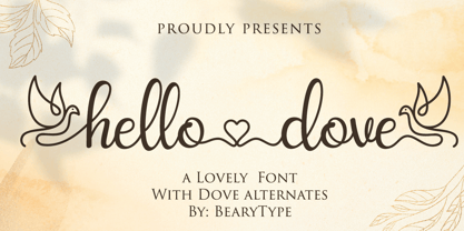 Hello Dove is a sweet and angelic handwritten font. It looks lovely on wedding invitations, thank you cards, quotes, greeting cards, logos, business cards and every other design which needs a handwritten touch. This font is PUA encoded which means you can access all of the glyphs and swashes with ease!
 - Velvet by Reserves,
$39.99 Velvet is a heavy rounded block retro face inspired by the typeset album cover of the protopunk rock band The Velvet Underground’s debut. Stylistically, Velvet’s extreme angled terminals exude a sense of tension and irreverance, contrasting the smooth rounded block letter forms.
 - Dancing Girl JNL by Jeff Levine,
$29.00 The poster for the 1930 film “Show Girl in Hollywood” had the title hand lettered in a squared Art Deco style with some angled cross strokes. This became the basis for Dancing Girl JNL, which is available in both regular and oblique versions.
 - Spiderfingers - 100% free

- Core Circus by S-Core,
$20.00 Core Circus is a layered type family consisting of seven 3D effect layers, eight 2D effect layers and one shadow effect layer. Uppercase and lowercase letters are separated by such features that counters are opened or closed. Core Circus provides other closed counter styles such as numbers with opentype feature (Stylistic Alternatives). Also available Core Magic (Slab- Serif version of Core Circus) and Core Circus Rough(Textured version) The shape of Core Circus is simple but the combinations of effect fonts are impressive. Core Circus makes your works charming and special with endless combinations (at least 262,551 kinds). This family is really nice for book titles, headlines, logotypes and any artworks.
 - Takox by John Moore Type Foundry,
$7.00 Takox is a display typeface based on a synthesis of righteousness extreme, futuristic spirit leads us to a way of plotting the words in a new way and in line with trends and technology synthesis century. Extreme music. Takox is provided with style forms to small caps, in both Regular and Italic. What was the inspiration for designing the font? Takox is the result of my own research in finding straight shapes of great simplicity. What are its main characteristics and features? Display font witn straight shapes of great simplicity. Usage recommendations: This letter design is ideal for use 3D extrusions, ideal to represent natural forms of cristals, metal or mechanical things. Fits indiustriales representations and aerospace, also for extreme music and avant garde.
 - Kamryn by Sharkshock,
$115.00 Kamryn is an updated overhaul of an earlier project. This version retains a distinct retro look with swashes and rounded serifs. This gives it a wholesome feel that will work well in children’s books, 80’s era apparel, or scrapbooking. European accents and extended punctuation were added along with improved kerning and alternates. Overlap may occur in certain uppercase/lowercase combinations. The 3D versions are equipped with several ligatures that correct this.
 - Motor Mouth by T4 Foundry,
$31.00Motor Mouth provides racy type, oozing of high octane gasoline and selfconfidence. Designer Martin Fredrikson CORE, graffiti artist turned typeface designer and car paint expert, combines his sense of speed with raw power lettering. Sloped and cocky, Motor Mouth is an original design in the great tradition of Nascar and Indy 500 and makes you think of roaring muscle cars and hot asphalt. Swedish type foundry T4 premiere new fonts every month. Motor Mouth is our fourth introduction. - Milanello by Mevstory Studio,
$25.00 Milanello is a strong sans serif font with medium contrast. Inspired by the High Octane Rock genre and modern-classic fashion. Carefully designed with a short ascender to give a solid look, also the sharp serif makes the letters look more strong. Milanello is a display-type which perfect for a headline, sub-headline, and short body text for magazine, books, fashion, quotes, hipster t-shirt, signboards, logo, and etc. A great choice for a brave concept!
 - Cremotic by Gatype,
$14.00 Cremotic Sans is stylish with extreme cuts, sharp angles, and interactive straps. Affected characters are spread across three capital-only subfamilies, with distinct styles, and distinct personalities. The bold separation of characters and the considered standard of ligature create a type that is solid, modern, and attractive. Cremotic is a modern fashion serif font, each letter has been carefully crafted to make your text look unique. Don't hesitate to send me a message if you have any questions!
 - Romanica by K-Type,
$20.00 ROMANICA is a relaxed humanist sans with subtly curved corners and slightly flared glyphic terminals that are expressively angled where appropriate. Romanica has the authority of the ages without the harshness of many classically inspired typefaces. All eight fonts include a full complement of Latin Extended-A characters, Welsh diacritics, Irish dotted consonants, and additional oldstyle numerals. ROMANICA is available in three packages - • Basic Family (Regular, Italic, Bold & Bold Italic) • Light (Light & Light Italic) • Medium (Medium & Medium Italic)
 - Galdana by Eurotypo,
$30.00 Galdana font family is a Roman serifs typeface, whose most relevant characteristic is the slanted angle of its true italic, at seventeen degrees. Its design was inspired by one of the most prominent American calligraphers of the last century, the book designer Oscar Ogg. Galdana contains 18 styles: starting from thin to ending in a fat typeface. This family is completed with multilingual support and a set of OpenType features such as stylistic alternates, swashes, and ligatures.
 - Vector by Reserves,
$39.99 Vector is inspired by the 1979 Atari Asteroids video game UI screen font, yet it has been completely reworked to achieve a more balanced and refined visual aesthetic, loosely adhering to the original source. Letterform widths, angles, metrics and kerning are thorougly tweaked throughout in an effort to recreate a modern classic anew and extend it's functionality. Stylistically, Vector accurately reflects it's name, exuding a uniform sense of flatness and rectangular geometry defined by it's retro-modernist origins.
 - Carbines by Gatype,
$14.00 Carbines Serif is Retro with extreme cuts, sharp angles and interactive straps. Affected characters are spread across three capital-only subfamilies, with distinct styles, and distinct personalities. The bold separation of characters and the considered standard of ligature create a type that is solid, modern and attractive. Carbines is a modern fashion serif font, each letter has been carefully crafted to make your text look unique. Don't hesitate to send me a message if you have any questions!
 - Sovana by SG Type,
$19.00 Sovana is a modern, friendly display font with sharply angled serifs. It is fun, elegant, and contemporary. Sovana works great for headlines, logos, branding, posters, packaging, and much more. FEATURES Uppercase alphabet Lowercase alphabet 41 ligatures Big range of numbers, symbols & punctuation Comprehensive language support including: Albanian, Basque, Catalan, Croatian, Danish, Dutch, English, Finnish, French, German, Hawaiian, Icelandic, Indonesian, Irish, Italian, Latvian, Lithuanian, Norwegian, Polish, Portuguese, Romanian, Slovenian, Spanish, Swedish, Turkish, Welsh & more Individual kerning & extensive range of characters
 - King Pong by Dan Auer,
$5.00 Inspired by apes and barrels, King Pong is a display font that's heavy, blocky, yet cheerful. Letterforms are brought to life through removal from a single square. Ascenders and descenders bring contrast and interest to the letterforms through a curved form cut at a 45 degree angle. King Pong works great for themes related to video games, technology, and music while the letterforms perform well in low-contrast environments and in very large formats – such as posters.
 - Metal Cry by Fabulous Rice,
$25.00 Metal Cry is a font family that was inspired by countless hours spent playing video games, watching old movies or reading comic books. And even more hours closely analysing the design of all these things. The art of creating beautiful letters has slowly declined with the rise of the digital age and its solid-colour, 2D fonts. And most of the time, the care given to typography in cultural products just isn't what it used to be anymore. This was the inspiration for Metal Cry, a family of 4 layerable fonts that can bring a feeling of depth to its letters, and offers endless possible combinations. Metal Cry Outlands is the basic shape of all the characters, it can be used as the bright side of the bevel. Metal Cry Front is the inline border font that can be used as the front side of the bevel. Metal Cry Shadow can be used as the dark side of the bevel. Metal Cry Depth can be used to flash out the inside shape of the letter. But of course, any font can be combined with any other font(s) to obtain various results. The planets in the above visuals are courtesy of 3D artist Thomas Veyrat / veyratom.com
 - Grotesque - 100% free

- Milla Cilla - Personal Use - Personal use only

- Yorktown - Personal use only

- Jetmix - Unknown license

- Zapped Sticks - Personal use only

- Stroke Dimension - Personal use only


