3,714 search results
(0.02 seconds)
- Beckinslade by Greater Albion Typefounders,
$15.95 Beckinslade is a lovely elaborate blackletter face, released just in time for Christmas, but useable at any time of the year. It is in the best traditions of Victorian Gothic revival, drawing inspiration from a range of sources and marrying them into one homogenous whole. The emphasis is on aesthetics rather than historical accuracy. Great fun though for anywhere ‘ye olde’ look is desired.
 - Century Expanded by Bitstream,
$29.99Shortly after the preparation of the original Century, the two Bentons (father Linn Boyd and son Morris Fuller) prepared a wider version for De Vinne’s press and called it Century Broadface. In 1900 ATF released the design for general use as Century Expanded, one of the most popular and effective of typefaces, to this day the text face of the New York Daily News. - P22 Monet by P22 Type Foundry,
$24.95 This font set was developed for the Albright-Knox Art Gallery and their 1999 Monet exhibition, Monet at Giverny: Masterpieces from the Musée Marmattan. Monet Regular is a fairly straightforward script font with an undulating thick and thin stroke. Monet Impressionist is a semi-legible script which can be used for decorative rather than communicative purposes. Monet Sketches features 26 icons related to Monet's imagery.
 - Jumbo Mumbo NF by Nick's Fonts,
$10.00This rather quirky typeface is based on a design by Collette and Dufour, originally called "Independant", for the Maison Plantin foundry of Belgium. Ultramodern (by 1930s standards, at least) and ultrabold, it takes up a lot of real estate, and commands a lot of attention while doing so. Both versions of this font include the complete Unicode Latin 1252 and Central European 1250 character sets. - Rustika by Linotype,
$40.99Rustika is a rather rough Oldstyle typeface. The roughness is seen in larger points only. In smaller points it is not easy to see that I tried to imitate characters cut with a chisel. The characters themselves follow otherwise totally the classic models. The name, in this spelling taken from Esperanto, refers to the rustic nature of the characters. Rustika was released in 1995. - Cabarga Cursiva by ITC,
$29.00Cabarga Cursiva is the work of the father and son team of Demetrio E. Cabarga and Leslie Cabarga, both New York designers. The details of the sharp strokes almost give the impression of a knife blade, whether straight or curved like a scimitar. The capitals should be used only as initials and are complemented by a robust lower case alphabet as well as alternate forms and ligatures. - Yan 333 Pro by JY&A,
$45.00 JY&A’s most distinctive calligraphic font, Yan Series 333 is usable at all resolutions and remains legible. Even though it has a strong calligraphic influence, the Yan Series is ideal for text settings that have to appear special. Designed by Jack Yan, the family was developed between 1987 and 1993. Yan studied the effect of a nylon-tip, rather than steel-nib, pen on paper.
 - Acaraje by Latinotype,
$39.00 Acarajé is a grotesque font that stands out thanks to its versatility. Its personality blossoms through its particular modulation, which grows with weights; making it a rather jovial typeface that does not abandon the characteristics of more classic grotesques. With two styles available: normal and italic, and a variety of 7 weights that range from "Black" to "Regular", this font offers incredible flexibility for your designs.
 - Galerie by ArtyType,
$29.00 Incorporating a certain Gallic ‘je ne sais quoi’ Galerie is a chic & stylish sans serif, though you'll notice some short tails with angled terminals acting rather like serifs, lending a sophisticated characteristic to its balanced proportions. Galerie’s large x-height makes it a very legible font family, available in 4 weights: Thin, Light, Medium and Bold. See also the condensed sister family Galerie 2.
 - Fire Down Below NF by Nick's Fonts,
$10.00The letterforms for this typeface are pretty much standard block gothic, but its prismatic treatment features a twist: the letters appear to be lit from below rather than above, which is usually the norm. The result is a perfect choice for dramatic headlines. This font contains the complete Latin language character set (Unicode 1252) plus support for Central European (Unicode 1250) languages as well. - Chromium Yellow NF by Nick's Fonts,
$10.00The Chromium Yellow family is based, very loosely, on Electro-type Serif, designed by John Wu of Hong Kong’s Archetype foundry. The rather quirky serifs have been removed and a few odd letter treatment have been amended to produce a smooth, techno-friendly family of faces. This font contains the complete Latin language character set (Unicode 1252) plus support for Central European (Unicode 1250) languages as well. - Americana by URW Type Foundry,
$35.99 Americana is a transitional typeface with very rounded, open characters. It was designed in 1967 by Richard Isbell for American Type Founders. Americana is a wide and open face with short, wedge serifs and a rather large x-height. Typical uses for this typeface are advertisements, short pieces of text, such as greeting cards and leaflets. The Americana font family is also ideal for headlines.
 - Berlewi FA by Fontarte,
$39.00 FA Berlewi is inspired by stencil lettering of a vanguard creator, Henryk Berlewi, who was a precursor of contemporary typography, a painter and a creator of the mechano-facture (Mechano-Faktura) theory. In 1924 he designed a poster for his mechano-facture one-man show in Warsaw Austro-Daimler car salon. An attention-grabbing composition with stencil lettering was doubtless a real innovation and according to Berlewi - the first typographic poster to be made in Poland.
 - Mustang by Linotype,
$29.99German Designer Klaus Sutter digitized Mustang, a brush script typeface from the 1950s originally drawn by Imre Reiner (1900-1987) and published in 1956 by D. Stempel AG. Mustang is a right slanted brush type drawn with simple and strong strokes. It has a dynamic character, and could be perfectly applied for emphasis in headlines. Mustang has the character of Imre Reiner's handriting. Imre Reiner was a prominent book illustrator, painter, and typographer during the 1950s. - Sightseeing Tour JNL by Jeff Levine,
$29.00 Samuel Welo was a sign painter who had published in the 1920s and again in 1960 his “Studio Handbook – Letter and Design for Artists and Advertisers”, prolifically hand lettering all of the type style examples within the pages of the publication. In 1930 Welo also published “Lettering - Practical and Foreign”. From this book comes a thick-and-thin hand lettered Art Deco alphabet – now available digitally as Sightseeing Tour JNL in both regular and oblique versions.
 - Misses Twiggs by Type Innovations,
$39.00 Misses Twiggs is a contemporary modern serif created by the American type designer Alex Kaczun. It compliments its partner Mister Twiggs and is a perfect marriage of two fonts. Mister Twiggs brings his tall good looks and Misses Twiggs bring her cute little serifs to the relationship. There are absolutely no curves in these elegant typefaces. Both fonts have sharp corners with extra tall capitals and narrow waistlines. Misses Twiggs also comes in 3 flavors: regular, thin and heavy.
 - Durer Display by iframe,
$28.00 Durer is a modern font, its soft curves and refined details create a sense of elegance. Inspired by the work of Albrecht Dürer (21 May 1471 – 6 April 1528), who was a German painter, printmaker, and theorist of the German Renaissance. Born in Nuremberg, Dürer established his reputation and influence across Europe in his twenties due to his high-quality woodcut prints. 551 Glyphs Upper / lower case, numbers, punctuation Language support: Latin / Greek Designed by iframe type foundry
 - Fiebiger Eins by Hanoded,
$15.00 Franz Fiebiger (1880 - 1932) was an Austrian painter and designer who was associated with the Vienna Secession. In 1908 he created a beautiful poster for the Kaiserjubiläums Möbel Ausstellung - a furniture exhibition during the Kaiser's Jubilee. Fiebiger Eins (meaning Fiebiger One) is based on one of the hand made typefaces gracing this poster. As I had to work with only a few glyphs, I designed the missing ones myself. Fiebiger Eins comes with language support befitting a Kaiser...
 - Plate Gothic by Monotype,
$29.00Around the turn of the twentieth-century, Steel and copper plate engraving was the most sophisticated and expensive method for producing business cards, stationery, and formal announcements. In engraved printing, the image is incised, or engraved into a hard, flat plate. Ink is applied to the plate, and then wiped off; leaving only the ink that is trapped below the surface in the incised areas. When the paper is pressed against the flat plate, the ink is drawn out of these areas and transferred to the paper. The results are twofold: printing which sits above the surface of the paper, and the reproduction very delicate lines and shapes. For business and formal printing, engraved printing was, and is, considered the best. The problem is that not everybody can afford the best. Type foundries, in the early 1900s, figured that if they could produce a typeface for traditional printing, which had appearance of engraving, they would be able to satisfy the needs of those forced to live with modest printing budgets. Engravers faces were born. Fredric Goudy’s Copperplate Gothic was one of the most popular. Plate Gothic is a version of this style updated for digital technology. It has all the charm and charisma as the metal type and yet is perfect for today's needs. - Pelegotic by T4 Foundry,
$21.00Pelegotic makes you think of Scandinavian pioneer design, with its functional letterforms and architectural look. It is also a very versatile typeface, and fits easily as headline type for a magazine, or as part of a graphic profile for a company. It looks simple, but that impression is deceptive; the letters are drawn with a flair and individuality that shows the hand of a master typographer. Pelegotic Regular is rather thin, and is useful for big type like signs. Veteran designer Bo Berndal has created Pelegotic: "Pelegotic is a sansserif inspired by the Art Deco of the 20's and the Swedish functional style of the 30's. The slightly condensed design is an attempt to find a somewhat more elegant lettershape than the usually rather technical expression of monoline typefaces", says Bo Berndal. Pelegotic comes in three weights, with roman and italic in each weight. It is an OpenType creation, for both PC and Mac. - Scala Sans Pro by Martin Majoor,
$49.00 The award-winning Scala family (1990-1993) is a worldwide bestseller and has established itself as a ‘classic’ among digital fonts. It was one of the first serious digital text fonts to support small caps, ligatures and different set of numbers. In fact Scala and Scala Sans (1990-1993) are two workhorse-like typefaces sharing a common form principle: the skeletons of both Scala and Scala Sans are identical, therefore they can be combined perfectly. Where many of the modern sans serifs (like Helvetica and Univers) have rather ‘closed’ letter shapes, the same elements in Scala Sans are much more ‘open’. This greatly improves legibility, especially in the smaller point sizes. The italic of Scala Sans is not a slanted version of the roman, but rather a ‘real’ italic. Another part of Scala is very popular among its users: Scala Hands, containing more than one hundred decorative hands and pointers, is included in the Scala fonts and is a free bonus.
 - MohoBis Pro by John Moore Type Foundry,
$36.00 MohoBis is a fancy font based on the multiplication of a source in many strokes way to create a texture called kinetic. This can mean substantial savings in printing ink. Parallel serves to create unusual headlines and prominent texts that provides an attractive modern typeface, ideal for packaging, editorial design and logos.
 - Beast Sketch by 38-lineart,
$19.00 "Beast Sketch" is an extraordinary handwritten font created with bold, untamed strokes using ink and a bamboo pen. It boasts a masculine aesthetic, an organic, natural feel, and extensive Latin character support. Perfect for book titles, magazine covers, logos, and more, it adds a raw, authentic, and compelling vibe to your projects.
 - Raguki by Saga Studio,
$20.00 Raguki is a sans serif display font with a modern and unique style. Aesthetic letterforms with stylistic ink traps make this font have bags of personality. Raguki has open-type features (salt and ss01) that enable the user to transform the letterforms to create different designs. We hope you enjoy it. Saga Studio
 - Gallows Hill by Hanoded,
$15.00 I am creating new fonts for my Halloween collection and Gallows Hill is the latest one. It was made using a cheap brush, gouache mixed with Chinese ink and paper. The result is a very messy, rough and scary font. As a bonus, I have added double letter ligatures for the lower case.
 - Frelline Script by Soft Creative,
$14.00 Frelline looks beautiful on wedding invitations, thank you cards, quotes, greeting cards, logos, business cards and more. Perfect for use in ink or watercolors. Including beginning and end letters, alternative support and many languages. I made this font very carefully so that each letter looked very unique and had various beautiful alternatives.
 - Nouveau Nights JNL by Jeff Levine,
$29.00 The deep well of creativity that is the era of the hand lettered sheet music title page brings forth Nouveau Nights JNL. Re-drawn from a period example of the 1920s, this titling font perfectly captures the warm "human" look of pen and ink lettering, long before the advent of "perfect" digital type.
 - Morning by Monotype,
$15.99 Morning’s spirited, bouncy cursive letterforms feel like a painter’s signature; it’s a familiar style but with something of a twinkle in its eye. The style of Morning looks to imitate wet brush and ink lettering, and dances between seriousness and play. You’ll find a mix of letter connections here, and some ligatures, too.
 - Murisa Rania by Murisa Studio,
$10.00 Murisa Rania is our next very attractive font. Have you ever imagined a font that is formed from brush strokes whose ink is almost dry? That's what this font is made of. Murisa Rania combines elements of art and high technique in its creation to create a unique, attractive and beautiful font.
 - Fictionalism by Haiku Monkey,
$10.00 Fictionalism is carefully handcrafted slab serif, slightly condensed to fit lots of beautiful text wherever you need. It's handwritten, but neat as a pin; it's tidy, but has a lively character that grabs attention in a friendly way. Use it for branding, posters, text, or a million and one other design applications.
 - Jesitta Signature Swash by Mega Type,
$10.00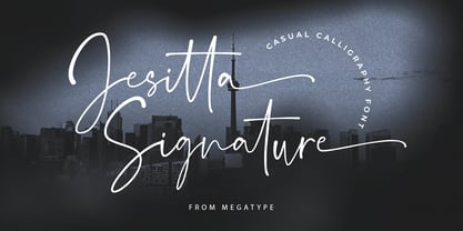 Jesitta Signature Font is a modern and elegant signature style script font with magical ink strokes. Jesitta Signature is a great choice for watermarks on photography, advertising, logos & branding, watermarks, weddings, invitations, product design, labels and other design projects. Please contact us if you have any questions, we are happy to help you!
 - LP Harmonia by URW Type Foundry,
$35.99 LP Harmonia arose from its designer’s private life. As a type designer, Peter Langpeter was often asked by friends or relatives to write a greeting on a birthday card or create a good looking invitation. Over the years, he used ink and a soft feather to form his personal handwriting: LP Harmonia.
 - Dragonblood by Hanoded,
$20.00 Dragonblood is quite an unusual font: it was made with Parker ink and a Chinese fur brush. When all the glyphs had been vectorized, and I saw them in a text for the first time, the only appropriate name I could think of was Dragonblood. Dragonblood comes with a realm of diacritics.
 - Katalina by Shape Studio,
$12.00 Katalina Font is a new modern script calligraphy font with an irregular baseline. Trendy and feminine style.Katalina Font Script looks lovely on wedding invitations, thank you cards, quotes, greeting cards, logos, business cards and more. Perfect for using in ink or watercolour. Including initial and terminal letters, alternates, ligatures and multiple language support.
 - Greatness Serif by Shape Studio,
$14.00 Greatness font is a new modern serif calligraphy font with an irregular baseline. Trendy and feminine style.Greatness font looks lovely on wedding invitations, thank you cards, quotes, greeting cards, logos, business cards and more. Perfect for using in ink or watercolour. Including initial and terminal letters, alternates, ligatures and multiple language support.
 - Fat Inker by Hanoded,
$10.00 For once the name of this font corresponds with the way it looks: Fat Inker is a fat, inky font. I made it with a Chinese brush and ink, Fat Inker is a nice poster font and it comes with extensive language support and some cool discretionary ligatures for double letter combinations.
 - Tropical Asian by Konstantine Studio,
$16.00 Tropical Asian, inspired from the summer vibes and the fun of careless brush and ink play in paper. Perfectly fit for welcoming summer and your casual fun branding projects. Teamed up with the Stylistic Alternates for each Uppercase and Lowercase letters, Multilanguage Support, and Vector Illustration pack to vibin' up this font.
 - Better Step by Siwox Studios,
$13.00 Better Step is a handmade font with stunning characters. Made with a brush and high-quality water-based ink. Ideal for name tags, handwritten quotes, product packaging, merchandise, social media, greeting cards, etc. To make your designs look even more naturally handwritten, Better Step has 1 extra set of alternate lowercase letters.
 - Architype Catalogue Solid by The Foundry,
$50.00 Architype Crouwel is a collection of typefaces created in collaboration with Wim Crouwel, following his agreement with The Foundry, to recreate his experimental alphabets as digital fonts. Crouwel's most recognized work was for the Van Abbe and Stedelijk museums (1954 –72) where he established his reputation for radical, grid-based design. Architype Catalogue’s soft ‘padded’ letterforms were originally created by Wim Crouwel for the Stedelijk museum’s 1970 exhibition of sculptor Claes Oldenburg.. Crouwel said, ‘When you look at Oldenburg’s work, with all those soft objects, it gets into your system, so you try to integrate that feeling in the design. Claes was very taken with the catalogue's typeface, and asked me if I would do the whole alphabet for him, so I did. I cut it all out in pink paper and pasted it together’.
 - Architype Fodor by The Foundry,
$99.00 Architype Crouwel is a collection of typefaces created in collaboration with Wim Crouwel, following his agreement with The Foundry, to recreate his experimental alphabets as digital fonts. Crouwel's most recognized work was for the Van Abbe and Stedelijk museums (1954 –72) where he established his reputation for radical, grid-based design. The Fodor letterforms were created for the magazine published by Museum Fodor, Amsterdam. To save cost it was designed to be ‘typeset’ on their own electric typewriter. The resulting monospaced effect was combined with a background of orange overlaid with pink dots that provided a page grid to align the text to. The title set on the dot matrix formed the 'system' for construction of the ‘digital effect’ letterforms. Now Architype Fodor recreates these letterforms as a truly digital font.