4,236 search results
(0.062 seconds)
- Art Exhibit JNL by Jeff Levine,
$29.00 In the 1930s the WPA (Works Progress Administration) was involved with getting a number of Americans back to work during the Great Depression. One faction of the WPA's efforts was the Federal Art Project. Thin, condensed hand lettering on a poster for an Art Exhibition at the New Bedford Free Public Library is the inspiration for Art Exhibit JNL.
 - Chanson De Paris JNL by Jeff Levine,
$29.00 A couple of pieces of sheet music from France [circa 1925] offered the inspiration for Chanson De Paris JNL (Song of Paris), which is available in both regular and oblique versions. This hand lettered Art Nouveau style features a unique take on thick-and-thin lettering which foreshadows the Art Deco typefaces to come during the 1930s.
 - Night Delivery by Kitchen Table Type Foundry,
$15.00 Since I live in a hamlet without any facilities whatsoever, I order a lot online. Most deliveries are done during daytime, but some companies prefer to deliver my stuff at night. When I was drawing out the glyphs for this font (using my Chinese ink and a broken paint stirrer), the door bell rang. It was a Night Delivery…
 - Futura ND Black by Neufville Digital,
$45.25 Designed by Paul Renner and published in 1929. It shows an alternative method of giving maximum thickness to a font by being designed to resemble the use of a stencil. It was a very fashionable typeface during the avant-garde period. It is still an excellent typeface for display use. Futura is a Trademark of BauerTypes SL
 - Visual Arts JNL by Jeff Levine,
$29.00 Visual Arts JNL is a classic Art Deco typeface based on the hand lettering found on a 1930s-era WPA (Works Progress Administration) poster for Women Artists. The exhibit took place in the Federal Art Gallery in Boston, and was part of the arts project underwritten by the WPA to keep many creative people working during the Depression years.
 - DF Staple Mono by Dutchfonts,
$33.00 DF Staple Mono is a personal answer on the archaic and ‘middle-of-the-road’-forms of typewriter typefaces like ‘Courier’ and ‘American Typewriter’. The form of a staple (office supply no. 1) and its transformations inspired me during the design process. The first four weights are all monospaced and are completed with a real italic.
 - Uptown Line JNL by Jeff Levine,
$29.00 Ask any typical New Yorker about subway directions and they'll tell you to take the "uptown line", "downtown line" or "cross-town line". Uptown Line JNL is yet another variation of the Art Deco monoline style of lettering prevalent during the 1930s and 1940s, and is based on titling from vintage sheet music for a Johann Strauss classical piece.
 - Roney JNL by Jeff Levine,
$29.00If it's at all possible to "Deco-ize" an Art Deco font even more, it's been done with Roney JNL. Named for one of the classic hotels built during the heyday of Miami Beach, this font is a stylized version of Jeff Levine's Metalet Modern; a design derived from an actual 1940s home movie titling set. - Movie Night JNL by Jeff Levine,
$29.00 Movie Night JNL was modeled from one of a number of ceramic home movie titling kits on the market that were popular during the 1950s and 1960s. The camera buff would set up the letters against a colored background and photograph clever titles to describe their 8mm home movies of vacations, sightseeing or their darling children (or grandchildren).
 - Music Lesson JNL by Jeff Levine,
$29.00 During the 1940s and 1950s, the Miller Music Corporation issued a number of its songs with a stock cover design for their “Miller Series of Piano Solos” but the song titles were hand lettered in an Art Deco dual line design. Recreated digitally as Music Lesson JNL, this type design is available in both regular and oblique versions.
 - Inked Bones by Mans Greback,
$59.00 Inked Bones is a hand painted blackletter typeface, created by Måns Grebäck during 2019. It works perfectly in Medieval contexts as well as in modern Gothic style typesetting. Use the typeface for a tattoo graphic or for your Middle Age project. The font supports all Latin-based European languages, contains numbers and all symbols you'll ever need.
 - Firstly by Mans Greback,
$59.00 Firstly is a script font with a unique character. It was created by Måns Grebäck during 2019 and 2020. Its wavy shapes and soft flow gives any project or logotype a well-balanced personality. It has an extensive lingual support, covering all European Latin scripts. The font contains all characters you'll ever need, including all punctuation and numbers.
 - Pinky Scream by Illushvara,
$18.00 Pinky Scream is the ideal for for any crafting project during the scariest time of the year. It will take any Halloween craft with the sweet feeling to the next level! Font includes: All caps glyphs, numbers, basic punctuation, and international characters. If you have any question, don’t hesitate to contact me. Happy Designing !!! Thank You, Bayu Suwirya
 - Querino Sans by Mans Greback,
$59.00 Querino Sans is an extra-bold sans-serif font, created by Måns Grebäck during 2018 and 2019. It comes as a regular, upright version and as italic. The font is multilingual and has an extensive range of glyphs; it supports all Latin-based European languages, contains numbers as well as all symbols and characters you'll ever need.
 - FreeDee by HouseOfBurvo,
$- FreeDee is a re-draw of some experimental lettering first drawn during A-Level (just after high-school) art and design studies. It was originally purely self initiated, and one of the first things I used Illustrator to draw. This version takes the original handful of letters and extrapolates a full alphabet with basic latin accents.
 - Put My Foot Down by Ingrimayne Type,
$14.95 If you grew up in the north, you may have stomped out letters in the fresh snow during the winter. Memories of such winter fun helped inspire this typeface. If one can do the typeface with shoes or boots, one can also do it with bare feet and hands. Non-human variants are possible, such as bird tracks.
 - Circles JY by JY&A,
$39.00Based on electrical circuitry, David Philpott's Circles typefaces are oddly legible, even though one might think they were destined for display usage only. The circle is the base form, repeated throughout the design. Originally drafted during his time at the Massey University School of Design, subsequent refinements have turned Circles into two complete fonts with a full character set. - Schoonheid by Fauzistudio,
$12.00 Schoonheid is based on the thick and thin Gothic typeface that was popular in the US during the first half of the 20th century. Schoonheid Contextual Capitals has more than 100 ligatures, alternatives, and special characters consisting of uppercase letters. Implementing alternative Contextual features makes it easier for all people to use. Hope you enjoy. Intuisi Creative
 - Conscription JNL by Jeff Levine,
$29.00 The sheet music for the 1914 Word War I comic novelty song "When the War Breaks Out in Mexico I'm Going to Go to Montreal" had one of those overly-worded song titles popular during this period (13!), along with interesting sans serif hand lettering. It now debuts digitally as Conscription JNL in both regular and oblique versions.
 - Telegram by ITC,
$29.00Telegram is the work of British designer Timothy Donaldson, a casual style influenced by the ball and rod, or atomic, imagery popular during the 1950s. Donaldson called the typeface Telegram because it reminds him of dots and dashes. Telegram is a play alphabet which communicates an almost childlike innocence and is ideal for work directed at younger people. - Bitmap Sketch by The Tree is Green,
$20.00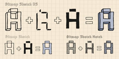 Inspired by early bitmap fonts, hand drawn for a contemporary twist.
 - Halena by Sakha Design,
$12.00 Halena is a modern and adaptable sans serif font. Suitable to a wide variety of designs due to its neat and simple style, this font has the potential to become your favorite go-to font, no matter the occasion!
 - Salminah by Letterafandi Studio,
$14.00 Salminah is a fashionable and thin lettered script font. Suitable to a wide variety of designs due to its neat and simple style, this font has the potential to become your favorite go-to font, no matter the occasion!
 - RM New Albion by Ray Meadows,
$19.00 A classic blackletter Which looks best at 16pt and above. Due to the modular nature of this design there may be a slight lack of smoothness to the curves at very large point sizes (around 100 pt and above).
 - Qareluna by Typebae,
$12.00 Qareluna is a beautiful and elegant sans serif font. Suitable to a wide variety of designs due to its neat and simple style, this font has the potential to become your favorite go-to font, no matter the occasion!
 - Tuba by Canada Type,
$24.95 Initially commissioned in the summer of 2009 for a popular North American ice cream parlor chain we cannot name, Tuba started with a reconceptualization of a somewhat flawed '72 alphabet idea by Swiss graphic designer Erwin Poell. During the back-and-forth of the custom project, other ideas seeped into the design, mostly from other Canada Type fonts, like Fab, Jonah, Jojo and Teaspoon. The end result was what the client called a "sugar circuit trigger alphabet". This now is the retail version of that project. Tuba's main style is a straight-forward mix of 60s/70s art nouveau ideas and late-70s/early-80s tube aesthetic. The Highlight and Outline styles are almost necessary spinoffs for this kind of typeface. And the all-caps Black style is a nod to the fat font fad of the past couple of years. All styles contain many alternates – so many that each style is almost two fonts in one. Make sure to check out the character sets for a few nice and useful surprises. Life's too short. Seek sweetness. Get gooey.
 - Arzachel by CAST,
$45.00 Arzachel is a humanistic sanserif with a big x-height and a specific organic look. Its design is scientifically sharp and efficient in small type sizes as well as rugged and dramatic in headlines. Arzachel’s essential feeling comes from several features: all the letters are slightly sloped, stem terminations are flared at the top, and the terminals in letters a, c, e, f… are widening with the inside parts completely flat. The stroke contrast is low in the regular weight while it increases in the black; finally the capitals have an inscriptional flavor. Despite being a sanserif (thus a product of recent typography) Arzachel’s roots stretch back to the Renaissance tradition: Olocco took inspiration from some of the early and rather weird types cut in Venice in the 15th century. Arzachel was conceived during Olocco’s MA in Reading to provide a companion for his Zenon for use in small type sizes. But instead of expanding the Zenon family with optical sizes, the designer decided on a sans with its own personality rather than a sanserif version of Zenon with chopped-off serifs.
 - Ongunkan Lepontic Script by Runic World Tamgacı,
$45.00 Lepontic is an ancient Alpine Celtic language that was spoken in parts of Rhaetia and Cisalpine Gaul (now Northern Italy) between 550 and 100 BC. Lepontic is attested in inscriptions found in an area centered on Lugano, Switzerland, and including the Lake Como and Lake Maggiore areas of Italy. While some recent scholarship (e.g. Eska 1998) has tended to consider Lepontic simply as an early outlying form of Gaulish and closely akin to other, later attestations of Gaulish in Italy (Cisalpine Gaulish), some scholars (notably Lejeune 1971) continue to view it as a distinct Continental Celtic language. In this latter view, the earlier inscriptions found within a 50 km radius of Lugano are considered Lepontic, while the later ones, to the immediate south of this area, are considered Cisalpine Gaulish. Lepontic was assimilated first by Gaulish, with the settlement of Gallic tribes north of the River Po, and then by Latin, after the Roman Republic gained control over Gallia Cisalpina during the late 2nd and 1st century BC
 - Ragazza Script by Latinotype,
$79.00 Ragazza Script isn’t just another display typeface. It honors the greatest handwriting skills but in a different way. Although It doesn't represent any traditional calligraphy style, it is still part of that expressive world. With more than 1000 glyphs, and taking advantage of the Opentype features, Ragazza is full of personality. When in use, it gives a feel very close to ornamental Copperplate mixed with some kind of modern 'high-contrast' typeface. Lots of alternates, swashes and initial capitals are the spine of this face, assuring almost infinite combination possibilities. The early forms that would eventually lead to what Ragazza is today, began as a college project –around 2006– in the context of the 'Hyperfuente' exercise developed during Typography 2, chair E. Longinotti, at the University of Buenos Aires. But that seed would never stop growing. Since then a lot of work had been made to take that initial project to a professional quality level. Ragazza Script is perfect for headlines and short phrases. It is the brand new modern script, designed by Guille Vizzari and published by Latinotype.
 - RM Victoriana by Ray Meadows,
$19.00 A decorative and fancy slice of the gay '90s (1890s that is). Due to the modular nature of this design there may be a slight lack of smoothness to the curves at very large point sizes (around 100 pt and above).
 - Ignorant by Bogstav,
$14.00 Ignorant was actually drawn on a grid. But due to the loose strokes of the pen, Ignorant has a lively look. I was thinking products for kids, packaging, organic products or something alike that needs a slightly rough and handmade font!
 - Magisk Time by Bogstav,
$11.00 This is my roughly handprinted typewrite-ish font. It has all the cool and classic moves of the traditional typewriter look, but with a more rough attitude due to the contextual alternates (which offer 6 different versions of each letter!)
 - LHF Centennial Panels 1 by Letterhead Fonts,
$46.00 One of four fonts consisting of the best old fashioned panels from Golden Era Studios. Each font contains 36 expertly drawn panels. Each letter generates a different design. Special Note: Due to the large file size of these fonts, they will not convert for use in Gerber Omega. Instead, Omega users may wish to use an alternate program to type the characters and import them into Omega as .eps files. CorelDraw users should use the "Weld" command rather than "Convert to Curves" command to convert these fonts to vector outlines. Otherwise, the program may crash due to the sheer number of points in each panel.
 - Grand Canyon by Red Rooster Collection,
$45.00 Based on an early wood type design. An original creation, that kept growing...!
 - Yarker by Corien’s Handwritingfonts,
$19.00 Yarker is the Business Hand of the late 1800's early 1900's.
 - Altemus Arabesques by Altemus Creative,
$11.00 A collection of 174 calligraphic designs derived from early 20th Century European arabesques.
 - Fansy by Jörg Schmitt,
$9.90 This font should be used with all three formats. It is recommended to use it in big font sizes due to the thin hairline of Fansy A. Have fun playing with the new modern and fancy display font designed by Jörg Schmitt.
 - RM Random by Ray Meadows,
$19.00 A fun design, useful for many informal applications. Based on hand-drawn letters. Due to the nature of this design there may be a very slight lack of smoothness to the curves at extremely large point sizes (around 200 pt and above).
 - Hero If Plus by Ingo,
$12.00 A type of “handwriting” discovered by chance, extremely abstract On April 8, 1948 a certain Walter Plaga wrote a crude poem about a hero on a commemorative plaque. The very poor reproduction of the handwritten original, etched into a metal sheet, produced extremely abstract forms so that — even if unintentional — a script completely void of bowls was created. That which originally was the normal clumsy handwriting of a layman thus transformed into a pseudo-modern deconstructive typeface, which in the 21st century appears contemporary. The capital letters especially reflect the original: in part they show forms labeled incorrectly ”old German“ handwriting, which is actually Latin, in the letters A D G I J K L S V W X Z , whereas C H N O P R appear very modern. Truly a form of handwriting: without joining the letters, especially between the lower case characters, a silhouette effect is formed. To a great extent Hero is impressive due to its driven-to-the-limit abstraction and to a lesser extent by retaining an antiquated and nearly illegible effect.
 - Hollenbeck JNL by Jeff Levine,
$29.00Hollenbeck JNL is the Art Deco, all-caps cousin of Jeff Levine's Hallandale JNL typeface. This version utilizes the thick-and-thin stroke weights so popular during the Art Deco era, while retaining the look of hand-lettered copy. Best suited at larger point sizes, this font is a nice alternative to the over-used display faces reminiscent of that time period.