10,000 search results
(0.121 seconds)
- Onyon by Ingrimayne Type,
$9.00 Onyon is a bizarre typeface with vertical stems that thicken in the middle and narrow at the ends. It was created as an experiment to see what a typeface would look like if the vertical stems were diamond or rhombus shaped. The letters are angular with unusual triangular serifs and they have no curves. It is a harsh, cruel typeface that will make your eyes water if you use it at small point sizes for text.
 - TCF Plastico by TypeCult Foundry,
$22.00 Inspired by the idea of the plastic model kits, TCF Plastico is a modular typeface that reflects the spirit of the 60’s, the Pop culture and the industrial design of that era. Despite the very simple and straightforward geometric shapes, TCF Plastico is a very delightful and humorous typeface. TCF Plastico was designed with a couple of special OpenType features in order to ensure the connection between all of the characters, but only when necessary.
 - Hello Bosnia Serif by Gatype,
$5.00 Hello Bosnia is a modern serif family signature font that is packaged in a modern and classy style, complete with your OpenType feature access to access a large selection of alternative fonts and bindings, the choice of fonts you like from large and small font variations to luxurious and elegant looks. This font is perfect for branding projects, Logo design, Apparel Branding, packaging, magazine titles, advertisements, T-shirts, postcards and more. Hello Bosnia is encoded with PUA Unicode, which allows full access to all additional characters without having to design any special software. Mac users can use Font Book and Windows users can use Character Map to view and copy any additional characters to paste into your favorite text editor/app. Designer: khaidir
 - Millettre by ParaType,
$30.00 A calligraphic script font Millettre is the last member of the trilogy of types designed by Lyudmila Mikhailova. First two fonts Milanette and Milafleur were released earlier. The font is based on author's lettering artworks which she did for many years for companies who produced greeting cards. The characters of the font have rough contours simulating lettering by a pointed pen on a rough paper. The character set covers standard Western, Central European and Cyrillic code pages. The default version of the font is presented by disconnected script, but connected variant is also included and organized as an alternative stylistic set. The font also contains some initial, finial and alternative forms of letters. Recommended for use in advertising and display typography. Released by ParaType in 2011.
 - Aphrosine by ParaType,
$30.00 Aphrosine is a font based on pointed pen script. A huge lot of alternatives and smart OpenType features allow it to look almost indistinguishable from real live handwriting. Aphrosine is something between handwriting and calligraphy: it took too much effort for being “just handwriting” but lacks seriousness and regularity comparing to true calligraphic fonts. That’s why it was called after a peculiar character from a children’s book: a witch who was very fond of dressing, makeup and writing letters. Aphrosine has three faces. But unlike most other type families, the glyphs from one face do not match exactly the glyphs from another one. The faces are based on writing with different nibs but by the same hand. The type is designed by Alexandra Korolkova and Alexander Lubovenko and released by ParaType in 2015.
 - Gill Display Compressed by ITC,
$29.99The successful Gill Sans® was designed by the English artist and type designer Eric Gill and issued by Monotype in 1928 to 1930. The roots of Gill Sans can be traced to the typeface that Gill's teacher, Edward Johnston, designed for the signage of the London Underground Railway in 1918. Gill´s alphabet is more classical in proportion and contains what have become known as his signature flared capital R and eyeglass lowercase g. Gill Sans is a humanist sans serif with some geometric touches in its structures. It also has a distinctly British feel. Legible and modern though sometimes cheerfully idiosyncratic, the lighter weights work for text, and the bolder weights make for compelling display typography. Gill Sans is also available as Value Pack for Macintosh, PC or as Hybrid CD with both platforms. - Gill Sans MT Greek by Monotype,
$67.99The successful Gill Sans® was designed by the English artist and type designer Eric Gill and issued by Monotype in 1928 to 1930. The roots of Gill Sans can be traced to the typeface that Gill's teacher, Edward Johnston, designed for the signage of the London Underground Railway in 1918. Gill´s alphabet is more classical in proportion and contains what have become known as his signature flared capital R and eyeglass lowercase g. Gill Sans is a humanist sans serif with some geometric touches in its structures. It also has a distinctly British feel. Legible and modern though sometimes cheerfully idiosyncratic, the lighter weights work for text, and the bolder weights make for compelling display typography. Gill Sans is also available as Value Pack for Macintosh, PC or as Hybrid CD with both platforms. - Gill Kayo Condensed by ITC,
$40.99The successful Gill Sans® was designed by the English artist and type designer Eric Gill and issued by Monotype in 1928 to 1930. The roots of Gill Sans can be traced to the typeface that Gill's teacher, Edward Johnston, designed for the signage of the London Underground Railway in 1918. Gill´s alphabet is more classical in proportion and contains what have become known as his signature flared capital R and eyeglass lowercase g. Gill Sans is a humanist sans serif with some geometric touches in its structures. It also has a distinctly British feel. Legible and modern though sometimes cheerfully idiosyncratic, the lighter weights work for text, and the bolder weights make for compelling display typography. Gill Sans is also available as Value Pack for Macintosh, PC or as Hybrid CD with both platforms. - Gill Sans MT WGL by Monotype,
$92.99The successful Gill Sans® was designed by the English artist and type designer Eric Gill and issued by Monotype in 1928 to 1930. The roots of Gill Sans can be traced to the typeface that Gill's teacher, Edward Johnston, designed for the signage of the London Underground Railway in 1918. Gill´s alphabet is more classical in proportion and contains what have become known as his signature flared capital R and eyeglass lowercase g. Gill Sans is a humanist sans serif with some geometric touches in its structures. It also has a distinctly British feel. Legible and modern though sometimes cheerfully idiosyncratic, the lighter weights work for text, and the bolder weights make for compelling display typography. Gill Sans is also available as Value Pack for Macintosh, PC or as Hybrid CD with both platforms. - Gill Sans MT Cyrillic by Monotype,
$67.99The successful Gill Sans® was designed by the English artist and type designer Eric Gill and issued by Monotype in 1928 to 1930. The roots of Gill Sans can be traced to the typeface that Gill's teacher, Edward Johnston, designed for the signage of the London Underground Railway in 1918. Gill´s alphabet is more classical in proportion and contains what have become known as his signature flared capital R and eyeglass lowercase g. Gill Sans is a humanist sans serif with some geometric touches in its structures. It also has a distinctly British feel. Legible and modern though sometimes cheerfully idiosyncratic, the lighter weights work for text, and the bolder weights make for compelling display typography. Gill Sans is also available as Value Pack for Macintosh, PC or as Hybrid CD with both platforms. - Gill Sans MT Infant by Monotype,
$43.99The successful Gill Sans® was designed by the English artist and type designer Eric Gill and issued by Monotype in 1928 to 1930. The roots of Gill Sans can be traced to the typeface that Gill's teacher, Edward Johnston, designed for the signage of the London Underground Railway in 1918. Gill´s alphabet is more classical in proportion and contains what have become known as his signature flared capital R and eyeglass lowercase g. Gill Sans is a humanist sans serif with some geometric touches in its structures. It also has a distinctly British feel. Legible and modern though sometimes cheerfully idiosyncratic, the lighter weights work for text, and the bolder weights make for compelling display typography. Gill Sans is also available as Value Pack for Macintosh, PC or as Hybrid CD with both platforms. - Quirky Notes by Insan Perkasya,
$12.00 Introducing the "Quirky Notes" font, which is a handwriting font made specifically for notes, but even though it is specifically for notes, this font is also very suitable for other things, such as quotes, lesson schedules, branding, logos and others. Quirky Notes font is made by handwriting so it produces natural strokes but is still beautiful to use. If you have any questions, don't hesitate to contact us. Thank You
 - Molto by TypeTogether,
$49.00 Xavier Dupre’s Molto font family is a tonal master, creating tenderness in a slab serif and tempering toughness with flourishes. Slab serifs created their original niche by their ability to grab attention and overwhelm, which caused them to be seen as strong, dominant, and desired fonts, especially in advertising. Slab serifs are the result of placing defined edges on something meant to take up an inordinate amount of space, rather than meant to be graceful. Molto updates this concept to allow a greater, and gentler, range in the lighter weights. Molto’s nine weights are defined by their intended use. The two extreme weights (Hair and Fat) act as display partners for magazines, titles, and posters. The Hair weight is runway ready with its sturdy serifs, breathy internal space, and stable lettershapes that were designed both to perform and impress. Molto’s Fat weight packs maximum punch in a believable way. Its wide and deliberate curves contrast against thin connections and landing strip stems. Molto can be put to perfect use in a fashion magazine using swashy Hair headlines set against its darkest weight. Molto’s seven intermediate weights, with their classic and legible shapes, are meant for texts of all sizes. The notches on diagonals, distinct numerals, and acute terminals grant benefits from caption sizes up to headings. Molto’s refined light weights and punchy heavy weights set the stage for a swashy surprise — alternate capital letters act as refined garments laid atop its concrete skeleton. The Molto font family rejects saving space in favour of intensifying shapes, placing maximum weight on the edges for better legibility and impact. Latin-based digital and printed designs will benefit from Molto’s design voice and breadth. This means UI, video, and online text, and print materials like dictionaries, packaging, advertising, and branding can all put Molto’s robust forms to multipurpose use. Molto successfully creates balance in a slab serif design: an opinionated and striking type family, stalwart in captions and exuberant in display, thanks to swashes which add some originality to the slab category.
 - Flece Display by Putracetol,
$26.00 Flece Display - Modern Sans Font is a versatile font that offers the perfect blend of modern style and elegance. It features two distinct styles: calligraphy and sans serif, providing a unique combination that is both luxurious and contemporary. This font is well-suited for various design projects, including logos, titles, book covers, headlines, magazines, products, invitations, and weddings, where a touch of sophistication and visual impact is desired. In addition to its stunning aesthetic, Flece Display also offers a range of features and a comprehensive font package. The font includes both calligraphy and sans serif styles, allowing you to switch seamlessly between the two to achieve the desired look for your design. It provides an extensive collection of characters and glyphs, ensuring versatility and creative possibilities. With its modern and elegant style, Flece Display - Modern Sans Font is the ideal choice for creating impactful and visually stunning designs. Whether you're designing a logo for a high-end brand, crafting attention-grabbing titles, or creating sophisticated invitations, this font will elevate your design projects with its luxurious and contemporary aesthetic. With its versatile features and comprehensive font package, Flece Display offers both convenience and creative flexibility, making it a valuable asset for designers.
 - Saluzzo by Wilton Foundry,
$29.00 The name Saluzzo is given to this font in honor of Giambattista Bodoni (1740–1813). Bodoni was born in the town of Saluzzo, Cuneo, Italy, and died at the age of 30. Saluzzo is a contemporary interpretation of Bodoni, retaining its elegant thin serifs and contrasted with heavy downstrokes. What makes Saluzzo unique is that it was approached from a calligraphic point of view. Also unique in this interpretation is the fact that it is a stencil. Saluzzo is a great choice when you need a font that is contemporary, timeless, and distinctive. Perfect for Advertising, Corporate identities and Packaging design, Fashion, Technology, Hospitality, Travel, and Retail applications. Saluzzo Regular Opentype is a Stencil font that is Contemporary, Distinctive, and Timeless.
 - Golden Clouds by Anastasia Kuznetsova,
$22.00 Say hello to Golden Clouds :) A charming and cute font duo with handwritten letters and doodles!! Bring some irresistible fun to your design with Golden Clouds Font Duo! This playful font duo consists of a fast-flowing signature font and a charming font with small capital letters as the perfect companion. But that's not all - the set also includes a bonus Doodle font containing hand-drawn drawings designed to give your "Golden Clouds" fonts the appeal of handmade. Golden Clouds Script • A clean, smooth handwritten signature font containing uppercase and lowercase characters, numbers and a wide range of punctuation marks. Golden Clouds SmallCaps • Clean, charming handwritten font with capital letters. Golden Clouds Doodles • A set of hand-drawn drawings designed in combination with Script and Small Caps fonts. Just set it as your own font and enter any character to create each drawing. "Golden Clouds" is ideal for everyday use in greeting cards, illustrations, quotes, original branding, book covers, children's books, packaging and much more :) Font Features: A-Z; a-z character set; 1 language (English); numbers and punctuation marks, symbols. Fonts can be opened and used in any software that can read standard fonts, even in MS Word. No special software is required to get started. It is recommended to use it in Adobe Illustrator or Adobe Photoshop. Made with love and magic ♡ Thank you for reading it, and do not hesitate to send me a message if you have any questions! ~ Anastasia
 - Rawson by Latinotype,
$45.00 Designed by Alfonso García and Latinotype Team. Rawson is inspired by early humanist sans-serif English typefaces. We have added a bit of Johnston, a bit of Gill and a lot of Latinotype to the font. Rawson is an elegant font—but definitely not a black tie one—with the strength of a geometric sans but as friendly as a humanist typeface. This mixture, though not capricious, gives the font a ‘classic’ personality and a modern look at the same time. Rawson is a typeface with a large x-height, open counterforms and classical ductus. The font is well-suited for branding, signage, packaging and short text. Rawson has a 778-character set that supports 219 languages and includes alternative characters, discretionary ligatures, small caps, a variety of figures and fractions—a wide range of typographic tools to meet different design needs.
 - Fibyngerowa - Unknown license

- Aeogo Pro by ffeeaarr,
$9.00 Aeogo is unique font, the form was made are different like as usual. we made it include a pixel style font
 - Secca Stencil by astype,
$42.00Secca Stencil is a special display font for the Secca font series. For more info look for Secca and Secca Soft . - Simple Elevation by Funk King,
$5.00 Simple Elevation is a progression of architectural-inspired fonts. The glyphs as font-bats designed as buildings that can be read.
 - Squidink by Gleb Guralnyk,
$15.00 Introducing a calligraphic script font named Squidink. This smooth font is perfect for lettering, has lots of ligatures and multilingual support.
 - Zekat by Twinletter,
$15.00 Introducing Zekat Arabic font. This premium Arabic style font is a great way to bring a new level of luxury to your designs. Whether you’re creating a logo for your website, magazine cover, packaging project, or other design work, our fonts are perfect for you. Our collection includes a wide variety of fonts from traditional to modern, with many different styles in between.
 - Redob by Product Type,
$18.00 The Redob Racing Font is a strong-looking font that gives your project a bold and sporty personality. This font was designed with attention to detail to make your design project stand out from the rest. A bold, masculine font that’s perfect for creating that “in your project” look. Comes in 6 different styles: Regular, Round & Italic, each with a slightly different feel.
 - The Franky Dunkey by Zeenesia Studio,
$17.00 The Franky Dunkey is a Bold style serif font with strong character and soft features. modern and classic serif font with a clear and bold look. It’s a very versatile font that works great in large. Perfect for editorial projects, Logo design, web font, clothing branding, product packaging, magazine headers, or simply as a stylish text overlay to any background image.
 - Quacker by Ergibi Studio,
$16.00 Quacker is a display sans font and is equipped with 80 alternative characters that make this font look beautiful. Alternative letters are provided to make this font look sweet and classy. Quacker is very good for your work such as logos, brands, packaging, posters, invitations, social media, and ads.
 - Noman by Arendxstudio,
$15.00 Noman - Bold Display Fontl, retro looking display font. Whether you use it for cartoon related designs, children games or just any creation that requires a lovely touch, this font will be an amazing choice. Features : • Character Set A-Z • Numerals & Punctuations (OpenType Standard) • Accents (Multilingual characters) Ligature
 - Innoxious by Gassstype,
$25.00 Here comes a New font, Introducing INNOXIOUS is a Annoying Rough Brush Font with a natural handwritten feel. This handmade font will make your design has a beautiful natural touch for each details. It is perfect for any design project as Invitation,logo, book cover, craft or any design purposes. This font INNOXIOUS is great for your next creative project such as logos, printed quotes, invitations, cards, product packaging, headers, Logotype, Letterhead, Poster, Design this font is great for your creative projects such as watermark on photography, and perfect for logos & branding, invitation,advertisements,product designs, stationery, wedding designs,label ,product packaging, special events or anything that need handwritting taste. That is has charming, authentic and relaxed characteristic more natural look to your text You can activate Ligatures OpenType panel.
 - Written By Himself by Gassstype,
$25.00 Hello Everyone, introduce our new product font Written by Himself is a Brush Display Font. This is a Textured Natural Style and classy style with a clear style and dramatic movement. This font Written by Himself is great for your next creative project such as logos, printed quotes, invitations, cards, product packaging, headers, Logotype, Letterhead, Poster, Design this font is great for your creative projects such as watermark on photography, and perfect for logos & branding, invitation,advertisements,product designs, stationery, wedding designs,label ,product packaging, special events or anything taste. That is has charming, authentic and relaxed characteristic more natural look to your text It also features a wealth of special features including Ligatures glyphs.
 - Dewhirst Display by Greater Albion Typefounders,
$16.00 There is a particular charm about traditional, hand executed sign writing. There is also something magical about watching an experienced sign writer at work with his sign writer's dagger (don't worry, it's a specially shaped paintbrush), watching the elegant lettering formed by deft brushstrokes. The Dewhirst family of five decorative faces is inspired by an elegant specimen of just such hand painted sign writing seen while I was out and about one day. Use this family of five faces to add a special touch of flair.
 - Fixga by Formatype Foundry,
$24.00 Behance Fixiga is a Modern rounded geometric sans with experiment forms to make powerful visual, a combining with the rounded and some sharp cutting edges. Fixga family comes with 8 weights, from ExtraLight to Black upright Italic, In addition Fixga also support OpenType alternate characters, Alternate SS.01 is offer with typewriter look and SS.02 is offer with neutral look with single storey "a" and "g" Fixga also support several OpenType features include: ligatures, tabular figures, fractions, and language support for extended Latin Icons and symbols.
 - Seraya by Ahmad Jamaludin,
$17.00 New Contemporary Style for you, Seraya! Seraya - is a unique contemporary and classic serif typeface. We add random thickness that makes the font look memorable, so perfect when you need something classy but not boring. Seraya - Sharp letter with smooth curves creating unique glyphs that are perfect for interesting header of magazines, wordmark logos, and typographic posters. File Included Seraya TTF, OTF, SVG, WOFF Unique letterforms Works on PC & Mac Simple Installations Accessible in Adobe Illustrator, Adobe Photoshop, Microsoft Word even work on Canva! PUA Encoded Characters Fully accessible without additional design software. Come and say hello over on Instagram! https://www.instagram.com/dharmas.studio/ Dharmas Studio
 - Soutumi by MYSTERIAN,
$9.00 SOUTUMI Features: 6 Ampersand options per weight Extended Latin characters 2 Pi symbols Capital and lowercase 'sharp S' Loathing the time it took me to complete the family for my personal freelance identity, Multipolar (& the first font I ever authored myself), I vowed to take the challenge of working within considerable record time. Soutumi was conceived of this challenge; it's vain purpose as such is more meaningful than the forms or any other semiotics that make up itself. Whereas Multipolar took me 9 months to complete, Soutumi was finished within the span of 3, and also sports three times more ampersand alternatives (as that theme was a running joke in Multipolar).
 - Moreske 2D by 2D Typo,
$36.00 The name Moreske, Maureske, Morisca, Morisco comes from Spanish “Mauritanian”. This ornament is based on the greenery motif with strongly stylized stems and leaves fancifully interlacing. Such ornaments were widely used in the 16th century in various decorations from architecture to household goods, and book covers in particular. The font contains high quality vector graphics with elaborate attention to details. This collection consists of friezes (borders) and closed compositions in the shape of circles, squares, rectangles and triangles that can be organized into repeats (patterns). Morseke 2D can be easily used not only in a traditional approach, but also in grunge stylistics enriching your compositions.
 - Codiga by Andinistas,
$19.95Codiga is perfect for titles and badges that need to show a futurist and space sensation. Its angles formed by straight lines and its san serif monolineal design allows its solid and rigid shapes stress its industrial and technology Look. Codiga consisting of 8 styles: Blanca, Gris, Negra, Super Negra, X1, X2, Stencil and Dingbats (Codiga Dingbats includes 26 illustrations characters). Codiga Blanca, Gris, Negra, Super Negra, X1, X2, Stencil include the complete character set with lower and upper case letters, numbers, accents, diacritics, puntuation and monetary symbols. All of the fonts included in this familily are available in the Open Type format and they are Mac and PC compatible. - Matra by Monotype,
$29.99Matra is a modernistic all-capitals headline typeface. The Matra font is a popular choice for Modern Art posters and brochures. - Mutiara by Groen Studio,
$15.00 Mutiara is a script font that has a very natural, handwritten characteristic and is very suitable for various and unique uses.
 - Chendolle by Rometheme,
$6.00 Chendolle is a bold display font, it has a fun and cute style and is perfect for creating playful kids designs.
 - Yuanita by Putracetol,
$12.00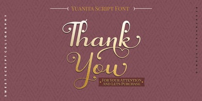 Yuanita is a beautiful modern calligraphy font. A modern script with a handmade calligraphy style. This font is feminime, elegant, messy and modern. Yuanita perfect for wedding event, anniversary, birthday, greeting cards, logotype, branding, wedding invite and card, elegant logo, poster, packaging, stationery, website, and any other projects requiring a handwritten and luxurious touch. Includes OpenType feature with a lot of alternates to help you to make great lettering. This font also supports multiple languages.
 - Halivelavierta by Ilhamtaro,
$99.00 HALIVELAVIERTA is a combination font between blackletter and serif, but I included it in the blackletter category because of the boldness and spacing that is close to a blackletter font, resulting in a font with a slightly gothic feel, vintage but also suitable for modern designs. YOU WILL GET : Halivelavierta.otf To enable the OpenType Stylistic alternates, you need a program that supports OpenType features such as Adobe Illustrator CS, Adobe Indesign & CorelDraw X6-X7. Cheers!
