10,000 search results
(0.075 seconds)
- SosaBravo by Alejandro Yñigo,
$12.00 “SosaBravo” is a font with a unique design... Its shapes are defined only by straight lines and the compositions that can be made communicate a casual and aggressive style that cannot be ignored. The structure of its glyphs and its anatomical details will transmit dynamism and freedom in each design where it appears. It is a font inspired by the work of the Cuban artist Manuel Alfredo Sosabravo, with his own very personal, pictorial and aggressive style, as this font is.
 - Luminum JNL by Jeff Levine,
$29.00In hardware stores across the country are display racks with letters and numbers silk-screened onto self-adhesive aluminum "parallelograms". These handy and durable items have graced countless mailboxes, office doors, hallway signs and automobiles for years. My fellow font designing buddy [Harold Lohner] suggested that I make a font based on this form of lettering as a counterpart to my Mailbox Letters JNL (also based on self-adhesive signage product)... and now his suggestion takes shape as a digital font... Luminum JNL. - Blank Lemon by PizzaDude.dk,
$18.00 Blank Lemon is my heavy stroke handmade serif font. Yes, it is heavy and it's loud and is very noisy when it comes to making your headlines visible and the reason for this is that the shapes of the font is based on classic serif fonts. Blank Lemon comes with 7 different versions of each letter, and these automatically cycle as you type. Also there are fancy swashes of a, k, n, q and r - and of course multilingual support! Enjoy!
 - Lovina Script by Alit Design,
$14.00 Lovina Script is our first font in 2019 and has a handwritten script style with a touch of natural rough from the shape of the brush. For Scripts, Lovina fonts have 2 choices namely "Lovina 1" and "Lovina 2" and in this font script there are many alternative choices of characters from Swash Lowercase, SS01 to SS06. Lovina Script is very worthy of being the newest collection in 2019 as a project design creation, social media quote, badges, logotype, fashion design etc.
 - BrunoBook by JOEBOB graphics,
$9.00 Stop using Times new Roman in children's books! BrunoBook is here to stay. A complete character set with numbers and most (but not all) special signs.
 - TessieXtraBirds by Ingrimayne Type,
$13.95 A tessellation is a shape that can be used to completely fill the plane—simple examples are isosceles triangles, squares, and hexagons. Tessellation patterns are eye-catching and visually appealing, which is the reason that they have long been popular in a variety of decorative situations. These Tessie fonts have two family members, a solid style that must have different colors when used and an outline style. They can be used separately or they can be used in layers with the outline style on top of the solid style. For rows to align properly, leading must be the same as point size. To see how patterns can be constructed, see the “Samples” file here. Shapes that tessellate and also resemble real-world objects are often called Escher-like tessellations. TessieMoreStuff contains mostly Escher-like tessellations with no clear organizing principle. Most or all of these shapes were discovered/created by the font designer during the past twenty years in the process of designing maze books, colorings books, and a book about tessellations. (Earlier tessellation fonts from IngrimayneType, the TessieDingies fonts, lack a black or filled version so cannot do colored patterns. The addition of a solid style that must be colored makes these new fonts a bit more difficult to use but offers far greater possibilities in getting visually interesting results.)
 - TessieMoreStuff by Ingrimayne Type,
$11.95 A tessellation is a shape that can be used to completely fill the plane—simple examples are isosceles triangles, squares, and hexagons. Tessellation patterns are eye-catching and visually appealing, which is the reason that they have long been popular in a variety of decorative situations. These Tessie fonts have two family members, a solid style that must have different colors when used and an outline style. They can be used separately or they can be used in layers with the outline style on top of the solid style. For rows to align properly, leading must be the same as point size. To see how patterns can be constructed, see the “Samples” file here. Shapes that tessellate and also resemble real-world objects are often called Escher-like tessellations. TessieMoreStuff contains mostly Escher-like tessellations with no clear organizing principle. Most or all of these shapes were discovered/created by the font designer during the past twenty years in the process of designing maze books, colorings books, and a book about tessellations. (Earlier tessellation fonts from IngrimayneType, the TessieDingies fonts, lack a black or filled version so cannot do colored patterns. The addition of a solid style that must be colored makes these new fonts a bit more difficult to use but offers far greater possibilities in getting visually interesting results.)
 - TessieAnimals by Ingrimayne Type,
$18.95 A tessellation is a shape that can be used to completely fill the plane. Simple examples are isosceles triangles, squares, and hexagons. Tessellation patterns are eye-catching and visually appealing, which is the reason that they have long been popular in a variety of decorative situations. These Tessie fonts have two family members, a solid style that must have different colors when used and an outline style. They can be used separately or they can be used in layers with the outline style on top of the solid style. For rows to align properly, leading must be the same as point size. To see how patterns can be constructed, see the “Samples” file here. Shapes that tessellate and also resemble real-world objects are often called Escher-like tessellations. This typeface contains many Escher-like tessellations that resemble animals including horses, goats, rabbits, fish, frogs, and other vertebrates. Most or all of these shapes were discovered/created by the font designer during the past twenty years in the process of designing maze books, coloring books, and a book about tessellations. (Earlier tessellation fonts from IngrimayneType, the TessieDingies fonts, lack a black or filled version so cannot do colored patterns. The addition of a solid style that must be colored makes these new fonts a bit more difficult to use but offers far greater possibilities in getting visually interesting results.)
 - TessieFlyingBirds by Ingrimayne Type,
$19.95 A tessellation is a shape that can be used to completely fill the plane—simple examples are isosceles triangles, squares, and hexagons. Tessellation patterns are eye-catching and visually appealing, which is the reason that they have long been popular in a variety of decorative situations. These Tessie fonts have two family members, a solid style that must have different colors when used and an outline style. They can be used separately or they can be used in layers with the outline style on top of the solid style. For rows to align properly, leading must be the same as point size. To see how patterns can be constructed, see the “Samples” file here. Shapes that tessellate and also resemble real-world objects are often called Escher-like tessellations. This typeface contains many Escher-like tessellations that resemble flying birds. Most or all of these shapes were discovered/created by the font designer during the past twenty years in the process of designing maze books, colorings books, and a book about tessellations. (Earlier tessellation fonts from IngrimayneType, the TessieDingies fonts, lack a black or filled version so cannot do colored patterns. The addition of a solid style that must be colored makes these new fonts a bit more difficult to use but offers far greater possibilities in getting visually interesting results.)
 - Corporaet by Characters Font Foundry,
$25.00 CFF Corporaet is a corporate brand typeface that comes in 5 sans serif weights; Light, Regular, SemiBold, Bold & Black. Its character is warm, friendly, humane, clear and soft. The humanistic design style is rooted in the cursive style of handwriting, clearly visible in letters such as the e, f, g and y. The spurless letters round it off. Striking characters, such as the z, and small quirky details make it both a corporate and a friendly typeface. The proportions of each character are carefully constructed in such a way that they're balanced and create an even colour in text. That’s why it works extremely well with long body copy. Making it a hero for magazines and editorial design challenges. The Corporaet fonts can be applied in large sizes for print or web, bringing out the refined details that give the fonts its distinctive personality.
 - Belladio by Mans Greback,
$69.00 Belladio is a beautiful calligraphic script typeface. An urban brush font, the handwriting is designed to help you to design professional graphics in cool, flowing styles; elevating your brand to the next level. It can be imagined on a t-shirt design or as a signature logotype. With its multiple alternates and ligatures, Belladio is sure to give any project a custom and genuine style. Use underscore _ to make a swash. Example: Ama_zing Use multiple underscores for different swashes. Example: Won_______der (Download required.) The font is built with advanced OpenType functionality and has a guaranteed top-notch quality, containing stylistic and contextual alternates, ligatures and more features; all to give you full control and customizability. It has extensive lingual support, covering all Latin-based languages, from North Europe to South Africa, from America to South-East Asia. It contains all characters and symbols you'll ever need, including all punctuation and numbers.
 - Grand Slam SG by Spiece Graphics,
$39.00 Grand Slam is based on an old cardwriting style known as Poster Gothic. This dynamic letterstyle was used in the heyday of the Hollywood movie poster because of its powerful and snappy appeal. The face is of uniform thickness and made as wide as possible without interfering with legibility. Its vertical strokes seem to be thickened slightly where normal serifs would be. It is interesting to note that another group of tiny little serifs populate the entire design. Grand Slam comes with a complete set of alternates including small caps and small figures. A lowercase has been added for greater versatility. Grand Slam is now available in the OpenType format. In addition to small caps, lining figures, oldstyle figures, petite lining figures, and swashes, this expanded OpenType version contains some new stylistic alternates. These advanced features work in current versions of Adobe Creative Suite InDesign, Creative Suite Illustrator, and Quark XPress. Check for OpenType advanced feature support in other applications as it gradually becomes available with upgrades.
 - Stenographer JNL by Jeff Levine,
$29.00 Sheet music for the song “The Little Thing You Used to Do” (from the 1935 motion picture “Go into your Dance” starring Al Jolson and Ruby Keeler) had its title set in what closely resembled Bank Gothic Condensed. [Bank Gothic was originally designed by Morris Fuller Benton for American Type Founders circa 1930.] This reinterpreted version is now known as Stenographer JNL, and is available in both regular and oblique versions.
 - Dance Partner JNL by Jeff Levine,
$29.00 The unusual mix of Art Deco lettering with a smattering of Art Nouveau characters found within Dance Partner JNL comes from a movie poster for the 1935 RKO picture "Roberta" starring Fred Astaire and Ginger Rogers. The musical was based on the hit 1933 stage play that introduced the song "Smoke Gets in Your Eyes". The play itself was based on the Alice Duer Miller novel "Gowns by Roberta".
 - Quinbuilt by Konstantine Studio,
$19.00 Are you ready to take your design projects to the next level? Say hello to Quinbuilt, the epitome of vintage charm blended seamlessly with modern design prowess. Elevate your creations with a touch of nostalgia that captures hearts and leaves a lasting impression. Hurry, dive into the world of Quinbuilt now, and embark on a journey that merges nostalgia with innovation. Your masterpiece awaits – let Quinbuilt be your guiding star!
 - Rafaella by Lián Types,
$37.00 To Rafaella, a menina dos cachos. We, designers, have grown accustomed to seeing that lowercase letters—not only in calligraphy but also in typography (1)—may be very playful and decorative. Almost every part of them can become a potential swash, ligature or decorative accolade (2) if the designer has some expertise regarding this matter. However, since we are living in an era that elevates the status of handcrafts, lettering has gained a lot of ground in different kinds of mediums, and with it there’s a sort of overuse of capitals. This may be due to the reason that lettering pieces need a high impact to convey their messages and many times why big capitals are the only solution. With this in mind, I started Rafaella: A font consisting entirely of capitals which go from unadorned to very decorative. Rafaella has ductus and forms vaguely based on the 1970s Bookman-like styled fonts. The presence and behaviour of serifs and ball terminals in this style were the perfect excuse to make really attractive aternates which the user can choose from the glyphs panel. The result is a font full of life. Able to be both very playful and formal due to its roman style which can be combined with (and between) a wide range of other styles of expressive scripts or geometric fonts with nice results (3). Also try Rafaella Shade Solo combined with Rafaella or Rafaella Bold for a layer effect to emphasize any given word or phrase. NOTES (1) See my fonts Erotica from 2013 or Dream from 2014. (2) Accolades is a wonderful word that refers to the ornaments made around the words in the spencerian style of calligraphy (3) Combinations often seen in different pieces of lettering were usually a contrast of style is wanted.
 - Z_SHINOBI - Unknown license

- Morseircle code - Unknown license

- SKYSCRAPER - Unknown license

- Z_tUBBA - Unknown license

- damara - Unknown license

- Linotype Atomatic by Linotype,
$40.99Linotype Atomatic is part of the Take Type Library, selected from the contestants of Linotype’s International Digital Type Design Contests of 1994 and 1997. German artist Johannes Plass designed his font in one strongly-crafted weight. Linotype Atomatic seems to mirror the fast pace and technology of modern times. The slight lean to the right gives an impression of speed and movement. Linotype Atomatic is intended exclusively for headlines in larger point sizes. - Gojet by 611 Studio,
$10.00 611 Studio proudly presents Gojet, Sans Serif font family with calm, gentle and friendly look. Gojet is available in six different weight, makes it flexible and widely usage possibilities, text, headlines, even logotype. Mix and matching different weight is absolutely the right decision to make your project more attractive, eye catching. The other fact that Gojet is based on ANSI encoding is additional point, multilingual support makes most languages can use this typeface properly.
 - TA Regresso PRO by Tural Alisoy,
$39.00 TA Regresso PRO graphic presentation at Behance TA Regresso PRO font is inspired by Didon and Bodoni fonts. A combination of a little Bodoni and a little Didon elements and a unique style and Text, Display, Subhead and about 80 styles, it is a font that gives the user a choice. TA Regresso font supports Greek, Hebrew, Cyrillic and Latin alphabets. After starting work on the font since February of last year, the font is ready today with constant revisions. Being open to learning, I sought help from experienced designers. I must mention that Yulia Gonina, the founder of Schrifteria Foundry, also helped me a lot to make Regresso good. With her knowledge and advice, the flaws in the font were eliminated. By the way, Viktor Baltus also helped me with his valuable advices. I did some research about the alphabets of the supported languages so that Regresso is good. I paid a lot of attention to the correct design of the letters. I will fix the problems I missed in the next updates of the font. I would be happy if you send me your work when you use my font. I'm very interested in where you use my font. TA Regresso PRO contains 200+ Latin and Cyrillic, Greek, Hebrew languages. TAFT produce retail typefaces, create custom fonts and even do Greek, Hebrew and Cyrillization. Our mission is to create and distribute only carefully drawn, thoroughly tested, and perfectly optimized typefaces which are available to a wide range of customers. If you're looking for a type or logo → t@taft.work
 - Souttia - Personal Use - Personal use only

- Hedon by Tour De Force,
$25.00 Hedon is hedonistic & humanistic, but not an egoistic, sans serif family that comes in 4 weights and matching italics. It declares itself a neutral, versatile and legible partner for any kind of publication, with a tiny dose of impressionable characteristics that softens its base.
 - FF Papertape by FontFont,
$41.99 German type designer Matthias Jordan created this display FontFont in 2000. The family contains 4 weights and is ideally suited for music and nightlife, poster and billboards as well as software and gaming. It comes with proportional lining, tabular lining, and tabular oldstyle figures.
 - Liong by Dikas Studio,
$15.00 Liong is a bold & retro slab serif typeface inspired by western typography signane, they have a contrast weight bar and slab with fun and fancy character. Liong comes with 4 style regular, italic, slab & slabitalic, perfect for logos, badges, typography and any retro design needs.
 - Moldr Thai by Deltatype,
$59.00 Moldr Thai, a sans-serif with modular grid structure with Thai script, inspired from handmade letter to industrial machine mold, Moldr come with 9 weights in complete family, Support many language with standard Adobe Lain 4 glyphs, world-ready and mark2mark support, especially Thai script.
 - FF Craft by FontFont,
$41.99 Slovakian type designer Peter Bil'ak created this display FontFont in 1994. The family contains 4 weights and is ideally suited for festive occasions and music and nightlife. FF Craft provides advanced typographical support with features such as ligatures. It comes with proportional lining figures.
 - Secreta by Ixipcalli,
$26.00 Secreta is a modern typeface with a geometric touch using "CAP" modes. It comes in 4 weights: Light Regular, Bold and Extended Bold. Each weight includes extended language support. Perfectly suitable for graphic design and any display use for web design, signage, corporate and editorial.
 - Masterson by Arterfak Project,
$10.00 Introducing Masterson, the strong slab serif that inspired from cowboy and western style. Masterson has three styles : Regular, Spurs and College that you can combine as a unite in your design project. Masterson is all-caps font, the good choice for your logo, logotype, badges, store front, headline, sub headline, even body text because the shapes already set to keep the readability when it's use in small size. This font is recommended for western style, vintage, retro, pop art or minimalist. 300+ Glyphs included with 27 accents : Afrikaans, Albanian, Catalan, Croatian, Czech, Danish, Dutch, English, Estonian, Finnish, French, German, Hungarian, Italian, Latvian, Lithuanian, Maltese, Norwegian, Polish, Portuguese, Romanian, Slovak, Slovenian, Spanish, Swedish, Turkish, Zulu. Masterson has catchwords to give you more variants in your design.
 - Hypercreepos by Bisou,
$15.00 Hypercreepos is a sweet and creepy hyper-bold font inspired by the horror comic books of the 60s. Handmade in La Chaux-de-Fonds (Switzerland) on lined A4 papers, the letter's shape is conscientiously designed to give a punchos impact on the reader. The unique and vibrant contours are drawn on an improvised backlit table inherited from Bisou's mother. Definitely contemporary, the overall feeling given off by Hypercreepos is profound and human, evoking the graphite smell of the comic's workshops. Exclusively made for titles, this impactos font will suite with delight the text of posters, signs of comics bookstore, gaming bar, horror movie theater or film festival. That said, the designer is not responsible for the use of Hypercreepos and wish it will serve beyond all expectation.
 - Canilari by W Type Foundry,
$35.00 Canilari is a post-modern type family inspired by Diaguita pottery and contemporary serif typefaces. The Diaguita culture—developed from 10th century A.D. until 16th century A.D.—settled in the area of the present-day north Chile and northwest Argentina. Surviving cultural expressions of the Diaguita people are reduced to just a few pieces of beautifully decorated pottery of high technical quality. Canilari itself is a scream of identity with an incomparable tone that borrows elements from native America and proudly show them to the world. The intense and consistent personality of Canilari makes it a functional font for a wide range of uses: from continuous text in the most challenging environments to pithy, high-impact headlines. Canilari is well-suited for publishing: newspapers, magazines, books, etc. Its flashy look and angular shapes also make it an excellent choice for posters, logotypes, and advertising. The family consists of 2 sets: one standard and one pro, each in 4 weights plus italics. Canilari also includes a set of ornaments and illuminated caps. Together, the Std set (369 characters) and Pro (710 characters) support 219 different languages. This typeface was selected at the Bienal Tipos Latinos 2014.
 - Humorist JNL by Jeff Levine,
$29.00 The May 7, 1936 issue of “The Film Daily” carried an ad for the Will Rogers Memorial Hospital Fund. (In August of 1935 Rogers, along with famed aviator Wiley Post died in a plane crash.) While the fundraising for the hospital was a serious event, Rogers is remembered as a humorist, hence the font’s name of Humorist JNL.
 - Mistral by Linotype,
$40.99 Mistral is a loose running script based directly on the handwriting of its designer, Roger Excoffon. His goal was to create a typeface with a true handwritten style, but in this case, the writing looks as though it were done with a brush or heavy felt tip.
 - Book& by Holland Fonts,
$30.00A design reminiscent to school script and handwriting, yet slightly off beat, with a gracious and elegant motion. Originally designed for invitations for a book store, the typeface likes to think it refers refers to book typography of the 40s and 50s of the last century. - Ghetto by Bosstypestudio,
$12.00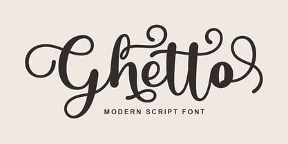 Ghetto is a modern script with handwriting, decorative characters, and dancing baselines! It's very suitable in use like blog headers, t-shirts, and for weddings, social media, product design, stationery, advertising, clothing, book covers, business cards, greeting cards, branding, merchandise, invitations and handmade quotes and more.
 - Inscription by ITC,
$29.99Inscription is the work of Alan Meeks, a bold copperplate script with a fine open line running throughout. The relatively restrained initial capitals are complemented by a lowercase which joins together in the style of true handwriting. Inscription will give any text a look of refined elegance. - John Handy by ITC,
$29.99John Handy is the work of British designer Timothy Donaldson and based on his own handwriting. Part of the ongoing trend for casual letterforms in display typography, John Handy is an excellent choice for letters, greeting cards, menus, wherever an elegant yet personal look is desired.


