10,000 search results
(0.054 seconds)
- Discolicious by Hanoded,
$15.00 Put the needle in the groove and jive baby! Discolicious brings back the golden age of moustaches and sideburns, psychedelic tie-dyes and bell bottoms. Use this ‘bubblegum’ disco font for your product packaging, magazines and party posters and they’ll look off the hook! Comes with a primo amount of diacritics, so you can let it all hang out! Word!
 - Pristine Light by Gerald Gallo,
$20.00 Some words from the foundry: The Pristine Light fonts are clean and crisp, sans serif, uppercase only. They were designed specifically for those applications where uppercase text is appropriate, such as display, headline, logotype, branding, and similar applications. There are numbers, punctuation, accented characters, symbols, and miscellaneous characters. For convenience the uppercase alphabet is repeated under their respective lowercase keys.
 - Bs Landscope by Feliciano,
$37.92That’s what people call ‘an experimental typeface’. Yes it is! It consists in letterforms designed in very strict geometrical parameters. I was not thinking about ‘reading’ when I’ve drawn this typeface — rather on different way of projecting our mental image of the words. Do not try to set a book with this type, please! One single version, one single font designed in 2000. - Allencon by Scriptorium,
$18.00Allencon is a lovely font based on freehand calligraphy. It has a bold, decisive look, with various aspects of the characters regularized to give a consistent appearance in print while preserving the personality of the lettering. It includes variant versions of many of the characters, particularly elongated characters for the ends of words at the ends of lines - great for poetry. - Gamboge by Hanoded,
$15.00 Gamboge is a deep saffron to mustard yellow pigment which is extracted from a tree. Its name comes from gambogium, the latin word for the pigment. Gambogia font is a beautiful all caps typeface with a pre-war feeling to it. Upper and lower case differ and can be mixed freely. Use Gamboge for your product packaging, book covers and websites.
 - NorB Scribe by NorFonts,
$28.00 NorB Scribe is a handwritten text font witch can be used with any word processing program for text and display use, print and web projects, apps and ePub, comic books, graphic identities, branding, editorial, advertising, scrapbooking, cards and invitations and any casual lettering purpose… or even just for fun! It comes with 6 weights featuring Light, Normal, Bold with their Italic version.
 - NorPen Script by NorFonts,
$15.00 NorPen Script is a handwritten Text Font made with an arabic calligraphy pen (my favorite pens) witch can be used with any word processing program for text and display use, print and web projects, apps and ePub, Comic Books, graphic identities, branding, editorial, advertising, scrapbooking, cards and invitations … or even just for fun! It comes with 2 weights: Regular and Italic.
 - Suilly La Tour by JBFoundry,
$30.00 Suilly la Tour is an elegant calligraphic and legible font. With his three character sets, Suilly la Tour uses OpenType features (liga, init, fina, isol) especially in second set. Suilly la Tour is available in two versions : -Ot with full OpenType features for OpenType friendly applications. -Office for usual word processors. In every case, use it for cards, invitations, menus, packaging, announcements, jackets...
 - Paul Epworth by Straight.Co,
$20.00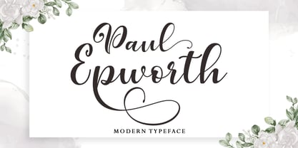 Paul Epworth is beautiful and lovely script font with many alternative styles, ligatures, swash and multilingual glyphs. Paul Epworth can be used for wide ranges of application, such as wedding design, logo, poster, name card, invitations, social media posts, and others. + PUA-Encoded + Can be used in any software, like Adobe Photoshop, Illustrator, even Microsoft Word, PowerPoint and others + Multilingual glyphs. Thank You
 - Heidar by Craft Supply Co,
$17.00 Unveil the Bold Elegance Serif Font – Where letters stand strong, strokes exude confidence, and design speaks with authority. Elevate your creations with this typographic powerhouse that turns words into captivating stories. This typeface is ideal for greeting card, packaging, brand identity, poster, or any purpose to make your art/design project look eye catching and trendy. Feel free to play with this typeface!
 - Bit Part JNL by Jeff Levine,
$29.00 Bit Part JNL is an extra condensed monoline sans serif typeface that's well suited for movie credits, disclaimers and other forms of tight-fit word copy. Inspired by just the numbers "65" on the cover of a 1965 high school yearbook, this retro font will fit a lot of copy into a small area. The typeface is available in regular and oblique versions.
 - Moonlight Serenade by Hanoded,
$15.00 Moonlight Serenade is a 1939 song composed by Glenn Miller, with lyrics by Mitchell Parish. Moonlight Serenade font is an all caps affair - very legible, very recognizable and very useful. Upper and lower case differ slightly and are quite happy to mingle. In the words of Mitchell Parish: I bring you and sing you a Moonlight Serenade! Comes with a universe of diacritics.
 - Acid Squares by Milan Vuckovic,
$29.00Acid Squares is a casual ornamental (fun) font. It was inspired by squares, the 70’s, the 90′s, street art and Berlin. Due to its limited readability it is recommended to use it in words that are common and uncomplicated or in logo design. As a decorative element it can be used well if the kerning is adjusted by the user. - Allegretto Script by My Creative Land,
$18.00 A modern calligraphy typeface with a playful yet elegant style, inspired by Mozart’s “Rondo Alla Turca” and his other compositions played with allegretto tempo. The font contains more than 1000 glyphs. Each letter in the typeface has few different swashes that can be accessed via glyphs panel of your opentype-aware application such as Adobe Illustrator, Adobe InDesign, MS Word.
 - MardiParty AOE by Astigmatic,
$19.95 MardiParty is a totally wild latin typestyle with inlines that grow out of it. Inspired by hand-lettering from a 1950's Haiti travel brochure, where the original lettering was just the word "Haiti", this font proved a fun challenge to flesh out. The end result, a funktastical tribute to its origins, perfect for any celebration themed invitations, logotypes, or outlandish branding.
 - Williesh by Almarkha Type,
$25.00 Introducing Williesh - Unique font that uses ligatures to smoothly link letters. inspired by the famous minimalist logo, perfect for the purposes of designing templates, brochures, videos, advertising branding, logos and more. Perfect for adding a unique twist to word-mark logos, monograms or pull quotes. Kavaloora has 18 unique ligatures and Alternate Glyphs as well as numbers and punctuation making it super fantastic.
 - Little Comet by Allouse Studio,
$16.00 Little Comet a Bubbly Handdrawn Typeface with two style that will give you choices to explore. Little Comet is perfect for product packaging, branding project, megazine, social media, wedding, or just used to express words above the background. Both styles also come with Multi-Lingual Support. Enjoy the font, feel free to comment or feedback, send me PM or email. Thank You!
 - Mocha Cherry by Allouse Studio,
$16.00 Proudly Present, Mocha Cherry a Handwritten Fun Sans with Two Styles, Inline and Regular. Mocha Cherry is perfect for product packaging, branding project, megazine, social media, wedding, or just used to express words above the background. Mocha Cherry also come with Multi-Lingual Support. Enjoy the font, feel free to comment or feedback, send me PM or email. Thank You!
 - Gloomy Mummy by Allouse Studio,
$16.00 Proudly Presenting, Gloomy Mummy a Handdrawn Halloween Typeface with two styles! Gloomy Mummy is perfect for any titles, logo, product packaging, branding project, megazine, social media, wedding, or just used to express words above the background. Gloomy Mummy also come with Multi-Lingual Support. Enjoy the font, feel free to comment or feedback, send me PM or email. Thank You!
 - Charme Script by Supfonts,
$15.00 My new font is beautiful and smooth modern calligraphy with a floating baseline. Charme Script will look beautiful on Christmas and holiday invitations, wedding invites and stationery, logos, and more. I love using it for emphasis words and pairing it with serifs Includes: Charme OTF & TTF Uppercase and lowercase Numbers and punctuation Foreign language support Check out my blog: www.instagram.com/dmitriychirkov pinterest.com/dmitriychirkov7
 - Monem by Wiescher Design,
$39.50 Monem is the word for the smallest significance-carrying part of a language. I thought that was a good name for a clean, straightforward Sans typeface. Monem is very sturdy and usable for lots of occasions. I am using this font myself for those of my clients that want to convey a clean unobtrusive image. Your very restrained Gert Wiescher
 - Multi by Type-Ø-Tones,
$60.00 Multi is an extensive sans serif typeface family that consists of two subfamilies: Multi Text that comprises three weights (roman & italic) and Multi Display (seven weights, roman & italic). Vitality bursts forth from Multi. It has a distinctive ‘phrasing’ (in the musical sense), neither humanist nor glyphic, somewhere in between, exploring uncharted territory. Its design is pragmatic, yet not rigid, slightly tinged with tiny incised touches. This is clearly noticeable in Multi Display: the roman lowercase’s asymmetric stems are very softly tapered, with bevelled, sharp upstrokes. Furthermore, all weights consistently share these idiosyncrasies from Thin to Poster. With its lower contrast, wider proportions, shorter ascenders and descenders, Multi Text was purposely adjusted to meet all the requirements of a legible typeface for newspapers in paper and screen, as they were manually hinted. It also has a few new features, such as the outstrokes of the roman ‘l’ and the italic ‘a’, which bring a subtle calligraphic feel to the text flow.
 - Houschka Alt Pro by G-Type,
$72.00 Houschka Alt Pro is a carbon copy of the Houschka Pro family with one key difference: the rounded signature glyphs A & W on the default positions swap places with their straight alternates. Houschka was named after Georg Houschka, a sadly defunct confectioner’s shop in Salzburg, Austria, which had a wonderful 1930s frontage and distinctively rounded letterforms in the sign above the door. Houschka Pro is the follow up to the original Houschka type family which first appeared back in 1999. Character shapes have been improved, kerning and spacing refined, and OpenType features include CE, Baltic, Turkish & Cyrillic language support plus small caps, 3 stylistic sets, contextual alternates, ligatures and 4 sets of numerals. Houschka is a clean and legible modern sans serif typeface which shares the humanist qualities of Gill Sans and Johnston but retains a uniquely charming character of its own (particularly in signature glyphs A, G, Q, W, u & w). The monolinear structure, rounded corners and rolling curves give Houschka a soft and friendly appearance.
 - Wildcat by K-Type,
$20.00 The starting point for Wildcat was the 3×5 squared grid popular for tiled lettering and American sportswear typefaces. However, Wildcat breaks free of the net whenever necessary. This typeface comes across as tough, it has no soft curves, and evokes strength and confidence. Unlike other collegiate-style fonts, Wildcat includes a real lowercase which makes the face particularly usable and adaptable. Wildcat also contains a full complement of Latin Extended-A characters. Three fonts are included in the download; Regular, College and Outline. The College and Outline fonts share identical spacing and kerning, so can be overlapped to create bicolor artwork.
 - Glitter Girl by Comicraft,
$19.00 Glitter Girl is a naive but romantic and flirty face with fragments of tinsel in its hair. Here's a font with a fresh attitude dressed in frilly flowing flower child fabrics sparkling with sequins. If you're looking for a light feminine aesthetic to grace your chic fashionista blog or livejournal, give it a little Glitter Girl Gossip, a safe text with long legs that will treat your thoughts with a twinkle and a touch of magic. These chic, cozy, clean, warm and fuzzy fonts are BFF -- Best Fonts for Facebook statements you want to share with your social network!
 - Optima Nova by Linotype,
$57.99 With the clear, simple elegance of its sans serif forms and the warmly human touches of its tapering stems, the Optima family has proved popular around the world. In 2002, when it was finally possible to produce digital alphabets without technical limitations and compromises, and more than fifty years after the first sketches, an expansion and redesign of the Optima family was completed and released as Optima nova. Hermann Zapf and Japanese type designer, Akira Kobayashi, collaborated on the project, which included re-working of the existing weights and the addition of several new weights: small caps, old style figures, light, heavy, and condensed. The original Optima was never manufactured with a real italic, only an oblique version of the roman. Optima nova has a complete range of beautifully designed real italics; the new italic forms, of the e, f and g are especially notable. The titling face includes capital letters with special and unusual letter combinations and ligatures, making it an excellent choice for headlines, logos and advertising purposes. Optima continues to be an all-purpose typeface; and Optima nova works for just about anything from book text to signage. Optima Nova® font field guide including best practices, font pairings and alternatives.
 - Carelia by My Creative Land,
$29.00 Carelia is a modern multilingual (including cyrillic) serif family with classic forms, enhanced by extended OpenType features. It is well suited for all sorts of design - starting from web, to editorial and branding. Its stylistic alternates, swashes and ligatures (more 1200 glyphs in each font) will make your design even more stylized and unique. Carelia comes in two styles Upright and Italic - each has it's own character but both share the same curves and style. Both fonts are fully unicode mapped - can be used in any application of your choice.
 - Sambo Briliant by Gian Studio,
$10.00 Brilliant Sambo Featuring Slab Serif totality and elegance. One of my most recent first releases, naturally drawn with pinpoint accuracy. Sambo Brilliant has the perfect amount of simplicity and subtlety for your next project. It perfectly represents the retro and vintage aesthetic. I recommend this font for your next logo, invitation, and home decor project that needs a succinct alternative combination touch! Sambo Brilliant appears with strong characters available: Get inspired by the image above and feel free to share with me what you get by using this font.
 - Midnight Asylum by Kitchen Table Type Foundry,
$15.00 I have no fantastic story on how I came up the name to share with you. I am currently not in an asylum, nor will I be in the near future. I also finished this font way before midnight, so it is just a crazy name for a scary looking font! Midnight Asylum was made with a pencil and Chinese ink. It comes with a full set of alternates for the lower case letters, extensive language support and a cute .notdef character, which is also the alternate asterisk glyph.
 - Houstonville by Veteran Type,
$14.00 Houstonville is the debut letterfrom of Veteran Type. Design by Abdul Rochman a.k.a Veteran Type. This font is inspired by ancient letters in the 19th century. This font is very suitable for designs with ancient concepts, such as print, logo design, and others. This consists of : 20 stylistic set 520 ± glyph count Multilingual support Support for multiple languages Math Symbol Numerals & Punctuation I am very grateful, to my friend and mentor, namely Spencerandsons a.k.a Gilang Purnama, for sharing their knowledge, time, and teaching me. Thank you again Spencer and Sons, always be great !!!
 - Krinah by Twinletter,
$15.00 For any project that calls for a gothic touch, the Krinah font is ideal. Krinah Blackletter fonts are the way to go whether you’re looking for a font for your logo, label, badge, or your newest music video or movie! Labels, vintage posters, and other items should all be designed using the professional-grade font Blackletter. It’s ideal for any project that calls for a little gothic flair. Additionally, it has a variety of lovely, harmonious forms, allowing you to choose the ideal word for your project.
 - Sunrise by Haksen,
$18.00 Sunrise a serif hand-drawn font with a retro look! There are three fonts included : Sunrise Regular Sunrise Outline Sunrise Extrude You can use these three fonts to create your own retro quotes and words! Font Features : Regular version Character set A-Z in uppercase and lowercase Alternates Character Ligatures Numerals & Punctuation Accented Characters Multiple Languages Supported Sunrise is perfect for : shirts, retro designs, procreate, stickers, logos, branding, greeting cards, Cricut projects, posters, magazines, social media, prints and more! Have a great day, Haksen
 - EFCO Fairley by Ephemera Fonts,
$35.00 EFCO Fairley Font Collection includes 11 fonts that have different styles in sans, serif and script, which are all works great together or in their own. The script version also combined with ending swashes, use stylistic alternates from 0 to 9 to work with them. The Inspiration for this collection comes from today's graphic design trends. EFCO Fairley Font Collection was designed carefully to create dozens of font combinations and get really unique typographic for your project. It would be a perfect choice for posters, logos, t-shirt and magazine prints, eye-pleasing typographic designs and more.
 - Urfa Rounded by Ahmet Altun,
$19.00 Urfa Rounded Font family is the rounded version of Urfa Typeface. The Urfa Rounded font family comes in nine weights of Normal and Italic. In addition, all weights contain small caps in both italic and normal. With the Urfa Rounded font family, you can create beautiful works for the web, including logos, banners, body copy, and presentations. Urfa Rounded typeface also works nicely in print formats such as posters, T-shirts, magazines, and affiches. Because of its eye-pleasing style, this font is both effective and versatile. It supports a wide range of languages, including Extended Latin and Cyrillic.
 - Magnolia Rainflower by Mevstory Studio,
$30.00 Magnolia Rainflower Font This modern serif typeface features serif. The name of this font is taken from one type of tulip. Perfect for gorgeous logos & titles, Magnolia Rainflower will pair beautifully with many fonts and work well with whatever project you're working on. A full set of punctuation and numerals Some instructions consist of NOTE about using alternative style fonts and glyphs after you download it Include Alternate, Swash & stylistic set Typeface. That's it! If you have any questions at all, feel free to pop me a private message, I'm always more than happy to help you along :) Happy creating!
 - Jazz Script by Fenotype,
$35.00 Jazz Script is a groovy font family of two weights of the Script, a vivid set of Caps and Extras to spice up your designs or create custom letters with extra swashes. Inspired by 50s and 60s American lettering but polished with sharp but smooth vector expression Jazz Script is a powerful tool for creating iconic headlines, packages, or logos. Each Script version contains more than 750 glyphs and is equipped with several OpenType features to easy up your access for all the goodies: turn on Swash, Contextual or Titling Alternates or manually select from the Glyph Palette from even more Alternates to compose elegant word images. Jazz Script also has plenty of Automatic Ligatures that keep the text flowing and then there’s Proportional Oldstyle for more bouncy numerals. Jazz Script Family has four versions: #1 is regular, #2 has inline and #3 and 4 have different styles of carefully designed printed texture on them. For the very best price purchase the complete set that has all versions of Jazz Script and go wild with the flow!
 - 112 Hours by Device,
$9.00 Rian Hughes’ 15th collection of fonts, “112 Hours”, is entirely dedicated to numbers. Culled from a myriad of sources – clock faces, tickets, watches house numbers – it is an eclectic and wide-ranging set. Each font contains only numerals and related punctuation – no letters. A new book has been designed by Hughes to show the collection, and includes sample settings, complete character sets, source material and an introduction. This is available print-to-order on Blurb in paperback and hardback: http://www.blurb.com/b/5539073-112-hours-hardback http://www.blurb.com/b/5539045-112-hours-paperback From the introduction: The idea for this, the fifteenth Device Fonts collection, began when I came across an online auction site dedicated to antique clocks. I was mesmerized by the inventive and bizarre numerals on their faces. Shorn of the need to extend the internal logic of a typeface through the entire alphabet, the designers of these treasures were free to explore interesting forms and shapes that would otherwise be denied them. Given this horological starting point, I decided to produce 12 fonts, each featuring just the numbers from 1 to 12 and, where appropriate, a small set of supporting characters — in most cases, the international currency symbols, a colon, full stop, hyphen, slash and the number sign. 10, 11 and 12 I opted to place in the capital A, B and C slots. Each font is shown in its entirety here. I soon passed 12, so the next logical finish line was 24. Like a typographic Jack Bauer, I soon passed that too -— the more I researched, the more I came across interesting and unique examples that insisted on digitization, or that inspired me to explore some new design direction. The sources broadened to include tickets, numbering machines, ecclesiastical brass plates and more. Though not derived from clock faces, I opted to keep the 1-12 conceit for consistency, which allowed me to design what are effectively numerical ligatures. I finally concluded one hundred fonts over my original estimate at 112. Even though it’s not strictly divisible by 12, the number has a certain symmetry, I reasoned, and was as good a place as any to round off the project. An overview reveals a broad range that nonetheless fall into several loose categories. There are fairly faithful revivals, only diverging from their source material to even out inconsistencies and regularize weighting or shape to make them more functional in a modern context; designs taken directly from the source material, preserving all the inky grit and character of the original; designs that are loosely based on a couple of numbers from the source material but diverge dramatically for reasons of improved aesthetics or mere whim; and entirely new designs with no historical precedent. As projects like this evolve (and, to be frank, get out of hand), they can take you in directions and to places you didn’t envisage when you first set out. Along the way, I corresponded with experts in railway livery, and now know about the history of cab side and smokebox plates; I travelled to the Musée de l’imprimerie in Nantes, France, to examine their numbering machines; I photographed house numbers in Paris, Florence, Venice, Amsterdam and here in the UK; I delved into my collection of tickets, passes and printed ephemera; I visited the Science Museum in London, the Royal Signals Museum in Dorset, and the Museum of London to source early adding machines, war-time telegraphs and post-war ration books. I photographed watches at Worthing Museum, weighing scales large enough to stand on in a Brick Lane pub, and digital station clocks at Baker Street tube station. I went to the London Under-ground archive at Acton Depot, where you can see all manner of vintage enamel signs and woodblock type; I photographed grocer’s stalls in East End street markets; I dug out old clocks I recalled from childhood at my parents’ place, examined old manual typewriters and cash tills, and crouched down with a torch to look at my electricity meter. I found out that Jane Fonda kicked a policeman, and unusually for someone with a lifelong aversion to sport, picked up some horse-racing jargon. I share some of that research here. In many cases I have not been slavish about staying close to the source material if I didn’t think it warranted it, so a close comparison will reveal differences. These changes could be made for aesthetic reasons, functional reasons (the originals didn’t need to be set in any combination, for example), or just reasons of personal taste. Where reference for the additional characters were not available — which was always the case with fonts derived from clock faces — I have endeavored to design them in a sympathetic style. I may even extend some of these to the full alphabet in the future. If I do, these number-only fonts could be considered as experimental design exercises: forays into form to probe interesting new graphic possibilities.
 - Wasleyton by Uncurve,
$30.00 Introducing "Wasleyton," a vintage ephemera font that weaves the elegance of a bygone era into your modern design projects. Drawing inspiration from the timeless charm of elegant signage, gold leaf craftsmanship, and the artistry of old label products, Wasleyton is more than just a font—it's a journey into the aesthetics of the past. Unleash the power of nostalgia as Wasleyton offers a plethora of alternate characters, ensuring your designs are not just eye-catching but also uniquely authentic. The versatility of this font makes it a perfect choice for a range of applications, from authentic logos and elegant headings to the artistry of sign painting and captivating posters. Infuse your projects with a touch of vintage sophistication as Wasleyton lends its charm to letterheads, branding materials, magazines, album covers, and book covers. Watch as your designs come alive in movies, apparel, flyers, and label designs, each one telling a story of craftsmanship and timeless style. Combine Wasleyton with other fonts, be it a script for a touch of fluid elegance, a serif for classic appeal, or a sans serif for a modern twist. Add a few effects, and suddenly, your project transforms into a masterpiece—classic yet contemporary, elegant yet bold. Elevate your design game with Wasleyton's ability to transport your audience to a different era. Whether you're working on product packaging that demands attention or creating an atmosphere on a movie poster, Wasleyton brings that touch of vintage authenticity that turns your project from ordinary to extraordinary. In summary, Wasleyton isn't just a font; it's a time machine to the aesthetics of yesteryears. Perfect for logos, signage, posters, branding, magazines, album covers, and much more, Wasleyton is your key to infusing a timeless vintage charm into the modern design landscape. Add it to your toolkit, and let your creativity unfold in a tapestry of nostalgia and elegance.
 - Aramus by Hackberry Font Foundry,
$24.95 Aramus is a new serif font in my continuing objective of designing book fonts that I can really use. In many ways, Aramus is a very different direction for me. It comes from a scan of an old display face that has been radically modified to a much smaller x-height than I have been using lately, plus taller ascenders. Many of the characters needed a lot of correction to bring them into my taste. In general, I have decided that many of my fonts create a type color that is too dense. Aramus is an attempt to get away from that look. Although Amitale has been a very successful book family and excellent to work with, I find I still need something more open with a lighter color. Aramus is the first look at the new direction. The original hand-cut serifs vary a lot, different for almost every character. This gives a little looseness and helps the lightness I am looking for. It will be interesting to see where this all goes. This is a normal serif for me in that it has caps, lowercase, small caps with the appropriate figures for each case. This font has all the OpenType features in the set for 2009. I didn't bother with the CE accents (though I can add them upon request. They will be in the final new book family). There are several ligatures for your fun and enjoyment: bb gg ff fi fl ffi ffl ffy fj ft tt ty Wh Th and more. Like all of my fonts, there are: caps, lowercase, small caps, proportional lining figures, proportional oldstyle figures, & small cap figures, plus numerators, denominators, superiors, inferiors, and a complete set of ordinals 1st through infinity. Enjoy!
 - Hoofer by Scholtz Fonts,
$15.00 Light and flexible, slightly retro, casual and readable, Hoofer combines 28 brush script, mono line script and sans-serif styles with ornaments into one Mega-Family. The different styles of the Hoofer Mega-family have been chosen to work together and to harmonize in a pleasing way. The Hoofer Mega-Family of fonts can be divided into three sub-families: Hoofer BRUSH subfamily: An eclectic group of five fonts. These are mainly joined scripts. Hoofer LINE subfamily: Seven mono-line scripts with joined letters in a number of weights, widths and styles. Hoofer SANS subfamily: Sixteen casual, Sans-Serif fonts. They are very readable and in a variety of weights & styles The mood of the Hoofer mega-family is light and flexible, slightly retro, casual and readable. It combines script and many sans-serif styles with ornaments into one Mega-Family. The different styles of the Hoofer Mega-family have been chosen to work together and to harmonize in a pleasing way. The Brush Sub-Family is designed for titling, packaging and display purposes, The Line Sub-Family can also be used for titling, packaging and display, however, it is less “showy”, and conveys an air of informality. The Sans Sub-Family is designed to shine as sub-heads and as body text. The wide range of Hoofline styles gives you, the designer, great flexibility in creating just the mood or impression that you want. Most of the fonts can use one or more OpenType Features. These can be accessed in a number of ways. The reason for this is that the major software producers provide different (and often conflicting) ways of accessing OpenType Features. In some cases such software manufacturers provide NO way of accessing certain OpenType Features. We have tried to remedy this by providing a highly flexible family of fonts. OPENTYPE (these OpenType features are only available in the “otf” fonts and not in the “ttf” fonts.) OpenType features that Hoofer makes use of are: Swashes (Word-Begin and Word-End Features); Alternate Numerals; and True Small Caps. ORNAMENTS In addition the Hoofer family has a font containing 94 ornaments. ALTERNATE NUMERALS You can access two sets of figures (numbers) in Hoofer Sans fonts. Both sets are tabular and lining but they differ in the height (but not the width) of the figures. The height of the alternate figures has been chosen so that they are compatible with the small caps. However, these alternate figures are available in ALL Hoofer Sans fonts, whether they feature small cap fonts or not. Hoofer has all the features usually included in a fully professional font. Language support includes all European character sets, Greek symbols and all punctuation. Opentype features include automatic replacement of some characters and discretionary replacement of stylistic alternatives.