10,000 search results
(0.147 seconds)
- KNF Damryl by Kenan Nasibov Fonts,
$29.00 KNF Damryl is a monospaced display font that can also be described as a modern geometric sans serif. Inspired by geometrics and postmodernist typefaces like Gridnik and FRAC, KNF Damryl is most suitable for headlines, posters, magazines, and logos. KNF Damryl has a bold presence and an artfully utilitarian feel, making it an incredible addition to your typeface library.
 - 3D Cursive by Okaycat,
$29.95 3D Cursive is an extruded cursive family with multiple styles. The 3D Cursive font is extruded in delicate outline. 3D Cursive Stencil is an alternate style in bold black. 3D Cursive Simple provides a perfectly matching, yet non-extruded style. 3D Cursive is extended, containing West European diacritics & ligatures, making it suitable for multilingual environments & publications.
 - PiS HansHand Pro by PiS,
$28.00 HansHand started out in 2003 as a simple free font, the adaption of my grimy handwriting. For its 10th anniversary it got a complete overhaul and lots of new characters. Now also available in BOLD for the first time, featuring scribbles, strokes, circles and boxes to underline the fast taking-notes-while-on-the-phone look!
 - Astronimus by Patria Ari,
$15.00 Astronomus, a cutting-edge sci-fi tech font characterized by its bold box-shaped letters. This modern typeface is meticulously designed, offering a distinctive aesthetic that makes it the ideal choice for various logotype applications. Whether you're in the technology sector, the construction industry, automotive design, or any other heavyweight domain, Astronomus delivers a powerful and futuristic visual impact.
 - Cuadrifonte by PintassilgoPrints,
$20.00 Cuadrifonte was freely inspired by the lettering from a 1917 poster – the only recorded poster designed by the architect and furniture designer Gerrit Rietveld. It is a hand-drawn bold and boxy typeface, available in 3 handcrafted styles. The family also comes with a very nice picture font, loaded with illustrations that match the typeface look and feel.
 - Bark Dones by Zamjump,
$19.00 Bark Dones is a powerful and visually stunning font that reflects the sharpness, ferocity and horror of your soul. Bark Dones is ideal for use in various projects, from logo design, music, events, branding to web design and other printed materials. With its bold and impressive appearance, Bark Dones is the perfect choice for your work.
 - Thrones by madeDeduk,
$14.00 Thrones is a bold classic typeface with gorgeous design and makes this font suitable for your any project design. Thrones Included file: - Thrones Regular.otf - Thrones Bold.otf Feature - Character Set A-Z - Numerals & Punctuations (OpenType Standard) - Accents (Multilingual characters) - Stylistic Alternates If you need anything else just shoot me on email at: dedukvic@gmail.com Hope you enjoy it.
 - Headlined Solid by Thinkdust,
$10.00 Where Headlined creates bold statements, Headlined Solid states facts. Simple, sans serif and steady as a rock, Headlined Solid does what needs to be done, no more and no less. For pragmatism and clarity of form this font couldn’t be better. Alternatively if you're looking for something a little more filthy, check out the original Headlined.
 - Heavy by madeDeduk,
$14.00 Introducing Heavy is a fun bold font and will be perfect for book, title branding, product packaging, invitation, quotes, t-shirt, label, poster, logo etc. Feature Uppercase & Lowercase Number & Symbol Alternates Ligatures International Glyphs Multilingual support Feel free to drop us a message any time and follow my shop for upcoming updates Hope you enjoy it.
 - Reboot by Typelove Fontworks,
$7.00 Born in the lab as a research experiment, Reboot is great for that certain 70’s sci-fi need. It’s filled with the angular curves of the technology of yore, with full diacriticals for Eastern European Cold War era galactic display copy. It’s the first font of a series of research experiments, varying from rectilinear to ovoid.
 - Millano Script by MJB Letters,
$17.00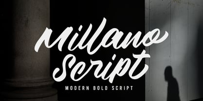 Millano Script is a bold script font, with a strong and masculine style that is equipped with some unique ligatures and alternates so that it can provide an interesting look Works on PC & Mac Simple installations Accessible in the Adobe Illustrator, Adobe Photoshop, Adobe InDesign, even work on Microsoft Word. PUA Encoded Characters – Fully accessible without additional design software
 - Lambo by Wahyu and Sani Co.,
$19.00 Lambo is a contemporary italic calligraphy script designed to work together in harmony that makes it very suitable for your graphic design project. It is consists of 7 styles from thin to bold and comes with stylistic alternated. To get the most out of this font, be sure to use an apps that support OpenType features.
 - Aragon Condensed by Canada Type,
$24.95The condensed version of Hans van Maanen's Aragon is a headline star. The elements that made Aragon a popular "Dutch Garamond" text repeat here, with the slight stress shifts and tapering stems optimized for headline use. Aragon Condensed also comes in bold and italic variations. All three fonts contain extended language support, superiors and inferiors, and class-based kerning. - Eastport JNL by Jeff Levine,
$29.00 Eastport JNL is the interpretation by Jeff Levine Fonts’ of the classic Stymie Extra Bold (a/k/a Stymie Black), designed in 1931 for American Type Founders by Morris Fuller Benton. Stymie and the somewhat similar Beton were both derivations of the popular European typeface Memphis. Eastport JNL is available in both regular and oblique versions.
 - Cyber Rock by WAP Type,
$15.00 Cyber rock Brush Script bold, cool, cursive, design, editorial, grunge, handpaint, handwritten, ink, letter, logo, logotype, magazine, marker, modern, paint, ragged, ROUGH BRUSH, script, sign, style, stylish, swash, tag tagging, textured, trend, trendy, urban, vintage, written handwritten brush script dry brush cursive font with rough and dynamic look. Ideal for quotes, posters, branding, packaging, illustration, social media.
 - Eat More Fruit JNL by Jeff Levine,
$29.00 Eat More Fruit JNL is an odd name for a typeface, but then again the lettering style of the font is just as unusual. Named for a 1940s-era poster espousing "Put more pep in your step... eat more fruit", the lettering (although Art Deco in nature) also evokes images of 1960s and 1970s hippie-era concert posters.
 - Kandel 105 by Talbot Type,
$19.50 Kandel 105 is a geometric, tri-line, display and headline font available in a family of three weights. Its bold, graphic styling gives it great stand-out qualities and a highly individual look. It’s particularly well suited to bringing energy to designs, or for designs with a sporting theme. It’s also available with character variations as Kandel 205 .
 - Jaina Sans by Linh Nguyen,
$8.00 A display font with expanded width, bold weight is cultivated with high contrast in strokes, suitable for ephemeral design applications. It simulates the impact of cut tools with paper, cloth, and comes along with a feeling of geometric suggestions. Jaina Sans also supports over 200 latin based languages with 235 accented characters along with basic OpenType features.
 - Cagila by Eotype,
$12.00 Cagila is a versatile, modern and elegant serif font. Designed by Eotype Studio, It has a unique style with stylistic, alternates, ligatures and supports multilingual languages. Create unique & beautiful logotype, use it as an elegant solution for your next magazine layout, or choose Cester for any graphics that require a bold look with a elegant flair.
 - Minebold by ahweproject,
$9.00 Minebold is a retro bold handwritten font that will bring you back to the 70s. Fall in love with its unique character and use it to create gorgeous wedding invitations, beautiful stationery art, eye-catching social media posts, and much more! Minebold is PUA encoded, which means you can access all glyphs and swashes with ease!
 - La Vieste by Reyrey Blue Std,
$18.00 La Vieste is a Bold, Elegant and Modern font with beautiful ligatures, tons of special alternative glyphs, ornament and multilingual support. It is suitable for branding, signature, wedding invitation, promotion, product packaging, and other needs. Fall in love with its incredibly versatile style and use it to create spectacular designs! Includes: Uppercase and Lowercase Ligatures PUA Encode Support
 - Medyson by Reyrey Blue Std,
$19.00 Medyson is an elegant and bold serif font. It is defined by smooth curves. It is perfect for branding projects, Logo design, Clothing Branding, packaging, magazine headings, advertising, T-shirts, postcards and much more. Add it confidently to your projects, and you won’t be disappointed. ? Features · All Uppercase and Lowercase · Number & Symbol · Supported Languages · Alternates and Ligatures · PUA Encoded
 - Lautren by Azzam Ridhamalik,
$16.00 Introducing Lautren, a new delightful bold script with reversed contrast typeface. The Ideas of this fonts came from funny summer vibes mood which is made more neater and smoother. Lautren created with a tons of opentype features like contextual alternates, stylistic sets, ligatures, and swashes at the ending of the letters. A fun typeface to play with!
 - Mushin by Satori TF,
$16.99 Mushin is a typeface, that comes with 14 fonts, roman and the matching italics, which draws inspiration from the grotesques of the beginning of the 20th century. However, its humanistic details and endings, remove the coldness so characteristic of this style, making Mushin a typeface of lively and dynamic curves, which can be used for various purposes.
 - Krone by Lebbad Design,
$27.95 Krone is a clean, bold contemporary semi-serif font characterized by its flared semi-serifs and graceful curves. Well-suited for all graphic design challenges such as dynamic display headlines, logos, posters, cover/titles and much more. Its optimized kerning enables it to work well in a variety of text uses for both web and desktop.
 - Kunstgewerbe NF by Nick's Fonts,
$10.00J. M. Bergling called the inspiration for this typeface “modern”—at least, it passed for modern in 1914. Its bold, sinuous forms and unusual decorative treatment suggest stained glass of a certain era, and so its name is German for “Arts and Crafts”. Both versions of the font include 1252 Latin, 1250 CE (with localization for Romanian and Moldovan). - Brighter by Letterhend,
$10.00 Brighter script is a bold casual and fun script that stands out from the crowd. It contains two styles: regular and rough. It's perfect to be used especially for logo type, signatures, photography, quotes, apparel design, and any design need. As usual, the font comes with many OpenType features such as ligatures, stylistic set alternates and also multilingual support.
 - Malvie by Eko Bimantara,
$17.00 Malvie is casual, groovy and friendly font. Made for titling and products, branding, packaging, display, signage and other fit-for-bold medium. Each glyphs shown dynamic curves, especially with the stems which is personalized by heavy swinging stroke. Its contain 270 glyphs with latin standard character set and two opentype features; Stylistic Alternates and standard Ligatures also extra swashes.
 - Chupada by Tipo Pèpel,
$14.00 Chupada is an ultra-condensed font family noted for their exaggerated x-height, which consists of five different weights, accompanied by their italic version. It contains all the central european characters and Cyrillic. Chupada with its bold semi-modular forms make it ideal for use in headlines, posters, titles and anywhere you need for create impact.
 - Z_SHINOBI - Unknown license

- Morseircle code - Unknown license

- SKYSCRAPER - Unknown license

- Z_tUBBA - Unknown license

- damara - Unknown license

- Raclette by Linotype,
$29.99Raclette grills are an ingenious Swiss invention. This tabletop grill is used to cook raclette cheese, a unique sort of cheese produced by the happy cows of Valais. Swiss designer Michael Parson created a typeface in 2002 that speaks endearingly to his hearty homeland tradition - endearingly enough, he named it Raclette. Raclette most likely started out as a bold, condensed sans serif. But then, just as one pulls little trays off of a raclette grill, Parsons quickly removed many rectilinear bits from the edges of each letter. Text set in Raclette looks like an old brick wall, or perhaps like a raclette party for several hundred people, that ended an hour ago! Raclette is one of ten of Michael Parson's experiments in type design featured in the Take Type 5 collection from Linotype GmbH." - Tusker Grotesk by Lewis McGuffie Type,
$35.00 Tusker Grotesk is a headline typeface designed for robust and high-impact use. The initial inspiration for Tusker came from postwar typefaces like Haettenschweiler, Impact and Helvetica Inserat which use very high x-heights. Other influences in the condensed end of the Tusker family are old grotesques like Folio Extra Condensed and Stephenson Blake Elongated Sans No.1 with their flat terminals and closed-up apertures. Then as the widths in Tusker grow, the lettering takes some more inspiration from gothic style sans such as Inland Type's Title Gothic No.8, while maintaining the optical weight established in the narrow end of the family. Each width set is duplexed, stackable and is ideal for headlines, logos and bold attention-grabbing editorial design. Tusker has extended latin coverage ideal for western, central and eastern European languages.
 - Azalleia Ornaments by Intellecta Design,
$24.90 Azalleia Ornaments is a new flourished ornaments typeface. Well elaborated and unusual design, inspired by old cross-stitch and craft books and entirely designed by hand, without use of auto-tracing and available in two different designs.
 - Floralissimo by Wiescher Design,
$39.50 Floralissimo are flowery embellishments that I found in several old publishing books dating back over a hundred years. I thought they might be useful for some of you, so I digitized them. Your digitizing typedesigner, Gert Wiescher
 - Westin Black by Miller Type Foundry,
$19.00 Westin Black is a great alternative to Cooper Black. Heavily influenced by clarendon typefaces, Westin Black also has a slight humanistic touch. It comes with open type features like old style figures, tabular figures and some ligatures.
 - Western Territory JNL by Jeff Levine,
$29.00 Browsing through images of old wood type for sale, a Western type design with some interesting character variations made the perfect subject for a digital revival. Western Territory JNL is available in both regular and oblique versions.


