10,000 search results
(0.3 seconds)
- Dept by Clevus,
$17.00 Proudly present Dept display typeface With a Unique and dynamic Display typeface style, Dept is a font that brings a bold and modern impression. The geometric and bold letter characteristics provide a unique and strong look to every design. Suitable for use in branding and advertising projects, Dept will make every design more attractive and effective. Font Features : Dept includes Lettres, numbers, symbols, punctuation, alternates, and ligatures No special software is required they may be used even in canvas, any basic program /website apps that allow standard fonts That's it, folks! Multilingual Support Language Support: Danish, English, Estonian, Filipino, Finnish, French, Friulian, Galician, German, Gusii, Indonesian, Irish, Italian, Luxembourgish, Norwegian Bokmål, Norwegian Nynorsk, Nyankole, Oromo, Portuguese, Romansh, Rombo, Spanish, Swedish, Swiss-German, Uzbek (Latin) Follow My Shop For Upcoming Updates Including Additional Glyphs And Language Support. And Please Message Me If You Want Your Language Included or If There Are Any Features or Glyph Requests, Feel Free to Send me A Message. Have a Good Day!
 - A Day That Feels Better by Clevus,
$14.00 Proudly present A Day That Feels Better Typeface, created by ClevUs, A nostalgic serif & calligraphic italic that has own unique style & modern look. This typeface is perfect for an elegant & luxury logo, book or movie title design, fashion brand, magazine, clothes, lettering, quotes, and so much more. Font Features : Letters, numbers, symbols, and punctuation 101 alternates and ligatures No special software required they may be used even in Canva, any basic program /website apps that allows standard fonts That's it folks! Multilingual Support Language Support: Danish, English, Estonian, Filipino, Finnish, French, Friulian, Galician, German, Gusii, Indonesian, Irish, Italian, Luxembourgish, Norwegian Bokmål, Norwegian Nynorsk, Nyankole, Oromo, Portuguese, Romansh, Rombo, Spanish, Swedish, Swiss-German, Uzbek (Latin) Follow My Shop For Upcoming Updates Including Additional Glyphs And Language Support. And Please Message Me If You Want Your Language Included or If There Are Any Features or Glyph Requests, Feel Free to Send me A Message. Have a Good Day !
 - Keyugah by Product Type,
$13.00 Keyugah is a classic serif font that exudes elegance and sophistication. Its timeless design makes it perfect for any project that requires a touch of refinement, from wedding invitations to high-end branding materials. With its clean lines and understated serifs, Keyugah is easy to read and works well in both print and digital media. Its versatility is further enhanced by its multilingual support, which allows you to use it in a wide variety of projects for a global audience. Whether you’re creating a logo for a luxury brand, designing a book cover, or crafting an elegant website, Keyugah is a reliable choice that will elevate your project to the next level. What’s Included : - All glyphs Iso Latin 1 - We highly recommend using a program that supports OpenType features and Glyphs panels like many Adobe apps and Corel Draw, so you can see and access all Glyph variations. - PUA Encoded Characters – Fully accessible without additional design software. - Fonts include Multilingual support
 - Groomed by Create Big Supply,
$15.00 Introducing Yellow Duck, a delightful bouncy handwritten script font that adds a playful touch to your creative projects. With its lively and energetic style, this font is a perfect choice for various craft projects and beyond. Yellow Duck's charming bouncy script style brings a sense of joy and character to your designs. Whether you're working on craft projects, farmhouse decor, shirt designs, websites, SVG creations, home decor, branding materials, blogs, logos, or invitations, this font will infuse your work with a vibrant and dynamic personality. Featuring both uppercase and lowercase letters, Yellow Duck offers versatility and allows for captivating compositions. The font also includes numbers and punctuations, ensuring seamless integration within your text. Its multilingual support enables effective communication across different languages, making it suitable for global audiences. Yellow Duck provides ligatures that enhance the fluidity and aesthetics of your typography, creating a harmonious and visually appealing result. With PUA Encoding, accessing special characters and glyphs is effortless, empowering you to unlock limitless creative possibilities.
 - Mono Grass by Clevus,
$14.00 Proudly present Mono Grass Typeface that makes us feel nostalgic! It brings back the 60s to 70s vibe with a joyful and retro look, with a uniquely crafted touch to each letter. Comes with alternatives and ligatures, and helps to create stunning magazine imagery, quotes, posts, blog posts, branding projects, logo, poster and much more. Font Features : Lettres, numbers, symbols, and punctuation 46 alternates and ligatures No special software required they may be used even in canva, any basic program /website apps that allows standard fonts That's it folks! Multilingual Support Language Support: Danish, English, Estonian, Filipino, Finnish, French, Friulian, Galician, German, Gusii, Indonesian, Irish, Italian, Luxembourgish, Norwegian Bokmål, Norwegian Nynorsk, Nyankole, Oromo, Portuguese, Romansh, Rombo, Spanish, Swedish, Swiss-German, Uzbek (Latin). Follow My Shop For Upcoming Updates Including Additional Glyphs And Language Support. And Please Message Me If You Want Your Language Included or If There Are Any Features or Glyph Requests, Feel Free to Send me A Message. Have a Good Day !
 - NEON CLUB MUSIC by TypoGraphicDesign,
$19.00 The typeface Neon Club Music is designed in 2011 for an Logo-Design of a electronic music label from South Germany. 324 glyphs incl. decorative extras like arrows, dingbats, emojis, symbols, geometric shapes, decorative ligatures (type the word #SMILE for ☺ or #LOVE for ♥ as OpenType-Feature dlig) and stylistic alternates (as OpenType-Feature salt. For use in logos, magazines, posters, advertisement plus as webfont for decorative headlines. The font works best for display size. Have fun with this font & use the DEMO-FONT (with reduced glyph-set) FOR FREE! CONCEPT/CHARACTERISTICS The geometric and rounded character of the typeface is a very unique futuristic sci-fi atmosphere. The sans-serif monoline letter-forms looks very modern, clean, fresh and fancy. APPLICATION AREA The fancy, geometric & round party, music & movie font “NEON CLUB MUSIC” would look good at display size for party flyer & movie poster, music covers or headlines in magazines or websites…
 - Hokuba Grabs by Afkari Studio,
$15.00 Hokuba Grabs - New Fun Display Font Hokuba Grabs is a New display font that creates with a very good concept and adjusted well to keep the legibility. Hokuba Grabs Display Font Comes with upper and lowercase Standard Characters, Punctuation, Numerals, And other Glyphs variation of the OpenType features/ Ligatures. Hokuba Grabs Display Font is suitable for logos, posters, school flyers, university banners, modern advertising design, product labels, cartoons, comics, kid books, custom mugs, pillows, t-shirts, youtube thumbnails/covers, subtitles, poster quotes, editorial design, book/cover Title, website/blog, social media post, packaging designs, and other designs. Features; - 2 Styles; Regular and Outline - Special Alternates - Uppercase, Lowercase, Number, and Punctuation - Works on PC & Mac - Simple installations - Accessible in Adobe Illustrator, Adobe Photoshop, Adobe InDesign, even work on Microsoft Word - Fully accessible without additional design software. - Mültîlíñgúãl Sùppört for; ä ö ü Ä Ö Ü ß ¿ ¡ Hope you enjoy our font and this font is useful font for your projects!
 - Cumhuriyet Pro by Fontuma,
$28.00 Cumhuriyet is an Arabic concept that means "the form of government in which the nation holds the sovereignty and uses it through the deputies elected for certain periods". The reason why I gave this name to the font is that 2023 is the centennial anniversary of the Republic of Turkey, which was founded by Atatürk. This typeface, which is sans serif, consists of three families: ▪ Cumhuriyet: Font family with Latin letters ▪ Cumhuriyet Pro: Font family including Latin, Arabic and Hebrew alphabets ▪ Cumhuriyet World: Font family including Latin, Cyrillic, Greek, Arabic and Hebrew alphabets Cumhuriyet Pro is a family of multi-purpose typefaces designed in a geometric style. This font is an extremely useful font for media and digital media as well as for printed products. In this respect, the Cumhuriyet font can be used as a text and title font in publishing and printing areas, magazines, newspapers, books, banner and poster designs, and websites.
 - Cumhuriyet by Fontuma,
$24.00 About the font family Cumhuriyet is an Arabic concept that means "the form of government in which the nation holds the sovereignty and uses it through the deputies elected for certain periods". The reason why I gave this name to the font is that 2023 is the centennial anniversary of the Republic of Turkey, which was founded by Atatürk. This typeface, which is sans serif, consists of three families: ▪ Cumhuriyet: Font family with Latin letters ▪ Cumhuriyet Pro: Font family including Latin, Arabic and Hebrew alphabets ▪ Cumhuriyet World: Font family including Latin, Cyrillic, Greek, Arabic and Hebrew alphabets Cumhuriyet is a family of multi-purpose typefaces designed in a geometric style. This font is an extremely useful font for media and digital media as well as for printed products. In this respect, the Cumhuriyet font can be used as a text and title font in publishing and printing areas, magazines, newspapers, books, banner and poster designs, and websites.
 - VinPoire by Clevus,
$14.00 Proudly present VinPoiré Typeface inspired by 1960s style. VinPoiré equipped with several OpenType. Have 73 unique alternates and ligatures. Comes with alternatives and ligatures, and helps to create stunning logos, quotes, posts, blog posts, branding projects, magazine imagery, wedding invitations, and much more. Font Features : Lettres, numbers, symbols, and punctuation 73 alternates and ligatures No special software required they may be used even in canva, any basic program /website apps that allows standard fonts That's it folks! Multilingual Support Language Support: Danish, English, Estonian, Filipino, Finnish, French, Friulian, Galician, German, Gusii, Indonesian, Irish, Italian, Luxembourgish, Norwegian Bokmål, Norwegian Nynorsk, Nyankole, Oromo, Portuguese, Romansh, Rombo, Spanish, Swedish, Swiss-German, Uzbek (Latin) Follow My Shop For Upcoming Updates Including Additional Glyphs And Language Support. And Please Message Me If You Want Your Language Included or If There Are Any Features or Glyph Requests, Feel Free to Send me A Message. Have a Good Day !
 - Ayeria by Clevus,
$16.00 Proudly present Ayeria is a Multipurpose serif font with a touch of elegant. Comes with alternatives and ligatures, this typeface is perfect for an elegant & luxury logo, book or movie title design, fashion brand, magazine, clothes, lettering, quotes, and so much more. Font Features : Ayeria Lettres, numbers, symbols, and punctuation 28 alternates and ligatures No special software required they may be used even in Canva, any basic program /website app that allows standard fonts That's it, folks! Multilingual Support Language Support: Danish, English, Estonian, Filipino, Finnish, French, Friulian, Galician, German, Gusii, Indonesian, Irish, Italian, Luxembourgish, Norwegian Bokmål, Norwegian Nynorsk, Nyankole, Oromo, Portuguese, Romansh, Rombo, Spanish, Swedish, Swiss-German, Uzbek (Latin). Follow My Shop For Upcoming Updates Including Additional Glyphs And Language Support. And Please Message Me If You Want Your Language Included or If There Are Any Features or Glyph Requests, Feel Free to Send me A Message. Have a Good Day!
 - Brandon Text by HVD Fonts,
$40.00 Brandon Text is the companion of the famous Brandon Grotesque type family. It has a higher x-height than the Grotesque version and is optimized for long texts, small sizes and screens. This sans serif type family of six weights plus matching italics was designed by Hannes von Döhren in 2012. Influenced by the geometric-style sans serif faces that were popular during the 1920s and 30s, the fonts are based on geometric forms that have been optically corrected for better legibility. Brandon Text has a functional look with a warm touch and works perfectly together with Brandon Grotesque . It is manually hinted and optimized for screens, so it will be a good choice for Websites, eBooks or Apps. The whole Brandon series is equipped for complex, professional typography with different sets of numbers, alternate letters, fractions and an extended character set to support Central and Eastern European as well as Western European Languages.
 - Century Expanded by Bitstream,
$29.99Shortly after the preparation of the original Century, the two Bentons (father Linn Boyd and son Morris Fuller) prepared a wider version for De Vinne’s press and called it Century Broadface. In 1900 ATF released the design for general use as Century Expanded, one of the most popular and effective of typefaces, to this day the text face of the New York Daily News. - Spur Wide JNL by Jeff Levine,
$29.00 Spur Wide JNL was modeled from an example of hand lettering from the antique French alphabet book L'Art du Tracé Rationnel de la Lettre. Heavy Roman style letters with spurs (often referred to as Latin) were most popular with sign painters and show card writers in the early part of the 20th century. Spur Wide JNL is available in both regular and oblique versions.
 - Tme by bb-bureau,
$65.00 Tme, new lineal — Tme is an update of Sl (T = S + 1, m = l + 1 and e for natural logarithm), drawn in 2006 for the University of Arts Saint-Luc de Tournai. Its geometrical drawing is based on the directions of the hexagon, a scrupulously followed constraint which confers on some glyphs a very particular drawing. in light, regular and bold language: all latin glyphs
 - Sweater School by Typodermic,
$11.95 Introducing Sweater School, a typeface that feels like the friendly embrace of a warm sweater on a chilly day. With its casual pen strokes and relaxed letterforms, this inviting teacher’s typeface is perfect for anyone who wants to convey a sense of approachability and warmth. Sweater School is a unique typeface that draws inspiration from the print style preferred by elementary school teachers, but with significant improvements that make it easier to read and more pleasant to look at. We know how important it is to get your message across clearly, and that’s why we’ve created Sweater School with readability in mind. One of the standout features of Sweater School is its alternate characters, including a charming “J”, “I”, and “q”, as well as nut fractions (vertical fractions). These variations can be easily accessed through your application’s OpenType “stylistic alternates” capability, allowing you to add a touch of whimsy to your designs and make them stand out from the crowd. Sweater School is available in four weights and italics, making it a versatile choice for a variety of projects. Whether you’re designing a logo, creating a presentation, or crafting a social media post, Sweater School is sure to help you make a statement with its friendly, approachable style. So why not cozy up to Sweater School today? Let its inviting warmth and casual charm elevate your designs and connect with your audience in a whole new way. Most Latin-based European writing systems are supported, including the following languages. Afaan Oromo, Afar, Afrikaans, Albanian, Alsatian, Aromanian, Aymara, Bashkir (Latin), Basque, Belarusian (Latin), Bemba, Bikol, Bosnian, Breton, Cape Verdean, Creole, Catalan, Cebuano, Chamorro, Chavacano, Chichewa, Crimean Tatar (Latin), Croatian, Czech, Danish, Dawan, Dholuo, Dutch, English, Estonian, Faroese, Fijian, Filipino, Finnish, French, Frisian, Friulian, Gagauz (Latin), Galician, Ganda, Genoese, German, Greenlandic, Guadeloupean Creole, Haitian Creole, Hawaiian, Hiligaynon, Hungarian, Icelandic, Ilocano, Indonesian, Irish, Italian, Jamaican, Kaqchikel, Karakalpak (Latin), Kashubian, Kikongo, Kinyarwanda, Kirundi, Kurdish (Latin), Latvian, Lithuanian, Lombard, Low Saxon, Luxembourgish, Maasai, Makhuwa, Malay, Maltese, Māori, Moldovan, Montenegrin, Ndebele, Neapolitan, Norwegian, Novial, Occitan, Ossetian (Latin), Papiamento, Piedmontese, Polish, Portuguese, Quechua, Rarotongan, Romanian, Romansh, Sami, Sango, Saramaccan, Sardinian, Scottish Gaelic, Serbian (Latin), Shona, Sicilian, Silesian, Slovak, Slovenian, Somali, Sorbian, Sotho, Spanish, Swahili, Swazi, Swedish, Tagalog, Tahitian, Tetum, Tongan, Tshiluba, Tsonga, Tswana, Tumbuka, Turkish, Turkmen (Latin), Tuvaluan, Uzbek (Latin), Venetian, Vepsian, Võro, Walloon, Waray-Waray, Wayuu, Welsh, Wolof, Xhosa, Yapese, Zapotec Zulu and Zuni.
 - Polarized by Typodermic,
$11.95 Introducing Polarized—the innovative and ultramodern typeface that redefines the concept of digital display type. Inspired by the iconic seven-segment liquid crystal numeric displays, Polarized encapsulates the essence of technological advancement through its angular and geometric design. With its unique corner logic, Polarized provides a distinctive and futuristic look that sets it apart from other typefaces. Whether you’re creating a digital interface or a sci-fi themed project, Polarized’s sharp and sleek design will add a touch of technical elegance. But that’s not all—Polarized’s versatility doesn’t stop at its design. It features a range of currency symbols, numeric ordinals, primes, and OpenType fractions, providing the flexibility and functionality that you need for your project. Available in Extra-Light, Light, Regular, Semi-Bold, and Bold, with obliques, Polarized offers a range of weights and styles to suit your specific design requirements. Whether you need a subtle accent or a bold statement, Polarized has got you covered. Incorporate Polarized into your project and experience the power of a typeface that blends cutting-edge technology with contemporary design. Get ready to bring your work to the next level with Polarized. Most Latin-based European, Vietnamese, Greek, and most Cyrillic-based writing systems are supported, including the following languages. Afaan Oromo, Afar, Afrikaans, Albanian, Alsatian, Aromanian, Aymara, Azerbaijani, Bashkir, Bashkir (Latin), Basque, Belarusian, Belarusian (Latin), Bemba, Bikol, Bosnian, Breton, Bulgarian, Buryat, Cape Verdean, Creole, Catalan, Cebuano, Chamorro, Chavacano, Chichewa, Crimean Tatar (Latin), Croatian, Czech, Danish, Dawan, Dholuo, Dungan, Dutch, English, Estonian, Faroese, Fijian, Filipino, Finnish, French, Frisian, Friulian, Gagauz (Latin), Galician, Ganda, Genoese, German, Gikuyu, Greenlandic, Guadeloupean Creole, Haitian Creole, Hawaiian, Hiligaynon, Hungarian, Icelandic, Igbo, Ilocano, Indonesian, Irish, Italian, Jamaican, Kaingang, Khalkha, Kalmyk, Kanuri, Kaqchikel, Karakalpak (Latin), Kashubian, Kazakh, Kikongo, Kinyarwanda, Kirundi, Komi-Permyak, Kurdish, Kurdish (Latin), Kyrgyz, Latvian, Lithuanian, Lombard, Low Saxon, Luxembourgish, Maasai, Macedonian, Makhuwa, Malay, Maltese, Māori, Moldovan, Montenegrin, Nahuatl, Ndebele, Neapolitan, Norwegian, Novial, Occitan, Ossetian, Ossetian (Latin), Papiamento, Piedmontese, Polish, Portuguese, Quechua, Rarotongan, Romanian, Romansh, Russian, Rusyn, Sami, Sango, Saramaccan, Sardinian, Scottish Gaelic, Serbian, Serbian (Latin), Shona, Sicilian, Silesian, Slovak, Slovenian, Somali, Sorbian, Sotho, Spanish, Swahili, Swazi, Swedish, Tagalog, Tahitian, Tajik, Tatar, Tetum, Tongan, Tshiluba, Tsonga, Tswana, Tumbuka, Turkish, Turkmen (Latin), Tuvaluan, Ukrainian, Uzbek, Uzbek (Latin), Venda, Venetian, Vepsian, Vietnamese, Võro, Walloon, Waray-Waray, Wayuu, Welsh, Wolof, Xavante, Xhosa, Yapese, Zapotec, Zarma, Zazaki, Zulu and Zuni.
 - Rumpled by Ingrimayne Type,
$9.00 TapedUp, Tinkerer, and Rumpled are based on the template I used for several letterbat fonts—fonts made of wrenches and bolts, hammers, or paper clips. TapedUp can be thought of as a font made from masking tape, and Rumpled is the same design but the tape pieces are wavy. Tinkerer is the same design but with elements that resemble what might happen if one constructed letters from Tinker Toys. All are caps only, but some of the shapes on the lower-case keys differ from the corresponding shapes on the upper-case keys. The Rumpled family has four members, the regular, an oblique, a shadowed, and an oblique shadowed.
 - Garagin Rock by Rodrigo de Carvalho,
$14.50 Garagin Rock was developed from the studies for the title of a publication called Garagin in 1999. Its use is indicated for the titles on posters and stuff like that, but feel free to dare. Anyway, it really was not made for small sizes and is not a WebFont obviously, but again, feel free to dare. May you notice something odd in the baseline position, this is to keep leading with a defined size. But of course you can change it in any editing program. Being a heavy typeface, use in moderation... or not! Garagin Rock Lite is a version with a limited set of characters.
 - Legestue by Bogstav,
$16.00 Legestue is danish and means playroom. But perhaps that translation is too direct. Legestue is a place where you can come with your kids and play with other kids. Kinda like a kindergarten, but in much smaller scale. I attended a Legestue when my kids were like 2 years old. But that's a looong time ago! I like the idea of just dropping by and see who's playing and who's around. And the same goes for this font - each letter is off and different, and quite playful. Also, the letters has a crunchy outline, which made me think of some of the cookies I ate at the Legestue :)
 - Young Itch AOE by Astigmatic,
$19.95Ok, so many of you are now probably wondering if I am a teenager. Nope. But I was once, and I had alot of pent up angst like alot of other teens, and maybe this typeface is my outlet for what is left of those teenage days of mine. Take it as you will, but Young Itch is a bold, scratchy, handdrawn typestyle, with that feel of grunge and pent up anger. The typeface comes with its own persona, but I bet it would work itself well into a wide array of designs. Ventilate your current or past teen angst with Young Itch today! - SK Boncuk by Salih Kizilkaya,
$9.99 SK Boncuk is a very special font family I designed for my pet. Bead is a very smart and special rabbit. It can understand all commands and do whatever is said. It is very lively and fun in his daily life, but also monotonous. For this reason, I designed a fun font for him, with a single weight but with surprises. This font represents Boncuk's fun but monotonous life. SK Boncuk offers full support for the Latin alphabet and includes all the typographic elements you will need. This font family consists of 8 different fonts and 3288 glyphs and it supports hundreds of different languages thanks to the characters it contains.
 - CRAY AN? by Skydog is an intriguing and visually captivating font that manages to transport users back to their childhood days, evoking memories of carefree doodles on the edges of notebooks. This fo...
- Compiler by Identity Letters,
$39.00 Legible, technical, clear—with a hint of retro: Compiler is a no-frills font family straight from the heart of a microprocessor. Inspired by console typefaces, the humanist sans serif typeface combines a large x-height with striking serifs on certain letters such as i and l. Those serifs evoke the aesthetics of monospace typefaces for programming. Even though Compiler is a proportional typeface, this detail improves glyph recognition and helps differentiate between individual letters. Combined with vertical stroke ends, which allow for particularly even spacing, the serifs make for an extremely legible typeface. (Even in small sizes.) Brand recognition guaranteed: Compiler is ideal for applications that require a mechanical flavor without appearing offish. You can use it for websites, apps, branding, corporate design, annual reports, signage, and many other areas with perfect results. Compiler consists of two font families; the second one is Compiler Plain. In Compiler Plain, the signature letters lose their serifs and the forms of "a" and "g" are simplified. This way, the shapes are neutralized. The technical impression recedes into the background. Both families can be combined smoothly: you might use the standard Compiler fonts for display sizes and Compiler Plain styles for body copy. For total design control, you can toggle each of the defining design elements individually from Compiler to Compiler Plain and vice versa. Just use Stylistic Sets to fine-tune your Compiler fonts. Compiler provides you with 8 weights in 4 variations: Upright, Italics, Plain Upright and Plain Italics. That's a total of 32 fonts. Each style contains more than 860 glyphs, including advanced typographic tools such as proportional and tabular figures (both lining and old-style) or small caps—something you'll rarely find in this genre. Other glyphs are optimized for display sizes, such as circled figures and various arrows. There's also a set of glyphs designed for web use: with symbols for shopping carts, hamburger menus or checkboxes, you can implement your web projects elegantly and consistently without relying on third-party tools (like an external icon font). Powered by highly productive OpenType functions, Compiler is an intermedia workhorse straight from cyberspace.
 - As of my last update in April 2023, "Divlit" is not a widely recognized or documented font in the realms of typography commonly discussed or published in well-known typographic resources, databases, ...
- Silence Rocken by Fikryal,
$14.00 Silence Rocken Handwritten Font is perfect for logo, branding, invitation, tittle, wedding invitations, social media posts, advertisements, product packaging, product designs, labels, photography, watermark, special events, magazine, web design, etc. What's Included : Silence Rocken ( otf, ttf ) Ligatures Multilingual support If you have any questions please don't hesitate to contact me. Thank you!
 - Palmaton by Fikryal,
$15.00 Palmaton is a new modern & stylish handwritten font. It's perfect for logo, branding, invitation, tittle, wedding designs, social media posts, advertisements, product packaging, product designs, label, photography, watermark, special events, magazine, web design, etc. What's Included : Ligature Multilingual support If you have any questions please don't hesitate to contact me at : mfikryalif@fmail.com
 - The Signage by Fikryal,
$18.00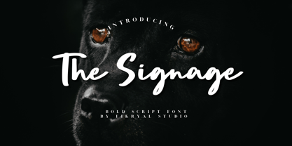 The Signage is a bold script font perfect for crafting, branding, invitation, stationery, wedding designs, social media posts, advertisements, product packaging, product designs, label, photography, watermark, special events, or anything. Included : The Signage multilingual support If you have any questions please don’t hesitate to contact me Thank you best regards, Fikryal Studio
 - Woodyland by Illushvara,
$16.00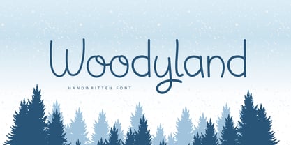 Hello, Woodyland is a cute and friendly handwriting font that is perfect for winter design or crafty projects. Use it for branding, crafts for decor, invitations, and more! Features : Uppercase and lowercase Numbers Symbols Ligature Multilingual Accent If you have any question, don’t hesitate to contact me. Happy Designing !!! Thank You, Bayu Suwirya
 - Humilde Regular by MrLetters,
$15.00 Introducing Humilde Script a new fresh & modern script with a handmade calligraphy style, decorative characters So beautiful on invitation like greeting cards, branding materials, business cards, quotes, posters, and more!! If you have any question, don't hesitate to contact me by email hello.mrletters@gmail.com Thanks and happy designing :-) Thank You for purchase!
 - Tita Script by Latinotype,
$59.00 Tita is dedicated to my grandmother Hebe, witty and arrabalera 1. The font is inspired by Milonga 2 music and the fileteado porteño 3. I picture it at The Moulin Rouge, sparkling, provocative, loving. It evokes Tita Merello and my grandmum singing her music. Tita is Argentinean to its very core. A font to shout goal and dulce de leche 4 with passion! Its curves originate from polirhythmic calligraphy, which I learnt from my mentor Silvia Cordero Vega. Tita is a pedigree script that is based on hand lettering and Sandra Biondi’s calligraphy works. Font digitalisation by Daniel Hernández. Edited by Javier Quintana / Programmed by Manuel Corradine. 1. A person from the arrabal (a working class neighborhood on the outskirts of the city of Buenos Aires) 2. Musical genre originated in the Río de la Plata areas of Argentina and Uruguay 3. Decorative hand lettering and artistic style that is frequently spotted in Buenos Aires 4. Sweet milk sauce
 - Roos ST by Canada Type,
$39.95 Roos ST is a special version of the Roos family, engineered specifically for science writing. It is equipped with SciType, a combination of additional characters and OpenType programming included in the fonts to help with typesetting science text. For more information about SciType, please consult the SciType FAQ available in the Gallery section of this page. The Roos design is the Dutch classic made by S. H. de Roos during the years of the second World War, and subsequently used for a special edition of the Dutch Constitution on which Juliana took the oath during her inauguration as the Queen of the Netherlands. This design is widely regarded as de Roos's finest, and has one of the most beautiful italics ever drawn. Aside from the SciType additions, all the Roos ST fonts contain OpenType features for ligatures, ordinals, automatic fractions, and seven kinds of figures. For details about the functionality of Roos ST, please consult its Access Chart PDF available in the Gallery section of this page.
 - Ministry by Device,
$39.00 A 14-weight sans family based on the original British ‘M.O.T.’ (Ministry of Transport) alphabet. A capitals-only, single-weight design was drawn up around 1933 for use on Britain’s road network, and remained in use until Jock Kinnear and Margaret Calvert’s ‘Transport Alphabet’ was introduced for Britain's first motorway in 1958. The identity of the original designer is not preserved; however, Antony Froshaug in a 1963 ‘Design’ magazine article mentions Edward Johnston as an advisor. Speculation that it was based on Johnston’s London Transport alphabet is discussed in archived government documents from 1957: “So far as I am aware, the Ministry alphabet was not based on Johnston’s design; indeed, it has been suggested that Gill got his idea from Johnston. Our alphabet was based on advice from Hubert Llewellyn-Smith (then chairman of the British Institute of Industrial Art) and Mr. J. G. West, a senior architect of H. M. Office of Works.” A 1955-57 revision of the alphabet which polished the somewhat mechanical aspects of the original may be the work of stone carver and typographer David Kindersley. For the digitisation, Rian Hughes added an entirely new lower case, italics and a range of weights. The lower case mimics the forms of the capitals wherever possible, taking cues form Gill and Johnston for letters such as the a and g, with single-tier versions in the italic. A uniquely British font that is now available in a versatile family for modern use.
 - Bembo MT by Monotype,
$45.99 The origins of Bembo go back to one of the most famous printers of the Italian Renaissance, Aldus Manutius. In 1496, he used a new roman typeface to print the book de Aetna, a travelogue by the popular writer Pietro Bembo. This type was designed by Francesco Griffo, a prolific punchcutter who was one of the first to depart from the heavier pen-drawn look of humanist calligraphy to develop the more stylized look we associate with roman types today. In 1929, Stanley Morison and the design staff at the Monotype Corporation used Griffo's roman as the model for a revival type design named Bembo. They made a number of changes to the fifteenth-century letters to make the font more adaptable to machine composition. The italic is based on letters cut by the Renaissance scribe Giovanni Tagliente. Because of their quiet presence and graceful stability, the lighter weights of Bembo are popular for book typography. The heavier weights impart a look of conservative dependability to advertising and packaging projects. With 31 weights, including small caps, Old style figures, expert characters, and an alternate cap R, Bembo makes an excellent all-purpose font family.
 - Bembo Infant by Monotype,
$45.99The origins of Bembo go back to one of the most famous printers of the Italian Renaissance, Aldus Manutius. In 1496, he used a new roman typeface to print the book de Aetna, a travelogue by the popular writer Pietro Bembo. This type was designed by Francesco Griffo, a prolific punchcutter who was one of the first to depart from the heavier pen-drawn look of humanist calligraphy to develop the more stylized look we associate with roman types today. In 1929, Stanley Morison and the design staff at the Monotype Corporation used Griffo's roman as the model for a revival type design named Bembo. They made a number of changes to the fifteenth-century letters to make the font more adaptable to machine composition. The italic is based on letters cut by the Renaissance scribe Giovanni Tagliente. Because of their quiet presence and graceful stability, the lighter weights of Bembo are popular for book typography. The heavier weights impart a look of conservative dependability to advertising and packaging projects. With 31 weights, including small caps, Old style figures, expert characters, and an alternate cap R, Bembo makes an excellent all-purpose font family. - Mislab Std by Typofonderie,
$59.00 A brighter slab n’ sans in 18 styles Referred to as Egyptian’s in the early years of the nineteenth century, today slab serifs are primarily used in display sizes but seldom used in body text. With Mislab, Xavier Dupré has designed a brighter and more legible slab serif than most. Mislab aptly combines the strength of a slab serif with the lightness of a sans serif. Bold and thick serifs make for strong impact in display uses while performing extremely well under the most stressful body text conditions. A slight cursive feel adds spice to the text while its delicate rounded rectangular structure is naturally adapted to screen displays. The capitals have fully assumed serifs while the lowercases have more discreet versions. Notable features include sanserif endings on the lowercase a, c, e & s, inducing fluidity and enhanced readability. This highly versatile typeface brings clarity to headlines. Mislab will provide foolproof stability to your layouts. Mislab, a new design by Xavier Dupré Type Directors Club 2014 Tokyo TDC 2014 Communication Arts Typography Awards 2014 Club des directeurs artistiques, 45e palmarès Slanted: Contemporary Typefaces #25
 - MFC Botanical Borders by Monogram Fonts Co.,
$19.95 The inspiration source for MFC Botanical Borders is a collection of border treatments from the 1886 “Spécimens de caractères d'imprimerie” by E. Houpied a Paris. This collection of elegant floral and foliage borders has been put together with their original decorated rules, as well as alternate matching precision rules for added versatility. You can start with a new document or work on a new layer within an existing document. Select MFC Botanical Borders from the font menu. (Some users may have font previewing enabled in the font menu which will cause the font name to appear as border elements, disable this option in order to choose the name) Make certain that the point size of the font is the same as the leading being applied to the font so the borders will meet up properly. While we’ve adjusted this within the font, your program may override these settings. For instance a 12 point font should have 12 points of leading. A PDF guidebook for MFC Botanical Borders is included in the font package. Download and view the MFC Botanical Borders Guidebook if you would like to learn a little more.
 - Pantographia by Intellecta Design,
$9.00Pantographia Collection is a Intellecta digitization, in facsimile style, without artistical interpretation of any kind, of the work of Edmund Fry (monumental book), Pantographia , a work on languages containing over 200 alphabets. We just are collecting in digital way these alphabets. Each alphabet has a short pdf description (see in the gallery). For example, in the pdf brochure of the "Saracen One" font, according to Edmund Fry, "This characters, according to Theseus Ambrosius, was used by the Saracens at the time of their conquests. Claude Duret, p. 475." Ambrosius, Theseus: Introductio in Chaldaicam lingua, Syriaca, atque Armenicam, [et] dece*. - 1539. Theseus Ambrosius or AMBROGIO, was an Italian orientalist, which born in 1469, and died in 1539 - He wrote his Introduction to the Chaldean, Syrian, Armenian, and ten other tongues, with the alphabetical characters of about forty different languages, 4to." The Pantographia font have only the original characters showed in Fry's book. There are instructions in the PDF files to get them. These fonts have no philological (or linguistic) academic pretentions. They are digitized and faithful versions of the original, like first published at Fry's book. - VLNL Bint by VetteLetters,
$35.00 Kornelis de Vries, a headmaster from the Dutch province of Friesland, cultivated new potato breeds that he named after pupils in his school. In the early 1900s he came up with the tasty Bintje (a Frisian girl’s name) and it became a big success – in Belgium and France it has remained the most popular potato for french fries to this day, more than a century since its introduction. Donald Roos took 10 kilos of fresh Bintje potatoes and cut the Bint typeface by hand with a short, sharp knife. He then inked each character once and printed it twice; the second, lighter printing is accommodated in the lower case alphabet. The Bint family offers a script to make the letters bounce up and down the baseline; with OpenType functionality the font randomly chooses each character from the upper- or lowercase alphabet. ‘Tabular lining figures’ will activate a series of negative numerals in boxes; ‘Discretionary ligatures’ activates specially designed letter combinations like ‘www’ as well as arrows and stars. Bint has a distinct, slightly rough handmade appearance, making it useful for a wide range of designs.
 - Mousse Script by Sudtipos,
$79.00 Mousse Script is based on Glenmoy, a 1932 Stephenson Blake typeface. Glenmoy a prime example of what display typography was in pre-WWII American ad art. It graced the pages of magazines, sold numerous products and services, then simply died out when the typographic trends shifted towards the more personalized, stylized and handwritten types of calligraphy. The current trend in typography is a revivalism that brings all of the distinctive display typography of the 20th century, without chronological discrimination, back in the name of ‘retro’. Who are we to deny the masses what they want? Mousse Script doesn’t just bring Glenmoy back from the ashes of the 20th century. It expands upon the limited metal character set nearly twice over and takes advantage of the latest type technologies. This makes Mousse Script a striking typeface, both functionally and visually. A simple, attractive display font on the surface, Mousse Script is unique in its bold upright calligraphy, something rarely found these days. The OpenType version of Mousse Script combines both the regular and alternate character sets into a single, cross-platform package that takes advantage of the extended typographic features of the OpenType format.