10,000 search results
(0.064 seconds)
- Mango Mingle by Balpirick,
$15.00 Mango Mingle is a Handdrawn Font. Whether you’re using it for crafts, digital design, presentations, or making greeting cards, this font has the potential to become your favorite go-to font, no matter the occasion! This font only has allcaps letters. - also multilingual support Enjoy the font! Feel free to comment or feedback! Thank you!
 - Honey Bread by Balpirick,
$14.00 Honey Bread is a Handbrushed Font. Whether you’re using it for crafts, digital design, presentations, or making greeting cards, this font has the potential to become your favorite go-to font, no matter the occasion! This font only has allcaps letters. - also multilingual support Enjoy the font! Feel free to comment or feedback! Thank you!
 - Bijoute Sans by Struvictory.art,
$16.00 Bijouté is a modern sans serif font with bohemian motives. The font is created in classic proportions and decorated with elegant decor. The font is suitable for the design on the theme of mysticism, esotericism, fashion and style. This font is based on my Nomad Bohemian Sans: https://www.myfonts.com/collections/nomad-decorative-font-struvictory-art
 - Summer Peach by Sakha Design,
$10.00 Summer Peach is a dazzling script font. This font is neatly crafted and highly detailed. Whatever the topic, this font will be a wonderful asset to your font library, as it has the potential to enhance any creation. This font is PUA encoded which means you can access all glyphs and swashes with ease!
 - Pierce Jackson by Balpirick,
$15.00 Pierce Jackson is a Handbrushed Font. Whether you’re using it for crafts, digital design, presentations, or making greeting cards, this font has the potential to become your favorite go-to font, no matter the occasion! This font only has allcaps letters. - also multilingual support Enjoy the font! Feel free to comment or feedback! Thank you!
 - Hebrew Castel by Samtype,
$125.00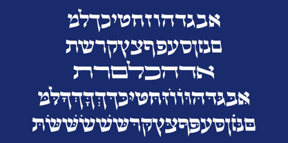 Beautiful Calligraphic font and also a readable font.
 - WarpedJenny by Ingrimayne Type,
$9.00 A warped font based on the font JennerickInformal.
 - WC Mano Negra Bta - Unknown license

- Bestiful by GlyphStyle,
$16.00 Beautiful is a font with a modern calligraphy style and free form, has a curly end, not found in other fonts. Charming and beautiful font - Font feature Uppercase, Lowercase, Numerals & Punctuations, Stylistic alternate(ending), Ss01(beginning), Ligature, Swashes, Multilanguage
 - Tasty Matcha by Crumphand,
$20.00 Here is it, Tasty Matcha Fonts. Based on my favorite drink become a fonts called Tasty Matcha. The fonts looks good, stunning, great, ease reading. What's Included Inside The Fonts ? Uppercase Lowercase Symbols Numerals European Multilingual Thank You, Regards!
 - Glembo by Differentialtype,
$10.00 Glembo is a bold sans display font. This font has six styles that you can combine. Whatever the topic, this font will be a great asset to your font library, as it has the potential to enhance any creation.
 - Allison Style by Sarid Ezra,
$13.00 Allison Style is my newest font duo. Contain two fonts, the delicate serif and a free hand writing script. This font duo also support multilingual, number and symbol, end swash and many ligatures. Also this font already PUA Encoded.
 - Kompress Pro by RMU,
$35.00 Kompress Pro - a font family of two highly compressed sans serif fonts, regular and shadowed. Both fonts contain West and East European character sets, as well as Cyrillic glyphs. This multilingual font family is well suited for decorative purposes.
 - Nice Dream by Sronstudio,
$12.00 Nice Dream is a fun display Font font, this font Is perfect for lproduct packaging, product designs, label, photography, watermark, special events or anything. Caps Only Fonts. Nice Dream comes with uppercase and lowercase letters, multilingual symbols, numerals, punctuation.
 - Dino Dingbats by Beewest Studio,
$10.00 Dino Dingbats Font is cute and adorable Dinosaurus dingbats font. Whether you’re using it for crafts, digital design, presentations, or making greeting cards, this font has the potential to become your favorite go-to font, no matter the occasion!.
 - Alphabet_02, while a hypothetical creation for the purposes of this discussion, can be visualized as a font that exudes a blend of modern sophistication and artistic creativity. Picture Alphabet_02 a...
- FS Silas Slab by Fontsmith,
$80.00 Slab-like sibling Why stop at sans? Rather than leave FS Silas Sans as an only child, the team wanted to extend the family, and create a complete system for brands and editorial. Unsure what the result would be, the team started experimenting with a slab serif version. ‘We didn’t know how it would turn out, but we really liked it and wanted to take it further. A fresh angle ‘We stuck with the angular theme of the sans by drawing angled slab serifs,’ says Phil Garnham, ‘as opposed to the square serifs that slab fonts usually have. That created an inner dynamism in words and sentences on the page, and a very distinctive, crafted character, like a Victorian soul in a contemporary body.’ These crafted touches include details such as the angled ascenders on the ‘i’ and ‘l’, while characters such as the ‘y’, with its abruptly-ending descender, add a mark of distinction. A perfect pair Silas Slab, like its sibling, offers a clear-cut range of five weights, from the elegant Thin to the monumental ExtraBold. Put it together with Silas Sans and you have the full complement, capable of performing the full range of tasks, above the line and below, in headlines, body copy and logotypes, B2B and B2C. Keep them together; they don’t like it when they’re apart.
 - MVB Embarcadero by MVB,
$79.00 MVB Embarcadero lies in a space between grotesque sans serifs and the vernacular signage lettering drawn by engineers. It’s a style that happens to convey credibility and forthrightness without pretense—it’s anti-style, actually. All of this makes for the most versatile of typefaces, capable of delivering any kind of message while staying out of the way. As is often the case with a type design that develops over several years, Embarcadero isn’t the realization of a specific concept. In the ’90s Mark van Bronkhorst began digitizing a blocky slab serif from the Victorian era, which was then set aside for many years. He later revisited the design, paring it down to its bare essentials, and as more time passed, it evolved from a grid-based outline to curves that echoed the rigid skeleton of the original. Eventually it became a complete family with all the readability requirements of a text sans serif, yet maintaining the subtle eccentricities of its inspiration. Functionally, the Embarcadero family is as adaptable as its design. The OpenType Pro set of 20 fonts contains two widths and five weights, each with italics, small caps, a full set of figures, bullets and arrows, and support for most Latin-based languages. In all, Embarcadero is suitable for headlines or text. And—thanks to its simple, square form—it’s ideal for type on screen too.
 - Normandia by Canada Type,
$30.00 Designed over three years after the second World War, and published in 1949 by the Nebiolo foundry, Normandia was Alessandro Butti’s take on the fat face. As it usually was with Butti’s designs, this face effectively injected a catchy yet expertly calculated calligraphic spin into its source of inspiration — which was the essentially geometric/deco, thicker model of Bodoni’s very popular aesthetic. The metal Normandia saw some widespread use for a handful of years after its publication, not least because of the multitude of sizes in which it was available. It stepped out of the limelight by the mid-1950s, due to a combination of the popularity of cold type and Nebiolo’s refusal to retool its faces for new technologies. It was copied by a few small film typesetting outfits on both sides of the Atlantic, but never really found its way back to the mainstream. By the time computer type became the norm, Normandia was pretty much relegated to a type historian’s collection of anecdotes. This digital update of the classic series revives and refines the three original metal designs (Tonda/Regular, Corsiva/Italic, and Contornata/Outline) and expands the character set to more than 600 glyphs per font, including small caps, six types of figures, fractions and nut fractions, a full set of f-ligatures, some stylistic alternates, and other fine typography niceties.
 - Maiola by TypeTogether,
$49.00 Being inspired by early Czech type design, Maiola is clearly a contemporary typeface, that is mindful of its historical heritage, implementing old-style features and calligraphic reminiscence, more frankly so in the Italic. Nevertheless, through its personality, it attempts to create a welcoming tension on the page, without shouting too loudly at the reader. It handles its expressive tendencies with care and in doing so increases its usability, with legibility being of great importance. Subtle irregularities of the letterforms enhance furthermore the dynamic spirit and liveliness of the typeface. With the advent of Opentype, allowing for bigger character-sets and better language support, as a natural consequence, Maiola Multiscript covers Latin A, Cyrillic and Greek. Although basically independent from each other, they are, however, designed in the same spirit as the Latin, and harmonize well in multilingual text settings. The update to this beautiful font family includes the addition of over 240 glyphs featuring new ornaments, stylistic alternates, ligatures, superior letters, fractions and more. Furthermore, several glyphs were significantly improved and the kerning was fine tuned for better performance. Originally released in 2005, Maiola was an immediate success. It won the renowned TDC competition in 2004 where it was also recognized as a “judge’s choice”, was part of the touring exhibition e-a-t, and was selected in the Creative Review design competition in 2005.
 - Farao by Storm Type Foundry,
$21.00Originally designed in 1998 as a 3-font family, updated in 2016 by new italics, small caps and many OpenType functions, resulting in a set of highly visible poster typefaces. If a text is set in a good Egyptienne, we can observe a kind of sparkle in the lines. Slab-serifs are cheerful typefaces, possibly due to the fact that they developed simultaneously with Grotesque typefaces. The design principle originating from the first half of the 19th century does not have such firm and long-established roots as for example, the Venetian Roman typefaces, hence it’s much more prone to a “decline”. We know of Egyptiennes with uneven color, with letters falling backwards (this often happens in the case of “S”), and especially with slightly bizarre modeling of details. In the course of time, however, it was realized that such things could be quite pleasant and tempting. After a century and a half, we find that such Egyptiennes could refresh uniform computer typography. The forms of many twisted letters resemble the gestures of a juggler: others, rectangularly static ones, reflect the profile of a rail or a steel girder – things which, in their times, were new and were observed by the first creators of Egyptiennes. These typefaces are ideal for circus posters and programs for theatre performances, just as for printing on cement sacks. - ALS SyysScript by Art. Lebedev Studio,
$63.00 Handwriting of a strong Carelian personality revived: It’s autumn time once again, harvesting season, mushroom & berry time – the favourite season of my Karelian aunt Katri. A postcard she sent me more than twenty years ago had inspired me to SyysScript, “Script of Autumn” in Finnish. Katri had a very kind but also energetic personality, and I always thought her handwriting was a mirror of it. By making SyysScript I felt I could revive some of her unforgettable character. My Finnish autumn font has by now become a favourite for many and is branding fine food in both the Eastern and the Western hemisphere – even far beyond the arctic circle. “SyysScript“ is actually a growing family. For enhanced functionality in small sizes I added “SyysScript Eco” a year ago, a style with shortened extensions and simplified letterforms especially suited for packaging. And this autumn, a special one for Finland which is celebrating its 99th birthday, SyysScript grew again: Two long awaited newcomers, “SyysScript FeltTip” and “SyysScript FeltTip Eco” joined the family. They are bolder and softer than the previous styles but keep their positive, lighthearted feel. Use them to make a powerful individual mark on any background. – They are equally well suited for paper, packaging, a screen or even a concrete wall! Language support: Western and Central European, Extended Cyrillic.
 - Tichy by NoCommenType,
$20.00 The "Tichy" typeface is intended for use in titles, headlines and in short text blocks, like citates. However, the typeface is legible even in larger text blocks. It's strong appeal allows the typeface's usage mixed with other graphic elements of the layout without compromising it's readability and it's presence. The typeface's simple initial module (double braked at 135 degrees straight line), the strict rules of forming the letters lead to an unique typeface - masculine, strong and still legible. The Cyrillic glyphs are influenced by the work of the great Bulgarian typographers Boris Angelushev, Vassil Yonchev and Alexander Poplilov, who developed Cyrillic further in 60-s and 70-s of the XX century. Western, East European, Cyrillic, Baltic and Turkish codepages are supported. The font file contains all the basic ligatures, alternate glyphs and kern pairs. It can be used both on Windows and MacOS based computers. The history of "Tichy" typeface began many years ago with a project for logotype design for a small company. It was a kind of designer's game to try making some letters just using one single module. Development of the other glyphs of the latin alphabet was for many years a mandatory exercise for the young colleagues in our studio. Suddenly we realized that this project matured and creation of a new typeface started.
 - ITC Tyke by ITC,
$29.99Tomi Haaparanta got the idea for the Tyke typeface family after using Cooper Black for a design project. He liked Cooper's chubby design, but longed for a wider range of weights. “I wanted a typeface that was cuddly and friendly,” recalls Haaparanta, “but also one that was readable at text sizes.” He started tinkering with the idea, and Tyke began to emerge. Even though Haaparanta knew his boldest weight would equal the heft of Cooper Black, he began drawing the Tyke family with the medium. His goal was to refine the characteristics of the design at this moderate weight, and then build on it to create the light and bold extremes. Haaparanta got the spark to design type in 1990, when he attended a workshop held by Phil Baines at the National College of Art and Design in Dublin. “I've been working and playing with type ever since,” Haaparanta recalls. He released his first commercial font in 1996, while working as an Art Director in Helsinki. After about two dozen more releases, he founded his own type studio, Suomi Type Foundry, early in 2004. At five weights plus corresponding italics, Tyke easily fulfills Haaparanta's goal of creating a wide range of distinctive, completely usable designs. The light through bold weights perform well at both large and small sizes, while the Black is an outstanding alternative to Cooper for display copy. - Shackie Handpainted by Mans Greback,
$59.00 Shackie Handpainted is a striking custom lettering font, embodying the charm and flair of a script brush. This logotype font is perfect for projects requiring a cool and edgy touch, such as T-shirt designs and sign painting. With its unique hand-painted style, Shackie Handpainted brings a distinctive appeal to your creative work. The font's dynamic brushstrokes lend it the authentic feel of a sign painter's masterpiece, making it an excellent choice for projects that call for custom lettering and a personal touch. The Shackie Handpainted font family includes six expressive styles to suit various design needs: The weights Thin, Regular and Bold, with each thickness as Italic. The font is built with advanced OpenType functionality and has a guaranteed top-notch quality, containing stylistic and contextual alternates, ligatures and more features; all to give you full control and customizability. It has extensive lingual support, covering all Latin-based languages, from Northern Europe to South Africa, from America to South-East Asia. It contains all characters and symbols you'll ever need, including all punctuation and numbers.
 - Wien Pro by Wannatype,
$36.00 Wien Pro, the sans serif by Ekke Wolf. Typeface lovers looking for a modern, well-developed sans serif font with a touch of retro and warm, individual lettering will get excited about a new addition to the font market. The more than complete Wien Pro front comes in three styles and four different weights. In addition to the upright Wien Pro there is the Wien Pro Oblique with a moderate 6° slant and the Wien Pro Superoblique with an 18° slant. Available weights are light, regular, medium, bold and black. These fonts are equipped with extended Latin alphabet for Central and Eastern Europe and also Cyrillic and Greek alphabet. The set of characters includes nine different sets of numbers, plus its own set for the small caps, as well as alternative characters and groovy ligatures. In addition, all Wien Pro styles are also available as unicase with upper case and lower case x-height alignment. The style, metrics and proportions of Wien Pro combine perfectly with the Liebelei Pro and the script fonts of the Calafati Pro.
 - Azudings 1 - Unknown license

- Leviatan by Saskara Type,
$15.00 leviatan is a spooky display font featuring horror & scary characters This font is inspired by blood Add this font to your most creative ideas
 - Tora Caligraphy by Samtype,
$39.95 This font is a new fresh type of caligraphy hebrew font. The opentype features are much better then those are in the font market.
 - Pixochrome - Unknown license

- Walentiny by Stringlabs Creative Studio,
$25.00 Walentiny is a Script Font with Handwritten Style. The Walentiny font made with digital brush pen strokes that making this font look authentic. This font is perfect for fashion brand, wedding invitation, business card, logo brand, signature, and then calligraphy.
 - Quiet The Thief by Dismantle Destroy,
$19.00This would be a great font for a book. There are 7 fonts in the font family, so there are a lot of choices to work with. The font features all capital letters with some alternate glyphs for certain characters. - Arionna by Stringlabs Creative Studio,
$25.00 Arionna is a Script Font with Calligraphy Style. The Arionna font made with modern digital brush pen strokes that making this font look beautiful. This font is perfect for fashion brand, wedding invitation, business card, logo brand, signature, and then calligraphy.
 - Black Orchestra by 38-lineart,
$16.00 ‘Black Orchestra’ is a black letter font inspired by heavy metal. This font consists of uppercase and lowercase and is supported by ‘Latin extended’ which allows wider use of this font. This font will turn any horror project into a standout!
 - Firsta by Stringlabs Creative Studio,
$25.00 Firsta is a Script Font with Handwritten Style. The Firsta font made with digital brush pen strokes that making this font look authentic. This font is perfect for fashion brand, wedding invitation, business card, logo brand, signature, and then calligraphy.
 - Baliung by Stringlabs Creative Studio,
$25.00 Baliung is a Script Font with Handwritten Brush Style. The Baliung font made with digital brush pen strokes that making this font look authentic. This font is perfect for fashion brand, wedding invitation, business card, logo brand, signature, and then calligraphy.
 - Reinstay by Stringlabs Creative Studio,
$25.00 Reinstay is a script font with textured brush style. The Reinstay font made with digital brush pen strokes that making this font look authentic. This font is perfect for fashion brand, wedding invitation, business card, logo brand, signature, and then calligraphy.
 - Vagnotie by Stringlabs Creative Studio,
$25.00 Vagnotie is a Script Font with Modern Brush Style. The Vagnotie font made with digital brush pen strokes that making this font look authentic. This font is perfect for fashion brand, wedding invitation, business card, logo brand, signature, and then calligraphy.
 - Rakeboom by CBRTEXT Studio,
$16.00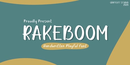 Rakeboom is a cute handwritten font. This font is equipped with uppercase, lowercase, symbols, and punctuation. This font is suitable for branding purposes such as logos, book covers, quotes, crafts, magazines, advertisements, and others. This font also supports multi-languages.
 - Curly Gloom by Heyfonts,
$15.00 Curly gloom is an experimental font adapted from a combined groovy font and graffiti that makes its unique character as a display font, this font is very suitable to use as your project design such as a graphic template or clothing.


