10,000 search results
(0.083 seconds)
- Bashan by Muksal Creatives,
$12.00 Bashan is modern serif font with beautiful contrast. Specially designed for fashion-themed projects, perfectly suitable for creating elegant, chic, lifestyle design such as logos, title, and magazine, and more.
 - Amallthea by AEN Creative Studio,
$15.00 Amallthea is natural dry brush font. It can be used for various purposes such as logos, quotes, posters, playful lettering, clothing, and every other design which needs a unique touch.
 - Fountain Pen by Jonahfonts,
$20.00 An unconecting script face that closely resembles hand written with a fountainpen. It was expressly designed for informal applications such as invitations, notations, side boxes and hand written personal cards.
 - Dantalia by Just Lett,
$13.00 Dantalia is a handwritten font. It is perfect for project designs such as wedding invitations, posters, logos, typography, lettering, and more. Features: Uppercase Lowercase Numerals & Punctuation Stylistic Alternates Stylistic Sets
 - Lyanna by Jonahfonts,
$35.00 Free flowing legible connected-script with glyph terminals including all diacritics. Suitable for various applications such as captions, fashion headlines, packaging, invitations, cards, posters, ads, greeting cards and book jackets..
 - Parlinttons Script by FadeLine Studio,
$12.00 Parlinttons Script is a trendy, elegant, natural and thin font. It is suitable for use in various design styles such as watercolors, minimalism, flat, modern designs, classic designs, and more.
 - Mollis Lux by Blendy wine,
$9.00 This font is designed using straight lines and circle segments. The font is simple and universally usable. But there are some unique characters such as S,K,X, and Y.
 - Quado by Tadiar,
$13.00 Quado is friendly style font designed for such areas as Entertainment, Techno, Games & Applications etc. with Multilingual support (Latin Extended). Please see the preview images to see how it works.
 - Ashery by Viswell,
$16.00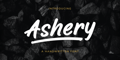 Ashery is a handwritten font, made with a natural marker brush. This font will be suit for your design project such as branding, logo design, packaging, quotes, and many more.
 - Particela by Putracetol,
$20.00 Particela - Display Font. Particela is a display style font. The classic, fun and groovy impression is very visible. But in Particela I combine several variations such as the ligature. Particela is inspired by vintage albums and posters from 1960s music bands. It makes this font even more unique and different. Particela is also great for any kind of display purpose from album, cover,poster, label, tshirt, apparel, signage, quote, logo, greeting card,logotype and many more. Particela is also support multi language. The alternative characters were divided into several Open Type features such as Swash, Stylistic Sets, Stylistic Alternates, Contextual Alternates, and Ligature. The Open Type features can be accessed by using Open Type savvy programs such as Adobe Illustrator, Adobe InDesign, Adobe Photoshop Corel Draw X version, And Microsoft Word. This font is also support multi language.
 - Hello Velantinos by IM Studio,
$12.00 Hello Velantinos is modern calligraphy. a bold, elegant & fun vintage script font. It can be used for various purposes such as logos, wedding invitations, t-shirts, letterheads, signage, news, posters, badges etc. Hello Velantinos features 453 glyphs and 222 alternate characters, ligatures, washes and multiple language support. To enable the OpenType Stylistic alternative, you need a program that supports OpenType features such as Adobe Illustrator CS, Adobe Indesign & CorelDraw X6-X7. How to get alternative glyph access from open type fonts: http://youtu.be/iptSFA7feQ0 There are additional ways to access alternatives/swashes, using Character Map (Windows), Nexus Font (Windows), Font Book (Mac) or a software program such as PopChar (for Windows and Mac). How to access all alternative characters, using Windows Character Map with Photoshop: https://www.youtube.com/watch?v=Go9vacoYmBw Need help? If you need help or advice, please contact me.
 - The Harley Queen by Natural Ink,
$10.00 Harley Queen is a fun, vintage script font. It can be used for various purposes such as logos, wedding invitations, t-shirts, letterheads, signage, news, posters, badges, and more. Harley Queen Script features 300+ glyphs and extruded font, alternate characters, ligatures, and swash support. To enable the OpenType Stylistic alternates, you need a program that supports OpenType features such as Adobe Illustrator CS, Adobe Indesign & CorelDraw X6-X7. How to get access alternate glyphs from open type fonts: http://youtu.be/iptSFA7feQ0 There are additional ways to access alternates/swashes, using Character Map (Windows), Nexus Font (Windows), Font Book (Mac) or a software program such as PopChar (for Windows and Mac). How to access all alternative characters, using Windows Character Map with Photoshop: https://www.youtube.com/watch?v=Go9vacoYmBw Need help? If you need help or advice, please contact me by e-mail. Thank you!
 - Historia Script by Fargun Studio,
$19.00 Historia script is the stylish vintage look font. Come with ligatures, stylistic alternate, stylistic set and end swash to make your own design look perfect. Can be used for various purposes. such as headings, signature, logos, retro wedding invitation, t-shirt, letterhead, signage, label, news, posters, badges etc. Features : Unique ligatures Stylistic Alternates Stylistic sets Basic Latin A-Z and a-z Numbers International Symbols included Punctuations To enable the OpenType Stylistic alternates, you need a program that supports OpenType features such as Adobe Illustrator CS, Adobe Indesign, Adobe Photoshop & CorelDraw X6-X7. There are additional ways to access alternates/swashes, using Character Map (Windows), Nexus Font (Windows), Font Book (Mac) or a software program such as PopChar (for Windows and Mac). Need help? If you need help or advice, please contact me by e-mail fargunstudio@gmail.com Thank you for your purchase!
 - Roney JNL by Jeff Levine,
$29.00If it's at all possible to "Deco-ize" an Art Deco font even more, it's been done with Roney JNL. Named for one of the classic hotels built during the heyday of Miami Beach, this font is a stylized version of Jeff Levine's Metalet Modern; a design derived from an actual 1940s home movie titling set. - Tarpon Springs JNL by Jeff Levine,
$29.00 An early-1960s Canadian magazine ad for a brand of birth control pills featured the least likely spokesperson – Annette Funicello (“starring in “Beach Blanket Bingo” and “How to Stuff A Wild Bikini”). The text was hand lettered in an Art Deco-inspired sans serif type design. Tarpon Spring JNL is available in both regular and oblique versions.
 - Art Deco Monograms JNL by Jeff Levine,
$29.00 The same monograms found on a 1930s-era business card that inspired Golden Beach JNL are reproduced as Art Deco Monograms JNL. Left-side monograms are on the upper case A-Z, while the lower case a-z are the right side monograms. A vertical bar is on the period key for a centerpiece between the two initials.
 - Vintage Melody Personal Use by Din Studio is a font that at first glance transports you to an era where handwritten letters were the primary means of communication, and each stroke of the pen was inf...
- Identa by Sudtipos,
$39.00 Because we know that you will never get tired of using them and that you will always need a new tool for Identity Design, we created Identa. Conceived to translate corporate and humanist ideals in its typographic form, it seeks a dialogue between neutrality and contemporaneity. With a pragmatic attention to functionality that does not forget aesthetics. It is a Sans serif model, accessible and well-founded. All-terrain, workhorse that seeks to be reliable and durable. It solves any type of content with efficiency, intelligence and professionalism. Its clean forms and x-height make it a very competent face for both short identifiers and long text bodies, ideal for display use where legibility and personality must match new design needs within a company. It is available in eight styles, ranging from its White version to the darker Vantablack, each optimally set with its respective italic variables, and a Dingbats font designed to solve everyday cases. Each font contains 737 glyphs, macro and micro aesthetic details inspired by current visual communication systems and trends. The dingbats font includes 303 signs and is a set of icons and symbols that can be used in multiple environments, both for print and digital media. This typeface family seeks to meet the needs of brand designers looking to create an assertive appearance, whatever the case. It is a solid and self-confident typeface, without appearing overly constructed; on the contrary, its nuance makes it look fresh.
 - Andulka by Storm Type Foundry,
$44.00A universal typeface for books, magazines and newspapers must be economizing, quiet, strong in drawing, but original and peaceful at the same time. Type "for all weather" must resist also many difficulties of printing on different surfaces. Therefore, the basic design "Text" is slightly darker and legible from 6 point size even in a dim light, whereas "Book" reduces the effect of running ink and saves toner cartridge. In offices of smaller companies these lighter fonts are welcomed as toner-savers. Andulka also need less space on the page than other text typefaces and saves paper too. Medium and Bold designs keep the original grace, changing its weight only in shadows. Italics may remind humanistic inspiration and forcing the horizontal of x-height with robust horizontal serifs, whereas Roman lower case maintains the baseline. Basic numerals are non-aligning proportional, but there are available upper case figures as well as special numerals drawn for the same height as small caps, which is just about a hairline above the x-height. The characteristic feature of Andulka is a squinted eye in letters 'a', 'c', 'f', 'r', 's', 'k', and softened diagonals through all characters in family. Diagonals were always disturbing and gripping attention extensively. Serifs are stressed trapezoids reminding small beaks at curved endings, descenders 'j' and 'y' may evoke tail feathers of budgerigar. Andulka [budgerigar] sings lovely and is everyday quiet companion. The whole family consists of 24 separate fonts for graphic studio, office or home. - Cloister Open Face LT by Linotype,
$29.99Cloister Open Face was designed in 1929 by Morris Fuller Benton as one weight of the Cloister Old Style family. Cloister itself appeared from 1897 with American Type Founders, and later for the typesetting machines of the Linotype, Intertype and Monotype companies. At that time, it was the truest modern industrial revival of the Jensonian Roman. Benton stayed close to the style of his model in both design and spacing. Cloister Open Face has an old-world elegance, and it works well for titling in books and magazines. In 1458, Charles VII sent the Frenchman Nicolas Jenson to learn the craft of movable type in Mainz, the city where Gutenberg was working. Jenson was supposed to return to France with his newly learned skills, but instead he traveled to Italy, as did other itinerant printers of the time. From 1468 on, he was in Venice, where he flourished as a punchcutter, printer and publisher. He was probably the first non-German printer of movable type, and he produced about 150 editions. Though his punches have vanished, his books have not, and those produced from about 1470 until his death in 1480 have served as a source of inspiration for type designers over centuries. His Roman type is often called the first true Roman." Notable in almost all Jensonian Romans is the angled crossbar on the lowercase e, which is known as the "Venetian Oldstyle e."" - Super Puff MX by Xuveki,
$12.00 Super Puff MX is a Y2K inspired variable display typeface that takes from early 2000's futurism, pop, and cartoon aesthetics. Due to its heavy weight and alternates it offers, it's perfect for a variety of logos, 3D, and motion graphics. SPMX was designed specifically for those use cases, and its wide range of styles and alternates gives you lots of freedom for creating unique graphics that still capture the same fun, futuristic, and playful early 2000's aesthetic. Features & What's Included: Variable font file that allows you to choose any slant degree from Regular to Full Tilt. OTF font files in 4 styles or slants, from Regular to Full Tilt. This is included because many young, talented designers around the world don't have access to programs that can take advantage of a variable font. I want them to have the option of using properly slanted and kerned oblique instances of Super Puff. Robust OpenType features including a vast pool of alternates and stylistic sets giving you lots of choices when choosing letters, numbers, and punctuation. Two stylistic sets for letters and numbers One stylistic set for punctuation and symbols One stylistic set that replaces punctuation with Y2K style icons Extensive Latin language support covering almost all of Europe and South America. All multilingual glyphs have access to alternates as well. Super Puff MX was designed and developed by Abe Zeinali/Xuveki.
 - KING HOSHUN by Twinletter,
$17.00 Welcome King Hoshun, a display font with a superhero style ready to take your projects to a higher level. If you need a strong, bold, and action-packed theme like those in movies, games, or bold designs, King Hoshun is the right choice. With King Hoshun in attendance, your designs will be in the spotlight. Each letter is filled with strength and heroism that will make an unforgettable impact on the audience. The impressive and bold look of this font will make your message feel even more powerful and compelling. Not only does it look impressive, but King Hoshun also offers special features that enrich your creativity. With the available ligatures and alternative characters, you can explore unique and interesting typography combinations. Plus, this font supports multiple languages, so you can present a strong and inspiring message to a global audience. Join the power of King Hoshun and let your projects light up the world. With its bold superhero style and superior features, this font will give your designs an unforgettable impression. Don’t miss the chance to own King Hoshun and create amazing works that amaze and inspire. What’s Included : File font All glyphs Iso Latin 1 Alternate, Ligature Simple installations We highly recommend using a program that supports OpenType features and Glyphs panels like many Adobe apps and Corel Draw so that you can see and access all Glyph variations. PUA Encoded Characters – Fully accessible without additional design software. Fonts include Multilingual support
 - Benguiat Caslon by House Industries,
$33.00 Designed to be set in big, large and huge sizes in classic TNT (tight-not-touching) style, Benguiat Caslon is dynamite for a wide range of display demands. We also included outline and drop-shadow versions as well as numerous swash caps, ligatures, contextual alternates and automatically-shifting punctuation. Ed Benguiat originally designed this alphabet for the Photo-Lettering library during his tenure as the legendary type house’s art director. When we purchased Photo-Lettering in 2003, one of the first things we did was start picking some of our favorite films to digitize as fonts. Photo-Lettering partner Christian Schwartz chose this expressive serif specimen for its high contrast strokes that stand up to the most vigorous display typography demands without withering against pesky design limitations like screen resolution, ink spread and dot gain. FEATURES: Alternate characters, ligatures and contextual substitutions add an unexpected flair to words and phrases. We also provided a drop shadow to add depth and dimension. Shifting punctuation marks take care of those optical tricks so you don't have to. A delicately expressive outline version adds color even in black and white. BENGUIAT CASLON CREDITS: Typeface Design: Ed Benguiat Typeface Digitization: Christian Schwartz, Bas Smidt Typeface Production: Ben Kiel, Jason Campbell Like all good subversives, House Industries hides in plain sight while amplifying the look, feel and style of the world’s most interesting brands, products and people. Based in Delaware, visually influencing the world.
 - Monaz by Craft Supply Co,
$20.00 Introduction to Monaz – Bubble Font Monaz – Bubble Font, a playful and airy display font, is inspired by the lightness and roundness of bubbles and balloons. Perfect for creating eye-catching headings, logos, and children’s books, this font not only grabs attention but also serves as an ideal choice for fun and whimsical projects. Design and Aesthetics In its design, Monaz – Bubble Font features characters that resemble bubbles, with rounded edges and a bouncy feel. Furthermore, the letters mimic the floating appearance of balloons, thus adding a cheerful and lighthearted touch to any design. Additionally, its rounded forms are easy on the eyes, ensuring readability while preserving its playful charm. Versatility and Usage Monaz – Bubble Font boasts high versatility, fitting a variety of design needs effortlessly. Not only does it shine in party invitations and product packaging, but it also excels in promotional materials. Moreover, its effectiveness extends to educational materials for children, making learning engaging with its friendly appearance. As a result, its readability and unique style make it a top choice for designers seeking to add a fun element to their projects. Accessibility and Appeal Designed for a wide audience, Monaz – Bubble Font features a simple and clear style that is easy to read. It appeals to all ages, capturing the whimsy of childhood while still being sophisticated enough for adult projects. In summary, this font brings a unique joy and playfulness to any design, making it a valuable addition to any font collection.
 - Ongunkan South Picene by Runic World Tamgacı,
$50.00 South Picene (also known as Paleo-Sabellic, Mid-Adriatic or Eastern Italic) is an extinct Italic language belonging to the Sabellic subfamily. It is apparently unrelated to the North Picene language, which is not understood and therefore unclassified. South Picene texts were at first relatively inscrutable even though some words were clearly Indo-European. The discovery in 1983 that two of the apparently redundant punctuation marks were in reality simplified letters led to an incremental improvement in their understanding and a first translation in 1985. Difficulties remain. It may represent a third branch of Sabellic, along with Oscan and Umbrian (and their dialects), or the whole Sabellic linguistic area may be best regarded as a linguistic continuum. The paucity of evidence from most of the 'minor dialects' contributes to these difficulties. The corpus of South Picene inscriptions consists of 23 inscriptions on stone or bronze dating from as early as the 6th century BC to as late as the 4th century BC. The dating is estimated according to the features of the letters and in some cases the archaeological context. As the known history of the Picentes does not begin until their subjugation by Rome in the 3rd century, the inscriptions open an earlier window onto their culture as far back as the late Roman Kingdom. Most are stelai or cippi of sandstone or limestone in whole or fragmentary condition sculpted for funerary contexts, but some are monumental statues.
 - ITC Werkstatt by ITC,
$29.99ITC Werkstatt is a result of the combined talents of Alphabet Soup's Paul Crome and Satwinder Sehmi, along with Ilene Strizver and Colin Brignall. It is inspired by the work of Rudolph Koch, the renowned German calligrapher, punchcutter, and type designer of the first third of this century, without being based directly on any of Koch's typefaces. Werkstatt has obvious affinities with the heavy, woodcut look of Koch's popular Neuland, but also with display faces like Wallau and even the light, delicate Koch Antiqua. Brignall began by drawing formal letters with a 55mm cap height, which Sehmi reinterpreted using a pen with a broad-edge nib. “Not an easy process,” says Brignall, “since one of the features of Koch's style is that while it was calligraphic in spirit, most of the time his counter shapes did not bear any resemblance to the external shapes, as they would in normal calligraphy. This meant that Sehmi could not complete a whole character in one go, but had to create the outside and inside shapes separately and then ink in the center of the letters.” The process was repeated, only without entirely filling in the outlines, for the Engraved version. Crome handled the scanning and digitization, maintaining the hand-made feel while creating usable digital outlines. “The collaboration of artisans with particular skills,” says Brignall, “in a modern-day, computer-aided studio environment, seems very much in step with the 'workshop' ethos that Rudolph Koch encouraged and promoted so much.” - Linotype Aroma by Linotype,
$29.99From the designer, Tim Ahrens... I started designing this typeface about half a year after learning that Frutiger was not a new brand of sweets and that Garamond is not the name of a fragrance. In time it became clear that designing a sans serif must always be considered as a transformation of traditional serifed typefaces instead of deriving it from typefaces that have been derived from others which have been derived from others again. I did not want Aroma to be one of those odourless and tasteless typefaces wich sacrifice a natural feeling and the characteristic shapes of the letters to neutrality. I think that beauty often evolves unintentionally. For example, I am fascinated by the beauty of airfoils, which are actually a careful transformation of a bird's wing. I love their anorganic and abstract shape which still bears the essence and all the complexity of what they are modelled on. This is exactly the formal concept behind Aroma. Many of the outlines are actually parabolics. The small r, for example, consists exclusively of straight lines and parabolics. I decided to give Aroma more stroke contrast than it is usual for sans serif designs. Many strokes are slightly convex, which gives the font an anorganic feeling. The font was intended to have a feel similar to the antiqua. More specifically, it is based on Old Style Faces. The character of those fonts, which were cut during the Renaissance, is still inherent to Aroma. - Toby Font by Ingo,
$19.00 A playful handwriting of a child Twelve-year old Tobias Düsel designed the characters of this font in 2002 during his family’s furlough in the USA. He drew the alphabet freehand in pencil on a piece of stationery, and clearly had examples of the well-known college and military fonts in mind. The characters in their basic form are geometrically thought out, as well as the construction of the shadows. But remarkably, while drawing, Tobias Düsel did not reach for the obvious aid of a ruler. In fact, the strokes of the letters are not linear, rather are recognizably well-balanced with declining and increasing straights as can be seen in polished classical fonts. Originally this font consists only of upper case letters — all other characters (punctuation marks, figures and similar) have been modified from the components of the capital letters. Complementary to the original Outline-Shadow-Version TobyFont Empty, the variations TobyFont Inside and TobyFont Full are also available. ”Empty“ is, so to speak, the frame of the typeface as “Inside” is the filling, and “Full” is the sum of both. All three versions have the exact same body size so that they can be placed over one another congruently. In this way the effect of a font in two or three colors can be attained. TobyFont is excellently suitable for designing “picturesque” or “hand-carved” contents; large weights are especially charming and striking.
 - Adobe Caslon by Adobe,
$35.00The Englishman William Caslon punchcut many roman, italic, and non-Latin typefaces from 1720 until his death in 1766. At that time most types were being imported to England from Dutch sources, so Caslon was influenced by the characteristics of Dutch types. He did, however, achieve a level of craft that enabled his recognition as the first great English punchcutter. Caslon's roman became so popular that it was known as the script of kings, although on the other side of the political spectrum (and the ocean), the Americans used it for their Declaration of Independence in 1776. The original Caslon specimen sheets and punches have long provided a fertile source for the range of types bearing his name. Identifying characteristics of most Caslons include a cap A with a scooped-out apex; a cap C with two full serifs; and in the italic, a swashed lowercase v and w. Caslon's types have achieved legendary status among printers and typographers, and are considered safe, solid, and dependable. Carol Twombly designed this Caslon revival for Adobe in 1990, after studying Caslon's own specimen sheets from the mid-eighteenth century. This elegant version is quite true to the source, and has been optimized for the demands of digital design and printing. Adobe Caslon? makes an excellent text font and includes just about everything needed by the discriminating typographer: small caps, Old style Figures, swash letters, alternates, ligatures, expert characters, central European characters, and a plethora of period ornaments. - Ongunkan Lycian by Runic World Tamgacı,
$50.00 Lycia (Lycian: 𐊗𐊕𐊐𐊎𐊆𐊖 Trm̃mis; Greek: Λυκία, Lykia; Turkish: Likya) was a geopolitical region in Anatolia in what are now the provinces of Antalya and Muğla on the southern coast of Turkey, bordering the Mediterranean Sea, and Burdur Province inland. Known to history since the records of ancient Egypt and the Hittite Empire in the Late Bronze Age, it was populated by speakers of the Luwian language group. Written records began to be inscribed in stone in the Lycian language (a later form of Luwian) after Lycia's involuntary incorporation into the Achaemenid Empire in the Iron Age. At that time (546 BC) the Luwian speakers were decimated, and Lycia received an influx of Persian speakers. Ancient sources seem to indicate that an older name of the region was Alope (Ancient Greek: Ἀλόπη, Alópē). Lycia fought for the Persians in the Persian Wars, but on the defeat of the Achaemenid Empire by the Greeks, it became intermittently a free agent. After a brief membership in the Athenian Empire, it seceded and became independent (its treaty with Athens had omitted the usual non-secession clause), was under the Persians again, revolted again, was conquered by Mausolus of Caria, returned to the Persians, and finally fell under Macedonian hegemony upon the defeat of the Persians by Alexander the Great. Due to the influx of Greek speakers and the sparsity of the remaining Lycian speakers, Lycia was rapidly Hellenized under the Macedonians, and the Lycian language disappeared from inscriptions and coinage.
 - Rigel by Supremat,
$15.99 Rigel was inspired by one poster by American artist and illustrator Katherine Milhous. It was a poster promoting the Ephrata Cloister in 1936. The letters from the Ephrata title on this poster are very concise and expressive, reminiscent of blackletter, but have a simplified look, which looks quite fresh even today. It was very inspiring to bring this font to life. In the process of redrawing and redesigning, the font has been slightly modified, but retained the character of those six letters from the reference poster. This is a header font consisting only of uppercase letters. It contains 6 styles from Light to ExtraBold. Despite the fact that the font has the character of blackletter, due to simplified forms, increased contrast and sharp lines, the font looks like a modern rethinking of Gothic script and it has found a new life. The name Rigel is taken for a reason. Rigel is a star, an blue supergiant in the constellation of Orion, and the Ancient Egyptians associated Rigel with the Sah - king of stars and patron of the dead. The human body after mummification was also seen as the embodiment of the soul. Of course, there is no direct connection between the font and Egyptian mythology, but indirectly in this way I wanted to emphasize even more the idea of incarnation, rebirth. Rigel is good for posters, large headlines, logos and any other large font compositions.
 - Kingthings Conundrum Pro by CheapProFonts,
$10.00 This pearl by Kevin King was the best faux chinese font I've ever come over, and now it can be used for setting themed text and menus in many more languages! :) Kevin King says: "I have said before you know - I can if I want to (Stamp! Scowl!). Cod Chinese of the worst kind, I wanted a "Chinese" font for a project and couldn't find what I wanted. I painted this font with a Chinese brush and imported the resultant mess - it's been a while since I did any Chinese calligraphy - add that to the fact that I don't read or speak Chinese..." ALL fonts from CheapProFonts have very extensive language support: They contain some unusual diacritic letters (some of which are contained in the Latin Extended-B Unicode block) supporting: Cornish, Filipino (Tagalog), Guarani, Luxembourgian, Malagasy, Romanian, Ulithian and Welsh. They also contain all glyphs in the Latin Extended-A Unicode block (which among others cover the Central European and Baltic areas) supporting: Afrikaans, Belarusian (Lacinka), Bosnian, Catalan, Chichewa, Croatian, Czech, Dutch, Esperanto, Greenlandic, Hungarian, Kashubian, Kurdish (Kurmanji), Latvian, Lithuanian, Maltese, Maori, Polish, Saami (Inari), Saami (North), Serbian (latin), Slovak(ian), Slovene, Sorbian (Lower), Sorbian (Upper), Turkish and Turkmen. And they of course contain all the usual "western" glyphs supporting: Albanian, Basque, Breton, Chamorro, Danish, Estonian, Faroese, Finnish, French, Frisian, Galican, German, Icelandic, Indonesian, Irish (Gaelic), Italian, Northern Sotho, Norwegian, Occitan, Portuguese, Rhaeto-Romance, Sami (Lule), Sami (South), Scots (Gaelic), Spanish, Swedish, Tswana, Walloon and Yapese.
 - Caltic by Ingrimayne Type,
$12.95 Caltic-Holiday, Caltic-Festival, and Caltic-Straight are three eye-catching, very bold typefaces that are suitable for posters and signage. Caltic-Holiday and Caltic-Festival base letter shapes on trapezoids with curved sides but with curves that are reversed going from one to the other. Caltic-Straight has letters based on trapezoids with straight sides. None are suited for text and with their built-in spacing will not work as all upper-case or all lower-case. All three come in two widths, regular and wide, giving the Caltic family six members. Caltic has nothing to do with Celts. The Calt refers to the calt or contextual alternative OpenType feature that makes this typeface work. When the letters on the upper-case keys alternate with the letters on the lower-case keys, they fit snuggly together. As long as the user has a word processor that supports the contextual alternatives feature, there is no need for the user to alternate letters; the calt feature does it automatically. Although the fonts seem similar to hand-drawn lettering that was done on posters and signs during the hippie era of the 1960s and 1970s, I can find nothing quite like them. My inspiration for them is older, in a newspaper from 1932 that led to the typeface family PoultySign. Caltic (and Lentzers) are the result of seeing what else I could do with the inspiration that sprang from that 1932 newspaper.
 - PT Serif Pro by ParaType,
$50.00PT Serif Pro is an universal type family designed for use together with PT Sans Pro family released earlier. PT Serif Pro coordinates with PT Sans Pro on metrics, proportions, weights and design. It consists of 38 styles: 6 weights (from light to black) with corresponding italics of normal proportions; 6 weights (from light to black) with corresponding italics of narrow proportions; 6 weights (from light to black) with corresponding italics of extended proportions; and 2 caption styles (regular and italic) are for texts of small point sizes. The letterforms are distinguished by large x-height, modest stroke contrast, robust wedge-like serifs, and triangular terminals. Due to these features the face can be qualified as matched to modern trends of type design and of enhanced legibility. Mentioned characteristics beside conventional use in business applications and printed stuff made the fonts quite useable for advertising and display typography. Each font next to standard Latin and Cyrillic character sets contain alphabet glyphs of title languages of the national republics of Russian Federation and support the most of the languages of neighboring countries. The fonts were developed and released by ParaType in 2011 with financial support from Federal Agency of Print and Mass Communications of Russian Federation. PT Serif family together with PT Sans won the bronze in Original Typeface category of ED-Awards 2011. Design – Alexandra Korolkova with assistance of Olga Umpeleva and supervision of Vladimir Yefimov - Fundstueck by Ingo,
$12.00 Inspired by a find a coarse but decorative font was created. "Fundstueck" ist the German term for it. Fonts can be so simple. That is what I was thinking as my attention was turned to this rusty piece of metal. Only a few centimeters in size, I couldn’t imagine which purpose it might truly serve. But my eyes also saw an E, even a well-proportioned E: a width to height ratio of approximately 2/3, black and fine strokes with a 1/2 proportion — could I create more characters on this basis? Thought it, did it. The form is based on a 5mm unit. The strikingly thick middle stroke of E suggests that the emphasis is not necessarily placed on the typical stroke, and likewise with the other characters. But if the font is going to be somewhat legible, then you cannot leave out slanted strokes completely. Eventually I found enough varying solutions for all letters of the alphabet and figures. A font designed in this way doesn’t really have to be extremely legible, which is why I forwent creating lower case letters. Nevertheless, Fundstueck still contains some diverse forms in the layout of upper and lower case letters. Thus, the typeface is a bit richer in variety. By the way — the “lower” letters with accents and umlauts stay between the baseline and cap height. And with that, you get wonderful ribbon-type lines.
 - SF Old South Arabian by Sultan Fonts,
$9.99Historical Background Old South Arabian Script (OSA) was used before the Islamic era not only in the southwest corner of the Arabian Peninsula, but actually in the entire Peninsula. In addition, samples of OSA have been found as far as Uruk in Mesopotamia, Delos in Greece, and Giza in Egypt. Archaeological finds show that as far back as the 8th century BCE, OSA was used in trade, religious writing, and in civil records. Following the spread of Islam in Yemen, the decline of OSA began in the 7th century CE as it was gradually supplanted by Arabic script. OSA was typically known by the name of the then-dominant peoples in the Southern Peninsula. At various times, it was known as Sabaean, Qatabani, or Hadramite, among others. Although it was used for a variety of languages, OSA is most strongly associated with Sabaean. Many Peninsular languages borrowed OSA before introducing further changes of their own. Prime examples are the Thamudic, Safaitic, and Lihyanite scripts which eventually developed into independent scripts. The westward migration of the Sabaean people into the Horn of Africa introduced the South Arabian consonantal alphabet into the region. The transplanted script formed the roots of the Geez script of Ethiopia, which, in time and under presumably external influences, developed into a rich syllabary unlike any other Semitic script in history. Even a cursory examination of the letter forms of Modern Ethiopic writing reveal a striking similarity to South Arabian Script. OSA inscriptions typically reveal a dominant right-to-left directionality, although there are also many cases of alternating directions, known as boustrophedon writing. Figure 1 is a fine example of this style of writing. OSA inscriptions were discovered early in the 19th century. Soon thereafter, two orientalists, Gesenius and Rödiger, made great strides towards deciphering the script. Styles of Writing Old South Arabian inscriptions have survived primarily on stone, ceramic, and metallic surfaces. Hundreds of artifacts have been found and, to this day, continue to be discovered. Some of the best examples number of inscriptions on softer materials, such as wood and leather, have also been discovered. Although there is a significant difference between the styles of letters on the hard surfaces and those on the soft. Old South Arabian (Musnad) is composed of 29 letters , that is one letter more than the Arabic alphabet, which is between “S” and “Sh”, and names “Samekh”. Aspects of difference between Musnad and the present Arabic writing is that Musnad is written in separate letters, and the shape of the letters do not change according to its place in the word. However, some letters change according to the beginning of the writing. Musnad is either prominent, or deep. Prominent writings are for important writings and deep writings are for ordinary. The material on which the Musnad was written were stones, rocks, wood, and metal. In the course of its development the Musnad use appeared in the “Lehyanite’, “Thamudic”, “Safaitic”, pen to which many changes and amendments were made. And from it “Habashi’ writing was born. As regards his place among the Arabs of the Peninsula , when we look at the internet and its role in cultural dialogue , the Arabs of the Peninsula considered Musnad inscription which was indisputably their national writing until the dawn of Islam. It was used by people in all parts of Arabia in their homeland and abroad . It was their means of chronology and record of their glories and history.2- Features of Musnad Script: 1. It is written from right to left and vice versa. 2. Its letters are not joined. 3. Shape of letters are uniform despite their positions in the word. 4. Words are separated by vertical lines. 5. A letter is doubled in case of assertion. 6. No points and punctuations. 7. Easy to be learned by beginners. My OSA Musnad Font My design and technical work is only a treatment of the OSA Musnad as a symbol of writing. And it is possible to use in computer.. My design is not aimed at demonstrating the linguistic and intellectual structure of the Old South Arabian (Musnad). It is so simple that it could be easy to learn by learners and those who are interested in the OSA Musnad letters in computer. The basis of such importance is that it spares a lot of time and effort for researchers and students in this field. Formerly they used to write the Musnad texts either by handwriting or scan them , But now they can easily write its texts in OSA Musnad by using keyboard directly, so that they can change , amend and fulfill easily and accurately . So, we made use of speed, easiness and accuracy. And anyone interested in the South Arabian history in any part of the world can due to this design read and write OSA Musnad letters most easily. This design will also be used by historians and archeologists. , as well as specialist linguistics . The design also demonstrates the aesthetics of the Himyarit writing. About this font family Old South Arabian is An Arabic, Old South Arabian and Latin typeface for desktop applications ,for websites, and for digital ads. Old South Arabian font family contains two types: Old South Arabian and Old South Arabian serif. The font includes a design that supports Arabic, Old South Arabian and Latin languages. Old South Arabian typeface comes with many opentype features. - Champagne by Alandya TypeFoundry,
$19.00 Champagne is a beautiful and elegant script, perfect for designing branding, blog logos, print ads, book covers, film covers, apparel, cards, logos, posters, and more. OpenType features give you more alternatives in designing. To enable the OpenType Stylistic alternates, you need a program that supports OpenType features such as Adobe Illustrator CS, Adobe Indesign & CorelDraw X6-X7. There are additional ways to access alternates/swashes, using Character Map (Windows), Nexus Font (Windows), Font Book (Mac) or a software program such as PopChar (for Windows and Mac).
 - Estro Venora by Ilhamtaro,
$32.00 ESTRO VENORA is a serif font with a vintage style of Victorian influence. A classic font that matches the vintage layout design combined with abstract leaf or floral ornaments. This font is an all caps font, with a letter height difference between the uppercase and lowercase. It is suitable for vintage logo designs such as liquor logos and label designs. To enable the OpenType Stylistic alternates, you need a program that supports OpenType features such as Adobe Illustrator CS, Adobe Indesign & CorelDraw X6-X7. Cheers!
 - Bargiery by Solidtype,
$15.00 Please welcome our newest script typeface. Bargiery - Calligraphy script. Beautiful and elegant script typeface with unique alternatives and italics. This font is very suitable for use, especially in logos, and various other formal forms such as invitations, labels, logos, magazines, books, greeting / wedding cards, packaging, fashion, make up, stationery, novels, labels or other types. advertising purposes. To enable OpenType Stylistic alternates, you will need a program that supports OpenType features such as Adobe Illustrator CS, Adobe Indesign & CorelDraw X6-X7, Microsoft Word 2010 or later versions
 - Radical Outcast by Joanne Marie,
$12.00 This brand new signature font is so versatile that you can use it for just about anything. Its big, bold caps are perfect for logos and icons, giving off a genuine and unique handwriting feel to your designs. Other uses for this casual font could be on apparel such as bags, t-shirts, bottles, etc. I see it being used in taglines on a range of products such as sport & fitness products, tattoo branding, soft drinks (energy drinks). I'm sure you'll find a use for it!