10,000 search results
(0.103 seconds)
- Salloon by Ingrimayne Type,
$8.95 The original version of Salloon was what has become Salloon-Wide. It was designed a year or two before 1990. The narrower version, which is now the regular version of the face, was constructed a few years later. There never has been a true lower-case set of letters for these fonts, but the narrower version introduced a second set of caps by removing the side bumps from the letters. Although Salloon may look like an old font, no historic font closely resembles it. Fonts with bold, thick stems such as Salloon invite interior decoration. The five striped versions and the shattered version of the font were produced a year or two after the construction of the narrower Salloon when the arrival of a font distortion program made it easy to cracked and stripe fonts. In 2019 an outline style and two highlighter styles were added to be used in layers with the Salloon-Regular and one highlighter style was added to be used with Salloon-Wide.
 - Fleur by Lián Types,
$39.00 La vie est une fleur dont l'amour est le miel Fleur is the French for flower and I've chosen this language for a good reason. Over the past 5 years, I've had the opportunity to travel a lot to Paris and I've always tried to catch every moment and detail of this delightful city through the eyes of the designer inside me. Paris is full of surprises, mainly for us, artists. In fact, I believe the city is a museum itself. Every corner of any street has something inspiring. But, there’s something I particularly love and I want to address here: The Palais Garnier. Built between 1861 and 1875, this opera house is a dream made true for many of us, who love somptuosité. Garnier, the architect of this magnificent building, said that the style he proposed was not Grecian nor Roman/baroque, he created something new and called it Napoleonic: Luxurious at its best. Fleur is inspired in this palace which, in fact, has some similar letters inside. Garnier put his name at the ceiling of the Rotonde des Abonnés: Letters are interlacing each other with nicely done art nouveau curves. I thought I could take this idea and achieve something very delicate and imposing at the same time if the font consisted entirely of caps with the logic of a didone and a bit of art-nouveau. This mix of elegance and flamboyance gave birth to Fleur which has a wide range of uses but was mainly intended for perfumes, fashion magazines, storefronts, book covers or logos. Not only you'll find many decorative glyphs, but also a vast amount of unique ligatures will make you really adore this font. Get Fleur and profite de la vie TECHNICAL As suggested above, the font has many open-type coded alternates and a vast amount of unique ligatures. Install the font in applications that support them, like Adobe Illustrator or Photoshop.
 - Florest Textured by Kaligra.co,
$29.00 The Floresto Textured is a Modern vintage sans serif font, with Roughed edges and touch of many beautiful alternate characters make this font look Elegant & stylist. It contains an uppercase alphabet with numbers and symbols. Designed with Stylistic Alternates and Contextual Alternate in some characters that allows you to mix and match pairs of letters to fit your design.
 - Adieu Two Pro by Hackberry Font Foundry,
$24.95 AdieuTwo is a radical revision of Adieu which was a revision of my original font, Chivalry, that was traced from Chevalier back in the mid-1990s. Its roots are obvious, but this one has small caps, small cap figures, oldstyle figures, ligatures, and more. This is a thoroughly up-to-date font ready to be used for stylish heads.
 - Gancio by Funk King,
$39.00 Gancio is my first fully realized hand-drawn font and has a robust character set. Its simple lines and sophisticated curves are contemporary, but recall vintage and retro cool. The font is very adaptable and flexible and can be used effectively in a number of themes. Also included are the dingbats used in the poster art.
 - ITC Fenice by ITC,
$29.99 ITC Fenice font (pronounced fe-nee-chay) is the work of designer Aldo Novarese and was influenced by the traditional designs of Didot, Bodoni, and Ibarra. It displays the fine serifs of a Bodoni but blends such characteristics with a contemporary structural style. ITC Fenice font is perfect for applications requiring the economical use of space.
 - News Plantin by Monotype,
$29.99Originally made for the Observer newspaper, in London, this version of Plantin is more condensed than the standard typeface. This condensing is most noticeable in the capitals and the bold fonts. The News Plantin font family was designed primarily for use in a magazine supplement. It retains the robust nature of Plantin but provides better economy in text use. - Bali Bliss by Four Lines Std,
$15.00 Step into the world of vintage charm and timeless grace with our "Bali Bliss" font! "Bali Bliss" is a script font that effortlessly channels the retro vibe, oozing with an irresistible charm that takes you back to a bygone era. Its retro-inspired design taps into the collective memory, making your designs not just beautiful but also deeply relatable.
 - 2009 GLC Plantin by GLC,
$38.00 We created this family in an attempt to submit a Plantin's font pattern overview. So it is not a real historical font, but a "looking like". We have added the special East European diacritics (Czech, Hungarian, Romanian, Croatian, Slovak, Slovenian, Sorbian ) and some other features. Our Italic style is resulting from a choice through the numerous possibilities.
 - Weltschmerz by Hanoded,
$15.00 Weltschmerz, world-weariness… I love the sound of it, so I chose this name for my new font. Weltschmerz font is a hand made Jugendstil typeface which was modeled on a 1910 poster from Austria. Weltschmerz is a classy typeface, a little melancholic, but with a positive uplift in the end. Weltschmerz comes with extensive language support.
 - Gamos by Letterara,
$12.00 Gamos comes from Greek which means marriage. Add some love in an instant. The font comes decorated with small embellishments, such as hearts. Making it the perfect font for Valentines Day designs, but also Christmas, Weddings, Anniversaries, Birthday cards, table numbers, header menus, display’s, logos, slider blogs, custom addresses, stamps, packaging, greeting cards, and much more!
 - Picadyll by T4 Foundry,
$21.00 Picadyll is a sanserif that flirts with the 1920s Art Deco tradition but adds a modern touch. The sober letter design brings old movie posters and packaging to mind. Picadyll is a sophisticated and fun font from Swedish type designer Bo Berndal and the T4 font foundry. It is an OpenType creation, for both PC and Mac.
 - Kingthings Willow Pro by CheapProFonts,
$10.00 These fonts just ooze Christmas and holiday spirit from every curve of every letter! If Kingthings Willowless Pro is a Christmas font, well... then Kingthings Willow Pro is a Christmas tree complete with decorations and lights! This font is sooooo ornamented - but still quite readable. I have cleaned up all the outlines, redesigned the F (which looked more like a J), tweaked some more letters and then expanded the font with the usual multilingual glyphs. I loved this font when I first saw it, but was very nervous that it would be difficult to design the accents - but it was a breeze! It has been one of the most enjoyable fonts to rework so far. Hope you will enjoy it, too. ALL fonts from CheapProFonts have very extensive language support: They contain some unusual diacritic letters (some of which are contained in the Latin Extended-B Unicode block) supporting: Cornish, Filipino (Tagalog), Guarani, Luxembourgian, Malagasy, Romanian, Ulithian and Welsh. They also contain all glyphs in the Latin Extended-A Unicode block (which among others cover the Central European and Baltic areas) supporting: Afrikaans, Belarusian (Lacinka), Bosnian, Catalan, Chichewa, Croatian, Czech, Dutch, Esperanto, Greenlandic, Hungarian, Kashubian, Kurdish (Kurmanji), Latvian, Lithuanian, Maltese, Maori, Polish, Saami (Inari), Saami (North), Serbian (latin), Slovak(ian), Slovene, Sorbian (Lower), Sorbian (Upper), Turkish and Turkmen. And they of course contain all the usual "western" glyphs supporting: Albanian, Basque, Breton, Chamorro, Danish, Estonian, Faroese, Finnish, French, Frisian, Galican, German, Icelandic, Indonesian, Irish (Gaelic), Italian, Northern Sotho, Norwegian, Occitan, Portuguese, Rhaeto-Romance, Sami (Lule), Sami (South), Scots (Gaelic), Spanish, Swedish, Tswana, Walloon and Yapese.
 - Amfibia by ROHH,
$40.00 Amfibia™ is a soft, flat-sided geometric grotesk family with a lot of character, equipped with tons of ligatures and swashes. Its main function is display use of all kinds, however it is prepared to serve as paragraph text typeface thanks to its 5 widths, giving total amount of 100 fonts. It is crafted for a broad variety design situations - from posters, magazine editorial use, logo design & branding, to web design, user interfaces and mobile applications. Main features: - 5 widths (Narrow, Condensed, Normal, Expanded, Wide), each consisting 20 fonts - 10 weights for each width (from Hairline to Black) - handdrawn, carefully crafted obliques - over 900 glyphs, full of swashes, initial forms, terminals and ligatures - pronounced ink traps and large x-height improving legibility in small sizes as well as adding strong personality to display sizes - flat-sided letter shapes adding vertical rhythm and elegance to narrow widths - extended latin language support - OpenType features (swashes, initials, terminals, standard and discretionary ligatures, stylistic sets, contextual alternates, case sensitive forms, lining, oldstyle and tabular figures, slashed zero, fractions, superscript and subscript, ordinals, currencies and symbols)
 - PF Handbook Pro by Parachute,
$79.00 This typeface incorporates round smooth corners and distinct design elements in several characters like 'a, g, k, m', without compromising legibility. In order to retain its sharpness, inner corners as well as junction points were left steep. This is a balanced typeface which works very well in long texts at small point sizes. Since its first release it has been used in numerous magazines, advertising campaigns and corporate applications. Handbook Pro comes loaded with a number of special features. The family consists of 14 fonts -from black to extra thin- including true italics. It supports 21 special OpenType features like small caps, fractions, ordinals, etc. and offers multilingual support for all European languages including Greek and Cyrillic. There is also a set of very interesting stylistic alternates which can be used to add a refreshing flair to your designs. Finally, every font in this family has been completed with 270 copyright-free symbols, some of which have been proposed by several international organizations for packaging, public areas, environment, transportation, computers, fabric care and urban life.
 - Binario by Tarallo Design,
$14.99 Binario is a simple and friendly font with three weights and matching obliques. The geometric and modular characteristics of this typeface subtly reference the Art Deco and early modernist periods. It is an ideal choice for achieving a clean, distinctive, and contemporary aesthetic, making it suitable for branding, posters, and screen-based designs. The light weight of Binario is good for body text. The regular weight exudes confidence, making it suitable for both body and heading text. For impactful headlines, the bold weight is superb. The clear weight distinction of this family make it easy to create organized text. Binario was designed in Siena, Italy taking some inspiration from train stations and shop signage. The name Binario means train platform in Italian. Other aspects that informed the design of this font are modularity and efficiency. The interior rounded forms of the letters (counterforms) are based on shape of the Roman arch. Binario has a sibling, Binario Soft. This version has gently rounded stroke ends, which make a softer impression on the page.
 - Tea Biscuit by Fenotype,
$39.00 Tea Biscuit is a classy upright script family with its roots in the past. It’s inspired by hand lettering of the 1950s, but finished with a modern, smooth appearance. The Tea Biscuit Family contains four weights, each of which contains more than 1200 glyphs, to fulfill the tasks of modern design challenges while retaining a customised look. Tea Biscuit is equipped with plenty of features to achieve a custom-designed look. When the Standard Ligatures function is on, the font automatically chooses different letterforms on the fly, depending on which characters appear first. For a bit of extra flavour, turn on Swash, Stylistic or Titling Alternates in any OpenType-savvy program for even more extra swirls and swashes. The Tea Biscuit family comes with a set of matching Ornaments to support your designs. In addition, Small Caps are included within the fonts: a complete set of frisky block letters that can be used on their own or to support the Script font. Enjoy!
 - M Stiff Hei PRC by Monotype HK,
$523.99 Stems (豎) and crossbars (橫) are direct and simple, dots (點) are short but authoritative, downstrokes (撇、捺) are no longer curvy but straight and sharp, thus, a smart and straightforward typeface. Bold in this family is rough and tough, demonstrating a high extent of muscularity. Meanwhile Light is neatly, naturally and nicely crafted, aiming to achieve high legibility. A popular choice for advertising with diverse usages.
 - Binnek by Twinletter,
$17.00 Binnek is the perfect font for any sporting event. This font, combined with the immense popularity of outdoor sports, has generated a huge demand for typography solutions suitable for use in outdoor advertising media. Binnek features 6 different styles from sans, and slabs, to sharp edges, as well as beveled variations, the result is a versatile display typeface that can be used in high-speed situations while still taking advantage of a contemporary tone. Using this font also tells everyone that you mean business. What’s Included : - File font - All glyphs Iso Latin 1 - Alternate, Ligature - Simple installations - We highly recommend using a program that supports OpenType features and Glyphs panels like many Adobe apps and Corel Draw, so you can see and access all Glyph variations. - PUA Encoded Characters – Fully accessible without additional design software. - Fonts include Multilingual support
 - Cyberspace - Personal use only

- Seanor by Typebae,
$15.00 Seanor is a modern and versatile logo font that features 26 elegant ligatures. It offers a modern aesthetic, making it suitable for various branding and design projects. The font's ligatures provide unique and stylish combinations of letterforms, enhancing the overall visual appeal of any logo or typographic design.
 - Alpha Dance - Unknown license

- Boldini by Luxfont,
$18.00 Introducing the unique family of COLORED fonts "Boldini" with minimalistic clean letters of a harmonious form in the style of modern POP culture. You no longer need to adjust the gradient for each letter, letters are immediately printed in gradient! Gradient fonts is perfect for headlines for fashion websites, magazines, and print design, and the basic solid font is suitable for branding boutique signs as well as for large amounts of text, because the font is very readable in a small size. Font family has two thicknesses - bold & regular, 6 gradient directions, gradient fonts also 2 type - with transparency and without transparency, as well as 2 basic monochrome fonts. Font consists of letters of the same height without division into uppercase and lowercase glyphs. *See also these fonts, which based on this family: Culoare & Anaglyph. Which means that if necessary you can combine these families and they will be absolutely stylistically identical and complement each other. Check the quality before purchasing and try the FREE DEMO version of the font to make sure your software supports color fonts. Features: Such color combinations in gradients are universal and very convenient for repainting. IMPORTANT: - OTF SVG fonts contain vector letters with gradients and transparency. - Multicolor OTF version of this font will show up only in apps that are compatible with color fonts, like Adobe Photoshop CC 2017.0.1 and above, Illustrator CC 2018. Learn more about color fonts & their support in third-party apps on www.colorfonts.wtf - Don't worry about what you see all fonts in black and not in multicolor in the tab “Individual Styles” - all fonts are working and have passed technical inspection, but not displayed in multicolor they, just because the website MyFonts is not yet able to show a preview of colored fonts. Then if you have software with support colored fonts - you can be sure that after installing fonts into the system you will be able to use them like every other classic font. Question/answer: How to install a font? The procedure for installing the font in the system has not changed. Install the font as you would install the classic OTF | TTF fonts. How can I change the font color to my color? · Adobe Illustrator: Convert text to outline and easily change color to your taste as if you were repainting a simple vector shape. · Adobe Photoshop: You can easily repaint text layer with Layer effects and color overlay. Try to experiment, it is so interesting and very easy! ld.luxfont@gmail.com
 - MC Scar Rock by Maulana Creative,
$16.00 Scar Rock Scary Display Font. Scar Rock scary display font. Heavy stroke, fun character with a bit of ligatures. To give you an extra creative work. Scar Rock scary display font support multilingual more than 100+ language. This font is good for logo design, Social media, Movie Titles, Books Titles, a short text even a long text letter and good for your secondary text font with script or serif. Make a stunning work with Scar Rock scary display font. Cheers, Maulana Creative
 - The Junos by Maulana Creative,
$14.00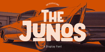 The Junos is a handwritten display sans font. With a bold stroke, rough and fun character with a bit of ligatures. To give you an extra creative work. The Junos font support multilingual more than 100+ language. This font is good for logo design, Social media, Movie Titles, Books Titles, a short text even a long text letter and good for your secondary text font with script or signature font. Make a stunning work with The Junos font. Cheers, MaulanaCreative
 - Fever Coaster by Maulana Creative,
$12.00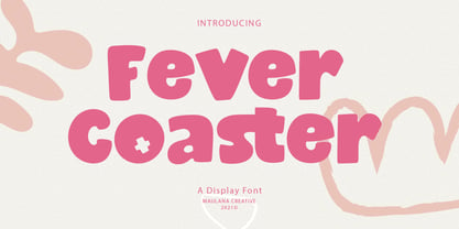 Fever Coaster Display Font is a casual handwritten font. With rough stroke, Condensed and fun character with a bit of ligatures. To give you an extra creative work. Fever Coaster font support multilingual more than 100+ language. This font is good for logo design, Social media, Movie Titles, Books Titles, a short text even a long text letter and good for your secondary text font with sans or serif. Make a stunning work with Fever Coaster font. Cheers, Maulana Creative
 - Belostika by Maulana Creative,
$14.00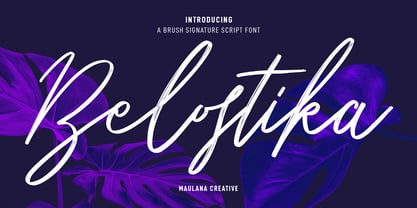 Belostika Brush Script Font is a modern smooth brush script font. With smooth brush stroke, fun character with a bit of ligatures and alternates. To give you an extra creative work. Belostika font support multilingual more than 100+ language. This font is good for logo design, Social media, Movie Titles, Books Titles, a short text even a long text letter and good for your secondary text font with sans or serif. Make a stunning work with Belostika font. Cheers, Maulana Creative
 - Hookypilots by Maulana Creative,
$12.00 Hookypilots Unique Handwritten Font Hookypilots is an expressive slanted handwritten display font. With bold stroke, fun character with a bit of ligatures and alternates. To give you an extra creative work. Hookypilots font support multilingual more than 100+ language. This font is good for logo design, Social media, Movie Titles, Books Titles, a short text even a long text letter and good for your secondary text font with sans or serif. Make a stunning work with Hookypilots font. Cheers, MaulanaCreative
 - Zenoa by Brenners Template,
$19.00 Zenoa Display Serif Font Family - They are sharp and sensitive, but connected-oriented. That's why they're designed by incorporating hook glyphs into an elegant serif style. Somewhat high contrast between vertical and horizontal, they reveal the strong individuality of each glyph, so you can create creative layouts. The meticulous design stands out so that readability and individuality can be expressed in harmony. And, these are the special excellences of this font family: Stylish Alternates and Ligatures where calligraphic subtlety is artistically connected. These OpenType features are decorative pleasures of using this font family more functionally. Please check first if the app you are using supports these features. They are easy to use in Adobe apps such as Photoshop and Illustrator. Alternates : A, B, C, D, E, F, G, H, J, K, L, M, N, P, Q, R, S, T, U, V, W, X, Y. Standard Ligatures : ff, fi, fl Discretionary ligatures : Am, Ba, Ca, Ch, De, En, Fr, Ge, Ha, In, Lo, Mi, No, Pa, Ro, Sa, Th, Va, Wo, Yo, an, bi, ck, de, ee, gn, ha,ie, lo, mo, no, oo, pr, ro, ss, st, te, um, ve, we, yo. Supported Languages: Western Europe, Central/Eastern Europe, Baltic, Turkish, Romanian
 - Beuys by Jan Eloy Gabriel,
$9.99 Beuys is a sans serif typeface based on geometrical shapes. The horizontal sroke contrast gives Beuys its distinct look. This unique appearance makes it an interesting display typeface. The six weights of Beuys come with OpenType-Features and a character set of 323 glyphs including symbols, ligatures and alternates.
 - Debelly by Tour De Force,
$25.00 Debelly is catchy fat typeface, with lovely geometric shapes. Inspired with contrast strokes, with square joins, Debelly gives an impression of retro style combined with contemporary trends. It is designed specially for packaging, posters, logotypes or headlines, even it can be pretty handfull in smaller sizes. Contains 375 glyphs.
 - Blob by Superfried,
$32.50 Blob, designed by Superfried, is available in two formats Round and Square. It is an experimental, sans-serif display typeface based on simple geometric shapes. Although unorthodox, care has been taken to ensure that it is completely legible. Blob has been featured on the Behance curated typographic gallery TypographyServed.com.
 - Joanne Script BH by BluHead Studio,
$25.00 Joanne Script BH is based on the handwriting of a BluHead friend. This fun design has a sharp, angular feel which lends itself to casual messages, greeting cards, post its, journals, you name it! Plus, a large complement of characters allows you to send your thoughts in multiple languages.
 - Miometry by HakanPolatovic,
$20.00 GEOMETRICAL PERFECTNESS Every letter of miometry has a ratio to one another SHARPNESS Due it's design,it has a elegant look at first sight RATIONALITY It can even be used in every kind of rational system like patterns etc INSPIRED BY Concepts like futurism,transhumanism,cyberpunk,cyberworld etc
 - COS Elfish by Cosmope Type,
$17.00 COS Elfish is a typeface with stroke contrast and has a unique shape. It has a structure that is well suited for display purposes. It has small serifs throughout and features curvilinear elements in some letters. It is suitable for use in various media such as unique and individual graphic design or web design.
 - Botanika by Suitcase Type Foundry,
$75.00The motivation behind the Botanika family was the desire to create a text version of the Magion font. Although the glyphs were originally drawn using the same proportions, they were subsequently adjusted in order to improve legibility. The font retains certain characteristics of the original, such as the top serif on the “i” and the similar bottom serif on the “l”. Lowering the x-height lent the family a new and original character. The italics are slightly more condensed than the regular weight, without losing the austere grace of the regular weight. They are distinct enough to stand out in the text. Alternative characters can be selected to spice up the setting, or conversely to subdue headlines by using more traditional letter shapes. Small caps are available as well. The monospace version is a 10 pitch font: at 10 pt type size 10 characters fit exactly into the width of one inch, meaning that individual letters Take up 60 % of an em in width. The family is provided with matching italics. The modifications made during the OpenType transition included the addition of missing glyphs to cover the Suitcase Standard set and adding relevant kerning pairs, plus redrawing the bold weight and the accents. Despite its lower x-height, the font is often used for setting medium to long texts. Its slightly archaic feel lends text set in Botanika an air of novelty, which may be the reason why it is so popular in extensive corporate identity systems. If you are looking for an alternative to the cold, neutral sans serifs which are so popular these days, Botanika is the perfect choice. - Palamecia by Typodermic,
$11.95 Palamecia is a typeface that embodies the very essence of organic design. It is a testament to the power of the creative process, one that is imbued with the spirit of experimentation and the thirst for innovation. Its unique appearance, at first glance reminiscent of a cartoon typeface, is just the beginning of what sets it apart from the competition. Palamecia was designed with a specific purpose in mind—to withstand the rigors of scaling and blurring on a variety of user interface devices. The creators of Palamecia recognized that the legibility of typefaces can be compromised by the impact of pixel scaling, and they set out to design a typeface that would not only overcome this challenge but also thrive in its wake. What makes Palamecia truly exceptional is its design process. Unlike many other typefaces, Palamecia’s designs were not born from pen strokes, but rather from cut-out silhouettes that were meticulously chiseled and chipped away. This unique approach allowed the designers to create a typeface that is both rugged and refined, with a natural aesthetic that seamlessly blends into any interface. The end result is a typeface that is both durable and versatile. Palamecia’s unique design allows it to pierce through any type of display, regardless of resolution, making it an ideal choice for designers and developers who are looking for a typeface that can deliver the goods under any circumstances. In conclusion, Palamecia is a triumph of organic design, a typeface that is as beautiful as it is functional. Its rugged yet refined aesthetic and its ability to withstand the rigors of scaling and blurring make it a must-have for any designer or developer who values both form and function. So why wait? Try Palamecia today and experience the power of organic design for yourself. Most Latin-based European writing systems are supported, including the following languages. Afaan Oromo, Afar, Afrikaans, Albanian, Alsatian, Aromanian, Aymara, Bashkir (Latin), Basque, Belarusian (Latin), Bemba, Bikol, Bosnian, Breton, Cape Verdean, Creole, Catalan, Cebuano, Chamorro, Chavacano, Chichewa, Crimean Tatar (Latin), Croatian, Czech, Danish, Dawan, Dholuo, Dutch, English, Estonian, Faroese, Fijian, Filipino, Finnish, French, Frisian, Friulian, Gagauz (Latin), Galician, Ganda, Genoese, German, Greenlandic, Guadeloupean Creole, Haitian Creole, Hawaiian, Hiligaynon, Hungarian, Icelandic, Ilocano, Indonesian, Irish, Italian, Jamaican, Kaqchikel, Karakalpak (Latin), Kashubian, Kikongo, Kinyarwanda, Kirundi, Kurdish (Latin), Latvian, Lithuanian, Lombard, Low Saxon, Luxembourgish, Maasai, Makhuwa, Malay, Maltese, Māori, Moldovan, Montenegrin, Ndebele, Neapolitan, Norwegian, Novial, Occitan, Ossetian (Latin), Papiamento, Piedmontese, Polish, Portuguese, Quechua, Rarotongan, Romanian, Romansh, Sami, Sango, Saramaccan, Sardinian, Scottish Gaelic, Serbian (Latin), Shona, Sicilian, Silesian, Slovak, Slovenian, Somali, Sorbian, Sotho, Spanish, Swahili, Swazi, Swedish, Tagalog, Tahitian, Tetum, Tongan, Tshiluba, Tsonga, Tswana, Tumbuka, Turkish, Turkmen (Latin), Tuvaluan, Uzbek (Latin), Venetian, Vepsian, Võro, Walloon, Waray-Waray, Wayuu, Welsh, Wolof, Xhosa, Yapese, Zapotec Zulu and Zuni.
 - Hughes by Larin Type Co,
$12.00 Hughes is a stylish and original multi-functional font, made in 6 styles (regular, rough, pressed, bold, bold rough, bold pressed), he fits perfectly for both modern and vintage design. With it, you can create beautiful logos, labels, templates, signs, highlight text, use it for outdoor advertising, branding, and much more. Also in this font there are stylistic alternates and swashes that will make your design even more attractive and interesting. It is easy to use and has OpenType features.
 - Brand by Lián Types,
$37.00 Jam jars; Warhol’s “Tomato Soup”; chalk lettering and baseball. Those were the triggers to make this soft chancery cursive turned into a script font. Brand is thought mainly for packaging but can be used in magazines and invitations also. It can be easily converted into a logo when using it and its features. Pro styles are loaded with the most complete sets of alternates, ligatures and ornaments; while Std styles are smaller versions of the font, with no decorative alternates.
 - Baseball Dynasty by Breauhare,
$19.99 Baseball Dynasty™ is an all-caps Art Nouveau font with authentic, classy, turn-of-the-century styling that recalls the early days of baseball. It can be used for historical purposes such as documentaries, but it also lends itself to nostalgic marketing & packaging with its down home, good-old-days kind of vibe. Let Baseball Dynasty™ help you knock your project out of the park! Digitized by John Bomparte. **Breauhare’s Elephant Party™ font also appears in the “Granny’s” poster

