10,000 search results
(0.051 seconds)
- Nata by MysticalType,
$10.00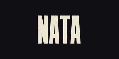 Nata is a sans serif family with fourteen weights plus matching italics. It was designed by Candi Erwanto in 2019. This sans serif family is based and influenced by geometric styles that were popular during the 1920s and 30s and have been optically corrected for better readability. Nata has a functional look with a warm touch. While thin and black weights are great players in display size, lightweights, regular, and medium are suitable for longer texts. Small x-height and curbed shape provide a distinctive elegance. Nata is equipped for complex and professional typography. This OpenType font family has extended characters to support Central and Eastern European and Western European languages.
 - Lemon Flower by chicken,
$17.00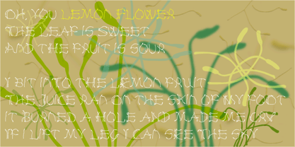 A flower became crushed in the door frame of the studio (a fancy shed at the end of an overgrown garden)... pretty pale yellow stamens scattered on the floor... I sprinkled some on the scanner and arranged them into a light and airy font for springtime. There are two alphabets, both uppercase, but one with doubled uprights for variety, and to provide a hint of extra weight. I didn't want to distort the natural shapes, or make up any of my own, so some letterforms are pretty quirky, and some characters just weren't possible... but there's a hidden bunch of flowery and grassy ornaments.
 - Hazelnut Pro by Eimantas Paškonis,
$-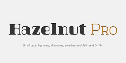 This small family can be counted as 4 fonts in 2. Because both weights contain small caps, 12 sets of stylistic alternates, and a decorative swashed form. That’s not counting dozens of ligatures in both multilingual latin and Cyrillic scripts. Plus ordinals, case-sensitive forms, and manual hinting. Due to its geometric nature, designers can manipulate vectors to change letters' dimensions for logotypes. They may seem modular, but every glyph was shaped individually to give handmade imperfections, reminiscent of wood type press. This allows for plenty of details at large sizes. Regular versions are multilingual but include only standard ligatures and case-sensitive forms.
 - Canaro by René Bieder,
$30.00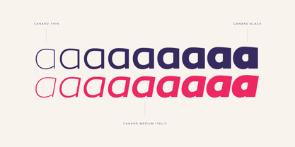 Conceived as an exploration of geometrical type designs of the early twentieth century, Canaro was — in its first design stages — heavily rooted in that time period. During its development and the effort to give it a modern appearance, it turned into a contemporary font with a strong historical background, defined by legibility and functionality. In addition, the lack of spurs provide a unique but unobtrusive character and support the contemporary impression. Typographic features like alternative glyphs, ligatures, oldstyle numbers, arrows, fractions and other special characters, round up the family. Canaro is available in nine weights plus matching italics. Ranging from sharp and elegant thinner cuts to sporty and athletic heavy weights.
 - Coo Coo by chicken,
$23.00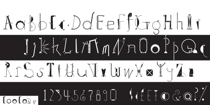 So I made five rather odd characters for a logo for a friend… Then I thought I'd fill a couple of spare hours expanding it to a single alphabet… And some considerable time later I ended up with a whole font with full punctuation, a bunch of alternates, pretty broad international support and some OpenType features to keep things varied… There are elements of Art Deco, Art Nouveau, Lego, circuit boards and Ceefax, Memphis lamps and lab clamps, hieroglyphs, googly eyes and who knows what else… Intricate, insane, highly irregular, but somehow it hangs together… Throw down a few letters nice and big when the fancy takes you…
 - Gilliany by Pen Culture,
$17.00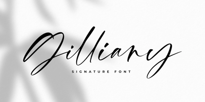 Gilliany is modern signature font that with a neat handwriting style, the shape of each letter and ligature has its own characteristics that are suitable for a variety of needs. Gilliany come with full set of uppercase and lowercase letters, multilingual symbols, numerals, punctuation and 71 ligatures. I really hope you enjoy it - please do let me know what you think, comments & likes are always hugely welcomed and appreciated. More importantly, please don't hesitate to drop me a message if you have any issues or queries. Guides to access all alternates glyphs : http://adobe.ly/1m1fn4Y Please fell free to contact me if you have any question Thank you
 - Jotia by Hashtag Type,
$32.00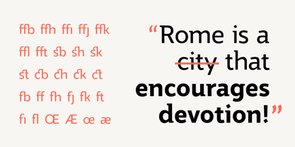 Creating a combination between serif and sans serif typefaces, Jotia utilises the best of both worlds, resulting in a unique and modern neo-humanist font family. Taking its inspiration from lapidary inscriptions rather than pen drawn text, Jotia uses triangular serif shape details to create a strong uniformed personality with clear legibility. This original quality enables characters to be expressive in headlines, as well as in printed and onscreen text situations. Jotia also works beautifully alongside both serif and sans serif typefaces giving complex editorial work a more powerful and visually stimulating dynamic. Details include six weights, manual kerning and spacing, ligatures and alternatives.
 - INDG Actio by Iñigo Uriarte,
$5.00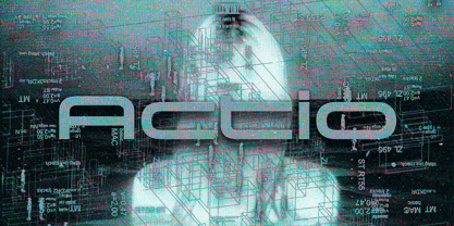 INDG Actio is the result of a several years long exploration. In it, a minimum amount of shapes are assembled into an alphabet of sci-fi feel. It is my personal Eurostil. Inspired by hope of a brighter future, INDG Actio is a great fit for spatial fantasy material, music gear interfaces or forward-looking tech ventures, as an example. Though designed mainly to be a display font for titles, short texts and logos, it is versatile. Have fun with it and adapt it to the specific needs you may have. INDG Actio is a family consisting of 5 weights of 208 glyphs each, including 12 stylistic alternates.
 - Frank Ruhl1924 MF by Masterfont,
$59.00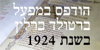 The most common Hebrew typeface, based on Sefaradic tradition, used in most newspapers and publications. The main Hebrew typeface of the 20th century, designed in 1908 and was published by Berthold in 1924. OpenType Pro Excellent support for Niqqud (Vowels). All marks are programmed to fit each glyph's shape and width. OpenType Pro includes new advanced features like Dagesh Hazak, ShevaNa, Qamatz Katan, Holam Haser and wide letters. Best used with Adobe InDesign CC that support complex Hebrew text. Please check these advanced features in this link: https://tinyurl.com/ybgdsxme Font files were re-generated to get better online screen display, as well as refined OpenType features as kerning glyph substitution.
 - Qadi by Linotype,
$187.99Qadi is a modern Arabic display face that includes the traditional range of letterforms. These extra bold shapes are striking, graceful, and confidently calligraphic. Produced in the mid 1980s under the design direction of the noted British typographer Walter Tracy, Qadi proved to be a very popular typeface for magazine and newspaper publications. Qadi has been updated to take full advantage of digital technology for accurate diacritical positioning and kerning refinements, ensuring high quality Arabic typesetting. The OpenType font incorporates the Arabic codepage, and supports Arabic and Persian. It also includes both tabular Arabic and Persian numerals, as well as Latin figures and complete punctuation. - Tjoekil Kajoe by IKIIKOWRK,
$25.00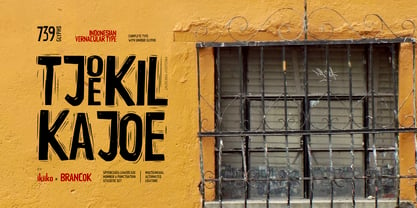 Introducing Tjoekil Kajoe - Indonesian Vernacular Typeface, created by ikiiko collaboration with Brancok (a.k.a Dhani Soenyoto) Tjoekil Kajoe is a linocut typography shape adapted to indonesian vernacular culture with many decorative glyphs. You can play with sizes, alternatives and styles to get the style of typographic character just the way you want it. This typeface is perfect for an vintage poster, vintage product, linocut design, books cover, packaging design, magazine header, poster, quotes, and so much more. What's included? Uppercase & Lowercase Number & Punctuation Alternates & Ligature Stylistic Set Multilingual Support Enjoy our font and if you have any questions, you can contact us by email : ikiikowrk@gmail.com
 - Thunder Inferno by Mans Greback,
$79.00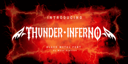 Thunder Inferno is a gothic black metal typeface with sharp serifs. Rooted in the aesthetics of heavy metal and the occult, this typeface is a harbinger of darkness and intensity. Evocative of Halloween and gothic grandeur, Thunder Inferno also captures a march toward darkness. It serves as a rebellious voice for skate culture and alternative lifestyles. Crafted exclusively in uppercase, this font is a growl in typographic form, a visual cacophony that grabs your attention and refuses to let go. Capitalize the first and last letters of any word for symmetrical heavy metal style. Example: Heavy metaL Enclose any word in < > ( ) [ ] { } to give it wings. Example: [HawkstylE]
 - Vistr by Kobuzan,
$18.99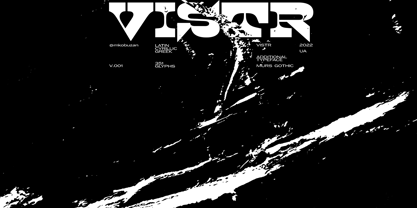 Vistr is a reverse-contrast display typeface inspired by western movies, infused with the tension of classic horror films. Powerful serifs, smooth curves, sharp details and an impressive contrast of strokes are unusually combined with each other. This creates a dramatic, eye-catching effect. Which is ideal for use in large sizes in titles and headlines to create a gloomy mood. This is an ALL-CAPS font. There is support for extended Latin, basic Cyrillic, and Greek. Features: – Total glyph set: 351 glyphs; – 1 style; – Support 210+ languages; – Latin Extended; – Cyrillic Basic + Bulgarian letters; – Greek; OpenType features: – Uppercase; – Proportional numerals; – Punctuations and symbols; – Arrows; – Stylistic alternates (ss01).
 - Bayamo by Monotype,
$29.99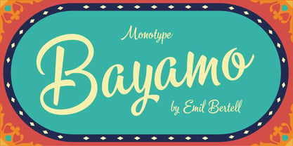 Emil Bertell's Bayamo is a contemporary, digital take on the brush script tradition. It echoes the loose forms and energetic personality of sign painted letters, tapping into the current nostalgia for hand-drawn type. “I think most script fonts nowadays are either some kind of modern calligraphy, or synthetic/mechanical scripts,” says Bertell. “This one leans more towards a classic American sign painting tradition.” Contextual alternates ensure that lowercase characters change depending what's next to them, mimicking the more varied word shapes created by sign writers. Well suited for branding projects, packaging and headlines, Bayamo also pairs well with strong sans serif, and other typefaces with angular forms.
 - HGBGalaxo Line by HGB fonts,
$23.00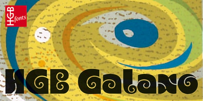 HGB Galaxo is a tribute to Othmar Motter (1927–2010), the Vorarlberg graphic artist and typeface designer, who designed very individual and perfectly crafted typefaces in the 1970's and later. (Motter Ombra, Motter Tectura ...)From a Motter sketch of 5 letters for a logogram, I derived a simplified letterform and developed all the necessary characters. Working on these glyphs and delving deeper into Motter's letterforms, the respect for the accuracy with which he drew his letters (in ink) grew more and more. The spiral resembles the shape of a galaxy, hence the name Galaxo. The font is suitable for retro, poster and logo design.
 - Melancholia by Barnbrook Fonts,
$75.00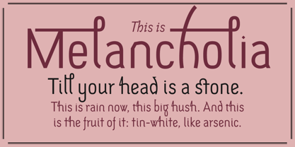 Melancholia is a subtle and beautiful sans-serif inspired by calligraphic letterforms. The name describes a feeling of deep sadness, an intense sensitivity to the world. The design of Melancholia is an attempt to introduce some of that wistfulness into the sans-serif form, a typographic classification that is often characterised by an austere functionality. Melancholia includes a set of true italics influenced by old-style serif italics, such as those found in Claude Garamond’s eponymous typeface, as well as a set of stylistic alternates and calligraphic-style swash characters.
 - Admiral by Greater Albion Typefounders,
$12.00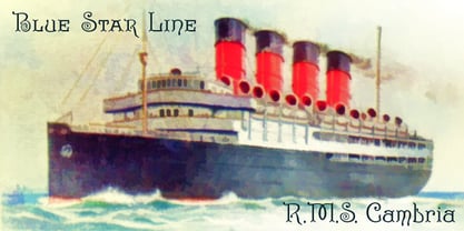 Admiral was inspired by and extrapolated from the Art Nouveau lettering incised into the facade of a local hostelry. This gave us some inspiration for the capitals 'A', 'B', 'C', 'E', 'H', 'I', 'L', 'O', 'S', 'T' and 'U'; we then had great fun extrapolating the rest! The source of the name Admiral can be spotted if you look at characters such as 'A', 'H' and 'N'. Admiral's distinctive charm and humour lends it to projects with a 1900s Art Nouveau theme, be they book covers, posters, signage, invitations, cards, or anything else you enjoy!
 - Talent Show JNL by Jeff Levine,
$29.00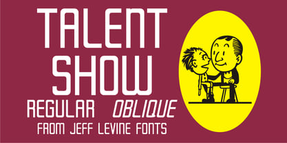 A 1930s hand-lettered poster for the play "The Cradle Will Rock", put on by the WPA (Works Progress Administration) Federal Theater Project is the source material for Talent Show JNL; available in both regular and oblique versions. Originally, the "R" and "L" had fish hook bends, but those two letters were revised to be more traditional in structure. The obvious Art Deco influence, along with what sign painters refer to as "stovepipe lettering" (straight lines with curved [bent] corners) is a simple, clean approach to retro-influenced titling.
 - Klip Klop by Samuelstype,
$24.00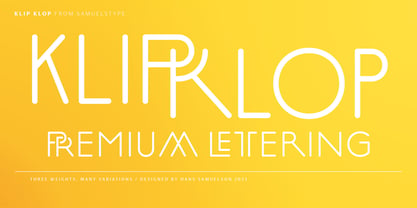 Designed by Hans Samuelson in 2023. With two weights and many variations Klip Klop offers a large set of characters for playful lettering. The flavouring is strong avant garde and the build is strict geometrical with even stroke thickness throughout. One unusual feature is that the bottom and top horizontal strokes are centered on the baseline and capital height. This renders the same optical size between the thin and the medium but different actual heights and baselines. Use it for Headlines or signage in any medium! Klip Klop!
 - Congress by Monotype,
$29.99Congress from Adrian Williams was shown for the first time at the Association Typographique International Congress, which proved to be so popular in 1980 at Kiel; designed to present a style equally appealling in European languages. Many characters are more condensed than is usual, while others have had certain elements exagerated, bringing notice to new elements of certain letters. The concept being to bring an equality of importance to the whole, producing a collection of International characters working together in harmony on the page -- a common aim that Europeans wish of any Congress. - Tioga Script Pro by SoftMaker,
$15.99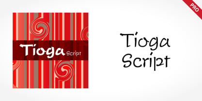 SoftMaker’s Tioga Script Pro typeface was designed in 1956, but feels as fresh as if it had been created yesterday. An informal script typeface that comes in three different weights. Tioga Script Pro contains OpenType layout tables for sophisticated typography. It also comes with a huge character set that covers not only Western European languages, but also includes Central European, Baltic, Croatian, Slovene, Romanian, and Turkish characters. Case-sensitive punctuation signs for all-caps titles are included as well as many fractions, an extensive set of ligatures, and separate sets of tabular and proportional digits.
 - Basile by Tipo,
$85.00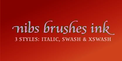 Basile is the conclusion of a process that began with the learning of italic handwriting in a roballos-Naab studio course. In this workshop I developed a variation of chancery handwriting which had a more pronounced wider than its historical model. While making the digitalization, the forms were modified to obtain a similar spirit to the one in the handwriting, but thinking about the text in small sizes. Also incorporating three sets of forms enlarged the family: italic, swash and extra swash. And the addition of initials and terminals sets.
 - Personalization by Jeff Levine,
$29.00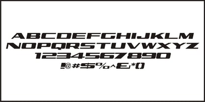 In the 1960s it was a popular trend to personalize one’s possessions with your initials. From wallets and handbags to eyeglasses; from luggage to even cars, initial personalization was the fad of the time. The British division of Gulf Oil offered for sale a set of gold metallic stick-on initials for 25 pence, complete with two Gulf logos so the company could get some extra advertising mileage out of the promotion. These extra-wide, bold initials served as the idea model for Personalization JNL, which is available in both regular and oblique versions.
 - Casual Deco JNL by Jeff Levine,
$29.00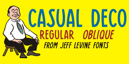 The hand lettered sans serif title on the1931 sheet music for “(Potatoes are Cheaper-Tomatoes are Cheaper) Now’s the Time to Fall in Love” presented another opportunity to create a typeface from the wealth of unusual alphabets found on the covers of vintage and antique song sheets. However, it seems that even as late as the 1930s, song writers had the urge to pen long-worded titles for their musical compositions. This thirteen word verbal excursion became the model for Casual Deco JNL, which is available in both regular and oblique versions.
 - Architype Bayer Type by The Foundry,
$99.00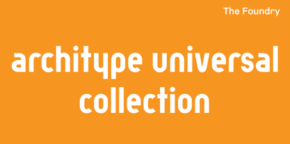 Architype Universal is a collection of avant-garde typefaces deriving mainly from the work of artists/designers of the inter-war years, whose ideals underpin the design philosophies of the modernist movement in Europe. Their ‘universal’, ‘single alphabet’ theory limits the character sets. Architype Bayer-type is based upon Herbert Bayer’s 1931 universal, modern serifed alphabet. Although the ‘modern’ style appears to be a radical departure from his first sans single alphabet of 1925, the structure of this later serifed style is still grid based and geometrically constructed.
 - Architype Ingenieur by The Foundry,
$50.00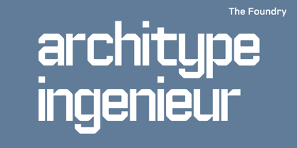 Architype Ingenieur was inspired by Wim Crouwel’s late 1950s exhibition catalogues and posters, for which he had created a few geometrically constructed, simplified letterforms. In the 1960 Venice Biennale Dutch entry poster, he drew grid-based letters with 45-degree angles for ‘olanda’, the style influenced by his boyhood fascination with naval lettering. A subtle variation appeared in the Stedelijk Museum catalogue for painter Jean Brusselmans. Several dot matrix versions followed. The themes and systems in these early letterforms are encapsulated in this new four weight family Architype Ingenieur.
 - Bodoni Classic Stencil by Wiescher Design,
$39.50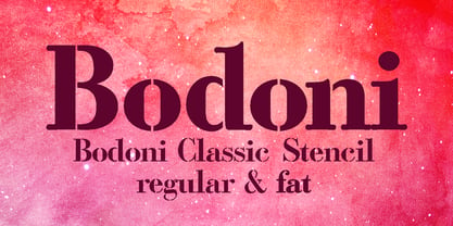 Bodoni Classic Stencil is another of my personal additions to the Bodoni Classic Family that Giambattista would have never made. In his days people had enough skill and the neccessary time to put beautiful handlettering on parcels and cases. No need for stencils! Today we do not need them either since shipping has gone barcode crazy, but for some reason stencil-letters are very much in fashion. Bodoni letters lend themselves perfectly to be stenciled so I just did the whole alphabet; not just the capitals. Yours, Gert Wiescher
 - CamingoDos SemiCondensed by Jan Fromm,
$65.00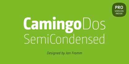 CamingoDos SemiCondensed fills the gap between CamingoDos and CamingoDos Condensed and combines them to a homogeneous and versatile type family. The flexibility of the semi-condensed version makes it a typographic all-rounder. On the one hand CamingoDos SemiCondensed is perfectly suited for compact headline settings. On the other hand, it works well as an ergonomic, space-saving typeface for large texts. CamingoDos SemiCondensed comes with a Pro version that offers a rich set of expert typographic features like small caps, ligatures, stylistic alternates, different figure sets, arrows, fractions and ordinals.
 - ITC Tremor by ITC,
$29.99ITC Tremor is the work of British designer Alan Dempsey. You might think that it looks like the letters are in a seismically lively geological zone, but Dempsey had other kinds of motion in mind. Most of the faces I design come from trace 'work-outs' for advertising products. In the case of Tremor, it was to reflect a lively teenager," says Dempsey. The result is ITC Tremor, a cartoony slab serif typeface with irregular angles, straight-edged curves, and lines surrounding each character, making them look like they are jittery. - Retro Nouveau JNL by Jeff Levine,
$29.00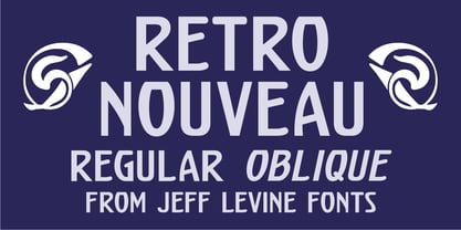 Because of the large influx of Irish immigrants during the late 1800s and early 1900s, it was not unusual for songwriters of the day to craft songs around Irish themes, offering a nostalgic link to their homeland. One such 1917 piece entitled "You Brought Ireland Right Over to Me" had the title hand lettered on the sheet music cover in a sans serif design reflecting the popular Art Nouveau movement of the day. This design is now available digitally as Retro Nouveau JNL, in both regular and oblique versions.
 - Fine Food by Jeff Levine,
$29.00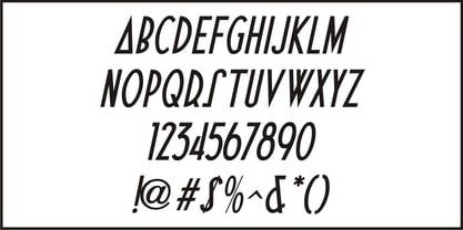 A 1942 photograph showing the exterior of the famous Hollywood restaurant Sardi’s and it’s unusually lettered sign was the inspiration for Fine Food JNL. Classically Art Deco, the Sardi’s sign had an ‘S’ looking like an inverted ‘J’ with a flat tail, a traditional ‘A’ replaced by a triangle and the ‘R’ composed of a ‘D’ with a diagonal extension. These elements were balanced against more traditional [but complementary] characters to retain the novel charm of the original signage. Fine Food JNL is available in both regular and oblique versions.
 - Ragnar by Linotype,
$29.99Ragnar can be called a typeface for compact typography. It is loosely related to the Saga typeface in many ways, even including its name. During discussing on what Saga should be called, the name "Ragnarök" (Twilight of the Gods) was humorously suggested. "Ragnarök" would of course have been unsuitable, since it uses a letter with a diacritic sign, and in many computer systems, that is a deadly sin. But the shorter form, Ragnar, was kept in mind, and later used for this typeface. Additionally, Ragnar is a common male Scandinavian name. - Antiquarian Scribe by Three Islands Press,
$39.00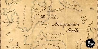 Henri Abraham Chatelain was a cartographer and publisher of the famous Atlas Historique, ou Nouvelle Introduction a L'Histoire, a world atlas released between 1705 and 1732 in Amsterdam. A few years ago, at an antique book shop in London, I bought a page from Chatelain's atlas—a page covering the Near East, India, the Indian Ocean—that had a particularly alluring, oblique handlettering style. The text is in French, which gave me plenty of samples of diacritics and accented characters. The overall effect is neat and legible, with a distinctly historical flair.
 - Deco Sketch JNL by Jeff Levine,
$29.00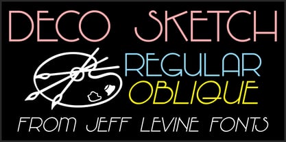 An interesting hand lettered example of Art Deco lettering (minus the letter ‘L’) was spotted on Pinterest and served as the inspiration for Deco Sketch JNL. Because there was no attribution as to the age or source of the alphabet, it can only be surmised that it was a scan from a 1930s or 1940s source. The original showed many of the irregularities of pen lettering, and had rounded terminals. The digital version has been redrawn more uniformly with flat terminals. Deco Sketch JNL is available in both regular and oblique versions.
 - Aviano Future Variable by insigne,
$99.99 Because you demanded it, the Aviano series is back with a variable version of the futuristic sans serif Aviano Future. Aviano Future’s strong letterforms will make you look like a rock star. Aviano Future Variable is a medium-contrast sans serif titling face that has a bold and futuristic look. It has a bowed square shape which gives it an interesting appearance that is both unique and eye-catching. Given that it has a variable axis any weight can be selected with no loss of clarity or legibility. Aviano Future's expanded forms give the letterforms heft and intensity. Aviano Future is a powerful yet adaptable title face that builds on the award-winning traits of Aviano and elevates them. Aviano Future Variable contains a ton of OpenType capabilities and comes in ten different defined weight instances with "fast" italic forms for emphasis. Want to use more traditional rounded forms? Need swash forms? Art Deco alternates? Aviano Future includes 400 alternate characters. Twelve style sets are available, two sets of art deco inspired alternates, small forms, tough swash, constructivist titling and traditional stylistic alternates. Aviano Future also includes 40 discretionary ligatures for artistic typographic compositions. Additionally, there are glyphs in this family to accommodate a variety of languages, and Cyrillic support was added in 2022. An extensive selection of sans serif typographic systems can be found in the Aviano family. The typefaces can be used alone or in combination to suit the needs of any project. The family's fonts have all been meticulously designed to assist ensure maximum impact and usability at any size. Aviano, Aviano Serif, Aviano Sans, Aviano Didone, Aviano Flare, Aviano Copper, and Aviano Slab are presently part of the Aviano collection. A skilled designer who wishes to create a technological, futuristic, or epic design should consider Aviano Future. Aviano Future Variable will make your design stand out from the competition, regardless of whether you are designing a logo, poster, flyer, website header, or banner ad. Why wait? With the exciting and versatile Aviano Future Variable at your disposal, reach new heights and create a brand that stands out from the rest.
 - Qarkine by Hishand Studio,
$15.00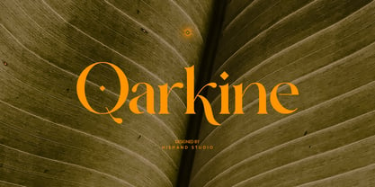 Experience the unparalleled beauty and refinement of Qarkine the font that sets the standard for elegance and class in typography. With its sleek and stylish design, Qarkine strikes the perfect balance between classic and contemporary, making it a versatile choice for a wide range of design projects. The font's effortlessly elegant and polished look is perfect for upscale branding and marketing materials, adding a touch of glamour and luxury to any project. Qarkine's refined lettering has a timeless aesthetic that will never go out of style, making it a wise investment for designers who want to stay ahead of the curve. Whether you're looking to create a high-end fashion brand, a luxury lifestyle magazine, or simply want to add a touch of exclusivity to your designs, Qarkine is the perfect font for the job. Complete with ligatures alternates regular italic icon kerning multilingual support
 - Maintain Theory by Create Big Supply,
$15.00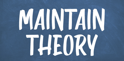 With its unique combination of uppercase and lowercase letterforms, Maintain Theory offers versatility and creativity for your design projects. Its brush-style strokes exude energy and movement, adding a touch of handcrafted authenticity to your work. The font includes a wide range of characters, including numbers and punctuation marks, making it suitable for various design applications. It also supports multiple languages, ensuring that your message can be communicated effectively to a global audience. Maintain Theory is equipped with PUA Encoding, which allows easy access to special characters, ligatures, and swashes. This feature enhances the font's versatility, allowing you to create custom and eye-catching typography. Embrace the artistic power of Maintain Theory and elevate your designs to new heights. Whether you're designing for branding, advertising, packaging, or any other creative project, this expressive display brush font will add a compelling visual impact that resonates with your audience.
 - Sears Tower - 100% free

- Azoft Sans - 100% free

- Anago by Positype,
$16.00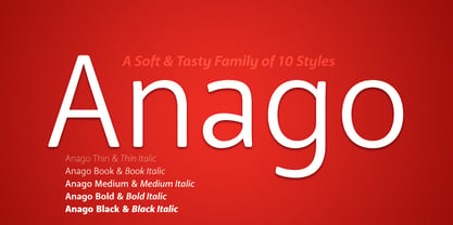 Anago shares the same DNA as its sibling Macha, but is a completely different species than the former or any of my other sans serifs (Aaux Next, Air, Akagi Pro or Wasabi). Soft, ample letterforms are casually constructed and the end result produces a typeface that changes color as it varies in size — allowing the type family to work well in both text and display settings as long as attention is given to size. Anago takes a little but gives a lot. The 10-style typeface features a fully-loaded character set that includes: Small Caps, Proportional Lining and Oldstyle Numerals, Tabular Lining and Oldstyle Numerals, Fractions, Ordinals, Inferiors, Superiors, Stylistic Alternates, Ligatures, Case-sensitive, and more.

