2,839 search results
(0.015 seconds)
- Tabor Sinfonia by Mans Greback,
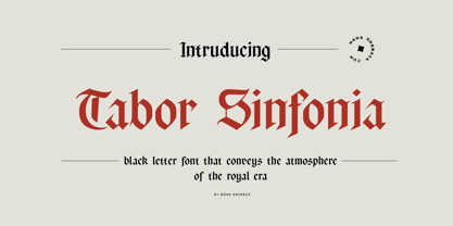
$59.00Tabor Sinfonia is a blackletter typeface that marries the historic beauty of Gothic script with the rhythm and harmony of music. This decorative font is perfect for logotypes, artistic projects, and designs that require a touch of vintage elegance. The inspiration for Tabor Sinfonia came from a fascinating combination of medieval manuscripts and musical compositions. - P22 Kells by P22 Type Foundry,
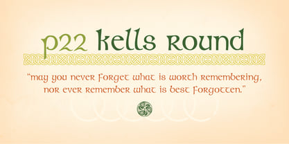
$24.95The Book of Kells is a ninth century gospel created in the British Isles and is considered to be the finest existing example of early Celtic art. The book itself is now housed in the Trinity College Library, Dublin. This computer set combines historical accuracy with functional readability and features 72 elements and linking borders. - Moore 003 by FSD,
$6.15Moore 003 was inspired by Henryk Tomaszewski's poster lettering for the Moore Exibition (Warsaw, Poland 1959). The headline "Moore" is composed of paper collage. The lettering, in Tomaszewski's vision, contrasts in ways that recall the contrast of Moore's sculptures. It was my intention to continue this research using lettering in the form of a typeface. - Gans Neoclassic Fleurons by Intellecta Design,
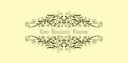
$23.90Historical printers ornaments researched by Intellecta Design; from the 1882 very rare Richard Gans first catalogue. See also other font families inspired by Gans' original typefaces: Gans Tipo Adorno, Gans Lath Modern, Gans Titular Adornada, Gans Ibarra, Gans Antigua, Gans Antigua Manuscrito, Gans Fulgor, Gans Radio Lumina, Gans Carmem Adornada, Gans Italiana, and Gans Titania. - Klute by Alias Collection,
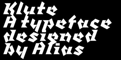
$60.00Klute references stylised forms of writing; historic Germanic, blackletter letterforms and graffiti and tagging. Its references are based on a personal idea of lettering - the action of writing is more personal and human than the craft of calligraphy or the mechanics of typing. These references suggest the idea of saying something particular and personal. - Easy Tiles by Intellecta Design,
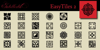
$21.00A nice mix of 62 decorative tile images. Designs are reminiscent of rubber stamps of architectural tiles found in historical homes and other buildings through the ages and printed devices from old catalogues. Generic enough to add interesting detail to just about any design. From invitations and greeting cards to book jackets, labels or fabric. - Bliss Mood by Ef Studio,
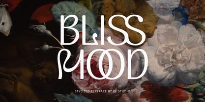
$15.00Bliss Mood is a display experimental sans font. Each character is a captivating fusion of geometry, fluidity, and abstract artistry. Unleash your imagination and redefine your visual narrative with this experimental font. Whether it’s a logo, a captivating poster, or a professional presentation, this font adapts seamlessly to bring your creative vision to life. - Gans Headpieces by Intellecta Design,
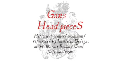
$24.90Historical printers ornaments researched by Intellecta Design; from the 1882 very rare Richard Gans first catalogue. See also other font families inspired by Gans' original typefaces: Gans Tipo Adorno, Gans Lath Modern, Gans Titular Adornada, Gans Ibarra, Gans Antigua, Gans Antigua Manuscrito, Gans Fulgor, Gans Radio Lumina, Gans Carmem Adornada, Gans Italiana, and Gans Titania. - Motion Picture Personal Use - Personal use only
- Ordinatum Medium - Personal use only
- Roskrift Clean - Personal use only
- Harry Potter and the Dingbats - Unknown license
- Pixelfy - Personal use only
- Brannboll Stencil PERSONAL USE - Personal use only
- Clipper Script (Personal Use) - Personal use only
- Society Editor Personal Use - Personal use only
- Rooky Hand - Personal use only
- T-Air - Unknown license
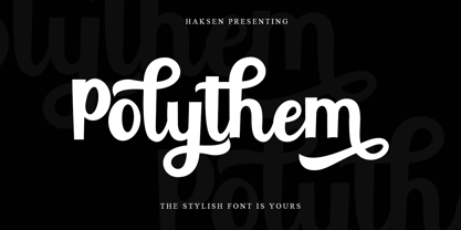
- Polythem by Haksen,
$13.00 - Bad Situation by Intellecta Design,
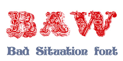
$24.90The historical source to Bad Situation comes from "EXAMPLES OF MODERN ALPHABETS, PLAIN and ORNAMENTAL; including German, Old English, Saxon, Italic, Perspective, Greek, Hebrew, Court Hand, Engrossing, Tuscan, Riband, Gothic, Rustic, and Arabesque, etc." Collected and engraved by F. Delamotte, and first published in 1864. The original alphabet was called "Example Alphabet" (plate 48), by Delamotte. - Krays by Pesotsky Victor,
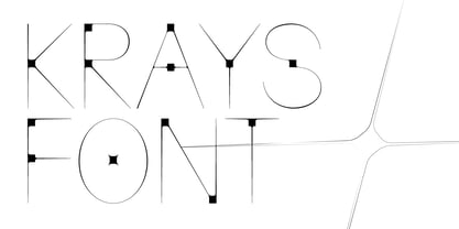
$10.00«KRAYS» is an ultra-thin font display. Simple structure and fine uniform strokes contrast with bold squares in the structural units. The combination of gravity and lightness. Krays supports Basic Latin and Extended Latin, Cyrillic — in total about 90 languages are supported. The font has one Regular weight. All uppercase. Krays font was designed by Viktor Pesotsky. - Dante Alighieri by RMU,
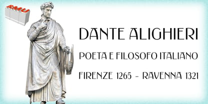
$35.00From the great Schelter & Giesecke collection, Dante Alighieri is a splendid companion to Aldo Manuzio. With its rather condensed characters it makes an ideal body text font even for narrow columns. Dante Alighieri comes with the historical long s and swash letters of H and T. It can be used for all major West and Central European languages. - DF Mercat by Dutchfonts,
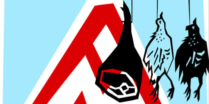
$30.00DF Mercat is a tribute to the famous marketplace situated at ‘La Rambla’ in Barcelona's historic centre. It is a picture font containing over 240 illustrations of fish, crustacean, clams, poultry, game, meat, sausages, herbs, vegetables, fruit, bread, butter, a variety of cheese, wines and spirits, small dishes, drinks (coffee, beer, soft drinks), ice cream, pastry, etc. - Medieval Pixel VP by VP Type,
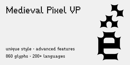
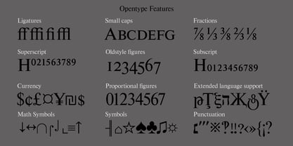
$11.00Medieval Pixel VP is a highly stylized family of three fonts that combine familiar pixelfont forms with unique sharp details - evocative of a fantasy and historical aesthetic, retro video games, and horror movies. All styles include an extensive character set and numerous advanced OpenType features. Over 800 glyphs in each font ensure full support for over 200 languages. - Newton by ParaType,
$30.00Based on Times New Roman of Monotype, 1932, by Stanley Morison and Victor Lardent, and other versions of Times. It has many characteristics of an Old Style serif faces; it was designed for better legibility in combination with good economy. Widely used in books and magazines, reports and office documents, and also for display and advertising. - Radioz by Four Lines Std,
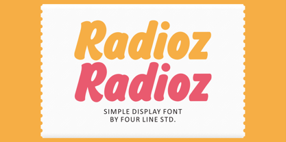
$15.00Radioz Font is engineered with simple precision to ensure every letter is crystal clear, making your message effortlessly readable. It's a font that doesn't shout but leaves a lasting impression. Radioz Font adapts to your creative needs seamlessly. Whether you're crafting a logo, designing a poster, or working on a digital project, it effortlessly blends into your vision. - Viking Initials by Wiescher Design,
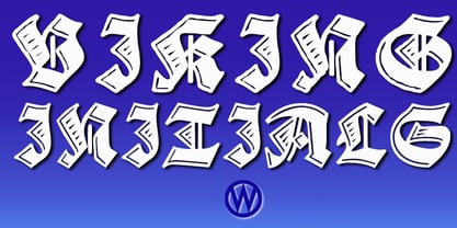
$19.50Viking Initials are pure brute-force blackletter initials of the time just before the Nazis started to rule, somehow these initials are typical for that period. I made one alphabeth-set with rough edges on the uppercase keys and a second set with sharp edges on the lowercase keys. For you to choose. Your historical designer Gert Wiescher - Petroglifos by John Moore Type Foundry,
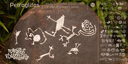
$19.00Petroglifos is a dingbats font as a collection of pre-Hispanic petroglyphs of indigenous ethnic Venezuela, most of them are found in signs carved in stone or painted in caves of the pre-Hispanic period, each icon is an accurate representation of these ancestral signs. Forms are very interesting from a visual, anthropological, historical and semiotic point of view. - Parler Fraktur by RMU,
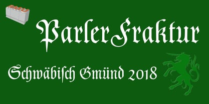
$25.00Friedrich Poppl’s blackletter font, carefully redrawn and redesigned for modern use, named after the Parler master builder family who built the Schwaebisch Gmuend cathedral. This font contains the letter ‚long s‘ which can be reached in two ways. Either you use the OpenType feature ‚historical forms‘, or you type the integral sign + the option key on your keyboard. - Bemis by Leksen Design,
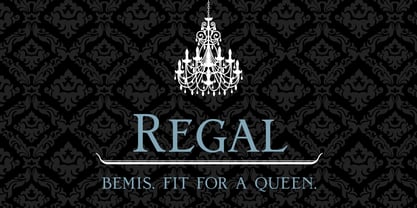
$29.00I accidentally fell in love with type design, and more specifically, the inscription on the historic Bemis building in Seattle. A high waist and great contrast are characteristics of this classic caps lettering that inspired my debut typeface, with additions of 3/4 caps and ornaments to boot. Read and hear more about the creation of this digital revival. - WIP The President by WIP Fonts,
$49.00WIPEU The President depicts the handwriting of a versatile and energetic man of vision at the highest stage. The (lower case) characters are joined as it is usual in German speaking countries. Originally designed in 1995 the font has been extended by a lot of new characters such as accented characters, punctuation, symbols and currency symbols. - Prospect Park JNL by Jeff Levine,
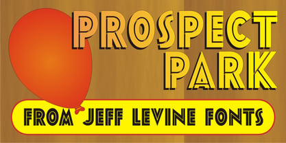
$29.00Prospect Park JNL was inspired by inline lettering found on some vintage sheet music from the Art Deco era entitled "By My Side". The font's namesake is located in the Crown Heights section of Brooklyn, NY. Prospect Park is famous for its zoo as well as its tree lined paths, historic carousel and the expansive park area. - 2009 GLC Plantin by GLC,
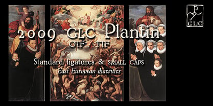
$38.00We created this family in an attempt to submit a Plantin's font pattern overview. So it is not a real historical font, but a "looking like". We have added the special East European diacritics (Czech, Hungarian, Romanian, Croatian, Slovak, Slovenian, Sorbian ) and some other features. Our Italic style is resulting from a choice through the numerous possibilities. - LTC Law Italic by Lanston Type Co.,
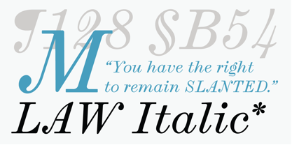
$24.95Law Italic was designed as an imitation of a formal style of penmanship used in legal documents. It has a more pronounced angle than standard italics. It is intended to be used by itself but can be combined with other faces to suit a designer's inclination. Historically, this face was once used by Bruce Rogers strictly for headings. - Linotype Auferstehung by Linotype,
$29.99Linotype Auferstehung is part of the Take Type Library, selected from contestants of Linotype’s International Digital Type Design Contests of 1994 and 1997. German designer Johannes Plass was influenced by historic broken letter faces, particularly Caslon Gotisch, although the rounded corners give the font a handwritten look. Linotype Auferstehung is particularly good for headlines in larger point sizes. - Ovidius Script by GroupType,
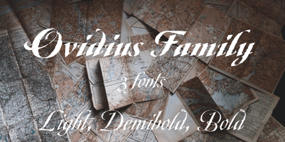
$21.00Ovidius is a formal script with solid structure. Characters present a look and feel of an ancient pen to very rough paper. The Ovidius family designed by Thaddeus Szumilas is now part of GroupType, a foundry specializing in period and revival typeface designs. These designs have not only important historical design roots, they possess great contemporary appeal. - Bipolar by VersusTwin,
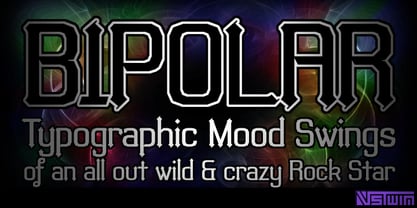
$39.00The Bipolar family of fonts is a synthetic blend of digital grid and historical blackletter forms, combining readability and ornamentation into a single modern interpretation. If you feel like you recognize this font style, you may have seen it as the menu font in the popular RockBand series of games. This trendy neo-medieval revival is hot! - Yacarena Ultra FFP - Personal use only
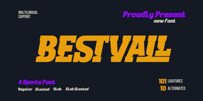
- Bestvall by Twinletter,
$17.00The BESTVALL type family is a highly athletic and dynamic typeface capable of evoking the energy of sport in its literal and historical form. Building on traditional athletic typefaces, BESTVALL font implements new shapes inspired by historical trends and modern typography, giving it the ability to add personality to any set of words. Features include slab and display types, oblique styles, multiple ligatures, and style alternatives. This display typeface has been designed to stand out and grab the attention of a wide audience. What’s Included : - All glyphs Iso Latin 1 - Alternate, Ligature - Simple installations - We highly recommend using a program that supports OpenType features and Glyphs panels like many Adobe apps and Corel Draw, so you can see and access all Glyph variations. - PUA Encoded Characters – Fully accessible without additional design software. - Fonts include Multilingual support - Exhibitionist by 38-lineart,
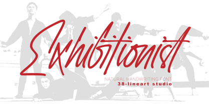
$16.00Related to typography and art, we define exhibitionist as an innovative work that is able to invite attention. An Exhibitionist must have a strong character, dare to appear as it is, natural, simple and modern-minded. That is what is represented in this font, a handwriting with a natural rhythm and reflects the lifestyle of urban society. We want to give a definition of exhibitionist in a positive typography frame. This font is very simple, too much glyph will make you confused, we make a lot of glyphs but we've filtered out only selected glyphs, so all you do is activate the ligature on your software and feel the interesting handwriting rhythm. We are sure with this font, you will look more stunning and attract the interest of visitors to look more closely at your brand
