10,000 search results
(0.057 seconds)
- Round Squeeze Monogram by MonogramBros,
$12.00 Round Squeeze Monogram Font is a perfect round shaped monogram font consisting of 78 letters and 3 frames. With just a single font file you will be able to create beautiful monograms in just a matter of minutes after the purchase! Round Squeeze Monogram Font comes with font file in .otf format. It features all the modern advanced font features such as contextual alternates, effectively eliminating the need to use multiple separate font files for left, center and right letters.
 - Athoor Style by Suamzu Art,
$10.00 Athoor Style fonts are serif fonts that combine signature styles and retro textures, Athoor style fonts are very easy to use in a variety of your design work such as posters, company logos, company brochures, marketing on websites, magazines, book covers, business cards, clothes, resume and all design work, come up with your best ideas for coming up with the best style of this font. Athoor Style fonts comes with 3 kinds of fonts ligature swash alternate fonts. enjoy the best design work.
 - Doggybag by Kustomtype,
$25.00 Doggybag is a font based on a text I found on a long-standing rock and roll record in a thrift store. Using several characters, I completed the font, vectorized and digitized it into a thoroughly modern font. The font is ideal to use as a display font, for rock bands, posters, T-shirts, postcards, etc. In short, Doggybag is an indispensable font for all your graphic works or projects. Lastly, it is a font for an eye-catching design. Enjoy Doggybag!
 - Heycaz by Twinletter,
$15.00 Heycaz is a quirky and cute font designed with passion and fun. This font is very suitable for a variety of your projects, use this font to get a beautiful and captivating visual impression that can captivate the entire audience. of course, your various design projects will be perfect and extraordinary if you use this font because this font is equipped with a font family, both for titles and subtitles and sentence text, start using our fonts for your extraordinary projects.
 - Proach by Grontype,
$10.00 Poarch is a clean and modern condensed font, the font well designed as a sans serif font with all caps. It has round tip angle and different style as a sans font in common. The font is perfect for any project such as Brochure/Magazine Header, Logo Tagline, Flyer Titles and it also can be a paragraph text font. Features: Uppercase and Lowercase Regular, Light and Italic Version Numeral and Punctuation Ligatures Multilingual Support Modern Look Thankyou for Choosing This font Regards, Grontype
 - Miligant by Slide Shoot,
$10.00 Miligant Font is a stunning combination of a calligraphy script font and a modern serif font. He has a beautiful character. Very suitable to be combined with invitation card designs, company logos, film titles, film names, business cards, book titles, brand names and various other designs. Miligant Font is a stunning combination of a calligraphic script font and a sleek modern serif font that exudes sophistication and elegance. Its stylish alternation and binding make this font the perfect partner for any project.
 - Six Sided Monogram by MonogramBros,
$12.00 Six Sided Monogram Font is a perfect shaped monogram font consisting of 78 letters and 1 basic frame. With just a single font file you will be able to create beautiful monograms in just a matter of minutes after the purchase! Six Sided Monogram Font comes with font file in OTF format. It features all the modern advanced font features such as Contextual Alternates, effectively eliminating the need to use multiple separate font files for left, center and right letters.
 - Nautica Line by Resistenza,
$39.00 Nautica Line is a new version of Nautica font. This fonts family contains 10 fonts, made by different weight of lines. The Features of this fonts are: Contextual Alternates, Standart ligatures, Stylistic Alternates and Stylistic sets.
 - Denmas by Beewest Studio,
$50.00 Denmas Font is Engaved Bold Decorative Font that ornamental. This Font is Best as tittle of the novel, Poster, Theatre, Logo and also tatoo. This font is bold , strong , classic and luxurious in the same time.
 - ITC Garamond by ITC,
$34.99 Drawn by Tony Stan, ITC Garamond was first released in 1975 in Book and Ultra weights only. These were intended as display faces to complement existing text designs from other foundries. (In fact, many of ITC’s interpretations of traditional typefaces began as display counterparts for existing text designs.) These first weights of ITC Garamond became so popular, however, that ITC released the Light and Bold weights and a suite of condensed faces in 1977. Now, the complete ITC Garamond family features sixteen members: four weights of roman and italic in normal width and four weights of roman and italic in companion condensed versions. The family resemblance is there, but ITC Garamond’s unique provenance gives it an unmistakable, one-of-a-kind appeal.
 - Recoleta by Latinotype,
$29.00 Just like Grandma’s recipe, Recoleta combines a variety of ingredients—from various popular 1970s typefaces—such as the soft and gentle shapes found in Cooper or the fluid, angled strokes in Windsor— mixed into one single design that features familiar, yet fresh, modern flavors. Its variety of weights provide a range of choices that will help you find the best typographic color for your project. Lighter weights are well-suited for body text while heavier ones are ideal for high impact headlines. The available stylistic alternates offer a number of different characters that give your logo or business card a unique look. Recoleta, our best selling typeface; now support russian cyrillic. Made by Jorge Cisterna, the Latinotype Team with the consulting of Vika Usmanova.
 - Centric Serif SG by Spiece Graphics,
$39.00 Here is a boxy, extremely squared alternative to display designs like Eden or Glamour. In comparison, Centric Serif does not share the fragile and delicate nature of these old 1930s classics. Instead it is fairly robust with a splayed M and a simple flattop A. It is interesting to note that Centric Serif (unlike Centric Geo) sports serifs in exaggerated and curiously bizarre ways. Centric Serif is now available in the OpenType Std format. Some new stylistic alternates and historical forms have been added to this OpenType version. Advanced features work in current versions of Adobe Creative Suite InDesign, Creative Suite Illustrator, and Quark XPress. Check for OpenType advanced feature support in other applications as it gradually becomes available with upgrades.
 - Restora by Nasir Udin,
$22.00 Restora is a mix of old-style roman serif styles. The combination of beautiful letterforms and old style serif makes Restora a versatile type family that can be used in many different themes of design projects. It comes in eight weights from thin to black with matching italics. Its mixture of weights provide a wide range of styles that will help you find the best vibe for your projects, from body text to big headlines, from classic style to modern, bold, and a bit funky style. It is well suited for book covers, editorial, branding, advertising and more. Its OpenType features provide a number of swash, beautiful ligatures and stylistic alternates that give your typography a unique look. RESTORA NEUE is available now! Check it out!
 - Centric Geo SG by Spiece Graphics,
$39.00 Here is a boxy, extremely squared alternative to display designs like Eden or Glamour. In comparison, Centric Geo does not share the fragile and delicate nature of these old 1930s classics. Instead it is fairly robust with a splayed M and a simple flattop A. It is interesting to note that Centric Serif (unlike Centric Geo) sports serifs in exaggerated and curiously bizarre ways. Centric Geo is now available in the OpenType Std format. Some new stylistic alternates and historical forms have been added to this OpenType version. Advanced features work in current versions of Adobe Creative Suite InDesign, Creative Suite Illustrator, and Quark XPress. Check for OpenType advanced feature support in other applications as it gradually becomes available with upgrades.
 - Mestika Arabic by Boharat Cairo,
$20.00 Mestika is a resinous spice, in Arabic means gum, the name is Mestika cause the mestika has a mixture of sharp edges and cursive connections, that mixture gives the typeface an edge to stand out, a low contrast sharp design with 9 weights making it works well with text and headlines. The design is a collaboration with the Iranian designer Kamyab Jafari, The typeface is a modern design, and has a wide range of ligatures and features for better justifications. The typeface comes with 9 weights, and works in variable axes, the typeface now supports only Arabic-based languages, but in the near future, it would support Latin-based languages, the Typeface is based on Naskh calligraphy, something in between the Iranian and the Arabic styles.
 - Newspeak by Barnbrook Fonts,
$30.00 Newspeak is a display typeface based upon Soviet architectural forms from the Stalinist period (spanning the 1930s—'50s). Stalinist architecture is now considered unsightly and without aesthetic merit, yet it has a strange beauty, hinting at an unrealised utopia (while its function was to buttress a brutal dictatorship). Inspiration was also drawn from the Cyrillic alphabet which, to kids growing up in Western Europe in the '70s and '80s, was a cipher for an alternative way of living – Cyrillic letterforms represented the exotic, familiarity-twice-removed universe of Eastern Bloc states. When you visited a communist country you were confronted with unfamiliar typography that reinforced your sense of alienation and unease that there existed a real, if imperfect, working alternative to consumerism.
 - Bodoni by ParaType,
$30.00 Designed at ParaType in 1989 by Alexander Tarbeev. A modern replica of the typeface by Giambattista Bodoni, the Italian punchcutter and typographer of the late 18th century. Bodoni was a director of printing house of Duke of Parma in Italy. His early types were based on those of Fournier and Didot, but he developed the designs to become what are now considered to be the first modern typefaces. His letters have strong vertical stress, sharply contrasting thick and thin strokes and unbracketed hairline serifs. The contrast of thick and thin in Bodoni typefaces can produce a sparkling effect on a page: should be carefully used in texts; good for headlines and display. Condensed and decorative styles were added in 1993–97.
 - FacetsNF - 100% free

- JunebugStompNF - 100% free

- UppenArmsNF - 100% free

- Vintage Crafted by Edignwn Type,
$18.00 The Vintage Crafted Font is hand drawn typeface with retro themes. This font collections contain script and sans serif font. Every font comes with 3 style typefaces (regular, rough and stamp). This sans serif font includes some ligatures. The Vintage Crafted matches apply in some designs such as the logo, poster, label, badge, packaging, t-shirt, branding, quotes and more custom design. Vintage Crafted includes : 6 fonts (script and sans serif) 3 style typefaces (regular, rough and stamp) Uppercase, lowercase, numeral, symbol and punctuation in script font All-caps, numeral, symbol, punctuation and ligature in sans serif font Multilingual and PUA Encoded
 - DXAngelus Mediaval by DXTypefoundry,
$45.00 The font DXAngelusMediaval was developed on the basis of the Angelus Mediaval font, which was issued by Russian type foundry from the beginning of the 20th century (type foundry of G. Bertgold, St. Petersburg and Moscow, before 1904). Probably, the font is a reworking of the DeVinne font (1892 (?), Designer Nicholas J. Werner) of the American Central Type Foundry. For the reconstruction, we used examples of font prints: Cyrillic from the catalog "Art Fonts", 1929, Latin part - Chicago font, from the catalog "La Fonderie Typographique Francaise" (FTF) 1924. In addition, in the font are available Digits of the old style and ligature.
 - Banuk by Grontype,
$16.00 Banuk is a brand new techno font designed with slanted line accent, the fonts is rounded edges and little imminent space between fonts. This font is a regular bold font and all caps with different style between uppercase and lowercase. Banuk is perfectly used font in any project such as logo font, flyer header, name card, invitational header, movie poster, poster, website header and much more. Features: Uppercase and lowercase Numeral and punctuation More Alternates and Ligatures Multilingual Support What inside Main Files Banuk .ttf Banuk .otf webfont Thankyou for choosing this font, i hope you enjoy it. Regard, Grontype
 - Majadira by Attype Studio,
$14.00 Introducing Majadira Font - a beautiful digital font that comes in two versions, Regular and Extrude. When combined, these two fonts give a 3D-like appearance to your designs. With its stylistic alternates, Majadira Font is visually appealing and perfect for wedding designs and Valentine's Day themes. Create stunning invitations, posters, and banners with this elegant font. Whether you're designing for a romantic event or just looking for a stylish touch, Majadira Font is the perfect choice. Features : - Majadira Font Family - Stylistic Alternates - Multilingual, US Roman, Latin 1 Support Hope you enjoy with our font! Attype Studio
 - Ozonos by Kufic Studio,
$15.00 Ozonos is a brand & design font to make your products look more bold and elegant. Rounded, Elegant, Minimalist & Bold Font that goes smoothly with any font, especially script fonts. The bold design of the font emphasizes your product, brand design and will surely satisfy your clients. The complete font set will surely bring a chic design touch to your website, the font is designed so easily be read & bring the bold effect to any kind of design. Kufic Studio is a platform that provides professional and high quality designs & fonts to fill the gap that has been missing in the market.
 - Hello, I'm John Brilliant, a PR consultant at Digiting Solutions Agency. With over 6 years of experience in the PR and digital industry, I excel in streamlining processes and helping teams achieve th...
- Hebrew Stam by Samtype,
$34.00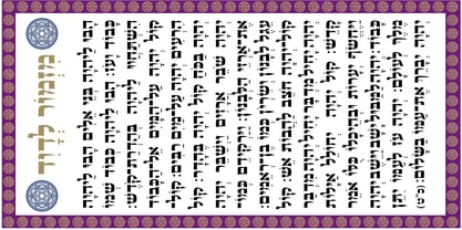 Beautiful Caligraphic font and also readable font.
 - Lost Forever - Unknown license

- High Country by FontMesa,
$25.00Although this font resembles the FontMesa High noon font a closer look reveals much more rounded serifs to this Antique Tuscan font. - GHEA Narek Serif by Edik Ghabuzyan,
$65.00 This font family can be used as Display as well as text font. The font family includes Armenian, Cyrillic and Latin alphabets.
 - KG PDX Blocks by Kimberly Geswein,
$5.00 This cute flag or banner font contains a unicase font inside. Enclosed PDF guides you on how to use the font effectively.
 - Ken Aroque by Beewest Studio,
$90.00 Ken Aroque Font is Engraved Bold Decorative Font that ornamental. This Font is Best as tittle of the novel, Poster, Theater, Logo and also tatoo. This font is bold , strong , classic and luxurious in the same time.
 - Brettisa by Rockboys Studio,
$28.00 Brettisa is a dazzling script font. This font is neatly crafted and highly detailed. Whatever the topic, this font will be a wonderful asset to your font library, as it has the potential to enhance any creation.
 - Roselitta by Rockboys Studio,
$23.00 Roselitta is a dazzling script font. This font is neatly crafted and highly detailed. Whatever the topic, this font will be a wonderful asset to your font library, as it has the potential to enhance any creation.
 - Tropical Drink by Sronstudio,
$23.00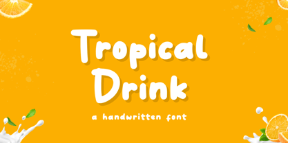 Tropical Drink – Handwritten Font is a fun display Font font, this font Is perfect for product packaging, product designs, label, photography, watermark, special events, or anything. Features: Uppercase and lowercase letters Multilingual, numerals, and punctuation Thank You!
 - Tahu Kotak by Sronstudio,
$23.00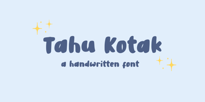 Tahu Kotak – Handwritten Font is a fun display Font font, this font Is perfect for product packaging, product designs, label, photography, watermark, special events, or anything. Features: Uppercase and lowercase letters Multilingual, numerals, and punctuation Thank You!
 - Dreaming by Amarlettering,
$15.00 Dreaming is a dazzling script font. This font is neatly crafted and highly detailed. Whatever the topic, this font will be a wonderful asset to your font library, as it has the potential to enhance any creation.
 - Borgson by Alphabet Agency,
$14.00 Borgson font is a sans serif display font that includes capitals and small capitals. The font includes basic Latin characters (128 characters). The font is great for vintage and hipster themes as well as sports related themes.
 - Baby Coffee - Personal use only

- Ghost - Unknown license


