10,000 search results
(0.075 seconds)
- Dociel by Maulana Creative,
$15.00 Dociel playful display font. Heavy stroke, fun character with a bit of ligatures. To give you an extra creative work. Dociel playful display font support multilingual more than 100+ language. This font is good for logo design, Social media, Movie Titles, Books Titles, a short text even a long text letter and good for your secondary text font with script or serif. Make a stunning work with Dociel playful display font.
 - MC Ifetur by Maulana Creative,
$16.00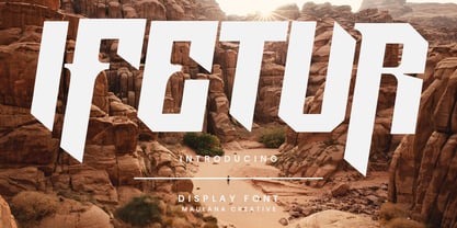 Ifetur display font. Bold stroke, fun character with a bit of ligatures and alternates. To give you an extra creative work. Ifetur font support multilingual more than 100+ language. This font is good for logo design, Social media, Movie Titles, Books Titles, a short text even a long text letter and good for your secondary text font with script or serif. Make a stunning work with Ifetur font. Cheers, Maulana Creative
 - MC Cluchy by Maulana Creative,
$14.00 Cluchy playful display font. Heavy stroke, fun character with a bit of ligatures. To give you an extra creative work. Cluchy playful display font support multilingual more than 100+ language. This font is good for logo design, Social media, Movie Titles, Books Titles, a short text even a long text letter and good for your secondary text font with script or serif. Make a stunning work with Cluchy playful display font.
 - Stubby by Tipos Pereira,
$12.00 Stubby is a display type family with 11 styles, was made for titles, headlines and also packages, posters and everything that provide space for a rude, fat and widish type. You should try Stubby in your text blocks if you're looking for an informal shape with some handwriting taste, there are eleven styles mixing from a narrowed thin to a sloppy ultrabold. Stubby has a tight spacing made to fit in squeeze places, not so elegant or clean but definitely an original choice for your real life project.
 - Baker Half by Ingrimayne Type,
$9.00 One of the odder things I remember from high school (50+ years ago) is the tile floor of hexagons in the bathroom. There is something fascinating with the way hexagons fill the plane. BakerHalfDozen is made of white letters that fit on black, hexagonal tiles. BakerHalfWhite switches the letters to black on white tiles, and BakerHalfBare eliminates the tiles. There are no true lower-case letters, but some letters have alternate shapes. To make the tiles line up right, alternate lines must be indented half a space. Use the {} characters (brackets) to do this.
 - Spargo by Greater Albion Typefounders,
$8.50 Spargo is inspired by 20s and 30s American typefaces, often seen on share certificates and other securities. Spargo is offered in six all capitals display typefaces. Bring a touch of inter-war America to your next design project!
 - Quinella by Eclectotype,
$40.00 Plumper than a misguided Z-lister's dodgy lip job, this is Quinella, named after the cheffy scoops of ice cream and the like, quinelles. It's a cute, fat script with a seventies vibe but a personality all of its own. It's non-connecting in the usual sense, but the letters overlap to make the white space as tiny as possible. Ligatures (standard and discretionary) make smoother solutions for quite a few pairs and trios, and every upper case letter has a more exuberant swash alternate. The contextual alternates feature substitutes in an alternate t for a better fit with certain letters. Fonts don't come much more voluptuous than this. The full-fat, creamy appearance makes it perfect for food packaging, but don't let it end there; it'll make memorable logos, unmissable headlines, and posters with more punch.
 - Prosty by Fontsphere,
$12.00 PROSTY is a family of minimalistic and geometric fonts. It follows the style of other Fontsphere's forms, but goes one step further. It contains both uppercase and lowercase characters, which makes it useful for display, titling, captions but also for composing short, intermediate and longer texts, which is a very interesting and useful combination here. It was created carefully with details in mind. PROSTY contains a large number of characters as well as multilingual support.
 - Booden by Lithographe,
$36.00 Booden is a name not to boo but to use in display type situations. but as texts funtion s to be read its functionality ges beyond a Cyber-tech font single weight single time use. it can be used for branding purposes or any type of editorial text because of its readability. Be it a logo, or a Title headliner, web or print booden typeface can certainly entertain your need for simple variation.
 - Raqmi Monoshape by Arabetics,
$39.00 Raqmi Monoshape is a simplified version of the Raqmi font family with unified (non-varying) shapes. This font family supports all Arabetic scripts covered by Unicode 6.1, and the latest Arabic Supplement and Extended-A Unicode blocks, including support for Quranic texts. It includes two weights: regular and light, each of which has normal and left-slanted Italic versions. The script design of this font family follows the Arabetics Mutamathil style utilizing varying x-heights. The Mutamathil type style utilizes only one glyph per Arabic Unicode character or letter, as defined by the Unicode Standards. Raqmi Monoshape includes the required Lam-Alif ligatures in addition to all vowel diacritic ligatures. Soft-vowel diacritic marks (harakat) are selectively positioned with most of them appearing on similar high and low levels—top left corner—, to clearly distinguish them from the letters. Tatweel is a zero-width glyph.
 - Dignus by Eurotypo,
$28.00 Dignus was inspired in two clever and famous typefaces: Bank Gothic and Microgramma. Bank Gothic designed by Morris Fuller Benton for ATF in 1930. Microgramma typeface designed by Alessandro Butti and Aldo Novarese for Nebiolo in 1952. Those typefaces were based on a stable rectangular shape with rounded corners, denoting the constructivist heritage and technological spirit of '50. We'd intended to review that typographic scenery with our contemporary point of view, aiming to obtain the formal synthesis of the signs and increase its legibility. Dignus fonts support Central, Eastern and Western European languages. Each font comes with full OpenType features like: standard and discretional ligatures, swashes, stylistic alternates, old style numerals, Tabular figures, numerators, denominators, scientific superior - inferiors, Case sensitive forms and vectors. The Dignus fonts include 7 weights, from Thin to ExtraBlack. The family is completed with condensed and expanded version all with their corresponding italics.
 - Kaoly by Creativemedialab,
$18.00 Kaoly Regular A unique bold serif with lots of beautiful alternate characters that you can combine to get an attractive final lettering with nice and dynamic shapes just in seconds! Thanks for the unique alternates! This font is suitable for use in many design form, for example Magazines, postcards, logos, Wedding projects and many more. We recommend using Adobe Illustrator or photoshop. Kaoly Lite This is the lite version of Kaoly Regular, recommend to use as a web font. For this style, changes only on uppercase, we also removed the alternative letters to reduce the file size. It will load your website faster when you're using this font for website heading text, products title or using applications that do not support OpenType features. It's very easy to make beautiful words just by typing and tada... you're done. Kaoly will make your work easy and fun.
 - Psychofun by Alit Design,
$15.00 Introducing Psychofun Typeface Psychofun Typeface is designed with a retro style concept that has a unique and cool shape. It is suitable for header text fonts, book covers and designs that have a retro and groovy concept, besides that Psychofun Typeface is also very good when used for body text. Psychofun Typeface has 5 families from Regular to Heavy. Display Serif typefaces such as “Psychofun Typeface” are very easy to apply to any design, especially those with an retro, groovy and classic concept, besides that this font is very easy to use both in design and non-design programs because everything changes and glyphs are supported by Unicode (PUA). The Psychofun Typeface contains 530 glyphs with many unique and interesting alternative options. Plus, there's a cool display serif font family for header and description text from regular to heavy. In the poster preview all the letters are in the Psychofun Typeface.
 - Yolk by Monotype,
$31.99 Yolk is an Eggcentric Sans Serif Typeface consisting of nine weights in both roman and italic. Essentially, this is a geometric sans typeface that has been inspired by the shape and proportions of an egg. With its bottom-heavy glyphs, Yolk has an unusual personality – it’s not too awkward to be off-putting, and it’s not too uniform to be associated with the myriad of generic geometric sans fonts that are available. Yolk has a distinctive presence in its upright form, while the italics exude a more flamboyant nature. When combined, your typographic results will be pleasing and perhaps a little quirky too. This 18-font type family achieves a good balance of personality, versatility, and usability. Small Caps are available at the click of a button, then add Stylistic Set 1 to achieve Petite Caps. The petite caps harmonise with the regular lowercase forms, so that you can create unicase-style typography too. All Latin-based languages are covered within the 1000+ glyphs of each Yolk font. Key Features: • 18 font family – 9 weights in Roman and Italic • Small Caps, Petite Caps, with Proportional, Old Style, and Small Cap figures, plus Fractions, Numerators, Denominators, Superiors, and Inferiors • Full European character set (Latin Extended) • 1,000+ glyphs per font.
 - Leco 1983 by CarnokyType,
$15.00 LECO 1983 is a headline display OpenType typeface with its three styles: LECO 1983: regular LECO 1983 Blind: without interiors of signs LECO 1983 Negative: in its inverse form. The inspiration for creating this font came from the label on a 1983 bottle of Lečo. The characteristic feature of this font is an embedded diacritic. The monolinear character of drawings is dominant. This font is drawn as capital letter type for both: upper case and lower case letters. It contains alternatives of some signs (e, f, g, m, n, y) and (& and a glyph No) but it consists several interesting alternatives (ligatures) of pairs as (in, on, of, by) as well. This font is best used on strong posters or as a headline display typeface.
 - Librum E by Hackberry Font Foundry,
$24.95 The major focus of my life and ministry at this point is book design. In the brave new world of 21st century self-publishing a new paradigm has arisen: the indie small shop. One of the problems is that all books are published as ebooks, and many books are published only as ebooks. There are two problems with this: character availability and licensing. The licensing problem is solved by including an ebook license with all of the Librum E fonts. The character availability is the core of the design. OpenType features do not work yet with ePUBs [though it is in the spec, if I understand correctly]. Kerning doesn't work, and so on. So these five fonts have only the 256-character [or less] ASCII set. A separate small caps is included. It has lining figures {proportional} and small caps instead of the graphics. The other four fonts have graphics to give bullet choices in lists, oldstyle figures {proportional}, and care given to character shapes so they will work better without kerning. For a great deal, see Librum Book Design Group , for a package containing all fifteen fonts!
 - Daenerys Signature by Ferry Ardana Putra,
$14.00 Daenerys is a thin, elegant signature font that is perfect for a wide range of design projects. It has a delicate, calligraphic style with smooth, flowing lines that give it a sense of grace and beauty. The letters have a slight slant, which gives them a hand-written feel, making it suitable for invitations, wedding stationery, and other special occasions. One of the most striking features of this font is the abundance of swashes. These are decorative flourishes that extend from the letters, adding a unique and ornate touch to your designs. The swashes come in a variety of shapes and sizes, and they can be used to add emphasis to specific letters or words. This makes the font perfect for creating elegant, eye-catching titles and headlines. The lowercase letters have a unique and modern touch, The uppercase letters are more formal and elegant, making them great for headlines and titles. Daenerys is a versatile font, it's perfect for branding, packaging, and web design. The thin lines make it easy to read in small sizes and it's also great for overlaying on top of other design elements. Overall, Daenerys is a beautiful and sophisticated font that can add a touch of elegance to any design project. Daenerys features: A full set of uppercase and lowercase Numbers and punctuation Multilingual language support PUA Encoded Characters OpenType Features +274 Total Glyphs +40 Signature Swashes
 - Terje by Further Type,
$9.00 When you've got something big to say, but space is tight, the only way is up! Terje, an ultra condensed display font by Further Type, is here to help you create eye-catching, playful headlines, and logotypes that stand head and shoulders above the rest.
 - Kolega by Just My Type,
$25.00 Maybe I should have named this font “Communist Block”. But it also works well for Colonial-style tavern signs. It’s square, geometric and rigid, and is the perfect thing for totalitarian themes. The family consists of three fonts: Kolega (“Comrade” in Polish), Kolega Tall, and Kolega Podrobska (Fake Comrade). Kolega and Kolega Tall are fully charactered with U.S., European, Greek and Cyrillic glyphs. The latter font is meant to use in English only; although it contains many accents and character variations, they mean nothing. It’s a joke.
 - Adventuros by Abo Daniel,
$21.00 introducing ADVENTUROS - a fresh dry brush font - This font is great for branding, packaging, logos, cards, apparel, quotes, banner, social media, and another project that needs urban style. Adventuros is All Capital fonts, but the uppercase and lowercase characters are totally different. You can combine them as you like. I also created 52 swash to complete this product. They will be a perfect combination. Features: Uppercase Lowercase Number & Punctuations International language Swash PUA Encoded Hope you love it. Grab it fast! regards, Abo Daniel Studio
 - Twombly by SAMUEL DESIGN,
$19.00 The name of this font is TWOMBLY, which is inspired by the abstract art master Cy Twombly. This original typeface has an Art Deco style with a firm, straightforward, confident character. Its self-respect is HEAVY, but it is very elegant and has a literary temperament. This font reveals a calm and calm temperament from Northern Europe. The details of the triangle used as a transition in the serif are full of playfulness, which makes the whole font have a youthful and cutting-edge feeling.
 - Dylan by Wiescher Design,
$29.00 »Dylan« is a Sans typeface in the best American tradition. In order to keep corners open and to make the font more readable in small sizes it has deep cuts where curves join straights. I designed 7 finely tuned weights with fitting italic sets. The fonts includes full smallcaps, language support for most European languages plus Turkish, many fractions, nominator and denominators, Greek mathematical signs and many currency symbols. It is a versatile font that is well suited for many occasions, even for signage.
 - Quadrat Grotesk by ParaType,
$30.00 PT Quadrat Grotesk™ was designed for ParaType in 2001 by Vladimir Pavlikov. An expanded sans serif with square letterforms due to what the face was named. Based on the shapes of one of old Russian wooden types. Wooden types were used for placard display composition at large sizes. Their printouts retained wooden texture and traces of handling. These features are reflected in the shapes of Quadrat Grotesk. It is a good typeface for display and advertising typography.
 - Anona by Nova Type Foundry,
$29.99 Anona brings the upright italic to fruition and shows the handwriting shapes in a sans serif great to use in packaging and branding. Anona is an upright italic sans serif typeface perfect for packaging and playful identities. Explore the stylistic sets to see all the different shapes. Fruity and friendly upright italic sans serif come to brighten your projects. A warm and friendly sans serif will work for your identity. It has a complementary slanted version.
 - Strateen by IbraCreative,
$17.00 Strateen – a Futurism Sans Serif Font Strateen, a Futurism Sans Serif font, encapsulates the essence of contemporary design with its sleek and progressive aesthetic. Its clean, geometric lines and minimalistic strokes evoke a sense of modernity, making it ideal for projects that seek a futuristic and cutting-edge look. The typeface’s letterforms boast a harmonious balance between simplicity and sophistication, enhancing legibility while maintaining a distinctive personality. Strateen’s sans serif nature contributes to its versatility, enabling seamless integration across various mediums, from digital interfaces to print materials. The font’s forward-thinking design not only aligns with the visual trends of the future but also ensures a timeless appeal, making Strateen a compelling choice for those in pursuit of a dynamic and forward-looking typographic solution. Strateen is perfect for branding projects, logo, wedding designs, social media posts, advertisements, product packaging, product designs, label, photography, watermark, invitation, stationery, game, fashion and any projects. Fonts include multilingual support for; Afrikaans, Albanian, Czech, Danish, Dutch, English, Estonian, Finnish, French, German, Hungarian, Italian, Latvian, Lithuanian, Norwegian, Polish, Portuguese, Slovak, Slovenian, Spanish, Swedish.
 - Pattheda - Personal use only

- Notela by Forberas Club,
$16.00 Introducing Notela by Forberas Club Notela is a Handwritten Script font that will make your designs look classic, Farmhouse, Boho, and Feminine. It is a great font for events, Wedding Project, fashion, apparel projects, signature, album covers, logos, branding, magazines, social media posts, advertisements, but it also works great for other projects. Add it to your fonts’ library, and it will enhance your creativity! Notela is best for: - logos, branding, & Signatures. - Flyers, Album cover, Magazine, & Advertisements. - Website design , design blogs, & fashion. - Quote graphics for social media. - and also it works great for other projects. Whats included : - Fonts are provided in OTF file formats. - Character Set - Numerals and Punctuation (OpenType Standard) - Accents (Multilingual characters) If you have any questions, before or after purchase, please feel free to get in touch.
 - Baby Bison by Forberas Club,
$16.00 Introducing Baby Bison by Forberas Club Baby Bison is a Handwritten Script font that will make your designs look classic, Farmhouse, Boho, and Feminine. It is a great font for events, Wedding Project, fashion, apparel projects, signature, album covers, logos, branding, magazines, social media posts, advertisements, but it also works great for other projects. Add it to your fonts’ library, and it will enhance your creativity! Baby Bison is best for: - logos, branding, & Signatures. - Flyers, Album cover, Magazine, & Advertisements. - Website design , design blogs, & fashion. - Quote graphics for social media. - and also it works great for other projects. Whats included : - Fonts are provided in OTF file formats. - Character Set - Numerals and Punctuation (OpenType Standard) - Accents (Multilingual characters) If you have any questions, before or after purchase, please feel free to get in touch.
 - Huskeseddel by Bogstav,
$17.00 Huskeseddel is to-do list or memo in English. If you not already guessed it, the font is based upon my own handwriting. Actually not my everyday handwriting, but the kind I use when I make my to-do lists. But it wouldn't look right with a simple font with the same letters repeating all the time, and that's why I added 12 different hastily written versions of each letter. These 12 different versions cycle as you type, making your text look...well, like hastily written letters...you'll have to take a real close look to find out that you are looking at a font, and not a genuine hastily written to-do list! :)
 - Auxerre by Ingo,
$33.00 A Roman typeface with emphasized triangular serifs. A font like this one could have been designed in 18th century France. To some extent, Auxerre is a precursor of “Etienne,” which later became popular as an advertising typeface of the 19th century. Auxerre is available in five font weights: light, regular, semibold, bold and black. Auxerre supports Western and Central European languages including Scandinavian languages. Plus, the font includes lots of ligatures, tabular figures as well as a “Capital German Double S.” Auxerre fits perfectly with any topic related to the past two centuries. It also works amazingly well on technical issues. And of course it fits very well with topics of fine art and art history.
 - Haarlemmer by Monotype,
$29.00 Haarlemmer is a recreation of a never-produced Jan Van Krimpen typeface that goes one step beyond authentic: it shows how he wanted it to be designed in the first place. The original, drawn in the late 1930s, was created for the Dutch Society for the Art of Printing and Books and was to be used to set a new edition of the Bible, using Monotype typesetting. Hence the problem: fonts for metal typesetting machines like the Linotype and Monotype had to be created within a crude system of predetermined character width values. Every letter had to fit within and have its spacing determined by a grid of only 18 units. Often, the italic characters had to share the same widths as those in the roman design. Van Krimpen believed this severely impaired the design process. The invasion of Holland in World War II halted all work on the Bible project, and the original Haarlemmer never went into production. Flash forward about sixty years. Frank E. Blokland, of The Dutch Type Library, wanted to revive the original Haarlemmer, but this time as Van Krimpen would have intended. Blokland reinterpreted the original drawings and created a typeface that matched, as much as possible, Van Krimpen's initial concept. While Van Krimpen's hand could no longer be on the tiller, a thorough study of his work made up for his absence. The result is an exceptional text family of three weights, with complementary italic designs and a full suite of small caps and old style figures. Van Krimpen would be proud.
 - Vglee by Ingrimayne Type,
$8.50 With its split serifs, Vglee looks like it could be a copy of an “Old West” font but it is not. It was constructed by taking a motif and applying it regardless of consequences. Vglee does not have lower-case letters but it does include a full set of Western and Central European accented characters. Its distinctive, odd appearance can be useful in small doses for decorative purposes. The VgleeStar style contains only the ornament. It is intended to be used in layers with Vglee.
 - Cinema Script by Eclectotype,
$40.00 The early Twentieth Century was a golden age for cinema, and for the artists who lettered the iconic title sequences. Cinema Script is inspired by this lettering style, but has departed substantially from the source material in an effort to be less retro and more in tune with today’s designers' needs. The font will work admirably ‘out of the box’ but to really shine use the advanced OpenType features. Contextual alternates and ligatures should be on by default for the best results. Discretionary ligatures are a little more out there, so use them, ahem, at your discretion. Cinema Script also boasts swash characters, optional oldstyle numerals, plenty of stylistic sets and a nice ordinal feature for 1st, 2nd, 3rd etc. For greater detail, check out the user guide in the gallery section. This is a versatile brush script style font. It seems familiar, with a similar vibe to other brush fonts but without the staid ubiquity. Cinema Script will look great on the big screen, or on your screen, on food packaging, t-shirts, blogs, photobooks, wedding stationery... You get the idea!
 - Blured Stroke by Ditatype,
$29.00 Blured Stroke is a beautiful script font. Every letter in this font looks like it was created with a skillfully swung brush. The subtle and soft brush strokes are clearly visible at every angle and bend, giving the entire font an artistic and expressive feel. The ends of each letter tend to be rounded, giving it a soft and elegant touch. This font is designed with detail and a perfect balance between thick and thin strokes. The thicker lines bring out strength and firmness, while thinner lines add softness and elegance to this font. The perfect combination of these differences creates an eye-catching visual harmony and expresses a unique writing style. The colors used in this font can vary, but to maintain a soft impression, bright colors would be the right choice. The letters remain legible and understandable because they have clear outlines. Enjoy the various features available in this font. Features: Ligatures Multilingual Supports PUA Encoded Numerals and Punctuations Blured Stroke fits best for any design projects that want to convey tenderness, friendliness and creativity. This font can be used in the invitations, greeting cards, brand logos, promotional materials, and many other design projects that require a warm artistic touch and are full of personality. Find out more ways to use this font by taking a look at the font preview. Thanks for purchasing our fonts. Hopefully, you have a great time using our font. Feel free to contact us anytime for further information or when you have trouble with the font. Thanks a lot and happy designing.
 - As of my last update in April 2023, while there's a significant array of digital and techno-inspired fonts available for various design needs, specific information on a font named "Digi" by Shane McF...
- Hunkster by Heypentype,
$20.00 HUNKSTER is heypentype journey to simplified a stencil fonts. Simplified means it must easy and fast to cut when creating stencil art. Hence, this typeface inspired a lot from stencil arts and fonts right from the beginning of its creations. When a lot of stencil fonts out there used to create political message and self-expression, Hunkster take it beyond that. This typefaces can be applied to anything, from motorsports, branding, logo or logotype, industrial design, products packaging, software, games, website headlines,etc. Whatever it will be used, the spirit of the stencil and street art remains. Include in this typeface family is plenty of ligatures because the nature of stencil and our design aims, easy-to-cut but still beautiful. Most importantly its thrown away an image of stencil fonts bound on military themes. This ligatures will be developed in the future release along with updates on Hunkster variable fonts.
 - JAF Lapture by Just Another Foundry,
$59.00 Lapture is based on the Leipziger Antiqua by Albert Kapr, released in 1971 by the East German foundry Typoart. It has been extended and carefully redesigned by Tim Ahrens in 2002-05. The strong calligraphic characteristics are a result of the design process: "The size of the counters and the width of individual characters at small optical sizes were analysed with a steel pen while the letter shapes were designed in larger size with a specially trimmed reed pen. Sometimes the hand is more innovative than the head alone," says Kapr. A unique feature of this font is the introduction of gothic shapes into a latin typeface. "The basic concept is to string together narrow white hexagons as counters and inter-letter spaces, defined by vertical stems and triangular serifs. The interior spaces are at least as important as the strokes that make up the characters." Lapture is an ideal choice if a reference to gothic style is desired, as true black letter types are often too eye-catching and not as legible as latin fonts for unfamiliar readers. "The last few years have seen a number of very elegant typefaces based on the mellow and feminine renaissance model. However, sometimes we require a font that is strong and robust, harmonic yet rigid," says designer Tim Ahrens. JAF Lapture is provided in OpenType format. Each font contains more than 600 glyphs, including true small caps, nine sorts of figures, contextual and stylistic alternates and accented characters. This means that you only need to purchase one font whereas in other families you would have to buy two or three fonts in order to get the same. Technically, they follow the Adobe Pro fonts and provide the same glyph set and OpenType functionality. JAF Lapture Basic is provided in OpenType format. Each font contains the standard sets of both MacOS and Windows. In contrast to JAF Lapture they do not provide any advanced OpenType features and no extended glyph set.
 - Apla Clare by Hooper Type,
$9.00 Apla Clare comes from the love of my wife.. She's 'Simply' Clare. It's a straihght forward sans, but with a little bit of play, and a friendliness that ensures it moves away from sterile, serious sans. PLease enjoy!
 - Orient - Unknown license

- TE Banner by Tharwat Emara,
$49.00 This font may be conservative and classic, but also may be more playful and modern. It is good for theater or art posters and for modern music, web-pictures or vinyl covers. Of course it also will be good for coffee shops, cafe's, restaurants, magazine's headers, signs or gift/post cards and weddings. Try to use it in your beauty or travel blogs, you will see how many options you will have with stylish Banner Font.

