10,000 search results
(0.119 seconds)
- ITC Stepp by ITC,
$29.99When Hal Taylor saw the 1930 logo for the Stetson Shoe Company of Weymouth, Massachusetts, he didn't run out and buy a pair of loafers. Instead, he seized on this striking example of an Art Deco logotype as the basis for a new typeface design. “I was impressed with the delicate and sophisticated letter forms,” Taylor recalls, “particularly the enlarged cap S -- in any other case it would have seemed unbalanced, but in the context of this logo, it worked perfectly.” All the letters in the original all-caps Stetson Shoe logo were rendered with condensed proportions except the O, which was a perfect circle. While the prominent O added visual interest to the logo, Taylor knew that such a character would limit his typeface to display applications. For versatility's sake, he drew his O for ITC Stepp with the same proportions as the rest of the alphabet. Taylor also gave the logotype's inverted S a more traditional design, but kept the original as an alternate character in the OpenType font. Taylor's toughest challenge during the design process was creating a lowercase. “A good type design tells you what it wants to be,” he says, “and after a little while the Stepp caps began to tell me what the lowercase should look like.” Taylor's lowercase is slightly more conventional than the caps. The jaunty g" and almost upside-down "s" add subtle charm, while the capital letters provide the broader gestures of Stepp's personality. Together, they create a versatile and distinctive typeface design. One of Hal Taylor's first jobs was as a photo-lettering typographer in Philadelphia, setting headlines and creating custom lettering. This was followed by a stint doing finished lettering for John Langdon, whose ambigrams appear in Dan Brown's best-selling novel, Angels & Demons. Today, Taylor works as a graphic designer in the publishing industry, but he still finds time to create an occasional hand-lettered book jacket, and draw handsome typeface designs. ITC Stepp is available in four weights, ranging from Light to Ultra Bold. All four weights have companion italics, and the lightest three weights also offer a suite of small caps." - Byrning Bridgez by Cyberian Khatru,
$20.00 This font is created specifically for the purpose of creating logos for Progressive Rock bands. Such bands oftentimes have their logos designed by Fantasy artists such as Roger Dean and Rodney Matthews. The capitals and lower case are distinct enough from each other to be completely separate fonts. I decided, however, to combined them as one font. http://homepage.mac.com/baronvoncruzer/cyberiankhatru/byrningbridgez.htm
 - Parten by Surotype,
$20.00 Parten a typeface inspired by old motel signage. Available in two styles Regular and italic with alternative characters such as Stylistic Alternates, Stylistic Set, and Swash Variant. Parten very suitable to use on many of your design projects such as : Signage, Logotype, Headline, Packaging, and more. To enable the style alternative, you need a program that supports the opentype features.
 - Calserif by Great Studio,
$19.00 Calserif is a serif font combined with a calligraphy serif font. With its blend of classic elements and contemporary designs, this serif family has two versions, a choice of regular serif styles and italic calligraphy styles. These fonts are perfect for your design needs such as making nostalgic but still clean and elegant designs such as headlines, magazines, logo designs, packaging, editorials, invitations.
 - Broline Script by Tebaltipis Studio,
$15.00 Introducing, Broline Bold Script is a typeface with personality. You can use it as a logo, badge, insignia, packaging, headline, poster, etc The alternative characters in this font were divided into several OpenType features such as Stylistic Alternates, Stylistic Sets, and Ligature. The OpenType features can be accessed by using OpenType program such as Adobe Illustrator, Adobe Photoshop, and Adobe InDesign. Thank you!
 - Ephemera Fascia by Ephemera Fonts,
$20.00 Ephemera Fascia is a typeface inspired from facade sign of historical building. 5 layer styles available from outline, inset, base, shadow 01, shadow 02. Opentype features support such as Stylistic set 01, Stylistic set 02, Stylistic set 03, and Discretionary Ligature. This typeface was created for Display needs, such as headlines, menu board, signage, logotype, badges design, packaging, etc. Caps only fonts.
 - Caneline by Gatype,
$14.00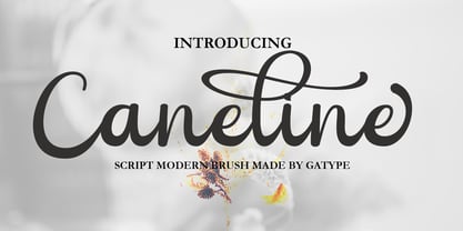 Caneline is an elegant classic script font, this font is equipped with various opentype features such as Stylistic Set & Ligature as well as multi-language support. Equipped with 90+ stylistic sets, this font has a large selection of glyphs / characters. This font is perfect for your design needs such as wedding invitations, logo designs, branding, social media designs, books, magazines, etc.
 - Barinde Brush by Tebaltipis Studio,
$12.00 Barinde Brush is a typeface with personality. You can use it as a logo, badge, insignia, packaging, headline, poster, etc The alternative characters in this font were divided into several OpenType features such as Stylistic Alternates, Stylistic Sets, and Ligature. The OpenType features can be accessed by using OpenType program such as Adobe Illustrator, Adobe Photoshop, and Adobe InDesign. Thank you!.
 - Redters Brush by Tebaltipis Studio,
$12.00 Redters Brush is a typeface with personality. You can use it as a logo, badge, insignia, packaging, headline, poster, etc The alternative characters in this font were divided into several OpenType features such as Stylistic Alternates, Stylistic Sets, and Ligature. The OpenType features can be accessed by using OpenType program such as Adobe Illustrator, Adobe Photoshop, and Adobe InDesign. Thank you!
 - Braylend Script by Tebaltipis Studio,
$15.00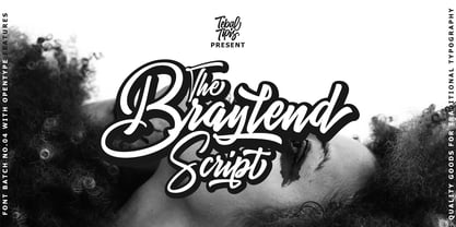 TebTipsudio, Braylend is a script typeface with personality. You can use it as a logo, badge, insignia, packaging, headline, poster, etc The alternative characters in this font were divided into several OpenType features such as Stylistic Alternates, Stylistic Sets, and Ligature. The OpenType features can be accessed by using OpenType program such as Adobe Illustrator, Adobe Photoshop, and Adobe InDesign.
 - OL Hebrew Qumran Torah by Dennis Ortiz-Lopez,
$30.00 This font contains every variant found in the Hebrew Bible such as the “mutilated” Waw in Numbers 25: verse 12, the small Heh in Genesis 2: verse 4 and the Nun Inversum before Numbers 10: verse 35 and after verse 36 and elsewhere as well as certain oversized consonants such as the Shin with hireq from the beginning of the Song of Songs.
 - Suprema by Artegra,
$29.00 Suprema is a modern sans serif family that will bring supreme geometric perfection to any piece of typography. It has 7 weights with matching true italics. When it comes to Opentype it has lots of features such as tabular lining, proportional oldstyle, tabular oldstyle, ligatures, superscript, subscript, fractions and language localisations for languages such as Polish, Dutch, Romanian, Moldovian and Catalan.
 - Mangkaning by TSA Creative,
$16.00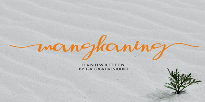 mangkaning is a beautiful script font with stylistic set ( ss01 & ss02), this font looks natural, elegant and perfect for any extraordinary project. mangkaning is suitable for various products such as invitations, product packaging, product design, crafter, labels, photography, watermarks, logos & branding. Everything can be accessed using software that supports Opentype, such as Adobe Indesign, Adobe CS Illustrator, Adobe Photoshop CC, and Corel Draw.
 - Lafisken Signature by Tebaltipis Studio,
$12.00 Lafisken Signature is a typeface with personality. You can use it as a logo, badge, insignia, packaging, headline, poster, etc The alternative characters in this font were divided into several OpenType features such as Stylistic Alternates, Stylistic Sets, and Ligature. The OpenType features can be accessed by using OpenType program such as Adobe Illustrator, Adobe Photoshop, and Adobe InDesign. Thank you!
 - Open-Dyslexic - Personal use only

- Old Standard TT - 100% free

- Pecita - 100% free

- News Cycle - 100% free

- Pfennig - 100% free

- nineveh - 100% free

- Justus - Unknown license

- Aurulent Sans - Unknown license

- Rambat Campotype - Personal use only

- Aurulent Sans Mono - Unknown license

- LT Stopwatch - 100% free

- LT Sonoma - 100% free

- LT Wave - 100% free

- LT Superior - 100% free

- LT Superior Serif - 100% free

- LT Renovate - 100% free

- LT Makeup - 100% free

- LT Beverage - 100% free

- Amdeira Script by Gatype,
$10.00 Amdeira Script is a bold style script font. elegant, simple and slightly vintage look. This font is equipped with open types such as: ligature, Stylistic Sets, Last alternative. In addition, this font also supports multiple languages. You can mix and match your best combination. And besides that, this font is suitable for your design needs such as: poster design, magazines, logos, branding, packaging and many more. To enable the OpenType Stylistic alternatives, you need a program that supports OpenType features such as Adobe Illustrator CS, Adobe Photoshop CC (With Glyphs Panel), Adobe Indesign & CorelDraw X6-X7, Microsoft Word 2010 or later versions. Encoded PUAs are also supported. Access font characters compatible with Silhouette Studio, Cricut Design Space. Simply copy and paste alternate characters using Character Map (Windows), Nexus Font (Windows), Font Book (Mac) or a software program such as PopChar (for Windows and Mac)
 - Love Future by Gatype,
$12.00 Love Future is a bold style script font. elegant, simple and slightly vintage look. This font is equipped with open types such as: ligature, Stylistic Sets, Last alternative. In addition, this font also supports multiple languages. You can mix and match your best combination. And besides that, this font is suitable for your design needs such as: poster design, magazines, logos, branding, packaging and many more To enable the OpenType Stylistic alternatives, you need a program that supports OpenType features such as Adobe Illustrator CS, Adobe Photoshop CC (With Glyphs Panel), Adobe Indesign & CorelDraw X6-X7, Microsoft Word 2010 or later versions. Encoded PUAs are also supported. Access font characters compatible with Silhouette Studio, Cricut Design Space. Simply copy and paste alternate characters using Character Map (Windows), Nexus Font (Windows), Font Book (Mac) or a software program such as PopChar (for Windows and Mac)
 - Sure, let's dive into the imaginative world of a font named "Whatever." Imagine this font as the epitome of casual chic, the kind of lettering that doesn't fuss over the formalities of typography. It...
- The font named Skratch, crafted by the talented typographer David Kerkhoff, is a true embodiment of creativity and unleashed artistic expression. It dives into the realm of casual and spontaneous des...
- Scrypticali Normal is a font that weaves an enchanting spell on any canvas it graces. Evoking a blend of ancient mystique and modern elegance, this typeface seems to dance between the realms of magic...
- The font SunriseSunset, designed by Marcia Loeb, encapsulates a visual narrative that effortlessly evokes the delicate transition periods of dawn and dusk. This typeface, through its design, seeks to...
- Reina Neue by Lián Types,
$29.00 Hey! See Reina Neue in action here! INTRODUCTION When I designed the first Reina¹ circa 2010, I was at the dawn of my career as a type designer. The S{o}TA, short for the Society of Typographic Aficionados, described it as complex display typeface incorporating hairline flourishes to a nicely heavy romantic letterform². And it was like that; that’s what I was pursuing at that time since I was very passionate about ornaments and accolades of Calligraphy. Why? I felt that Typography, in general, needed more of them. These subtle flourishes could breathe life into letters. Maybe, I thought it was the only way I could propose something new into the field of type. However, after some years, I came across a very interesting quote: –Beautiful things don’t ask for attention– Wow! What did this mean? How could something be attractive if it’s not actually showing it. Could this be applied to my work? Sure. I think every type-designer goes through this process (aka crisis) regarding his or her career. At the beginning we love everything. We are kind of blind, we only see the big picture of a project. And that’s not because we are lazy. We actually can’t see the small mistakes nor the subtleties that make something simpler beautiful. We are not able. But, the small subtleties… They are actually everything: With experience, one puts more attention into the details and learns that every single decision in type has to be first meticulously planned. Here I am now, introducing a new Reina, because I felt there was a lot of it that could be improved, also the novelty of Variable Fonts caught my attention and I had to take that to my type library. THE FONT A thing of beauty is a joy forever Now, a decade later, I’m presenting Reina Neue. This font is not just an update of its predecessor: –A thing of beauty is a joy forever– is the first line of the poem ‘Endymion’ by John Keats, and despite the meaning of “beauty” may vary from person to person, and even from time to time (as read in the last paragraph), with Reina I always wanted to bring joy to the eye. In 2010, and now, in 2020. I believe the font is today much better in every aspect. It was entirely re-designed: Its shapes and morphology in general are much more clean and pure. The range of uses for it is now wider: While the old Reina consisted in just one weight, Reina Neue was converted into a big family of many weights, even with italics, smallcaps and layered styles. The idea behind the font, this kind of enveloping atmosphere made out of flourishes, is still here in the new Reina. This time easier to get amazing results due to the big amount of available alternates per glyph and also more loyal from a systemic point of view. However, and as read in the introduction -Beautiful things don’t ask for attention-, if none of the flourishes are activated the font will look very attractive anyway. Reina Neue is ready to be used in book covers, magazines, wedding cards, dazzling posters, storefronts, clothing, perfumes, wine labels and logos of all kind. Like it happened with the previous Reina, I hope this new font satisfies every design project around the world if used, and can be a joy forever. SOME INSTRUCTIONS Before choosing the right style for your project, hear my advice: -Reina Neue Display was meant to be used at big sizes. If you plan to print the font smaller than 72pt, I suggest using Reina Neue, not Display. Otherwise, if the font will be BIG or used on a digital platform, Reina Neue Display should be your choice. For even smaller sizes, use Reina Neue Small. This style was tested and printed in 12pt with nice results. (Note for variable fonts: Print them in outlines) -Reina Italic is not a slanted version of the roman, and this means some flourishes are different between each other. The Italic version has other kind of swirls. More conservative, in general. -All the styles of Reina Capitals have Small Capitals inside. -Reina Capitals Shine should be used/paired ONLY with Reina Capitals Black. The engraved feeling can be achieved if Reina Capitals Black and Reina Capitals Shine are used as layers, with the same word. Variable fonts instructions: -For more playful versions, choose Reina Neue VF, Reina Neue Italic VF or Reina Neue Capitals VF: With them you can adjust between 3 axes: Weight (will change the weight of the font) – Optic Size (will thicken/lighten the thin strokes and open/close the tracking) – Accolades (will modify the weight of the active flourishes). SOME VIDEOS OF REINA NEUE VF https://youtu.be/8cImmT5bpQM https://youtu.be/1icWfPmKAkg https://youtu.be/YC9GkJDL1a8 NOTES 1. The original Reina, from a decade ago: https://www.myfonts.com/fonts/argentina-lian-types/reina/ 2. In 2011, Reina received an honourable mention by S{o}TA. “Great skill is shown in the detailing, and an excellent feel for the correct flow of curves and displacement of stroke weight.” https://www.typesociety.org/catalyst/2011/ Reina was featured in the “Most Popular Fonts of the year” in MyFonts in 2011 https://www.myfonts.com/newsletters/sp/201201.html In 2012, the font was also selected in Tipos Latinos, the most prestigious competition of type in Latinoamerica. https://www.tiposlatinos.com/bienales/quinta-bienal-tl2012/resultados Also, chose as a “Favorite font of the year” in Typographica. https://typographica.org/typeface-reviews/reina/
 - Freigeist by René Bieder,
$29.00 The story of Freigeist is a journey into the past, back to the early grotesk fonts and long before Helvetica and Co were standard fonts in operating systems. For what we take for granted today is the result of innovation and pioneering spirit of type foundries such as Caslon or Stephenson Blake in the 19th century, whose expressive designs are mostly forgotten today. The Freigeist family captures this untamed spirit — hence the name (German for “free spirit”) — and puts it into a contemporary context, resulting in a multi-faceted family with a wide range of applications, font styles and features for modern typesetting. Design Details Unlike other modern grotesk typefaces like Helvetica or Univers, Freigeist is characterized by a warm and dynamic appearance. It draws inspiration from various historical models such as Caslon’s Doric or the Grotesque variants of Stephenson Blake. Particularly noticeable are the narrow terminals, the serpentine S or the dynamic g in combination with ascenders that reach to the cap-height only. Italics Many italic grotesk fonts are strongly oriented towards their upright counterparts. Unfortunately, this often means that they cannot do justice to their actual task, which is to highlight words or sections of a text. The italic cuts of Freigeist try to remedy this situation by using the greatest possible formal distance while reinforcing the untamed spirit. What adds to this, is a reminiscent of handwritten forms, which can be found in a, n, y or g, as well as the German sharp s or the ampersand. Alternate Characters Alternative letterforms are ideal for customizing the overall appearance of a text, for usage in logos or they can even work as custom fonts for companies. Freigeist comes with ten stylistic alternatives that are easy to insert via the Opentype window, such as the single-storey a, a tail-less version of the a for compact text, when uses in condensed widths or a dialed down version of the r. Languages Freigeist has a built-in support for Latin and Cyrillic based languages and covers more than 210 languages. Opentype Features and Symbols The family comes with many opentype features to support modern typesetting. This includes ligatures, different number sets or alternative shapes for texts set in all caps. Styles Freigeist is available in five widths (XCon, Con, Normal, Wide, XWide) and six weights (Thin, Light, Regular, Medium, Bold, Black). Including the accompanying italics, the family comes in 60 cuts that are suitable for any application. Testfonts If you like to test the fonts before buying the full version, please follow the link below: https://www.renebieder.com/test-fonts Update 1 A lot has changed in this first update. It is more than just a 1.01 or 1.02. It is actually the 2.0! I’ve gone through all! single glyphs of the 18 master files, making the family more sharp and even a bit more modern. I’ve added some new opentype features and redesigned the italics, because I wasn’t happy enough with the result. I’ve added new kerning pairs, new metrics, and even new glyphs. Please check my website for more details on the new design and overview about the opentype features and alternate shapes. If you purchased the Freigeist family already, thanks a lot!! It is the most advanced family that I published so far. I hope that you’re happy with this new version. Thanks!


