10,000 search results
(0.082 seconds)
- Samarra by madjack.font,
$13.00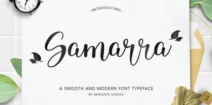 Samarra is a modern script. This font is casual and beautiful with exceptional swashes. It can be used for various purposes, such as logos, product packaging, wedding invitations, branding, headlines, signage, labels, signatures, book covers, posters, quotes, and more. Samarra includes a change of the OpenType language style, binding and international support for most Western languages. To activate the OpenType Stylistic alternative, you need a program that supports OpenType features such as Adobe Illustrator CS, Adobe Indesign & CorelDraw X6-X7, Microsoft Word 2010 or newer versions. How to access all alternative characters using Adobe Illustrator: https://www.youtube.com/watch?v=XzwjMkbB-wQ Samarra script is coded with PUA Unicode, which allows full access to all additional characters without having to design special software. Mac users can use the Font Book, and Windows users can use Character Map to view and copy one of the additional characters to insert into your favorite text editor / application. How to access all alternative characters, using Windows Character Map with Photoshop: https://www.youtube.com/watch?v=Go9vacoYmBw If you need help or have questions, please let me know. I am happy to help :) Thank you & Congratulations on Designing.
 - Girly Night by Natural Ink,
$12.00 Girly Night is a modern calligraphy design, including Regular. This font is casual and beautiful with swash. Can be used for various purposes. such as logos, product packaging, wedding invitations, branding, headlines, signage, labels, signatures, book covers, posters, quotes, and more. Girly Night includes a change of the OpenType language style, binding and international support for most Western languages. To activate the OpenType Stylistic alternative, you need a program that supports OpenType features such as Adobe Illustrator CS, Adobe Indesign & CorelDraw X6-X7, Microsoft Word 2010 or newer versions. How to access all alternative characters using Adobe Illustrator: https://www.youtube.com/watch?v=XzwjMkbB-wQ Girly Night is coded with PUA Unicode, which allows full access to all additional characters without having to design special software. Mac users can use the Font Book, and Windows users can use Character Map to view and copy one of the additional characters to insert into your favorite text editor / application. How to access all alternative characters, using Windows Character Map with Photoshop: https://www.youtube.com/watch?v=Go9vacoYmBw If you need help or have questions, please let me know. I am happy to help :) Thank you & Congratulations on Designing!
 - Shape Variable Script by Roland Hüse Design,
$32.00 A shape-shaky script font that reacts to audio! Thanks to the variable font technology, fonts today can be variable be it weight, width or any other parameters that are defined by values such as shape! Even better: in html, with a bit of css (and in this case, javascript as well) it is possible to animate them between these values. This gave me the idea to create something really fun which is a quirky, informal handwritten font that can react to sound. The html file along with css and javascript is taken from codepen.io and I was using and tweaking it to this specific project. Please read more details in this pdf where you can also find link to a demo and download the txt files: https://drive.google.com/file/d/15J_6g3NgmZKJYO6SrnOHj4Rk7qltkfwE/view?usp=sharing The character set of this font contains Western, Eastern and South-Eastern Latin accented characters, special characters, basic symbols, punctuation and signs. Best use is with large size and a few words rather than large sentences. I hope you guys like it and it will add up to your next creative project! Have fun and happy creating!
 - HELLO Wosella Script by Straight.Co,
$25.00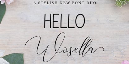 HELLO Wosella Duo is a modern calligraphy design, including Regular. This font is casual and beautiful with swash. Can be used for various purposes. such as logos, product packaging, wedding invitations, branding, headlines, signage, labels, signatures, book covers, posters, quotes, and more. HELLO Wosella Duo includes a change of the OpenType language style, binding and international support for most Western languages. To activate the OpenType Stylistic alternative, you need a program that supports OpenType features such as Adobe Illustrator CS, Adobe Indesign & CorelDraw X6-X7, Microsoft Word 2010 or newer versions. How to access all alternative characters using Adobe Illustrator: https://www.youtube.com/watch?v=XzwjMkbB-wQ HELLO Wosella Duo is coded with PUA Unicode, which allows full access to all additional characters without having to design special software. Mac users can use the Font Book, and Windows users can use Character Map to view and copy one of the additional characters to insert into your favorite text editor / application. How to access all alternative characters, using Windows Character Map with Photoshop: https://www.youtube.com/watch?v=Go9vacoYmBw If you need help or have questions, please let me know. I am happy to help :) Thank you & Congratulations on Designing!
 - Ambicase Modern by Teeline Fonts,
$48.00 Most fonts include uppercase and lowercase letters. Some experimentally-minded designers have proposed unicase typefaces as well: rather than having two different forms for a given letter, unicase fonts have one, chosen from the upper- or lowercase forms. Ambicase Modern takes the next step, offering not "either/or", but rather "both/and". Each letter in Ambicase Modern is a combination of its traditional upper- and lowercase forms, in a modern (didone) style. The inventive, hybrid forms that result are intriguing and handsome. Ambicase Modern stands out as a carefully crafted experimental font: its eccentric forms do not hinder its readability. It is suitable for high-style display settings. Ambicase Modern offers a large character set and extensive OpenType features. Most notably, in modern OpenType-aware applications, Ambicase Modern can be set in swash mode, which features sophisticated decorative flourishes that differ depending on whether the letter is at the beginning, middle, or end of a word. Ambicase Modern is available in two optical sizes: Regular and Poster. At very large sizes, the Poster cut, with its finer details, is recommended. For an extra bold variant, see its sibling typeface, Ambicase Fatface.
 - Maydena by Cocodesign,
$10.00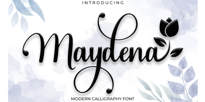 Maydena Script is a modern calligraphy design, including Regular. This font is casual and beautiful with swash. Can be used for various purposes. such as logos, product packaging, wedding invitations, branding, headlines, signage, labels, signatures, book covers, posters, quotes, and more. Maydena Script includes a change of the OpenType language style, binding and international support for most Western languages. To activate the OpenType Stylistic alternative, you need a program that supports OpenType features such as Adobe Illustrator CS, Adobe Indesign & CorelDraw X6-X7, Microsoft Word 2010 or newer versions. How to access all alternative characters using Adobe Illustrator: https://www.youtube.com/watch?v=XzwjMkbB-wQ Maydena Script is coded with PUA Unicode, which allows full access to all additional characters without having to design special software. Mac users can use the Font Book, and Windows users can use Character Map to view and copy one of the additional characters to insert into your favorite text editor / application. How to access all alternative characters, using Windows Character Map with Photoshop: https://www.youtube.com/watch?v=Go9vacoYmBw If you need help or have questions, please let me know. I am happy to help :) Thank you & Congratulations on Designing!
 - Briancha by Rotterlab Studio,
$12.00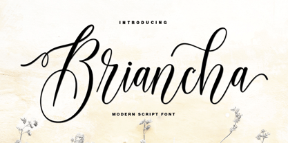 Briancha is a modern calligraphy design, including Regular. This font is casual and beautiful with swash. It can be used for various purposes. such as logos, product packaging, wedding invitations, branding, headlines, signage, labels, signatures, book covers, posters, quotes, and more. Briancha includes a change of the OpenType language style, binding and international support for most Western languages. To activate the OpenType Stylistic alternative, you need a program that supports OpenType features such as Adobe Illustrator CS, Adobe Indesign & CorelDraw X6-X7, Microsoft Word 2010 or newer versions. How to access all alternative characters using Adobe Illustrator: https://www.youtube.com/watch?v=XzwjMkbB-wQ Briancha is coded with PUA Unicode, which allows full access to all additional characters without having to design special software. Mac users can use the Font Book, and Windows users can use Character Map to view and copy one of the additional characters to insert into your favorite text editor / application. How to access all alternative characters, using Windows Character Map with Photoshop: https://www.youtube.com/watch?v=Go9vacoYmBw If you need help or have questions, please let me know. I am happy to help :) Thank you & Congratulations on Designing!
 - Tombo Brush by Ditatype,
$29.00 Tombo Brush is an interesting font that combines brush font’s artistic and organic characteristics with even line edges which are clear and firm. Furthermore, the capital letters express more modern, simple impressions by following the brush script font’s characteristics of the soft and smooth brush wipes, yet the even smooth lines on the edges show clearer, firmer nuances. Bright and contrast colors can show interesting, dynamic nuances on designs with this font. The even edge lines will ease the application of colors and show clearer visual effects separated from the background. You can apply this font for big text sizes for a legibility reason and also enjoy the available features here. Features: Multilingual Supports PUA Encoded Numerals and Punctuations Tombo Brush fits best for various design projects, such as brandings, quotes, printed products, merchandise, social media, etc. Find out more ways to use this font by taking a look at the font preview. Thanks for purchasing our fonts. Hopefully, you have a great time using our font. Feel free to contact us anytime for further information or when you have trouble with the font. Thanks a lot and happy designing.
 - Daily Mail by Natural Ink,
$14.00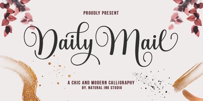 Daily Mail Script is a modern calligraphy design, including Regular. This font is casual and beautiful with swash. Can be used for various purposes. such as logos, product packaging, wedding invitations, branding, headlines, signage, labels, signatures, book covers, posters, quotes, and more. Daily Mail Script includes a change of the OpenType language style, binding and international support for most Western languages. To activate the OpenType Stylistic alternative, you need a program that supports OpenType features such as Adobe Illustrator CS, Adobe Indesign & CorelDraw X6-X7, Microsoft Word 2010 or newer versions. How to access all alternative characters using Adobe Illustrator: https://www.youtube.com/watch?v=XzwjMkbB-wQ Daily Mail Script is coded with PUA Unicode, which allows full access to all additional characters without having to design special software. Mac users can use the Font Book, and Windows users can use Character Map to view and copy one of the additional characters to insert into your favorite text editor / application. How to access all alternative characters, using Windows Character Map with Photoshop: https://www.youtube.com/watch?v=Go9vacoYmBw If you need help or have questions, please let me know. I am happy to help :) Thank you & Congratulations on Designing!
 - Night Circus by Yumna Type,
$25.00 Night Circus is a capitalized display font in a circus theme having unique, interesting designs with big, prominent letter sizes to catch attention. All of its letters are peculiarly designed in bright colors and many decorative circus elements. The power-expressing big, thick letters are perfect to use in power, boldness message-delivering designs. The advantages of Night Circus font, which provides a clipart in line with the theme, are the abilities to produce unique, charming nuances to your designs and to make your products more interesting which increases the products’ attractiveness. You can use it in big text sizes to be greatly legible and enjoy the available features here. Features: Multilingual Supports PUA Encoded Numerals and Punctuations Night Circus fits best for various design projects, such as brandings, headings, magazine covers, quotes, printed products, merchandise, social media, etc. Find out more ways to use this font by taking a look at the font preview. Thanks for purchasing our fonts. Hopefully, you have a great time using our font. Feel free to contact us anytime for further information or when you have trouble with the font. Thanks a lot and happy designing.
 - Ah, Jellyka by Jellyka Nerevan – the font that decided to take a leisurely stroll through the whimsical garden of creativity, wearing its most charming attire. Picture if you will, each letter crafte...
- Elly Sandeo Cyrillic by Ira Dvilyuk,
$21.00 The Elly Sandeo Cyrillic font is a handwritten calligraphic wedding script font with. It is the font pair with will be the best option for branding, logos, wedding invitations, social media, packaging, business cards, DIY projects, social media, and many others. Elly Sandeo Latin part contains a full set of uppercase and lowercase letters. Also, lowercase letters have 6 sets of variable flourishes with teils. To make a needed form type a letter with a number such as a1, a2, a3, a4... b1, b2, b3... c1, c2, c3...after that select the word and apply the Open Type Features in programs such as Adobe Illustrator, Photoshop, and others And 17 ligatures can be used to create a handwritten calligraphy look. The Cyrillic part of the font contains uppercase letters and 2 complete sets of lowercase letters, (standard, and final form. To make a needed form type a letter with a number such as a1, a2, a3, a4... б1, б2, б3... в1, в2, в3... After that select the word and apply the Open Type Features in programmes such as Adobe Illustrator, Photoshop, and others) The Elly Sandeo Symbols is a font with 26 hand-drawn elements and swashes that can help you to make your design unique and matchless. just use A-Z and a-z keys in the included Symbols font. A different symbol is assigned to each uppercase or lowercase standard character, so you do not need graphics software, just type the letter you need. Multilingual Support for 33 languages: Latin glyphs for Afrikaans, Albanian, Basque, Bosnian, Catalan, Danish, Dutch, English, Estonian, Faroese, Filipino, Finnish, French, Galician, Indonesian, Irish, Italian, Malay, Norwegian Bokmål, Portuguese, Slovenian, Spanish, Swahili, Swedish, Turkish, Welsh, Zulu. And Cyrillic glyphs support Russian, Belorussian, Bulgarian, Ukrainian, and Kazakh languages.
 - Mifelin by Nathatype,
$29.00 Mifelin is a well-defined serif font. Serifs are small ornaments that appear at the ends of the lines of letters, giving them a neater, more structured appearance. The well-defined serifs in this font create an elegant and professional impression. This serif font has a balanced and harmonious proportion of height and width. The proportions ensure that each letter looks proportional and easy to read. The line of letters in this font has a smoothness and clarity that distinguishes each character. Sharp, clear lines give off a professional and organized impression. This clarity also helps strengthen the legibility of the font in a variety of design settings. This serif font with an elegant look has a classic style that remains relevant in modern designs. Despite having strong roots in traditional typographic design, this font is able to adapt to more contemporary design contexts and give it a touch of elegance and class. Even though it has a touch of elegance, this serif font still prioritizes good readability. Each letter is carefully designed to ensure that the text remains easy to read and understand for the reader. Prominent readability is the hallmark of this font. Enjoy the various features available in this font. Features: Stylistic Sets Ligatures Multilingual Supports PUA Encoded Numerals and Punctuations Mifelin is suitable for any designs that require a formal and official impression. This font is can be used in the design of books, magazines, reports, formal invitations, brand identities, and other design projects that require elegance and professionalism. Find out more ways to use this font by taking a look at the font preview. Thanks for purchasing our fonts. Hopefully, you have a great time using our font. Feel free to contact us anytime for further information or when you have trouble with the font. Thanks a lot and happy designing.
 - RAYOH by Product Type,
$13.00 Rayoh is a stylish and freedom-loving graffiti display font. With two variations available, regular and shadow, this font gives a unique touch to projects that require rich and beautiful handwriting. With Rayoh, you can bring freedom and creativity to your designs. This font combines bold graffiti and beautiful handwriting elements to create an amazing combination. Expressive designs and bold characters make Rayoh the perfect solution for projects that want to stand out. With this font, you can create a striking poster, a cool merchandise design, or unforgettable promotional material. Their different variations provide flexibility in customizing the desired style and effect. Use regularly for a plain look and bring out the beauty of handwriting, or choose shadow for a dramatic shadow effect that adds depth and dimension to your design. Rayoh is the right choice for those who want to add a touch of freedom and uniqueness to their creative projects. Immediately choose Rayoh as your flagship font and see how your design steals attention and attracts potential customers in no time. What’s Included : - File font - All glyphs Iso Latin 1 - Ligature, Alternate - We highly recommend using a program that supports OpenType features and Glyphs panels like many Adobe apps and Corel Draw, so you can see and access all Glyph variations. - PUA Encoded Characters – Fully accessible without additional design software. - Fonts include Multilingual support
 - Antoine by Anastasia Kuznetsova,
$19.00 Introducing Antoine — is a vintage retro display typeface. The three font combinations I launched are very compatible if for the victorian classic design concept. As for if the font was worn by itself, without combinations are also brave!! In addition to many get unique character, luxury, brave and elegant. You also have a collection ornament, very suitable if in the gradient. This font is also very easy to use with other design programs or with out design program. Antoine Typeface is perfect for beverage label design project. coffee label. logotype design, badges, classic wedding concept. victorian design concept and so on. gig poster, letterhead, droop cap, titles, and any artworks. Now it’s your time to go crazy and explore the uniqueness of this typeface!! I invite you to familiarize yourself with the preliminary images and hope that you will be imbued with my vision of this creative font, which, I am sure, will be suitable for all the interesting projects you are working on. Fonts can be opened and used in any software that can read standard fonts, even in MS Word. No special software is required to get started. It is recommended to use it in Adobe Illustrator or Adobe Photoshop. Made with love and magic ♡ Thank you for reading it, and do not hesitate to send me a message if you have any questions! ~ Anastasia
 - Gigafly by ROHH,
$39.00 Gigafly™ is a contemporary high-contrast sans-serif display typeface designed for branding and impactful posters. The family features very modern and sharp design language, opening a world of lively compositions full of strength, energy and movement. Its playful contrast makes it stand out from the crowd and gives it a unique type of cheerful elegance. Gigafly features lots of stylistic alternates, allowing to create a collage-like, dynamic compositions by mixing the styles and weights of the letters. To make things even more fun, the family contains a set of quirky icons that will inject even more personality into your designs (do not miss out on the super cool manicules!). The family is very powerful, extravagant, playful, yet it manages to keep its elegance - it can be more calm, measured and simple when needed as well. It has a vibe of modern, crisp sans-serif as well as fashion magazine type didone. The full family consists of 15 styles - 5 weights in 3 different optical sizes for headlines, display sizes and big posters. The family offers a 2-axis variable (weight and optical size) font that contains every style and gives even more flexibility and versatility. Each font features 1400 glyphs, including uppercase, lowercase, icons, tons of alternates, as well as other OpenType features such as stylistic sets, case sensitive forms, lining and old style figures, basic fractions and superscript/subscript, slashed zero, currencies and symbols.
 - Cabrito Didone by insigne,
$- A graceful kid if ever you’ve seen one, Cabrito Didone joins the Cabrito family of fonts--a family designed to provide young infants with clear recognition of letter forms. The original letters were released as part of the children’s book about fonts, The Clothes Letters Wear. Now, this latest addition brings a new Didone flavor to the table. But don’t judge the book by its cover. While Didones can be stodgy in the way they deliver a sense of luxury, this stubborn goat of a Didone bucks the stodgy stereotypes with its high-contrast, carefree, flowing fun, taking a more calligraphic direction than most. Cabrito Didone joins structure and handwriting to create a flowing balance of both characteristics. It’s a unique combination of functional and friendly. Its 42 well-designed fonts give you plenty of easy-going, highly readable options to work with as you craft your design. The typeface has unique serifs that give the sense of ink pooling slightly at the points, drawn with a sharp nib. Cabrito Didone supports OpenType features and is packaged with upright obliques, alternates, ligatures, old-fashioned figures, and compact caps. Preview any and all of these features in the interactive PDF manual. The family member font also includes glyphs for 72 languages; over 600 glyphs per font await. Cabrito Didone is an excellent choice for websites as well as flyers and packaging. Like Cabrito, which is currently used by a number of visible brands, Cabrito Didone is also a great option for defining your brand. Grab a taste of the Cabrito Didone flavor--and those of the other Cabrito members: Sans, Semi and Inverto.
 - Barberry by FontaZY,
$35.00 Barberry is a hand-made brush script typeface equipped with some decorative OTF features, made by Zakhar Yaschin (FontaZY). Barberry font contains stylistic alternates, initial and final alternates (which is duplicated by contextual alternates in the case when ini & fina are not supported), ligatures, titling alternates, small caps and large collection of swashes (additional variants - in Stylistic Set). The Barberry font is essential for hand-made lettering and design. The Barberry family also includes Barberry Vigniette font with over 200 icons and vigniettes in it. Barberry Letters supports most of Western languages (including Central Europian, Baltic and Eastern European languages) and also Cyrillic. Each lowercase letter has three positional versions of the design – basic (if the letter is in the middle of a word), initial (if the word starts with it) and the final (in the end of the word) that makes the set look more alive and expressive. Working with Barberry Letters you can enable and disable if needed such typographic tools as swashes, ligatures, small caps, titling alternates, stylistic alternates, additional swashes and the already mentioned initial and final alternates. If your design software does not support the use of the initial and final alternatives, they can be duplicated by contextual substitutions. There are more than 20 Latin and Cyrillic ligatures in the Barberry Letters. It works by default as the standard ligatures, but you can switch it off for design reasons or to select the more appropriate typographic solution in any particular case. Ornamental font Barberry Vigniette has more than 200 pictograms and vignettes that can decorate your typographic layout. All icons are drawn with a brush in the same style as the Barberry Letters. You can use them inside the text lines, or make the ornamental decoration for text, or use separately, without any letters. OpenType extensions of the Barberry Letters significantly expand the choice of typographical tools to design a better, more expressive layout. Choosing the optimal variant of certain letters in each case, you can receive a unique composition. Whether it is lettering for packaging or magazine headline, logotype or the name in the invitation – just one Barberry font-family gives you the very wide typographic possibilities.
 - Today Sans Now by Elsner+Flake,
$59.00 With the publication of the “Today Sans Now” Elsner+Flake extends its offering of the “Today Sans Serif” type family, developed in 1988 by Volker Küster for Scangraphic, by another cut so that the gradation of the stroke width can now be more finely calibrated. The type complement is available for 72 Latin-based languages as well as Cyrillic. Where available, small caps were integrated, and mathematical symbols as well as fractions were included. In order to make the symbols for text applications in regard to headlines more flexible, the insertions which were formerly added, for technical reasons in order to sharpen the corners, were eliminated, and the optical size adjustments of the vertical and diagonal stem endings (I, v, H, V) to the horizontal bars (z, Z) were scaled back. Already since the end of 1984, Volker Küster experimented with broad sticks of chalk and a broad felt pen in order to develop a new sans serif typeface which, in the interest of easy legibility, would be built on the basic structures and proportions of the Renaissance-Antiqua. Using a normal angle of writing, his experiments lead to the form structure of the characters: a small contrast between bold and light weights, serif-like beginning and end strokes in some of the lower-case characters, and the typical, left-leaning slant of all round lower-case letters and the typical left-leaning axis of all round letter forms. In this way, a rhythmization of a line of type was achieved which created a lively image without being “noisy”. With this concept, Volker Küster has enlarged the Sans Serif by a distinctive, trend-setting form variation.
 - Heavenly Bodies by Aah Yes,
$0.25 All 6 fonts use the characters A - K and a - k to show two planets/stars/moons moving across each other. Nice and simple. There's a different number of points on the stars, or they're different sizes, and some appear to pass left-to-right, and some appear to pass the other way. Just type in ABCDEFGHIJK or abcdefghijk and you'll see. Two fonts have all the characters on the same level, (All-Black and Black+White). The Offset font has the 'sun/moon' with one slightly above the other and in black and white, and Half has them all-black. Partial has them even further separated in 2-tone. NearMiss is a very close shave. Comma, hyphen, and full stop/period give just a single symbol; there's a Space, and that's it.
 - Sharpe Variable by Mans Greback,
$19.00 Sharpe Variable is a stylish serif typeface family. The original type was drawn between 2018 and 2019, and the variable font and its updated styles was created in 2020. It is clear, sharp and has brave, lively letter forms but with a conservative backbone. This font is provided as a Variable Font. It is only one font file, but this file contains multiple styles. Use the sliders in Illustrator, Photoshop or InDesign to manually set any weight and width. This gives you not only the 15 predefined styles, but instead more than half a million steps to customize the type to the exact look your project requires. Each style contains ligatures and support for a wide range of languages. More info about Variable Fonts: https://mansgreback.com/s/About_Variable_Fonts.pdf
 - Pronk Family by wearecolt,
$9.00 Pronk - move forward by leaps and bounds This family includes Clean, Rough and Outline - You're welcome! This is an all caps, tall, bold and round sans serif display font designed for retro-modern designs. This font is perfect for your next logo design or magazine titles. Taking inspiration from many tall fonts and American number plates I created a display font that would be my 'go-to' for a neat tall, bold font. I also wanted something which would take a good amount of treatment like stamp effects and grunge. Pronk works brilliantly as a pegboard font and for neon lettering. Pronk pairs perfectly with Stroom and Gill Sans. I really hope you enjoy this font, please don't hesitate to drop me a message if you have any questions. Features: - Uppercase letters - Numerals
 - South Central by Loshaj Foundry,
$9.00 "To us it ain't vandalism. It's just letting the people know: We grew up here. This is our neighborhood. And as they pass by they know where we're at." – Los Angeles gang member Graffiti is equivalent to local news, its intended purpose is to inform general populace where gang members are, where they operate, as far as territory lines, and which neighborhoods are at war. Gang Graffiti can be used for: – Marking territory with graffiti. – It's a form of gang advertisement. – Letting people know who's in the gang, living, dead, or in prison. – Which neighborhoods they are at war with. – Who are their allies. Graffiti has along history, specifically Los Angeles gang graffiti, which has has been around since the 1930s. South Central typeface includes uppercase letters, numbers, and select punctuation glyphs.
 - und4 by URW Type Foundry,
$39.99 The rasterized square (clear, therefore 4 as part of the font name) was the constructive basis. The intention was to put all characters within this grid and produce a highly structured, yet lively, resting in itself, display font. Relaxed but exciting, just. An absolutely noteworthy detail are the classical construction principles (based on a typography book from the 50's for poster designers), the so-called optical weighting, derived and slightly exaggerated character elements: The characters are not purely symmetrical and the curve shapes do not close justified with the surrounding square. Loops and tongues slightly hang over; the upper bows are slightly less protruding than lower ones, etc. The kerning is tuned to fit these design details: the white space between the characters match the same filling space.
 - Nokrios by Twinletter,
$17.00 Nokrios is a font specifically inspired by the sport of racing. adopts the speed and power it tries to fully reflect to make a bold statement that stands out. We designed it to be a heavy-duty, functional add-on option for big, bold titles or small add-on types. This font features two different font options and two italic options. This font is perfect for adding punch to your projects without losing readability or impact at small sizes. What’s Included : - File font - All glyphs Iso Latin 1 - Alternate, Ligature - Simple installations - We highly recommend using a program that supports OpenType features and Glyphs panels like many Adobe apps and Corel Draw, so you can see and access all Glyph variations. - PUA Encoded Characters – Fully accessible without additional design software. - Fonts include Multilingual support
 - BIG Slant Black UltExp - Personal use only

- TT Octosquares by TypeType,
$35.00 TT Octosquares useful links: Specimen | Graphic presentation | Customization options TT Octosquares is a fresh, revised, expanded, and significantly improved version of our first commercial typeface TT Squares and its narrow version TT Squares Condensed. With all our love for the original font family, it felt there was a lack of functionality, character composition, features, and design freshness, which prompted us to the idea of a complete restart. Now TT Octosquares can be safely called a superfamily consisting of 4 widths (Compressed, Condensed, Standard, Expanded), 72 faces (18 in each width), and 1 incredible variable font in which variability works jointly on three axes. In addition to working on the contours themselves and their design, we completely revised the composition of the typeface. First, we added two completely new widths: Compressed and Expanded. Secondly, we increased the number of weights in each of the subfamilies—while in the old versions there were 5 weights, now in each of the subfamilies there are 9 weights. At the stage of working with the contours of characters, we revised the roundings, changed the forms of shoulder and stem crossings, added noticeable shelves at the letters, removed the sharpness from the triangular characters and cut off all sharp endings. From the very beginning of work on TT Octosquares, we planned to make a variable 3-axis version of it sewn into 1 font file. This means that by installing just one variable font file, you get access to three axial adjustment of the font: by thickness, width and inclination. Thanks to this flexibility in settings, you can always choose a custom combination of thickness, width or inclination that best suits your tasks. Due to the increased language support and the appearance of a bunch of useful OpenType features, the number of glyphs in the typeface has increased from 480 to 825 in each style. Now you can use stylistic alternates, standard and discretionary ligatures, or use old-style figures, numbers in circles and even slashed zeros in your design. Full list of features: aalt, mark, mkmk, ccmp, subs, sinf, sups, numr, dnom, frac, ordn, lnum, pnum, tnum, onum, case, zero, dlig, liga, salt, ss01, ss02, ss03, ss04, ss05, ss06, ss07, ss08, ss09, ss10, ss11, ss12, calt, locl. To use the variable font with three variable axes on Mac you will need MacOS 10.14 or higher. For other software and browsers, you can check the support status here: v-fonts.com/support/.
 - Trakya Sans by Bülent Yüksel,
$19.00 Thrace (/θreɪs/; Greek: Θράκη, Thráki; Bulgarian: Тракия, Trakiya; Turkish: Trakya) is a geographical and historical region in Southeast Europe, now split among Bulgaria, Greece, and Turkey, which is bounded by the Balkan Mountains to the north, the Aegean Sea to the south, and the Black Sea to the east. It comprises southeastern Bulgaria (Northern Thrace), northeastern Greece (Western Thrace), and the European part of Turkey (East Thrace). Trakya Sans is a modern sans serif with a geometric touch. Futura, Avant Garde and the like. It has a modern streak which is the result of a harmonization of width and height especially in the lowercase letters to support legibility. Ideally suited for advertising and packaging, editorial and publishing, logos, branding and creative industries, posters and billboards, small text, way-finding and signage as well as web and screen design. Trakya Sans provides advanced typographical support for Latin-based languages. An extended character set, supporting Central, Western and Eastern European languages, rounds up the family. The designation “Trakya Sans 500 Regular” forms the central point. The first figure of the number describes the stroke thickness: 100 Thin to 900 Bold. "Trakya Sans" comes in 5 weights with matching italics plus "Trakya Sans Alt", also 5 weights and italics so a total of 20 styles. The family contains a set of 630+ characters. Case-Sensitive Forms, Classes and Features, Small Caps from Letter Cases, Fractions, Superior, Inferior, Denominator, Numerator, Old Style Figures just with one easy touch in all graphic programs. Trakya Sans is the perfect font for web use. You can enjoy using it.
 - Megre by JAB,
$16.00The courageous Russian author of the best seller Anastasia, Vladimir Megre, once said that this remarkable woman would inspire creative people around the world to produce their best work. Since I consider myself a creative person who has been deeply touched by her story, I sincerely hope that this will be true for me also. Anastasia talks a lot about God, the wonders of the natural world and how all things have been created so perfectly. This belief in universal perfection, however, is not confined to mystics alone. Many great mathematicians and scientists, including Albert Einstein, were of the same opinion. Having read Dan Brown’s The Da Vinci Code, I became quite fascinated with the so-called Fibonacci series; "a sequence of integers in which each integer (Fibonacci number) after the second is the sum of the two preceding integers; specif., the series 1, 1, 2, 3, 5, 8, 13, . . ." (Webster’s Dictionary). These mysterious numbers, which are said to give divine proportions, are found throughout nature in everything from a rose to a spiral galaxy. Many believe that this reinforces the argument that there is a divine intelligence back of creation. With that in mind, I thought it would be interesting to see if I could somehow create a font using these numbers in the design process. If I have succeeded - even partially - in attaining these mystical proportions, it will definitely have been worth all the hard work. And, I sincerely hope that many will enjoy using this font in producing their own best work. - Bonyad by Naghi Naghachian,
$98.00 The Bonyad font family, designed by Naghi Naghashian, was developed considering specific research and analysis on Arabic characters and definition of their structure. Bonyad is a modern Sans Serif font family.The Bonyad innovation is a contribution to modernisation of Arabic typography; gives the Arabic font letters real typographic arrangement and provides for more typographic flexibility. Bonyad supports Arabic, Persian, and Urdu and includes proportional and tabular numerals for the supported languages. The Bonyad Font family is available in six weights; Thin, Light, Regular, Demi Bold, Bold and Heavy. Its intuitive design arrangement fulfills the following needs: It is precisely crafted for use in electronic and print media. Bonyad is not based on any pre-digital typefaces and it is not a revival. Rather, its forms were created with today’s ever-changing technology in mind. Bonyad is suitable for multiple applications, and gives the widest potential for acceptability. It is extremely legible not only in its small sizes, but also when the type is filtered or skewed, e.g., in Photoshop or Illustrator. Bonyad's simplified forms may be artificially oblique with InDesign or Illustrator, without any degradation of its quality for the effected text. Bonyad is an eye-catching and classy typographic image that developed for multiple languages and writing conventions. Bonyad uses the very highest degree of geometric clarity along with the necessary amount of calligraphic references. The Bonyad typeface is of a high vibration that is finely balance between calligraphic tradition and the contemporary sans serif aesthetic commonly seen in Latin typography.
 - Klainy by Identity Letters,
$29.00 An unadorned Grotesque with a refreshingly personal touch. If “Grotesque” mainly means “industrial, mechanical, anonymous typeface” to you, Klainy might redefine your image of the genre. Yes, it’s a Grotesque—but with a contemporary look and a lot of personality. Klainy’s apertures are more closed at the top and more open at the bottom, creating an informal rhythm that sets Klainy apart: a confident, optimistic voice with a clean appearance. Terminals are subtly back-bent: these quaint “hooks” make Klainy a bit more personal, a bit friendlier. (You can find them in the a, c, f, and r.) Just like its old-style Grotesque ancestors, Klainy is optimized for display sizes and short texts. There, its unobtrusive quirks can be wholly appreciated. However, the familiar Grotesque appearance makes sure that the typeface is comfortable to read in smaller sizes, as well. Use Klainy whenever a basically classic sans-serif typeface with a modern and individual twist is called for. This font family comes in eight weights ranging from Thin to Black, each with a matching italic style. More than 500 glyphs and a bunch of Open Type Features make it a reliable companion for all of your projects. You can fine-tune the flavor of Klainy with Stylistic Alternates such as a one-story a and a two-story g. Their simple construction blends perfectly with the design concept of this typeface. Klainy is a seasoned blue-collar worker that surprises you with wit and team spirit. It’ll be a great addition to your font library.
 - Trakya Slab by Bülent Yüksel,
$19.00 Thrace (/θreɪs/; Greek: Θράκη, Thráki; Bulgarian: Тракия, Trakiya; Turkish: Trakya) is a geographical and historical region in Southeast Europe, now split among Bulgaria, Greece, and Turkey, which is bounded by the Balkan Mountains to the north, the Aegean Sea to the south, and the Black Sea to the east. It comprises southeastern Bulgaria (Northern Thrace), northeastern Greece (Western Thrace), and the European part of Turkey (East Thrace). Trakya Slab is a modern slab serif with a geometric touch. It has a modern streak which is the result of a harmonization of width and height especially in the lowercase letters to support legibility. Ideally suited for advertising and packaging, editorial and publishing, logos, branding and creative industries, posters and billboards, small text, way-finding and signage as well as web and screen design. Trakya Slab provides advanced typographical support for Latin-based languages. An extended character set, supporting Central, Western and Eastern European languages, rounds up the family. The designation “Trakya Slab 500 Regular” forms the central point. The first figure of the number describes the stroke thickness: 100 Thin to 900 Bold. "Trakya Slab" comes with 5 weights and italics; "Trakya Slab Alt" also comes with 5 weights and matching italics, giving a total of 20 styles. The family contains a set of 630+ characters. Case-Sensitive Forms, Classes and Features, Small Caps from Letter Cases, Fractions, Superior, Inferior, Denominator, Numerator, Old Style Figures just with one touch, easy to access in all graphic programs. Trakya Slab is the perfect font for web use. Enjoy using it.
 - Brass by HiH,
$8.00 The Brass Family has a lineage that extends into English history. About five hundred years ago a devout, but anonymous Englishman gave glory to the God he worshipped by designing the capital letters and decorations of these two fonts. Originally recorded in The History Of Mediaeval Alphabets And Devices by Henry Shaw (London 1853), they are described by Alexander Nesbitt in his Decorative Alphabets And Initials (Mineola, NY 1959) as “Initials and stop ornaments from brasses in Westminster Abbey.” I wish I could say I remember seeing them when I was there, but that was forty-two years ago and all I remember was seeing the tomb of Edward the Confessor. One definition of “stop” as a noun is a point of punctuation. I have heard people from the British Isles speak of a “full stop” when referring to a period. Some may remember a 19th century form of communication called a telegram being read aloud in an old movie, with the use of the word “stop” to indicate the end of a sentence or fragment. A full dozen of these stop ornaments are provided. They occupy positions 060, 062, 094, 123, 125, 126, 135, 137, 167, 172, 177 & 190. The Brass Family consists of two fonts: Brass and Brass Too. Both fonts have an identical upper case and ornaments, but paired with different lower cases. Although the typefaces from which the lower cases were drawn are both of modern design, both are interpretations of the textura style of blackletter in use in England when the upper case and ornaments were fashioned for the Abbey. Brass is paired with Morris Gothic, which matches the color of the upper case quite well. Brass Too is paired with Wedding Regular, which is distinctly lighter than the upper case. I find it very interesting how each connects differently. The resulting fonts are unusual and most useful for evoking an historic atmosphere.
 - BF Konkret Grotesk Pro by BrassFonts,
$39.99 BF Konkret Grotesk Pro, designed by Guido Schneider, is a contemporary grotesque with a straightforward style – but a very individual touch. Inspired by classic grotesque typefaces, Konkret Grotesk Pro impresses with its unique character and rhythm: It’s elegant and edgy, flexible and forceful. The Pro family supports up to 220 Latin-based languages. Each of the 16 fonts contains more than 1500 glyphs, including small caps, 7 figure sets, fractions, many ligatures, currency symbols, alternates, special characters and other useful symbols. 11 style sets give you the option to individualize and adjust the typeface to the requirement of your design, without changing the general visual feeling. In this way you can also switch the simply slanted styled Italic into a “real Italic”. BF Konkret Grotesk Pro is a typeface family that can adapt to many requirements without losing its character and expression. The range of 8 weights provides all possibilities. Due to the lovingly designed details, Konkret Grotesk Pro works both in small sizes as well as in display applications. Thus, Konkret Grotesk Pro is ideally suited for contemporary and demanding typographic tasks, both in the fields of editorial design, branding, posters and advertising. (The new Pro edition is the extended and optimized version of the previous BF Konkret Grotesk.)
 - Bear Club by Pink Broccoli,
$19.00 Another offbeat typeface inspired by the lettering on a design by Patrick Owsley for the Chicago Bears. There's nothing more lively than animated text, and Bear Club has that flavor in two ways. With counter inspirations drawn from fonts like Ad Lib and Nightclub, an automatic alternating caps and alternate caps feature, as well as a contextual alternates set that creates a true animated bounce, just like Hip Hopper. Let the fun begin with this spunky, lighthearted and heavy-weighted comic typeface.
 - Alifut MF by Masterfont,
$59.00 A practical font family with 4 weights for all your day to day design needs: headlines, body text, signage etc. High legibility at small sizes. An extended sans serif typeface with rounded endings that provides a unique softness appearance without losing legibility. The Pro version is an excellent support for Niqqud (Vowels). All marks are programmed to fit each glyph's shape and width. Best used with apps that support right to left Hebrew text, like Adobe InDesign CC or MS Word.
 - Shake by Comicraft,
$29.00 Shake it DOWN! Shake it UP! Shake it OFF! Shake a LEG! You can even shake it like a polaroid picture now that Comicraft has the font that allows you to do just that, in comic book form! Shake is the ideal partner to our font, SHIVER, and yet it does not preclude rattling OR rolling if you're getting ready to RUMBLE! CAUTION: This font may cause you to move to and fro with jerky movements. See the families related to Shake: Shiver.
 - Marseille by Louise Fili Ltd,
$35.00 Marseille is an Art Deco-inspired typeface which is based on Louise Fili’s iconic cover design for the hauntingly beautiful Marguerite Duras novel, The Lover. The font is available in six irresistible weights: thin, light, regular, medium, semibold, and bold. Each weight features both caps and lower case, and supports over 200 languages. Marseille will satisfy all your typographic needs, from book jackets to monograms to packaging, logos, and even wedding invitations—timelessly elegant, with a distinctive flair that exudes La Belle France.
 - P22 Tulda by IHOF,
$24.95 Tulda is a very lively lettering font originally drawn for a German calendar. The optional symbols feature over 72 festive renderings for just about any occasion. This font is also available as an OpenType font with over 500 characters. For the OpenType version: standard Opentype features such as ligatures & oldstyle figures are available through the features menu in programs such as InDesign or other applications that support OpenType. Additional ornaments and alternate characters can be inserted through the glyph pallet.
 - Marseillette NB by No Bodoni,
$39.00 These four typefaces, Berlinette NB, Lyonette NB, Marseillette NB and Parisette NB, were designed from the same basic shape, a fanciful geometric form that avoids strict horizontals and uses more offbeat triangular shapes. Marseillette is the nasty one, with sharp hook terminations that require careful use. Don�t slip and accidentally stick one in your hand � it will hurt pretty bad and make you blubber like a baby. It�s good for surreal warning signs on dark, forbidding docks where gooey monsters live.
