10,000 search results
(0.142 seconds)
- Draetha by Hackberry Font Foundry,
$24.95 Draetha is the 6-font companion to Biblia and Biblia Serif. But it is definitely designed to be used with Biblia Serif for book design and production. It is a nearly monoline sans with a clean style which contrast beautifully with Biblia serif. The Black versions push monoline to the extreme of boldness. It has the same font metrics as Biblia and Biblia Serif. The only compromise is that Ultra is too extreme to be able to provide small caps or oldstyle figures. It is designed with text spacing, to work in text with Biblia and Biblia Serif. For heads and subheads, you will need to adjust the tracking. But it tracks well.
 - Harond by Arterfak Project,
$29.00 Introducing Harond font, a bold serif font with a retro touch. Inspired by the dynamic and chubby typography style of the 70s, this font exudes a delightful, playful, yet elegant impression, making it ideal for various design themes, especially in the realm of food-related design. Harond is a display font best suited for larger sizes. Its plump form and tight spacing offer a delightful design experience and captivate attention. It's the perfect choice for use in posters, decals, logos, branding, flyers, promotional materials, motion graphics, packaging, and much more! But that's not all you get with this font. In addition to the standard alphabet, Harond also comes with multilingual support and numerous special characters, making it easier to enhance your designs.
 - Isle Body by Mans Greback,
$19.00 Isle Body is a high-quality serif typeface family, drawn by Måns Grebäck during 2018 and 2019. It is a sweet font with a casual and calm look, with generous spacing and an even weight, adapted for body texts and small sized type settings. It comes in four weights, each one as italic, totaling in eight styles: Light and Light Italic, Medium and Medium Italic, Bold and Bold Italic, Black and Black Italic. The font family can be used in a combination with a font of a different style, or together with its sister font Isle Headline, also a serif font, which has the same basic structure but more distinct weights and a sharper look. Each style contains ligatures and support for a wide range of languages.
 - Arbus by Popskraft,
$18.00 When we think of a child's font, random scribbles often come to mind, but I thought, why not make a child's font fun, spontaneous, and at the same time simple and readable. This is how the Arbus font was born. This font is perfect for anyone looking for a light, free-style font that will last a long time. In addition, the font has a number of undeniable advantages: The Arbus font is perfectly balanced, which allows you to use it both in headings and for large amounts of text. Thus, you can completely design your products with one font family. The Arbus font family has nine font weights. The font supports all European languages and of course the Latin alphabet. Works on PC & Mac This beautiful Arbus font can be installed on any operating system, it can also be used in professional programs like Figma or Addobe Crative Cloud, as well as in other simpler software like Canva.
 - Newgrange by Scriptorium,
$24.00Newgrange is a distinctive Celtic-style font designed as a companion to our Stonecross font. It has the same size and weight as Stonecross and the same carved/chipped style, but rather than being based on traditional insular minuscule letter forms, it's based on a squared uncial style similar to our Lindisfarne font. The result is unusual and rather more modern looking than we expected, but it's great for stylized titles. The name comes from the giant prehistoric stone tomb at Newgrange which some have called Ireland's answer to Stonehenge. - Bearskin by Hanoded,
$15.00 NO! I don’t have a bearskin rug, nor a fur collar on my jacket. I believe fur should only be worn by its first owner. I have no idea why I called this font Bearskin: maybe I was influenced by one of the Viking novels I am reading - they’re full of Berserkers - but that name was already taken. Anyhoo, Bearskin font is a nice handmade all caps font. A little rough here and there, but with a lot of character as well. Bearskin comes with swashes, so you can have a ball!
 - Afrobeat Light by Resistenza,
$39.00 Inspiration The pounding tribal rhythms of Afrobeat music is expressed through this psychedelic brand new font, Afrobeat. Every letter becomes art as every letter is elegantly placed side by side, like music notes, creating music for the eyes. Afrobeat is a musical style performed by many African artists such as Fela Kuti, Femi Kuti, Antibalas and many more, which is a fusion of jazz,funk, and psychedelic rock, originating from the 60s and was based on the political movements of Nigeria. The Font This font is perfect for when you want to use eye-catching big texts for anything from posters and flyers for concerts, events, parties, to CD covers, advertisements, and art, but it´s especially striking for printed projects. Afrobeat Light thinks green Think green. With Afrobeat light you save up to more than 35% of your ink toner. Being green in no longer a luxury, but an an essential. By using Afrobeat light you openly demonstrate that your company integrates the 3 Ps into its operations: People, Planet. Profit. Go ahead - be green! Check out also the original ‘Afrobeat’
 - Gigafly by ROHH,
$39.00 Gigafly™ is a contemporary high-contrast sans-serif display typeface designed for branding and impactful posters. The family features very modern and sharp design language, opening a world of lively compositions full of strength, energy and movement. Its playful contrast makes it stand out from the crowd and gives it a unique type of cheerful elegance. Gigafly features lots of stylistic alternates, allowing to create a collage-like, dynamic compositions by mixing the styles and weights of the letters. To make things even more fun, the family contains a set of quirky icons that will inject even more personality into your designs (do not miss out on the super cool manicules!). The family is very powerful, extravagant, playful, yet it manages to keep its elegance - it can be more calm, measured and simple when needed as well. It has a vibe of modern, crisp sans-serif as well as fashion magazine type didone. The full family consists of 15 styles - 5 weights in 3 different optical sizes for headlines, display sizes and big posters. The family offers a 2-axis variable (weight and optical size) font that contains every style and gives even more flexibility and versatility. Each font features 1400 glyphs, including uppercase, lowercase, icons, tons of alternates, as well as other OpenType features such as stylistic sets, case sensitive forms, lining and old style figures, basic fractions and superscript/subscript, slashed zero, currencies and symbols.
 - Ring Eyes by Ochakov,
$11.00 Now you can see... the new direction of the big family called Ring - Ring Eyes! That's a very unique Ring & truly devoted. There are only four styles, but they are all very important. Ring Eyes font like our eyes held a million stories. Ring Eyes font like other of the Ring Family is the perfect choice for headlines, logos, branding, packaging, publications, and much more.
 - Brazos NF by Nick's Fonts,
$10.00One in the series of fonts called Whiz-Bang Wood Type, intended to be set large and tight. Brazos is an ultrabold, ultrawide sans-serif face that takes up a lot of horizontal territory, but fits in little vertical space. Named after the famous river in Texas. Both versions of the font include the 1252 Latin and 1250 CE character sets (with localization for Romanian and Moldovan). - Goversy by Maulana Creative,
$15.00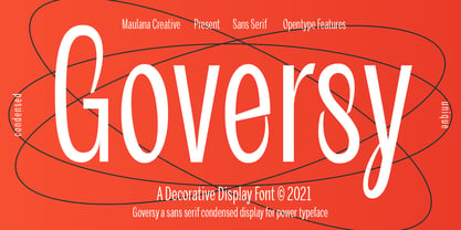 Goversy is a Decorative Condensed Display font. With Regular stroke, fun character with a bit of ligatures. To give you an extra creative work. Goversy font support multilingual more than 100+ language. This font is good for logo design, Social media, Movie Titles, Books Titles, a short text even a long text letter and good for your secondary text font with handwriting and script font. Make a stunning work with Goversy font. Cheers, Maulana Creative
 - Mandrel by insigne,
$39.99 From the realm of insigne, a new family has risen. By name, Mandrel. Courtly in character and elegant in appearance, the face finds great favor among those with whom it seeks audience. With confident air, Mandrel carries itself gracefully before each pair of eyes, never faltering or stumbling in its refined step. But while dressed with gentility, this elegant family is not faint of heart when challenged. Crafted well for high-impact resistance, Mandrel steps boldly and prominently into the arena of the reader’s eye, boasting its tall x-heights, high contrast, confident bends, and sharp serifs. Skillfully, it wields its sharp serif endings, cutting swiftly through opponents’ crude clutter, which fights for the reader’s attention. From Thin to Black, nine weights and their matching italics make up this noble family. Mandrel furthermore includes an abundant treasury of OpenType variables to adorn your text. Ligatures, old-style figures, and stylistic sets are available to accompany the family’s 500 glyphs and its support for more than 70 languages. Raise your cup to this new Mandrel! With strong serifs and high contrast, you’ll find this champion ready to take up your challenge in many a test ahead.
 - Dynamique by PizzaDude.dk,
$15.00 I wouldn't recommend that you use this font for massive text, or text written in CAPS ... but then again, go ahead and try - I even kerned all the capital letters ... just in case that you would do something so crazy! :) Dynamique is a kind of a "straight out of the highway" grid-font. But then again, not ... if you use the lowercase alone, you have this almost monospaced font - try starting every word with a capital letter, and let it end with the alternate ligature, your words suddenly got even more power! If you want to go lightspeed - then use the same technique, but only with the italic version!
 - Dunhill Script by Lipton Letter Design,
$29.00 A bit of happenstance and accident are always full of possibility — Richard Lipton’s Dunhill Script is based on observations of the work of his left-handed calligraphy students and then from a small detail generated by his own freehand sketching. Like his other script typefaces, Dunhill was born from the desire to achieve a certain visual drama. Many details show the pen at work, like the terminal shapes and the caps and ascenders. Dunhill also has a range of alternate stylistic glyphs and contextual features that can transform it into a connected script. It’s a great choice for editorial display or advertising and branding settings on its own or paired with a Roman sans or serif.
 - Enfluence by Thera Type,
$9.00 Enfluence is a modern typeface perfect for titles and short texts. It could worked in print and digital mediums. It depicts a fresh and modern image but with some winks to older typefaces. About the shape of the letter, it was built with a wide “x” height, short ascendants and descendants, a high contrast, angular serif, and some round terminals. Some letters such as “m, n, h” show a light inclination in the right stem. These characteristics give this typeface great readability with a strong attraction to the eye for its cool forms. Not enough? Also includes a set of ornamental capital letters perfect for the creation of awesome designs.
 - Alinea Sans by Présence Typo,
$36.00Alinea is a typeface in 3 styles (Sans, Incise, and Serif) conceived for being mixed in the same document. Alinea sans, with its neutral shapes, can be used everywhere. Like many recent sans serifs, its italic is a true italic and not a sloped roman. - curlyJoe by JOEBOB graphics,
$19.00 CurlyJoe is a fast, informal handwritten font. A bit in the line of the dearJoe series, with a different style of caps.
 - Reynard by Scriptorium,
$12.00Reynard is an arts and crafts period font with a bit of a Celtic inclination. Very well suited to formal, elegant titles. - Diamond by Volcano Type,
$19.00 Angular diamond shapes.
 - Archive American Shadow by Archive Type,
$19.95Threedimensional shaded typeface. - Overly Sweet by Bogstav,
$16.00 Usually I prefer desserts that aren't overly sweet, but a week ago I lost my sense of tasting - due to Corona, and when I wanted something sweet...I preferred it overly sweet...of course because I hardly could taste the overwhelming sweetness! But now, I have my sense of tasting (and smelling!) back, and everything is back to normal. And since I completed this easy-recipe-inspired handmade font while suffering from Corona, I thought I'd name it Overly Sweet. And...well. because, the font is somewhat overly sweet (without being over the top sweet!)
 - SomaSkript by ArtyType,
$29.00 SomaSkript is a natural extension to the basic Somatype font design, adding more variety to the family, all of which have similar features. Basically, by widening the uprights and maintaining the thin cross-bars it takes on more of a script-like quality, hence the name. Slanting the letters reinforces the script illusion and consequently brings a broader application to the font’s original format. When designing the Somatype alphabet originally, I always envisaged maximizing on its potential by creating an incised version. This variation not only emphasizes the implied script qualities within the name but brings out the softer, feminine side of the typeface. This evolutionary process creates a different looking font altogether and in turn the slanted version emphasizes the elegant quality even more so.
 - Wacky Duck NF by Nick's Fonts,
$10.00A postcard for a 1952 DeSoto automobile, combined with the (non)sensibilities of legendary British lettering artist Cecil Wade, yielded this slightly tacky and thoroughly wacky gaggle of letters. Use liberally whenever levity, brevity (the soul of wit), or a bit of mischief is called for. Both versions of the font include 1252 Latin and 1250 CE (with localization for Romanian and Moldovan) character sets. - Mallorca Dirty Numbers by TypoGraphicDesign,
$25.00 The typeface “Mallorca Dirty Numbers Vol 1” is designed for the Typo Graphic Design font foundry in 2017 by Manuel Viergutz. The playful display font is designed on holiday photos of different numbers (house numbers, graffitis, handwritten menu cards …) from Mallorca. An alphabet built with numbers. 524 glyphs with A–Z, a–z, 0–9 and 99+ decorative extras like ornaments, arrows, dingbats, emojis, symbols, geomatric shapes, catchwords, decorative ligatures (type the word “LOVE” for ❤ or “SMILE” for ☺as OpenType-Feature dlig ) and of course many many numbers (20+ stylistic sets). For use in logos, magazines, posters, advertisement plus as webfont for decorative headlines. The font works best for display size. Have fun with this font & use the DEMO-FONT (with reduced glyph-set) FOR FREE!
 - Netherlands Dirty Numbers by TypoGraphicDesign,
$25.00 The typeface “Netherlands Dirty Numbers Vol 1” is designed for the Typo Graphic Design font foundry in 2017 by Manuel Viergutz. The playful display font is designed on holiday photos of different numbers (house numbers, graffitis, handwritten menu cards …) from the Netherlands. An alphabet built with numbers. 342 glyphs with A–Z, a–z, 0–9 and 40+ decorative extras like arrows, dingbats, emojis, symbols, geomatric shapes, catchwords, decorative ligatures (type the word “LOVE” for ❤ or “SMILE” for ☺as OpenType-Feature dlig ) and of course many many numbers (20+ stylistic sets). For use in logos, magazines, posters, advertisement plus as webfont for decorative headlines. The font works best for display size. Have fun with this font & use the DEMO-FONT (with reduced glyph-set) FOR FREE!
 - Blushing Spring by Rhd Studio,
$15.00 Blushing Spring is a smooth, elegant, and flowing handwritten font. It has a very balanced character and as a result, it fits into a wide set of designs. Blushing's history features varied baselines, smooth lines, beautiful glyphs and stunning alternatives. Add to your most creative ideas and see how they put them into action! Blushing Spring has 358 Alternates, including multiple language support. With OpenType features with alternative styles and elegant binding. The OpenType feature works automatically, but you can access it manually and for the best results necessary for your creativity in combining these variations of the Glyph.
 - Cora by TypeTogether,
$49.00 Cora is a sans serif with an experimental bent, offering a large x-height, some contrast of stroke weight, and capitals inspired by classical lettering. The large x-height gives it a voice with a little more volume so that those in the back of the room have no trouble hearing. Because the letters seem slightly large, Cora remains clear at smaller point sizes. It is a typeface intended to perform well on screen without losing its attraction in print and the nature of its shapes allows for condensation or expansion without becoming severely distorted. The uppercase exhibits classical proportions found in ancient Roman inscriptions, which provides opportunities for setting titles in all caps. Cora Opentype Pro has a full range of numerals for every use, small caps, the most common open type features and supports many languages that use the latin extended alphabet. It is available in a range of three weights plus Italics. CoraBasic is a reduced version of Cora. It is still an OT-font but without any particular features except of a set of ligatures, class-kerning and language support including CE and Baltic.
 - Document by Aah Yes,
$11.00Document is an easy-to-read sans serif with large lower-case letters, but with one difference - it is slightly slanted to the right, but a lot less than a conventional italic angle. This is intended to give it a more informal and modern look than a perfectly upright font would be, and which also contributes extra dynamism while reading. It's a sort of in-between font, for situations where a boring old upright typeface is too formal and staid but where the italic version is too slanted and obvious. There are six weights, giving adequate representation for most jobs, from large bodies of text to headlines. The zip package contains both OTF and TTF versions - install either OTF or TTF, not both versions of a font on the same machine. - Rapsed Vintage by Craft Supply Co,
$20.00 Introduction to Rapsed Vintage – Stamp Font Rapsed – Vintage Font is a unique serif font, embodying a retro and vintage feel. It features a grunge, stamped, rough appearance, ideal for nostalgic designs. This font captures the essence of a bygone era, making it perfect for projects seeking a classic display. Design and Texture Rapsed’s design boasts large, prominent serifs, giving it a bold and distinct look. Its textured, rough edges simulate a stamped effect, adding an authentic vintage character. This grunge aesthetic is not only eye-catching but also adds depth to the font, enhancing its retro appeal. Versatility in Use Rapsed is versatile for various design applications, from branding to poster creation. Its vintage style is perfect for thematic restaurants, event flyers, and historical projects. Additionally, its distinct appearance makes it suitable for book covers and merchandise that require a touch of nostalgia. Accessibility and Appeal Designed to be user-friendly, Rapsed appeals to a wide range of audiences. Its simplicity in design ensures readability, while its unique character captures interest. This font is a valuable asset for designers aiming to infuse a vintage feel in their work, bridging the gap between past and present design trends.
 - Trick Pony by Volcano Type,
$19.00Trick Pony is a typeface bastard that steals its characteristics from sans serif fonts and combines these with an ink brush appearance. The design is strictly reduced on the one hand, but on the other gets its handmade touch through varying stroke sizes. - Amelia by TipoType,
$19.90 Amelia is a geometric sans, but it keeps the softness of humanistic strokes. The contrast and the different styles allow Amelia to work as a text or display font. Also it incorporates an Up version, calligraphic features that add a touch of informality.
 - Channelley Script by dotHK Studio,
$25.00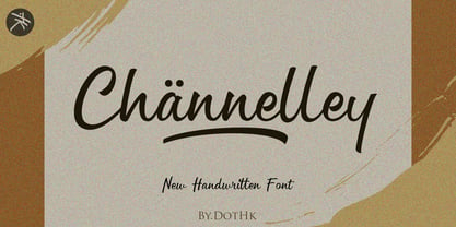 Channelley is a casual and clean brush script font. It has a trendy style and it will be a tremendous hit for each of your branding, product packaging, invitations, quotes, t-shirts, label, poster, logos or anything else that you wish to design.
 - Aterline by AEN Creative Studio,
$15.00 Aterline is a simple but elegant slab serif font family. It will elevate a wide range of crafting ideas, from cards to branding, labels, and much more. Add it confidently to your favorite creations and let yourself be amazed by the outcome generated.
 - Mighty Monday by Nathatype,
$29.00 Mighty Monday is an adorable serif display font that will bring a smile to your designs. With its cute and playful letterforms and a fairly thick weight, this typeface exudes a delightful and charming vibe. This font duo special feature lies in its cute and endearing serifs, which add a touch of whimsy and character to each letter. The fairly thick weight of the font enhances its boldness and creates a visual impact. This font is perfect for projects that require a standout and attention-grabbing typographic choice. Inspired by the charm of playful design, Mighty Monday captures the essence of cuteness and joy. The letterforms are carefully designed to be friendly and approachable, making them perfect for designs targeted at children or any audience that appreciates a lighthearted and cheerful aesthetic. This font brings a sense of fun and playfulness to your designs. The uppercase letterforms are carefully crafted to maintain legibility and clarity, even in the thick weight. Each letter retains its distinctive characteristics, allowing your message to be easily understood. You can use it in big text sizes to be greatly legible and enjoy the available features here. Features: Stylistic Sets Ligatures Multilingual Supports PUA Encoded Numerals and Punctuations Mighty Monday fits in children's books, packaging, greeting cards, headlines, titles, logos, branding materials, and any design project that aims to evoke a sense of cuteness and playfulness. Find out more ways to use this font by taking a look at the font preview. Thanks for purchasing our fonts. Hopefully, you have a great time using our font. Feel free to contact us anytime for further information or when you have trouble with the font. Thanks a lot and happy designing
 - Appelstroop by Hanoded,
$15.00 Appelstroop literally means ‘Apple Syrup’ in Dutch, but it is also know as Apple Butter; a slightly sweet & sour goo that you can use to sweeten things, or, as we do in Holland, spread it on a sandwich. It’s delicious, give it a try! Appelstroop font is a chunky, slightly eroded affair. It is mostly all caps, with a few lower case glyphs thrown in for good measure. Use this sticky font for your product packaging, toys and kids book covers!
 - Bungehuis by Hanoded,
$15.00 Bungehuis font was modeled on the lettering found on an Amsterdam art deco building from 1931. This building on the Spuistraat, also called "Het Bungehuis", used to house offices, but is now part of the University of Amsterdam. In 2015 it had its brief moment of fame, when students, demanding more democracy at the University, occupied it. Bungehuis is a heavy art deco font and would look great on posters and in headlines. It comes with a rather democratic range of diacritics.
 - Clasica Sans by Latinotype,
$26.00 Clasica Sans is a fresh and contemporary typeface, consisting of 7 standard fonts plus italics. It is perfect for publishing and print design. Clasica Sans comes in various weights, working well into paragraphs with small and large text sizes. Regardless of its use, size or alignment, the family keeps a solid look, thanks to its balanced contrast. In short, it is a font based on classical proportions, but with a fresh and contemporary look, ideal for the most versatile designs.
 - Vendetta by Emigre,
$69.00 The famous roman type cut in Venice by Nicolas Jenson, and used in 1470 for his printing of the tract, De Evangelica Praeparatione, Eusebius, has usually been declared the seminal and definitive representative of a class of types known as Venetian Old Style. The Jenson type is thought to have been the primary model for types that immediately followed. Subsequent 15th-century Venetian Old Style types, cut by other punchcutters in Venice and elsewhere in Italy, are also worthy of study, but have been largely neglected by 20th-century type designers. There were many versions of Venetian Old Style types produced in the final quarter of the quattrocento. The exact number is unknown, but numerous printed examples survive, though the actual types, matrices, and punches are long gone. All these types are not, however, conspicuously Jensonian in character. Each shows a liberal amount of individuality, inconsistency, and eccentricity. My fascination with these historical types began in the 1970s and eventually led to the production of my first text typeface, Iowan Old Style (Bitstream, 1991). Sometime in the early 1990s, I started doodling letters for another Venetian typeface. The letters were pieced together from sections of circles and squares. The n, a standard lowercase control character in a text typeface, came first. Its most unusual feature was its head serif, a bisected quadrant of a circle. My aim was to see if its sharp beak would work with blunt, rectangular, foot serifs. Next, I wanted to see if I could construct a set of capital letters by following a similar design system. Rectangular serifs, or what we today call "slab serifs," were common in early roman printing types, particularly text types cut in Italy before 1500. Slab serifs are evident on both lowercase and uppercase characters in roman types of the Incunabula period, but they are seen mainly at the feet of the lowercase letters. The head serifs on lowercase letters of early roman types were usually angled. They were not arched, like mine. Oddly, there seems to be no actual historical precedent for my approach. Another characteristic of my arched serif is that the side opposite the arch is flat, not concave. Arched, concave serifs were used extensively in early italic types, a genre which first appeared more than a quarter century after roman types. Their forms followed humanistic cursive writing, common in Italy since before movable type was used there. Initially, italic characters were all lowercase, set with upright capitals (a practice I much admire and would like to see revived). Sloped italic capitals were not introduced until the middle of the sixteenth century, and they have very little to do with the evolution of humanist scripts. In contrast to the cursive writing on which italic types were based, formal book hands used by humanist scholars to transcribe classical texts served as a source of inspiration for the lowercase letters of the first roman types cut in Italy. While book hands were not as informal as cursive scripts, they still had features which could be said to be more calligraphic than geometric in detail. Over time, though, the copied vestiges of calligraphy virtually disappeared from roman fonts, and type became more rational. This profound change in the way type developed was also due in part to popular interest in the classical inscriptions of Roman antiquity. Imperial Roman letters, or majuscules, became models for the capital letters in nearly all early roman printing types. So it was, that the first letters in my typeface arose from pondering how shapes of lowercase letters and capital letters relate to one another in terms of classical ideals and geometric proportions, two pinnacles in a range of artistic notions which emerged during the Italian Renaissance. Indeed, such ideas are interesting to explore, but in the field of type design they often lead to dead ends. It is generally acknowledged, for instance, that pure geometry, as a strict approach to type design, has limitations. No roman alphabet, based solely on the circle and square, has ever been ideal for continuous reading. This much, I knew from the start. In the course of developing my typeface for text, innumerable compromises were made. Even though the finished letterforms retain a measure of geometric structure, they were modified again and again to improve their performance en masse. Each modification caused further deviation from my original scheme, and gave every font a slightly different direction. In the lower case letters especially, I made countless variations, and diverged significantly from my original plan. For example, not all the arcs remained radial, and they were designed to vary from font to font. Such variety added to the individuality of each style. The counters of many letters are described by intersecting arcs or angled facets, and the bowls are not round. In the capitals, angular bracketing was used practically everywhere stems and serifs meet, accentuating the terseness of the characters. As a result of all my tinkering, the entire family took on a kind of rich, familiar, coarseness - akin to roman types of the late 1400s. In his book, Printing Types D. B. Updike wrote: "Almost all Italian roman fonts in the last half of the fifteenth century had an air of "security" and generous ease extremely agreeable to the eye. Indeed, there is nothing better than fine Italian roman type in the whole history of typography." It does seem a shame that only in the 20th century have revivals of these beautiful types found acceptance in the English language. For four centuries (circa 1500 - circa 1900) Venetian Old Style faces were definitely not in favor in any living language. Recently, though, reinterpretations of early Italian printing types have been returning with a vengeance. The name Vendetta, which as an Italian sound I like, struck me as being a word that could be taken to signifiy a comeback of types designed in the Venetian style. In closing, I should add that a large measure of Vendetta's overall character comes from a synthesis of ideas, old and new. Hallmarks of roman type design from the Incunabula period are blended with contemporary concerns for the optimal display of letterforms on computer screens. Vendetta is thus not a historical revival. It is instead an indirect but personal digital homage to the roman types of punchcutters whose work was influenced by the example Jenson set in 1470. John Downer.
 - Wasty Pudding by PizzaDude.dk,
$15.00 Wasty Pudding was made by drawing a lot of letters, over and over again - and not caring so much about the looks, but focusing more on the speed of drawing, because I wanted a font that represented the way I write, when I am taking notes for myself. It’s not pretty, but it’s legible and scribbeliciously beautiful! :) Anyway, I think the purpose of this font is massive amounts of text. Song lyrics, novels, stories, diaries, manuscripts, books, etc. I bet you can fool someone with them thinking that this is not a font, because I have added 6 different versions of each lowercase letter!!!
 - Makeba Retro Funky Groovy by Beast Designer,
$15.99 Makeba Retro Funky Groovy Font is a fun and funky display font that brings back the spirit of the 70s. Its bold, rounded letters feature groovy curves and playful embellishments that exude a retro vibe. This font is perfect for creating eye-catching titles and headlines for posters, album covers, and other retro-inspired designs. The font’s energetic and upbeat personality is sure to make any project stand out.