10,000 search results
(0.308 seconds)
- Oh, if fonts could talk, Growing Script by Nuryanto Dwi would be the charming, smooth-talking poet at the party, captivating everyone with its elegant flourishes and oh-so-expressive curves. Released...
- Ah, "Silky Smoke" by DM Letter Studio; envision a font that dances on the page like a graceful wisp of smoke from an aristocrat's cigar in a swanky, dimly-lit lounge. It's not just a font; it's a per...
- Picture this: the font Chow Fun comes sauntering into the room, a masterpiece cooked up by the ingenious Harold Lohner. It's like that one friend who's been around the world, dabbles in everything co...
- Sure, let's dive into the vibrant and quirky world of the font "Kinkee" crafted by Fontalicious. Right off the bat, it's clear that Kinkee doesn't play by the rules of conventional typography. This f...
- Ego Trip Fat Skew, conjured by the creative mind behind the PizzaDude moniker, embodies a buoyant and daring spirit, which makes it stand out in the vast landscape of typography. This font, with its ...
- DancingSuperserif by Manfred Klein is a delightful and engaging font that exudes a whimsical and energetic charm. This typeface, as suggested by its playful name, combines the traditional elegance of...
- TagStarHardcore by PizzaDude.dk,
$15.00TagStarHardcore comes with a full character set plus extra features such as wavy arrows and stuff. - FT Forest by Fenotype,
$29.95 With Forest Dingbats you can easily create fast nature patterns or use the images as such.
 - Celtic Ornaments BA by Bannigan Artworks,
$19.95Characters are ornaments that are derived from ancient Celtic manuscripts such as the Book of Kells. - Alright, imagine a font that captures the eerie yet whimsical vibe of a Tim Burton movie, entangling the gothic with the playful in each curve and stroke. That's "Scars Before Christmas" by Juan Casc...
- Leather by Canada Type,
$24.95 Over the past few years, every designer has seen the surprising outbreak of blackletter types in marketing campaigns for major sports clothing manufacturers, a few phone companies, soft drink makers, and more recently on entertainment and music products. In such campaigns, blackletter type combined with photos of usual daily activity simply adds a level of strength and mystique to things we see and do on a regular basis. But we couldn't help noticing that the typography was very odd in such campaigns, where the type overpowers all the other design elements. This is because almost all blackletter fonts ever made express too much strength and time-stamp themselves in a definite manner, thereby eliminating themselves as possible type choices for a variety of common contemporary design approaches, such as minimal, geometric, modular, etc. So extending the idea of using blackletter in modern design was a bit of a wild goose chase for us. But we finally found the face that completes the equation no other blackletter could fit into: Leather is a digitization and major expansion of Imre Reiner's forgotten but excellent 1933 Gotika design, which was very much ahead of its time. In its own time this design saw very little use because it caused problems to printers, where the thin serifs and inner bars were too fragile and broke off too easily when used in metal. But now, more than seventy years later, it seems like it was made for current technologies, and it is nothing short of being the perfect candidate for using blackletter in grid-based settings. Leather has three features usually not found in other blackletter fonts: - Grid-based geometric strokes and curves: In the early 1930s, blackletter design had already begun interacting back with the modern sans serif it birthed at the turn of the century. This design is one of the very few manifestations of such interaction. - Fragile, Boboni-like serifs, sprout from mostly expected places in the minuscules, but are sprinkled very aesthetically on some of the majuscules. The overall result is magnificently modern. - The usual complexity of blackletter uppercase's inner bars is rendered simple, geometric and very visually appealing. The contrast between the inner bars and thick outer strokes creates a surprising circuitry-like effect on some of the letters (D, O, Q), wonderfully plays with the idea of fragile balances on some others (M, N and P), and boldly introduces new concepts on others (B, F, K, L, R). Our research seems to suggest that the original numerals used with this design in the 1930s were adopted from a previous Imre Reiner typeface. They didn't really fit with the idea of this font, so we created brand new numerals for Leather. We also expanded the character set to cover all Western Latin-based languages, and scattered plenty of alternates and ligatures throughout the map. The name, Leather, was derived from a humorous attempt at naming a font. Initially we wanted to call it Black Leather (blackletter...blackleather), but the closer we came to finishing it, the more respect we developed for its attempt to introduce a plausible convergence between two entirely different type categories. Sadly for the art, this idea of convergence didn't go much further back then, due to technological limitations and the eventual war a few years later. We're hoping this revival would encourage people to look at blackletter under a new light in these modern times of multiple design influences.
 - Sports World - Unknown license

- Designosaur - 100% free

- Web Serveroff - 100% free

- Goldilocks_Revised - 100% free

- Glyphstream - 100% free

- Awwam by Eyad Al-Samman,
$20.00 Awwam refers to the region of Awwam which is now thought by most scholars to be Ma'rib or the famous temple of Awwam otherwise known as Mahram Bilqis. The Awwam temple—Arabic Haram Bilqis or Mahram Bilqis—is a Sabaean temple near Ma'rib in today's Yemen. It was built by Mukarrib ‘Yada'il Dharih I’ between the 7th and 5th century B.C. Also, one of the most frequent titles of the God ‘Almaqah’ was the Lord of Awwam. Almaqah was the main God of the ancient Yemeni kingdom of Saba' and also the kingdoms of D’mt and Aksum in Eritrea and Northern Ethiopia. Different members of the ruling dynasties of Saba' regarded themselves as Almaqah’s children. Awwam is a wide and headline Arabic display typeface. The main trait of this typeface is the wide, curved, and streamlined design of its wide kashida, letters, and ligatures. This feature renders it as one of the modern stylish typefaces used for headlines, titles, headers, banners, and captions. Among the distinguished letters of Awwam typeface are the “Alef”, “Qaaf”, “Waaw”, “Yaa”, “Gheen”, and others. Moreover, Awwam typeface has a character set which supports Arabic, Persian, Urdu, and simple Latin letters/numerals with a limited range of specific Arabic and Latin ligatures. This typefac comes in two styles (i.e., Awwam, and Awwam-Pro) with a single weight (i.e., regular) and nearly 650 distinctive glyphs for each style. Due to its ultra-wide design, Awwam typeface is mostly appropriate for headings and titles in Arabic, Persian, and Urdu. It can be graphically and visually exploited in books, novels, magazines, newsletters, pamphlets, posters, and interfaces of other objects such as clothes and equipment. Moreover, it can be pleasingly used for signs, books’ covers, advertisement light boards, and titles of flyers, and books of children and adults. In brief, Awwam typeface is one of the new wide Arabic typefaces which can be utilized efficiently in diverse graphic, typographic, and artistic works for different languages and cultures.
 - DT Paper Type by Dragon Tongue Foundry,
$9.00 DT PaperType has evolved and morphed over time from quite distant origins. I previously created DT Paperside. It was neither Papyrus nor SSI Countryside, but was inspired in some ways by the Papyrus form, although untextured and smoother, and had the more open dimensions and proportions, similar to that of Countryside SSi, with its larger easily readable lowercase body, and more consistent, shorter stems. DT Paperside had an open scripted feel which was pleasing to the eye and easy to read. DT PaperType has since been crafted from of the original Paperside font. The Organic flow and comfortable form of Paperside has been retained, but it has been shifted very much from the feel of a script font, into a quality, extremely readable, organic and friendly, serif font, retaining its clarity, while adding a great deal of pose and class. This font is primarily suited to body text, and as such is extremely readable. It does however also make an excellent Display font, and comes with a full set of over sized Caps that drop below the line to stand out on a headline when required. Paperside can also automatically enhance the first letter of most sentences, and changes other letters to suit their position within words, and the letters they appear beside. Now comes with an italic that curves and softens various letters. For best results, use this ‘smart font’ with Contextual Ligatures turned on. Mulitiple Stylistic Alternatives are included. Inspiration for this fonts predecessor (Paperside) came from two other fonts. Papyrus: designed by Chris Costello and created in 1982, it is a hand-drawn textured typeface, emulating texts written in biblical times. One of the most used (and misused) fonts of all times. Owned by Letraset, and currently published by the Internation Typeface Corporating (ITC). Countryside SSi: The serif font of an unknown designer, currently licensed by Southern Software Inc. Feel free to preview some other Dragon Tongue fonts that are yet to be released, at https://www.dragon-tongue.com/fonts
 - Nusaibah by Eyad Al-Samman,
$20.00 “Nusaibah” is the first name of an early convert woman to Islam, and the first female to fight in defense of the Islamic religion. Her full name is Nusaibah bint Kaíab Al-Maziniyyah and she took part in the Battles of Uhud, Hunain, Yamama and the Treaty of Hudaibiyah with Islam’s prophet Muhammad (pbuh). Nusaibah is best known for her brave and heroic feat during the Battle of Uhud - fought on March 19, 625 - when she entered the battle carrying a sword and a shield to protect the prophet Muhammad (pbuh) from the arrows of the enemy, and she accordingly received several wounds while fighting and these wounds were not healed until the following year. The prophet Muhammad (pbuh) mentioned her distinct courage by saying that in whichever direction he turned in the battlefield, he could see her defending and protecting him. "Nusaibah" is a modern, geometric, and headline Arabic display typeface. The main trait of this typeface is the novel symmetrical design of its letters which renders it as one of the modern stylish typefaces used for headlines and titles. This is can be noticed in its letters such as “Theh”, “Jeem”, “Ain”, “Sheen”, and others. Moreover, “Nusaibah” font has a character set which supports Arabic, Persian, Urdu, and Latin letters and numerals with a limited range of specific Arabic and Latin ligatures. This font comes in two weights (i.e., regular and bold) with nearly 643 distinctive glyphs. Due to its geometric and linear design, “Nusaibah” typeface is appropriate for heading and titling in Arabic, Persian, and Urdu magazines, posters, and surfaces of different equipment. It is also elegantly suitable for signs, books’ covers, advertisement light boards, products’ and services’ names, and titles of flyers, pamphlets, novels, and books of children. “Nusaibah” typeface is one of the Arabic typefaces that has a novel and modern-day design which can be used in versatile graphic, typographic, and artistic works in different languages for diverse cultures.
 - Open Book ING by Ingrimayne Type,
$9.00 OpenBookING is a gimmick or novelty font that has letters on pages of a book. It is caps only and monospaced. The letters on the upper-case keys are on the left-handed pages of an open book and the letters on the lower-case keys are the same letters but on the right-handed pages of an open book. One could alternate upper and lower case keys to get letters on complete books, but the Opentype feature of contextual alternatives (calt) does this automatically. Several previous typefaces from IngrimayneType used the calt feature to alternate shapes that fit together in an interlocking pattern, such as alternating concave and convex shapes. OpenBookING uses the calt feature in a different way, to alternate two halves of a symmetrical shape. To provide two copies of numbers and common symbols, some non-alphabetical characters are unavailable because their slots were taken by the second form of the number or common symbol. If stylistic set one (ss01) is turned on, spaces are replaced with empty pages. This may leave you with unwanted spaces at the end of lines, and to eliminate them, turn off the feature (or change the font) for these spaces. The empty pages can be used in a layer to add color to the text. There is also a second set of empty pages with a filled page that can also be used in layers. (See poster for examples.) These pages are on the (logicalnot multiply) and (register divide) characters for the first set and on the (ordmasculine ellipsis) and (macron trademark) keys for the second set. Finally, OpenBookING has a large set of accented characters if anyone should need them. The letters used on the books were derived from the font Myhota-Bold. For a related typeface of letters on book covers, see NewLibrary. OpenBookING has limited uses and is priced accordingly.
 - Desphalia Pro by Ingo,
$42.00 A classic “American” sans serif with a kink Desphalia belongs to the kind of sans serif fonts that were created in the 19th century. You could also name it “American Gothic”, a sans serif in the style of fonts like Franklin Gothic, News Gothic and similar. Above all, the high x-height characterizes this typeface style, as do the identical heights of uppercase and ascenders. However, I allowed myself a few peculiarities ;-) On the one hand, there is the gently sloping horizontal middle line on letters such as H, E, F, A and e. The M also got gently slanted sides. Some of the lower-case letters have an up- or down-stroke: a d m n p u. This "kink" on the shaft also serves to better distinguish the small l from the capital I — as can be seen clearly with the term »Illinois«. In keeping with the tradition of American typefaces, Desphalia does not have a true italic. Rather, the letters of the “Italic” have the same character forms as the normal upright variant, but in oblique — and so it is not called “Italic” but “Oblique”. Style Set 01: Another American peculiarity is the capital I with dashes above and below. It is included in the Desphalia as an alternate character form. An alternative small l with the “kink” in the ascender is also included — as is a y with the “kink” in the descender. Style Set 02: The corresponding “straight” forms a d l m n p u without the break are included as alternatives in a separate style set. Small caps are uppercase letters that are optically the same size as lowercase letters. They offer a very classy way of emphasis. Desphalia is available in the widths Condensed, Normal and Expanded, the weights include Thin, Light, Book, Bold, Black. Using the variable font, all intermediate levels can be freely selected. The figures are optionally available as tabular figures, proportional lining figures or old style figures.
 - Rufina STD by TipoType,
$13.00 Rufina was as tall and thin as a reed. Elegant but with that distance that well-defined forms seem to impose. Her voice, however, was sweeter, closer, and when she spoke her name, like a slow whisper, one felt like what she had come to say could be read in her image. Rufina's story can only be told through a detour because her origin does not coincide with her birth. Rufina was born on a Sunday afternoon while her father was drawing black letters on a white background, and her mother was trying to join those same letters to form words that could tell a story. But her origin goes much further back, and that is why she is pierced by a story that precedes her, even though it is not her own. Maybe her origin can be traced back to that autumn night in which that tall man with that distant demeanor ran into that woman with that sweet smile and elegant aspect. He looked at her in such a way that he was trapped by that gaze, even though they found no words to say to each other, and they stayed in silence. Somehow, some words leaked into that gaze because since that moment they were never apart again. Later, after they started talking, projects started coming up and then coexistence and arguments, routines and mismatches. But in that chaos of crossed words in their life together, something was stable through the silence of the gazes. In those gazes, the silent words sustained that indescribable love that they didn't even try to understand. And in one of those silences, Rufina appeared, when that man told that woman that he needed a text to try out his new font, and she saw him look at her with that same fascination of the first time, and she started to write something with those forms that he was giving her as a gift. Rufina was as tall and thin as a reed, wrote her mother when Rufina was born.
 - Glance Sans by Identity Letters,
$29.00 Geometric, stylish, and not quite a stencil face: Glance Sans is the urban alter ego of Glance Slab—a strong-willed sans-serif with no frills but a few unique character traits. Glance Sans follows the design principle of nonjoining parts that made Glance Slab successful. Some strokes may not connect to their stems, creating visible gaps and thus, a dynamic impression of balance and movement. However, Glance Sans has a calmer appearance due to the lack of detached serifs. If Glance Slab’s home territory are large, crowded stadiums and massive sports events, Glance Sans prefers streetball courts, well-used skate parks, and underground clubs. It also adapts to urban work environments from finance to high-tech. Whenever a more toned-down look is called for while retaining the elegance of an athlete, Glance Sans is ready to roll. In the city environment, versatility is key. That’s why Glance Sans sports 7 weights as well as a complete set of italics. These are not just sloped romans but individually drawn letterforms, subtly referencing classic italic construction for more effective emphasis. Among the 600+ glyphs of Glance Sans, you’ll find goodies such as six sets of figures, circled numbers, circled arrows, and all kinds of currency symbols in two stylistic versions. Glance Sans is a great tool for industrial and high-tech branding, for wayfinding systems in contemporary or modernist architecture, for corporate identities in arts, crafts, medicine, culture, and education, and for all kinds of sports-themed design. Both members of the Glance superfamily are easily and effectively combinable; both are able to stand on their own feet. With its powerful italics, you might opt for Glance Sans as your text typeface and use Glance Slab for headlines. Or you set large, clean, display-sized lines in Glance Sans and spice them up with a bit of sportive Glance Slab. It’s up to you to decide how to bring out the best in both of them.
 - Calypso E by Typolar,
$72.00 Founded on a rigid structure of modernist type, Calypso E has a determined tone without an authoritative tang. It is an updated interpretation of a Neo-grotesque model Egyptian with a hint of Humanist lightness in its forms. Seriously big x-height, square basic form and sturdy serifs create firm text regardless of the weight. This makes Calypso E well suited for various media, from sharp plotter images to low-res television screens. Calypso E includes four suitable body copy styles. Book, Regular, Normal and Medium can be applied according to, for example, the size of text and quality of paper. All styles in the family are equipped with an expanded character set, small caps, case sensitive forms, discretionary ligatures and much more to make even the most elaborate typographic detailing possible.
 - Rational by René Bieder,
$39.00 Rational is a contemporary representative of the Grotesk genre inspired by drawings dating back to the early 20th century. It is a highly utilitarian family focusing on clarity and simplicity by approaching the design with a strong modernist fused attitude. Rooted in Swiss traditional and pragmatic design, Rational contains ingredients like horizontal terminals and uniform widths which result in a highly functional and flexible font. This is juxtaposed with circular and subtle calligraphic elements creating a warm and approachable layer within an objective surrounding. With more than 800 glyphs per font, the family is optimized for numerous scenarios. It comes in 10 weights with matching italics containing opentype features like small caps, stylistic sets, case sensitive shapes, tabular figures and many more, making Rational the perfect choice for modern, contemporary and professional typography.
 - Jano Round by Craceltype,
$37.00 Jano Round™ is a sans serif type family with a friendly and synergetic profile. Designed with rounded forms, low contrast and a somewhat techie feel, Jano Round™ is a highly legible typeface suited for any text application and typographic reproduction. Jano Round™ has 18 styles and its a workhorse type system. It covers 290+ languages, including extended latin, cyrillic and greek writing systems. With over 1800 glyphs per style, its Opentype features include alternative shapes, small caps, standard and discretionary ligatures, localized forms in latin and cyrillic, case sensitive forms, numerators and denominators, proportional and tabular figures, slashed zero, fractions and more. The engaging personality and the huge set of features and glyphs makes Jano Round™ an excellent choice for branding, editorial, web and broadcast.
 - LC Gianluca by Compañía Tipográfica de Chile,
$29.00 Gianluca is a typeface of glyphic serif, or “flare” inspired by Aldo Novarese’s fonts from the 70s, with a fresh and modern touch. It is a type family that can be elegant in its normal version, or very playful, to compose from extensive texts to flashy headlines in books, magazines, labels, posters, branding and more. It has many discretionary ligatures in capital letters (with its diacritics) to play with the text, 5 stylistic sets: among them medieval style or references to Herb Lubalin, and some special letters. Gianluca consists of 5-weight fonts, from Thin to Extra Bold. All of them with matching italics. It has a nice set of small capitals, modern and old style numbers, and capital-sensitive punctuation, among other striking glyphs. Play with Gianluca!
 - Museo by exljbris,
$- Museo... it all started with my love for the letter ‘U’. This uppercase letter just came to me as an image in a daydream. The top of both stems bent into semi-slab serifs. From this principle I worked out the rest of the uppercase letters. My first intention was to make it an all-caps display font, but after a while, I changed my mind. I wanted it to be a bit more versatile, so I decided to add lowercase and adjust spacing and kerning to increase legibility. This OpenType font family comes in five weights, and each weight comes with support for CE languages, even Esperanto. Besides ligatures, contextual alternatives, stylistic alternates, fractions and proportional/tabular figures, Museo has a ‘case’ feature for case-sensitive forms.
 - Longa Iberica by Paweł Burgiel,
$38.00 Longa Iberica is a serif typeface inspired by ancient scripts (Visisigothic, Proto-Gothic, Gothic). It has a long ascender and descender, small x-height and low-profile lining figures. Include automatic ligature creation, stylistic alternates and historical letterforms, lining and oldstyle numerals, fractions, Roman numerals adjusted to figure height (lining and oldstyle) and ordinal letters. Character set contains the complete Unicode Latin 1252 (Western European; ANSI), 1250 Latin 2 (Central European), 1254 Turkish, 1257 Baltic. Supported OpenType features: Acces All Alternates, Alternative Fractions, Capital Spacing, Case-Sensitive Forms, Contextual Alternates, Contextual Swash, Fractions, Historical Forms, Kerning, Lining Figures, Localized Forms, Oldstyle Figures, Ordinals, Proportional Figures, Slashed Zero, Stylistic Alternates, Stylistic Set (1-20), Superscript, Swash, Tabular Figures. Kerning is prepared as single ('flat') table for maximum possible compatibility with older software.
 - Elioth by Soerat Company,
$20.00 Elioth is a humanist font with angled terminals as a identity of this product. Comes with a modern look, this font suitable for display and body text. Elioth is perfect for advertising, packaging, logo, editorial and publishing, branding and other creative industries. This family of 9 weights from Thin to Heavy along with italics contain several OpenType features: Stylistic Alternates and Figures Variation (circled number, fraction, tabular lining, numerator, denominator). With over 752 glyphs per style, Elioth supports around 150+ languages in Latin and Cyrillic script. Family overview: 9 weights (from Thin to Heavy) + italics Extended Latin Cyrillic 752 glyphs Variable Font 150+ languages OpenType Features: Localized Forms Subscript and scientific inferiors Superscript (Superiors) Numerators and Denominators Fractions Lining Figures Tabular Figures Oldstyle Figures Circled Number Case-Sensitive Forms Standard and Discretionary Ligatures Stylistic Alternates
 - Kotomi Display by The Paper Town,
$26.00 Kotomi Display is a high contrast all-caps serif font with an elegant calligraphic touch. Inspired by didones, it features thin bracketed serifs, sleek lines, proportioned curves, angled axis...all, with a sense of fashion. Designed for high end branding, Kotomi Display is intended for large titles and big headers where its sharp and refined finish is particularly appreciated. The font is equipped with beautiful alternates and countless ligature variations that flows in harmoniously to achieve a well balanced combination and a legible composition. With a set of 1414 glyphs, Kotomi Display can serve a wide range of projects from editorial to branding, logos, posters, magazines, blog titles, packaging, wedding invitations, social media and more. Included case sensitive punctuation, numerals, symbols and multilingual support for western, central and south east European languages. Caps Only Fonts.
 - Blue Goblet Drawn by insigne,
$5.00 This best selling series has now been extended to include a new member, Blue Goblet Drawn. Blue Goblet is hand-drawn by the artist, Cory Godbey, and is organic, charming and exuberant. Characters bounce and dance above and below the baseline and x-height, making this a whimsical and fun script. Not only is Blue Goblet Drawn a excellent choice, it also is also a versatile member of a wide family of different fonts. You can use it side by side with the original Blue Goblet fonts, and there are a wide range of ornaments available in the supplemental ornament sets--over 370 illustrations! These illustrations include doodley frames, lovely florals and other text ornaments that can be inserted into your text and resized at will. This makes the Blue Goblet series a great pick when you want a type system for a very unique and consistent look. The Blue Goblet series also continues to expand, making any of these family members a valuable investment for the future. Blue Goblet Drawn comes in three weights and three widths in each weight, with complementary italics for maximum impact for a total of eighteen pro fonts. The compact thin weights are delicate and tall, while the Regular has just enough heft for those situations where subtlety doesn't work. If you don't need the professional features, there are three stripped down fonts that include only the basic character set! Blue Goblet Drawn also includes auto-replacing ligatures that make it appear that the script was drawn by the artistís own hand--just for you! Blue Goblet Drawn also includes a wide variety of alternates that can be accessed in any OpenType enabled application. Blue Goblet includes over 190 additional glyphs and is loaded with features including an even more unique alternate alphabet. Included are swash alternates, style sets, old style figures and small caps. Please see the informative PDF brochure to see these features in action. OpenType enabled applications such as the Adobe suite or Quark can take full advantage of the automatic replacing ligatures and alternates. This family also includes the glyphs to support a wide range of languages. Blue Goblet Drawn is a great choice for friendly display type in children's books, packaging, organic packaging or other unique applications. Use Blue Goblet whenever you want to inject a handmade sense of fun and whimsy to your designs. Give the Blue Goblet series a whirl today!
 - BR Sonoma by Brink,
$30.00 BR Sonoma is a new geometric grotesque built for the 21st century with a finely tuned modern aesthetic. BR Sonoma builds on the foundations laid by the classic Swiss grotesques such as Helvetica and Univers but combines their features with a stronger geometric base usually found in other early classics such as Avant Garde, Futura and Avenir.
 - Headmista Script by Tebaltipis Studio,
$10.00 Headmista is a script typeface with personality. You can use it as a logo, badge, insignia, packaging, headline, poster, etc The alternative characters in this font were divided into several OpenType features such as Stylistic Alternates, Stylistic Sets, and Ligature. The OpenType features can be accessed by using OpenType program such as Adobe Illustrator, Adobe Photoshop, and Adobe InDesign.
 - Young Heart by Alit Design,
$14.00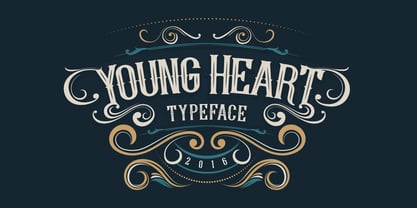 Introducing Young Heart Typeface western style display font. OpenType features with Stylistic Alternates. To access the alternate glyphs, you need a program that supports OpenType features such as Adobe Illustrator CS and Adobe Indesign. You can use this font for various purposes. such as logo, t-shirt, posters, lable, letterhead, book cover and etc. Thank you and enjoy :)
 - Alma Serif by Alma Type,
$19.00 Alma Serif is a typeface that tries to combine the modern shape of serif magazines such as Times New Roman with the atmosphere of classic typefaces such as Baskerville. I was working on the universality of the typeface, so that it would be suitable for both long papers and books, but also for formatting narrow columns in magazines.
 - Fomo by Gassstype,
$23.00 Hello Everyone, introduce our new product Font FOMO This Is Simple Sans Display Font .This is a Textured Natural Style and classy style with a clear style and dramatic movement. This font FOMO is great for your next creative project such as logos, printed quotes, Design this font is great for your creative projects such as watermark on photography.
 - Grongert by Oleg Gert,
$25.00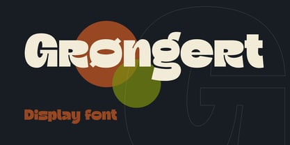 Decorative font Stonegert equipped with alternative characters, ligatures, and multi-language support. This font equipped with several features such as alternative characters, ligatures, and multi-language support that makes it easier for you to design. This font is perfect for your design needs such as poster design, logo design, branding, social media design, book, magazine, etc.
 - Put My Foot Down by Ingrimayne Type,
$14.95 If you grew up in the north, you may have stomped out letters in the fresh snow during the winter. Memories of such winter fun helped inspire this typeface. If one can do the typeface with shoes or boots, one can also do it with bare feet and hands. Non-human variants are possible, such as bird tracks.
 - Muffin Cake by Raditya Type,
$11.00 Muffin Cake is a suitable font when used for logos and product names. Especially products related to the world of children who are fun and cheerful. Such as food products, toys, or institutions related to the world of children, such as children's school names, the world of parenting. This font is also suitable for brand playgrounds.


