10,000 search results
(0.089 seconds)
- Police JNL by Jeff Levine,
$29.00Police JNL was modeled from one of the many fonts created by the late Alf Becker exclusively for Signs of the Times magazine during the 1930s through the 1950s. This was a bit of a difficult design to translate into a digital font file, because the individual characters did not follow a formal structure as to the width and length of the cast shadows or the letter shapes—such is the way of the hand-lettered alphabet. Special thanks to Tod Swormstedt of ST Publications (and curator of the American Sign Museum in Cincinnati) for providing the archival material to work from in creating this font. Police JNL has a limited character set. The basic A-Z character is on the upper and lower case keys, along with numbers, some punctuation and the dollar and cents signs. - Antiquary by DimitriAna,
$22.00 The Antiquary font collection was designed and illustrated, to reanimate the art of vintage advertising design. The fonts are inspired by the old ad posters and product labels, as well as the art of sign-making. The 4 typographic styles are combined with shapes and ornaments to create a variety of designs. They are ideal for logos, packaging, branding and all kinds of advertisements. Typographic styles: Antiquary: Old fashioned, serif, with 2 styles (Regular and Outline), stylistic alternates and ligatures. Antiquary Wide: All caps, bold, serif, vintage, with 3 styles: Regular, Inline and Outline. Antiquary Script: Modern brush calligraphy with terminal forms, contextual alternates, stylistic alternates and ligatures. Antiquary Thin: All caps, minimal, old fashioned. Antiquary Elements: 52 symbols, ribbons, frames and ornaments. The font collection supports Western, Central, Eastern, European, Baltic, Turkish and Greek languages.
 - Bajazzo by Schriftlabor,
$39.00 Bajazzo is a multi-weight and multi-width humanist sans-serif typeface. Inspired by old wood-type specimens, its timeless and unapologetic design lends itself for posters just as much as it does for text. Its extensive range of styles, widths, and weights make it fit for use in practically any application.
 - Bajazzo Rounded by Schriftlabor,
$39.00 Bajazzo is a multi-weight and multi-width humanist sans-serif typeface. Inspired by old wood-type specimens, its timeless and unapologetic design lends itself for posters just as much as it does for text. Its extensive range of styles, widths, and weights make it fit for use in practically any application.
 - Bajazzo Variable by Schriftlabor,
$899.00 Bajazzo is a multi-weight and multi-width humanist sans-serif typeface. Inspired by old wood-type specimens, its timeless and unapologetic design lends itself for posters just as much as it does for text. Its extensive range of styles, widths, and weights make it fit for use in practically any application.
 - Capsa by DSType,
$26.00Capsa is a typeface designed for use in books. Although inspired by Gros Romain Ordinaire and Saint Augustin Gros Oeil from the Type Specimens of Claude Lamesle, this typeface does not intend to be a revival or an interpretation. The Vignettes and Patterns provide a very classic yet contemporary look to the design. - Grand Atlantic by Fenotype,
$35.00 Grand Atlantic is a powerful display package by Fenotype. It’s a genuine Brush script packed with features and Swoosh extras and it’s a striking condensed flared serif in two weights, designed with the same sharp edges on the flares as the Brush. Together they make stunning logotypes, posters or headlines. On top of that there’s a “Printed” version of each. Printed versions are the same but with rugged outlines and a print texture. Grand Atlantic is great for creating powerful identities for artisanal coffee brands, craft beer, organic juice or a sports teams. Grand Atlantic Brush is equipped with Standard Ligatures and Contextual alternates that help keeping the connections between letters smooth. They’re automatically on as you should normally keep them. On top of that Grand Atlantic Brush has Stylistic, Titling and Swash Alternates for standard characters if you need more ornamental letters and if you want to break up the rectangular word shapes. There’s even more alternates in the glyph palette, making it total more than 600 glyphs. Grand Atlantic Swoosh contains 52 shapes designed to go with the Brush. There’s many “terminal swashes” that you can put in the end of a word and it will connect to the last letter, and swirl under the word from there.
 - Meloneads 2 by PizzaDude.dk,
$20.00Although being made of geometric shapes, Meloneads 2 is a playful and funny set of drawings. - Shearlight by Patria Ari,
$15.00 Shearlight is a beautiful signature monoline script typeface with elegant but strong shapes in every glyphs.
 - VLNL Bromfiets by VetteLetters,
$30.00 Vette Letters are thrilled to add maverick designer Dirk Uhlenbrock to the family, with the release of VLNL Bromfiets. Bromfiets (the Dutch word for moped) is a ‘holiday child’, the basic idea coming from a stop at a road junction in the Dutch coastal province of Zeeland. The Dutch signage, the black and white rings of traffic light poles, the symbols for brom- and snorfiets have always appealed to Dirk. While on vacation in Zeeland the first scribbles and digital drafts were created, always in mind that the typeface had to be striking, clear and friendly. The end result is more than that, a strong and instantly recognisable font with a matching dingbat weight full of icons and arrows. Stencil fonts have always interested Dirk, the informal character and the possible universal use as a paint- or spray-stencil on a wide variety of surfaces makes this type of font so interesting for me. The technically necessary dissolution of closed font contours always ensures a special aesthetic: What’HAT and HOW MUCH has to be removed or left, in order to make words easy to read and to avoid a fractal impression. Dirk Uhlenbrock has been working as graphic designer and illustrator in his hometown Essen, Germany for over 30 years. Always interested in typedesign he got in contact with Fontographer in 1996 and started to create and distribute loads of free fonts through his online platforms ‘Eyesaw’ and ‘Fontomas’. A bunch of these type experiments have been extented on request to complete fonts. Still located in Essen in 2009 Dirk started his second owner-based business erste liga büro für gestaltung - ersteliga.de
 - Whisper Script by Ferry Ardana Putra,
$15.00 Whisper is a stunning hand-lettered dry brush font. This typeface is very unique! It has an unique natural dry-brush feel which will outstand your project with ease! Combine it with its remarkable swashes which you can choose dozens of them! This typeface is perfect for creating elegant branding and headlines for handmade, food & beverage and artisan goods, quotes, invites, t-shirts, Logos, or use it to make your social media feed into another level! Whisper features: A full set of upper & lowercase characters Numbers & punctuation Multilingual language support PUA Encoded Characters Dozen of Swashes OpenType Features Whisper includes: ——— ⚠️To enable the OpenType Stylistic alternates, you need a program that supports OpenType features such as Adobe Illustrator CS, Adobe InDesign & CorelDraw X6-X7, Microsoft Word 2010 or later versions. There are additional ways to access alternates/swashes, using Character Map (Windows), Nexus Font (Windows), Font Book (Mac) or a software program such as Pop Char (for Windows and Mac). ⚠️For more information about accessing alternative, you can see this link: http://adobe.ly/1m1fn4Y ——— 🔑Important tutorial from the author: Tutorial for Mollusca font trio: https://lnkd.in/d984CQD6 How to use Midway | Retro Script Font on illustrator: https://lnkd.in/eusbZd7s How to use Midway | Retro Script Font on Photoshop: https://lnkd.in/evsYrwgs ——— ❤️Get in touch with the author: Instagram: https://www.instagram.com/ardana619 Behance: https://www.behance.net/ardana619 ——— 🔥Thankyou for purchasing our product, hope you like and have fun with our product. If you have any queries, questions or issues, please don't hesitate to contact us directly. If you satisfied with our product, please give 5 stars rating. ——— 😊Happy Designing...
 - Bomr by Typodermic,
$11.95 The graffiti on freight trains inspired Bomr. The large top left serifs add flair and sparkle. For added effect, use capitals in the midst of a word or go completely crazy and mix upper and lower case. Some letter combinations in OpenType-savvy programs are automatically substituted with custom letter/number pairs for an intriguing effect. Most Latin-based European writing systems are supported, including the following languages. Afaan Oromo, Afar, Afrikaans, Albanian, Alsatian, Aromanian, Aymara, Bashkir (Latin), Basque, Belarusian (Latin), Bemba, Bikol, Bosnian, Breton, Cape Verdean, Creole, Catalan, Cebuano, Chamorro, Chavacano, Chichewa, Crimean Tatar (Latin), Croatian, Czech, Danish, Dawan, Dholuo, Dutch, English, Estonian, Faroese, Fijian, Filipino, Finnish, French, Frisian, Friulian, Gagauz (Latin), Galician, Ganda, Genoese, German, Greenlandic, Guadeloupean Creole, Haitian Creole, Hawaiian, Hiligaynon, Hungarian, Icelandic, Ilocano, Indonesian, Irish, Italian, Jamaican, Kaqchikel, Karakalpak (Latin), Kashubian, Kikongo, Kinyarwanda, Kirundi, Kurdish (Latin), Latvian, Lithuanian, Lombard, Low Saxon, Luxembourgish, Maasai, Makhuwa, Malay, Maltese, Māori, Moldovan, Montenegrin, Ndebele, Neapolitan, Norwegian, Novial, Occitan, Ossetian (Latin), Papiamento, Piedmontese, Polish, Portuguese, Quechua, Rarotongan, Romanian, Romansh, Sami, Sango, Saramaccan, Sardinian, Scottish Gaelic, Serbian (Latin), Shona, Sicilian, Silesian, Slovak, Slovenian, Somali, Sorbian, Sotho, Spanish, Swahili, Swazi, Swedish, Tagalog, Tahitian, Tetum, Tongan, Tshiluba, Tsonga, Tswana, Tumbuka, Turkish, Turkmen (Latin), Tuvaluan, Uzbek (Latin), Venetian, Vepsian, Võro, Walloon, Waray-Waray, Wayuu, Welsh, Wolof, Xhosa, Yapese, Zapotec Zulu and Zuni.
 - Ladies and gentlemen, gather round, for I have the pleasure of introducing you to one of the most charmingly whimsical typefaces to ever grace the digital page: akaDora, crafted by the one and only J...
- Mosquito Formal by Monotype,
$29.00Mosquito Formal, by Éric de Berranger, takes the original jaunty design of Mosquito and dresses it in a tuxedo. The stressed character strokes, simple, straightforward shapes, relatively large x-height, open counters and hint of Peignot are still there, but the cursive strokes and lively terminals have been replaced with traditional designs. The result is a more serious-and more sophisticated typeface. The idea," says Éric de Berranger, "was to assuage the drawing of Mosquito. To 'calm' it; and eliminate its idiosyncrasies while preserving character structure and general appearance." Although still distinctive, as Éric de Berranger puts it, "Mosquito Formal is more to be read than seen, it is more invisible and thus, more readable than my earlier design." He does, however, use both typefaces in his graphic design projects: Mosquito for headlines and in applications where the lively design is appropriate, and Mosquito Formal for those instances that require a quieter more sophisticated look. Mosquito Formal is available in three weights with complementary italic designs in addition to a suite of small caps and old style figures. " - Bree by TypeTogether,
$37.50 The Bree font family is a spry sans serif by Veronika Burian and José Scaglione that delivers a spirited look and feel for branding and headline usage. As an upright italic, Bree shows a pleasant mix of rather unobtrusive capitals with more vivid lowercase letters, giving text a lively appearance. Bree is clearly influenced by handwriting. As such, some of its most characteristic features are the single-story ‘a’, the cursive ‘e’, the outstroke curves of ‘v’ and ‘w’, the flourished ‘Q’, and the fluid shapes of ‘g’, ‘y’, and ‘z’. Alternates of these letters are available when a more neutral look is desired. Bree has a touch of cheekiness, a wide stance for each character, and an extra-large x-height. All this adds up to a big personality, so even when set in small text there is no skimming past the words Bree voices. In 2019, the Bree font family got a huge update. A few shapes were updated or added (the ‘k’ and German capital ‘ß’), two entirely new weights were added (Book and Book Italic), and spacing was perfected. More than that, Vietnamese support was added to Bree Latin, and the Bree Greek and Bree Cyrillic scripts were designed from scratch to parallel the Latin’s tone. Additionally, Bree was designed in variable font format for those who want complete control over the font’s appearance while simultaneously saving digital weight in the form of kilobytes and megabytes. Bree is in the perfect position for the next digital revolution. The complete Bree font family, along with our entire catalogue, has been optimised for today’s varied screen uses. Bree has been chosen for such wide-ranging uses as Breast Cancer Awareness Month in the US, the branding for the country of Peru, and numerous layouts including mobile apps, magazines, newspapers, and books. Awards – Tipos Latinos exhibition 2008 – Several best-of-the-year typeface lists of 2008 MyFonts Top 10 Fonts of 2008 Smashing Magazine: 60 Brilliant Typefaces For Corporate Design https://www.smashingmagazine.com/2008/03/60-brilliant-typefaces-for-corporate-design/ Die besten Schriften 2008 http://www.fontwerk.com/619/die-besten-schriften-2008/ – Selected for Typographica’s Best Typefaces of 2008 – Won Bronze for Original Typeface in the 2009 European Design Awards
 - Arable by Heyfonts,
$18.00 Arable Font Is "Unique Display Font" refers to a specific type of typography that is characterized by its distinctive, one-of-a-kind design, and it is typically used for eye-catching and decorative purposes. Here's a detailed explanation of what a unique display font is: -Distinctive Design: Unique display fonts stand out because of their distinct and unconventional design. They often deviate from traditional letterforms and can take on a wide range of creative and artistic shapes. Unlike standard, legible fonts used for body text, display fonts prioritize aesthetics over readability. -Specialized Use: Display fonts are not intended for extended reading. Instead, they are used in small quantities for headlines, titles, logos, posters, banners, invitations, and other design elements where visual impact is essential. Their unique and attention-grabbing design makes them ideal for drawing attention to specific text. -Creative Freedom: Designers have creative freedom when creating unique display fonts. This allows for a wide array of styles, from whimsical and ornate to futuristic and abstract. Some display fonts may be inspired by art movements, cultures, historical periods, or nature, leading to highly original and thematic designs. -Limited Character Set: Display fonts often have a limited character set compared to standard fonts. They typically include uppercase letters, numbers, and basic punctuation marks, but may lack lowercase letters or extended characters. This limitation is due to their specialized use and focus on visual impact. -Customization: Some unique display fonts are custom-designed for specific projects or brands. Designers work closely with clients to create a font that aligns with the brand's identity or the project's theme, ensuring a truly unique and tailored result. -Combination with Other Fonts: In many design projects, unique display fonts are paired with more standard, legible fonts to achieve a balance between visual impact and readability. This combination allows for a harmonious and effective overall design.
 - Mifelin by Nathatype,
$29.00 Mifelin is a well-defined serif font. Serifs are small ornaments that appear at the ends of the lines of letters, giving them a neater, more structured appearance. The well-defined serifs in this font create an elegant and professional impression. This serif font has a balanced and harmonious proportion of height and width. The proportions ensure that each letter looks proportional and easy to read. The line of letters in this font has a smoothness and clarity that distinguishes each character. Sharp, clear lines give off a professional and organized impression. This clarity also helps strengthen the legibility of the font in a variety of design settings. This serif font with an elegant look has a classic style that remains relevant in modern designs. Despite having strong roots in traditional typographic design, this font is able to adapt to more contemporary design contexts and give it a touch of elegance and class. Even though it has a touch of elegance, this serif font still prioritizes good readability. Each letter is carefully designed to ensure that the text remains easy to read and understand for the reader. Prominent readability is the hallmark of this font. Enjoy the various features available in this font. Features: Stylistic Sets Ligatures Multilingual Supports PUA Encoded Numerals and Punctuations Mifelin is suitable for any designs that require a formal and official impression. This font is can be used in the design of books, magazines, reports, formal invitations, brand identities, and other design projects that require elegance and professionalism. Find out more ways to use this font by taking a look at the font preview. Thanks for purchasing our fonts. Hopefully, you have a great time using our font. Feel free to contact us anytime for further information or when you have trouble with the font. Thanks a lot and happy designing.
 - Jelly Ball by Yumna Type,
$15.00 Finding a perfect font for your project which always looks good in different display types can be a complicated task. Furthermore, the right font choice determines the success and the failure of your project. Unfortunately, if you fail to find the perfect one, you will waste your time, money and energy. Therefore, we would like to introduce you to Jelly Ball, a perfect font for any different display types without decreasing the legibility. Jelly Ball is a display font in round shapes on the letters’ edges to produce different effects on different applications. Generally, such a display font shows amazing, fresh, modern expressions to highlight important messages, to attract readers’ attention, and to beautify the display as well. The letters’ forms and proportions are relatively consistent enough to be legible. An extra bonus given is the clipart. You can also enjoy the available features here. Features: Multilingual Supports PUA Encoded Numerals and Punctuations Jelly Ball fits best for various design projects, such as brandings, posters, banners, headings, magazine covers, quotes, invitations, name cards, printed products, merchandise, social media, etc. Find out more ways to use this font by taking a look at the font preview. Thanks for purchasing our fonts. Hopefully, you have a great time using our font. Feel free to contact us anytime for further information or when you have trouble with the font. Thanks a lot and happy designing.
 - Defused - Personal use only

- Pancetta Pro by Mint Type,
$- Pancetta Pro is a squarish sans-serif typeface with semi-closed aperture and pillow-shaped terminals. The shape of a pillow is furthermore used to enliven the boring horizontal stems which are very frequent in Cyrillic script, and get rid of the right angles. Also take a look at Pancetta Pro's serif companion – Pancetta Serif Pro
 - The Maus font, designed by James Arboghast, embodies a unique fusion of artistic expression and typeface design, offering a fresh perspective on digital typography. Its visual characteristics are a t...
- Sisters by Type-Ø-Tones,
$40.00 Sisters is a lively set of stencil display typefaces designed by Type-Ø-Tones’ co-founder Laura Meseguer. The family features four fresh fonts that share foundational principles of construction yet complement each other—as sisters do—by celebrating their differences. Variations in contrast, weight, and design characteristics result in four distinct styles dubbed One through Four. This cool quartet contains no lowercase, asserting the family’s rightful place in the titling typography space. Like many Type-Ø-Tones typefaces, Sisters was conceived as a custom lettering project—in this case, the design was crafted for the identity of an art exhibition. Laura initially drew only the limited character set the show required, but from the outset, she saw great potential for a fully developed type family based on her lettering concept. The first member of Laura’s new family was, naturally, Sisters One. She later added contrast to produce Sisters Two, then equalized the weight of Sisters Two to create Sisters Three. To round out the group, Laura added a deco touch to Sisters Two, resulting in the festive but retro-elegant Sisters Four. Each Sister shares DNA with the other members of the family, just as human siblings do :). Credit for the Sisters name goes to Eider Corral and we couldn’t imagine a more fitting moniker for this little family.
 - Alberta Script by Factory738,
$15.00 Alberta Signature Script is ideal for branding projects, logos, wedding designs, social media posts, advertisements, product packaging, product designs, label, photography, watermark, invitation, stationery, and any other project that requires a handwritten touch. Alberta Signature Script (Regular, Caps, and Tails) Basic Latin A-Z and a-z Numerals & Punctuation Stylistic Alternates Multilingual Support for ä ö ü Ä Ö Ü … Free updates and feature additions Thanks for looking, and I hope you enjoy it.
 - Doohickey Lower by Comicraft,
$29.00So your widget’s stuck between the framistat and the whatchamacallit, there’s a spanner in the works and your avengers just won't assemble? Hey, if you want to get any more work done, you know you're gonna have to hook the hoojamajigger up to the Doohickey! And if those instructions aren't already confusing enough, DoohickeyLower is also available in a variety of languages for our international customers. See the families related to Doohickey Lower: Doohickey. - Hi Barbie by Areatype,
$21.00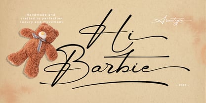 Hi Barbie, modern handmade script. It features dynamic and pretty swashes and can be used for many purpose, such as titles, signatures, logos, wedding invitations, letterhead, signage, labels, newsletters, posters, badges, and more. Files included: Hi Barbie Regular Numerals & Punctuation Stylistic Alternates & Ligatures PUA Encoded Characters Thanks so much for looking, I really hope you enjoy it and please don't hesitate to drop me a message if you have any issues or queries :)
 - Mike Sans by Factory738,
$10.00 Mike Sans is a modern sans serif with a square style. It comes in 8 weights, clean and modern glyphs, thereby creating more variability. Designed with powerful opentype features in mind. Each weight includes extended language support, currency, and more. Perfectly suited for graphic design and any display use. It could easily work for web, signage, corporate as well as for editorial design. Thanks for looking, and I hope you enjoy it.
 - Routerline by Viaction Type.Co,
$15.00 Routerline is a script monoline with 4 styles, nice applied in various products. Complete with multilingual characters, ligature and alternate. It is suitable for quote, clothing design, vintage logo, label, poster, packaging design and other designs. File Include (All Family) : Routerline.otf Routerline.ttf Routerline Slant.otf Routerline Slant.ttf Routerline Bold.otf Routerline Bold.ttf Routerline Bold Slant.otf Routerline Bold Slant.ttf Features (PUA Encoded) : UPPERCASE. LOWERCASE. MULTILINGUAL. PUNCTUATION & SYMBOL. STYLISTIC SET. LIGATURE. I hope you enjoy and thank you.
 - Tocco by Papanapa,
$30.00 Meet the first typographic family designed by Papanapa. Inspired by leftover chunks of wood found in a workshop we conducted with one of our clients, this type carries an elegant and distinctive personality due to its unexpected angles. Tocco is available in 8 weights, from Thin to Black, and it was designed to be used primarily on headlines, titles or small texts. It also supports basic Latin. We hope you enjoy it!
 - Abhartach by Fontdation,
$18.00 Introducing Abhartach, funky reverse-contrast display typeface. A perfect mix from both classic and modern typography. Packed with lots of alternate characters and ligatures (and faux-italic style too!), lets you explore more letter variations that will level up your designing projects. Check out the entire preview images to get the inspiration & hints of how powerful slash beautiful this typeface is. Hope you enjoy this typeface as much as we created it for you! Cheers!
 - Song Plugger JNL by Jeff Levine,
$29.00 In the heyday of "Tin Pan Alley", a song plugger was one whose job it was to bring a publisher's song to the attention of performers, show producers and radio station executives; the forerunner of the promotion man who visited disk jockeys with new record releases in the hopes of getting them played on the air. Song Plugger JNL was based on hand lettering spotted on some late-1920s-early 1930s sheet music.
 - Steglstan by Alphard Type,
$16.00 Steglstan is a luxurious serif with an elegant style. It seduces your eyes with its curves yet manages to maintain its classy serenity, perfect for your branding, logos, invitations, long texts and more. FEATURES: OpenType support Playful to use (with ligatures options) Multilingual support PUA Encoded If you need support or more information about this item, please kindly contact me: alphardtype@gmail.com Thank you so much...I really hope you enjoy when using it!
 - Menoka by Valentino Vergan,
$16.00 Menoka is an elegant and modern serif typeface inspired by the late renaissance period. Menoka was designed with a very thin hairline and long serifs, this reflects the elegance and sophistication that was evident during the 17th century. With over 90 stylistic ligatures, Menoka is great for headlines and short to medium texts. Menoka is compatible with 93 languages and contains 433 glyphs, including several alternatives. I hope you enjoy using the Menoka typeface.
 - Sure, diving into the unique world of creative fonts, let's explore Cock Boat, a delightfully named typeface that captures attention not just with its name, but with its design as well. Though I can'...
- Merry Melody by Comicraft,
$19.00 Sufferin' Succotash, was that five minutes already?! Seemed to us like that lunatic cartoon went by faster than a roadrunner being pursued by a wily coyote or a hare brained bunny dodging short sighted hunters during wabbit season. Adorn your favorite duck, pig, cat, tweeting bird or skunk with the warming strains of our merry melody font or it'll be all over for all you folks.
 - P22 Vale by IHOF,
$24.95 The Vale Press was a contemporary of Willam Morris's Kelmscott Press. The types used by the Vale Press were designed by artist Charles Ricketts, who also supervised the design and printing of Vale Press books. The main type used, Vale, was based on the Jenson 15th century roman type style. The King's Fount was an experimental semi-uncial font based on the Vale type. The King's Fount was designed in 1903 for the Vale edition of the 15h century poem "The Kingis Quair". This semi-uncial font evokes old English and Anglo-Saxon lettering. P22 Vale Pro combines the two fonts P22 Vale Roman and P22 Vale King's Fount into one "Pro" font. This pro font also includes a Central European character set, old style figures, fractions, ornaments and a special faux "Middle English" feature to make "anee text appeer Olde." This feature is not known to exist in any other font.
 - Karmina by TypeTogether,
$49.00 Karmina is a text typeface developed mainly for pocket books and budget editions. It was built to withstand the worst printing conditions: low quality papers, high printing speed with web presses and variations in the ink level of the printing press. Some of Karmina's most representative features are the rather large serifs, intended to work perfectly in small reproduction sizes, the sharpness of the shapes, including some calligraphic reminiscences, and the large and yet graceful ink traps in the acute connections. Structurally, Karmina combines a significantly large x-height with relatively compressed letterforms. The result of these features grants Karmina outstanding legibility and economy. Karmina features four weights and 800 characters per weight, including small caps, discretionary ligatures, fractions and a complete range of numerals for every use. It also supports over 40 languages that use the latin extended alphabet. Karmina was selected in the text typography category at the Letras Latinas exhibition 2006 and won a merit in the European-wide ED-Awards competition 2007. Karmina Basic is a reduced version of Karmina. It is still an OT-font but without any particular features except of a set of ligatures, class-kerning and language support including CE and Baltic.
 - Tescellations by Ingrimayne Type,
$9.95 Though there are many thousands of digital typefaces available, none seem to be made exclusively of letters that tessellate, a complete tessellating alphabet. This void is now filled with not one typeface, but a group of typefaces, the Tescellations kinship group. Even though I am aware of only one use for this typeface--writing about tessellations--that does not mean there are not hundreds or perhaps thousands of other uses. These typefaces are a byproduct of two maze books I designed, Puzzling Typography and Puzzling Typography A Sequel. I found the challenge of making mazes from tessellations, including letter tessellations, intriguing and these typefaces are a byproduct that endeavor. There are seven members of this typeface kinship group. I tried to select the the glyphs that fit together best to form Tescellations; it is the most readable of the lot. The reason for an Italics version is that I needed one for the maze project. In constructing it, I tried to include as many different lower-case glyphs as I could rather than just skew the regular version. A purist might insist that the tessellation deal with the counters. My approach was to worry only about the exterior of any letter that has an interior, but for anyone who who might object to the counters, versions with filled counters are included. What did not fit into Tescellations was dumped into Tescellations Two, which is somewhat of a ransom-note type of face. It comes in two styles, a regular version and a version in which the counters are removed. TescellationPatterns shows how many of the characters in these typefaces tessellate. It has over 100 tessellation patterns, each on only one character. Simply type several lines with any character and make sure the leading is the same as the font size, and you have an instant tessellation pattern of a letter.
 - Aerolite Pro by CheapProFonts,
$10.00 The history of Aerolite, from Jan Paul: "The Aerolite fonts are essentially stripped down versions of a complex outline typeface I designed for the first Midnight Oil album in 1978, affectionately known as "The Blue Meanie". Many years later I saw the font "powderworks" and asked Brian Kent if he would be interested in digitizing Aerolite. Brian is a font (!) of knowledge and was of invaluable help by getting Aerolite to where it is today. Special care was taken in keeping the distinct character while as Aerolite Regular also providing a legible, thouroughly kerned body type which can be used in all sizes for large volume text." For the Pro version the kerning has been tweaked further, and the character set completed and expanded - and the alternate uppercase A (also with accents) is available as OpenType stylistic alternates. It is now ready for your next international science or sci-fi project. ALL fonts from CheapProFonts have very extensive language support: They contain some unusual diacritic letters (some of which are contained in the Latin Extended-B Unicode block) supporting: Cornish, Filipino (Tagalog), Guarani, Luxembourgian, Malagasy, Romanian, Ulithian and Welsh. They also contain all glyphs in the Latin Extended-A Unicode block (which among others cover the Central European and Baltic areas) supporting: Afrikaans, Belarusian (Lacinka), Bosnian, Catalan, Chichewa, Croatian, Czech, Dutch, Esperanto, Greenlandic, Hungarian, Kashubian, Kurdish (Kurmanji), Latvian, Lithuanian, Maltese, Maori, Polish, Saami (Inari), Saami (North), Serbian (latin), Slovak(ian), Slovene, Sorbian (Lower), Sorbian (Upper), Turkish and Turkmen. And they of course contain all the usual "western" glyphs supporting: Albanian, Basque, Breton, Chamorro, Danish, Estonian, Faroese, Finnish, French, Frisian, Galican, German, Icelandic, Indonesian, Irish (Gaelic), Italian, Northern Sotho, Norwegian, Occitan, Portuguese, Rhaeto-Romance, Sami (Lule), Sami (South), Scots (Gaelic), Spanish, Swedish, Tswana, Walloon and Yapese.
 - Bowling Script by Sudtipos,
$69.00 There is plenty of lyric and literature about looking over one's shoulder in contemplation. What would you have done differently if you knew then what you know now? This is the kind of question that comes out of nowhere. When it does and whether its context is personal or professional make very little difference. It's a question that can cause emotions to rise and passions to run hot. It can trigger priority shifts and identity crises. It's never easy to answer. Three years ago, I published a font called Semilla. My aim with that was to distill the work of Bentele, a lettering artist from early 1950s Germany. Picking such an obscure figure back then was my way of pondering the meaning and efficiency of objectivity in a world where real human events and existences are inevitably filtered through decades of unavoidably subjective written, printed and oral history. And maybe to pat myself on the back for surviving surprises mild and pleasant. Having been fortunate enough to follow my professional whims for quite some time now, I took another, longer look at my idea of distilling Bentele's work again. I suppose the concepts of established history and objectivity can become quite malleable when personal experience is added to the mix. I say that because there I was, three years later, second-guessing myself and opining that Bentele's work can be distilled differently, in a manner more suited to current cultural angles. So I embarked on that mission, and Bowling Script is the result. I realize that it's difficult to reconcile this soft and happy calligraphic outcome with the introspection I've blathered about so far, but it is what is. I guess even self-created first world problems need to be resolved somehow, and the resolution can happen in mysterious ways. Bowling Script is what people who like my work would expect from me. It's yet another script loaded with all kinds of alternation, swashing and over-the-top stuff. All of that is in here. These days I think I just do all that stuff without even blinking. But there are two additional twists. The more noticeable one is ornamental: The stroke endings in the main font are of the typical sharp and curly variety found in sign painting, while the other font complements that with ball endings, sometimes with an added-on-afterwards impression rather than an extension of the actual stroke. In the philosophical terms I was mumbling earlier, this is the equivalent of alternate realities in a world of historical reduxes that by their very nature can never properly translate original fact. The second twist has to do with the disruption of angular rhythm in calligraphic alphabets. Of course, this is the kind of lettering where the very concept of rhythm can be quite flexible, but it still counts for something, and experimenting with angular white space in a project of a very dense footprint was irresistible. After playing for a bit, I decided that it would interesting to include the option of using optically back-slanted forms in the fonts. Most scripts out there, including mine, have a rhythm sonically comparable to four-to-the-floor club beats. So the weirdly angled stuff here is your chance to do the occasional drumroll. Everyone knows we need one of those sometimes. Bowling Script and Bowling Script Balls fonts comes with 1600 characters and features extended Latin-based language support. There are also a basic version of both fonts without all the alternates and extra OpenType features. Bowling family ships in cross-platform OpenType format. We also want to present “Mute”, a visual essay narated by Tomás García and Valentín Muro, about digital life created specially to introduce Bowling Script.
 - Hollgates by Mozatype,
$17.00 Proudly present our new font. It is named Hollgates - Elegant Signature Font. Hollgates is script handwritten style with a natural charm. This font which is a modern signature and unique style handmade comes with very beautiful character changes. To keep the maximum real hand-lettered effect, there were created 240 ligatures (you can see them among the presentation pictures). When creating the font, we should take into consideration that each letter should be able to be connected with other letters. For example, the letter "a" should be well connected as well as with "l" and "n" and with any other letters. This limits us: we have to start letter from exact one point and finish at exact second point. So here come ligatures. Hollgates font contains following ligatures: ab ad af ah ai ak al am an ao ap as at az az bh bl bk bt bx br cb cl ch ck cc cr cs ct co cx cz dd db dh dl dk dt dr ds dx dz eb ef eh ek el et ett er em en es ex ez ff fh fl fk fi fo fs ft fr fz fx gg gh gr gb gf gl gk gt go gs gz hf ho hs ht hz ib if ih ik il it itt ii in im ip is ir iz ix jo kl kk kh ko ks kr kt kx kz lo li ls lu lr lx ly lz mm mf mi mh ml mk mo mp ms mt mz mx nb ni nf nh nl nk no ns nr np nt nx nz ob of oh oi oj ok ol om on op os ot ott ou ox oz ph ppl pp ps pt pu pi pr po px pz rs rr st sh sl sk sb si sm sn so sp su sx sy sz oll all ell ill ull th tl tk ti ts tr to tu tx tz ty ub ul uh uk ul ut utt un um up us ux uz vh vl wh wl wo zz ee ll ff oo rr ss tt dd ff It’s the perfect fit for all luxury projects, such as wedding invitation, signatures, luxury logos, printed quotes, grettings cards, social media headers, product packaging and many more! It includes a full set of uppercase and lowercase letters, multilingual symbols, numerals, punctuation and ligatures. It is PUA encoded which means you can access all of the glyphs and swashes with ease! Fall in love with its incredibly versatile style and use it to create spectacular designs! Use this font for any crafting project that requires a personalized look! What’s Included : – Works on PC & Mac – Easy to use ( Installations ) – Easy Convert to webfont – Compabilty Windows, Apple, Linux, Cricut, Silhouette and Other cutting machines Thanks for downloading, and I hope you enjoy it!
