10,000 search results
(0.053 seconds)
- Gleaming Christmas by Seemly Fonts,
$12.00 Introducing Gleaming Christmas, a handcrafted font that exudes sweetness and friendliness. Its natural and one-of-a-kind style is a perfect match for a wide variety of design projects, letting your imagination run free.
 - Julmeme-Kun by Julmeme,
$25.00 Julmeme-Kun is a fully italic font. This unique characteristic added to its tall and elegant proportions makes it a very dynamic typeface. Applicable for any type of graphic design, especially for posters and logotypes.
 - Balgor by Syafbe,
$17.00 Balgor is an elegant and modern serif font. It is characterized by smooth curves and is perfect for fashion branding or editorial designs. Add it confidently to your projects, and you will love the results.
 - PIXymbols Signet by Page Studio Graphics,
$29.00Font with elegant cursive script initials to create two-letter monograms for letterheads. Includes 37 borders, each accessed by a single key-stroke on the computer keyboard.The borders will automatically line up with the initials. - Boldetton by Rockboys Studio,
$26.00 Boldetton is an elegant and bold script font. Fall in love with its incredibly versatile style and use it to create gorgeous wedding invitations, beautiful stationary art, eye-catching social media posts, and much more!
 - Sylphe Pro by RMU,
$35.00 Inspired by Schelter & Giesecke’s Sylphide Sylphe Pro comes as an elegant, calligraphic Italic with the touch of the Golden Age of type design. This beautiful font encompasses most European languages, Central and West, plus Turkish.
 - Yogyakarta by Letterafandi Studio,
$10.00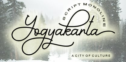 Yogyakarta is a handwritten script font, with an elegant and beautiful look. It looks stunning on invitations, thank you cards, quotes, greeting cards, logos, business cards and every other design which needs a handwritten touch.
 - Vigallse by Krakenbox Studio,
$17.00 Vigallse – Vintage Modern Serif Typeface. It has vintage, modern, classic & elegant. It’s a great font for fashion, apparel projects, signature, album cover, logo, branding, magazine, social media, & advertisements, but also works great for other projects.
 - Brown Love by sizimon,
$18.00 Introducing our latest product Bethany Script! handwritten fonts companion designed to convey elegance and style. Bethany is perfect for fashion, e-commerce brands, trend blogs, or any business that wants to appear classy and chic.
 - Bellarosse by Nissa Nana,
$26.00 Bellarosse is a delicate, elegant and flowing handwritten font. Get inspired by its authentic feel and use it to create gorgeous wedding invitations, beautiful stationary art, eye-catching social media posts, and cute greeting cards.
 - Bottania by Rockboys Studio,
$23.00 Bottania is an elegant and bold script font. Fall in love with its incredibly versatile style and use it to create gorgeous wedding invitations, beautiful stationary art, eye-catching social media posts, and much more!
 - Nortune by Ardyanatypes,
$10.00 Nortune is inspired by modern style combined with retro style so that it has a dynamic and elegant shape. This will be very suitable for use in any design that has a modern, retro, and classic feel. Nortune also has 10 thicknesses so it will be very easy to use on any design you have in mind. It also comes with multiple languages, making it easy to use for any country and language. Nortune also comes with alternative Ligatures and styles to make your designs more attractive. Alternate fonts will also create lots of options to combine. This modern letter shape will be very suitable to be combined with various types of fonts. Nortune is suitable for branding projects and various design purposes such as business cards, name tags, advertisements, posters, invitations, branding, logos, magazines, merchandise, presentations, etc. Supports languages: Afrikaans, Albanian, Asturian, Asu, Azerbaijani, Basque, Bemba, Bena, Bosnian, Breton, Catalan, Chiga, Colognian, Cornish, Croatian, Czech, Danish, Dutch, Embu, English, Esperanto, Estonian, Faroese, Filipino, Finnish, French, Friulian, Galician, German, Gusii, Hungarian, Icelandic, Igbo, Indonesian, Irish, Italian, Kabuverdianu, Kalaallisut, Kalenjin, Kamba, Kikuyu, Kinyarwanda, Latvian, Lithuanian, Low German, Lower Sorbian, Luo, Luxembourgish, Luyia, Machame, Makhuwa-Meetto, Makonde, Malagasy, Malay, Maltese, Manx, Meru, Morisyen, North Ndebele, Norwegian Bokmål, Norwegian Nynorsk, Nyankole, Oromo, Polish, Portuguese, Quechua, Romanian, Romansh, Rombo, Rundi, Rwa, Samburu, Sango, Sangu, Scottish Gaelic, Sena, Shambala, Shona, Slovak, Slovenian, Soga, Somali, Spanish, Swahili, Swedish, Swiss German, Taita, Teso, Turkish, Turkmen, Upper Sorbian, Vietnamese, Vunjo, Walser, Welsh, Western Frisian, Yoruba, Zulu
 - Goldplay by Latinotype,
$26.00 Goldplay is based on Isidora Sans design yet features rounded shapes. Its rounded, soft terminals give it a friendly and expressive look, and its modern and contemporary style as well as its classic proportions make it an excellent choice for headlines, logotypes, branding, books, magazines, motion graphics, and use on web and Tv. One of its key features is a large x-height which make it look elegant and classy. Goldplay comes in 2 versions—each in 7 weights, from Thin to Black, and matching italics, resulting in a total of 28 fonts. The standard sans serif version—fresh, clean and contemporary—is a perfect choice for editorial and corporate design, headlines, books, magazines or any other piece of graphic design. The Alt semi-serif display version—more expressive and modern—is ideal for logotypes, branding, packaging, and use on web and Tv. Goldplay contains a set of 540 characters that support over 200 Latin-based languages.
 - Art Nouveau SCF by Scholtz Fonts,
$21.00 The Art Nouveau styles of the the turn of the 20th century (1890 - 1905) exhibited a bold approach to organic lines and lavish decoration. This new style was spread throughout the world and helped usher in a new era that led to modern art and design. Art Nouveau SCF is strongly influenced by the style of decoration and typography created by Rennie Mackintosh as well as the Art Nouveau movement in general (with particular reference to Gustave Klimt and Alphonse Mucha). However, it differs from much of the art nouveau typography in that it largely avoids the use of straight lines in its letter forms. It is a decorative, romantic font and its subtly curved bolder lines contrast with delicate tracery to create an intricate pattern of organic flowing shapes. Use Art Nouveau SCF for: -- posters -- wedding invitations -- advertising material for clothing and beauty products -- Music CD covers and advertising media -- Film advertising media
 - ITC Hedera by ITC,
$29.99ITC Hedera's roots can be traced to a suite of initials intended for book design. Olivera Stojadinovic, the face's designer, made the first sketches for the initials with a handmade tool consisting of two flexible metal strips tied to a wooden handle. This makeshift pen created the distinctive uneven double strokes of the letterforms. Stojadinovic says that she tried to keep the original flavor of the sketches in the finished font. Stroke roughness has been preserved in final execution, though the characters had some cleaning and polishing," she notes. Based on Renaissance letterforms, ITC Hedera has a classical quality that complements its calligraphic exuberance. The name Hedera? According to Stojadinovic, "It's the name of a common ivy. I chose it because of the organic image of the character strokes, which, to me, resemble shapes from nature's leaves or stems of plants." Rough-hewn yet elegant, ITC Hedera is an exceptional display design." - Madrea by Craft Supply Co,
$20.00 Introducing Madrea – Friendly Sans Serif Unconventional Charm Madrea – Friendly Sans Serif is anything but conventional; it introduces a unique and friendly twist to your designs. Irregular Shapes What sets Madrea apart is its irregular shapes, which establish a welcoming and friendly atmosphere. This makes it the perfect choice for designs seeking to break free from formality and monotony. A Breath of Fresh Air In the realm of sans serif fonts, Madrea is indeed a breath of fresh air. Its non-uniformity and organic feel breathe personality and approachability into your projects. Breaking Formality Madrea excels at breaking the chains of formality. It’s an ideal choice for design projects that demand a friendly and informal touch, effortlessly transforming the mundane into something captivating. In Conclusion In summary, Madrea – Friendly Sans Serif is your gateway to a non-uniform, friendly design experience. Its irregular shapes infuse character, warmth, and a refreshing departure from conventional design, ensuring that your creations are brimming with life and far from monotonous.
 - VLNL Cleaver by VetteLetters,
$29.99 Chop chop! VLNL Cleaver is an important tool in the Vette Letters’ kitchen. It’s a butcher knife of a font. Razor sharp, ultra heavy and with pointy slanted serifs. At first glance it seems straight-lined, but a closer look revails that all straight lines are curved inward slightly, which enhances the sharp image even more. Cleaver was originally designed by DBXL for cutting meat - hell, it even hacks right through bone. It can easily splice a chicken in one slash or seperate ribs, just like that. You can also very well use it to chop up hard vegetables like pumpkin or squash on the chopping block. It gets better, the opposite blunt side can be deployed to crush ingredients like garlic, nuts or spices like black pepper. You could use a grinder, but with Cleaver it’s more fun, isn’t it? VLNL Cleaver is suitable to give a sharp edge to flyers, posters, logos (Heavy metal bands and other) or magazine headlines.
 - Tsubame by Thirdin,
$30.00 "TSUBAME" means swallow in Japanese. These fonts are based on the shape of Tsubame. The relationship between humans and swallows is as deep-rooted. Japanese swallows have adapted to nesting in and around human habitation from ancient time. So in Japan, they prohibited people from catching or killing swallows because of their beneficial role as insect eaters. Since the relationship between humans and swallows is close, this font's letter spacing is designed to be very tight.
 - Franqueline Slab by Sudtipos,
$39.00 Introducing Franqueline Slab, the captivating new typeface family passionately designed by Estudio Vástago and expertly distributed by Sudtipos! This versatile font offers a diverse array of styles, ranging from delicately refined to boldly eye-catching on the weight axis, all elegantly inspired by the timeless Egyptian fonts of the late 19th century. With expressive character and exquisitely unique shapes, Franqueline Slab harmoniously blends the finesse of its delicate strokes with sophisticated endings, resulting in a truly remarkable typography. Every letter in Franqueline Slab has been meticulously crafted to strike the perfect balance between a contemporary edge and a touch of traditional charm, appealing to both the younger generation and typography enthusiasts who appreciate the artistry of the past. Its adaptability makes it ideal for captivating headlines that convey a message of youthful energy and playfulness, while still exuding the timeless elegance that only classic fonts can deliver. Embrace distinction and originality in your designs with Franqueline Slab. Whether it graces an editorial project, logo, or advertising material, this exceptional typeface family will undoubtedly stand out, leaving a lasting impression with its captivating personality. Watch your messages come to life and shine with the unparalleled charm of Franqueline Slab!
 - VVDS Fifties by Vintage Voyage Design Supply,
$15.00Fifties is a mix of classic geometric and a bit of humanistic grotesque. The goal was to create the font for present with look to the past. In other words, I tried to came back the Modernism aesthetics of XX century into nowadays. The result gives you 60 styles including Italic (Slanted). Your typography may be airy and elegant with Expanded Thin, catchy and expressive with Condensed Bold or dynamic and sharp with Expanded Bold Italic. You will find your way to use this family certainly. Theatre posters or party flyers, vintage t-shirt or modern web service, movie titles or magazine header and even infographic – Fifties will suit you everywhere. You may use the completed styles or may use a Variable Font. To make it as you want to. Weights: Thin / Light / Regular / Medium / Semi Bold / Bold. Widths: Condensed / SemiCondensed / Medium / SemiExpanded / Expanded OTF and Variable Font (TTF) OpenType features: Stylistic alternates for A, G, K, M, N, R, W, a, e, g, j, m, n, r, t, u, w, y; Fraction figures; Subscript and Superscript figures; Tabular figures; Typographic spaces: Em / En / Third / Quarter / Thin / Sixth / Hair - Teenage Garde by Teenage Foundry,
$19.00 Introducing by Teenage Foundry! Teenage Garde is a bold and neat display typeface font that exudes confidence and modernity. With its strong, clean lines and sharp edges, this font is designed to make a bold statement. Teenage Garde boldness gives it a commanding presence, making it ideal for designs that require attention-grabbing headlines or strong brand identities. Despite its simplicity, the font still manages to maintain a sense of elegance and sophistication. This makes Teenage Garde a versatile choice for a wide range of design projects, including advertising materials, logos, posters, and website headers. There are 2 styles, Regular & Extrude. Features: Uppercase, Lowercase, Numeral, Punctuation & Multilingual. Multilingual contained: Afrikaans, Albanian, Asu, Basque, Bemba, Bena, Breton, Catalan, Chiga, Cornish, Danish, Dutch, English, Estonian, Filipino, Finnish, French, Friulian, Galician, German, Gusii, Indonesian, Irish, Italian, Kabuverdianu, Kalenjin, Kinyarwanda, Luo, Luxembourgish, Luyia, Machame, Makhuwa-Meetto, Makonde, Malagasy, Manx, Morisyen, North Ndebele, Norwegian Bokmål, Norwegian Nynorsk, Nyankole, Oromo, Portuguese, Quechua, Romansh, Rombo, Rundi, Rwa, Samburu, Sango, Sangu, Scottish Gaelic, Sena, Shambala, Shona, Soga, Somali, Spanish, Swahili, Swedish, Swiss German, Taita, Teso, Uzbek (Latin), Volapük, Vunjo, Zulu. For any questions please contact me 🙂 Thanks!
 - SP Vincent by Studio Pulp,
$19.99 Discover the captivating charm of SP Vincent, a masterfully crafted display font developed in 2023 by Studio Pulp. Inspired by the iconic character Vincent Vega, the central figure in the film classic "Pulp Fiction" (1994), this typeface exudes a powerful and refined aesthetic, befitting a leading role. SP Vincent, with meticulous attention to detail and craftsmanship, showcases versatility that seamlessly complements a variety of design projects, especially excelling in the creation of impressive titles. The three well-balanced weights provide you with the flexibility to unleash your creativity, while the clear, open shapes optimize readability. Anchored in a sleek grid design, SP Vincent embodies modern minimalism and accessible elegance. Whether you are engaged in web design, graphic design, or print materials, this font adds a timeless class to your creations. Be inspired by the seamless blend of functionality and aesthetics in SP Vincent. Specifically designed to meet the demands of 2023, this font brings a contemporary flair to your projects while remaining faithful to Studio Pulp's commitment to quality and innovation. Transform your typographic landscape with SP Vincent and leave a lasting impression reminiscent of the unforgettable moments from "Pulp Fiction."
 - Obvia by Typefolio,
$29.00 Obvia, a geohumanist type for all media. Obvia appeared as a result of direct observation on typefaces classified as geometric and the plan to explore for the first time width axes - to be published soon - expanding its usability. The idea behind Obvia’s design was to create a distancing from geometrically pure shapes, in this case, square shapes. Then some details were added, such as subtle inktraps, concave endings of the stems and carefully drawn alternate characters, giving a ‘geohumanist’ tone to the font. This first family of Obvia has 9 weights ranging from Thin to Black with their respective italics, delivering a strong typographic identity, from the paper to the pixel.
 - Umkhonto by Scholtz Fonts,
$19.00 Umkhonto is the Zulu word for SPEAR, the traditional weapon of war that the Zulus used. The sharp points of the letters face upwards and represent the sharp points of the dangerous spears. The font includes a full 256 character set: all upper and lower case letters, as well as all numerals and punctuation. It also includes the most commonly used characters used in non-English European languages such as Spanish, French, German and Portuguese. The numerals are mono-spaced so that they will line up correctly in columns of figures. The letters of the alphabet are spaced according to their width and are carefully kerned.
 - Nambya by Ahmad Jamaludin,
$17.00 Introducing new sharp style font, Nambya! Nambya - A serif typeface with an experimental and sharp style. Nambya is inspired by timeless packaging from a forgotten era. It has a beautiful range of stylistic alternates with unique characters. Nambya - fearless and chic typeface perfect for big headlines for both print and web. It comes with Italic style, unique lower and uppercase plus numbers, punctuation & multilingual letters File Included: Unique letterforms Works on PC & Mac Simple Installations Accessible in Adobe Illustrator, Adobe Photoshop, Microsoft Word even work on Canva! PUA Encoded Characters Fully accessible without additional design software. Come and say hello over on Instagram! https://www.instagram.com/dharmas.studio/ Dharmas Studio
 - Shiver by Comicraft,
$29.00 Is your character vibrating slightly or feeling shuddering feverishly, as if from fear or excitement? Is he or she a warm-blooded animal experiencing the early onset hypothermia? Is your protagonist experiencing a pleasurable sensation of anticipation or maybe he/she has a fragment or splinter of glass or stone in the tip of his/her finger. Any which way, Comicraft now has the font for you to effectively convey the way your characters are feeling to comic book readers everywhere... It'll be just like they're listening to a track by Coldplay while trying to shake off the flu in a haunted house. See the families related to Shiver: Shake.
 - Stenographer JNL by Jeff Levine,
$29.00 Sheet music for the song “The Little Thing You Used to Do” (from the 1935 motion picture “Go into your Dance” starring Al Jolson and Ruby Keeler) had its title set in what closely resembled Bank Gothic Condensed. [Bank Gothic was originally designed by Morris Fuller Benton for American Type Founders circa 1930.] This reinterpreted version is now known as Stenographer JNL, and is available in both regular and oblique versions.
 - Dance Number JNL by Jeff Levine,
$29.00 Vintage sheet music for the song "Just Once for All Time" (from the United Artists release "Congress Dances") provided the bold sans that served as the model for Dance Number JNL. This 1932 film was the English language version of the German comedy "Der Kongrefl tanzt" The movie's plot is based around the Congress of Vienna. There, an Austrian commoner is mistakenly thought to be the Tsar of Russia.
 - XXII Centar by Doubletwo Studios,
$19.00 Centar Sans is a simple, modern, universal, powerful, invisible but not characterless, sans serif family. The family is designed for identities & corporate projects. Its wide range of styles covers lots of possibilities of use, from headlines to texts. It supports a lot of languages including cyrillic and comes along with 19 OpenType features - Small Caps, ligatures, alternates and many more. Regular styles are FREE! Extended detail here. or here.
 - Dance Partner JNL by Jeff Levine,
$29.00 The unusual mix of Art Deco lettering with a smattering of Art Nouveau characters found within Dance Partner JNL comes from a movie poster for the 1935 RKO picture "Roberta" starring Fred Astaire and Ginger Rogers. The musical was based on the hit 1933 stage play that introduced the song "Smoke Gets in Your Eyes". The play itself was based on the Alice Duer Miller novel "Gowns by Roberta".
 - Guadalajara JNL by Jeff Levine,
$29.00 Hand lettered, the title on the sheet music for a 1940s hit song "Ti-Pi-Tin" inspired Guadalajara JNL. The melody and original Spanish lyrics were written by Maria Grever, one of Mexico's first successful female composers, with English lyrics supplied by Raymond Leveen. This decorative and fun type face brings to mind fiestas South of the border, and emanates the charm of Mexico's music, dance and colorful costumes.
 - Zahar by Apostrof,
$30.00 Zahar type family is based on the lettering developed by the famous Ukrainian graphic artist Georgi Yakutovich and designed for Ivan Franko's book Zakhar Berkut. It is good for the design of children's books, folk tales, songs, etc. Zahar is easy to read in short texts. It supports Extended Latin and Cyrillic (including Old Church Slavonic). A special OT-feature is added to support the Old Church Slavonic alphabetic numeral system.
 - Nature Stencils JNL by Jeff Levine,
$29.00 Nature Stencils JNL brings together a number of vintage decorator stencils with bird and flower motifs (along with individualized elements from the original designs). These home decor stencils were manufactured by the Huntington Oil Cured Stencil Company somewhere around the early 1950s. Originally located in Huntington, New York, the company later relocated to the South Florida area, but there is no additional information found about the company's background.
 - Nouveau Square JNL by Jeff Levine,
$29.00 Sheet music for the 1915 song "Is There Still Room for Me Neath the Old Apple Tree" had the title hand-lettered in a condensed, square sans serif. Although far from the more decorative lettering styles of the Art Nouveau period, this type of simple understatement was also a popular choice for the illustrators of the day. It is presented digitally as Nouveau Square JNL in both regular and oblique versions.
 - Luckiest Guy Pro by Stiggy & Sands,
$29.00 Our Luckiest Guy Pro was inspired by hand-lettering by vintage 1950’s advertisements. The uber-bold unicase letterforms exude charm and light-heartedness, while the SmallCaps and extensive figure sets expand the range of usability and appeal. Opentype features include: - SmallCaps. - Full set of Inferiors and Superiors for limitless fractions. - Tabular, Proportional, and Oldstyle figure sets (along with SmallCaps versions of the figures). - Stylistic Alternates for Caps to SmallCaps conversion.
 - Angro by Linotype,
$29.99 The sans serif Angro was designed in the weights light and bold by Erwin Koch. The figures are based on the form of a rectangle which along with the high xheight and short ascenders and descenders gives the forms a static character. Lines of text in Angro are very compact and close set. Due to the reserved ascenders and descenders Angro can be set with very close line spacing.
 - Bourton Text by Kimmy Design,
$25.00 Bourton Text is a modern sans-serif typeface family perfect for both text type settings and display purposes. While it’s not a layering type family like its brother, Bourton, it come packed with features, extras and over 2,000 characters that make it stand on its own. HISTORY Bourton Text is a new take of the Bourton family that was one of the best-selling and favorite fonts of 2016. After countless requests for lowercase alphabet, or suggestions for a font pairing with Bourton, this new text setting family is based on the original shapes of Bourton. DESIGN & CREATION In taking Bourton Base was the starting point as they narrowest width and boldest weight. From there, lowercase shapes were designed that matched the aesthetic and details of the popular capitals. As Bourton was a heavy display font, some small tweaks were done to make it more fitting for smaller text settings, including reducing the letter-spacing and reworking some counters. Some areas needed complete reconstruction, such as the figures. The design of those began anew with a style that worked with the capitals and lowercase but also as a standalone set. Currency shapes were updated to match the numerals. Punctuation was also reimagined to work better in smaller type settings. Diacritics and extended language support was also updated and expanded to include full Latin plus language support for 219 latin based language spoken in 212 countries. Once the basic alphabet for Bourton Text Bold Narrow was formed, the font was expanded in both weight and width. Taking the weight from Bold down to Hairline, it allowed for more range in use. The typeface needed to be expanded in order to reach better as a book weight and width, in addition to a regular width, a wider version was create as well. FEATURES Once the extremes were set in place, small capital forms were designed for text and display purposes. These also allow for nested capital letters, lifted small caps and other display features offered in the typeface. One of the most popular fonts in the Bourton layering font family is Bourton Line. This led to an experimentation with rounded Bourton Text completely and thus a complete set of duplicated characters with rounded terminals. By using the Opentype Panel, a rounded font is a single click away. Every feature has been carefully thought out and updated across the entire font. In total, Bourton boasts over 2,300 glyphs, 42 font files with 3 widths and 7 weights in upright and italic.
 - Jupiter Mission by Wing's Art Studio,
$10.00 Jupiter Mission: A Science-Fiction Font Spectacular by Wingsart Studio Jupiter Mission is a futuristic font family inspired by science-fiction movies and TV shows. It promotes the spirit of adventure and space exploration with a design aimed at recapturing the excitement of childhood movie nights and VHS video covers. It is at once cool and serious, retro and modern. It’s clean look is suitable for large headlines and small infographics and works great for sci-fi movie titles, production design elements, technology articles, video games and much more. Regular and Italic styles are included with additional Sliced versions when you need an extra futuristic flourish. It features unique uppercase and lowercase characters, along with numerals, punctuations and language support. For more great fonts check out our website at Wingsart Studio.
 - Elioth by Soerat Company,
$20.00 Elioth is a humanist font with angled terminals as a identity of this product. Comes with a modern look, this font suitable for display and body text. Elioth is perfect for advertising, packaging, logo, editorial and publishing, branding and other creative industries. This family of 9 weights from Thin to Heavy along with italics contain several OpenType features: Stylistic Alternates and Figures Variation (circled number, fraction, tabular lining, numerator, denominator). With over 752 glyphs per style, Elioth supports around 150+ languages in Latin and Cyrillic script. Family overview: 9 weights (from Thin to Heavy) + italics Extended Latin Cyrillic 752 glyphs Variable Font 150+ languages OpenType Features: Localized Forms Subscript and scientific inferiors Superscript (Superiors) Numerators and Denominators Fractions Lining Figures Tabular Figures Oldstyle Figures Circled Number Case-Sensitive Forms Standard and Discretionary Ligatures Stylistic Alternates
 - Metrisch by Gumpita Rahayu,
$18.00 Metrisch is new sans serif typefamily of seven weights plus seven italics uprights in each weights. The typefaces designed based on traditional geometric construction that have been built with letter size wider, the x-heights taller and short descender that almost proportioned with the basic letter shape. With little details added like clean vertical cuts on the terminals and optimized sharp corners that makes this fonts smooth and refined looks. It was represents the flavor of the most common humanist typefaces style and grotesk feels. The weights comes from extra light to extra bold suitable to make display appearance, and the book and medium weights also works well as small/medium text sizes to accompany your design, such as editorial fashion magazine, solid headline, websites heading, poster, advertising, logo, signage, etc Also, Metrisch type-family fully loaded with OpenType features such as some stylistic alternates, case-sensitive forms, fractions, small capitals,and another most common numerals features such as super & subscript, tabular & oldstyle figures, numerator-denominator, and has more extended latin diacritics characters.