10,000 search results
(0.052 seconds)
- Palatino by Linotype,
$47.99 Palatino is the work of Hermann Zapf and became available in the late 1950s from D. Stempel AG in Frankfurt am Main. Zapf optimized Palatino’s design for legibility, producing a typeface which remained legible even on the inferior paper of the post World War II period. Zapf named the font after Giambattista Palatino, a master of scripts from the time of Leonardo da Vinci. Palatino is an Old Face font which proves that classic forms can still be used to create new typefaces.
 - Shepia Script by Seniors Studio,
$19.00 Shepia script is a monoline cursive handwriting. It is a classic and fun vintage script. With almost 390 glyphs and 188 alternative characters, it contains a plethora of opentype features (including stylistic alternates, ornaments, swashes and more). Can be used for various purposes such as logos, wedding invitations, t-shirts, letterheads, signage, labels, news, posters, badges etc. To enable the OpenType Stylistic alternates, you need a program that supports OpenType features such as Adobe Illustrator CS, Adobe Indesign & CorelDraw X6-X7.
 - Billie James by Ardian Nuvianto,
$23.00 Billie James is a sophisticated and elegant script font that exudes timeless beauty and grace. With its fluid and graceful letterforms, this font brings a touch of refinement and luxury to any design project. Inspired by classic calligraphy, Billie James is perfect for wedding invitations, high-end branding, and any project that requires a touch of sophistication and charm. Its cursive strokes and gentle curves create a sense of movement and rhythm, adding a sense of elegance to your designs.
 - Casthago by BustanType,
$24.00 Casthago is a transitional, humanist serif typeface family, comes with some contrast in the stroke and medium curve braketed serif that creates a very classic and traditional feel. Casthago designed for body text, creating a steady and readable rhythm, made for immersive reading. Some Character comes with alternate style 'a,h,m,n' that inspirated by Carolingian manuscript that was popular in medieval European period. Casthago consists of 16 styles from Extralight to black including italic styles and 2 variable fonts addition.
 - Kakadu by Ludwig Type,
$55.00 Kakadu is a squarish sans serif, designed to work equally well on paper and on screen. The angular curves in this typeface create a firm and dependable appearance. The square-like forms also provide an inward openness and allow large and open letterforms, adapting perfectly to the orthogonal pixel grid of the monitor. Kakadu works well in small sizes while, it appears strong and distinguished in larger ones. Play the classic snake game and see the Kakadu fonts in action here.
 - Adriane Swash by Typefolio,
$59.00 The Swash version of Adriane Text features the best characteristics of this lineage, without losing the strong personality and elegant design featuring in your text styles, Adriane Swash brings a fancy look to this classic style. The family comes with a complete character set in Uppercase, Lowercase and Small Caps, and the Swash option can be activated through the OpenType features panel, including glyphs initial, intermediate and final, plus a wide range of stylistic ligatures, alternate glyphs, ornaments and languages.
 - WT Solaire by Wraith Types,
$50.00 Inspired by the classical “Fell Types”, especially the charmingly quirky weights designed by Peter De Walpergen. WT Solaire is a liberal interpretation of those cuts, meant for the digital age. Its design reflects an elegant tension between tradition and modernity. Its elegance and sharpness make it a perfect fit for any project that requires impact and subtlety at the same time. It is especially meant for editorial design, be it magazines or books, but it also works well with images.
 - P22 Basel Roman by P22 Type Foundry,
$24.95 In mid 2001, P22 was approached by a Daniel Garrison, a Classics scholar at Northwestern University about possibly digitizing a long lost "Garamond" typeface. This font was used by Johannes Herbst (a.k.a. Ioannes Oporinus) in 1543 to publish Andreas Vesalius' "On the Fabric of the Human Body" (De humani corporis fabrica) in Basel. The story of the development of this font takes a few twists and almost becomes forgotten itself over time.Forteen years later it is available to the public.
 - Vanderlin by Rillatype,
$19.00 Introducing "Vanderlin," a captivating retro script font that takes you on a nostalgic journey. With its charming swashes and alternate characters, Vanderlin adds a touch of vintage elegance to your designs. Crafted with precision, this font offers versatility and a timeless appeal. Whether you're working on a poster, logo, or any design project, Vanderlin brings a perfect blend of classic and contemporary. Elevate your creations with the distinctive style of Vanderlin and let your designs resonate with the beauty of the past.
 - Holybuck by Sarid Ezra,
$15.00 Introducing, Holybuck, classic signature family! Holybuck is signature script with three style that contain stylistic alternate, swash and underline to create your own costumized signature or logo design. This font is also support multi language. Available in OTF and TTF. Also Support PUA. It's available in three weigh style! For another questions, please send a mail to saridezra@gmail.com. Thank You! To add the line in under the text, type underscore + number (from 1 to 5). Or copy Some_5thing in preview bellow..
 - Platinor by Larin Type Co,
$16.00 Platinor this is a beautiful and elegant Display Serif font. You can use this font in the classical style, with it you can highlight exactly what you need. But Platinor can also be more expressive, playful and looking vintage due to the many alternatives and ligatures that are harmoniously combined in this font. Try changing alternatives, ligatures and you will get many options for your project, which will make it unique. This font is easy to use as it has OpenType features.
 - Brojeria by Maulana Creative,
$14.00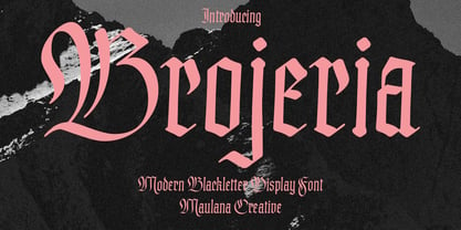 Bojeria is a Classic modern Blackletter font. With medium high contrast stroke and smooth edges, fun character with a bit of ligatures and alternates. To give you an extra creative work. Bojeria font support multilingual more than 100+ language. This font is good for logo design, Social media, Movie Titles, Books Titles, a short text even a long text letter and good for your secondary text font with sans or serif. Make a stunning work with Bojeria font. Cheers, Maulana Creative
 - Hillstown by Letterhend,
$13.00 Hillstown Font Family is a font collection that contains three different styles that will perfectly complement each other. You will get script, sans, and condensed sans in a clean and aged version for each style. The classic feel is really perfect when you need a typeface for a logotype, apparel, invitation, branding, packaging, advertising, and more. Hillstown comes in uppercase, lowercase, with punctuations, symbols and numerals, 09 stylistic set alternate, ligatures. There is multi-lingual support and Hillstown is already PUA encoded.
 - PM Alcorn by Paper Moon Type & Graphic Supply,
$17.00 A new font inspired by classic retro and mid-century modern interlocking hand-written typography. Do you need to create some fun snack packaging to stand out on the shelf? PM Alcorn will quell your appetite. Are you designing a product that needs a funky, friendly retro vibe? PM Alcorn is fun, funky, friendly, and easy to read! It's perfect for everything from games to bath products. Plus with tons of ligatures and stylistic alternates it has real hand-lettered feel.
 - Clamshell by Jafar07,
$20.00 Clamshell Modern Caligraphy Script font is a harmonious blend of elegance and contemporary flair, seamlessly adaptable to modern and classic design landscapes. It effortlessly radiates timeless elegance and is tailored to meet the needs of professionals seeking designs that are both sophisticated and versatile. Easy to use yet rich in detail, this font is the ideal choice for designers who value both beauty and functionality in their work. Explore this font collection now and infuse your designs with the captivating essence of calligraphy.
 - Rosiana by Arterfak Project,
$24.00 Rosiana is a modern decorative serif font. Inspired by the classic typography which visualizes a bright shade that feels good to apply to your design, such as magazines, cards, invitations, labels, logo, logotypes, books, packaging, and more! Designed with high contrast and soft-sharp serif that looks strong and confident as a display. Equipped with 200+ special characters and ligatures to beautify your typographic design. Font featured: Uppercase Lowercase Numbers Symbol Accented characters ÞþßÀÁÂÃÄÅÆÇÐĐÈÉÊËÌÍÎÏŁÑÒÓÔÕÖØŒŠÙÚÛÜŸÝŽàáâãäåæçđèéêëìíîïłñòóôõöøœšùúûüýÿž ĀāĆćĈĉČčĎďĒēĚěĜĝĤĥĨĩĪīĴĵŃńŇňŌōŔŕŘřŚśŜŝŞşŢţŤťŨũŪūŮůŴŵŶŷŹźẀẁẂẃẄẅĹ徼 Stylistic alternates Stylistic set 01-11 Ligatures
 - Chinta Retro Font by Khoir,
$15.00 Launched Chinta, new serif type modern fonts wrapped in a soft classic touch combined with crooked and crooked alternative fonts, will make it one of the conveniences to explore various types of designs. With a soft touch but does not leave an elegant impression, this font is suitable for using logos, food design, weddings, branding needs, posters, emblems, advertising and much more. so what are you waiting for? FEATURES CHINTA ONE CHINTA TWO So what are you waiting for? immediately purchase this font.
 - Brittania by Atharuah Studios,
$18.00 Introducing the Brittania! Classic script font that shows beauty and balance in every letter that is displayed. The font files include uppercase, lowercase, numbers, punctuation, and multilingual support. Brittania also adds a beginning and ending swash to beautify each of your projects. You can access it in every lowercase alternative. That's it! I hope you enjoy it. Feel free to comment if there are issues or queries. You can also say hello to me on Instagram: https://www.instagram.com/atharuah_ Thank You!
 - Roundica by Fontease,
$20.00 Roundica is a modern geometric typeface inspired by both classic typefaces of the 20th century like Avantgarde, Bauhaus, Futura, Helvetica and some modern fonts such as Abeat By Kai, Comfortaa, Gotham. Started in 2018 Roundica is the main reason for the appearance of Fontease Type Foundry. With its 834 glyphs Roundica includes extended Latin language support, but also Cyrillic and Greek. Designed with OpenType features like ligatures, fractions, small capitals etc., Roundica is perfectly suited for graphic design and any display use.
 - Chutpen by Graphicfresh,
$9.00 Introducing our Handwriting Font Editorial: a classic yet modern and elegant typeface inspired by the charm of hand drawn letters. This versatile font is perfect for adding a touch of sophistication to your magazine layouts. With its meticulously crafted curves and stylish strokes, our Handwriting Font Editorial will elevate your designs and captivate your readers, making it an essential tool for any editorial project. Embrace the artistry of handwritten fonts and bring a timeless appeal to your publications with our Font.
 - Byronic by Alan Meeks,
$30.00 Byronic is soft modern sans-serif but with an antique style lower-case. The rounded end soft look gives Byronic a friendly soft look whilst still retaining a classical typographic appearance. A very clean style and slightly condensed it is excellent for text setting and headline with an unusual loser case that compliments the caps perfectly. Available in a range of 5 weights and 5 italics and a Latin Pro character set of 430 characters including ranging numerals and small caps.
 - Danos by Katatrad,
$29.00 Danos is a flexible family of modern sans serif and characterized by some humanistic. It has his own unique style in expressed perfect condensed forms, inspired by the classic industrial grotesque and geometric typefaces. Danos is an ideal font family for display, text, print, user interfaces, mobile devices, branding, signage, and especially web design creation, with a set of minimal ligatures and alternative characters for your design in any layout. The family has 18 weights ranging from Thin to Black and their italic.
 - Chocolate Box Pro by CheapProFonts,
$10.00 The lowercase has classical Roman letterforms, and together with the cute, swirly capitals they make for a slightly more feminine take on the genre. Trajan lettering - with added sugar! ALL fonts from CheapProFonts have very extensive language support: They contain some unusual diacritic letters (some of which are contained in the Latin Extended-B Unicode block) supporting: Cornish, Filipino (Tagalog), Guarani, Luxembourgian, Malagasy, Romanian, Ulithian and Welsh. They also contain all glyphs in the Latin Extended-A Unicode block (which among others cover the Central European and Baltic areas) supporting: Afrikaans, Belarusian (Lacinka), Bosnian, Catalan, Chichewa, Croatian, Czech, Dutch, Esperanto, Greenlandic, Hungarian, Kashubian, Kurdish (Kurmanji), Latvian, Lithuanian, Maltese, Maori, Polish, Saami (Inari), Saami (North), Serbian (latin), Slovak(ian), Slovene, Sorbian (Lower), Sorbian (Upper), Turkish and Turkmen. And they of course contain all the usual "western" glyphs supporting: Albanian, Basque, Breton, Chamorro, Danish, Estonian, Faroese, Finnish, French, Frisian, Galican, German, Icelandic, Indonesian, Irish (Gaelic), Italian, Northern Sotho, Norwegian, Occitan, Portuguese, Rhaeto-Romance, Sami (Lule), Sami (South), Scots (Gaelic), Spanish, Swedish, Tswana, Walloon and Yapese.
 - Ornable by Casloop Studio,
$16.00 Meet Ornable Typeface, your font of choice for a captivating blend of Renaissance, Art Nouveau, Medieval, and Art Deco vibes. This single-weight typeface is designed for those seeking a font that embodies a rich tapestry of artistic nuances. With 35 meticulously crafted ligatures, Ornable ensures your text is not just seen but experienced. Dive into the charm of fractions for precise numerical representation and case-sensitive forms for a perfect interplay of uppercase and lowercase letters. Stand out effortlessly with the inclusion of a unique arrow symbol, adding a modern touch to your designs. Ornable adapts seamlessly to various themes, from the classic allure of Renaissance to the bold geometry of Art Deco. Whether you're crafting posters or logos, Ornable celebrates your creativity with sharp lines and intricate details. It's the ideal choice for projects that demand a touch of mystique and retro charm. Capture the essence of artistic movements with this typeface and step into a world where past and future converge – embrace Ornable and redefine the boundaries of your creative expression.
 - Birth Of A Hero Pro by CheapProFonts,
$10.00 A grunged-up variant of a classic font – with ultra-tight spacing (uppercase letters are mostly overlapping). Perfect for that worn but stylish look, now with hugely extended language support. ALL fonts from CheapProFonts have very extensive language support: They contain some unusual diacritic letters (some of which are contained in the Latin Extended-B Unicode block) supporting: Cornish, Filipino (Tagalog), Guarani, Luxembourgian, Malagasy, Romanian, Ulithian and Welsh. They also contain all glyphs in the Latin Extended-A Unicode block (which among others cover the Central European and Baltic areas) supporting: Afrikaans, Belarusian (Lacinka), Bosnian, Catalan, Chichewa, Croatian, Czech, Dutch, Esperanto, Greenlandic, Hungarian, Kashubian, Kurdish (Kurmanji), Latvian, Lithuanian, Maltese, Maori, Polish, Saami (Inari), Saami (North), Serbian (latin), Slovak(ian), Slovene, Sorbian (Lower), Sorbian (Upper), Turkish and Turkmen. And they of course contain all the usual “western” glyphs supporting: Albanian, Basque, Breton, Chamorro, Danish, Estonian, Faroese, Finnish, French, Frisian, Galican, German, Icelandic, Indonesian, Irish (Gaelic), Italian, Northern Sotho, Norwegian, Occitan, Portuguese, Rhaeto-Romance, Sami (Lule), Sami (South), Scots (Gaelic), Spanish, Swedish, Tswana, Walloon and Yapese.
 - Major Snafu Pro by CheapProFonts,
$10.00 Classic stencil typeface. Please note many of the letterforms come in two versions - some of the Uppercase letters are filled in while the lowercase letters are open, and there are also other variations to play with. Ten shun! ALL fonts from CheapProFonts have very extensive language support: They contain some unusual diacritic letters (some of which are contained in the Latin Extended-B Unicode block) supporting: Cornish, Filipino (Tagalog), Guarani, Luxembourgian, Malagasy, Romanian, Ulithian and Welsh. They also contain all glyphs in the Latin Extended-A Unicode block (which among others cover the Central European and Baltic areas) supporting: Afrikaans, Belarusian (Lacinka), Bosnian, Catalan, Chichewa, Croatian, Czech, Dutch, Esperanto, Greenlandic, Hungarian, Kashubian, Kurdish (Kurmanji), Latvian, Lithuanian, Maltese, Maori, Polish, Saami (Inari), Saami (North), Serbian (latin), Slovak(ian), Slovene, Sorbian (Lower), Sorbian (Upper), Turkish and Turkmen. And they of course contain all the usual "western" glyphs supporting: Albanian, Basque, Breton, Chamorro, Danish, Estonian, Faroese, Finnish, French, Frisian, Galican, German, Icelandic, Indonesian, Irish (Gaelic), Italian, Northern Sotho, Norwegian, Occitan, Portuguese, Rhaeto-Romance, Sami (Lule), Sami (South), Scots (Gaelic), Spanish, Swedish, Tswana, Walloon and Yapese.
 - Martinail by Picatype,
$12.00 Martinail Script is a contemporary romantic calligraphic typeface, a mixture of retro script and modern sans serif. get a classic and elegant touch. Can be used for various purposes.such as logos, wedding invitation, t-shirt, letterhead, signage, lables, news, posters, badges etc. To enable the OpenType Stylistic alternates, you need a program that supports OpenType features such as Adobe Illustrator CS, Adobe Indesign & CorelDraw X6-X7, Microsoft Word 2010 or later versions. How to access all alternative characters, using Windows Character Map with Photoshop: https://www.youtube.com/watch?v=Go9vacoYmBw How to access all alternative characters using Adobe Illustrator: https://www.youtube.com/watch?v=XzwjMkbB-wQ Martinail Script is coded with PUA Unicode, which allows full access to all the extra characters without having special designing software. Mac users can use Font Book , and Windows users can use Character Map to view and copy any of the extra characters to paste into your favourite text editor/app. Thanks so much for looking and please let me know if you have any questions.
 - Ellora by 99TyppeFoundry,
$10.00 Ellora , a captivating piece of typographic art, depicts a harmony between traditional elegance and modern simplicity. With a mesmerizing design, each letter is a carefully carved work of art, creating a stunning yet easily understandable appearance. The combination of sans-serif style with a human touch elevates Ellora beyond a mere set of letters. Every curve and angle is meticulously chosen to create a captivating visual harmony, making it the perfect choice for designs that prioritize clarity and elegance. With balanced letter heights and precision in every detail, Ellora establishes a timeless classical ambiance that is invaluable. It's more than just a font; it's an expression of beauty that transcends words. With each character, Ellora Humanis Typeface radiates timeless magnificence and undeniable relevance in contemporary design. As you explore each letter, you'll feel the profound artistic beauty, inviting you to reflect on the richness of aesthetics and tranquility offered by this perfect typography. Ellorai s not just a communication tool; it's a living work of art, telling its beautiful story on every page
 - Ruihant by Twinletter,
$17.00 For those of you who require a typeface with an attractive classic, retro, and vintage vibe, Ruihant Retro Condensed is the ideal option. This font was created with an original and striking look, making it ideal for all of your creative projects. Premium features like ligature, alternative, and multilingual support are included with the Ruihant, allowing you to customize the font’s design to suit your needs. This font’s straightforward and compact form will enable you to produce designs that are more well-structured and effective. Ruihant is the ideal option to boost your creative endeavors because of its distinctive style and flexibility to alter the font’s appearance. Purchase this font right away and benefit from its advantages to raise the caliber of your designs. What’s Included : - File font - All glyphs Iso Latin 1 - Alternate, Ligature - Simple installations - We highly recommend using a program that supports OpenType features and Glyphs panels like many Adobe apps and Corel Draw so that you can see and access all Glyph variations. - PUA Encoded Characters – Fully accessible without additional design software. - Fonts include Multilingual support
 - Chercán by PampaType,
$28.00 Chercán is a spirited typeface created with a delicate sense of how readability doesn't need to be dull. Chercán wears a uniquely friendly voice, and its mature design makes it highly legible in small bodies as well as in the distance. Its balanced rhythm is the result of a slow pairing of qualities found in old classics admired by Gálvez, such as Copperplate by Frederic Goudy (1905) and Antique Olive by Roger Excoffon (1962). Chercán occupies a unique place in the contemporary type design shelf, by exquisitely combining versatility and elegance. Due to the delicate grey colors it gains within long texts, Chercán is good for immersive reading, where one wants to avoid readers’ eyes fatigue. It can be a great choice for setting texts that require a slightly informal atmosphere without losing authority. Chercán is the Chilean name for the melodious little bird Troglodytes aedon usually found all across the Americas. Available in Std and Pro versions with all the usual OT features, Chercán addresses all modern needs of the demanding typographer.
 - Leaf by Journey's End,
$12.00This "Leaf" font has been swirling in my head for years - I remember my sister and I making letter formations like these when I was young. It was exciting to see the lettering look even better on paper than it did in my mind! "Leaf" surprised me by having two distinct looks: in size 24 or smaller, the look is delicate, because your eye doesn't see any space in the letters. In size 28 or larger, the eye can discern spaces, which gives a different facet to its personality. As much as I like this font when viewed on a monitor screen, it really shines when printed. The "Leaf" font is a perfect blend of quaint hand-written style mixed with crisp letter formations. This font has a very "happy" quality to it. May using it bring a little more happiness to your day! - Flanker Tanagra by Flanker,
$12.00 In order to give new imput to the art of typeface design in Italy, Nebiolo Company held, in March 1910, an artistic competition for a new alphabet conception, so the best-ranked design would be transformed into a real new typeface. 42 competitors participated and, although the first prize was not technically awarded, "Ancora" resulted as the best typeface, created by the designer-typographer Natale Varetti of Turin. Nonetheless, the new alphabet was transformed into a full-fledged metal typeface in 1924, renamed "Tanagra" in honor of the Greek city in the center of Boeotia. The new font, although not significantly detached from the classical Roman form, introduced decorative elements that allowed its use in both rational and artistic compositions. This font appears very clear and easy to read, with very high ascenders and some decorations that make it distinctly retrò. Finally, after almost 100 years, this peculiar character has been digitized taking it as a model the shapes of the 16 points size (other dimensions have significantly different contrasts and proportions). To adapt it to modern use, some glyphs have been modified, but all the originals are available as Stylistic Alternate OTF, as well as all the swashed variants while the missing ones were added.
 - Generis Slab by Linotype,
$29.00The idea for the Generis type system came to Erik Faulhaber while he was traveling in the USA. Seeing typefaces mixed together in a business district motivated him to create a new type system with interrelated forms. The first design scheme came about in 1997, following the space saving model of these American Gothics. Faulhaber then examined the demands of legibility and various communications media before finally developing the plan behind this type system. Generis’s design includes two individually designed styles; each of with is available with and without serifs, giving the type system four separate families. Each includes at least four basic weights: Light, Regular, Medium, and Bold. Further weights, small caps, old style figures, and true italics were added to each family where needed. The Generis type system is designed to meet both optical criteria and the highest possible measure of technical precision. Harmony, rhythm, legibility, and formal restraint make up the foreground. Generis combines aesthetic, technical, and economic advantages, which purposefully and efficiently cover the whole range of corporate communication needs. The unified basic form and the individual peculiarity of the styles lead to Generis’ systematic, total-package concept. The clear formal language of the Generis type system resides beneath the information, bringing appropriate typographic expression to high-level corporate identity systems, both in print and on screen. The condensed and aspiring nature of the letterforms allows for the efficient setting of body copy, and the economic use of the page. A range of accented characters allows text to be set in 48 Latin-based languages, offering maximal typographic free range. This previously unknown level of technical and design execution helps create higher quality typography in all areas of corporate communication. Optimal combinations within the type system: Generis Serif or Generis Slab with Generis Sans or Generis Simple. - Generis Serif by Linotype,
$29.00The idea for the Generis type system came to Erik Faulhaber while he was traveling in the USA. Seeing typefaces mixed together in a business district motivated him to create a new type system with interrelated forms. The first design scheme came about in 1997, following the space saving model of these American Gothics. Faulhaber then examined the demands of legibility and various communications media before finally developing the plan behind this type system. Generis’s design includes two individually designed styles; each of with is available with and without serifs, giving the type system four separate families. Each includes at least four basic weights: Light, Regular, Medium, and Bold. Further weights, small caps, old style figures, and true italics were added to each family where needed. The Generis type system is designed to meet both optical criteria and the highest possible measure of technical precision. Harmony, rhythm, legibility, and formal restraint make up the foreground. Generis combines aesthetic, technical, and economic advantages, which purposefully and efficiently cover the whole range of corporate communication needs. The unified basic form and the individual peculiarity of the styles lead to Generis’ systematic, total-package concept. The clear formal language of the Generis type system resides beneath the information, bringing appropriate typographic expression to high-level corporate identity systems, both in print and on screen. The condensed and aspiring nature of the letterforms allows for the efficient setting of body copy, and the economic use of the page. A range of accented characters allows text to be set in 48 Latin-based languages, offering maximal typographic free range. This previously unknown level of technical and design execution helps create higher quality typography in all areas of corporate communication. Optimal combinations within the type system: Generis Serif or Generis Slab with Generis Sans or Generis Simple. - Generis Simple by Linotype,
$39.00The idea for the Generis type system came to Erik Faulhaber while he was traveling in the USA. Seeing typefaces mixed together in a business district motivated him to create a new type system with interrelated forms. The first design scheme came about in 1997, following the space saving model of these American Gothics. Faulhaber then examined the demands of legibility and various communications media before finally developing the plan behind this type system. Generis’s design includes two individually designed styles; each of with is available with and without serifs, giving the type system four separate families. Each includes at least four basic weights: Light, Regular, Medium, and Bold. Further weights, small caps, old style figures, and true italics were added to each family where needed. The Generis type system is designed to meet both optical criteria and the highest possible measure of technical precision. Harmony, rhythm, legibility, and formal restraint make up the foreground. Generis combines aesthetic, technical, and economic advantages, which purposefully and efficiently cover the whole range of corporate communication needs. The unified basic form and the individual peculiarity of the styles lead to Generis’ systematic, total-package concept. The clear formal language of the Generis type system resides beneath the information, bringing appropriate typographic expression to high-level corporate identity systems, both in print and on screen. The condensed and aspiring nature of the letterforms allows for the efficient setting of body copy, and the economic use of the page. A range of accented characters allows text to be set in 48 Latin-based languages, offering maximal typographic free range. This previously unknown level of technical and design execution helps create higher quality typography in all areas of corporate communication. Optimal combinations within the type system: Generis Serif or Generis Slab with Generis Sans or Generis Simple. - Generis Sans by Linotype,
$29.00The idea for the Generis type system came to Erik Faulhaber while he was traveling in the USA. Seeing typefaces mixed together in a business district motivated him to create a new type system with interrelated forms. The first design scheme came about in 1997, following the space saving model of these American Gothics. Faulhaber then examined the demands of legibility and various communications media before finally developing the plan behind this type system. Generis’s design includes two individually designed styles; each of with is available with and without serifs, giving the type system four separate families. Each includes at least four basic weights: Light, Regular, Medium, and Bold. Further weights, small caps, old style figures, and true italics were added to each family where needed. The Generis type system is designed to meet both optical criteria and the highest possible measure of technical precision. Harmony, rhythm, legibility, and formal restraint make up the foreground. Generis combines aesthetic, technical, and economic advantages, which purposefully and efficiently cover the whole range of corporate communication needs. The unified basic form and the individual peculiarity of the styles lead to Generis’ systematic, total-package concept. The clear formal language of the Generis type system resides beneath the information, bringing appropriate typographic expression to high-level corporate identity systems, both in print and on screen. The condensed and aspiring nature of the letterforms allows for the efficient setting of body copy, and the economic use of the page. A range of accented characters allows text to be set in 48 Latin-based languages, offering maximal typographic free range. This previously unknown level of technical and design execution helps create higher quality typography in all areas of corporate communication. Optimal combinations within the type system: Generis Serif or Generis Slab with Generis Sans or Generis Simple. - Digi Grotesk by Linotype,
$29.99DigiGrotesk is one of the earliest digital fonts ever created. It is intended for use in longer texts set in smaller point sizes, including dictionaries and newspaper classified ads. - Blackest by Zetafonts,
$39.00 Download PDF Specimen See Blacker and Blacker Sans , the perfect matching companions of Blackest. Blackest is an inverse contrast wedge serif typeface family, designed by Francesco Canovaro and Andrea Tartarelli as a development of the Blacker typeface designed by Cosimo Lorenzo Pancini. The classical skeleton and sharp edges of the original have been kept while bringing the contrast of the typeface in the realm of the so called “italian” or reverse-contrast typefaces. The result is a typeface family that manages to be quirky but classical, and playful without losing elegance. With its exuberance and six weights of eye-catching proportions, Blackest is perfect for display use: editorial & magazine design, poster design and logo development - but to allow its usage as a for typesetting of longer texts a text variant in two weights has been developed, with less contrast, looser spacing, and high readability. Blackest features an extended character set that covers over 220 languages using the Latin alphabet, as well as Russian Cyrillic. Open type features include small caps, positional figures, alternate letter forms, stylistic sets, arrows and extra punctuation and discretionary ligatures.
 - Alter Headletter by Alter Littera,
$25.00 This is Alter Littera’s second original design. It started as an attempt at translating into roman forms the lowercase metrics of classic blackletters, in particular those of The Oldtype “Alter Gotisch” Font. Eventually, the design process led naturally to an innovative and modern re-creation of the overall forms and style of classic bold condensed letters from the early twentieth century, especially those of the “Century Bold Condensed” type from American Type Founders (ATF) Company’s American Specimen Book of Type Styles, Jersey City, 1912 (pp. 274-7) [also seen in McGrew, M. (1993), American Metal Typefaces of the Twentieth Century, New Castle: Oak Knoll Books (pp. 76-7)]. In addition to the usual standard characters for typesetting in modern Western languages, the font includes a comprehensive set of special characters, alternates, ligatures and ornaments, plus Opentype features, that can be used for creating distinctive and attractive texts with virtually unlimited variations. The glyphs are clean, smooth and definitely readable, so the font will be suitable not only for large titles and headings, but also for full text pages. Specimen, detailed character map, OpenType features, and font samples available at Alter Littera’s The Oldtype “Alter Headletter” Font Page.
 - Radio Volna by Supfonts,
$12.00 This is my new font, a classic calligraphic script, made with a thick brush. The font is super versatile and suitable for any project. You want to post on instagram? The menu in the cafe? A banner or sign on the website? It's easy! Classic never gets old, your design will always look fresh. And one more thing, this font fully supports Cyrillic! Oh Yes, this is cool news for Russian-speaking designers. Fresh font in the piggy Bank, and satisfied customers. --- Здравствуйте, друзья. Это мой новый шрифт, классическая каллиграфия толстой кистью. Шрифт супер универсальный и подойдёт для любых проектов. Хочешь пост в инстаграм? Меню в кафе? Баннер или надпись на сайт? ЛЕГКО Классика никогда не стареет, ваш дизайн будет выглядеть свежо всегда И еще одна фишка, этот шрифт полностью поддерживает кириллицу! О да, это крутая новость для русскоязычных дизайнеров. Свежий шрифт в копилку, и довольные клиенты --- Test it out below to see how it could look for your next project! Includes: Ful Cyrillic support Latin language support Uppercase and lowercase Numbers and punctuation Ligatures Check out my blog: https://www.instagram.com/zloillev pinterest.com/dmitriychirkov7