10,000 search results
(0.387 seconds)
- Verse Sans by Hubert Jocham Type,
$39.00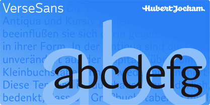 In 2006 the art director of Emotion, a women’s psychology magazine, asked me to design a copy typeface for them. Before I actually got the job I started to work on a serif. I wanted it to be feminine but still clear and modern. On one hand there are the floral round elements and on the other hand the angular serifs. In the composition I wanted the two extremes to work together. All the other elements had to be harmonized. The proportions needed to match the magazine’s requirements. The ascenders and descenders are short enough to work in narrow columns but long enough to work in small sizes. As you can imagine, the emotion-job never happened. In copy you should not get heavier than Heavy. Extrabold and Ultrabold work best in display.
 - Mallorca Dirty Numbers by TypoGraphicDesign,
$25.00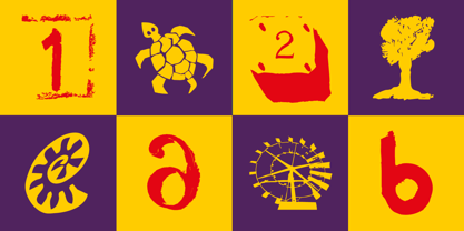 The typeface “Mallorca Dirty Numbers Vol 1” is designed for the Typo Graphic Design font foundry in 2017 by Manuel Viergutz. The playful display font is designed on holiday photos of different numbers (house numbers, graffitis, handwritten menu cards …) from Mallorca. An alphabet built with numbers. 524 glyphs with A–Z, a–z, 0–9 and 99+ decorative extras like ornaments, arrows, dingbats, emojis, symbols, geomatric shapes, catchwords, decorative ligatures (type the word “LOVE” for ❤ or “SMILE” for ☺as OpenType-Feature dlig ) and of course many many numbers (20+ stylistic sets). For use in logos, magazines, posters, advertisement plus as webfont for decorative headlines. The font works best for display size. Have fun with this font & use the DEMO-FONT (with reduced glyph-set) FOR FREE!
 - Wagon by Dirtyline Studio,
$25.00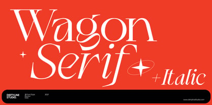 Wagon a new fresh & modern serif with a strong style, a dancing baseline! So beautiful on invitations like greeting cards, branding materials, business cards, quotes, posters, and more! Wagon Display Typeface is part of a strong and modern display family. This typeface is both impressive at display sizes and easily readable in text size, while the sharp shapes of the triangular serifs and the distinctive letter shapes show their strength in logo design and impressive editorial use. Wagon comes with elegant style, strength and contrasts, with features an extended latin character set of 415 glyphs covering over 87 languages. Wagon is ready to be like a top model on the design catwalk, making your projects look classic but contemporary, finely tuned but assertive, and elegant as the best luxury fashion.
 - Frost by Fenotype,
$35.00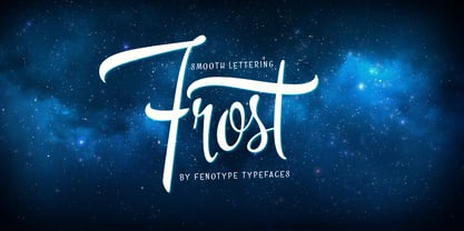 Firing Imaginations and lively connected script family of three weights, ornament and banner sets and separate caps and small caps designed to support the script. Frost is influenced by the hand lettering and sign painting of the 1950s and 1960s with more polished appearance to better suit contemporary design trends. Frost is equipped with loads of automatic ligatures to make the text better flowing and has minimum three alternatives to every basic letter: To activate the alternates click on Swash, Stylistic or Titling Alternates in any OpenType Savvy program or manually choose from even more alternate characters from the Glyph Palette. Frost is an effective and easy to use font family for creating ambitious headlines, logos & posters with a custom-made feeling. For the absolutely best price purchase the complete family!
 - XXII AwesomeScript by Doubletwo Studios,
$59.99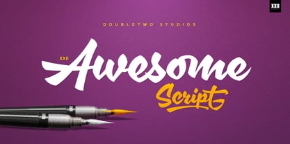 Doubletwo Studios - XXII AwesomeScript – the brush lettering font. Lettering is quite popular these days. And one thing is for sure… you are nothing without cool lettering. Here is one possibility to easily get a cool brush lettering result without calligraphic skills or any knowledge of using a brush. XXII AwesomeScript, that’s more than 1k wonderfully designed letters, ligatures and alternates which may bring a cool and individual handwritten look to your creation. This font is designed to easily create logos, headlines and text phrases within a blink of an eye. Just open your glyphs-palette* and simply chose, from up to 13 different alternates per glyph, the one that fits best for your needs. *For further information visit the Behance-Projectsite or download the pdf in the gallery.
 - Scriptissimo by Wiescher Design,
$39.50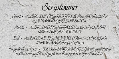 Scriptissimo is, as the name says, very much of a script! It is in the best American tradition. A script that could have served for writing the Constitution with, if only they would have had computers at that time. Scriptissimo consists of three different scripts that are meant to be used together. One is the script with the more or less plain characters. Two is the version for characters to start a word with. Three is the cut that has the characters for the end of a word. Ligatures is used for, well, ligatures and some glyphs like Ltd., GmbH, and so on. Scriptissimo is a very elegant and versatile script. It can be used for chocolate bars as well as stock certificates. I really enjoyed designing it. Yours scriptissimo, Gert Wiescher
 - Netherlands Dirty Numbers by TypoGraphicDesign,
$25.00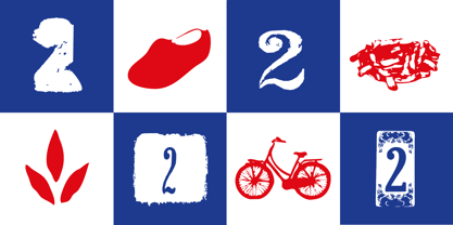 The typeface “Netherlands Dirty Numbers Vol 1” is designed for the Typo Graphic Design font foundry in 2017 by Manuel Viergutz. The playful display font is designed on holiday photos of different numbers (house numbers, graffitis, handwritten menu cards …) from the Netherlands. An alphabet built with numbers. 342 glyphs with A–Z, a–z, 0–9 and 40+ decorative extras like arrows, dingbats, emojis, symbols, geomatric shapes, catchwords, decorative ligatures (type the word “LOVE” for ❤ or “SMILE” for ☺as OpenType-Feature dlig ) and of course many many numbers (20+ stylistic sets). For use in logos, magazines, posters, advertisement plus as webfont for decorative headlines. The font works best for display size. Have fun with this font & use the DEMO-FONT (with reduced glyph-set) FOR FREE!
 - Boos by Fontex,
$29.00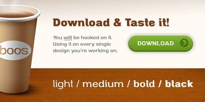 A lot of time and effort has been put into the process of creation the Boos Font. A careful analysis of the current font market and overly increasing customer needs have shaped Boos' final appearance and content. We don't have a precise target audience for Boos, since the amazing amount and structure of the chosen characters enables a very wide utilization. It will be best suited for headlines for classy magazines. It's look and feel came from a different designing approach, so that it can successfully satisfy the needs of even the neediest. Shining with calm and dignity, while in the roots being aggressive, it has successfully connected classic and modern styles - representing it's largest value. Medium, bold, black and light versions are included in the complete package, at a discounted price!
 - Pompeijana by Linotype,
$29.99Pompeijana is a part of the 1990 collection Type before Gutenberg 2’, which includes twelve contemporary typefaces each representative of a particular era. Pompeijana is Adrian Frutiger’s contribution to the project Type before Gutenberg’. He based the forms of this capital typeface on the writing of the Romans in Pompei. The decorative look of the alphabet is achieved by purely graphic means, placing the emphasis of the top and foot of the letters with heavy horizontals and diamond-shaped serifs. Frutiger completed his typeface with the weight Borders, a font consisting of numerous ornaments true to the style of the alphabet. The ornaments can be combined to form different borders and offer an optimal addition to the elegant Pompeijana. Pompeijana is best combined with modern sans serif typefaces. - The Penyet by Twinletter,
$12.00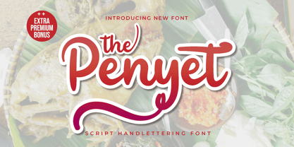 This font is created with original hand drawn strokes for a relaxed, beautiful and elegant impression. This font also offers beautiful abstract typographic harmony for a wide variety of design projects, including natural handwriting in digital form for designs, quote designs, for social media business designs, advertisements, trademarks, promotional banners, posts, posters, signatures, and all designs require handwriting or whatever design you want. This font is equipped with uppercase, lowercase, numbers, punctuation marks, swhases and several variations on each character including multi-language. This font is best suited for open type friendly applications. How to get alternative glyphs from open type fonts: http://adobe.ly/1m1fn4Y PUA Character Code - Fully accessible without additional design software. We hope you enjoy this font. Feel free to send whatever message you want to convey.
 - Not My Type by It's me Simon,
$14.00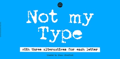 If you want your design to have that nostalgic typewriter effect, Not my Type would be perfect. It's old-fashioned and retro—letters are worn and grungy like it needs a new ink ribbon. Some of the letters are misaligned—just like a real old typewriter. It is best used at smaller sizes, perfect for logos, headlines, covers and any design where you want that vintage look and feel. Each letter has two alternatives, making three in total. Using the alternative letters, you can make your type layouts look more random, like a real typewriter. You can manually set the alternatives via the glyphs panel in your design software or you can enable them automatically. If you enable contextual alternatives in your design application, the letters will change automatically as you type.
 - Soto by Thinkdust,
$10.00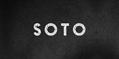 A grungy, blocky, sans-serif font, Soto has one goal: get the message across. Saying it plain and simple, in a way that no-one can misunderstand, Soto’s very slight angles and thick style carry a weight and impact that make it stand out. With the textured finish it even jumps out from the backgrounds it’s placed on, so you can make use of the contrast to draw people in. Soto is best used in headlines and announcements that want to get their message across in an interesting and quick way. Stand out from the crowd and make people want to read what you’re writing by using a font like Soho to shout it out. If you like Soto but you're not feeling the grunge texture, then check out Ebisu.
 - Bouba Round by HVD Fonts,
$40.00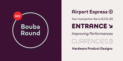 Bouba Round is more than it seems on first sight. It combines the best of two worlds, having an expressive character with its round and friendly shapes and performing great in every typographic aspect. The type family is a true workhorse, ready for serious typography. Creating a round typeface with a great reading experience has been our guiding principle throughout the design process — Bouba Round needed to work in small sizes and long text as well as in Headlines. To ensure a great reading experience in most languages, Bouba Round has a huge language support including nearly all latin based languages, Greek and Cyrillic. On top of an extensive language support, Bouba Round is loaded with a lot of icons, arrows and graphic elements for modern UI/UX design.
 - Nougat Script by Sudtipos,
$59.00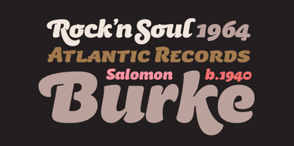 The first glyphs of Nougat Script were born in 2010 to honor the birth of my first chubby and charming daughter, Siena. The ongoing project with significant progress was presented at Tipos Latinos, the biennal of Latin America typography where Nougat Script was selected among 70 of the best fonts. After a long pause, the project had a powerful restart at the begining of 2018. In those days, it not only grew in number of signs but in complexity of behavior. There are 4 different types of writing within the same font file accesible via opentype features: Script (base or normal), two glyphic alternatives with well differentiated swashes and finally a small cap version. Nougat Script has a fresh and relaxed lettering attitude combined with the typographic harshness for elegant text compositions.
 - Millie by Kyle Wayne Benson,
$10.00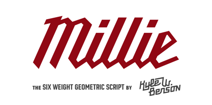 Millie is a stressed, geometric script who spends her days as industrial lettering and her nights paired with blackletter on the patches of motorcycle gangs. Millie was weighted by the conventions of broad nib calligraphy, inspired by the Milwaukee Tools logo, and finds herself best used in logos and titles. She was designed to be used on about a 20 degree angle, though she looks just fine on a level plane. By using opentype, many ligatures, and two sets of stylistic alternates, Millie was developed to look great with any string of letters. Access the first stylistic set for a disconnected script look, and the second set for even more connections and fluid script than standard. Millie Round takes the edge off a bit, giving the entire set a more approachable and versatile feel.
 - Delectables by ITC,
$29.99A former lettering artist at Hallmark Cards, Rob Leuschke now has his own thriving design businesses, Alphabytes and the new TypeSETit. Growing up in St Charles, Missouri, where he still lives, Rob showed great artistic promise at an early age. He earned a BFA in graphic design at the University of Missouri at Columbia. After graduation, his stint at Hallmark Cards gave him the opportunity to learn from and work with some of the best lettering artists in the industry. Rob struck out on his own in 1987 and now boasts a long list of clients from all over the world. Rob has created over 250 custom typefaces, and his work has been exhibited in New York. Ambiance BT is Rob’s first typeface published by Bitstream, with more to follow. - Blumen by Kaer,
$21.00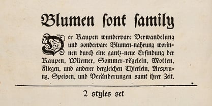 This font family based on vintage German book called “Der Raupen wunderbare Verwandlung und sonderbare Blumennahrung.” by Merian, Maria Sibylla and printed in Frankfurt am Mayn in 1683. I manually redesign initials and regular style fonts from this folio. Also, I’ve added some modern symbols. I'm happy to present to you my new font family. Blumen font family has Initials and Regular styles. It's all you need to precisely imitate medieval style text. Use Drop cap style as a decorative element at the beginning of a paragraph or section, other part of the paragraph should be in Regular style. You’ll get: * Initials & Regular styles * Uppercase and lowercase * Multilingual support * Numbers * Symbols * Punctuation * Ligatures Please feel free to request any help you need: kaer.pro@gmail.com Best, Roman. Thank you!
 - Bally by Studio&Story,
$19.00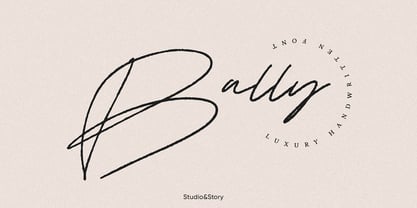 Bally is is a hand-written Script font ,It's a mix between a luxurious and fashionable, Combining texture and movement it creates a readable and clear message. Bally can work as a signature font but also understandable for longer texts like classic script font. The inspiration was minimalism so it could work best with any of your projects. Created for beautiful logos, Branding projects, Posters, Blog posts, Social media, Campaigns, Advertising, Web design and more! Here is what you get : bally • A hand-made script font containing upper & lowercase characters, numerals and large range of punctuation. superfast Include multilingual support: English, Italian, French, Polish, German, Swedish, Spanish, Danish, Dutch, Portuguese, Norwegian, Malaya, Indonesian, Finnish, Filipino. Malaya . feel free to send me a message ;) Studio&Story Instagram! https://bit.ly/2Di49cv :) Thank you!
 - Turmus MF by Masterfont,
$59.00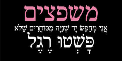 This type family is a revival of the old and famous Frank Rühl from 1924. With less contrast the 2 weights make it more readable and pleasant to the eye too. OpenType Pro Excellent support for Niqqud (Vowels). All marks are programmed to fit each glyph's shape and width. OpenType Pro includes new advanced features like Dagesh Hazak, ShevaNa, Qamatz Katan, Holam Haser and wide letters. Best used with Adobe InDesign CC that support complex Hebrew text. Please check these advanced features in this link: https://tinyurl.com/ybgdsxme Font files were re-generated to get better online screen display, as well as refined OpenType features as kerning glyph substitution. Please be aware of minor changes that might impact page layouts done with older fonts' versions. So be careful.
 - Martin by profonts,
$41.99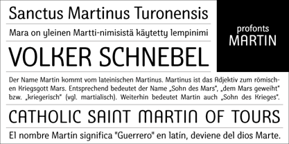 Martin, a condensed semi-serif with rounded edges and friendly serifs, shows its charme best in short, pointed sentences, in headlines set in about 20 to 36 p. The playing with serifs in a condensed, very characteristic type design is attractive and the technical skill is convincing. More styles are planned. The idea was to try to apply a given design criteria (also see Volker Schnebel's Marita and Manuel fonts) to every single character. In other words, start with a character and develop all of the others from it. This is quite easy for some characters but extremely difficult for others. This process generates creativity and the characters move away from the initial constructed sketch. Together in a typeface, the individual characters are now all of a piece and character.
 - Shaky Kane by Comicraft,
$39.00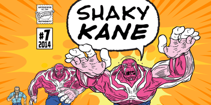 He sees you! He can see everything YOU do! He wears X-Ray Spex! He glows in the dark! Top Pop Cult Comic Artist Shaky Kane pushes at the limits of taste, dragging a scalpel down the veil of your illusions to make you see the world as it really is, as HE sees it. You've wondered at his work in the pages of ELEPHANTMEN! THE BULLETPROOF COFFIN! CAP'N DINOSAUR! THAT'S BECAUSE YOU'RE A ROBOT! MONSTER TRUCK and DEADLINE! You've worn the HATEFUL DEAD t-shirt and drawn blood with the SHAKY KANE FAN CLUB pins. Now Shaky Kane isn't just a disaffected punk rock way of looking at the world, it's a font too. A little Shaky, a little Stirred, best served with a purple eyeball spiked on a cocktail stick.
 - The Philosopher Script by Colllab Studio,
$19.00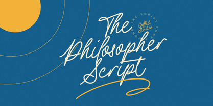 "Hi there, thank you for passing by. Colllab Studio is here. We crafted best collection of typefaces in a variety of styles to keep you covered for any project that comes your way! The Philosopher Script is a different take on what a monoline script should be. It’s not like anything else out there and it works in any context The conciseness of The Philosopher Script makes it well-suited not just for those seeking a new direction in design, but also for anyone producing art, looking to add their own style. Professional design and smoothed curves that are inherently better than a standard font. It comes with a vast array of ligatures, alternates, and many other helpful glyphs not found in any other typeface A Million Thanks Colllab Studio www.colllabstudio.com
 - Burnley by Putracetol,
$24.00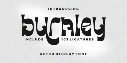 Introducing Burnley, a bold and groovy retro display font that exudes a clean and unique vibe. With its retro feel, Burnley comes equipped with beautiful ligatures, tons of alternative glyphs, and multilingual support, making it a highly versatile font that looks great both in large and small sizes. It's perfect for creating layout designs for 60s or 70s projects. The font is packed with open type features and a wide range of alternates to help you create amazing lettering. Burnley is best used for headings, headlines, covers, posters, logos, quotes, product packaging, merchandise, social media and greeting cards, and more. The zip package includes Burnley in otf, ttf, and woff formats, and comes with a range of features, including uppercase and lowercase letters, opentype alternates and ligatures, numbers, punctuation and symbols, and multilingual support.
 - Arabic Script by Kaer,
$22.00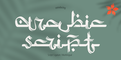 Hello! I'm happy to present you my new ethnic font family. I tried to create Latin letters font in Arabic style. Right now, you can type your text with Latin characters, and it can be read internationally. So, can you read this script? This font family consists of two font styles (regular and rough). Both of them will make an Arabic feel to every text you type using this font. I paid a lot of time for ligatures to provide flowing effect to every lettering. You can easily design Ramadan advertising, Islamic quotes posters, Arabic style greeting cards, Eastern brand logos, and others. You'll get: * Uppercase and lowercase * Mültîlíñgúãl Sùppört * Special Alternates and ligatures * Numbers * Symbols * Punctuation Please feel free to request to add characters you need: kaer.pro@gmail.com Best, Roman.
 - Ambaghy by Colllab Studio,
$19.00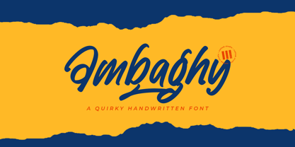 "Hi there, thank you for passing by. Colllab Studio is here. We crafted best collection of typefaces in a variety of styles to keep you covered for any project that comes your way! Ambaghy is a goofy font that's elevated by its posh, handwritten style. It will spice up your designs and add a unique feel to your design and it just might be the secret ingredient you've been missing. We've spent years honing our craft to create the most unique and original fonts like Ambaghy. We were inspired by the wild creativity that flows from our hands, and we want to share that inspiration with you. Ambaghy works great for logos and headlines, and also works well in text blocks of body copy. A Million Thanks Colllab Studio www.colllabstudio.com
 - African Gold by Scholtz Fonts,
$19.00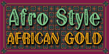 The name African Gold is associated with Johannesburg, the "City of Gold"; (the Zulu name for Johannesburg is eGoli). The font was so named for two reasons: the intricate African patterns within the characters of the font suggest the shafts and tunnels of a gold mine, and, as with a gold mine, the richness lies within. African Gold is a display font that is best used at larger sizes, however, it contains a full character set with all accents, special characters, diacritical marks and all the characters are carefully spaced and kerned. The numerals are mono-spaced so that they will line up correctly in columns of figures. The letters of the alphabet are spaced according to their width and are carefully kerned to create an attractive appearance.
 - Summer of Love by Mysterylab,
$14.00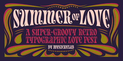 It's the Summer of Love all over again with this groovy psychedelic font. Designed in 2019, this typeface harks back to the carefree days of the late 1960s. Whimsical and offbeat with its swaying verticals, it nonetheless remains one of the more legible reimaginings of the genre, sporting all of the handlettered vibe of posters and album covers from the original hippie era, but with polished color and weight that evens out the legibility even at relatively small point sizes. Predominantly a unicase font, with a couple of alternate glyphs from upper to lowercase, Summer of Love works best as a large headline face, and benefits greatly from twisting and morphing the type blocks as was common during the original psych era. It's a real groove machine, baby.
 - Just Be by Roland Hüse Design,
$12.00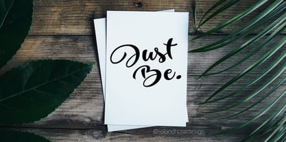 JUST BE is a playful brush script. Perfect for titles, headings and logotypes for blogs, ads, quote prints, home decor, book title, invitation, birthday, custom product, lifestyle imagery (like quotes and stuff). Character set contains Eastern and Western European Latin accented letters. For additional customisations (for logotypes for example) please email me at contact@rolandhuse.com You MAY NOT sell this font or claim them as your own. You MAY NOT edit or rename this font. You MAY NOT redistribute this font. Thank you I hope you like this font & good luck with your project! Roland Instagram: @rolandhusedesign Background images of "Just Be" main poster by Annie Spratt from unsplash https://unsplash.com/@anniespratt "Your best moments in life are ahead" by Helena Hertz https://unsplash.com/@imperiumnordique paper bag mock up by Graphic Burger https://graphicburger.com"
 - Swingset by Twinletter,
$12.00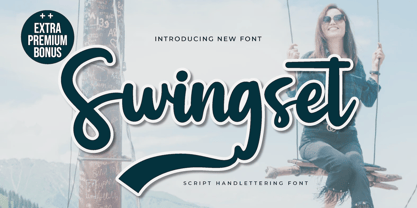 This font is created with original hand drawn strokes for a relaxed, beautiful and elegant impression. This font also offers beautiful abstract typographic harmony for a wide variety of design projects, including natural handwriting in digital form for designs, quote designs, for social media business designs, advertisements, trademarks, promotional banners, posts, posters, signatures, and all designs require handwriting or whatever design you want. This font is equipped with uppercase, lowercase, numbers, punctuation marks, swhases and several variations on each character including multi-language. This font is best suited for open type friendly applications. How to get alternative glyphs from open type fonts: http://adobe.ly/1m1fn4Y PUA Character Code - Fully accessible without additional design software. We hope you enjoy this font.Feel free to send whatever message you want to convey.Thank you Regards
 - Parochus by Kaer,
$24.00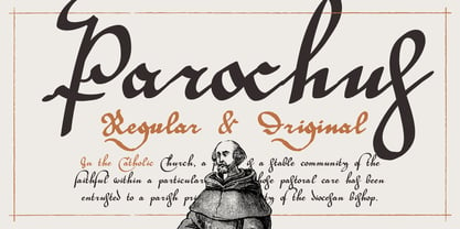 Hello! Inspiration for this beautiful script font I found in “A Source of Solace in Illness” (Trost Bronn der Kranchhen) book, published in the middle of 17th century. There was an entire on the back of the top cover: Joannes Auanger Parochus Sinchingae 1808”. That's why I named my font family Parochus. In the Catholic Church, a parish is a community of the faithful within a particular church, whose pastoral care has been entrusted to a parish priest (Latin: parochus). There are original and regular style fonts. Also, I’ve added some modern symbols. With this set, you can precisely imitate medieval style text. I designed a full uppercase and lowercase set with Multilingual support and ligatures. You'll found ß, &, Š, ę and many other beautiful glyphs. Best, Roman.
 - An Electronic Display LED LCD LED7 Seg 3 by Fortune Fonts Ltd.,
$15.00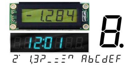 * For when you need the most realistic looking electronic display. * See User Manuals Main advantages: - Spacing between characters does not change when entering a decimal point or colon between them. - Custom characters can be produced by selecting any combination of segments to be displayed. Low cost electronic displays have a fixed number of segments that can be turned on or off to represent different symbols. A digital watch would be the most common example. Fonts typically available for depicting electronic displays are often in the artistic style of these common LED or LCD displays. They provide the look-and-feel, but fall short when technical accuracy is required. Failure to represent an accurate and consistent representation of the real thing can be a cringe-worthy experience for the product design and marketing team, or even the hobbyist for that matter. To solve this problem, Fortune Fonts has released a range of fonts that accurately depict the displays typically found on low cost electronic devices: watches, answering machines, car stereos, alarm clocks, microwaves and toys. These fonts come with numbers, letters and symbols predefined. However, they also allow you to create your own segment combinations for the custom symbols you need. When producing manuals, marketing material and user interfaces, accuracy is an all-or-nothing concept. Instructions in the user manual describe how to turn these fonts into realistic displays according to your own design, in the manner of the images above. If you cannot see a license option for your specific application, such a license may be purchased from here. By purchasing &/or using &/or distributing the fonts the buyer user and distributor (including Monotype Imaging Inc. & Monotype Imaging Hong Kong) agree to (1) indemnify & hold harmless the foundry, for any consequential, incidental, punitive or other damages of any kind resulting from the use of the deliverables including, but not limited to, loss of revenues, profits, goodwill, savings, due to; including, but not limited to, failure of the deliverables to perform it’s described function, or the deliverable’s infringement of patents, copyrights, trademarks, design rights, contract claims, trade secrets, or other proprietary rights of the foundry, distributor, buyer or other parties (2) not use the fonts to assist in design of, or be incorporated into, non-software displays
 - An Electronic Display LED LCD LED7 Seg 2 by Fortune Fonts Ltd.,
$15.00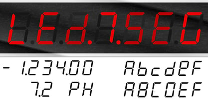 * For when you need the most realistic looking electronic display. * See User Manuals Main advantages: - Spacing between characters does not change when entering a decimal point or colon between them. - Custom characters can be produced by selecting any combination of segments to be displayed. Low cost electronic displays have a fixed number of segments that can be turned on or off to represent different symbols. A digital watch would be the most common example. Fonts typically available for depicting electronic displays are often in the artistic style of these common LED or LCD displays. They provide the look-and-feel, but fall short when technical accuracy is required. Failure to represent an accurate and consistent representation of the real thing can be a cringe-worthy experience for the product design and marketing team, or even the hobbyist for that matter. To solve this problem, Fortune Fonts has released a range of fonts that accurately depict the displays typically found on low cost electronic devices: watches, answering machines, car stereos, alarm clocks, microwaves and toys. These fonts come with numbers, letters and symbols predefined. However, they also allow you to create your own segment combinations for the custom symbols you need. When producing manuals, marketing material and user interfaces, accuracy is an all-or-nothing concept. Instructions in the user manual describe how to turn these fonts into realistic displays according to your own design, in the manner of the images above. If you cannot see a license option for your specific application, such a license may be purchased from here. By purchasing &/or using &/or distributing the fonts the buyer user and distributor (including Monotype Imaging Inc. & Monotype Imaging Hong Kong) agree to (1) indemnify & hold harmless the foundry, for any consequential, incidental, punitive or other damages of any kind resulting from the use of the deliverables including, but not limited to, loss of revenues, profits, goodwill, savings, due to; including, but not limited to, failure of the deliverables to perform it’s described function, or the deliverable’s infringement of patents, copyrights, trademarks, design rights, contract claims, trade secrets, or other proprietary rights of the foundry, distributor, buyer or other parties (2) not use the fonts to assist in design of, or be incorporated into, non-software displays
 - An Electronic Display LED LCD LED7 Seg Platz by Fortune Fonts Ltd.,
$15.00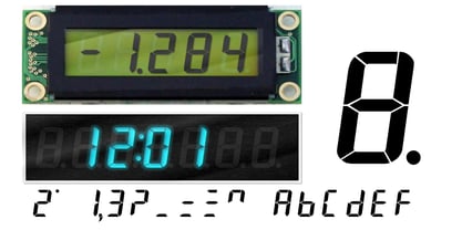 * For when you need the most realistic looking electronic display. * See User Manuals Main advantages: - Spacing between characters does not change when entering a decimal point or colon between them. - Custom characters can be produced by selecting any combination of segments to be displayed. Low cost electronic displays have a fixed number of segments that can be turned on or off to represent different symbols. A digital watch would be the most common example. Fonts typically available for depicting electronic displays are often in the artistic style of these common LED or LCD displays. They provide the look-and-feel, but fall short when technical accuracy is required. Failure to represent an accurate and consistent representation of the real thing can be a cringe-worthy experience for the product design and marketing team, or even the hobbyist for that matter. To solve this problem, Fortune Fonts has released a range of fonts that accurately depict the displays typically found on low cost electronic devices: watches, answering machines, car stereos, alarm clocks, microwaves and toys. These fonts come with numbers, letters and symbols predefined. However, they also allow you to create your own segment combinations for the custom symbols you need. When producing manuals, marketing material and user interfaces, accuracy is an all-or-nothing concept. Instructions in the user manual describe how to turn these fonts into realistic displays according to your own design, in the manner of the images above. If you cannot see a license option for your specific application, such a license may be purchased from here. By purchasing &/or using &/or distributing the fonts the buyer user and distributor (including Monotype Imaging Inc. & Monotype Imaging Hong Kong) agree to (1) indemnify & hold harmless the foundry, for any consequential, incidental, punitive or other damages of any kind resulting from the use of the deliverables including, but not limited to, loss of revenues, profits, goodwill, savings, due to; including, but not limited to, failure of the deliverables to perform it’s described function, or the deliverable’s infringement of patents, copyrights, trademarks, design rights, contract claims, trade secrets, or other proprietary rights of the foundry, distributor, buyer or other parties (2) not use the fonts to assist in design of, or be incorporated into, non-software displays
 - An Electronic Display LED LCD LED7 Seg dots 2 by Fortune Fonts Ltd.,
$15.00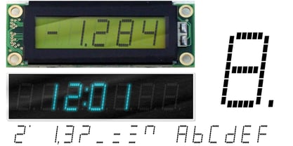 * For when you need the most realistic looking electronic display. * See User Manuals Main advantages: - Spacing between characters does not change when entering a decimal point or colon between them. - Custom characters can be produced by selecting any combination of segments to be displayed. Low cost electronic displays have a fixed number of segments that can be turned on or off to represent different symbols. A digital watch would be the most common example. Fonts typically available for depicting electronic displays are often in the artistic style of these common LED or LCD displays. They provide the look-and-feel, but fall short when technical accuracy is required. Failure to represent an accurate and consistent representation of the real thing can be a cringe-worthy experience for the product design and marketing team, or even the hobbyist for that matter. To solve this problem, Fortune Fonts has released a range of fonts that accurately depict the displays typically found on low cost electronic devices: watches, answering machines, car stereos, alarm clocks, microwaves and toys. These fonts come with numbers, letters and symbols predefined. However, they also allow you to create your own segment combinations for the custom symbols you need. When producing manuals, marketing material and user interfaces, accuracy is an all-or-nothing concept. Instructions in the user manual describe how to turn these fonts into realistic displays according to your own design, in the manner of the images above. If you cannot see a license option for your specific application, such a license may be purchased from here. By purchasing &/or using &/or distributing the fonts the buyer user and distributor (including Monotype Imaging Inc. & Monotype Imaging Hong Kong) agree to (1) indemnify & hold harmless the foundry, for any consequential, incidental, punitive or other damages of any kind resulting from the use of the deliverables including, but not limited to, loss of revenues, profits, goodwill, savings, due to; including, but not limited to, failure of the deliverables to perform it’s described function, or the deliverable’s infringement of patents, copyrights, trademarks, design rights, contract claims, trade secrets, or other proprietary rights of the foundry, distributor, buyer or other parties (2) not use the fonts to assist in design of, or be incorporated into, non-software displays
 - An Electronic Display LED LCD LED7 Seg dots1 by Fortune Fonts Ltd.,
$15.00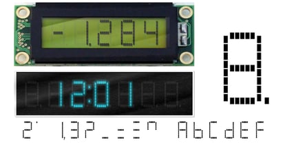 * For when you need the most realistic looking electronic display. * See User Manuals Main advantages: - Spacing between characters does not change when entering a decimal point or colon between them. - Custom characters can be produced by selecting any combination of segments to be displayed. Low cost electronic displays have a fixed number of segments that can be turned on or off to represent different symbols. A digital watch would be the most common example. Fonts typically available for depicting electronic displays are often in the artistic style of these common LED or LCD displays. They provide the look-and-feel, but fall short when technical accuracy is required. Failure to represent an accurate and consistent representation of the real thing can be a cringe-worthy experience for the product design and marketing team, or even the hobbyist for that matter. To solve this problem, Fortune Fonts has released a range of fonts that accurately depict the displays typically found on low cost electronic devices: watches, answering machines, car stereos, alarm clocks, microwaves and toys. These fonts come with numbers, letters and symbols predefined. However, they also allow you to create your own segment combinations for the custom symbols you need. When producing manuals, marketing material and user interfaces, accuracy is an all-or-nothing concept. Instructions in the user manual describe how to turn these fonts into realistic displays according to your own design, in the manner of the images above. If you cannot see a license option for your specific application, such a license may be purchased from here. By purchasing &/or using &/or distributing the fonts the buyer user and distributor (including Monotype Imaging Inc. & Monotype Imaging Hong Kong) agree to (1) indemnify & hold harmless the foundry, for any consequential, incidental, punitive or other damages of any kind resulting from the use of the deliverables including, but not limited to, loss of revenues, profits, goodwill, savings, due to; including, but not limited to, failure of the deliverables to perform it’s described function, or the deliverable’s infringement of patents, copyrights, trademarks, design rights, contract claims, trade secrets, or other proprietary rights of the foundry, distributor, buyer or other parties (2) not use the fonts to assist in design of, or be incorporated into, non-software displays.
 - An Electronic Display LED LCD LED14 Seg 1 by Fortune Fonts Ltd.,
$15.00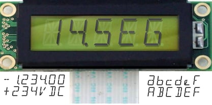 * For when you need the most realistic looking electronic display. * See User Manuals Main advantages: - Spacing between characters does not change when entering a decimal point or colon between them. - Custom characters can be produced by selecting any combination of segments to be displayed. Low cost electronic displays have a fixed number of segments that can be turned on or off to represent different symbols. A digital watch would be the most common example. Fonts typically available for depicting electronic displays are often in the artistic style of these common LED or LCD displays. They provide the look-and-feel, but fall short when technical accuracy is required. Failure to represent an accurate and consistent representation of the real thing can be a cringe-worthy experience for the product design and marketing team, or even the hobbyist for that matter. To solve this problem, Fortune Fonts has released a range of fonts that accurately depict the displays typically found on low cost electronic devices: watches, answering machines, car stereos, alarm clocks, microwaves and toys. These fonts come with numbers, letters and symbols predefined. However, they also allow you to create your own segment combinations for the custom symbols you need. When producing manuals, marketing material and user interfaces, accuracy is an all-or-nothing concept. Instructions in the user manual describe how to turn these fonts into realistic displays according to your own design, in the manner of the images above. If you cannot see a license option for your specific application, such a license may be purchased from here. By purchasing &/or using &/or distributing the fonts the buyer user and distributor (including Monotype Imaging Inc. & Monotype Imaging Hong Kong) agree to (1) indemnify & hold harmless the foundry, for any consequential, incidental, punitive or other damages of any kind resulting from the use of the deliverables including, but not limited to, loss of revenues, profits, goodwill, savings, due to; including, but not limited to, failure of the deliverables to perform it’s described function, or the deliverable’s infringement of patents, copyrights, trademarks, design rights, contract claims, trade secrets, or other proprietary rights of the foundry, distributor, buyer or other parties (2) not use the fonts to assist in design of, or be incorporated into, non-software displays
 - AF LED7Seg 1 by Fortune Fonts Ltd.,
$15.00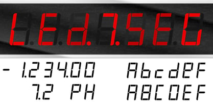 * For when you need the most realistic looking electronic display. * See User Manuals Main advantages: - Spacing between characters does not change when entering a decimal point or colon between them. - Custom characters can be produced by selecting any combination of segments to be displayed. Low cost electronic displays have a fixed number of segments that can be turned on or off to represent different symbols. A digital watch would be the most common example. Fonts typically available for depicting electronic displays are often in the artistic style of these common LED or LCD displays. They provide the look-and-feel, but fall short when technical accuracy is required. Failure to represent an accurate and consistent representation of the real thing can be a cringe-worthy experience for the product design and marketing team, or even the hobbyist for that matter. To solve this problem, Fortune Fonts has released a range of fonts that accurately depict the displays typically found on low cost electronic devices: watches, answering machines, car stereos, alarm clocks, microwaves and toys. These fonts come with numbers, letters and symbols predefined. However, they also allow you to create your own segment combinations for the custom symbols you need. When producing manuals, marketing material and user interfaces, accuracy is an all-or-nothing concept. Instructions in the user manual describe how to turn these fonts into realistic displays according to your own design, in the manner of the images above. If you cannot see a license option for your specific application, such a license may be purchased from here. By purchasing and/or using and/or distributing the font, the buyer, user and distributor (including Monotype Imaging Inc. & Monotype Imaging Hong Kong) agrees to (1) indemnify and hold harmless the font foundry and neither the font foundry nor distributor is responsible to the buyer or user or any other party for any consequential, incidental, special, punitive or other damages of any kind resulting from the use of the deliverables including, but not limited to, loss of revenues, profits, goodwill, savings or expected savings, due to; including, but not limited to, failure of the deliverables to perform it’s described function, or the deliverable’s infringement of patents, copyrights, trademarks, design rights, contract claims, trade secrets, or other proprietary rights of the foundry, distributor, buyer or other parties, (2) not use the fonts to assist in design of, or be incorporated into, non-software displays.
 - Antique Tuscan No 9 by HiH,
$8.00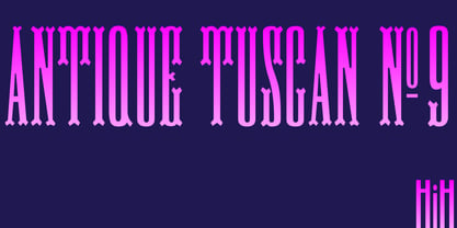 Antique Tuscan No.9 was one of the earlier wood-type designs by William Hamilton Page. It was first shown among the specimens produced in 1859, shortly after Page entered into a new partnership with Samuel Mowry, owner of the Mowry Axle Company. The new company was named Page and Company and was located at the Mowry facility in the Greenville section of Norwich, Connecticut. Antique Tuscan No.9 is an extra-condensed version of the tuscan style that had been released in moveable type by Vincent Figgins of London in 1817 and had become so popular for advertising in the intervening years. Because of the extreme compression in the design, we might be tempted to describe it as "Triple-X," but that might be misleading. The analogy would, of course, be to clothing sizes, not movie ratings. Because of the compression, this typeface reads best when set extra-extra-extra large. For printing, we recommend 36 points or larger. For the screen, we suggest at least 72 points. An unusual and distinctive design, it is best used with discretion. If I were doing a term paper for school or submitting an article to a magazine for publication, I might use it for the title page, to grab someone’s attention. I would certainly not use it for the main body of text - not if I expected anyone to read what I wrote. If you wonder why we make this recommendation, take the Ten-Point challenge. Print this paragraph using Antique Tuscan No.9 and set the font size at 10 points. If you are young and blessed with good eyesight, you will probably be able to read it - with effort. So, here is the challenge: hand it to your Grandmother and ask HER to read it.
 - FranciscoLucas Briosa - Unknown license

- FranciscoLucas Llana - Unknown license


