10,000 search results
(0.029 seconds)
- LOLO Animals by Okaycat,
$24.50Ready for the wild & wooly world of LOLO Animals? These animals are happy to explore new habitats with you. There are more than 50 different animals residing in here, its a full out ecosystem. Looking for specific animals? Check out the keyword list above, for an idea of what kind of animals are included, or see the full character map to meet them up close & personal. Each vector illustration was developed by Luke Turvey, a professional artist, who's nature-themed art has appeared in exhibitions in Montreal, Tokyo, & N.Y.C. LOLO Animals are a great help, whenever you need some cool looking animals. LOLO Animals is a fully extended character set, with animals stampeding all over the alternate spots that are typically reserved for the West European diacritics & ligatures. You never know what you might find stomping around in there. - Canadian Animals by Okaycat,
$29.50 Canadian Animals is a picture font with highly detailed illustrations drawn by hand. Comes in outline and silhouettes, it is easy to colour in photoshop. These detailed vector illustrations will help you create your ultimate design.
 - Gans Animals by Intellecta Design,
$19.90 A collection of animal drawings in font format. A great set of type dingbats in the genre of farm animals and more. See also other font families inspired by Gans' original typefaces: Gans Tipo Adorno, Gans Lath Modern, Gans Titular Adornada, Gans Ibarra, Gans Antigua, Gans Antigua Manuscrito, Gans Fulgor, Gans Radio Lumina, Gans Carmem Adornada, Gans Italiana, and Gans Titania.
 - Wildlife Animal by Trim Studio,
$15.00 **Wildlife Animal** a sharp and cutting-edge typeface that perfectly captures the spirit of the forest and the wild. Ideal for Easter Day designs, this font boasts a cute and playful style that's sure to delight. Whether you're creating invitations, greeting cards, or posters, "Wildlife Animal" will help your text stand out with its unique and eye-catching design. With its forest-inspired theme and playful, yet sharp style, this font is perfect for adding a touch of nature to your designs. Download "Wildlife Animal" today and take your Easter Day designs to the next level! --- File Include: - Wildlife Animal otf - Wildlife Animal ttf - Wildlife Animal woof - Readme.pdf Thank you for let us be your design partner, If you have any questions please don't **hesitate** to drop me a message
 - Faltura Animals by Mans Greback,
$59.00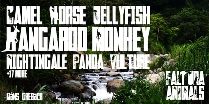
- Pretty Animal by Sronstudio,
$12.00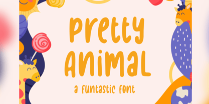 Pretty Animal is a handwritten font, this font Is perfect for logo, social media posts, advertisements, product packaging, product designs, label, photography, watermark, special events or anything. Pretty Animal comes with uppercase and lowercase letters, multilingual symbols, numerals, punctuation.
 - Fox Animal by Fox7,
$12.00 Fox Animal is a bold and playful Slab Serif Fonts that adds a captivating and energetic touch to your designs. Its main feature is its vibrant and expressive design, allowing you to create attention-grabbing headlines, t-shirt typography, banners, product labels, and more with its versatility and eye-catching presence.
 - Animal Silhouettes by Intellecta Design,
$10.90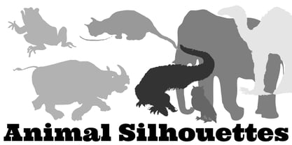
- Polytype Animals by Prime Graphics,
$45.00 - Animal Hunter by JK Typeface,
$60.00 This unique font is characterized by the presence of only one sharp serif, skillfully positioned to give it an aggressive and distinctive appearance. This typographic singularity seamlessly blends the minimalism of sans-serif fonts with the visual intensity of a serif, resulting in a design that will undoubtedly catch the eye and make your message stand out.
 - Just Animals by Outside the Line,
$19.00 Just Animals… is just really cute. 34 animals – monkey, frog, bear, sheep, tiger, leopard, lion, cat, dog, horse, cow, penguin, birds, ducks, snake, bunny, ladybug, dragonfly, fish, shark, turtle, pig, mouse, hippo, elephant, giraffe and a deer. Think scrapbooking or kid’s party invitations. Lots of cuteness, lots of uses.
 - Black Animal by sizimon,
$15.00 Black Animal is handmade brush style font. Very cool for logos, product packaging, merchandise, social media & branding. And very easy to use to design t-shirts and other products. It contains a full set of lower & uppercase letters, a large range of punctuation, numerals, and multilingual support. To enable the OpenType Stylistic alternates, you need a program that supports OpenType features such as Adobe Illustrator CS, Adobe Indesign & CorelDraw X6-X7.
 - Bezar - Personal use only

- Gear - Unknown license

- Gears - Unknown license

- Tear - Personal use only

- Bearz - Unknown license

- Beware - Unknown license

- Beam - Unknown license

- Gearing by Heyfonts,
$15.00 Gearing is a typeface that is widely associated with the extreme music genre of death metal. It is characterized by its dark and aggressive appearance, evoking a sense of brutality and chaos. The font is typically designed with sharp edges, bold and angular letterforms, and intricate or distorted shapes. The death metal font typically features strong upper and lowercase letter variations, often with sharp, exaggerated serifs or thorn-like spikes. These embellishments contribute to its menacing and threatening aesthetic. The letters may also have broken or damaged elements, giving them a weathered or decayed look. Though death metal fonts come in various styles and variations, they often prioritize legibility and impact over ease of reading. This means that certain parts of the letters may be missing or disconnected, making them appear jagged or incomplete. Ligatures, which are unique letter combinations, are sometimes included in the font to add a sense of continuity or artwork to the overall design. In terms of color, death metal fonts are commonly depicted in monochromatic shades such as black, grey, or dark red to maintain their sinister appearance. The color contrast often enhances the sharpness and intensity of the font, making it more visually striking. Due to its association with the underground music scene, the death metal font has become an essential element in album covers, band logos, posters, and merchandise. It effectively conveys the aggressive and rebellious spirit of the genre, becoming instantly recognizable to fans and enthusiasts.
 - Gears by Janworx,
$19.95 Gears, designed by Janet Valdez of Janworx, was inspired by the popularity of steampunk artwork, for which gears and levers are a defining element. Gears is a single bold typeface, incorporating gears and levers into each glyph in one form or another. It is intended to be used at a large size, and works well in graphics with gradient finishes, textures, and bevels. Lower case letters are uniformly understated, whereas upper case are more elaborate. This typeface is suitable for posters, screen printing, or any general graphics work that requires short words or slogans with high-impact, particularly in a steampunk theme.
 - Beats by 4RM Font,
$29.00 Inspired by street posters, this font combines the value of beauty and authenticity in its creation. and the style set feature adds variety to the anatomy of the letters, this font belongs to the display category which is suitable for use in graphic designs such as posters, billboards, and large graphic designs.
 - Beary by Balevgraph Studio,
$15.00 Beary is a stylish and modern sans serif font. You can use this font in a variety of projects to create a unique and distinctive look. The Beary font can be used anywhere without the need for opentype support. Beary fonts are available in regular, alternate, and oblique.
 - Bean by Eotype,
$14.00 Bean is unique retro condensed display font. The Bean font has extraordinary curved characteristics with a thick size. This font is suitable for modern vintage retro designs. You can use this font on posters, banners, logos, headline projects and more. This font features alternate, ligature and multilingual supports.
 - Bezar by Mans Greback,
$59.00 Bezar is a wild brush script font drawn and created by Mans Greback in 2020. A handwriting of extreme speed, this typeface will give your graphic project both the action and the character to stand out. Use it for whimsical headlines, a product logotype or anywhere where a bright-spirited, flowing script could lift the layout. Its multiple alternates and ligatures makes for a customizable, non-static typeface. Use [ ] { } _ anywhere in a word to create a swash. Example: Ham}burg The font has extensive lingual support, covering all European Latin scripts. It contains all characters you'll ever need, including all punctuation and numbers.
 - Benar by Twinletter,
$12.00 Benar is our newest san serif, and it has amazing fonts for your projects. This typeface is ideal for branding, advertising, posters, banners, packaging, headlines, magazines, websites, logo designs, banners, social media designs, and many other uses. Light, Regular, Medium, and Thick are the four available weights. It features a clean and beautiful aesthetic that can help your project appear more serene, and unique and grab the attention of the audience. of course, your various design projects will be perfect and extraordinary if you use this font because this font is equipped with a font family, both for titles and subtitles and sentence text, start using our fonts for your extraordinary projects.
 - Beat by MADType,
$21.00 Beat is a quirky OCR-inspired face with a rounded, retro-electronic feel. All of the stem weights were drawn at random, but the ensuing chaos works amazingly well.
 - Anivers by exljbris,
$- Anivers is robust and rigid, forgiving, flexible and elegant ... and also suitable for a broad use: from a stationery to a poster headline. From an intro in a magazine to a base for a logo. This OpenType font family comes in regular, italic, bold and small caps and offers supports CE languages and even esperanto.
 - Animo by Durotype,
$49.00 Animo stands out from the crowd. Animo is surprisingly legible for its outspoken personality. Many of Animo’s small details were crafted to enhance its legibility, while preserving its personality. Animo is suitable for both text and display use — for graphic design, corporate identity design, magazines, reports, editorials, web, advertising, signage, etc. Animo includes 32 fonts, 8 weights, 16 uprights, and matching italics. Animo provides nine numerical styles: lining and oldstyle figures (proportional and tabular), small cap figures, superiors, inferiors, numerators, and denominators. Animo provides small caps, arbitrary fractions, and extensive language support. Animo Alt provides a more usual shape for the ‘A’, ‘M’, ‘W’, and ‘w’. For more information about Animo, download the PDF Specimen Manual.
 - Animus by Artisticandunique,
$25.00 Animus - Serif font family - Multilingual - 6 Styles Animus is a uniquely elegant serif font family.This font provides flexibility in all your projects with its aesthetic structure, multilingual options, 6 styles and 3 weight options. You will have the opportunity to enrich the content of your projects with its elegant structure. Depending on the purpose of use in the typographic composition you will create with 6 styles; you can enrich your titles in books or magazines and your logos for branding. You can benefit form the elegant structure of standard characters in your plain text. This font comes with uppercase, lowercase, punctuation, symbols and numbers, ligatures and multilingual supports. Ideal for books and magazines, editorials, headlines, websites, packaging, logos, branding, advertising, movie titles and more. This font family can meet your needs in all creative projects, modern and classic. With this font you can create your unique designs. Have a good time.
 - Anymals by FaceType,
$10.00 Anymals are fictitious monsters from under the sea. BEWARE!!!
 - raw - Personal use only

- Pais by Latinotype,
$39.00 "País" is a contemporary and modern grotesque sans serif, inspired by the grotesques of the early 20th century, but more geometric and with a wider x-height than its referents; making it ideal for the current times. "País" comes in 2 versions, each with 9 weights, from thin to black, and matching italics, for a total of 36 fonts. The standard sans serif version is fresh, clean, and more ideally neutral. It's a perfect choice for editorial design, branding, headlines, or any other piece of graphic design. The "País Alt" version has more expressive and modern characters, with some giving it a much more playful image. It is ideal for logos, packaging, web and television use. País contains a total of 682 characters that make it possible to write in more than 200 Latin languages and basic Cyrillic.
 - Wawe by Volcano Type,
$19.00A font for all the surfers and beachboys out there! - Paz by Sudtipos,
$29.00 Paz, a squarish 4-weight industrial family, ranging from extreme hairline to black. It is ideal for editorial headlines where type plays a major role in the overall design. The fonts were designed by Ariel Di Lisio and digitized by Alejandro Paul.
 - Pax by Linotype,
$29.99Pax is clearly a didone, using Vox classification. The contrast between the thin lines and the thicker ones is noticeable, as you would expect from a didone. The basic form is relatively narrow, therefore I designed another Pax, slightly wider and darker, and called it Pax #2. Otherwise they are more or less identical. Pax is Latin for peace, on everyone's want list in 1995 - as well as every single year before and after that. Pax was released in 1995. - Raw by Device,
$29.00 Raw was designed in 2006 for Shelter, the UK homeless charity. It was originally called “Cathy”, after the film “Cathy Come Home”, which was instrumental in inspiring the founding of the charity. Now reworked with more “inkiness”, it is released as part of the Device range.
 - Pawl by The Ampersand Forest,
$20.00 Meet Pawl, an affordable 48-font squarish sans family with a little grotesque in him! Oh, you may think you’ve got him pegged at first glance, but he’ll surprise you with his versatility. AND he's just been totally refurbished from top to bottom and boy, did he need it! Pawl lives in the same visual landscape as fantastic modular superfamilies like Eurostile, Agency, Geogrotesque, Barlow, and even the great American Gothics. Unlike those faces, though, he's nimble enough to switch between looks effortlessly. Pawl is energetic, aggressive, strident, and structural. Depending on how you use him, his voice can be retro, futuristic, industrial, or sleek. He can be sober or splashy, techy or oldschool. Use his alternate characters and stylistic sets to create looks ranging from Streamline Moderne to Futurism to Brutalism to Swiss. He works from small paragraphs all the way up to monumental signage. This guy is smart and useful, with a lotta looks! How many times have you needed multiple weights, styles, and widths for your hierarchy, but standard type families were either shockingly expensive or couldn't deliver? Pawl delivers. Give him a shot!
 - Font - Unknown license

- Sharely by Arterfak Project,
$21.00 Sharely is a minimalist brush font, with a beautiful and feminine feel. Inspired by the girly style and modern-minimalist label that visualize naturality with the brush style. This font has a simple letterform either the uppercase or lowercase that emphasizes the minimalistic feel. Sharely is designed in condensed shapes which perfect for the logotype, short quote, labels, display information, merchandise, t-shirt, poster, mug, and more. This brush font also complete with some OpenType features that you can mix and match to get the more playful brush style! Fonts featured : Uppercase Lowercase Numbers Symbols & punctuation Stylistic alternates Ligatures Swashes (simply type 'underscore' and a number, eg: _1, _2, _3, etc) That's all folks! Thank you for watching.


