7,757 search results
(0.155 seconds)
- Ultras Liberi - Unknown license

- Albion's Very Old Masthead by Greater Albion Typefounders,
$15.00 Albion’s Very Old Masthead is inspired by traditional newspaper mastheads. A heavy Black Letter which brooks no argument, and can be emphatic and refined (emphatically refined?) at the same time. Very Old Masthead has been deliberately weather to suggest that it has been set with timeworn, well-used, type.
 - Ex Libris by Fenotype,
$25.00 Ex Libris is a high contrasted Flared Serif font family in two weights. Ex Libris is a display type and it’s at its best in headlines, branding, packaging or as a logotype. Try adding some extra flair with Swash, Stylistic or Titling Alternates or wield any of Ex Libris’s 33 Discretionary Ligatures when typing in caps.
 - SF Limone by Fonts66,
$16.00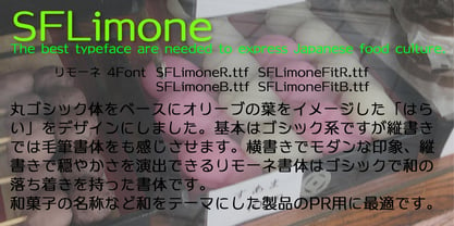 A feminine typeface with Japanese style features. 和風な特長を持った女性的な書体。 丸ゴシック体に毛筆タッチの曲線を組み合わせた、柔らかい印象が女性的でもあり、かつ和風のテイストも感じます。 和の名称や文章、カードなどに柔らかい表現にマッチします。
 - HG Soei Kakugothic by RICOH,
$199.00 HG創英角ゴシックLは、極細のゴシック体で、創英企画によるデザインです。シンプルな線で構成された現代的なゴシック体で、仮名が大きめに作られていて、全体的な印象はとても明るくカジュアルです。HG創英角ゴシックUBは、極太のゴシック体で、水本恵子氏のデザインです。仮名はHG創英角ゴシックLと比較すると小さめに設計されていて、現代的でありながらも、フォーマルさも合わせもっています。
 - SF Tenduex by Fonts66,
$18.00 Historic font that has been used for seal for a long time in Japan. 現代の丸ゴシック体をみると、そのルーツは篆書に有るような気がします。筆で書かれているのも関わらず、エレメントのけ形状はほぼ丸ゴシック体に見えます。 しかし部首などの字体かなり異なり判読しにくい文字も見られます。 そこでユニークな字体を残しつつ、分かりやすき読みやすくしたフォントがテンドゥです。 文字のキャラクターは古いイメージを感じますので歴史的なもの(地名、寺社、旅館)の名称やその説明文などに適しています。 逆に真逆の表現に使っても面白いと思います。
 - Seibi Mita by Nihon Literal,
$169.00 This typeface departs from the antiquated and orthodox image of the clerical script and offers a flat, simple design. With little trace of brushstrokes, it is a modern take on the clerical script that is often used for TV captions. 古くオーソドックスなイメージを持つ隷書体に対し、フラットでシンプルな書体を目指しました。TVテロップにも使用される、毛筆の名残を極力なくした現代風デザインの隷書体です。扁平で運筆が特徴的な正統隷書体に比べ、やや扁平を緩和し、毛筆の名残を取り除いた新しい隷書体です。現代的にアレンジしているものの、隷書体の雰囲気は保っているので、かなが入った文章でも漢文のような印象に組むことができます。毛筆さび(にじみ・かすれ)や運筆を極力除いていますが、隷書本来の筆の動きや字形を生かして簡略化しているので、隷書体の雰囲気は損なわれていません。
 - Hachi Maru Pop by Norio Kanisawa,
$40.00 It is a cute font that imaged a circle that was popular among young Japanese girls in the 1970s and 1980s, plus elements of the current round character as well. The momentum of the circle fads of the 70s and 80s back then seemed to have been great, and it seems that there were schools that prohibited the use of the round letters as students were all writing, too. In addition, a circular letter contest was held, and it seems that the work selected from many entries was released as a phototype. I tried to round up to the limit while incorporating the elements of that circle and the elements of the round letters that the current Japanese girls would write. It corresponds to Hiragana · Katakana · Alphabet · Numerals · Symbols · Kanji(chinese characters). You can also write vertically. You can use it easily, because it contains JIS first · second level, and IBM extended Kanji(about 6700chinese characters). I think that it is an eye-catching design although it lacks a little on readability, so it is also recommended to use it point-wise. The name "Hachimaru" is a thing that touched "80" in the 1980s. The 80s is one of my favorite times. I think that the power to young girls 'Kawaii' such as circle letters, fancy goods and idols was a very strong era. I hope I can express even a little "Kawaii" culture of that unique and unique 80's Japan. <「はちまるポップ」紹介文> 1970年〜80年代に、日本の若い女の子の間で流行した丸文字をイメージし、現在の丸文字の要素もプラスしたかわいいフォントです。 70〜80年代当時の丸文字の流行の勢いは凄かったらしく、学生さんもみな書いていたそうで、丸文字の使用を禁止する学校もあったそうです。 また、丸文字のコンテストが行われ、多数の応募から選ばれた作品が写植書体としてリリースされたこともあるそうです。 その丸文字の要素と、現在の日本の女の子が書くような丸文字の要素も取り込みながら、極限まで丸っこくしてみました。 ひらがな・カタカナ・アルファベット・数字・記号類・漢字に対応しており、縦書きもできます。 漢字はJIS第一水準・第二水準・IBM拡張漢字に対応(約6700文字)しているので、使い勝手も良いかと思います。 可読性には少々欠けますが目を引くデザインだと思うので、ポイント的に使うのもオススメです。 名称の「はちまる」は80年代の「80」をもじったものです。 80年代は私の好きな時代の1つです。丸文字をはじめ、ファンシーグッズやアイドルなど、若い女の子の「かわいい」へのパワーがとても強い時代だったんだなぁと思います。 その個性的で独特な80年代日本の「かわいい」カルチャーを少しでも表現できてればいいなぁと思います。 <スタイルカテゴリー> 手書き風、丸ゴシック
 - 8 bit Darling by Norio Kanisawa,
$5.00 8bit darling is digital taste font. I think digital fonts are bitmap fonts generally, but dared to make digital fonts that are not bitmap fonts and made it. The name "8bit darling" borrowed a name from my favorite song. I made it consciously that it is a digital style but not so much inorganic. It contains hiragana, katakana, alphanumeric characters, some symbols. Horizontal writing only, vertical writing is not possible. Although it is slightly unique, I think choose a scene to use too much. I would be pleased if it could help you. <「エイトビットダーリン」紹介文> カクカクしたデジタル風のフォントです。 デジタル風のフォントといえばビットマップフォントかと一般的には思うのですが、敢えてビットマップフォントではないデジタル風のフォントを作りたいと思って作りました。 「エイトビットダーリン」という名前は私の好きな曲から名前を拝借しました。 デジタル風ではあるけれどもあまり無機質にならないように、と意識して作りました。 収録文字はひらがな、カタカナ、英数字、一部記号です。横書き専用、縦書きはできません。 ちょっと個性的ですがあまり使う場面を選ばないかと思います。 みなさまのお役に立てれば幸いです。 <スタイルカテゴリー> 角ゴシック
 - HG Marugothic PRO by RICOH,
$199.00 HG丸ゴシックは、リョービの書体「シリウス」を字母とする丸ゴシック体です。L、M、Bと、3つの太さがあります。線はやわらかで、全体的に明るく、あたたかさがあります。ふところは大きくとられていて、かつ、仮名も大きめに作られていて、判別もしやすくなっています。また、それらの特徴から、カジュアルな印象を強く与えますが、ややコントラストがあるため、すっきりとしていて、優しい印象も与えます。
 - HG Marugothic by RICOH,
$199.00 HG丸ゴシックは、リョービの書体「シリウス」を字母とする丸ゴシック体です。L、M、Bと、3つの太さがあります。線はやわらかで、全体的に明るく、あたたかさがあります。ふところは大きくとられていて、かつ、仮名も大きめに作られていて、判別もしやすくなっています。また、それらの特徴から、カジュアルな印象を強く与えますが、ややコントラストがあるため、すっきりとしていて、優しい印象も与えます。
 - HG Mincho PRO by RICOH,
$199.00 HG明朝は、リョービの「本明朝」を字母とする明朝体です。現代的なイメージにするため、仮名文字の一部は変更されています。クラシックでシャープな書体ですが、ふところは大きく、読みやすい書体です。縦、横線の始筆部のふくらみをカットすることで、初期のPCディスプレイでの表示品位向上を実現しています。また、線幅補正ヒンティングのため、線幅の種類を抑制しています。HG明朝Lは、MS明朝と同じデザインです。
 - Pushkin - Unknown license

- TA KokoroF by Skill Information"S",
$99.00 TA-kokoro is very popular in Japanized font. TA-kokoro is designed by Yasushi Saikusa who is famous as typographer and based with Maru-gothic. TA-kokoro expresses yet cuteness. TAこころは、日本語のデザイナーズフォントの中で大変人気の有るフォントです。 タイポグラファで有名な七種泰史がデザインしたフォントで、丸ゴシックのデザインをベースにして更に可愛らしさを表現したフォントです。
 - Iwata Gyousho Pro by IWATA,
$199.00 楷書と草書の中間的な筆法の書体です。 字体を崩しすぎず、読みやすくなるようデザインしています。
 - Iwata Gyousho Std by IWATA,
$149.00 楷書と草書の中間的な筆法の書体です。 字体を崩しすぎず、読みやすくなるようデザインしています。
 - Otome Mincyou by Norio Kanisawa,
$50.00 This font is I thought "I wanna try to make cute Mincyoutai.", and made it. I think it is cute font but may have a little nostalgia. It corresponds to Hiragana · Katakana · Alphabet · Numerals · Symbols · Kanji(chinese characters). You can also write vertically. You can use it easily, because it contains JIS first · second level, and IBM extended Kanji(about 6700chinese characters). Since it is little bold Mincyoutai, I think it is useful for headlines and text. About it's name, it is simple but has some childhood and romantic, I named this font "OtomeMincyou". I'm hope you like it. <「乙女みんちょう」紹介文> 「かわいい明朝体を作ってみたい!」と思い作ったフォントです。 かわいい中にもどこか懐かしさを持ったフォントになったかと思います。 ひらがな・カタカナ・アルファベット・数字・記号類・漢字に対応。縦書きもできます。 漢字はJIS第一水準・第二水準・IBM拡張漢字(約6700文字)に対応しているので、使いやすいかと思います。 ちょっと太めの明朝体なので、本文にも見出しにも使えると思います。 名称については、シンプルだけども夢見る少女のような幼さ・ロマンチックさを持っているなぁと思ったので「乙女みんちょう」と名付けました。 皆様のお役に立てれば幸いです。 <スタイルカテゴリー> 明朝体、装飾
 - Motoya Kj Gaku Gothic by Motoya,
$229.00 モトヤ学参フォントは、字体のハネ・トメ・押え・筆順などを文部科学省の学習指導要領に準拠させて新たに制作した書体です。小学生はもとより中学生の教科書・ドリル・学参物書籍・学参資料などにも使っていただけるよう、改定常用漢字(2,136字)、人名漢字(285字)、両仮名(96字)を学習指導要領の字形に合わせています。
 - Iwata Reisho Std by IWATA,
$149.00 中国で古くから使用されていた伝統的な隷書を源流にする「イワタ隷書体」と、 新しい感覚の「イワタ新隷書体」の2種類があります。
 - Iwata Reisho Pro by IWATA,
$199.00 中国で古くから使用されていた伝統的な隷書を源流にする「イワタ隷書体」と、 新しい感覚の「イワタ新隷書体」の2種類があります。
 - Iwata New Reisho Std by IWATA,
$149.00 中国で古くから使用されていた伝統的な隷書を源流にする「イワタ隷書体」と、 新しい感覚の「イワタ新隷書体」の2種類があります。
 - Iwata New Reisho Pro by IWATA,
$199.00 中国で古くから使用されていた伝統的な隷書を源流にする「イワタ隷書体」と、 新しい感覚の「イワタ新隷書体」の2種類があります。
 - Begadul by Differentialtype,
$10.00 Begadul is an elegant serif font with a contrasting thickness, very suitable for displays such as titles, greeting cards, magazine covers, and many more. This font will be a great addition to your library, as it will make every design a true piece of art.
 - Iwata New Gothic by IWATA,
$149.00 漢字・仮名とも天地左右を広くとり、 均整のとれたデザインのゴシック体です。 縦組み横組みどちらでもきれいにラインが揃い、 バランスがとれた美しい組版を実現します。
 - Iwata New Gothic Pro by IWATA,
$199.00 漢字・仮名とも天地左右を広くとり、 均整のとれたデザインのゴシック体です。 縦組み横組みどちらでもきれいにラインが揃い、 バランスがとれた美しい組版を実現します。
 - Amabile by REN FONT,
$25.00 Hello. Welcome to the Foundry "REN FONT"! I am a Japanese font artist, and this is my first challenge at a full-fledged Latin fonts. The typeface name is “Amabile (Adorable, прекрасный, Αρκετά/Αξιολάτρευτο)”. It means “lovely” in music terms. The design feature reflects the feature of Japanese typeface “Waon”, as the depending latin characters of which this typeface is designed. “Amabile” briefly expresses the basic concept of Waon, to “Express a music with typeface”. The non-Japanese characters in the Japanese font are basically composed with Latin, Cyrillic, and Greek. In addition to these 3 types of characters, “Amabile” have the capability of 87 languages by extending character types so called “W1G”, which consists of Latin supplements, Cyrillic supplements, Greek supplements, Latin extensions. We no longer offer free Regular weights for OpenType. こんにちは。ファウンドリー "REN FONT" へようこそ! 私は日本人のフォント作家ですが、初めて本格的な欧文フォントに挑戦しました。 この書体の名前は「Amabile(アマービレ)」。音楽用語で「愛らしく」という意味があります。 「和音」の従属欧文として制作された性格上、当然ながら「和音」の特長を反映したデザインになっています。 「和音」の基本コンセプトである「文字で音楽を表現する」を、最も端的に文字通り「表現」しているのがこの「Amabile」です。 ほとんどの和文書体の従属欧文は Latin, Cyrillic, Greek の3種類が基本です。「Amabile」はこの3種類に Latin 補助、Cyrillic 補助、Greek 補助、Latin 拡張などを加えた、いわゆるW1Gの規格にプラスアルファし、87か国言語を表現できる多言語フォントに生まれ変わりました。 グリフ形状は、比較的自由にデザイン表現が可能な Latin 以外は「Amabile」の特徴を残しつつ、ネイティブの形状を壊さない、ぎりぎりの選択を施してあります。 OpenType の Regular ウェイトの無料提供は終了しました。
 - Seibi Takanawa by Nihon Literal,
$169.00 The category of font type is Kaisho-tai(square style), but it is a similar design to a textbook style with a delicate control over the sharpness of Kaisho-tai. Kanais designed somewhat larger for better line alignment in typesetting. 書体カテゴリーは楷書体ですが、楷書体のメリハリをやや押さえた教科書体に近いデザイン。仮名をやや大きめにデザインし、組み版時のライン揃えを意識しました。L(細)・M(中細)・B(太)・UB(特太)と4 つのウェイトがある楷書体シリーズですが、太さによって性格が違い、厳密にはファミリーではありません。LとMは筆のかすれなど名残を簡素にした教科書体風デザインの楷書体、Bは筆のメリハリを抑えた見出し用楷書体、UBは筆の名残を生かし、極限まで太く力強くインパクトを求めた毛筆体です。Lについては、Mに比べ若干明るく、かながやや小ぶりにデザインされています。
 - Manda Rawles by Ws Studio,
$15.00 Manda Rawles is a dazzling script font. This font is neatly crafted and very detailed. Whatever the topic, this font will be a great asset to your font library, as it has the potential to enhance any creation. This font is PUA encoded which means you can access all the glyphs and sweeps easily!
 - Battle Cry by Comicraft,
$19.00 As Titans Clash in The Final Battle of Good versus Evil, Man versus Machine, God versus Mortal and Coke versus Pepsi, ace lettering artist, Ferran Delgado from Spain teams up with our very own John ‘JG’ Roshell for one last attack on the assembled Cover Lettering Styles of Yore. Fill your lungs and prepare for... BATTTTTTLECRRRRRYYYYYYYYYYY! See the families related to Battle Cry: Battle Scarred & Battle Damaged .
 - Ardina Title by DSType,
$50.00 Ardina was designed for the Portuguese newspaper Jornal de Notícias. Right after the exclusivity period, we decided it was a wonderful addition to our type library, therefore we redesigned it and included an extended set of characters. Ardina is a soft and warm news typeface, with five weights and matching italics, three grades (Display, Title, and Text), and slightly narrow proportions but with a very nice x-height. It’s the right typeface for a serious newspaper that intends to achieve a very contemporary feeling.
 - Ardina Display by DSType,
$50.00 Ardina was designed for the Portuguese newspaper Jornal de Notícias. Right after the exclusivity period, we decided it was a wonderful addition to our type library, therefore we redesigned it and included an extended set of characters. Ardina is a soft and warm news typeface, with five weights and matching italics, three grades (Display, Title, and Text), and slightly narrow proportions but with a very nice x-height. It’s the right typeface for a serious newspaper that intends to achieve a very contemporary feeling.
 - Ardina Text by DSType,
$50.00 Ardina was designed for the Portuguese newspaper Jornal de Notícias. Right after the exclusivity period, we decided it was a wonderful addition to our type library, therefore we redesigned it and included an extended set of characters. Ardina is a soft and warm news typeface, with five weights and matching italics, three grades (Display, Title, and Text), and slightly narrow proportions but with a very nice x-height. It’s the right typeface for a serious newspaper that intends to achieve a very contemporary feeling.
 - Iwata Kaisho Std by IWATA,
$149.00 書の基本を生かし、美しく格調高いデザインの筆書系書体です。伝統的な正/中太/特太楷書体に加え「力強さ」「伸びやかさ」「整然とした読みやすさ」を意識した「新楷書」「新楷書かなA」があります。
 - Miniver Pro by Open Window,
$19.95 Miniver was inspired by a trip made to the library, looking for new ideas. Immediately gravitating towards the DVD for the 1942 film Mrs. Miniver, the hand-lettered title on the cover had a very contemporary look and feel so, there was the 'springboard' into a new font. First drawn were the inline forms and then they were traced, utilizing a playful 'cutout' effect.
 - Sutro Initials by Parkinson,
$20.00 A two-font chromatic (or layered) set. The Primary font, which is the old Sutro Inlined Initials. Salvaged from the wreckage of my Type1 font library, the inlined initials have been in the shop for some repairs and detailing. I just added the fill font to support the inlined version. Each font works on it’s own but they work very well together. Caps only. Open Type.
 - Colonna by Monotype,
$29.99Colonna is an inline roman typeface with some very elegant letterforms, based on artwork obtained by Stanley Morison during 1926 as part of a program to increase the range of display faces in the Monotype library. The letters of the Colonna font have an inscriptional feel about them, figures are non-ranging. Originally developed as an advertising face, Colonna is at its best when used in large sizes. - Ring Soft by Ochakov,
$9.00 Ring Soft, soft as cashmere... Cute set of the Ring font family! It probably won't get any softer than this. Ring Soft is a cool, varied, and trendy-looking display font. No matter the topic, this font will be an incredible asset to your fonts’ library, as it has the potential to elevate any creation. Cuter than ever and much prettier. Ring Soft and other fonts of Ring family is still very cozy and comfortable.
 - Malaga Pro by SoftMaker,
$9.99 Malaga Pro is one of the fonts of the SoftMaker font library.
 - Soledad Pro by SoftMaker,
$9.99 Soledad Pro is one of the fonts of the SoftMaker font library.
 - Balloon Pro by SoftMaker,
$14.99 Balloon Pro is one of the fonts of the SoftMaker font library.

