10,000 search results
(0.093 seconds)
- The Black Sugare by Arterfak Project,
$23.00 Inspired by minimalism and black letter, introducing "The Black Sugare", the combination of a gothic era and geometric shapes. The more simple black letter display font that is suitable for any style, especially modern style. The flow of the letter shapes gives geometric looks also the stem (and the strokes) and is easy to combine once it writes in 2 lines or more. With fewer spurs The Black Sugare is suitable for classy design, and looks minimalist, elegant, and quietly awesome in your design. This font also good to use in body text. There are OpenType features to give more alternative looks.
 - XPawnShop by Ingrimayne Type,
$5.00 XPawnShop is a typographical chess font; the pieces are letters. The Pawn is an awkward letter P, the knight is a horse in the shape of an h, the bishop is a decorative letter B, the rook is an elephant with an R shape, the queen is a Q, and the king is an ornate K. Two other XPawnShop fonts are made of very simple pieces, but as a bonus, both have the set of dominoes from the unicode block 1F030 to 1F093. The key layout is a bit complicated; see the key guide for detailed information on how to position pieces correctly.
 - Pattern by Mauve Type,
$29.00 The Pattern Project is an ornamental display type family. It is inspired by medieval initials and transforms their mesmerizing rhichness of detail into cool state-of-the-art typography. All letter shapes and patterns are exclusively geometric, providing a very distinct and contemporary feel. Pattern is the new sexy – perfect for vodka labels, record sleeves and posters. For editorial design and packaging. With a special typographic impact. Some practical details: - Family consists of 9 diverse patterns + a blank version. - 3 weights available. - As with patterns in general: It is quite essential how far you zoom in to change the graphic impression. 3 pattern resolutions (Coarse, Medium + Fine) allow varying the pattern size independently from the font size. - Each pattern comes with diverse weights and/or pattern resolutions. - Use in display sizes only. The bigger – the better! - Fine pattern resolutions require even larger font sizes than coarse resolutions. - Fonts gain kind of ʺtransparencyʺ through the patterns - handy for use on top of images. - Characterset is caps only and supports Central, Eastern and Western European languages. - Entertaining 2 min movie explaining the basic concept: youtube.com/watch?v=wbuUkRDApzs
 - Tea Chest by Linotype,
$29.99The English typographer Robert Harling created Tea Chest in 1939 with the Stephenson Blake foundry. Today, this classic design is available in digital format from Linotype GmbH. Tea Chest is a bold stencil face. The font's narrow letters are all caps, and they sport small, slab serifs. Harling's design was most likely reminiscent of the old industrial lettering painted onto boxes and wooden crates that used to be shipped all over the world on the high seas. These letters had to be simple to reproduce, easy to read, and not take up too much space! Try out Tea Chest for large signage displays, on exotic product packaging, or in magazine or newsletter headlines. - Something Fishy - Personal use only

- Hidayatullah by ARToni,
$25.00 Hidayatullah is a bold and distinct display font, featuring Arabic influences. Expertly designed to make your creation look out of this world, this font has the potential to take your ideas far further.
 - Option Sans by Cadson Demak,
$29.00 Option Sans is a rework of Anuthin Wongsunkakon's Coupe. The popular font originally sold by T26 has now been humanized. Improved legibility from the original Coup to serve better as fine text font.
 - Quaint 235 by Bejeletter,
$16.00 Quaint 235 is a regular and slant font with a modern concept with a bold typeface, good for products and very suitable for use as a display font and also as a header.
 - Alhabsyi by ARToni,
$24.00 Alhabsyi is smooth, bold and distinct display font, featuring Arabic influences. Expertly designed to make your creation look out of this world, this font has the potential to take your ideas far further.
 - Lebbad Script by Lebbad Design,
$45.00 Lebbad Script is a bold decorative script font. It's ideal to give your headlines a sporty, retro feel. This original font design contains an alternate set of connecting lower case characters and ligatures.
 - Diamond Lake by Rillatype,
$15.00 Introducing, Diamond lake! This font have strong and bold charasteristics that will make your design more standout from the others. this font is perfect for magazine, headline, packaging, branding, logotype, badge,book, etc.
 - White Rabbit - Unknown license

- Angie Sans Std by Typofonderie,
$59.00 A sanserif with human touch in 6 fonts Angie Sans is a low contrast incised sans serif sharing some similarities with Optima by Hermann Zapf and Pascal by José Mendoza, both created at the end of the 50’s. The later, feature an italic not published by the initial foundry who launched Pascal. Angie Sans follow same path with its italic based on Chancery forms from the Renaissance, narrower than the roman shapes. With its capitals based on Roman proportions, lowercases featuring open counters, strong horizontals, Angie Sans is a legible typeface. The manual gesture is present in Angie Sans, which offer the plastic qualities such as warmth, craftmanship and humanity. Angie Sans is an Incised Garalde who works well for display as text settings. Available in 6 series, with matching italics, Angie Sans will work well in design projects where delicate and human touch is required. Angie Sans Morisawa Awards 1990
 - Michigan Signature by Cititype,
$19.00 Michigan Signature, is a monoline Calligraphy script font, the font looks slightly lower in a constant direction. Like making a quick signature, firm and strong decisions. feature 78 ligatures Support languages: Western Europe, Central / Eastern Europe, Baltic, Turkish, Romanian Lowercase beginning and ending swashes (titling and swash alternates) Alternates glyph This font is very elegant for your digital signature. Likewise for the brand (logotype). Its natural ligature makes this font great for writing quotes as well as the unique message text. This is a signature font that deserves a collection because Michigan Signature suits everyone. young and old, natural or elegant, it's up to you to package it. Thanks
 - Rubber B by TwelveTimesTwo,
$40.00 Rubber B is a heavy display typeface with very tight open counters & character spacing and non-existent closed counters. It is an amalgam of styles and influences that demands attention. It is comparable with the highly geometric experimental fonts of the '90s and early '00s, but also heavily inspired by decorative fonts of the '60s and the psychedelic poster art of the '70s. Bold and loud, yet delicate, almost calligraphic in some cases. It works with Latin & Extended Latin, Cyrillic & Extended Cyrillic and Greek. It comes with 1,500+ glyphs, with more than half of them being ligatures. It also contains several Stylistic Alternates as well as Localised forms (available through the Open Type Features and also as ligatures). All these features are available in order to not only make sure that it works with as many languages as possible, but also that depending on the specific glyph or ligature one chooses to use, they have the ability to alter the emotional character of the word(s) they’re setting. Ideal for titles and logos, as it works best in medium and large sizes.
 - CoffeeBreak by Andinistas,
$36.00 The coffee made typography. CoffeeBreak is a typefamily designed by Carlos Fabian Camargo G. Its purpose is to communicate similar feelings to the ones you get when you first try the best roasted Colombian coffee early in the morning. That is the reason of the waiting, accompanied, or when you only want to be, nuances your design with its fonts full of flavor, texture and passion. For each time, every time, it gives you hints of flavor to design your day. It unleashes your artistic streak mixing possibilities as you wish, to your taste or the taste of your friends or that special someone. From handwriting to every warm drop of your first mug of the morning, we've always got something for you. Eye catching, modern, beautiful, cool and adventurous styles in the CoffeeBrwak shop ready for you to purchase. - CoffeeBreak A & B: 2 typographic tools with countless swashes and ligatures ideal for use at the beginning, in the middle or end of words that need italics, flavored dancers and rhythm masterfully expressed in gestural strokes for his calligraphic experimental logic. - Coffee Break Script 1 & 2: write them you can easily with decorative letters advocating a return to the artisan product ingenuity of the primacy of man over machine so your upper and lower case letters travel in a single line. - CoffeeBreak Words & WordsBold: It contains words specially designed to attract attention. - CoffeeBreak Dingbats: They are figurative silhouettes with textures that add warmth and a highly communicative environment. All are easily activated glyphs using the Glyphs panel in Illustrator, InDesign and Photoshop. Special thanks: Ilustrations: Eduardo Gomes. Photos: Karen Salvatierra. Texts: Javier Lineares- Description: Ernesto Googolplex. French translation: Marta Cano
 - An Electronic Display LED LCD LED7 Seg 3 by Fortune Fonts Ltd.,
$15.00 * For when you need the most realistic looking electronic display. * See User Manuals Main advantages: - Spacing between characters does not change when entering a decimal point or colon between them. - Custom characters can be produced by selecting any combination of segments to be displayed. Low cost electronic displays have a fixed number of segments that can be turned on or off to represent different symbols. A digital watch would be the most common example. Fonts typically available for depicting electronic displays are often in the artistic style of these common LED or LCD displays. They provide the look-and-feel, but fall short when technical accuracy is required. Failure to represent an accurate and consistent representation of the real thing can be a cringe-worthy experience for the product design and marketing team, or even the hobbyist for that matter. To solve this problem, Fortune Fonts has released a range of fonts that accurately depict the displays typically found on low cost electronic devices: watches, answering machines, car stereos, alarm clocks, microwaves and toys. These fonts come with numbers, letters and symbols predefined. However, they also allow you to create your own segment combinations for the custom symbols you need. When producing manuals, marketing material and user interfaces, accuracy is an all-or-nothing concept. Instructions in the user manual describe how to turn these fonts into realistic displays according to your own design, in the manner of the images above. If you cannot see a license option for your specific application, such a license may be purchased from here. By purchasing &/or using &/or distributing the fonts the buyer user and distributor (including Monotype Imaging Inc. & Monotype Imaging Hong Kong) agree to (1) indemnify & hold harmless the foundry, for any consequential, incidental, punitive or other damages of any kind resulting from the use of the deliverables including, but not limited to, loss of revenues, profits, goodwill, savings, due to; including, but not limited to, failure of the deliverables to perform it’s described function, or the deliverable’s infringement of patents, copyrights, trademarks, design rights, contract claims, trade secrets, or other proprietary rights of the foundry, distributor, buyer or other parties (2) not use the fonts to assist in design of, or be incorporated into, non-software displays
 - An Electronic Display LED LCD LED7 Seg 2 by Fortune Fonts Ltd.,
$15.00 * For when you need the most realistic looking electronic display. * See User Manuals Main advantages: - Spacing between characters does not change when entering a decimal point or colon between them. - Custom characters can be produced by selecting any combination of segments to be displayed. Low cost electronic displays have a fixed number of segments that can be turned on or off to represent different symbols. A digital watch would be the most common example. Fonts typically available for depicting electronic displays are often in the artistic style of these common LED or LCD displays. They provide the look-and-feel, but fall short when technical accuracy is required. Failure to represent an accurate and consistent representation of the real thing can be a cringe-worthy experience for the product design and marketing team, or even the hobbyist for that matter. To solve this problem, Fortune Fonts has released a range of fonts that accurately depict the displays typically found on low cost electronic devices: watches, answering machines, car stereos, alarm clocks, microwaves and toys. These fonts come with numbers, letters and symbols predefined. However, they also allow you to create your own segment combinations for the custom symbols you need. When producing manuals, marketing material and user interfaces, accuracy is an all-or-nothing concept. Instructions in the user manual describe how to turn these fonts into realistic displays according to your own design, in the manner of the images above. If you cannot see a license option for your specific application, such a license may be purchased from here. By purchasing &/or using &/or distributing the fonts the buyer user and distributor (including Monotype Imaging Inc. & Monotype Imaging Hong Kong) agree to (1) indemnify & hold harmless the foundry, for any consequential, incidental, punitive or other damages of any kind resulting from the use of the deliverables including, but not limited to, loss of revenues, profits, goodwill, savings, due to; including, but not limited to, failure of the deliverables to perform it’s described function, or the deliverable’s infringement of patents, copyrights, trademarks, design rights, contract claims, trade secrets, or other proprietary rights of the foundry, distributor, buyer or other parties (2) not use the fonts to assist in design of, or be incorporated into, non-software displays
 - An Electronic Display LED LCD LED7 Seg Platz by Fortune Fonts Ltd.,
$15.00 * For when you need the most realistic looking electronic display. * See User Manuals Main advantages: - Spacing between characters does not change when entering a decimal point or colon between them. - Custom characters can be produced by selecting any combination of segments to be displayed. Low cost electronic displays have a fixed number of segments that can be turned on or off to represent different symbols. A digital watch would be the most common example. Fonts typically available for depicting electronic displays are often in the artistic style of these common LED or LCD displays. They provide the look-and-feel, but fall short when technical accuracy is required. Failure to represent an accurate and consistent representation of the real thing can be a cringe-worthy experience for the product design and marketing team, or even the hobbyist for that matter. To solve this problem, Fortune Fonts has released a range of fonts that accurately depict the displays typically found on low cost electronic devices: watches, answering machines, car stereos, alarm clocks, microwaves and toys. These fonts come with numbers, letters and symbols predefined. However, they also allow you to create your own segment combinations for the custom symbols you need. When producing manuals, marketing material and user interfaces, accuracy is an all-or-nothing concept. Instructions in the user manual describe how to turn these fonts into realistic displays according to your own design, in the manner of the images above. If you cannot see a license option for your specific application, such a license may be purchased from here. By purchasing &/or using &/or distributing the fonts the buyer user and distributor (including Monotype Imaging Inc. & Monotype Imaging Hong Kong) agree to (1) indemnify & hold harmless the foundry, for any consequential, incidental, punitive or other damages of any kind resulting from the use of the deliverables including, but not limited to, loss of revenues, profits, goodwill, savings, due to; including, but not limited to, failure of the deliverables to perform it’s described function, or the deliverable’s infringement of patents, copyrights, trademarks, design rights, contract claims, trade secrets, or other proprietary rights of the foundry, distributor, buyer or other parties (2) not use the fonts to assist in design of, or be incorporated into, non-software displays
 - An Electronic Display LED LCD LED7 Seg dots 2 by Fortune Fonts Ltd.,
$15.00 * For when you need the most realistic looking electronic display. * See User Manuals Main advantages: - Spacing between characters does not change when entering a decimal point or colon between them. - Custom characters can be produced by selecting any combination of segments to be displayed. Low cost electronic displays have a fixed number of segments that can be turned on or off to represent different symbols. A digital watch would be the most common example. Fonts typically available for depicting electronic displays are often in the artistic style of these common LED or LCD displays. They provide the look-and-feel, but fall short when technical accuracy is required. Failure to represent an accurate and consistent representation of the real thing can be a cringe-worthy experience for the product design and marketing team, or even the hobbyist for that matter. To solve this problem, Fortune Fonts has released a range of fonts that accurately depict the displays typically found on low cost electronic devices: watches, answering machines, car stereos, alarm clocks, microwaves and toys. These fonts come with numbers, letters and symbols predefined. However, they also allow you to create your own segment combinations for the custom symbols you need. When producing manuals, marketing material and user interfaces, accuracy is an all-or-nothing concept. Instructions in the user manual describe how to turn these fonts into realistic displays according to your own design, in the manner of the images above. If you cannot see a license option for your specific application, such a license may be purchased from here. By purchasing &/or using &/or distributing the fonts the buyer user and distributor (including Monotype Imaging Inc. & Monotype Imaging Hong Kong) agree to (1) indemnify & hold harmless the foundry, for any consequential, incidental, punitive or other damages of any kind resulting from the use of the deliverables including, but not limited to, loss of revenues, profits, goodwill, savings, due to; including, but not limited to, failure of the deliverables to perform it’s described function, or the deliverable’s infringement of patents, copyrights, trademarks, design rights, contract claims, trade secrets, or other proprietary rights of the foundry, distributor, buyer or other parties (2) not use the fonts to assist in design of, or be incorporated into, non-software displays
 - An Electronic Display LED LCD LED7 Seg dots1 by Fortune Fonts Ltd.,
$15.00 * For when you need the most realistic looking electronic display. * See User Manuals Main advantages: - Spacing between characters does not change when entering a decimal point or colon between them. - Custom characters can be produced by selecting any combination of segments to be displayed. Low cost electronic displays have a fixed number of segments that can be turned on or off to represent different symbols. A digital watch would be the most common example. Fonts typically available for depicting electronic displays are often in the artistic style of these common LED or LCD displays. They provide the look-and-feel, but fall short when technical accuracy is required. Failure to represent an accurate and consistent representation of the real thing can be a cringe-worthy experience for the product design and marketing team, or even the hobbyist for that matter. To solve this problem, Fortune Fonts has released a range of fonts that accurately depict the displays typically found on low cost electronic devices: watches, answering machines, car stereos, alarm clocks, microwaves and toys. These fonts come with numbers, letters and symbols predefined. However, they also allow you to create your own segment combinations for the custom symbols you need. When producing manuals, marketing material and user interfaces, accuracy is an all-or-nothing concept. Instructions in the user manual describe how to turn these fonts into realistic displays according to your own design, in the manner of the images above. If you cannot see a license option for your specific application, such a license may be purchased from here. By purchasing &/or using &/or distributing the fonts the buyer user and distributor (including Monotype Imaging Inc. & Monotype Imaging Hong Kong) agree to (1) indemnify & hold harmless the foundry, for any consequential, incidental, punitive or other damages of any kind resulting from the use of the deliverables including, but not limited to, loss of revenues, profits, goodwill, savings, due to; including, but not limited to, failure of the deliverables to perform it’s described function, or the deliverable’s infringement of patents, copyrights, trademarks, design rights, contract claims, trade secrets, or other proprietary rights of the foundry, distributor, buyer or other parties (2) not use the fonts to assist in design of, or be incorporated into, non-software displays.
 - An Electronic Display LED LCD LED14 Seg 1 by Fortune Fonts Ltd.,
$15.00 * For when you need the most realistic looking electronic display. * See User Manuals Main advantages: - Spacing between characters does not change when entering a decimal point or colon between them. - Custom characters can be produced by selecting any combination of segments to be displayed. Low cost electronic displays have a fixed number of segments that can be turned on or off to represent different symbols. A digital watch would be the most common example. Fonts typically available for depicting electronic displays are often in the artistic style of these common LED or LCD displays. They provide the look-and-feel, but fall short when technical accuracy is required. Failure to represent an accurate and consistent representation of the real thing can be a cringe-worthy experience for the product design and marketing team, or even the hobbyist for that matter. To solve this problem, Fortune Fonts has released a range of fonts that accurately depict the displays typically found on low cost electronic devices: watches, answering machines, car stereos, alarm clocks, microwaves and toys. These fonts come with numbers, letters and symbols predefined. However, they also allow you to create your own segment combinations for the custom symbols you need. When producing manuals, marketing material and user interfaces, accuracy is an all-or-nothing concept. Instructions in the user manual describe how to turn these fonts into realistic displays according to your own design, in the manner of the images above. If you cannot see a license option for your specific application, such a license may be purchased from here. By purchasing &/or using &/or distributing the fonts the buyer user and distributor (including Monotype Imaging Inc. & Monotype Imaging Hong Kong) agree to (1) indemnify & hold harmless the foundry, for any consequential, incidental, punitive or other damages of any kind resulting from the use of the deliverables including, but not limited to, loss of revenues, profits, goodwill, savings, due to; including, but not limited to, failure of the deliverables to perform it’s described function, or the deliverable’s infringement of patents, copyrights, trademarks, design rights, contract claims, trade secrets, or other proprietary rights of the foundry, distributor, buyer or other parties (2) not use the fonts to assist in design of, or be incorporated into, non-software displays
 - Pagkaki by Nantia.co,
$8.00 Pagkaki Font is a fun display font, with support for Extended Latin and Greek characters. Of course, with this typeface, you have access to a Greek set of characters. Pagkaki Handcrafted Greek Font is a multilingual font that can transform any project into a bold graphic design statement. Also, this handmade font supports both uppercase and lowercase characters, and it is a powerful, bold handwritten font. Additionally, the font supports all the European languages with the Extended Latin character set. This craft font looks perfect on baby shower invitations, but not too childish. Again, if you are loving crafts this is the scrapbooking font for you! In addition, I have to mention the endless applications of this lettering font in food products, restaurant menus, hotels, and generally in the food and hospitality industries.
 - 360 by Wilton Foundry,
$29.00Distorted fonts are great but are mostly not very practical - 360 is an attempt to create a simple distorted font that can be used far beyond a few logos or headlines. Each 360 character averages roughly half the number of sharp angles of a regular sans serif. This gives it an unusually fresh and timeless appeal and creates a dynamic presence across body text that is very legible and compact without looking overly condensed. 360 was chosen as a name because it can be used as an everyday font, all year round, and because 360 has so many unusual angles that don't conform to normal font conventions. 360 also happens to be a cool number: 360 makes a highly composite number. 360 is also a superior highly composite number and a colossally abundant number. A circle is divided into 360 degrees for the purpose of angular measurement. 360° is also called round angle. 360 is a convenient standard since, 360 being highly composite, it allows a circle to be divided into equal segments with each segment measured in integer degrees rather than fractional degrees. 360 is the sum of a twin prime (179 + 181). A year is roughly calculated as 360 days. - Adero by Eko Bimantara,
$22.00 Adero is a futuristic and versatile display font family designed to meet the needs of modern design projects. With its wide and minimalist style, Adero offers designers a unique blend of futuristic and functional design elements that make it a perfect choice for a wide range of applications. Featuring nine weights, from Thin to Black, and matching obliques, Adero provides designers with a wide range of options to choose from when creating designs. The font’s letterforms are carefully crafted with attention to detail, resulting in a modern, clean look that is both attractive and easy to read. Adero’s minimalist design makes it ideal for a variety of design applications, including branding and logo design, product design, advertising, web and various digital design. The font’s wide proportions and large x-height make it a great choice for bold and attention-grabbing designs, while its sleek and functional style makes it perfect for more understated design applications. Whether you’re creating a futuristic poster or a sleek website design, Adero is a versatile and powerful tool that can help you achieve your design goals. With its unique blend of wide proportions, minimalist design, and futuristic style, Adero is an excellent choice for any modern design project.
 - The Best We Could Do by Chank,
$39.00 The new font “The Best We Could Do” was created by artist and author Thi Bui who used the font in the graphic novel by the same name. The font is brush-script handwriting font which displays human personality rendered with bold confident strokes full of passion and expression. Chank’s work on this font captured Bui’s distinctive textual style and also saved her a ton of headache and time in inking. A debut memoir that tells the story of one family’s journey from their war-torn home in Vietnam in the 1970s to their new lives in America, the autobiographical book is lauded for its heart-breaking exploration of identity, family, and home. Bui ties her modern life with the multi-generational experiences of her family, weaving together the emotional threads of their relationships to find clarity in her current day. “The Best We Could Do” graphic novel is published by Abrams ComicArts and is available wherever fine books are sold.
 - Syom by Luxfont,
$38.00 Take a trip back in time with our unique color font family Syom! The rounded and inflated shapes of the letters embody the atmosphere of decades of the last century, while remaining relevant in modern design. Features: - Real 3D effect - Extras - Multilingual - Ability to adapt 3D letters to other languages - Kerning IMPORTANT: - Check the glyphs in the font before buying! - SVG fonts contain raster letters.
 - Murottal by Arendxstudio,
$15.00 A new font called Murottal Stylish Handwritten inspired by urban script fonts with sharp and beautiful letters that create fonts that are modern, tendy and elegant. Murottal came with opentype features such stylistic alternates, stylistic sets & ligatures good for logotype, poster, badge, book cover, tshirt design, packaging and any more. Features : • Character Set A-Z • Numerals & Punctuations (OpenType Standard) • Accents (Multilingual characters) • Ligature • Alternate
 - Meticula by KushJain,
$- Meticula is a sans-serif font family meticulously crafted with geometric shapes and inspired by modern sans typefaces. Comes with 8 uprights and an outline font with italic counterparts. It’s aesthetic, minimal design and diverse font styles cater to all kinds of typography and graphic design work. Supports major Latin based languages, advanced open type features, full set of ligatures, punctuation and major currency symbols.
 - Prossimo by Studio Sun,
$16.00 This font is strongly inspired by the Futurism (Futurismo) movement in the early 20th century; with its simple shapes and strong structure, this font can be used to give a contemporary look to any design. Available in 3 styles (Display, Stencil, Text), this font is great for logos, headlines, posters, and UI/UX design. It can be used in various design applications such as print or web.
 - Kuzimy by Twinletter,
$15.00 Introducing kuzimy Arabic style font. With this, Font lets you create designer-quality designs with ease. You will get a variety of styles for your project. They come in upper and lower case and alternate with different shapes. You will be able to easily create professional designs with an Arabic Style theme. This font gives you the best results when used in your projects.
 - Slabton by alphabeet.at,
$40.00 Slabton is a font family in the slab serif style. There are six defined weights, from thin to black, and six italic weights as well as a variable font. All latin small caps are integrated and the font contains a lot of useful open type features and options. Also, there is an additional shaded decor style for decorative matters and elements like headlines and initials.
 - Molabrista by Jehansyah,
$15.00 Molabrista Display this is a very beautiful serif font, you can enjoy it as an extraordinary work, make this font design your choice as your favorite font, with several alternates that you can combine into the shape you want, to add an elegant and luxurious impression to your design. show, very suitable for any project Include : Numeric Punctuation Latin Alternate Thank you very much
 - Kegina by Attract Studio,
$19.00 Kegina is a sans serif font family with sharp curves that look clean in a minimalist look. Kegina is equipped with a variety of attractive font alternatives and natural ligature bonds, each version of the Roman style equipped with an Italic style version to produce your extraordinary design needs. Include: 18 Weights (Roman & Italic) 1 Variable Font Replacement & Binding OpenType support Multilingual PUA Encoded.
 - Klepsydra by Hellig,
$12.00 When creating the font, I was inspired by the various names of musical groups and sci-fi movies. I took the hourglass shape as a basis and added various serifs to it, hence the name of my font appeared - Klepsydra, as in the Greek hourglass. This style has an abbreviation - "Z". I will develop this font family and will add new styles, as well as characters.
 - Heykido by Blankids,
$19.00 Introducing a new font combination script and serif called Heykido inspired by urban script fonts with sharp and beautiful letters that create fonts that are modern, tendy and elegant. Heykido came with opentype features such stylistic alternates, stylistic sets & ligatures good for logotype, poster, badge, book cover, tshirt design, packaging and any more. MULTILINGUAL ACCENT : ŽžŠŒšŸÀÁÂÃÄÅÆÇÈÉÊËÌÍÎÏÐÑÒÓÔÕÖØÙÚÛÜÝßàáâãäåæçèéêëìíîïðñòóôõöøùúûüýÿ FILES INCLUDE : Heykido Script. Otf Heykido Serif. Otf
 - Chilloxine by Owl king project,
$29.00 Chilloxine is a clean font with detailed edges combined with sharp corners and one side with rounded corners. font with 18 families that bring more varied thickness and slope, with many style choices in one family, the font is very good to use for logos, titles headlines, & can even work well for text. Chilloxine is very minimalist with a clean form and is more professional.
 - Lambreta by Arendxstudio,
$14.00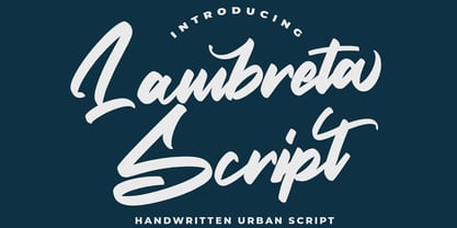 Introducing a new font called Lambreta inspired by urban script fonts with sharp and beautiful letters that create fonts that are modern, tendy and elegant. Lambreta came with opentype features such stylistic alternates, stylistic sets & ligatures good for logotype, poster, badge, book cover, tshirt design, packaging and any more. Features : • Character Set A-Z • Numerals & Punctuations (OpenType Standard) • Accents (Multilingual characters) • Ligature • Alternate • Swash
 - Murisa Ulyana by Murisa Studio,
$10.00 we would like to introduce one new font which we have released in this march. Murisa Ulyana is our newest font. Still inspired by the oval shape, this font is very cute and eye-catching. It is very fitting if you use it for designs that are cheerful and happy. You can also use it for baby and children's product names. Get it right now.
 - Lillyberry by ARToni,
$19.00 Lillyberry is a round lettered and beautiful script font. It is both dynamic and flexible and fits wide ranges of creations. with a soft and smooth appearance makes it very beautiful. Its distinctive curves make this font very suitable for use in any design project. this font shape is perfect if you want to add ornaments or decorations so that it looks more attractive.

