10,000 search results
(0.175 seconds)
- Booer by Product Type,
$18.00 Introduce the Booer Font Express Your Creativity with a Powerful and Modern Gaming Style. Booer display is a font that reflects the power and style of the gaming world in a sharp, modern package. Booer is the perfect solution for a variety of projects that require a unique theme, whether it's a film, game, or streaming event. Her bold and exciting style provides room for creativity to flourish. What Makes Booer Special: Powerful Gaming Style, Booer Design exudes power, capturing the essence of the gaming world. Each letter is a statement of dominance and modernity. Two Style Families: The Booer font offers two different style families: Regular and Italic. This advantage allows you to adapt your designs to various contexts, whether requiring a strong presence or an elegant touch. Multilingual Support: Booer Font supports multiple languages, allowing you to connect with a global audience easily. Enhance your designs and make an impact with Booer Fonts. It's not just a font; it's a gateway to a bold, modern, and compelling visual world. Download Font Booer now and experience the thrill of creating unforgettable designs!
 - Cogsworth by Anastasia Kuznetsova,
$17.00 Get to know the natural and neat font "Cogsworth"! This beautiful neat retro font with imperfect ink edges and a little careless shading is inspired by nature. Eco-friendly fashion takes into account the health of consumers, the health of the planet. The "Cogsworth" font is perfectly combined with any stylized graphics, watercolors, and also looks great on its own as part of a minimalist design. Play with letters to get different effects. Great for branding, wedding invitation design, packaging design, quotes, label design and more. Font Features A-Z; a-z character set; 1 language (English); numbers and punctuation marks, symbols. A font containing uppercase and lowercase letters, numbers, and a wide range of punctuation marks. Fonts can be opened and used in any software that can read standard fonts, even in MS Word. No special software is required, and to get started. It is recommended to use it in Adobe Illustrator or Adobe Photoshop Made with love ♡ Thanks for checking it out, and feel free to drop me a message if you had any queries! ~ Anastasia
 - Frothydue by Keristyper Studio,
$14.00 Frothydue is a lovingly crafted Signature script typeface that lends a natural feel to all your designs. This font looks very natural, perfect for all your large projects that require a handwritten touch. Frothydue is perfect for branding projects, logos, wedding designs, social media posts, advertisements, product packaging, product designs, label, photography, watermark, invitation, stationery, and any projects that need handwriting taste. Frothydue Font multilingual support: Afrikaans, Albanian, Catalan, Danish, Dutch, English, Estonian, French, Finnish, German, Icelandic, Indonesian, Italian, Malay, Norwegian, Portuguese, Spanish, Swedish, Zulu, and many more. What’s Included : Standard & Multilingual glyphs Ligature Works on PC & Mac Simple installations Accessible in Adobe Illustrator, Adobe Photoshop, Adobe InDesign, and even work on Microsoft Word. Hope you enjoy our font!
 - AT Carterwood by Amera Type,
$20.00 Inspired by the old style serifs of 19th century print labels that have a classic touch in this modern era Carefully crafted with lowercase and uppercase to complement this font as well as using variable bold and thin shapes to give a sense of beauty and strength to the letterforms Carterwood is great for designing posters, labels, sign paintings and other media to enhance your visual appearance
 - Stonechips by FadeLine Studio,
$10.00 Stonechips is a new Display Font with a bold and unique style. This font is carefully made to maintain the balance of each letter, so that creating a bold and strong style in this font. And very easy and convenient to use! With a style like this, this font will be suitable in use for logo's, branding projects, homeware designs, product packaging, mugs, quotes, posters, shopping bags, logo's, t-shirts, book covers, name card, invitation cards, greeting cards, and all your other lovely projects.
 - Visitor BRK Ten Pro by CheapProFonts,
$10.00 This is the first true pixel-font released by CheapProFonts. It may not be the first font based on a 5x5 pixel grid, but it probably has the best language support. The glyphs have all been optimized for Flash (by making the pixel shapes slightly overlapping) and should render sharp and perfect when set in 10px size (or multitudes of 10). As with all pixelfonts: make sure to place the text at coordinates with whole numbers, and always use left (and NEVER centered) alignment. ALL fonts from CheapProFonts have very extensive language support: They contain some unusual diacritic letters (some of which are contained in the Latin Extended-B Unicode block) supporting: Cornish, Filipino (Tagalog), Guarani, Luxembourgian, Malagasy, Romanian, Ulithian and Welsh. They also contain all glyphs in the Latin Extended-A Unicode block (which among others cover the Central European and Baltic areas) supporting: Afrikaans, Belarusian (Lacinka), Bosnian, Catalan, Chichewa, Croatian, Czech, Dutch, Esperanto, Greenlandic, Hungarian, Kashubian, Kurdish (Kurmanji), Latvian, Lithuanian, Maltese, Maori, Polish, Saami (Inari), Saami (North), Serbian (latin), Slovak(ian), Slovene, Sorbian (Lower), Sorbian (Upper), Turkish and Turkmen. And they of course contain all the usual "western" glyphs supporting: Albanian, Basque, Breton, Chamorro, Danish, Estonian, Faroese, Finnish, French, Frisian, Galican, German, Icelandic, Indonesian, Irish (Gaelic), Italian, Northern Sotho, Norwegian, Occitan, Portuguese, Rhaeto-Romance, Sami (Lule), Sami (South), Scots (Gaelic), Spanish, Swedish, Tswana, Walloon and Yapese.
 - Spoonbread by Hanoded,
$15.00 I originally wanted to call this font Instant Pudding. When I was a kid, we sometimes had instant pudding (the ‘add cold milk and rest in the fridge’ kind) for dessert. My brother and I loved the stuff, especially when some of the pudding powder had not dissolved and had turned into brightly coloured speckles! But this font, alas, did not ‘feel’ like instant pudding, so I hunted the internet for other, more obscure, puddings. I found Spoonbread. Apparently it is a pudding-like Southern American dish, made from cornmeal. I have never tasted it, nor do I particularly like corn (most of it is GMO anyway), but the font and the name became friends. And who am I to tear this beautiful relationship asunder? Spoonbread - use it for your packaging, your books, your posters and your games. And when you make Spoonbread, use organic cornmeal!
 - Gladiate by Solotype,
$19.95This was a favorite of job printers in late Victorian times. They used it on cards and stationery, as well as small handbills. It was made in a range of sizes from 10 point to 36 point. Good for places where you really don't want to shout. - Brussels City by Mevstory Studio,
$20.00 Brussels City is Modern Slab Serif Font Brussels City font is perfect for your up coming projects. Such as logo branding, editorial design, stationery design, sport design, blog design, modern advertising design, card invitation, art quote, home decor, book/cover title, special events and any more. That's it! Have fun with Brussels City Serif Font. Thank you! Lettercorner Std
 - Ondo by JAM Type Design,
$23.00 Ondo is a low contrast geometric sans serif with large open counters which give the typeface a somewhat bold and contemporary appearance. This feature gives Ondo a fun yet sensible feel which can be used for both large chunks of text as well as for short headlines. Ondo comes with more than 370 glyphs, supporting a wide range of languages. With its 10 fonts, Ondo is an ideal font family for text, branding, signage, print and digital design. Give Ondo Demo Medium a try on your personal projects – completely FREE.
 - Meutas Soft by Trustha,
$25.00 Meutas Soft is a sans serif font family which geometric and humanist make a blend. Make it more attractive and dynamic. Meutas Soft is designed for display and body text. Maximizes thickness while maintaining balance in each form. This makes it especially suitable for all kinds of creative projects. Meutas Soft is a rounded version of Meutas font. Meutas Soft comes with 10 weights and a matching oblique, making it 20 styles. Some alternative glyphs will be an attractive choice. Makes every project you work on easier, and will certainly be awesome!
 - Marones by Arterfak Project,
$18.00 Complete your vintage style with Marones font! Marones is a serif font with inky effect and spurs on the letterforms. Inspired by old school garage and vintage logo, Marones visualize a quite strong look so that's perfect for any display such as packaging, bottle, headline, logo, apparel, posters, stickers, craft projects and more! Marones is an all-caps font equipped with a Stylistic set and multilingual support that you can mix and match the letters to ease your design project. Fonts featured : Uppercase Smallcaps Numbers Symbols Punctuation Stylistic alternates Stylistic set 01-04 Thank you for watching! Ramz
 - Retroparty by Putracetol,
$21.00 Introducing Retro Party - A Display Retro Script Font. In creating this font, I just wanted to combine classic style with modern retro style, so be this font. Hope you like it. Inspired by some retro fonts that I made before. Retro Party is perfect for vintage and retro design, badge, logos,t-shirt, poster, branding, packaging, signage, book coverand so much more! Come with Opentype feature with a lot of alternates, its help you to make great lettering. This font is also support multi language.
 - Qritticaly by Maulana Creative,
$14.00 Qritticaly is a Marker Script font. With regular marker stroke, fun character with a bit of ligatures and has a to files lowercase alternates. To give you an extra creative work. Qritticaly font support multilingual more than 100+ language. This font is good for logo design, Social media, Movie Titles, Books Titles, a short text even a long text letter and good for your secondary text font with sans or serif. Make a stunning work with Qritticaly font. Have some fun enjoy the products :) Cheers, MaulanaCreative
 - Anton Charlote by Gloow Studio,
$16.00 Introducing Anton Charlote - A Display Retro Script Font. In creating this font, I just wanted to combine classic style with modern retro style, so be this font. Hope you like it. Inspired by some retro fonts that I made before. Anton Charlote is perfect for vintage and retro design, badge, logos,t-shirt, poster, branding, packaging, signage, book coverand so much more! Come with Opentype feature with a lot of alternates, its help you to make great lettering. This font is also support multi language.
 - Typewriter by Monotype,
$29.00The Monotype Typewriter" series contains three typefaces. These were made to enable type to be set that could emulate output from real typewriters. Use where a typewritten look is required for reports, tabular work, where the fixed pitch nature of these faces is an advantage, technical documentation and correspondence. Typewriter Regular is the base style of the family. Typewriter Elite is lighter than Typewriter Regular, and is monotone in weight, being designed to retain readability even when multiple carbon copies are produced. Typewriter Gothic is a medium weight sans serif typewriter face designed to give good readability from a fixed pitch typeface. Originally made for daisy wheel printers, the Typewriter Gothic font is useful for tabular work, technical documents, correspondence and reports." - Tenement JNL by Jeff Levine,
$29.00 A 1916 book entitled “Lettering” by Thomas Woods Stevens features a number of hand lettered alphabets; some plain, others unique. One of the more novel examples was designed by Harry Lawrence Gage and featured letters and numbers with a crude, wavy style described in the book as “adapted to wood block and linoleum cutting”. To keep the design as close to the original as possible, the image from the book page was auto-traced, with each character given just enough of a clean-up as to retain its own quirkiness while smoothing out any jagged lines and fixing some curves. From there, other necessary characters were created for the digital font, and the end result is Tenement JNL, which is available in both regular and oblique versions.
 - The Bouquet List by Nasir Udin,
$16.00 Introducing the Bouquet List - an ultimate handwriting script font. Inspired by the beauty of flower bouquets and the aesthetic of handwriting when you write some bucket list or itinerary on your journal while you travel. The Bouquet List is a handwritten font featuring 70+ ligatures that gives you beautiful typographic in organic, authentic, and natural handwriting style. Perfect for magazines, social media posts, travel blog, travel vlog, signatures, sticky notes, journal, quotes, restaurant menus, websites, women products, calendar marks, book covers, advertisements, wedding designs, even for a logo and branding! Its OpenType Features provides you an easy swash and magic underline (please see the instruction in the last two preview images). • How to add swash easily: type space three times after the word. • How to add underline: type underscore 2 or 3 or 4 times.
 - Metub by Twinletter,
$17.00 Introducing Metub, the superhero display font with a unique and powerful serif style that’s sure to make your designs stand out. Each letter is meticulously crafted to convey strength and individuality, making this font the perfect choice for bold and impactful projects. With 52 stylish alternate characters and 32 beautifully designed ligatures, Metub offers endless design possibilities that are sure to elevate your work to new heights. Whether you’re designing posters, logos, or branding materials, Metub is the ideal font for any project that demands a strong and unique aesthetic. And with multilingual support, this font is perfect for projects with a global reach. Give your designs a powerful edge with Metub today. What’s Included : - File font - All glyphs Iso Latin 1 - Alternate, Ligature - Simple installations - We highly recommend using a program that supports OpenType features and Glyphs panels like many Adobe apps and Corel Draw so that you can see and access all Glyph variations. - PUA Encoded Characters – Fully accessible without additional design software. - Fonts include Multilingual support
 - Festany by FHFont,
$19.00 Festany is script font with handlettering brush style, this is handmade ink, and with dry ink for finished the texture font. Suitable for design, element design, wedding, event, t-shirt, logo, badges, sticker, and awesome work.
 - Silent Brush by Ditatype,
$29.00 Silent Brush is a very lovely, elegant script font in capital letters bigger than ordinary ones to express such dramatic, attractive visual effects. To be consistently legible and harmonious in the whole context, every letter has its own proportions. One of the font’s main features is the brush scratch on every letter to show that the writing is made up of a paint brush producing a lot of rough textures. You can see the brush scratches along the letters’ edges and the letters’ sides to express dynamic moving flows. Despite being inspired by handwritings, this script font has gone through various adjustments making it more consistent and legible. Furthermore, it is much better to use this font for big text sizes to be more legible. In addition, you may enjoy the available features here as well. Features: Multilingual Supports PUA Encoded Numerals and Punctuations Silent Brush fits best for any design projects requiring artistic touches such as brands’ logos, posters, merchandise designs, and other promoting media. Find out more ways to use this font by taking a look at the font preview. Thanks for purchasing our fonts. Hopefully, you have a great time using our font. Feel free to contact us anytime for further information or when you have trouble with the font. Thanks a lot and happy designing.
 - Pistol Shot by Linotype,
$29.99At first glance, Pistol Shot looks like it was originally drawn as a large, geometric slab serif font - a slab serif font that underwent an unfortunate accident, and had many of its extremities shot off! However, there is more to Pistol Shot's appearance than looking as if it had survived a showdown. Pistol Shot also looks vaguely like a pixel font viewed through a blurry filter. It also looks like it could have been cross-stitched into a craft project. Whatever its appearance, Pistol Shot Light and Pistol Shot Normal are perfect headline fonts for a wide variety of display applications. You might even want to try cross-stitching its letters into fabric yourself! Both weights of the Pistol Shot family were designed by the French design team of Roselyne and Michel Besnard in 2002, and are included in the Take Type 5 collection from Linotype GmbH." - Museum Fournier by T4 Foundry,
$16.00Museum Fournier is inspired by a set of Rococo capitals designed by Pierre Simon Fournier le Jeune circa 1760. The matrices are part of a set imported to Sweden by J.P. Lindh in 1818 from Breitkopf & Härtel in Leipzig, Germany. They are now in the Nordiska Museum in Stockholm. Type designer Torbjörn Olsson has expanded the original 31 lead matrices in the collection to 55 characters. Please note that the font contains capitals only, no lower case letters and no figures either. Museum Fournier is an OpenType creation, for both PC and Mac. Swedish type foundry T4 premiere new fonts every month. Museum Fournier is our ninth introduction. Museum Fournier is part of the growing Museum type family. Museum also includes three different border fonts, an ornament font with some of Granjon's arabesques and Museum Tertia Cursive, an exquisite 1700's typeface with modern additions. - Insiders by Arterfak Project,
$25.00 Introducing our new brush exploration, Insider. A signature brush font made with the high attention of the brush details. Inspired by the dry brush lettering and signature logo. This font has the feel of handwriting and energetic, which absolutely handy to create a casual and elegant design. Insider complete with alternates characters, ligatures, and swashes that you can apply on T-shirts, labels, titles, books, quotes, logos, logotypes, packaging, and much more! That's all, folks! Thank you for watching and keep it up!
 - The Cheelaved by Almarkha Type,
$35.00 Introducing our latest display typeface called The Cheelaved - Display Vintage Serif with 19 Ligatures and 8 Alternate Glyphs can make your logotype become more interesting. Best Vintage font with special alternative glyphs, and multilingual support. inspired by the decorative arts and architecture movement The Cheelaved fonts is perfect for your project and allows you to create designs, headlines, posters, logos, badges, t-shirts and many more that are beautiful. It is also best used for posts, logos, posters, certificates, labels and more.
 - Barracuda by Wiescher Design,
$39.50 Barracuda has this sharp, sharky look and I do a lot of diving with my best friend. What else is there to say? If you see a shark say hello from me. Yours from under the Red Sea, Gert Wiescher
 - Jumper by Mans Greback,
$49.00 Jumper is an optimistic sans-serif typeface family. Drawn and created by Mans Greback between 2019 and 2021, Jumper is a speedy, naive type for logotypes, headlines and body text. The geometric components merge seamlessly with the organic shapes, resulting in a professional but genuine lettering. With a sport character reminiscent of typography in famous brands such as Nike and Adidas, this type is active, happy and has great velocity. The twelve complementing styles gives great variety to your design: Thin, Light, Regular, Bold, Extra-Bold, Black, and each weight as Italic. Also includes a variable font! Only one font file, but the file contains multiple styles. Use the sliders in Illustrator, Photoshop or InDesign to manually set any weight and slant. This gives you not only the 16 predefined styles, but instead more than a thousand ways to customize the type to the exact look your project requires. More info about Variable Fonts: https://www.mansgreback.com/variable-fonts The font is built with advanced OpenType functionality and has a guaranteed top-notch quality, containing stylistic and contextual alternates, ligatures and more features; all to give you full control and customizability. It has extensive lingual support, covering all Latin-based languages, from North Europe to South Africa. It contains all characters and symbols you'll ever need, including all punctuation and numbers.
 - Schism One by Alias,
$55.00 Schism is a modulated sans-serif, originally developed from our Alias Didot typeface, as a serif-less version of the same design. It was expanded to three sub-families, with the thin stroke getting progressively heavier from Schism One to Schism Three. The different versions explore how this change in contrast between thick and thin strokes changes the character of the letterforms. The shape is maintained, but the emphasis shifts from rounded to angular, elegant to incised. Schism One has high contrast, and the same weight of thin stroke from Light to Black. Letter endings are at horizontal or vertical, giving a pinched, constricted shape for characters such as a, c, e and s. The h, m, n and u have a sharp connection between curve and vertical, and are high shouldered, giving a slightly square shape. The r and y have a thick stress at their horizontal endings, which makes them impactful and striking at bolder weights. Though derived from an elegant, classic form, Schism feels austere rather than flowery. It doesn’t have the flourishes of other modulated sans typefaces, its aesthetic more a kind of graphic-tinged utility. While in Schism Two and Three the thin stroke gets progressively heavier, the connections between vertical and curves — in a, b, n etc — remain cut to an incised point throughout. The effect is that Schism looks chiselled and textural across all weights. Forms maintain a clear, defined shape even in Bold and Black, and don’t have the bloated, wide and heavy appearance heavy weights can have. The change in the thickness of the thin stroke in different versions of the same weight of a typeface is called grading. This is often used when the types are to used in problematic print surfaces such as newsprint, or at small sizes — where thin strokes might bleed, and counters fill in and lose clarity, or detail might be lost or be too thin to register. The different gradings are incremental and can be quite subtle. In Schism it is extreme, and used as a design device, giving three connected but separate styles, from Sans-Didot to almost-Grotesk. The name Schism suggests the differences in shape and style in Schism One, Two and Three. Three styles with distinct differences, from the same start point.
 - Schism Three by Alias,
$55.00 Schism is a modulated sans-serif, originally developed from our Alias Didot typeface, as a serif-less version of the same design. It was expanded to three sub-families, with the thin stroke getting progressively heavier from Schism One to Schism Three. The different versions explore how this change in contrast between thick and thin strokes changes the character of the letterforms. The shape is maintained, but the emphasis shifts from rounded to angular, elegant to incised. Schism One has high contrast, and the same weight of thin stroke from Light to Black. Letter endings are at horizontal or vertical, giving a pinched, constricted shape for characters such as a, c, e and s. The h, m, n and u have a sharp connection between curve and vertical, and are high shouldered, giving a slightly square shape. The r and y have a thick stress at their horizontal endings, which makes them impactful and striking at bolder weights. Though derived from an elegant, classic form, Schism feels austere rather than flowery. It doesn’t have the flourishes of other modulated sans typefaces, its aesthetic more a kind of graphic-tinged utility. While in Schism Two and Three the thin stroke gets progressively heavier, the connections between vertical and curves — in a, b, n etc — remain cut to an incised point throughout. The effect is that Schism looks chiselled and textural across all weights. Forms maintain a clear, defined shape even in Bold and Black, and don’t have the bloated, wide and heavy appearance heavy weights can have. The change in the thickness of the thin stroke in different versions of the same weight of a typeface is called grading. This is often used when the types are to used in problematic print surfaces such as newsprint, or at small sizes — where thin strokes might bleed, and counters fill in and lose clarity, or detail might be lost or be too thin to register. The different gradings are incremental and can be quite subtle. In Schism it is extreme, and used as a design device, giving three connected but separate styles, from Sans-Didot to almost-Grotesk. The name Schism suggests the differences in shape and style in Schism One, Two and Three. Three styles with distinct differences, from the same start point.
 - Schism Two by Alias,
$55.00 Schism is a modulated sans-serif, originally developed from our Alias Didot typeface, as a serif-less version of the same design. It was expanded to three sub-families, with the thin stroke getting progressively heavier from Schism One to Schism Three. The different versions explore how this change in contrast between thick and thin strokes changes the character of the letterforms. The shape is maintained, but the emphasis shifts from rounded to angular, elegant to incised. Schism One has high contrast, and the same weight of thin stroke from Light to Black. Letter endings are at horizontal or vertical, giving a pinched, constricted shape for characters such as a, c, e and s. The h, m, n and u have a sharp connection between curve and vertical, and are high shouldered, giving a slightly square shape. The r and y have a thick stress at their horizontal endings, which makes them impactful and striking at bolder weights. Though derived from an elegant, classic form, Schism feels austere rather than flowery. It doesn’t have the flourishes of other modulated sans typefaces, its aesthetic more a kind of graphic-tinged utility. While in Schism Two and Three the thin stroke gets progressively heavier, the connections between vertical and curves — in a, b, n etc — remain cut to an incised point throughout. The effect is that Schism looks chiselled and textural across all weights. Forms maintain a clear, defined shape even in Bold and Black, and don’t have the bloated, wide and heavy appearance heavy weights can have. The change in the thickness of the thin stroke in different versions of the same weight of a typeface is called grading. This is often used when the types are to used in problematic print surfaces such as newsprint, or at small sizes — where thin strokes might bleed, and counters fill in and lose clarity, or detail might be lost or be too thin to register. The different gradings are incremental and can be quite subtle. In Schism it is extreme, and used as a design device, giving three connected but separate styles, from Sans-Didot to almost-Grotesk. The name Schism suggests the differences in shape and style in Schism One, Two and Three. Three styles with distinct differences, from the same start point.
 - Awry by Gholib Tammami,
$15.00 Awry is a cute and quirky handwritten font that elegantly dances on the edges of organized precision and captivating disorder. With its unique design, ‘Awry’ breaks free from the confines of traditional typography, inviting you to explore a world where imperfection becomes an art form.
 - Satigof by holyline design,
$19.00 Satigof by Holyline is a playful sans serif font family, This font very playful and unique comes in nine weight, thin to black . It's very unique, fancy, playful very easy to combine with multiple design style. Satigof perfect for headline, sub headline ,custom logo,packaging, quote, invitations, watermark,social media posts, label, anything for your creativity and Satigof is perfect font if you want something new with your project, and you can pairing this font with the weight, its very satisfy. Happy creating!
 - Astogria Bejha by Figuree Studio,
$18.00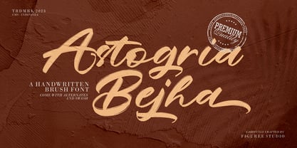 Introducing Astogria Bejha! Astogria Bejha is modern hand-drawn brush font that combines attractive curves with a fresh urban edge; delivering a stylish brush font that is guaranteed to add an eye-catching appeal to your logo designs, brand imagery, handwritten quotes, product packaging, merchandise, social media post, or website font. Features: Uppercase and Lowercase Number and Punctuation Ligature Stylistic Alternate Swash Versatile for branding, headline, or printing product Detailed dry brush markers I hope you enjoy this font. If you have questions, don't hesitate to give me a message Thank You!
 - Eternal Spring by Krismagraph,
$19.00 Eternal Spring is an elegant and modern San serif font family. It's sans serif in 8 weights from Thin to ExtraBold font. Comes with 76 unique ligatures and 27 alternates. Eternal Spring is a multipurpose font perfect for any project, with high contrast glyphs, giving it a feminine and masculine quality, modern, and easy to read. Excellent in layout design for quotes or body copy, best used as a display for headings, logos, branding, magazines, product packaging, invitations, and others. This font is easy to use and has OpenType features.
 - Maribon Script by PeachCreme,
$20.00 Say hello to our brand new font duo “Maribon“ - a contemporary elegant all-caps serif and stylish script font. Maribon Serif • A delicate modern serif includes classy regular and multilingual letters, symbols, punctuation, numerals and brings a touch of character to any design. Maribon Script • A clean, elegant hand-drawn script font with natural flow contains upper & lowercase characters, all punctuation, numerals, and gives a custom-made feel to any text. "Maribon" Font Duo is a perfect choice for logos, headlines, social media posts, invitations and so many more.
 - The Brother Hoops by Figuree Studio,
$24.00 Introducing The Brother Hoops! The Brother Hoops is strong hand-drawn brush font that combines attractive curves with a fresh urban edge; delivering a stylish brush font that is guaranteed to add an eye-catching appeal to your logo designs, brand imagery, handwritten quotes, product packaging, merchandise, social media post, or website font. Features: Uppercase and Lowercase Number and Punctuation Ligature Extra Swash Versatile for branding, headline, or printing product Detailed dry brush markers I hope you enjoy this font. If you have questions, don't hesitate to give me a message
 - Fellaure by MJB Letters,
$17.00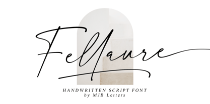 Fellaure is a modern authentic handwritten script, this font has a strong character in each letter that makes the font looks suitable for branding design, packaging, wedding design, logo design, poster design, signature, stationery design, and more. Fellaure comes with beautiful ligature, multilingual support, and additional underline swashes.
 - Roulletes Handrawn by Siwox Studios,
$11.00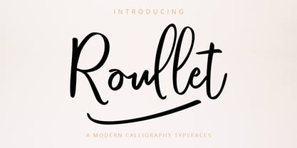 Roullet Fonts is a handwriting style. For designers, Instagrammers, bloggers, YouTubers, fashion lovers or somebody who Loves Fresh design. Roullet Fonts are suitable for any modern-design such as ad banner, modern card, invitation, announcement, seasonal design, social media promotion, web design, branding and logo stylist and many more.
 - Hello Freeday by Nathatype,
$29.00 Hello Freeday is a striking display font that combines a bold and clean font weight with playful swinging endings. With its uniform letter proportions and unique character details, this typeface effortlessly balances sophistication and a touch of whimsy. The bold and clean font weight of this font commands attention and adds a sense of strength and impact to your designs. Each letter is meticulously designed with precise geometric forms, resulting in a polished and professional appearance. The consistent proportions of the letters contribute to the font's overall coherence, ensuring a harmonious and balanced visual experience. What sets this display apart is the charming swinging endings found in select letters. These decorative details add a hint of playfulness and movement to the font, injecting a touch of personality and delight into your designs. The swinging endings give the letters a sense of rhythm and flow, making Hello Freeday an excellent choice for projects that require a dynamic and captivating visual presence. The font's bold and clean aesthetic ensures legibility and readability, even at smaller sizes. Enjoy the available features here. Features: Stylistic Sets Ligatures Multilingual Supports PUA Encoded Numerals and Punctuations Hello Freeday fits in headlines, logos, attention-grabbing titles, product packaging, greeting cards, branding materials, editorial layouts and website headers. Find out more ways to use this font by taking a look at the font preview. Thanks for purchasing our fonts. Hopefully, you have a great time using our font. Feel free to contact us anytime for further information or when you have trouble with the font. Thanks a lot and happy designing.
 - Depot New by moretype,
$35.00 Original released in 2006 Depot has now been updated to Depot New. While staying true to its original robust charm Depot New has been reexamined from the ground up with improved outlines, spacing, kerning and opentype features. Depot New also boasts two new weights with Thin and Thin Italic added to its arsenal, making it the perfect choice for the most demanding of jobs.