10,000 search results
(0.097 seconds)
- Lazy Dude by Gleb Guralnyk,
$14.00 Hi, introducing a creative bold font Lazy Dude. It's an all caps typeface with smooth curvy shape. Lazy Dude has a wide languages support with west european and cyrillic characters (check out all available characters on previews). Thank you and have a nice day!
 - Western Suburbs JNL by Jeff Levine,
$29.00 The cover of a 1932 edition of “Sunset magazine” (a publication for homeowners living in the west and southwest area of the United States) featured a lovely Art Deco serif alphabet that is now available as Western Suburbs JNL in both regular and oblique versions.
 - Paint Hand by Letters&Numbers,
$18.00 Paint Hand is based on type drawn with an open acrylic paint tube. This bold vernacular typeface with rugged rounded edges will work well for headers and captions. Paint Hand is extended, containing West European diacritics making it suitable for multilingual environments and publications.
 - Snack Lover by Illushvara,
$14.00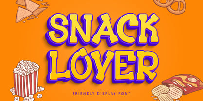 Hello, We are so excited to announce our new fonts "Snack Lover" is a friendly, casual and fun display font. Whether you use it for cartoon related designs, children games or just any creation that requires a lovely touch, this font will be an amazing choice. Features : Uppercase and lowercase Numbers Symbols Multilingual Accent If you have any question, don’t hesitate to contact me. Happy Designing !!! Thank You, Bayu Suwirya
 - Krispiest Signature by Omotu,
$19.00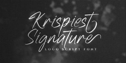 Krispiest Signature! A handwritten script brush font, all caps. Krispiest Signature font is suitable for branding, logotype, apparel, T-shirt, business card, product packaging, quotes, flyer, poster, book cover, advertising, etc. Whats Include? Opentype support Multilingual support PUA encoded Features: Uppercase, lowercase, numerals, punctuations, alternates, and ligatures Thanks for looking, and I hope you enjoy it! Please don't hesitate to drop me a message if you have any issues or queries.
 - Mildstones by IKIIKOWRK,
$17.00 Proudly present Mildstones - Modern Bold Sans, created by ikiiko. A contemporary bold condensed sans serif typeface created to breathe life into headlines with its eye-catching presence. Mildstones attracts attention and takes any design project to a new level with its striking and fashionable look. Each letter in Mildstones has undergone meticulous design in order to convey a sense of power, assurance, and beauty. The font has a sense of verticality and compactness due to the condensed proportions, which also make it easy to fit into small places while keeping outstanding readability. The Mildstones experience is more than simply a font. It has been meticulously designed to be a dependable and powerful typographic in terms of both aesthetic and readability. This type is very suitable for making a headline news, sport advetorial, logotype, branding, poster, magazine layout, quotes, or simply as a stylish text overlay to any background image. What's Included? Uppercase & Lowercase Number & Punctuation Multilingual Support Works on PC & Mac
 - Richard Starkings by Comicraft,
$39.00 A NEW HOPE! You begged with us..! You pleaded with us..! But we decided to release the official Richard Starkings font anyway! Huh? WHAT? You heard that line before? Where? Hmm... on this very site...? Well, yes, the Hedge Backwards font is all fine and dandy and does resemble the lettering legerdemain of comic book lettering robot, Richard Starkings... but has it been tweaked over the years to better suit the writing stylings of ELEPHANTMEN creator and writer, Richard Starkings? Has it been refurbished and digitally remastered by ELEPHANTMEN designer and Comicraft Secret Weapon, John JG Roshell? Hmm? No? Well then... here it is, retooled, reimagined and reStarkingsed...ah, what the hell, we started from scratch! This ain't no Greedo Shoots First -- you won't have to keep your pasty '70s VHS recordings of previous Richard Starkings Fonts inside a concrete bunker. Because any other font that claimed to be the official Richard Starkings font would have been called The Official Richard Starkings Font, would it not?
 - P22 Hedonic by IHOF,
$24.95This 12-font family employs several unique features including a 2-part Chisel set which allows for the look of stone incised lettering. Hedonic has just a hint of a slab serif and even that is used so sparingly that it almost feels like a sans serif font. Its design does appear to be painfully simple but there are many interesting features including a selection of weights, small caps with old style numerals and display weights that make it very useful. And legible. Old style numerals are included with the small caps and italics. Also for display purposes are two "Chisel" fonts. Used together, set one on top of the other, they create a stylish 3D effect—ideal for logos and headlines or anything that needs a strong graphic punch. Hedonic may not be as eccentric as many fonts out there, but overall it is clean and legible with a few extra flourishes to stand out from the crowd! - MFC Monarchy Initials by Monogram Fonts Co.,
$19.95 The inspiration source for Monarchy Initials is the 1934 Book of American Types by American Type Founders. In that specimen book, they had created a sophisticated two color initial design they called "Stationers Initials" which was only available in metal type at 24, 36, and 48 points. This wonderfully detailed initial style is now digitally recreated and revived for modern use. Monarchy Initials is only capable of initial or single letter monograms due to its unique design. The two color aspect of the original design has been preserved and made accessible within all programs. The Capital character slots contain the background color glyphs, and the lowercase slots hold the outline art for the letters. You can choose a color, type a capital letter, then switch to black and type a lowercase letter for the two color effect, or just tpe a lowercase letter on its own. It's that easy! Download and view the Monarchy Initials Guidebook if you would like to learn a little more.
 - OCR A Tribute by Linotype,
$57.99OCR-A was originally designed in 1968 as a machine-readable alphabet. Its functionality was its most important element, instead of its design. Over the following decades, the typeface has become popular in the design world nevertheless. But typographically pleasing results are often hard to come by, due to the original design’s “non-design design”, as well as its undeveloped character set. In 2006, Miriam Röttgers revised and extended OCR-A, creating OCR A Tribute. OCR A Tribute is a typeface family comprising of two versions: one in which the glyphs have been proportionally-spaced, and another that is monospaced. In the monospaced version, all glyphs have the same width, like the letters in the original OCR-A font do. Both versions of OCR A Tribute contain complete character sets and expert glyphs, as well as lining and old style figures. Now you can rest easy, and finally use this classic design for display purposes and headlines! - Bigruns Brush by Din Studio,
$29.00 Looking for a font that will make your branding stand out? Do you sometimes have an appetite for a bit more wholesome typography? Looking for a fabulous, stylish, and adventure font? We've got what you want. Bigruns Brush - A Display Brush Font Bigruns Brush is a display font is accompanied by a gorgeous handcrafted script brush font that works together in perfect harmony. This font made all in uppercase that easy on the eyes and nice to look while it’s also easy to read. Designed primarily as a captivating font to add the right amount of modernity and style, The best choice to ensure a great font match for your designs and projects! Well suited to titles, poster designs, branding, quotes, and logos. Our font always includes Multilingual Support to make your branding reach a global audience. Features: Ligatures Stylistic Set PUA Encoded Numerals and Punctuation Thank you for downloading premium fonts from Din Studio
 - Scala Pro by Martin Majoor,
$49.00 The award-winning Scala family (1990-1993) is a worldwide bestseller and has established itself as a ‘classic’ among digital fonts. It was one of the first serious digital text fonts to support small caps, ligatures and different set of numbers. In fact Scala and Scala Sans (1990-1993) are two different typefaces sharing a common form principle: the skeletons of both Scala and Scala Sans are identical. Scala’s dark colour and low contrast works to prevent the thin parts from breaking up. The generous length of Scala italic’s serifs gives it a strong rhythm. The bold weight has the same character widths as the normal weight, so changing a text from normal into bold does not affect the set width. Another part of Scala is very popular among its users: Scala Hands, containing more than one hundred decorative hands and pointers, is a free bonus. Scala Jewels is a set of four highly decorative typefaces, based on the bold capitals of Scala.
 - Monocle by Reserves,
$39.99 Monocle is a clean and contemporary monospaced geometric sans that excels in titling, data and numerical settings due to its clear and systematic design. The capitals-only format increases the harmony between letter pairings, opposing the irregularity of mixed case fixed-width typefaces. Stylistically, Monocle has the feel of a neutral sans, yet its underlying structural finish exudes a strong sense of order and authority. Its geometric foundation is especially pronounced in the constructed round forms. With multiple stylistic sets, individual letters can be exchanged to fine-tune text settings for a unique custom type solution. Features include: -Basic Ligature set including ‘f’ ligatures (ae, oe, fi, fl, ff, fh, fj, ft, tt, th, ct, st) -Alternate characters (O, I, S, G, R, Q, _, $, ©, #, •, %) -Slashed zero -Full set of numerators/denominators -Automatic fraction feature (supports any fraction combination) -Extended language support (Latin-1 and Latin Extended-A) *Requires an application with OpenType and/or Unicode support.
 - MFC Memoriam Initials by Monogram Fonts Co.,
$19.95 The inspiration source for Memoriam Initials is the 1934 Book of American Types by American Type Founders. In that specimen book, they had created a sophisticated two color initial design they called “University Initials” which was only available in metal type at 24, 36, and 48 points. This wonderfully detailed initial style is now digitally recreated and revived for modern use. Memoriam Initials is only capable of initial or single letter monograms due to its unique design. The two color aspect of the original design has been preserved and made accessible within all programs. The Capital character slots contain the background color glyphs, and the lowercase slots hold the outline art for the letters. You can choose a color, type a capital letter, then switch to black and type a lowercase letter for the two color effect, or just type a lowercase letter on its own. It’s that easy! Download and view the Memoriam Initials Guidebook if you would like to learn a little more.
 - Sneakers Max by Positype,
$22.00 Sneakers was a typeface that I originally drew all the way back in 2005, with a release in 2006. Its most recent iteration, Sneakers Pro was released in 2009. Since then, the idea of reworking the design has lingered in the back of my head, but I wanted to add additional flexibility and value to anything offered beyond the originals. Sneakers Max does just that and I am happy to see it released and available to everyone. Sneakers Max raises the bar in terms of functionality… incorporating all of the options found in Sneakers Pro (e.g. Small Caps and a biform/unicase located now in Titling Alternates), but it expands the character offering, improves on letter designs (everything was redrawn) and explores more flexible settings by providing 5 distinct counter widths to keep more uniform multi-line settings with mixed letter heights. Special thanks to Potch Auacherdkul for his additions to the original character set and for his engineering skills.
 - Vintage Lander by Din Studio,
$25.00 Have you thought about how you can add that touch of magic to your branding and projects? Want to travel your audience to a world of gorgeous, versatile, but still have the retro touch? Then, here we go. Introducing Vintage Lander- A RetroScript Font This vintage font features thick and angular letters. With its strong outlines and fat strokes, this is the font you need when you want to create that classic bubble font look. This font becomes more special with extruding version option. This font can be used for a host of different content needs and projects. Create gorgeous printed quotes, standout packaging, or beautiful t-shirts! You can even use it to create amazing headings, logos, menus, and social media graphics. Our font always includes Multilingual Support to make your branding reach a global audience. Features: Ligatures Stylistic Set Swashes Multilingual Support PUA Encoded Numerals and Punctuation Thank you for downloading premium fonts from Din Studio
 - XXII Geom Slab by Doubletwo Studios,
$- XXII GeomSlab are the additional slab-serif styles to the geometric sans-serif XXII Geom. XXII Geom and XXII Geom Slab are modern geometric type systems designed with focus on functionality & legibility and with an eye on the old masters. Their well balanced low contrast letter shapes come with a tall x-height. With its range of Opentype features it is designed to fulfill the needs your content deserves (Smallcaps, Case Sensitives, Ligatures…) as well as serving your individual taste (Stylistic alternates & Sets). More information on Behance.
 - Gyroscope by Milan Pleva,
$18.00 Gyroscope is an all caps display font duo consisting of two styles - Serif and Sans Serif. Both of them can also be bought separately. Gyroscope has elegant and well balanced curves of letters perfect for logos, headlines, magazines, or even longer texts. There are selected ligatures you can use for a better look. Features: 2 Styles: Gyroscope Sans & Gyroscope Serif Basic latin alphabet A-Z 43 Ligatures & Alternates 56 Accented characters Numbers, Punctuation, Currency, Symbols, Math symbols & Diacritics Old style figures Case sensitive glyph Enjoy Gyroscope!
 - Consolas by Microsoft Corporation,
$49.00OpenType Layout features: stylistic alternates, localized forms, uppercase-sensitive forms, oldstyle figures, lining figures, arbitrary fractions, superscript, subscript. Consolas is intended for use in programming environments and other circumstances where a monospaced font is specified. All characters have the same width, like old typewriters, making it a good choice for personal and business correspondence. The improved Windows font display allowed a design with proportions closer to normal text than traditional monospaced fonts like Courier. This allows for more comfortable reading of extended text on-screen. - Battafia by PojolType,
$13.00 My font name is Battafia. This font is usually used for brands, greeting for someone, T-shirt design, nameplate, pins, accessories, film titles, magazine titles, web, posters, book titles, logos, country names, billboards, advertisements, book writing, products, display, and many others. Battafia, offers you: 1. Alternative uppercase (all uppercase, 1 model) 2. Lowercase character 12 letters, usually used in end letters 3. Ligature (1 two-letter character) and Alternative Styles 4. Multilingual Support (Europe Latin West), Numbers and Punctuation
 - ITC Legacy Sans by ITC,
$40.99 ITC Legacy¿ was designed by American Ronald Arnholm, who was first inspired to develop the typeface when he was a graduate student at Yale. In a type history class, he studied the 1470 book by Eusebius that was printed in the roman type of Nicolas Jenson. Arnholm worked for years to create his own interpretation of the Jenson roman, and he succeeded in capturing much of its beauty and character. As Jenson did not include a companion italic, Arnholm turned to the sixteenth-century types of Claude Garamond for inspiration for the italics of ITC Legacy. Arnholm was so taken by the strength and integrity of these oldstyle seriffed forms that he used their essential skeletal structures to develop a full set of sans serif faces. ITC Legacy includes a complete family of weights from book to ultra, with Old style Figures and small caps, making this a good choice for detailed book typography or multi-faceted graphic design projects. In 1458, Charles VII sent the Frenchman Nicolas Jenson to learn the craft of movable type in Mainz, the city where Gutenberg was working. Jenson was supposed to return to France with his newly learned skills, but instead he traveled to Italy, as did other itinerant printers of the time. From 1468 on, he was in Venice, where he flourished as a punchcutter, printer and publisher. He was probably the first non-German printer of movable type, and he produced about 150 editions. Though his punches have vanished, his books have not, and those produced from about 1470 until his death in 1480 have served as a source of inspiration for type designers over centuries. His Roman type is often called the first true Roman." Notable in almost all Jensonian Romans is the angled crossbar on the lowercase e, which is known as the "Venetian Oldstyle e."" ITC Legacy® Sans font field guide including best practices, font pairings and alternatives.
 - Catskin by Hanoded,
$15.00 Catskin is a fairytale by The Brothers Grimm. The story is about a king who has a beautiful wife and daughter - you know, the basic fairytale stuff. Long story short: they all live happily ever after (except for the wife, who dies…). Catskin is also a nice, handmade font. I like making fairytale fonts, especially since I have three kids, who love books. And when I see one of my fonts on the cover, I can tell them: ‘daddy made this’. #prouddaddy ;-)
 - WBP Cor by Studio Jasper Nijssen,
$25.00 Introducing the WBP Cor. A retro font based on the old drugstore signage (DROGISTERIJ). Many happy customers have observed it and is now made available for all. Accents have been added, and there quite are a few alternative glyphs. The A has two options for example: there's a sharp version consistent with the original signage, but also a rounded version consistent with the rest of de design. The font can be used to recreate retro signage or other niche designs.
 - Brahma Rounded by Tall Chai,
$15.00 Brahma Rounded is a modern geometric rounded sans-serif font family with weights ranging from Thin (100) to Black (900). It is a sibling of the Brahma font family. Features: Available in 9 weights Over 550 glyphs supporting extended Latin Ideal for display texts: Titles, Logos and Headlines etc. Perfect for branding and rebranding Supports OpenTypes features like Ligatures and Stylistic Alternates Tabular Numerals included Symbols for 10 major currencies including Bitcoin provided in all weights Description: The name comes from Brahmā who is known as the god of creation. And manifesting the same spirit, the Brahma font family focuses on modern creativity. With its smooth and polished curves, Brahma Rounded provides friendly, casual vibes to all its characters. Every character effortlessly integrates with current design standards and interfaces. The fonts are professional yet have a hint of informal personality in them. This makes Brahma Rounded perfect for use in modern apps and websites. Brahma Rounded is built for the influencing, designing and marketing squads. It has a trendy geometric characteristic which is ideal for any branding and rebranding. Brahma has lot of OpenType features (like ligatures and tabular numerals) and the Extended Latin character set supports over a hundred languages. Start Creating!
 - Nortika by Luhop Creative,
$18.00 Nortika is a classy and distinct serif font. Add it confidently to your favorite creations and let yourself be amazed by the outcome generated. This font is PUA encoded which means you can access all glyphs and swashes with ease! Nortika is also included full set of: Uppercase and lowercase letters Multilingual symbols Numerals Punctuation Standard ligatures Discretionary Ligatures Alternates Wish you enjoy our font and if you have a question, don't hesitate to drop message & I'm happy to help :)
 - WILD2 Ghixm by Fontry West,
$15.00 Accidents happen. Things go where they don't belong, get changed - remade. Something new crawls out of the murky depths. Ghixm is a retrospective of the horror comics and movie posters of the 1960s and the 1970s. It's fluid forms harken to watery graves and tentacled unnameable horrors. These twisted shapes are reminiscent of titles that will make your skin crawl. It’s already warped and twisted, so don't hesitate to abuse it. This face can take it and still deliver its chaotic message.
 - Arlen by Groteskly Yours,
$45.00 Meet Arlen, a funky, variable type family in 36 styles. Inspired by 20th century hand-painted signs and the visual culture of the 1980's, Arlen adds a little extra to this already charismatic mix. Arlen is a display sans serif that can be freely used for larger bodies of text. Among its most prominent visual features are high contrast, flaring stems and dynamic letterforms. With 860 characters in each font, Arlen supports most Latin-based languages and offers a large number of extra characters, dingbats, alternate glyphs, ligatures, and punctuation marks. Some of the most useful OpenType features are included too, such as Case-Sensitive Punctuation, Stylistic Alternates, Tabular Figures, Fractions, Localization, and a lot more. Some letters and characters come in two versions: thin and bold, and you can easily alternate between the two using a corresponding stylistic set. Arlen is a cheerful typeface that conveys kindness, good cheer, and only good vibes. It would feel at home both in digital and print mediums; it can be used in advertising, editorial design, social media, web design, packaging, or personal design projects. With versatility at its heart, Arlen would be a perfect typeface for large design systems that require multiple styles for typesetting.
 - HWT Etta by Hamilton Wood Type Collection,
$24.95 HWT Etta is a fun display typeface that has two styles: East and West! Its two variations ensure you have maximum wood type swagger in every display size that you might want. This fresh design takes a cue from the wild design experimentation that was happening in the heyday of mid 19th Century wood type—but filtered through 1960s photo-type sensibilities and served up for today’s design needs. Etta West is a decorative inline style and the Etta East is a whimsical reverse contrast style. They live together harmoniously, with their own specific flavors. Practically speaking, both styles are intended for display use, so use them big and use them proudly! Set your XXL size titles in West and your L to XL size types in East. As different as they might look at first, both fonts share a common DNA—Don’t be shy about using them together. The HWT Etta font is part of the Hamilton Wood Type and Printing Museum’s Type Legacy Project. In keeping with the project, Etta is named after Etta Shove Hamilton, who was J.E. Hamilton’s wife and the company’s first bookkeeper.
 - Platipus Script by Areatype,
$15.00 Platipus Script A sweet handlettered font, casual and dynamic with a dancing baseline.. all to add an authentic touch to your designs. perfect for Branding, Logos, Greeting Cards, Wedding Stationery, Quotes etc. It comes with a handy set of Opentype Stylistic Alternates, Ligatures and multiple language support. To enable the OpenType Stylistic alternates, you need a program that supports OpenType features such as Adobe Illustrator CS, Adobe Indesign & CorelDraw X6-X7, Microsoft Word 2010 or later versions. Files included: These coded with PUA Unicode. Mac users can use Font Book and Windows users can use Character Map to view and copy any of the extra characters to paste into your favourite text editor/app. How to access all alternative characters, using Windows Character Map with Photoshop: https://www.youtube.com/watch?v=Go9vacoYmBw How to access all alternative characters using Adobe Illustrator: http://youtu.be/iptSFA7feQ0nn Thanks so much for looking, I really hope you enjoy it and please don't hesitate to drop me a message if you have any issues or queries :)
 - Western Wood Type JNL by Jeff Levine,
$29.00 Inspired by a sample of a vintage wood type supplied by a fan of Jeff Levine fonts, Western Wood Type JNL is a traditional Clarendon-style condensed typeface from the era of letterpress and the Old West.
 - Plinc Banjo by House Industries,
$33.00 When it comes to poster design, the line between wild west and psychedelic can be surprisingly fine. Dave West combined both typographic genres to create his refreshing Banjo. Developed in the late 1960s for Photo-Lettering, Inc., this curvaceous high-contrast sort-of serif might have been born on the nineteenth-century frontier, but it was raised in the counterculture of the mid-twentieth century. Use it wherever the conventional and uncommon collide. Vectorized by Mitja Miklavčič in 2017. Like all good subversives, House Industries hides in plain sight while amplifying the look, feel and style of the world’s most interesting brands, products and people. Based in Delaware, visually influencing the world.
 - Factum by Fontop,
$14.00 Factum is a classical style serif typeface that sets the mood and evokes emotions before you read the text. Interchanging thick and thin lines, especially in Medium and Bold styles, creates an elegant silhouette and a rhythm in title sheet, cover art or poster. Yet Light and Regular styles look great in large type as well as headlines. Another speciality of the font family is Stencil styles that help you play around your typography and logotypes. Rich heritage and cultural experience behind the classical design make Factum font perfect for texts and messages connected to glamour, fashion, arts, literature, architecture, science, education, travelling, fine dining, cosmetics, beauty and etc. Timeless pattern and variety of weights and styles will make you use the font family again and again in different projects: creating logo, articles in magazines, branding, wedding invitations, quotes, posters, advertisements, monograms and many more. Character set of each font includes all European Latin-based glyphs, numbers, punctuation and OpenType features like standard ligatures, discretionary ligatures and fractions.
 - Akagi Pro by Positype,
$29.00 Akagi Pro is a complete rebuild and expansion of my popular Akagi typeface. Contemporary, clean, simple and friendly continue to serve as the adjectives for an expansion that includes 250+ additional characters per weight, many new ligature options, expanded stylistic alternates, 4 sets of figures, new symbols, case-sensitive punctuation, superscripts, subscripts, ordinals, expanded language support and two new styles that provide even more flexibility within the lighter weights of the family. When I designed Akagi in 2007, I wanted this new sans serif to "smile" at you — with this new expansion, I hope you smile back. Akagi Pro is economical while keeping a distinctive, expressive personality on the page that distinguishes it from among many of the mechanical/rigid/emotionless sans out there without becoming cliché. Perfect for the page and the screen, the flexible weights available allow for pinpoint selection at whatever size. Each style of Akagi Pro has a robust character set made even more functional with expansive OpenType features. A typesetter's dream — case-sensitive punctuation, tabular and proportional variants of lining and oldstyle numerals, true italics, small caps, expansive language support, an alternate 'g' and 'y', highlight a wealth of features of the typeface. This versatility infused within Akagi Pro will allow it to assume both roles of the utilitarian workhorse and light-hearted go-to typeface — and make the user happy.
 - Xenippa - Unknown license

- Xirwena - Unknown license

- WirWenzlaw - Unknown license

- Scrawlerz by Hanoded,
$15.00 My teacher used to say my writing looked like ‘hanenpoten’ (“rooster legs”). It is a Dutch expression for a scrawly script. When this script emerged, it had ‘scrawl’ written all over it! Scrawlerz is a messy script font with a lot of joie de vivre. Enjoy!
 - Gomme Sans by Dharma Type,
$29.99 Gomme Sans is a wide and masculine sans-serif family for text designed by Ryoichi Tsunekawa and the whole family consists of 6 weights from ExtraLight to ExtraBold and their matching Italics. The basic concept of this family is not only to make an impact by masculine, squarish letter form but also to be legible and readable even on small size screen by the sophisticated design, and their large x-heights. Gomme Sans supports almost all European languages: Western, Central, South Eastern Europeans and afrikaans. And proportional figures, superior figures, inferior figures, denominators, numerators, fractions, ordinals and case-sensitive-forms can be accessed by using OpenType features.
 - Lempicka by Molly Suber Thorpe,
$17.99 Lempicka is a ligature-rich typeface duo with support for Latin and Greek. Lempicka Display and Small Caps are a pair of light, clean fonts with strong Art Deco character. Lempicka Display has over 150 ligatures and alternates (in Greek, too!), so it's extremely customizable and versatile. Lempicka Small Caps is Display's little sister: the perfect complement for creating hierarchy in a layout.⠀ This is a beautiful typeface for wedding invitations and personal stationery, as well as unique logo design and branding projects. The name of this type family is an homage to Art Deco painter Tamara de Lempicka.
 - Blackhaus by Canada Type,
$25.00Almost a half of a millennium after being mistaken for the original 4th century Gothic alphabet and falsely labeled "barbaric" by the European Renaissance, the blackletter alphabet was still flourishing exclusively in early 20th century Germany, not only as an ode to Gutenberg and the country's rich printing history, but also as a continuous evolution, taking on new shapes and textures influenced by almost every other form of alphabet available. Blackletter would continue to go strong in Germany until just before the second World War, when it died a political death at the height of its hybridization. For almost 50 years after the war, blackletter was very rarely used in a prominent manner, but it continued to be seen sparely in a variety of settings, almost as a subliminal reminder of western civilization's first printed letters; on certificates and official documents of all kinds, religious publications, holiday cards and posters, to name a few. In the early 21st century, blackletter type has been appearing sporadically on visible media, but as of late 2005, it is not known how long the renewed interest will last, or even whether or not it will catch on at all. The last few years before World War II were arguably the most fascinating and creative in modern blackletter design. During those years, and as demonstrated with the grid-based Leather font, the geometric sans serif was influencing the blackletter forms, taking them away from their previous Jugendstil (Art Nouveau) hybridizations. Blackhaus is a digitization and elaborate expansion of a typeface called Kursachsen Auszeichnung, designed in 1937 by Peterpaul Weiss for the Schriftguss foundry in Dresden. This is one of very few designs from that time attempting to infuse more Bauhaus than Jugendstil into the Blackletter forms. This is why we used a concatenation of the words blackletter and Bauhaus to name this face. The result of injecting Bauhaus elements into blackletter turned out to be a typeface that is very legible and usable in modern settings, while at the same time harking back to the historical forms of early printing. The original 1937 design was just one typeface of basic letters and numbers. After digitizing and expanding it, we developed a lighter version, then added a few alternates to both weights. The Rough style came as a mechanically-grunged afterthought, due to current user demand for such treatment. Having the flexibility of 2 weights and many alternates of a blackletter typeface is not a very common find in digital fonts. More specifically, having the flexibility of 2 weights and alternates of a 20th century blackletter typeface is almost unheard of in digital fonts. So the Blackhaus family can be quite useful and versatile in an imaginative designer's hands.


