10,000 search results
(0.044 seconds)
- Malohallo by Maulana Creative,
$15.00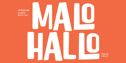 Malohallo is a Fun Display font. With Bold sharp and round edge combine stroke, fun character with a bit of ligatures and alternates. To give you an extra creative work. Malohallo font support multilingual more than 100+ language. This font is good for logo design, Social media, Movie Titles, Books Titles, a short text even a long text letter and good for your secondary text font with script or signature. Make a stunning work with Malohallo font. Cheers, Maulana Creative
 - Northyhuny by Maulana Creative,
$10.00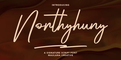 Northyhuny is a casual signature script font. With clean sharp stroke and fun character. It has Opentype features of ligatures and lowercase to give you an extra creative work. Northyhuny signature script font support multilingual more than 100+ language. This font is good for logo design, Social media, Movie Titles, Books Titles, a short text even a long text letter and good for your secondary text font with sans or serif. Make a stunning work with Northyhuny signature font. Cheers, MaulanaCreative
 - Karbines by Maulana Creative,
$14.00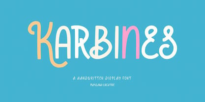 Karbines is a modern handwritten display font. With medium consist stroke with sharp edge, fun character with a bit of ligatures and alternates. To give you an extra creative work. Karbines font support multilingual more than 100+ language. This font is good for logo design, Social media, Movie Titles, Books Titles, a short text even a long text letter and good for your secondary text font with sans or serif. Make a stunning work with Karbines font. Cheers, Maulana Creative
 - Freik by Maulana Creative,
$13.00 Freik is a wide strong headlines display sans font. With bold sharp edge stroke, fun character with a bit of ligatures and alternates. To give you an extra creative work. Freik font support multilingual more than 100+ language. This font is good for logo design, Social media, Movie Titles, Books Titles, a short text even a long text letter and good for your secondary text font with sans or serif. Make a stunning work with Freik font. Cheers, Maulana Creative
 - Qiduwy by Twinletter,
$15.00 Qiduwy is a futuristic and stylish font perfect for designing labels, retro, stamps, badges, Oktoberfest posters, packaging, titles, beer, logos, barbershops, whiskeys, tattoos, music, movies, or certificates. This font is perfect for a dark and mysterious look. Bold black lines make this font perfect for a classy and stylish look. The wide, bold typeface gives this font an upscale look. Sharp corners and edges add a touch of class. This is the perfect font for a dark and mysterious look.
 - Laerna by Sensatype Studio,
$15.00 An Unique Feminine Display Serif font that we created special for elegant branding needs, with unique shape will be ready to add value of your brand. And specially for Belgium font, We prepared any characters to help you create unlimited variations for your creative needs. Laerna Unique Feminine Display Serif Font ready with: Ready with Alternate Fancy Characters Preview as a inspirations that you can do with Laerna font Ready with Lowercase and Uppercase characters Wish you enjoy our font. :)
 - The Impostor by Maulana Creative,
$15.00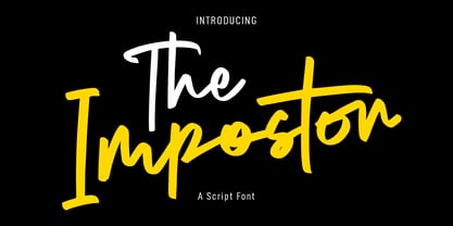 The Impostor is a regular casual script font. With sharp felt-tip stroke, slant and fun character with a bit of ligatures. To give you an extra creative work. The Impostor font support multilingual more than 100+ language. This font is good for logo design, Social media, Movie Titles, Books Titles, a short text even a long text letter and good for your secondary text font with sans or serif. Make a stunning work with The Impostor font. Cheers, MaulanaCreative
 - Railstone by Maulana Creative,
$14.00 Railstone is a quirky handwritten font. With sharp bold stroke, slanted, tight spacing and fun character with a bit of ligatures and Capital "R" & "L" alternates. To give you an extra creative work. Railstone font support multilingual more than 100+ language. This font is good for logo design, Social media, Movie Titles, Books Titles, a short text even a long text letter and good for your secondary text font with sans or serif. Make a stunning work with Railstone font. Cheers, MaulanaCreative
 - Track drift by Scratch Design,
$14.00 Track Drift is a strong font with a race theme. This font has speed, strong, sharp, fast, powerful, and modern characters. Track Drift will be suitable for racing or game themes of design, such as logos, headlines, posters, sports or race events, automotive posters, magazines, product design, packaging, labels, and other creative projects that need speed and strong font. What you'll get : All caps font in two styles Numbers & punctuation Multilingual support Ligatures Thank you for your purchase! Hope you enjoy our font!
 - Frisco Antique Display SG by Spiece Graphics,
$39.00 Here is a decorative condensed antique design that is sure to fit a variety of contemporary situations. The Bruce Type Foundry (later acquired by V. B. Munson) developed this wonderfully shaded Tuscan in the 1880s - or possibly earlier. It was known back then as Style No. 1050 and carried a pronounced three-dimensional look with a thin hairline at the bottom and right of each stroke. It is best to use Frisco Antique in large display sizes because it is easy to lose these delicate hairlines. A lowercase and several alternate characters have been provided for your convenience. Frisco Antique Display is also available in the OpenType Std format. Some new characters have been added to this OpenType version. Advanced features currently work in Adobe Creative Suite InDesign, Creative Suite Illustrator, and Quark XPress. Check for OpenType advanced feature support in other applications as it gradually becomes available with upgrades.
 - Gina by Tipo Pèpel,
$22.00 Gina is an unbiased humanist sans. The simple skeleton of the characters and the organic strokes are essential features to the design. It is a typeface that looks to the future while keeping an eye on classic letterforms. If we have a closer look, we will notice there is a tendency towards vertical proportions. Ascenders and descenders are long, making for a light texture in small text sizes. The type family includes 8 weights and 8 italics. There is a clear link between styles, both in the structure and shape of the letterforms. The italic counterpart uses a moderate inclination and some letters adopt characteristics of cursive forms. Besides Latin, the character set of Gina includes Cyrillic and essential features for covering current typographic needs. Gina has a wonderful set of ligatures, which indeed will catch the attention of those who love connected letterforms.
 - Carmensin by Rafael Jordan,
$35.00 Carmensin is a beautiful humanist serif typeface created by Rafael Jordán. Designed in the 21st Century with all the flavor of the Renaissance. The conclusion of a story that began in Type@Paris program in June, 2015 & ended at February, 2020. Inspired by historical models, its classic conventional appearance with small details, smooth curves, large x-height and open counters made of Carmensin a great, efficient and solid typeface for long text settings. Also, its bigger sizes styles show the beautiful shapes and contrast, exhibiting its exuberance. Carmensin has a great collection of OpenType features that will satisfy any typographic necessity as ornaments, ligatures, stylistic sets, small caps, automatic fractions and more options along 3 optical styles (Text, Headline and Display) plus a fancy Stencil style. With an extensive Latin character set, Carmensin covers a wide amount of Latin-based languages, including Latin Plus encoding.
 - Dracula by Storm Type Foundry,
$37.00 The best way to radicalize your typographic expression is to use Blackletter! Gothic calligraphy had been used throughout all historical periods without much of the principal development the Latin typefaces underwent. However, since the invention of movable type, even now its slight variations over time can be seen. Blackletters are always used where emotions are required, be it spiritual literature, romantic novels, decadent poetry or extreme music. Dracula is a typeface dedicated to classical horror. I started to draw its letters along with my illustrations for Argo publishers in spring 2017. I needed a specific typeface for book cover and chapter titles to emphasize the mysterious atmosphere of the text. Sharp teeth and claws on a thin blackletter skeleton shall remind of the early vampirism in literature. Its slightly narrowed face enhances a thrilling feel of anguish and despair, whereas the darkest cut may work well on funeral announcements.
 - Korolev by Device,
$39.00 DF Korolev is a 72 weight geometric sans serif family based on lettering by an anonymous Soviet graphic designer from the propaganda displays at the Communist Red Square parade in 1937. It has been named in honor of Sergey Pavlovich Korolyov, or Korolev, considered by many to be the father of practical astronomics. Rational and robust, it is also elegant and refined. Tracings done in Illustrator over a photograph featuring this type pinned down some of the basic character shapes. These were then imported into FontLab, where the full glyph complement was developed. The lower-case has been designed from scratch, and adheres to the structural logic of the uppercase as closely as possible. The complete Korolev super-family includes standard, italic, condensed, and compressed versions, each in five weights. Try the ‘rounded’ and ‘rough’ companion families. The Alternate families come with a double-story “a”.
 - Patrima by Juri Zaech,
$30.00 Patrima is a contemporary typeface with roots in the past. Specifically in the late nineteen hundreds where decorative type applications were en vogue and dimensional aspects and shadings where heavily used. Patrima takes simplified cues from these designs to make the typeface contemporary and versatile. Its base is a squarish Sans which expands through diagonal hatching to a three dimensional body. The hatching is wide enough for screen applications down to 24pt while remaining detailed for decorative purposes in larger sizes. Patrima’s different styles can be layered for chromatic results or used – complementary – alongside. As a decorative typeface it lends itself to display applications and eclectic logo designs, it brings a vintage touch to any branding project and elevates contemporary editorial layouts. Patrima comes with a set of catchwords which enrich its typographic texture even further. They are easily accessible through OpenType’s Discretionary Ligatures feature.
 - Fondue by Latinotype,
$29.00 Fondue: an eclectic-flavoured contemporary typeface. Designed by Jorge Alberto Martínez and Latinotype Team. Fondue is a type family of eclectic shapes, inspired by Art Deco designs, in particular, the lettering used by the Mexican cartoonist Ernesto “El Chango” Cabral on almost the entire publication Revista de Revistas ("Magazine of Magazines"). Far from being a copy, Fondue expects to be an adaptation of the thinking of that time to be used in contemporary context. Fondue has a cursive ductus, wide horizontal proportion and large x-height. Its friendly consistent rhythm makes it ideal for medium-sized text, headlines, branding, and so on. The family comes in 6 weights, from Thin, which reminds of the cartoonist’s loose strokes, to Ultra Bold, the version with powerful and unique voice. Fondue has a set of 496 characters that support 207 different languages.. OpenType features include standard and discretionary ligatures as well as stylistic alternates.
 - Aqua Lagoon by Patria Ari,
$15.00 Aqua Lagoon is a strong and sharp script typeface with alternative characters that inspired from beach and lagoon.
 - Tetris - Unknown license

- Jolly Roger by Red Rooster Collection,
$45.00 Steve Jackaman has refined and optimized Jolly Roger for digital release. The original design was created in 1970 by the legendary American type designer Phil Martin, founder and creator of the Alphabet Innovations and TypeSpectra type collections. Although quirky, playful and highly unusual, Phil describes Jolly Roger as his personal favorite out of his entire library of over 400 typefaces. We are proud and humbled to reintroduce the design in honor of our good friend and colleague.
 - Portland Grotesk by QUADRAAT,
$35.00 Portland Grotesk is a grotesque sans serif typeface with chubby proportions in 5 weights Light - Regular - Medium - SemiBold - Bold and supports all latin languages. Easy to use and easy to read. The character set contains 1109 glyphs with a wide range of alternates characters and includes: - Small Capitals - Fractions - Superiors, denominators - Open type features such as case sensitive, standard ligatures and several stylistics sets Portland Grotesk fits perfectly for all types of communication (Books, magazines, posters)
 - Jaroslav by Suitcase Type Foundry,
$45.00 Jaroslav is a typeface that breaks down typical assumptions on the construction of a monolinear grotesque, but still maintains excellent readability and the recognizability of individual characters. The sensitively-balanced type family of five weights is accompanied by a distinctive italic, so it works well with both expressive titles as well as shorter texts. This is why all weights include small caps, nine types of figures, alternatives, a large number of ligatures, arrows and other ornaments.
 - Linotype Mailbox by Linotype,
$29.99Linotype Mailbox is part of the Take Type Library, chosen from the entries of the Linotype-sponsored International Digital Type Design Contests of 1994 and 1997. The typefaces was created by German designer Andreas Karl. An entire alphabet, only lower case letters, with the look of @ -- who doesn’t think of the Internet? If you want to give your headlines or short texts an unmistakable feel of the Internet, you could not do better than Linotype MailBox. - Falena by Typoforge Studio,
$19.00 Falena is a type family designed by Gianluca Boffito. This simple, easy-to-read, geometric-style sans serif family is published by Typoforge Studio and consists of 18 weights (together with italics). It has more than 300 glyphs per style (including special characters). Falena works equally well in long form type settings and for titles, headings, posters. It comes with two sets of original dingbats (set 1 contains 52 ornaments, set 2 contains 52 truly distinctive and stylish icons).
 - Neva by ParaType,
$30.00 Neva Regular with Italic was created by Moscow book and type designer Pavel Kuzanyan (1901-1992) at Polygrafmash in 1970 for slugcasting and display composition. Based on simple strict letterforms of Russian classical typefaces. Neva typeface was rewarded on the Gutenberg international type design contest in 1971 (Leipzig). The typeface is useful in text and display composition, in fiction and art books. The digital version and bold styles were designed for ParaType in 2002 by Lyubov Kuznetsova.
 - Redwood by Canada Type,
$29.95 Redwood is the fresh and lively digitization of the popular ATF landmark, Raleigh Cursive. Drawn by Willard Sniffin in 1929, and introduced by ATF in 1930, this classic script is prominently featured in almost every published type history book, and proudly listed among every letterpress printer's type assets. Redwood's unique calligraphy is complemented with a set of swash capitals unlike any others out there. Strength, grace and elegance rarely ever combine the way they do in this typeface.
 - Serp and Molot by ParaType,
$30.00 Designed for ParaType in 2003 by Tagir Safayev. The typeface was inspired by some of the Cyrillic letterforms of Sergey Chekhonin (1878-1936). Chekhonin belonged to the World of Art group, which is so closely associated with the flowering of Russian book and theater design at the beginning of the 20th century. For use in advertising and display typography. Serp & Molot has been adjugded Award of Excellence in Type Design of 'bukva:raz!' ATypI International Type Design Competition, 2001.
 - Bulldog Slab by Club Type,
$36.99 Figgins and Caslon may be names familiar to many as Type Founders. Indeed they are, but they are perhaps less well known for the emergence of Sans Serif type styles which have become part of our lives since 1889. The first hundred years of this style is celebrated with this design by Adrian Williams, completed in 1989. It echoes many features of the Gothic, Grotesque and Sans Serif models of the period, based particularly on the 1870 Figgins.
 - Big Caslon CC by Carter & Cone Type Inc.,
$35.00 The three largest sizes of type made by the Caslon foundry are strangely unlike the famously consistent text faces cut by William Caslon. Perhaps they were the work of other hands—or of the master in a funky mood. Caslon’s text types have often been revived, but the display sizes, forceful and a touch eccentric, had no digital version until Matthew Carter’s Big Caslon. With striking Italics and rich design features , this typeface shines at BIG sizes.
 - PLatinum by Letterhead Studio-IG,
$35.00 The pLatinum family was created in 1998. Ink, scanner, Fontographer and as a result Regular and Italic styles of pLatinum typeface. Kyrillitsa'99 International type design competition Award winning typeface. The design style is “Irregular Serif”. The glyphs of pLatinum roman are reminiscent of the Russian types of early eighteenth century—especially in the smaller point sizes. An Italic, surprisingly close to the handwriting copybooks of mid-eighteenth century, is a later addition to the design.
 - Monthly Statement JNL by Jeff Levine,
$29.00 The 1934 French publication L'Art du Tracé Rationnel de la Lettre is a vintage guide book on lettering chock full of interesting alphabets that have been an ongoing source of digital type revivals from the designs found within its pages. Monthly Statement JNL is a squared slab serif design with some Art Deco flair; available in both regular and oblique versions. This style of type evokes images of billheads, bank statements and other important documents of the era.
 - Hotel Suite JNL by Jeff Levine,
$29.00 This is a digital reinterpretation of Walter Huxley's 1935 evergreen "Huxley Vertical", which was originally cast for American Type Founders. A timeless classic which has been in use since the Art Deco era, this version is known as Hotel Suite JNL. As in the original metal type, alternates for A,K,M,R,W and Y are available and can be found on their respective lower case keys. Hotel Suite JNL is available in both regular and oblique versions.
 - Bulldog by Club Type,
$36.99Figgins and Caslon may be names familiar to many as Type Founders. Indeed they are, but they are perhaps less well known for the emergence of Sans Serif type styles which have become part of our lives since 1889. The first hundred years of this style is celebrated with this design by Adrian Williams, completed in 1989. It echoes many features of the Gothic, Grotesque and Sans Serif models of the period, based particularly on the 1870 Figgins. - Garment Bag Stencil JNL by Jeff Levine,
$29.00 Searching the internet for interesting type ideas leads one to many unusual items for sale online. An antique, hand-cut metal stencil from France with the word “Bagagens” [luggage] provided a condensed Art Deco design in a semi-stencil format (some solid letters, others with traditional ‘breaks’ within the characters). The digital version of the type style has a more traditional stencil character set. Garment Bag Stencil JNL is available in both regular and oblique versions.
 - Woodline by Jeff Levine,
$29.00 Most folks might picture wood type lettering as the fancy styles of the 1880s which so perfectly evoked images of the Old West. Occasionally there is an exception to that rule, as an online image of some vintage wood letters with an Art Deco influence inspired a revival as a digital type face. Wood Lined JNL features a bold alphabet with an engraved line throughout the characters, and is available in both regular and oblique versions.
 - Schnitz by Linotype,
$29.99Linotype Schnitz is part of the Take Type Library, selected from the contestants of Linotype’s International Digital Type Design Contests of 1994 and 1997. Designed by the Finnish artist Osmo Niemi, the characters seem to contain no round forms at all. Linotype Schnitz looks as though it were chiseled and has an angular, almost brittle feel. The restless and lively appearance makes Linotype Schnitz particular well-suited to headlines and shorter texts with point sizes of 12 and larger. - JAF Herb by Just Another Foundry,
$59.00 Herb is based on 16th century cursive broken scripts and printing types. Originally designed by Tim Ahrens in the MA Typeface Design course at the University of Reading, it was further refined and extended in 2010. The idea for Herb was to develop a typeface that has the positive properties of blackletter but does not evoke the same negative connotations – a type that has the complex, humane character of fraktur without looking conservative, aggressive or intolerant.
 - Drawlers by Letterhend,
$14.00 Drawlers is a organic sans with stencil versionthat effortlessly infuses your designs with a touch casual and a dash of classic. Its unique type- maekt it perfect choice for any projects especially in logo, and the other various formal forms such as invitations, labels, logos, magazines, books, greeting / wedding cards, packaging, fashion, make up, stationery, novels, labels or any type of advertising purpose. Features : Regular & Stencil Version Uppercase & lowercase Numbers and punctuation Alternates & Ligatures Multilingual PUA encoded
 - Adobe Caslon by Adobe,
$35.00The Englishman William Caslon punchcut many roman, italic, and non-Latin typefaces from 1720 until his death in 1766. At that time most types were being imported to England from Dutch sources, so Caslon was influenced by the characteristics of Dutch types. He did, however, achieve a level of craft that enabled his recognition as the first great English punchcutter. Caslon's roman became so popular that it was known as the script of kings, although on the other side of the political spectrum (and the ocean), the Americans used it for their Declaration of Independence in 1776. The original Caslon specimen sheets and punches have long provided a fertile source for the range of types bearing his name. Identifying characteristics of most Caslons include a cap A with a scooped-out apex; a cap C with two full serifs; and in the italic, a swashed lowercase v and w. Caslon's types have achieved legendary status among printers and typographers, and are considered safe, solid, and dependable. Carol Twombly designed this Caslon revival for Adobe in 1990, after studying Caslon's own specimen sheets from the mid-eighteenth century. This elegant version is quite true to the source, and has been optimized for the demands of digital design and printing. Adobe Caslon? makes an excellent text font and includes just about everything needed by the discriminating typographer: small caps, Old style Figures, swash letters, alternates, ligatures, expert characters, central European characters, and a plethora of period ornaments. - Engria by Eclectotype,
$40.00 Engria is a type family of four weights with corresponding italics that treads the fine line between sans and serif. There are serifs, of a sort, inspired by the brush. Not the marks made by a brush, but the actual splayed shape the bristles make when clamped together. Wedge-like chunks that resemble engraved forms, as the name Engria hints at. But it also has the appearance of a stressed, flared sans. This mixed approach lends a unique voice. Highly legible at text sizes, as indeed it is optimized for, Engria does however shine at display sizes thanks to its characteristic details – flared stems, angular counterforms, rugged ink traps and fluid curves. (I would recommend tracking it a little tighter at larger sizes.) Engria started life way back in 2014, and has been worked and reworked tirelessly to get to this finished product. My intent was to really push the idea of the white shapes being as important, if not more so, than the black. Engria is equipped for typographically demanding applications, boasting as it does an array of OpenType features, including small caps, automatic fractions, stylistic sets, various figure styles, arrows, case sensitive forms and more. It will make a very useful addition to your typographic arsenal, with a flare (ahem) for editorial work, but the individuality for packaging, branding, and logo work.
 - FS Untitled Variable by Fontsmith,
$319.99Developer-friendly The studio has developed a wide array of weights for FS Untitled – 12 in all, in roman and italic – with the intention of meeting every on-screen need. All recognisably part of a family, each weight brings a different edge or personality to headline or body copy. There’s more. Type on screen has a tendency to fill in or blow so for each weight, there’s the choice of two marginally different versions, allowing designers and developers to go up or down a touch in weight. They’re free to use the font at any size on any background colour without fear of causing optical obstacles. And to make life even easier for developers, the 12 weight pairs have each been designated with a number from 100 (Thin) to 750 (Bold), corresponding to the system used to denote font weight in CSS code. Selecting a weight is always light work. Easy on the pixels ‘It’s a digital-first world,’ says Jason Smith, ‘and I wanted to make something that was really functional for digital brands’. FS Untitled was made for modern screens. Its shapes and proportions, x-height and cap height were modelled around the pixel grids of even low-resolution displays. So there are no angles in the A, V and W, just gently curving strokes that fit, not fight, with the pixels, and reduce the dependency on font hinting. Forms are simplified and modular – there are no spurs on the r or d, for example – and the space between the dot of the i and its stem is larger than usual. The result is a clearer, more legible typeface – functional but with bags of character. Screen beginnings FS Untitled got its start on the box. Its roots lie in Fontsmith’s creation of the typeface for Channel 4’s rebrand in 2005: the classic, quirky, edgy C4 headline font, with its rounded square shapes (inspired by the classic cartoon TV shape of a squidgy rectangle), and a toned-down version for use in text, captions and content graphics. The studio has built on the characteristics that made the original face so pixel-friendly: its blend of almost-flat horizontals and verticals with just enough openness and curve at the corners to keep the font looking friendly. The curves of the o, c and e are classic Fontsmith – typical of the dedication its designers puts into sculpting letterforms. Look out for… FS Untitled wouldn’t be a Fontsmith typeface if it didn’t have its quirks, some warranted, some wanton. There’s the rounded junction at the base of the E, for example, and the strong, solid contours of the punctuation marks and numerals. Notice, too, the distinctive, open shape of the A, V, W, X and Y, created by strokes that start off straight before curving into their diagonal path. Some would call the look bow-legged; we’d call it big-hearted.
