10,000 search results
(0.091 seconds)
- Artifex Regina by Adorae Types,
$29.00 Created for designs that require a handcrafted and handwritten look with a majestic touch. Artifex Regina is a blend of fantasy, wizardry, and charming delight. What's even better? IT'S VARIABLE! Designed to be a fun variable font, it allows Artifex Regina to be used as an animated typography adding a hint of magic through styles & transitions. Need a brighter inline? Need a softer shade? We got you! As an extra feature, you might want to try and play with its sliders and navigate throughout its 2 axes plus a swirly style handler to get a fully customized style! FEATURES: · Alternates: With an easy access at hand and through various stylistic sets that may contain many or a few alternates, leaving the choice to the designer for the right combination of sets and alternate characters. This includes a set of swirly ends available for static fonts as well as an axis for the variable font. · Contextual alternates: a few characters that provide some variety when used together. · Ligatures: Common used connectors with a playful twist. · Swashes: Accesible through OpenType Swashes feature there's a set of initial, final and middle swashes with passionate, elegant, and expressive strokes. Also, through stylistic sets, there's a set of monoline swashes for a cleaner look or limited spaces.
 - Press Gothic by Canada Type,
$24.95 Press Gothic is a revival of Aldo Novarese's Metropol typeface, released by Nebiolo in 1967 as a competitor to Stephenson Blake's Impact (designed by Goeffrey Lee). Though Metropol enjoyed a few short months of popularity and use in Italy, Germany and France, Impact won the technological outlasting battle by moving on to film type then to computer outlines bundled with mainstream software, while Metropol never made it past the metal state until now. Too bad really, since this is one of the few faces that could have played well with all the horrendous stretch'n'squeezing of the 1970s. Just like its inspiration, Press Gothic aims to be a fresh alternative to big economical poster fonts with clear sans serif forms and an urgent, strong, yet elegant design appeal. In the summer of 2008, Press Gothic underwent a major linguistic and aesthetic reworking for an international publishing company. The result of this on the retail side are new small capitals and biform/unicase additions to the main font, as well as expanded language support that includes Cyrillic, Greek, Turkish, Baltic, Central and Eastern European, Maltese, and Esperanto. Press Gothic Pro, the OpenType version, combines all three fonts into one, taking advantage of the small caps feature, and the stylistic alternate feature for the biform shapes.
 - New Age Gothic by Type Innovations,
$39.00 New Age Gothic is an original design by Alex Kaczun. It is a contemporary gothic design based on generous proportions and clean crisp lines. Ideally suited for easy reading and long lines of copy. The concept for the design came from a previously successful font family Contax Pro. Alex felt that the skeleton for Contax Pro was ideally suited to modify the design into a true gothic companion typeface series. Numerous modifications where made to the body proportions, stems and shapes. Serifs where added reminiscent to Copperplate Gothic to solidify the overall design. The result is a truly unique modern gothic font. Unlike other typefaces, New Age Gothic incorporates uniform stems throughout the capitals, lower case and figures. This gives the design a uniform appearance in overall color and strength. There is a perfect visual balance between inter-letter spacing, stem weights and proportions. The large Pro font character set, which supports most Central European and many Eastern European languages, also include small caps to compliment the old style figures. As a result, the design is ideally suited for display copy as well as text composition. In the near future, Alex plans to expand the typeface to include a broad range of weights along with italics.
 - Core Sans N SC by S-Core,
$15.00 Core Sans N SC is the Small Caps version of the Core Sans N that is a part of the Core Sans Series (Core Sans N SC, Core Sans N Rounded, Core Sans M, and Core Sans G). Letters in the Core Sans N SC Family are designed with genuine neo-grotesque and neutral shapes without any decorative distractions. The spaces between individual letter forms are precisely adjusted to create the perfect typesetting. The Core Sans N SC Family consists of 3 widths (Condensed, Normal, Extended), 9 weights (Thin, ExtraLight, Light, Regular, Medium, Bold, ExtraBold, Heavy, Black), and Italics for each format. It also supports WGL4, which provides a wide range of character sets (CE, Greek, Cyrillic and Eastern European characters). Each font includes support for Tabular numbers, Arrows, Box drawings, Geometric shapes, Block elements, Mathematical operators, Miscellaneous symbols and Opentype Features such as Proportional Figures, Numerators, Denominators, Superscript, Scientific Inferiors, Subscript, Fractions and Standard Ligatures. The Core Sans N SC Family provides both OpenType (.OTF) and TrueType (.TTF) versions in the same package. We highly recommend it for use in books, web pages, screen displays, and so on.
 - Core Sans WHH Sub NR by S-Core,
$15.00The Core Sans NR Family is a part of the Core Sans Series, such as Core Sans N, Core Sans N SC, Core Sans M, and Core Sans G. This family is the rounded version of Core Sans N family. Letters in the Core Sans NR Family are designed with genuine neo-grotesque and neutral shapes without any decorative distractions. The spaces between individual letter forms are precisely adjusted to create the perfect typesetting. The Core Sans NR Family consists of 3 widths (Condensed, Normal, Extended), 9 weights (Thin, ExtraLight, Light, Regular, Medium, Bold, ExtraBold, Heavy, Black), and Italics for each format. It also supports WGL4, which provides a wide range of character sets (CE, Greek, Cyrillic and Eastern European characters). Each font includes support for Tabular numbers, Arrows, Box drawings, Geometric shapes, Block elements, Mathematical operators, Miscellaneous symbols and Opentype Features such as Proportional Figures, Numerators, Denominators, Superscript, Scientific Inferiors, Subscript, Fractions and Standard Ligatures. The Core Sans NR Family provides both OpenType (.OTF) and TrueType (.TTF) versions in the same package. We highly recommend it for use in books, web pages, screen displays, and so on. - Core Sans NR by S-Core,
$15.00 The Core Sans NR Family is a part of the Core Sans Series, such as Core Sans N, Core Sans N SC, Core Sans M, and Core Sans G. This family is the rounded version of Core Sans N family. Letters in the Core Sans NR Family are designed with genuine neo-grotesque and neutral shapes without any decorative distractions. The spaces between individual letter forms are precisely adjusted to create the perfect typesetting. The Core Sans NR Family consists of 3 widths (Condensed, Normal, Extended), 9 weights (Thin, ExtraLight, Light, Regular, Medium, Bold, ExtraBold, Heavy, Black), and Italics for each format. It also supports WGL4, which provides a wide range of character sets (CE, Greek, Cyrillic and Eastern European characters). Each font includes support for Tabular numbers, Arrows, Box drawings, Geometric shapes, Block elements, Mathematical operators, Miscellaneous symbols and Opentype Features such as Proportional Figures, Numerators, Denominators, Superscript, Scientific Inferiors, Subscript, Fractions and Standard Ligatures. The Core Sans NR Family provides both OpenType (.OTF) and TrueType (.TTF) versions in the same package. We highly recommend it for use in books, web pages, screen displays, and so on.
 - Thermal by TipoType,
$35.00 Thermal is an exploration of balance and contrast. Combining the elegance of classical typography with the sharpness of contemporary design. It was conceived to be a variable font with two axes: weight & optical size, providing a wide range of options for texts & display applications. The regular and italic text weights breathe a warm atmosphere, their design inspiration is a relaxed interpretation of the work of 16th-century French type designer Robert Granjon, evoking a comforting rhythm and a sense of familiarity that makes reading enjoyable. On the other end of Thermal's design spectrum lie the extreme weights – thin and heavy –, specifically designed for larger sizes. These weights borrow stylistic cues from several distinct influences: the characteristic woodtype from the 19th century, the sharp lettering styles from the 70s, and the bold work of Oscar Ogg. One of Thermal's disctint features is its italic's 20° inclination, an significant inclination by all standards, this design choice finds its roots in the "Ascendonica Cursive" of 1571, but is a contemporary interpretation that generates a captivating contrast with the regular version. Thermal studies the past and analyzes the present to create a unique blend, bringing a dictint dichotomic identity.
 - Core Sans WHH Head NR by S-Core,
$15.00The Core Sans NR Family is a part of the Core Sans Series, such as Core Sans N, Core Sans N SC, Core Sans M, and Core Sans G. This family is the rounded version of Core Sans N family. Letters in the Core Sans NR Family are designed with genuine neo-grotesque and neutral shapes without any decorative distractions. The spaces between individual letter forms are precisely adjusted to create the perfect typesetting. The Core Sans NR Family consists of 3 widths (Condensed, Normal, Extended), 9 weights (Thin, ExtraLight, Light, Regular, Medium, Bold, ExtraBold, Heavy, Black), and Italics for each format. It also supports WGL4, which provides a wide range of character sets (CE, Greek, Cyrillic and Eastern European characters). Each font includes support for Tabular numbers, Arrows, Box drawings, Geometric shapes, Block elements, Mathematical operators, Miscellaneous symbols and Opentype Features such as Proportional Figures, Numerators, Denominators, Superscript, Scientific Inferiors, Subscript, Fractions and Standard Ligatures. The Core Sans NR Family provides both OpenType (.OTF) and TrueType (.TTF) versions in the same package. We highly recommend it for use in books, web pages, screen displays, and so on. - Perfora by In-House International,
$15.00 Perfora is the typographic antidote to our relentlessly anxious and uncertain times. On one hand, Perfora is heavy, monospaced and brick-like. It feels secure, permanent, reliable. On the other, Perfora is extra variable—stretching taller or growing wider as needed—so all your words can fit perfectly together. And this seeming contradiction is the sweet spot we’ve all been missing: sturdy but not rigid. Named for its punch-hole shaped counters and eyes, Perfora is a flexible powerhouse that’s easy to use, stack, and click into any shape. Use it to assemble everything from dynamic logos to posters and festival lineups, from seamlessly responsive titles to instantly recognizable product lines. Perfora features two uppercase styles—rounded and angular—punctuation, numbers, latin diacritics, and stylistic alternates for a subset of characters. It also includes 19 ornamental glyphs to compose with flair and add some rhythm to your copy. It’s available (and recommended) as a variable type (.ttf) for designers using compatible platforms. It’s also available in opentype format (.otf) as a set of 25 static fonts, spanning 5 widths and 5 heights. Perfora was created by In-House International, designed by Alexander Wright and developed by Rodrigo Fuenzalida.
 - Silent Brush by Ditatype,
$29.00 Silent Brush is a very lovely, elegant script font in capital letters bigger than ordinary ones to express such dramatic, attractive visual effects. To be consistently legible and harmonious in the whole context, every letter has its own proportions. One of the font’s main features is the brush scratch on every letter to show that the writing is made up of a paint brush producing a lot of rough textures. You can see the brush scratches along the letters’ edges and the letters’ sides to express dynamic moving flows. Despite being inspired by handwritings, this script font has gone through various adjustments making it more consistent and legible. Furthermore, it is much better to use this font for big text sizes to be more legible. In addition, you may enjoy the available features here as well. Features: Multilingual Supports PUA Encoded Numerals and Punctuations Silent Brush fits best for any design projects requiring artistic touches such as brands’ logos, posters, merchandise designs, and other promoting media. Find out more ways to use this font by taking a look at the font preview. Thanks for purchasing our fonts. Hopefully, you have a great time using our font. Feel free to contact us anytime for further information or when you have trouble with the font. Thanks a lot and happy designing.
 - Bordeaux Nova by Designova,
$9.00 BORDEAUX - A custom handmade display typeface with unique design and hybrid lettering styles. This all caps typeface has two different nature: the uppercase is purely simple & minimal but the lowercase is defined by unique alternatives having special design. This typeface is perfectly suitable for anything that needs to stand out from crowd, be it some Ultra Modern Branding, Techno or Cosmic Themed Designs, Haunted Movie Posters, Mysterious Arts and even the Minimal Stuffs. BORDEAUX could be perfect choice for logo / logotype design, branding, marketing graphics, banners, posters, signage, corporate identities as well as for editorial design that can bring uniqueness. Please see the examples shown above to get an idea about the capability of this typeface. Handcrafted and designed with powerful OpenType features in mind, each weight includes extended language support including Western European & Central European sets.
 - P22 Blox by P22 Type Foundry,
$24.95 P22 Blox is a modular system of shapes that can build letterforms and abstract patterns. Created as a working prototype for the letterpress P22 Blox project from P22 Analog and Starshaped Press, this system of shapes presents a unique approach to designing letterforms with a limited set of variables. Based on the American Type Founders 1944 modular metal type ornament system... you can have hours of fun building letters, patterns and more.
 - Duetto by ParaType,
$25.00 The letterforms of this face represent a "subtraction" of two different faces by weight, style, and shape -- one from another. The shapes of TM Miniature Italic are subtracted from FreeSet Bold with subsequent deconstruction. Though the spots may look amorphous they create images of both external and internal. At the same time none of them is explicit. The alphabet is lower case only. Designed by Boris Popov and licensed by ParaType in 2002 .
 - ATFAntique - Unknown license

- Franca by René Bieder,
$29.00 Franca is a neo-grotesk family in nine weights plus matching italics. The inspiration for the design came through the constant interest in new interpretations of the classic grotesk model and a study of "neutral“ typefaces like Helvetica, Univers or Normal Grotesk. During the studies, additional attention was given to the American representatives of the genre, resulting in the initial impetus for a reinterpretation, combining both paths into one contemporary design. This is reflected in the name, blending together the names of the most popular typefaces of each genres, (Fran)klin and Helveti(ca). Due to its large x-height and plain design, the family is perfectly suited for all kinds of text. Its mid-weights are optimized for usage in long paragraphs, while the bolder weights, due to a short descender and ascender, create a compact and confident look in headlines or short copy. In order to create strong and dynamic italics, the oblique glyph shapes come with a faint calligraphic hint, defined by a higher stroke contrast and a steeper connection between stems and arcs in, for example, h n m and u. This is followed by different standard shapes for a and y, supporting the dynamic movement of the lowercase in general. A wide range of OpenType features such as ligatures, old style figures, fractions, case-sensitive shapes and many more, are available for professional and contemporary typesetting. This is completed with eleven alternative glyph sets, enabling a quick customization of the typeface. The family supports up to 92 languages and comes with 500+ glyphs per font.
 - Kristen Curly - Personal use only

- Murisa Alexandra by Murisa Studio,
$10.00 Murisa Alexandra is one of our next proud fonts. Combining a strong and strong font style with a beautiful and charming calligraphy style, Alexandra is the perfect combination. You will be presented with a variety of font styles contained therein. Starting from the font that is sturdy and tough, there are also beautiful and charming swash fonts. Coupled with decorative fonts that are beautiful to look at. Not only that, this font is also equipped with an outline font type. So many kinds of fonts in it make you more and more expressive. Explore this font in such a way that it creates the perfect piece of work. Alexandra, a font, a perfection.. Get it now
 - Alterglam by Popskraft,
$18.00 Alterglam is one of my all time favorite fonts, although I didn't think so at first. The font appeared as a modification of my other default font. But over time, the font turned into an independent work. Moreover, the font began to live its own life and constantly demanded attention. So at the same time the Alterglam font is the most thoughtful and polished font in my collection. It is my pleasure to present this wonderful font set for exquisite designs. In the set there are 20 font sizes, which provides a rich typography. If you need a strict, but at the same time artistic font, Alterglam is the font of your choice.
 - Pagnol by Typorium,
$15.00 The Pagnol typeface has been designed with a principle developed by A. M. Cassandre in 1937, when the great French designer created the Peignot typeface following paleographic studies on the evolution of letterforms. Researches in the history of writing have proved that the lowercase "a" is at its origin nothing but the "A" shape transformed through centuries by scribes until the invention of printing. A large number of lowercases meanwhile kept their original shapes. If the scribes’ hand didn’t find the necessity to simplify them, it is only because these letters could be easily written. Integrating the classical shapes of capitals to the lowercases has already been used, keeping the lowercases which are only a deformation of capitals. Nevertheless, the respect of readability imposes to keep ascendants and descendants from traditional lowercases which serve as optical focus points in a text and make reading easier. The particularity of Pagnol is to use rounded shapes on top and bottom of pointed capital letters to make them fit with corresponding lowercases (Aa, Mm, Nn, Vv, Ww, Zz). Lowercases proportions are wide, to be in tune with classic lowercase shapes in order to optimize readability. Five weights in roman and italic have been designed to offer a wide palette of typographic possibilities in all sizes and all paper and screen supports.
 - They Live Brush by Alphabet Agency,
$14.00 They Live Brush font is inspired by the 80's cult classic movie They Live logo. The font is ideal for use in designs that you include a bold brush font in a cool way. The font has a graffiti feel that can allow you to express yourself with some attitude. The font is an all capital letters font. The font contains 128 characters.
 - Versica by Letrasupply Typefoundry,
$25.00 Versica is a handcrafted display font. This font family consists of multiple style fonts that can be used either as authentic individual fonts or can be combined to get cool layered type. The package is completed with swashes, shadow and serif font. Don't forget to play with stylistic alternates character that featuring the font. You may get a perfect font for any advertise or editorial work issues.
 - Tailor by Suomi,
$25.00 Tailor was a study of slab serif style with round and comfortable feel. I wanted to merge round shapes with exaggerated ink traps for legibility.
 - Thataway JNL by Jeff Levine,
$29.00 Thataway JNL is an assortment of arrows in many different sizes, shapes and directions that were collected from antique letterpress blocks and other vintage sources.
 - Omnidirectional Arrows JNL by Jeff Levine,
$29.00Omnidirectional Arrows JNL is a series of arrow dingbats in different shapes and directions in both solid and outlined drop shadow versions from Jeff Levine. - HeartMatrixed by Ingrimayne Type,
$12.95 HeartMatrixed is based on a matrix of dots in the shape of little hearts. It uses the same design pattern for placing dots as Dottie.
 - Itchy Handwriting by Gustav & Brun,
$10.00 Let’s be creative and have fun at the same time! With the new Itchy Handwriting, you will make your friends smile and your foes shake.
 - Crusellia by Ditatype,
$29.00 Introducing Crusselia Font. Crusselia font is a elegant handwritten font. Create from our talented font designer. This font will suitable for any project, like branding, print template, logo, quotes and etc. Features : Accents (Multilingual characters) PUA encoded Alternates Numerals and Punctuation (OpenType Standard) Full Support Thanks for visiting and purchasing my font!
 - Wonky by Ana's Fonts,
$16.00 The Wonky Font family is a set of 3 handmade fonts, made using three different materials: a pencil, a thin fineliner and a bold marker. Each font includes 3 variations for each letter and number, accessible through contextual alternates, for extra realism and fun. The pencil font is a SVG font, which allows for the texture of the pencil to be captured in a more authentic way, and is complemented with an extra doodles font. Wonky Font looks good at small sizes and will also look great in all caps texts. Use Wonky Font in designs such as postcards and notes, posters, logotypes, social media posts, branding and packaging. This font includes: a Wonky Pencil SVG font, with a vector alternative that preserves the texture a Wonky Thin font a Wonky Bold font a Wonky SVG Extras font, with 26 pencil doodles Software requirements for the SVG font: Photoshop CC2017+ // Illustrator CC2018+
 - Riclane by suhadidesign,
$15.00 Riclane elegant serif font Hi Ladies and Gentlemen! According to the market demand for fonts that tend to be more modern, then I decided to make a serif font that is in your view. The Riclane font is a serif font with very beautiful, comes with a modern style hoping to become a market favorite. We keep this font looking elegant, classy, easy to read, stylish, attractive and easy to use. Riclane Font is a great choice for magazines, retro designs, newspapers, books, brand names, branding, and other projects. The Riclane font is here to take the quality of your designs to a higher level. Riclane Font is my thirty first Font created in 2023 The Riclane font style will make you love designing and taking advantage of the cool design results for this font. Continue to follow us for updates on making further fonts :) Font Features: • Standard uppercase and lowercase letters • Multilingual Support • Numeral and punctuation • Elegant style
 - Brays by suhadidesign,
$16.00 According to the market demand, fonts tend to be unique fonts, so I decided to make a unique display serif font that is in your view. The Brays font is a font with many ligatures that is very unique and sought after, comes with a stylish style to become a market favorite. We keep this font looking elegant, classy, easy to read, stylish, attractive and easy to use. Brays Font is a great choice for beauty brands, magazines, travel, newspapers, books, brand names, branding, branding, quotes, album covers, and other projects. The Brays font is here to take the quality of your designs to a higher level. Brays Font is my Twenty ninth Font created in 2022 The Brays font style will make you love designing and taking advantage of the cool design results for this font. Continue to follow us for updates on making further fonts :) Font Features: • All capital letters • Stylistic ligatures • Stylistic alternate • Multilingual Support • Numeral and punctuation
 - Pressato by Resistenza,
$180.00 Pressato Font is a dynamic and innovative typeface meticulously crafted in collaboration with Pressato Coffee Bookshop in Torino. This unique font boasts three axes—weight, width, and slant—providing designers with unparalleled flexibility and control over their typographic compositions. With a total of 12 distinct fonts and a variable option, Pressato Font allows for a rich variety of styles, making it a versatile choice for a myriad of design applications. The font's flexibility in weight enables users to seamlessly transition from bold and impactful headlines to subtle and elegant body text, ensuring a cohesive and visually appealing design. The inclusion of width and slant axes further enhances the adaptability of Pressato Font. Designers can effortlessly customize the width of characters for a condensed or expanded look, while the slant axis adds a dynamic tilt, injecting personality and movement into the typography. Rooted in the aesthetics of Pressato Coffee Bookshop, this font exudes a contemporary and artistic vibe. Its variable nature opens up endless possibilities for creative expression, making it an ideal choice for branding, editorial design, and various other graphic projects. Pressato Font stands as a testament to the seamless integration of form and function, providing a sophisticated and engaging typographic solution for diverse design needs.
 - Vintage Glader by Ditatype,
$29.00 Vintage Glader is a beautifully crafted script font that exudes a timeless elegance and sophistication. Designed with a fairly thick weight, this font makes a bold statement while maintaining a classic script style. Its well-balanced proportions ensure a consistent and harmonious look across all letters, making it both visually appealing and highly readable. One of the defining characteristics of Vintage Glader is its contrasting strokes, which add a dynamic rhythm to the text. This contrast not only enhances the overall aesthetic but also contributes to the font's excellent legibility, making it suitable for a wide range of design applications. Adding to its charm, Vintage Glader swinging ends on some letters, lending a playful yet refined touch to the script. In addition, enjoy the features here. Features: Ligatures Stylistic Sets Multilingual Supports PUA Encoded Numerals and Punctuations Vintage Glader fits in headlines, invitations, logos, posters, flyers, branding materials, greeting cards, print media, and many more designs. Find out more ways to use this font by taking a look at the font preview. Thanks for purchasing our fonts. Hopefully, you have a great time using our font. Feel free to contact us anytime for further information or when you have trouble with the font. Thanks a lot and happy designing.
 - Lendriyan by Liartgraphic,
$18.00 Lendriyan fonts, calligraphy and handwriten fonts. This font is very beautiful and charming with curves. With its uniqueness, this font can be used as a logo, title, script, leaflet, landing pages and others. You just like this font, thank you
 - Garava - 100% free

- Mr Gabe by Leksen Design,
$- Check out Mr Gabe in motion! Mr Gabe is a typeface designed to dance. Not that it’s a flamboyant display face, but that it has a liveliness, especially in its heavier weights, that dances across the page. And the letters include a selection of exuberant flourishes that can be used to kick up a ruckus or make a sweeping gesture. Mr Gabe is a high-contrast serif typeface with vertical stress, a “modern” face in traditional type terms. Even in the regular weight, the contrast between thick and thin strokes is very obvious. Designer Andrea Leksen has given many of the lowercase letters ball terminals, teardrop shapes that make Mr Gabe seem decorated even when most of its letter forms are conservative. If you need more bells and whistles, or perhaps revolving mirror balls and dancing shoes, you can explore the font’s collection of ornaments and decorative borders. Mr Gabe comes in four weights, from Regular to Black, with italics for each. Each font includes over 57 ligatures, 31 illustrations and borders, small caps and proportional oldstyle numerals.
 - Serway by Hazztype,
$20.00 Serway is a captivating typeface that seamlessly blends elegance with a touch of playfulness. This font's defining characteristic is its wavy stems, which give each character a dynamic and fluid appearance. The wavy stems gracefully meander, creating a harmonious rhythm that adds a unique visual appeal to any design. The wavy stems in Serway mimic the graceful movement of gentle waves, the bending of tall grasses in the wind, or the meandering path of a flowing river. These organic shapes infuse each character with a sense of fluidity and harmony. The sans serif structure of Serway maintains a contemporary and modern aesthetic. The clean lines and smooth curves of the letterforms offer a sense of simplicity and sophistication, perfectly complementing the nature-inspired wavy stems. Serway is an ideal choice for various design projects, including editorial design, packaging, headlines, web design, logo creation, and branding. Its wavy stems add a distinct touch that sets it apart from traditional sans serif fonts, making it perfect for designs that seek to capture attention and create a memorable visual impact.
 - Browsa by FHFont,
$19.00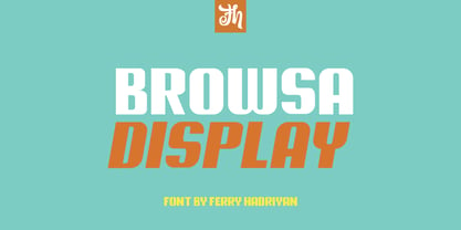 Browsa is a display font suitable for design, logotype, element design, wedding, event, t-shirt, logo, badges, sticker, and awesome work. Features Of The Font: - All Standard Character, Symbols, Multi-lingual Support, Stylistic Sets - PUA Encoding Follow Me: - https://www.instagram.com/FHFont - https://twitter.com/FH_Font - https://www.facebook.com/FHFont/ - https://id.pinterest.com/feydesign/
 - Feelin Sweet by Ardian Nuvianto,
$12.00 Hello. I want present my new font called "Feelin Sweet". This font have have very smooth curve and also have crunchy look. This font come with 2 styles. Regular font and Extrude font. it comes to make your project easier. This font can make your font more have a depth look with adding "Feelin Sweet" extrude font. This font will be the best choice for many project such as banner, brand packaging, cookies brand, snack brand, dessert design, cake logo design, mascot design letter, etc. This font also have Ligatures features. Enjoy and stay crunchy :) Drop me message if you have any questions. Or you can mail me damarkurung8@gmail.com Thanks
 - Castle Rocks by Java Pep,
$17.00 Introducing ligature serif font called CASTLE ROCKS duo fonts, these fonts have more than 50 ligatures include full set in uppercase and lowercase. This package consists of CASTLE ROCKS is the ligature font and CASTLE ROCKS DUO is the regular font so you can combine it to mix and match with switch on ligature font (CASTLE ROCKS) or regular font (Castle Rock). CASTLE ROCKS duo fonts are pretty and elegant fonts that perfect for title, headline, logotype, personal branding, branding invitations, quote, magazine, text font, etc. The package including CASTLE ROCKS (Ligature Font), this full set ligature font in uppercase and lowercase and have 4 weight style regular, italic, bold, and bold italic. CASTLE ROCKS DUO (Regular Font), this regular font without ligature feature so you can mix and match with CASTLE ROCKS or use to text font, this has 4 weight style regular, italic, bold, and bold italic. Multilingual, support more than 30 languages PUA Encoded If you have any questions, please let me know. Thanks and have a wonderful day.
 - Aish by 4RM Font,
$15.00 Aish font is an authentic handwritten font. This font combines simple style with authenticity of the font in its creation. suitable for use in simple themed graphic designs.


