10,000 search results
(0.048 seconds)
- Drop Cap One by Outside the Line,
$19.00 Drop Cap One is a drop cap or an initial cap font. Even though it has all the letters of the alphabet it is not an alphabet font to be used for headlines or body copy. It has no kerning or punctuation except a period. It does not have accent marks. There are basically 2 alphabets in this font. The lighter letters are lower case and the darker letters are upper case. The light and dark letters are interchangeable. While a fun desktop font the real inspiration for this font was my need for a webfont for initial caps for blogging. It could also make a great scrapbooking font too. Lots of uses for this quirky little font.
 - bubblii - Unknown license

- hannahhandlessbold - Unknown license

- HannahHand - Unknown license

- Gameness by Typodermic,
$11.95 Step back into the 1990s with Gameness, the font that embodies the spirit of the era’s gaming culture. Inspired by the Game Boy box art for Final Fantasy Adventure, Gameness evokes a sense of nostalgia while still looking fresh and modern. But this isn’t just any retro font. Gameness is sleek and sophisticated, with a narrow elegance that sets it apart from other throwback designs. Its tall letters are perfect for headlines, logos, and branding materials, giving your projects a bold, confident look. For clients who demand only the best, Gameness comes with an alternate barred “A”, adding even more versatility to your designs. And in OpenType-enabled applications, the “S” shape subtly alters to match the adjacent letters, ensuring a smooth, harmonious look every time. So why settle for ordinary fonts when you can make a statement with Gameness? Download it now and bring a touch of retro cool to your next project. Most Latin-based European writing systems are supported, including the following languages. Afaan Oromo, Afar, Afrikaans, Albanian, Alsatian, Aromanian, Aymara, Bashkir (Latin), Basque, Belarusian (Latin), Bemba, Bikol, Bosnian, Breton, Cape Verdean, Creole, Catalan, Cebuano, Chamorro, Chavacano, Chichewa, Crimean Tatar (Latin), Croatian, Czech, Danish, Dawan, Dholuo, Dutch, English, Estonian, Faroese, Fijian, Filipino, Finnish, French, Frisian, Friulian, Gagauz (Latin), Galician, Ganda, Genoese, German, Greenlandic, Guadeloupean Creole, Haitian Creole, Hawaiian, Hiligaynon, Hungarian, Icelandic, Ilocano, Indonesian, Irish, Italian, Jamaican, Kaqchikel, Karakalpak (Latin), Kashubian, Kikongo, Kinyarwanda, Kirundi, Kurdish (Latin), Latvian, Lithuanian, Lombard, Low Saxon, Luxembourgish, Maasai, Makhuwa, Malay, Maltese, Māori, Moldovan, Montenegrin, Ndebele, Neapolitan, Norwegian, Novial, Occitan, Ossetian (Latin), Papiamento, Piedmontese, Polish, Portuguese, Quechua, Rarotongan, Romanian, Romansh, Sami, Sango, Saramaccan, Sardinian, Scottish Gaelic, Serbian (Latin), Shona, Sicilian, Silesian, Slovak, Slovenian, Somali, Sorbian, Sotho, Spanish, Swahili, Swazi, Swedish, Tagalog, Tahitian, Tetum, Tongan, Tshiluba, Tsonga, Tswana, Tumbuka, Turkish, Turkmen (Latin), Tuvaluan, Uzbek (Latin), Venetian, Vepsian, Võro, Walloon, Waray-Waray, Wayuu, Welsh, Wolof, Xhosa, Yapese, Zapotec Zulu and Zuni.
 - Astro Serif by Typehead Studio,
$15.00 Introducing Astro, a charming serif font designed to bring an elegant and classic touch to your designs. Crafted with meticulous attention to detail and inspired by mid-millennium Serifs, Astro seamlessly blends traditional sophistication with contemporary elements, making it suitable for a variety of design projects, both print and digital. Enchanting Letter Shape Designs: Astro exudes charm with its letter design that is heavily inspired by the mid-millennium Serifs often found in European and American designs. Each letter is carefully carved to create a charming and luxurious impression. Unique Alternative Glyphs: Astro is not just a font; it is a standout typographic masterpiece. By offering several unique alternative glyphs, such as the letters a, g, and k, Astro gives designers the freedom to express their creativity in a unique and personal way. Mid-Millennium Serif Elegance: Astro features smooth lines and proportions, creating an elegant impression characteristic of mid-millennium Serifs. This design provides a timeless classic touch making it suitable for a variety of design needs, including books, magazines, posters and other printed materials. Ease Readability: While the Astro exudes striking elegance, its design also prioritizes readability and comfort. Each letter is created with balanced proportions and optimal contrast, ensuring text appears clear and easy to read, whether on a large or small scale. Flexible Use: Astro is designed to provide flexible use across a variety of design platforms. From the logo design to the magazine layout, Astro adapts beautifully, maintaining a consistent feel that enhances the aesthetic quality of the design. European and American inspiration: Astro creates a bridge between European and American typographic styles, combining the best elements of both traditions. This makes it the perfect choice for projects that combine elements from both continents. Astro is more than just a font, it is an artistic statement that leaves an unforgettable impression on any design project. Suitable for designers who appreciate classic beauty and modern uniqueness, Astro brings a special and charming feel to every character it creates.
 - Acroyear by Typodermic,
$11.95 Looking for a unique display typeface that will set your designs apart? Look no further than Acroyear! This quirky font is based on a soft, capsule shape that is sure to catch the eye of anyone who sees it. And while it can be used horizontally, it truly shines when placed on an upward incline. Whether you’re designing a poster, logo, or website, Acroyear is the perfect font to add a touch of personality to your work. Its soft curves and playful vibe make it perfect for anything from children’s books to edgy fashion campaigns. But don’t just take our word for it—give Acroyear a try for yourself and see how it can elevate your designs to the next level. With its unique style and endless versatility, this font is sure to become a staple in your toolkit in no time. So why wait? Try Acroyear today and see the difference it can make! Most Latin-based European, Greek, and some Cyrillic-based writing systems are supported, including the following languages. Afaan Oromo, Afar, Afrikaans, Albanian, Alsatian, Aromanian, Aymara, Bashkir (Latin), Basque, Belarusian (Latin), Bemba, Bikol, Bosnian, Breton, Bulgarian, Cape Verdean, Creole, Catalan, Cebuano, Chamorro, Chavacano, Chichewa, Crimean Tatar (Latin), Croatian, Czech, Danish, Dawan, Dholuo, Dutch, English, Estonian, Faroese, Fijian, Filipino, Finnish, French, Frisian, Friulian, Gagauz (Latin), Galician, Ganda, Genoese, German, Greek, Greenlandic, Guadeloupean Creole, Haitian Creole, Hawaiian, Hiligaynon, Hungarian, Icelandic, Ilocano, Indonesian, Irish, Italian, Jamaican, Kaqchikel, Karakalpak (Latin), Kashubian, Kikongo, Kinyarwanda, Kirundi, Komi-Permyak, Kurdish (Latin), Latvian, Lithuanian, Lombard, Low Saxon, Luxembourgish, Maasai, Macedonian, Makhuwa, Malay, Maltese, Māori, Moldovan, Montenegrin, Ndebele, Neapolitan, Norwegian, Novial, Occitan, Ossetian, Ossetian (Latin), Papiamento, Piedmontese, Polish, Portuguese, Quechua, Rarotongan, Romanian, Romansh, Russian, Sami, Sango, Saramaccan, Sardinian, Scottish Gaelic, Serbian, Serbian (Latin), Shona, Sicilian, Silesian, Slovak, Slovenian, Somali, Sorbian, Sotho, Spanish, Swahili, Swazi, Swedish, Tagalog, Tahitian, Tetum, Tongan, Tshiluba, Tsonga, Tswana, Tumbuka, Turkish, Turkmen (Latin), Tuvaluan, Uzbek (Latin), Ukrainian, Venetian, Vepsian, Võro, Walloon, Waray-Waray, Wayuu, Welsh, Wolof, Xhosa, Yapese, Zapotec Zulu and Zuni.
 - Khalitta by Yoga Letter,
$14.00 Khalitta is a modern calligraphy font. This font is very elegant and beautiful and is perfect for all types of your work. This font is perfect for weddings, branding and logos, for marketing your business, status updates on social media, and for capturing beautiful and romantic moments, and more.
 - This Boring Party - Unknown license

- Hearts Love Smile by TypoGraphicDesign,
$9.00 The typeface Hearts Love Smile (All We Need Is LOVE) is designed in 2018–2021 for the font foundry Typo Graphic Design by Manuel Viergutz. A font-collection from rough hand-printed old wood letters, rubber-stamps and plastic stamps till clean vectors, photos … 302 glyphs of LOVE. Decorative extras like icons, arrows, dingbats, emojis, symbols, decorative ligatures (type the word LOVE for ♥ or SMILE for ☻ as OpenType-Feature dlig). For use in logos, magazines, posters, advertisement and packaging plus as webfont for decorative headlines. The font works best for display size. Have fun with this font & use the DEMO-FONT (with reduced glyph-set) FOR FREE! ■ Font Name: Hearts Love Smile ■ Font Styles: 1 Icons + DEMO (with reduced glyph-set) ■ Font Category: Display for headline size ■ Glyph Set: 302 glyphs / decorative extras like arrows, dingbats, emojis, symbols ■ Design Date: 2021 ■ Type Designer: Manuel Viergutz
 - Cerita Kids by Beewest Studio,
$10.00 Cerita Kids is Doodle Comic font style. This font is look relax and fun, suitable for comic and Children book. This font is rendered and done by manual hand drawing that digitalized as a font so this font is very natural. Thank you for download this font.
 - FF Mutual by FontFont,
$50.99 FF Mutual is a friendly geometric sans serif full of subtle, unexpected details. Designer Luis Bandovas drew inspiration from an unlikely source—the credits from one of his favorite childhood shows, Space 1999—and turned that spark into a typeface that is warm and approachable, but contemporary. Bandovas built FF Mutual on a geometric skeleton, but the typeface has enough humanist touches to offset the rigidity usually found geometric designs. These touches are most apparent in the italics, where curved strokes on the “a” and “l” bring a softness to text. Generous spacing, angular details on letters like the “r” and “t,” and flared terminals on the “e,” “s,” and “c,” add further character to the design. FF Mutual’s bold shapes and retro-inspired warmth make it ideal for headlines, where the subtle details can really shine. The typeface is similarly well-suited for small blocks of text such as captions and call-outs, packaging design, and branding.
 - Jano Sans Pro by Craceltype,
$39.00 Jano Sans™ Pro is a neo humanist sans serif that was initially created to be used as a text and display typeface in brand communication. The result is a type family with a relatable character and a collaborative profile. Designed with elegant forms, low contrast and a geometric feel, Jano Sans™ Pro is a highly legible typeface suited for any text application and typographic reproduction. Jano Sans™ Pro has 18 styles and its a workhorse type system. It covers 290+ languages, including Extended Latin, Cyrillic and Greek writing systems. With over 1800 glyphs per style, its Opentype features include alternative shapes, small caps, standard and discretionary ligatures, localized forms in Latin and Cyrillic, case sensitive forms, numerators and denominators, proportional and tabular figures, slashed zero, fractions and more. The techie personality and the huge set of features and glyphs makes Jano Sans™ Pro an excellent choice for a wide range of applications, such as branding, editorial, web and broadcast.
 - Gloria Monoline by IM Studio,
$15.00 Gloria Monoline is a text serif with an editorial focus designed by Ikhsan Maulana. The idea for a typography job came from a design school letter-making exercise: Get a pair of scissors and some large sheets of paper, and start cutting. The resulting letters and the act of cutting them from paper inform the type design process, resulting in strong, simple shapes and open, inviting textures. The tone is crisp and straightforward. The classic letterforms, with a playful touch, give the design a personality that is both practical and spontaneous. The text weight is capable of adjusting copies at various sizes to print and render clearly on screen. Its lightest and heaviest weights work best at display sizes. Great care has been taken to save typists time with OpenType features including contextual punctuation and symbols to match case-sensitive, lower-case, and all-caps settings, as well as set images set for each use.
 - Monto Screen by Lucas Tillian,
$28.00 Introducing Monto Screen – the latest addition to the Monto superfamily, distinguished by its rational and meticulously constructed aesthetic. This new sub-family complements the success of Grotesk and Grotesk Display while offering a fresh take on Monto's design principles. Monto Screen is purposefully crafted for the digital era, ensuring unparalleled legibility and visual clarity on screens of all sizes. Its stroke endings align precisely at 90 and 0-degree angles, and its rounded shapes feature carefully designed verticals, creating a clean and harmonious structure. Through its rational construction, Monto Screen exudes a very trustworthy feel and established aesthetic, embodying a sense of reliability and timeless elegance. Its cap height aligned to the ascenders presents a unique choice that sets it apart, making it a compelling and distinct addition to the Monto superfamily. Embrace the future of typography with Monto Screen – a modern and rationally designed typeface that sets new standards for clarity and readability on digital platforms.
 - MVB Dovetail by MVB,
$79.00 MVB Dovetail is an editorially focused text serif designed by David Sudweeks. The working idea for the typeface came from a design school letter-making exercise: Take a pair of scissors and a few large sheets of paper, and start cutting. The resulting letters and the action itself of cutting them out of paper informed the type design process, producing strong, simple shapes and an open, inviting texture. Dovetail’s tone is crisp and straightforward. Its classic letterforms, set off with a touch of playfulness, give the design both a practical and spontaneous personality. The text weights capably set copy at a variety of sizes for print and render crisply on screen. Its lightest and heaviest weights perform best at display sizes. Care has been taken to save the typographer’s time with OpenType features including contextual punctuation and symbols to fit mixed-case, small-caps, and all-caps settings, as well as figure sets tuned to each use.
 - Voluta Script by Adobe,
$35.00Voluta Script is the work of Austrian designer Viktor Solt, created for use in a guide to the Austrian Gallery at Castle Belvedere. A volute (Latin voluta") is a spiral or scroll-shaped ornament used in the Baroque architecture of Castle Belvedere, similar to the swashes in this typeface. The castle was the historic residence of Prince Eugene of Savoy, one of the great military commanders of the 18th century and a prominent figure in Austrian history. When asked to create a typeface based on the calligraphy of the period to illustrate Eugene's epic, Solt turned for inspiration to Kurrent writing, a cursive blackletter style. Solt created a hybrid style that embodies the rhythm and basic forms of its ancestors, with large capitals, dark vertical strokes, and flourished beginning and ending characters. The typeface was designed to be used in sizes of 24 points and greater. Voluta Script allows designers to evoke the Baroque era or to lend a hint of majestic grace to contemporary typesetting." - Mr Chips by The Ampersand Forest,
$35.00 Mr Chips is a love letter to modern text serif families like Century Schoolbook and Scotch Romans of all kinds. There's nothing precious about Mr Chips. He's built sturdily, but with a less upright stance than his forebears, with a lower, more relaxed x-height. Mr Chips is dependable and true, with recognizable shapes that make him a pleasure to read. He's a Clarendon, but without the bulkiness that makes Clarendons difficult in text. Mr Chips has character sets for Western Europe, Cyrillic, and monotonic Greek. He has a full set of true small caps for versatility and hierarchy, and some fun and functional ligatures. His alternate characters include a one-story a and g in the upright versions, straight and curly Ka's and Zhe's in Cyrillic, and two styles of ampersand. He's an all around usable, agreeable guy! Mr Chips is a companion typeface to Miss McGee, also from The Ampersand Forest!
 - Vertrina by Greater Albion Typefounders,
$8.95 Vertrina marries four virtues: elegance, simplicity, character and usefulness. It started as an idea to combine two things: the elegance of classical Roman typefaces and of classical Roman architecture. The result is that rarest of all things - a truly new face that is elegant yet characterful but not so obtrusive as to be restricted to display work. All the faces' uprights mirror the elegant taper of Roman columns, as used in the most simple and elegant form of Roman architecture. The serifs are a subtle shape that mirrors the pediments and corbels of that same order of architecture. Vertrina is a family of eight faces, four upper and lower case faces, suitable for the elegant setting out of text, and four small capitals faces ideal for headings and titles. You'll find regular and bold weights and normal and condensed width, as well as a range of Opentype ligatures. All faces are offered individually and in family groups. Bring some simple elegance to your work.
 - Floki by LetterMaker,
$39.90 Floki is a contemporary condensed sans serif with sixteen styles ranging from extralight to extrabold and accompanying italics. The amount of styles, condensed proportions and large character set make Floki suitable for various uses such as infographics, packaging, branding, advertising and editorial design. Floki’s aesthetics are distinctly modern and they have a hint of softness which comes from sublty curving the diagonal strokes in letters such as A and V. This feature really shines when you set text in tightly set caps as big as possible. Stylistically Floki leans more to the humanist sans serif but it has a flavour of geometry in its shapes as well. The result of this combination of features is a highly usable typeface with a clear voice of it's own. All styles feature small caps and multiple sets on numerals including lining figures, old style figures, tabular figures, small cap figures, numerators, denominators, superiors, inferiors and fractions. Floki has latin extended character set making it well suited for multilingual typography.
 - VLNL Bon Bon by VetteLetters,
$35.00 Exuberantly delicious and lusciously sweet! VLNL Bon Bon embodies the perfect after dinner treat. Chocolate is a known aphrodisiac and bonbons are its most romantic carrier. Bonbon is not for nothing the French word for ‘good’ twice! You could definitely consider VLNL Bonbon the typographic equivalent of these exquisite chocolate sweets. Inspired by lettering on an Amsterdam church facade and a ladies clothing store window, Donald DBXL Beekman started drawing the first incarnation of Bon Bon already in 2004. The original idea was an alphabet design with slanted oval inner shapes and extremely long and striking serifs. This proved to be a quite demanding design job, so It took Bon Bon some time to get finished. But now it’s here in all its extravagant glory. Most recently a number of lowercase characters were added to make Bon Bon more versatile. Totally insane and over-top-the-top it has been called. But hey, we all love Bon Bon. Don't we?
 - VTF Ruth by Variable Type Foundry,
$22.99 VTF Ruth is a different typeface with a sans serif style inspired by classic geometric typefaces, adding a contemporary and modern touch in its output to seek style and quality in any project. This very personal character of its shapes, together with the variety of eighteen weights with their respective italics (Thin, Extra Light, Ultra Light, Light, Regular, SemiBold, Bold, Ultra Bold, and Black) and two styles, makes it perfect to combine with VTF Justina in digital editorial projects (e.g., web or apps) or printed (e.g., books, magazines or packaging). Making it an exciting option for large and small bodies without losing legibility at any weight. VTF Ruth has Opentype functions (case-sensitive forms, ordinals, scientific lower case, denominators, superscripts, subscripts, numerators, fractions) designed exclusively for your design. Supported languages: Afrikaans, Albanian, Catalan, Croatian, Czech, Danish, Dutch, English, Estonian, Finnish, French, German, Hungarian, Icelandic, Italian, Latvian, Lithuanian, Maltese, Norwegian, Polish, Portuguese, Romanian, Slovak, Slovenian, Spanish, Swedish, Turkish and Zulu.
 - Alien Alphabet by ParaType,
$25.00Alien Alphabet is inspired by the ideas of change, transformation, creative deconstruction and mutual penetration of various cultures, languages, and opposing cognitive systems, which seem to be prevalent in our 'globalized' civilization. It appears as various visual constructs -- archetypal symbolism, pieces of the world alphabets, socio-cultural icons, mathematical formulae, etc., -- broke down into pieces and were reassembled in a way that carried traces of previous meanings. However, this contradictory mutation invokes enigmatic meanings and emotions begging for further definition and interpretation. Alien Alphabet shapes arranged in linear sequential manner tend to evoke a sense of written language. The fact that a message cannot be understood does not really change its emotional appeal. Moreover, the less message can be deciphered, the more seems to be the appeal -- for it triggers our imagination. In fact, we may not want to know the actual meaning because deep inside we are afraid that this might be just another alien dry-cleaning receipt. - Nazare Exuberant by Ndiscover,
$39.00 Nazare Exuberant is the Poster version of Nazare. This version makes the vintage design more elegant and luxurious. It has super high contrast and the semi-serifs were turned into opulent serifs. Some shapes were redesigned by adding a slight calligraphic feel, making it even more vibrant. This way this design got more organic, more human, more serious, more trustworthy and more luxurious. This is the design for your posters, headlines and actually anything where the letters have a big point size. If you need a more text suitable version you can always use the original Nazare. Another feature is the insertion of some Opentype features: Ligatures were added as well as old style numbers. With its six weights you will have plenty of room for many variations. From the Regular that focus more on elegance to the Heavy that focus more on the lavishness. Regardless of which style you choose Nazare Exuberant is so unique that your designs will not remain unnoticed.
 - Amika by Craceltype,
$39.00 Amika™ is a rational geometric sans serif with an engaging personality and a contemporary profile. The large x-height, minimal contrast and the double storey 'a' makes Amika™ a highly legible typeface suited for any kind of text applications, from display poster type to massive text layouts. Amika™ has 22 styles and it's a workhorse type system. Versatile and reliable, it covers 230+ languages, including extended Latin, Cyrillic and Greek writing systems. With over 1280 glyphs per style, its Opentype features include alternative shapes, small caps, standard and discretionary ligatures, localized forms in Latin and Cyrillic, case sensitive forms, numerators and denominators, proportional and tabular figures, slashed zero, fractions and more. With a tectonic touch, Amika™ is a prototypical sans serif of the New Media age that, due to its extensive set of features, conveys a great choice for a wide range of applications, from branding to broadcast.
 - NO culture no SOUL by TypoGraphicDesign,
$9.00 The typeface No Culture No Soul is designed from 2021–2022 for the font foundry Typo Graphic Design by Luise Herke × Manuel Viergutz as a project for support the culture. Special THX to Michael Rütten of soulpatrol.de The display font with 254 glyphs incl. numbers, punctation, marks & symbols is inspired in the past and present. Extras like OpenType-features and 7 sylistic sets. For use in logos, magazines, posters, advertisement plus as webfont for decorative headlines. The font works best for display size. Have fun with this font & use the DEMO-FONT (with reduced glyph-set) FOR FREE! Font Specifications ■ Font Name: No Culture No Soul ■ Font Styles: 1 (Rough) + DEMO (with reduced glyph-set) ■ Font Category: Display for headline size ■ Glyph Set: 254 glyphs incl. extras like icons (decorative extras like dingbats, emojis, symbols) ■ Design Date: 2021–2022 ■ Type Designer: Luise Herke, Manuel Viergutz, THX to Michael Rütten (Soulpatrol)
 - Daily Spark by Sarid Ezra,
$17.00 Introducing, Daily Spark, handwritten font duo Daily Spark is a package of two fonts including Bold Sans and Script that will compliment each other. You can use this font for any occasions such as a branding, merchandise, etc. With handmade feels, this font is suitable for quote. For additional, this font also contains underline that you can access from ligature and type underscore + number (1-3) in the middle of the text, for example : Sp_2ark. This font also support multilingual.
 - Brostone by Rockboys Studio,
$17.00 Brostone Brush is a magical script font carefully created with a touch of elegance. Whether you’re looking for fonts for Instagram or calligraphy scripts for DIY projects, this font will turn any creative idea into a true piece of art!
 - Wonderella by Almarkha Type,
$29.00 Wonderella is a cute and casual sans serif font with an incredibly friendly feel. Whether you’re looking for fonts for Instagram or calligraphy scripts for DIY projects, this font will turn any creative idea into a true piece of art!
 - Sweet Barbrown by TM Type,
$20.00 Sweet Barbrown is a cute and bold script font with an incredibly friendly feel. Whether you’re looking for fonts for Instagram or calligraphy scripts for DIY projects, this font will turn any creative idea into a true piece of art!
 - Beach Party by Cititype,
$9.00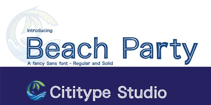 Beach Party is a cute and casual display font with an incredibly friendly feel. Whether you’re looking for fonts for Instagram or calligraphy scripts for DIY projects, this font will turn any creative idea into a true piece of art!
 - The Comic Struves by Stringlabs Creative Studio,
$25.00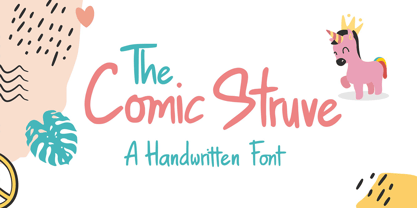 The Comic Struve is a cute and casual display font with an incredibly friendly feel. Whether you’re looking for fonts for Instagram or calligraphy scripts for DIY projects, this font will turn any creative idea into a true piece of art!
 - Plance by Hsan Fonts,
$16.00 Plance is a font for simplified logo design. The font is suitable for creating headlines, logos, text and advertising tags All alternate options for characters are included in each font. You can use the alternatives in most major photo editors.
 - Lemon Rolls by Illushvara,
$12.00 Lemon Rolls is a cute and casual handwritten font with an incredibly friendly feel. Whether you’re looking for fonts for Instagram or calligraphy scripts for DIY projects, this font will turn any creative idea into a true piece of art!
 - Pea Shirley - Unknown license

- Pea Jordan - Unknown license

- Pea Susan - Unknown license

- Pea Bethany - Unknown license

- Pea Neffer - Unknown license

- Pea Carrie - Unknown license


