10,000 search results
(0.119 seconds)
- Saturator FA by Fontarte,
$39.00 Inspired by hand lettering and vernacular typography. Its informal and friendly character allows for different creative ways of usage. It is recommended for publishing, advertising and branding to get fresh handmade feeling. First version of Saturator FA Regular was designed by Magdalena Frankowska in 2007 and used successfully by many graphic designers all over the world. New version of Saturator FA is broadened with more diacritic characters for most of Latin languages. In 2016 new styles: Italic, Serif and Serif Italic were designed to enrich the Saturator FA family.
 - ITC Cushing by ITC,
$29.99ITC Cushing has a long history. The typeface was originally designed by J. Stearns Cushing, a Boston-based book printer, and famous American type designer Frederic Goudy expanded it to include an italic weight. Under a special license from the American Type Founders, Vincent Pacella modified the design for ITC and added some additional weights. ITC Cushing is slightly condensed with large, bracketed serifs. Pacella changed the capital letters to better complement the lower case and replaced the sloping serifs of the italics to linear type serifs to produce ITC Cushing. - FF Zwo Correspondence by FontFont,
$62.99 German type designer Jörg Hemker created this sans FontFont in 2002. The family contains 4 weights: Regular, Italic, Bold, and Bold Italic and is ideally suited for logo, branding, small text, software and gaming as well as web and screen design. FF Zwo Correspondence provides advanced typographical support with features such as ligatures, alternate characters, case-sensitive forms, fractions, super- and subscript characters, and stylistic alternates. It comes with tabular lining and proportional lining figures. This FontFont is a member of the FF Zwo super family, which also includes FF Zwo.
 - 1906 French News by GLC,
$38.00 We have created this family from the numerous derivatives in use for newspapers since the middle of the 1800s to the 1970s, inspired by the well known Clarendon. Mainly, the patterns are those used to print Le Petit Journal, a popular French Newspaper of the era (published from 1863 to 1937). The present version contains Normal, Italic, Bold and Bold Italic styles, in two sub families: 1906 French News for texts and titlings with upper and lower case, and 1906 French News Caps (Caps, small caps, small numerals, for texts and titlings).
 - Auto Pro by Underware,
$50.00 Auto Pro is a warm, humanist sans serif typeface which has three different styles of italics, each with its own flavor. With its three italics, Auto creates a new typographic palette, allowing the user to drive through unknown typographic and linguistic possibilities. Also, because of its four weights and the three different figure styles, it’s a vehicle equipped for many roads of typography. Comes with Underware’s Latin Plus character set with a support for 219 languages. Take a cruise, and let this typeface carry you to business or leisure.
 - Solidus by Brown Type,
$40.00 Inspired by the heuristic typography of the Concrete Poetry movement, Solidus is a hardworking and unobtrusive sans in the Neo-grotesque style. Its simplified features, generous spacing and squarish curves imbue a sense of sobriety and allow the textual information to take centre stage, whether in body copy or at display sizes. Solidus is available in nine distinctive weights from wafer-thin Hairline to a hefty Black, each with accompanying italics. Typical of the Neo-grotesque style the italics are slanted in construction and have the same advance width as the uprights.
 - Eco Hand Kid by TypoGraphicDesign,
$19.00 The typeface Eco Hand Kid is designed from 2022 for the font foundry Typo Graphic Design by Manuel Viergutz as a political statement #climatejustice 4 font-styles (Cond, Bold, Outline, Icons) with 948 glyphs (Adobe Latin 3) incl. 100+ decorative extras like icons, arrows, dingbats, emojis, symbols, geometric shapes, catchwords, German Capital Sharp S, zodiac signs, ligatures (type the word #LOVE for ♥︎ or #SMILE for ☺ as OpenType-Feature dlig) and stylistic alternates (8 stylistic sets). For use in logos, magazines, posters, advertisement plus as webfont for decorative headlines. The font works best for display size. Have fun with this font & use the DEMO-FONT (with reduced glyph-set) FOR FREE! Font Specifications ■ Font Name: Eco Hand Kid ■ Font Styles: 4 (Cond, Bold, Outline, Icons) + DEMO (with reduced glyph-set) ■ Font Category: Sans Serif Display for headline size ■ Glyph Set: 948 glyphs (Adobe Latin 3) incl. 100+ icons (decorative extras like arrows, dingbats, emojis, symbols) ■ 93 languages: Afrikaans Albanian Asturian Asu Basque Bemba Bena Breton Catalan Chiga Colognian Cornish Croatian Czech Danish Dutch Embu English Esperanto Estonian Faroese Filipino Finnish French Friulian Galician German Gusii Hungarian Igbo Indonesian Irish Italian Kabuverdianu Kalaallisut Kalenjin Kamba Kikuyu Kinyarwanda Latvian Lithuanian Lower Sorbian Luo Luxembourgish Luyia Machame Makhuwa-Meetto Makonde Malagasy Maltese Manx Meru Morisyen North Ndebele Norwegian Bokmål Norwegian Nynorsk Nyankole Oromo Polish Portuguese Quechua Romanian Romansh Rombo Rundi Rwa Samburu Sango Sangu Scottish Gaelic Sena Serbian Shambala Shona Slovak Soga Somali Spanish Swahili Swedish Swiss German Taita Teso Turkish Upper Sorbian Uzbek (Latin) Volapük Vunjo Walser Welsh Western Frisian Yoruba Zulu ■ Design Date: 2022 ■ Type Designer: Manuel Viergutz
 - ITC Legacy Sans by ITC,
$40.99 ITC Legacy¿ was designed by American Ronald Arnholm, who was first inspired to develop the typeface when he was a graduate student at Yale. In a type history class, he studied the 1470 book by Eusebius that was printed in the roman type of Nicolas Jenson. Arnholm worked for years to create his own interpretation of the Jenson roman, and he succeeded in capturing much of its beauty and character. As Jenson did not include a companion italic, Arnholm turned to the sixteenth-century types of Claude Garamond for inspiration for the italics of ITC Legacy. Arnholm was so taken by the strength and integrity of these oldstyle seriffed forms that he used their essential skeletal structures to develop a full set of sans serif faces. ITC Legacy includes a complete family of weights from book to ultra, with Old style Figures and small caps, making this a good choice for detailed book typography or multi-faceted graphic design projects. In 1458, Charles VII sent the Frenchman Nicolas Jenson to learn the craft of movable type in Mainz, the city where Gutenberg was working. Jenson was supposed to return to France with his newly learned skills, but instead he traveled to Italy, as did other itinerant printers of the time. From 1468 on, he was in Venice, where he flourished as a punchcutter, printer and publisher. He was probably the first non-German printer of movable type, and he produced about 150 editions. Though his punches have vanished, his books have not, and those produced from about 1470 until his death in 1480 have served as a source of inspiration for type designers over centuries. His Roman type is often called the first true Roman." Notable in almost all Jensonian Romans is the angled crossbar on the lowercase e, which is known as the "Venetian Oldstyle e."" ITC Legacy® Sans font field guide including best practices, font pairings and alternatives.
 - Radja Lover by Alit Design,
$18.00 IntroducingRadja Lover Script Font 🖤The Radja Lover Script Font 🖤 is valentines day inspired font made for romance theme. The Radja Lover Script Font adheres to a simple and elegant modern script style, besides that this font has a unique swash in the shape of a heart that can be used for unique love designs. Very suitable for use in making greeting card designs, Instagram posts, logo designs, wedding texts, romance quotes and so on, the first is about love. Apart from that this font is very easy to use in both design and non-design programs because all alternates and glyphs are supported by Unicode (PUA).
 - BD Micron Robots by Typedifferent,
$8.00 The BD Micron Robots variable dingbats font features 52 Microns – micro-tiny robot characters with 5 mutations. The variable font technology helped breathing live into the BD Micron Robots See them in action. The Muta1 version of the font shows the Micron Robots in its original shape. Muta5 is the final stage of the Micron Robots mutations. The Variable version of the Micron Robots font is a variable font and you can determine the grade of the mutation between Muta1 and Muta5 by yourself. By the way: The BD Micron Robots perfectly fit together with the BD Micron Font, also available here at MyFonts.
 - Deicho by Twinletter,
$15.00 Do you need a beautiful, one-of-a-kind font for your business, social media, or other purposes? Then this package is ideal for you. Deicho San Serif is a premium font family that comes in 18 different styles. Designed to assist you in creating visually stunning projects of any kind. Its one-of-a-kind shape will make your project stand out to your audience. of course, your various design projects will be perfect and extraordinary if you use this font because this font is equipped with a font family, both for titles and subtitles and sentence text, start using our fonts for your extraordinary projects.
 - Sought by Sensatype Studio,
$15.00 SOUGHT is a Modern Classy Extended Serif Font A new Serif font that we created special for logo and branding needs, with extended shape that will add your brand value. It so nice to leverage designer or product owner that need solutions to make their design look more classy and stunning. And specially for SOUGHT font, We prepared only uppercase characters to help you create any creative things specially for logotype or wordmark. SOUGHT Modern Classy Extended Serif font ready with: Perfect characters for beauty or fashion brand Preview as a inspirations that you can do with SOUGHT font Ready with all Uppercase characters Wish you enjoy our font. :)
 - Remhu by Twinletter,
$12.00 Remhu is a sans serif font from the modern era. An option with a distinctive shape adds value to your brand and is ideal for branding purposes. It’s wonderful to be able to help designers or product owners who are looking for ways to make their designs more classic and elegant. And, in particular, for font satisfaction, multilingual language support, numbers, and punctuation. of course, your various design projects will be perfect and extraordinary if you use this font because this font is equipped with a font family, both for titles and subtitles and sentence text, start using our fonts for your extraordinary projects.
 - Sila by Khoir,
$15.00 Introducing, Sila, Modern Serif. This font has an attractive and elegant alternative and several ligatures that enhance it, making your font / logo more attractive. This font has a bold and smooth shape, making this font look unique but doesn't leave an elegant impression. This font is suitable to be applied especially in logos, invitations, novels, books, magazines, labels, greeting / wedding cards. So what are you waiting for! What's included? Uppercase Characters Lowercase Characters Support 75+ Language FEATURES So what are you waiting for? immediately purchase this font, feel free to comment, or send me my PM or email at khoirtypework@gmail.com Thank you for seeing
 - Gencis by Twinletter,
$15.00 introduce Gencis unique display font. You can use this font that has a funny, cute, attractive, and playful shape for various things in your special project. It can be used as the title of your news article, or it can be used in your search button. Or you can even use it as a subtitle in various visual media to promote your company. of course, your various design projects will be perfect and extraordinary if you use this font because this font is equipped with a font family, both for titles and subtitles and sentence text, start using our fonts for your extraordinary projects.
 - Kilura Style by Sensatype Studio,
$15.00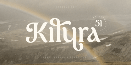 An Classy Modern Vintage Font font that we created special for elegant branding needs, with extra alternates in unique shape will be ready to add value of your brand. It so nice to leverage designer or product owner that need solutions to make their design look more classy and modern. And specially for Kilura font, We prepared any alternate characters to help you create unlimited variations for your creative needs. Kilura Classy Modern Vintage Font ready with: Any options to get creative variations (combination of Alternate characters) Preview as a inspirations that you can do with kilura font Ready with Lowercase and Uppercase characters Wish you enjoy our font. :)
 - Cratch SS by Sensatype Studio,
$15.00 Cratch Vintage font is a well-balanced contemporary font with a fancy, unique, and versatile heritage vintage serif font that you can combine to get any variations and unique shapes easily just in seconds. It is a serif display font with moderate contrast that perfect for branding projects, logo, wedding designs, social media posts, advertisements, product packaging, product designs, label, photography, watermark, invitation, stationery, and any projects, it makes with a high level of legibility. What's Included: 4 Styles Fonts Character set A-Z Uppercase & Lowercase Numerals & Punctuation Accented Characters (West Europe) Stylistic alternates Works on PC & Mac Recommended using Adobe Illustrator or Adobe Photoshop. Wish you enjoy our font. :)
 - Anthrope by Ilhamtaro,
$23.00 ANTHROPE is a serif font with a grunge style so it feels like a retro font, with a thick body that makes this font very manly. This font is perfect for designs related to male hobbies such as motorbikes. Besides that, this font is an all caps font, so this will add to the manly impression. All caps here still have the difference between Uppercase and Lowercase, which have different heights and different letter shapes. To enable the OpenType Stylistic alternates, you need a program that supports OpenType features such as Adobe Illustrator CS, Adobe Indesign & CorelDraw X6-X7. Guides to access all alternates glyphs : http://adobe.ly/1m1fn4Y Cheers!
 - Mybook Again by Alit Design,
$18.00 Introducing Mybook Again Font 🖤The Mybook Again Romantic Script Font 🖤 is valentines day inspired font made for romance theme. The Mybook Again Font adheres to a simple and elegant modern script style, besides that this font has a unique swash in the shape of a heart that can be used for unique love designs. Very suitable for use in making greeting card designs, Instagram posts, logo designs, wedding texts, romance quotes and so on, the first is about love. Apart from that this font is very easy to use in both design and non-design programs because all alternates and glyphs are supported by Unicode (PUA).
 - Adore by Canada Type,
$24.95 In 1939 the Stephenson Blake Company bought a very popular script called Undine Ronde and began marketing under the name Amanda Ronde. Although Undine/Amanda was quite popular and can be seen in many advertisements from the 1930s and 1940s, there seems to be no surviving record stating the original foundry or designer. We thought that six and half decades of dust layers over the once-popular typeface were enough, so here and now you have its complete and expanded digital incarnation, Adore. It is quite easy to see why this typeface was popular. A round script with graceful meaty curves is rarely found and can be used in plenty of applications. Wedding paraphernalia, chapter titles, posters, poetry, book covers, religious literature... you name it, Adore can fit it. Aside from its totality being unmatched by currently available designs, Adore also possesses some of the most unique and imaginative letter shapes. The narrow loops on the B, P and R, the minuscule-like Z, the looped b and d, the descending h... all these shapes contribute to a breathtaking and adorable calligraphic work unlike any other. The original design came in a basic alphabet, but we have updated it for current digital technologies, and expanded it to include plenty of alternates and ligatures, as well as some ornaments. The Postscript Type 1 and True Type versions come in two fonts, the second containing the alternates and extras, while the Open Type version is a single font containing all the alternates and extras in conveniently programmed features, easily accessible at the push of a button in OpenType-supporting software. We also encourage you to take a look at Typodermic's Mecheria font, which is further experimentation with the same letter forms, resulting in a quirky, friendly, curly, angular gothic-like creature.
 - Rotato by VIP Graphics,
$8.49 Rotato is a lowercase only geometric slab-serif typeface that brings versatility to any design. This minimalist but distinctive font is defined by its crisp composition and modern elements — designed for optimal legibility at all sizes. Out now in all lower case, Rotato leaves an understated impression of elegance & futurism. Currently available in three standard weights, more coming soon: Rotato Light - Clean and classy Rotato Regular - Elegant and elite Rotato Bold - Strong and classic FEATURES Three (3) Font Weights + Italics Numbers and Punctuation New (v2): Extended Ligatures & Nordic Character Set Special Characters Rotato is a dynamic font that works great across various applications: from branding & logos to technology & fashion — whether in a giant heading, or paragraphs of body text. Thanks for checking out Rotato; we hope you enjoy using it.
 - Planc by Taner Ardali,
$39.00 Planc has emerged as an approach to reconsider the grotesque font anatomy in a contemporary way. It is a new grotesque family with its subtle touches of details. Its relaxed proportional structure differentiates Planc from the usual grotesque anatomy, meeting the grotesque font requirement that can keep up with today. In addition to the solid grid structure on the horizontal axis, with its smoothed curves, Planc provides a comfortable reading flow and avoids being dull with its details. Its minimalist approach comes from Planc's reduced dysfunctional details. As a clean design principle, it contains innovative letterforms. Planc font family consists of 10 weights including matching italics with extended Latin character set. It is a designer-friendly typeface with extra symbols, standard-old style,tabular-proportional numbers, arrow sets, and stylistic alternates.
 - Eris Pro by DBSV,
$120.00 Rolling gemstones… The name "Eris" is again borrowed from Greek mythology, is related to the myth "the apples of Hesperides" which were gold and one of them got the Erida!!! More about this myth can be found on the web... And in this font (as in one section in the "Cyceon" font) I have mixed in the lower case with the capitals in many letters.I tried here to give a different illustration in lowercase letters, simply because of whims or because the monotony is tiring me!!! One can also mix here with two levels to get a third color depiction using the “ErisPro-Black” with “ErisPro-Strap” or “ErisPro-BlackIt” with “ErisPro-StrapIt” This series is composed and includes twenty-four fonts with 658 glyphs each, with true italics and supports Latin, Greek and Cyrillic.
 - Isidora by Latinotype,
$26.00 Designed by Enrique Hernández V. Isidora is a modern geometric design based on the classic typefaces of the early 20th Century with a contemporary and functional touch. In spite of its strong and rational structure, the font also looks friendly and expressive, thanks to its rounded terminals. In addition, its diagonal terminal cuts give it a softer and more rounded appearance. Isidora consists of two 7-weight subfamilies: one (more classic) Regular and one Alternative (more contemporary and for display use). Both subfamilies come in italic version, giving a total of 28 fonts. Isidora is the perfect font for headlines, logotypes, branding, packaging, publishing and web use. The family contains a set of 438 characters—supporting 207 different languages—and also includes an alternative character set, which allows for more versatility when composing text.
 - Black Butcher by IKIIKOWRK,
$19.00 Introducing Black Butcher - Oldtype Series, created by ikiiko. Black Butcher is inspired by logo/ typography of classic american muscle car. The letters are bold script fonts with a flexible and straight line. This font have a unique waveform and has a large selection of stylistic sets. You can play with many style choices! This typeface is perfect for an vintage car logo, magazine cover, poster & flyer design for automotive event, and also good for vintage product, or simply as a stylish text overlay to any background image. What's included? 2 Weights : Regular & Italic Uppercase & Lowercase Number & Punctuation Alternates & Stylistic Multilingual Support Get also a good offer & FREEBIE at our site : www.ikiiko.com Enjoy our font and if you have any questions, you can contact us by email : ikiikowrk@gmail.com
 - Jupiter Mission by Wing's Art Studio,
$10.00 Jupiter Mission: A Science-Fiction Font Spectacular by Wingsart Studio Jupiter Mission is a futuristic font family inspired by science-fiction movies and TV shows. It promotes the spirit of adventure and space exploration with a design aimed at recapturing the excitement of childhood movie nights and VHS video covers. It is at once cool and serious, retro and modern. It’s clean look is suitable for large headlines and small infographics and works great for sci-fi movie titles, production design elements, technology articles, video games and much more. Regular and Italic styles are included with additional Sliced versions when you need an extra futuristic flourish. It features unique uppercase and lowercase characters, along with numerals, punctuations and language support. For more great fonts check out our website at Wingsart Studio.
 - California Signature by Bosstypestudio,
$16.00 California Signature is the perfect blend of Luxury and Unique. California Signature is a set of Seven modern fonts: upper and lowercase serifs and stylized script. The subtle curves of the serifs create a feminine feel. California Signature is perfect for logos, social media posts, invitations, and many other projects. It comes with multilingual support as well. These notes include: • California Signature Script Regular / Bold • Thin and realistic signature font containing 24+ ligatures and substitutes, lowercase, uppercase, all punctuation & numbers. • California Signature Serif Regular / Italic / Outline / Bold / Heavy • California Signature supports the following languages; English, French, Italian, Spanish, Portuguese, German, Swedish, Norwegian, Danish, Dutch, Finnish, Indonesian, Malay, Hungarian, Polish, Croatian, Turkish, Romanian, Czech, Latvian, Lithuanian, Slovak, Slovenian. I hope you enjoy this font. If you have any questions, feel free to message me :)
 - Gik by Serebryakov,
$39.00 Gik is sans serif font family with modular aesthetic and the elegance of contemporary typography. Its compositional and plastic solution combines echoes of (de)constructivism, brutalism, de Stijl and other manifestations of 20th century antiquity + techniques characteristic of italics. But this does not make the font old-fashioned — on the contrary, it helps to understand how to use it. Gik is a product of the metamodernism era — it is on the border between modernist enthusiasm and postmodernist mockery, between simplicity and awareness, wholeness and cleavage, clarity and ambiguity — a kind of conceptual oxymoron. Looking at Gik, you could imagine it at Fashion Week, if there was one for typography. Gik has a message for both the designer and the viewer, it stimulates the imagination, it is the anthology of all fonts of the future.
 - Town by J Foundry,
$20.00 Town is a display collection inspired by art deco and contemporary lettering. The fonts have a classic feel, with contemporary proportions, styling and details. There are eight base weights and nine decorative styles in multiple weights. The variety of styles are designed to create bespoke brand marks, stylish liquor labels, unique restaurant menus, engaging websites and fresh magazine layouts. The fonts are built on the same foundations, so the display and decorative styles can be mixed and matched while maintaining a harmonious look. Several of the styles can also be layered together; add a subtle shadow to your headline or create a full dimensional look with an inline face. The collection is rounded out with two sets of accent fonts, and a set of text weights, with matching italics.
 - Benda by Suitcase Type Foundry,
$45.00 Benda is a modern geometric script font with roots in the calligraphy and lettering of legendary artist Jaroslav Benda. With bold, predominantly low joins, the robust monolinear character strokes shine in one-word and short inscriptions as well as in longer headlines. The practical letterforms do not clutter the space with loops and curlicues, while the emphasised baseline helps to underline the importance of the message. What’s more – Benda is a smart font, automatically replacing conflicting characters with suitable alternatives as you write so that the final text flows seamlessly. Because Benda is the sequel to Jaroslav, it derives the slant, colour, and geometric characteristics from the sans typeface, forming the perfect companion to the font. So much so, it can serve as a second italic emphasis in long texts.
 - Classic Roots Personal Use - Personal use only

- Rabiosa - Personal use only

- Bauer - Unknown license

- Photonica - Unknown license

- HansHand - Unknown license

- Opal - Unknown license

- Old Script - Unknown license

- Groovy 3D Caps JNL by Jeff Levine,
$29.00 It all started with a simple idea back in 1998: do a digital version of a "lost" 70's typeface, and make up the missing letters that were not present in the only available example Jeff Levine had to work with. Jeff wasn't yet doing his own digital font creation, so he hooked up with Brad Nelson who owns a small foundry called Brain Eaters Fonts. Together, they collaborated on "Action Is"- a freeware font named after the source of the type example. This was a title page for a commemorative photo album of images from the 60's TV music show "Where the Action Is", formerly hosted by Jeff's employer at the time, singer-writer-producer Steve Alaimo. The free font took off like a rocket, being released just at the peak of the 60’s/70’s retro craze in the late 1990’s, and it was EVERYWHERE! It showed up on TV shows, packaging and web design -- and was even spotted on signage used on the side of a major amusement resort’s retro-themed hotel. From that point on, Jeff kept getting requests for a version with a lower case. Although they shared the copyright in the freeware version, Brad Nelson gave Jeff his blessing to re-work and take Action Is into the realm of commercial type. Newly improved and re-released as Groovy Happening JNL, it became one of Jeff's better selling type designs. A simplified, yet similar font was issued called Groovy Summer JNL. Now, after about a decade, Jeff had decided to clean up the 3-D (drop shadow) version that was originally freeware with many minute design flaws and re-release it commercially. Groovy 3D Caps JNL is an all-caps, limited character set font which ties in well with the previous releases, yet retains itís 1960s-1970s era charm. The font flag art is courtesy of Barbara D. Berney and is used by permission.
 - Spantaran by Nurf Designs,
$25.00 Spantaran is a sporty display typeface which is very suitable for logos, titles, player names on the jersey, and more. It was made with italic & bold characters which give it a strong feel.
 - Evander by Punchform,
$29.00 Evander allows graphic designers to create advanced typographical layouts by offering 64 alternative glyphs and 3 stylistic sets. The family has 18 weights — 9 uprights and 9 italics — ranging from Thin to Black.


