10,000 search results
(0.185 seconds)
- Moonlily by Allouse Studio,
$16.00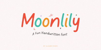 Moonlily a Fun Handwritten Font. Moonlily is perfect for any titles, logo, product packaging, branding project, megazine, social media, wedding, or just used to express words above the background. Moonlily also come with Multi-Lingual Support. Enjoy the font, feel free to comment or feedback, send me PM or email. Thank You!
 - Shortline by Qwrtype Foundry,
$14.00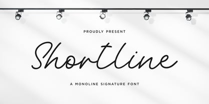 Proudly Present, Shortline Shortline is a Monoline Signature Font Shortline is perfect for product packaging, branding project, megazine, social media, wedding, or just used to express words above the background. Shortline also come with Multi-Lingual support. Enjoy the font, feel free to comment or feedback, send me PM or email. Thank you!
 - Westbum by Allouse Studio,
$16.00 Proudly Presenting, Westbum A Bold Handbrush Font. Westbum is perfect for any titles, logo, product packaging, branding project, megazine, social media, wedding, or just used to express words above the background. Westbum also come with Multi-Lingual Support. Enjoy the font, feel free to comment or feedback, send me PM or email.
 - Timegoing by Allouse Studio,
$16.00 Proudly Presenting, Timegoing a Graffiti Street Font. Timegoing is perfect for any titles, logo, product packaging, branding project, megazine, social media, wedding, or just used to express words above the background. Timegoing come with Multi-Lingual Support. Enjoy the font, feel free to comment or feedback, send me PM or email. Thank You!
 - Mothenary by Adante Creative,
$23.00 Introducing by Adante Creative Proudly Present, Mothenary Mothenary is A Beautiful Calligraphy Font Mothenary is perfect for product packaging, branding project, magazine, social media, wedding, or just used to express words above the background. Mothenary also multilingual support. Enjoy the font, feel free to comment or feedback, send me PM or email.
 - Manthoels by Almarkha Type,
$25.00 Manthoels is our new Stylish Signature font, a fashionable and super-chilled sexy script. Manthoels was created to look as close to a natural handwritten script as possible. Built with OpenType features, this script comes to life as if you are writing it yourself. Thanks to the very natural writing techniques that look beautiful and elegant, this font is very suitable to be used to brand a product because if you write a brand name it will look like your company signature. Manthoels is perfect for bloggers, trademarks, magazines, fashion, wedding invitations, greeting cards. It's highly recommended to use it in OpenType capable software - there are plenty out there nowadays as technology catches up with design.Other than Photoshop, Illustrator and Indesign, many standard simple programs now come with OpenType capabilities - even the most basic ones such as Apple’s Text Edit, Pages, Keynote, iBooks Author, and others. Thanks for checking Manthoels out, and feel free to drop me a message if you have any queries. almarkhatype@gmail.com
 - VinPoire by Clevus,
$14.00 Proudly present VinPoiré Typeface inspired by 1960s style. VinPoiré equipped with several OpenType. Have 73 unique alternates and ligatures. Comes with alternatives and ligatures, and helps to create stunning logos, quotes, posts, blog posts, branding projects, magazine imagery, wedding invitations, and much more. Font Features : Lettres, numbers, symbols, and punctuation 73 alternates and ligatures No special software required they may be used even in canva, any basic program /website apps that allows standard fonts That's it folks! Multilingual Support Language Support: Danish, English, Estonian, Filipino, Finnish, French, Friulian, Galician, German, Gusii, Indonesian, Irish, Italian, Luxembourgish, Norwegian Bokmål, Norwegian Nynorsk, Nyankole, Oromo, Portuguese, Romansh, Rombo, Spanish, Swedish, Swiss-German, Uzbek (Latin) Follow My Shop For Upcoming Updates Including Additional Glyphs And Language Support. And Please Message Me If You Want Your Language Included or If There Are Any Features or Glyph Requests, Feel Free to Send me A Message. Have a Good Day !
 - Rahere Roman Display by ULGA Type,
$30.00 Rahere Roman Display is an elegant design with flared stems and subtle old style features, influenced by Berthold Wolpe’s wonderful Albertus font and (to a lesser extent) fonts based on Roman square capitals. It’s a classic design for the modern age, appealing to serious typographers, graphic designers and anyone looking for a beautiful, multipurpose font that also offers value for money. Originally conceived as a display companion for the Rahere Sans typeface family, Rahere Roman harmonizes perfectly with its sans counterpart: use it for headings, sub-headings or pull-out quotes. Want an eye-catching introduction? The small caps have been sized to optically align with the x-height of Rahere Sans or start a paragraph with a swash drop cap. There are also ornaments and devices on hand to spice things up. Of course, Rahere Roman Display works beautifully as a standalone font too. Although predominantly a display font, with a quick flick of its lowercase switch, Rahere Roman transforms effortlessly into a readable text font. Like a Swiss Army Knife, this is a hugely versatile font, capable of conveying different messages from classic and romantic to historical and modern. It’s suitable for a wide range of applications including: branding, posters, advertising, packaging, labels, signage, wedding stationery, museums, art galleries and book covers. Weighing in at well over 2,000 glyphs, Rahere Roman contains a myriad of alternative characters (mostly capitals) including two sets of small caps that allow certain letter combinations - such as RO, LA, LI, TY, etc. - to mimic ligatures. The advantage of this is that if letter spacing is increased or decreased, the letter combinations aren’t fixed and can move too, which helps the space between letters to remain even. However, for lovers of ligatures there is still a bucketload of goodies to play with, including the obligatory ‘OO’ ligature. If that’s not enough, the font also contains start & end swashes, alternative numerals, seven ampersands, ornaments and devices. .ss01 - Initial swash capitals .ss06 - Superior small capitals (aligned to the cap height) .ss07 - Small capitals (sitting on the baseline)
 - Roasted by Crumphand,
$30.00 Hello, Introducing the new hand brush fonts Roasted. Roasted is truly hand made by 100%. This fonts have a Stylistic Set. You can access the Stylistic Set with lowercase too. Still have a good readibility and strong font. What's Included Inside The Fonts ? Uppercase Lowercase Numerals Symbols European Multilingual Stylistic Set 1 Stylistic Set 2 Thank You, Regards!
 - CEREAL KILLERZ - Personal use only

- Angled by Artyway,
$9.00 Proudly present this bold font inspired by current trends in sport headline typography or digital product. Beautiful geometric cut outs to perfection. Feel free to use it on futuristic or gaming designs, gui and hud or t-shirts design.
 - Olympukes by Barnbrook Fonts,
$30.00 Olympukes is a collection of 52 icons depicting the true spirit of the Olympics. This pictogram font is offered free for personal use only and will be released on 13th of August, the occasion of the Athens Olympics 2004.
 - Lyu Lin by Stefan Stoychev,
$25.88 LyuLin is a modern sans-serif font and contains 24 styles. Available in 6 weights and its italics and condensed forms. LyuLin Heavy Italic weight and LyuLin Light Condensed are free, so you can use them for your projects.
 - Seeking Brush by Java Pep,
$15.00 Introducing Fresh from the Oven, a casual handwritten brush font with a signature style called Seeking font. This font comes with ligature and swash, Seeking font is perfect for logotype, display text, headline, branding, advertising, social media posts, etc. Seeking font available for multilingual support that more than 25 languages. What's include Seeking font Seeking Swash PUA encoded Multilingual Support Thanks, and have a nice day
 - Fidusmager by PizzaDude.dk,
$17.00 This is definitely a font suitable for kids toys. The letters are legible, and at the same time totally wacky! Kinda like what a kids toy should be! Fidusmager started out as a handdrawn, slightly rugged looking fon. However I ended up manually tracing each letter in order to have those smooth lines. By the way, Fidusmager is danish and actually means someone who’ll trick you - but as a kid I didn’t know that, and found that it most likely was something positive! :)
 - Squealer Embossed - Unknown license

- LT Stopwatch - 100% free

- LT Sonoma - 100% free

- LT Wave - 100% free

- LT Superior - 100% free

- LT Superior Serif - 100% free

- LT Makeup - 100% free

- LT Beverage - 100% free

- LT Renovate - 100% free

- Borensa by Arterfak Project,
$28.00 Introducing Borensa. our brand new serif exploration with reversed contrast and unique shapes. Inspired by the historical books and vintage signage. Borensa is classically elegant to be applied to formal designs and can be used for the headline and long text. This font also has some alternates characters to give you some options in making the design. You can use Borensa for editorial, label, invitation, newspaper, books, poster, flyer, signboard, logo, branding, merchandise, apparel, and many more! We recommend you to use a program that has OpenType support such as Photoshop, Illustrator, Indesign, CorelDraw, etc. Featured : Uppercase Lowercase Numbers & symbols Accented characters Stylistic alternates Ligatures. Thank you for your support and have a nice day!
 - Aquiline by GroupType,
$24.95 Handsome, adventurous, legible and elegant, this script has the feel of practical handwriting from past centuries. Aquiline is based on a cursive italic style influenced by the 16th century European writing masters. The Aquiline design team turned to Ludovico degli Arrighi, the great 16th century writing master, for period ideas on how to improve, strengthen and add grace to the font. Aquiline has strokes and gestures that seem very like the writing of Arrighi and Mercator, such as the flamboyant balloon of a flourish on the cap A; the graceful flourishes on the cap B, D, and L; and the compact lowercase with tall ascenders. Aquiline has a strong personality and is historically correct.
 - Guile by Bunny Dojo,
$10.00 A timeless and mighty sans-serif, Guile's chiseled forms make the font ideal for reaching into history, while its minimalism and balance are fit for propelling into the future. Guile voraciously absorbs and enhances the style of its surroundings. In sports, it's a true team player, from the jerseys to the on-air presentation. In film, it's a blockbuster star, from the title treatment to the billing block.
 - Sign Card JNL by Jeff Levine,
$29.00 The addition of serifs to an existing typeface can drastically change the look and feel of a design. Sign Card JNL and its oblique version is just such a treatment of Sign Shop JNL. By adding the serifs, there is not only a brand-new Art Deco typeface possessing a regal and formal style, but a distant resemblance to a Russian Cyrillic font with its mechanical form and function.
 - Daviton by Sarid Ezra,
$13.00 Introducing, Daviton! Daviton is a new handmade font. You can use these fonts for various purposes such as making realistic handwriting, for promotions, or other purposes that will make your design more real as handmade. This font also contain ligatures and underline. What will you get: Daviton Solid Daviton Brush Happy Creating!
 - Behrensschrift iF Plus by Ingo,
$29.00 Peter Behrens’ renowned art nouveau type from 1902 – with ornaments. Newly revised and neatly digitalized by Ingo Zimmermann In 1902, Peter Behrens (1869–1940), architect, designer and typographer, created a new ”German“ type which became very successful very quickly for the Rudhard’sche Gießerei (foundry which later became Gebr. Klingspor AG) in Offenbach am Main. It served, for example, as the official German type for the world expositions in 1904 and 1910. Behrens himself writes about the development of this type ”...For the actual form of my type, I took the technical principle of the Gothic script, the stroke of the quill feather. The proportions of height and width and the boldness of the strokes of the Gothic letters were also decisive for me in producing a German character. A cohesive character could be hoped for by avoiding all non-necessities and by strictly carrying out the design principle of holding the quill at an angle…“ By the way, when “long s” is activated, the typographically correct “round s” is automatically placed at the end of the word so that you need only pay attention to the correct s on syllable endings within words. When using “long s,” you must ensure the correct use of the rules for the Fraktur font: “round s” is always at the end of the word, also in compound words. For those of you who want to be even more correct, read the corresponding article in >> Wikipedia. Peter Behrens also drew matching ornaments for his typeface – we have likewise carefully revised these decorative touches and arranged them into a font. The "Behrens-Schrift" fits best on all topics that have something to do with art history or the time around 1900.
 - Mallikay by sizimon,
$20.00 Mellyana Script is free-flowing, feminine, fashionable and friendly. Mellyana is perfect for fashion, e-commerce brands, trend blogs, or any business that wants to appear classy and chic. Mellyana Includes: Uppercase, lowercase, numeral, punctuation & Symbol multilingual support Stylistic alternates PUA Encoded Characters Fully accessible without additional design software. To access the alternate glyphs, you need a program that supports OpenType features such as Adobe Illustrator CS, Adobe Photoshop CC, Adobe Indesign and Corel Draw.
 - Giotto Handwriting - Personal use only

- Ballpoint Marker by Crumphand,
$18.00 Introducing the new handwriting font Ballpoint Marker. Ballpoint Marker is made 100% ballpoint. Still looks fun, cute. make your design looks better. What's Included Inside The Font ? Uppercase Lowercase Numbers Symbols European Multilingual Stylistic Alternates 1 Stylistic Alternates 2 PUA Encoded Thank You, Regards!
 - Inklination by Emtype Foundry,
$69.00 Inklination is a new grotesque that goes against the 'genre rules' and has a low x-height. It breathes quite better than larger x-height typefaces, with the sensation of air and more whitespace. This, combined with long ascenders and descenders, makes it look luxurious, elegant and refined. The family has two sets of italics, a regular one with 10º of inclination, and a more brutalist one with 20º. A monospaced version of five weights complete this versatile family. For more info visit emtype website.
 - PDRPT - Personal use only

- Nouveau Dreams JNL by Jeff Levine,
$29.00 The 1910 sheet music for “In All My Dreams I Dream of You” had the title hand lettered in an eclectic sans serif that typified the free form Art Nouveau movement of the time. The lettering was recreated digitally as Nouveau Dreams JNL, and is available in both regular and oblique versions.
 - Cebreja by Rafaeiro Typeiro,
$29.90 Cebreja is made of “cereja” (Cherry in English) with “br” in the middle, “br” from Brazilian. So called because the font is made with Brazilian cherry wood, which allows thin rods to be carved without breaking and maintaining its shape with use and allowing the ink to spread evenly and precisely, since the density of the wood guarantees this robustness. Its well-polished and minimalistic, works wonderfully on its own for logos, headlines, posters, packaging and smaller applications! And with seven different weights with their correlated italics and all SmallCaps to choose from, your option to create more unique and versatile designs is a lot wider. Have fun and produce more. This typography has the OpenType features that are standard in our type foundry, complete set of numerals, standard ligatures, discretionary ligatures, Stylistic Alternates, Stylistic Sets –ss01 and ss02, in addition these features have been enriched with smarter scrypts, which make fractions form automatically; prevents alternate glyphs from clash. Making composition with this typography even faster and easier.
 - Caribe by Andinistas,
$37.00 Caribe is an expressive typefamily like the blue sky and bright Caribbean sun, designed by CFCG @andinistas. We love to design experimental fonts with a large amount of ligatures and swashes, drawn with special respect and study for what is handmade by ancient artisans. In this context, Caribe is an impressive typefamily of 5 fonts to create logos, posters, book covers, menus, labels, packaging, etc. The 5 Caribbean fonts add up to more than 1500 glyphs that serve to be mixed or independent, functioning as a springboard to encourage your creativity in the design of words, phrases or remarkable headlines of the elements that appear around them. Caribe Script has lowercase letters such as "b d f g h i j k l p q y z" with extremely short ascending and descending strokes achieving generous height x in: "a c e m n o r s u v w x". Caribe Script Produces visual attraction in words and phrases that need lowercase letters with sparing horizontal space width and bold stroke thickness, producing exceptional legibility in headlines or advertising texts. Caribe Script & Caps are based on ancient and multiple letterings from the 40s and 50s that were useful inspiration tools to produce visual pleasure. Caribe Words has more than 60 script words drawn diagonally generating greater intensity within a sentence. Caribe Shields & Digits has more than 50 designs each and they have containers and numbers designed to accompany words, phrases or drawings that serve to harmonize different writings. ENJOY more than 1500 glyphs: + Caribe Script: 743 glyphs + Caribe Caps: 507 glyphs + Caribe Words: 71 glyphs + Caribe Shields: 230 glyphs + Caribe Digits: 40 glyphs
 - Gidglet by Nathatype,
$29.00 Gidglet is a serif font highlighting the height differences of the letters’ thick and thin parts, and has elegant, clear letters. Little hooks and lines on the letter edges show classical, traditional nuances to your designs. Moreover, the thick and thin letter parts are clearly seen in a high contrast serif font. The thin letter lines show elegant characteristics, while the thick ones express firm, clear nuances. Such high contrasts between the thick and thin parts add dimensions and prominence to the designs. As a result, such a font is perfectly applicable for designs with formal, elegant, professional impressions in big text sizes in order for the beauty and the contrasts of such thick and thin parts to be clearly seen. In addition, you may enjoy the available features here as well. Features: Ligatures Stylistic Sets Multilingual Supports PUA Encoded Numerals and Punctuations Gidglet fits best for various design projects, such as brandings, quotes, invitations, name cards, greeting cards, printed products, merchandise, social media, etc. Find out more ways to use this font by taking a look at the font preview. Thanks for purchasing our fonts. Hopefully, you have a great time using our font. Feel free to contact us anytime for further information or when you have trouble with the font. Thanks a lot and happy designing
 - Acklebury by Studio Buchanan,
$32.00 Acklebury is a chunky, reverse contrast, slab-serif typeface available in two styles. It has heaps of personality, plenty of open type features, and a whole host of special characters and dingbats. Although it's drawn from historical sources, Acklebury is not a straight revival, rather more of an homage to the many, varied, extended lining figures of the late 1800's. Acklebury celebrates the once labelled 'hideous' combination of wide rounded forms and hard slab serifs. Only using modern type technology to fix the spacing and kerning issues that would of been impossible with metal or wooden type. Acklebury is not a French Clarendon, neither is it really an Italienne... but it is phat, wide and hella funky.


