10,000 search results
(0.079 seconds)
- Mint Monday by Supfonts,
$12.00 Mint Monday is a beautiful handwritten font, fashionable appearance and elegant simplicity of lines. You will fall in love with this font Font is an open type with clean shapes and precise kerning. It includes ligatures encoded by the PUA. Language support: All European languages Don't forget to subscribe so you don't miss out on the new awesome fonts Dima
 - Sokinz by Aliptype,
$10.00 Introducing Sokinz. Sokinz was round shapes, funky and playfull fonts, made carefully with handdrawn by combining two concepts of graffity style and groovy styles, you can use this font for your creative design, this font was suitable to make posters, pamflets, t-shirt, merch, apparels, brand names, gift cards, products tags, and many more can be discovered by using this fonts.
 - Plottage by Arendxstudio,
$14.00 Introducing a new font called Pottage - Handwritten Font inspired by urban fonts with sharp and beautiful letters that create fonts that are modern, trendy and elegant. Pottage came with opentype features such stylistic alternates, stylistic sets & ligatures good for logotype, poster, badge, book cover, tshirt design, packaging and any more. Features : • Character Set A-Z • Numerals & Punctuations (OpenType Standard) • Accents (Multilingual characters) • Ligature
 - Madhewari by Nian Keun Studio,
$12.00 Maheswari is an elegant font specially designed for those of you who like luxury. Maheswari has a specialty in sharp fonts but also has elements of curves in some of its characters. This font can be applied to your designs ranging from jewelry designs, hotels, magazines, to branding logos. Thank you for coming to my shop and enjoying other fonts.
 - Griba by Decade Typefoundry,
$20.00 GRIBA Typeface is an experimental display typeface, based on every shape of each characters and transformed into double lines. This font is perfect for poster, titles, and t-shirt designs.
 - KD Brushure by Kassymkulov Design,
$9.95 KD Brushure is a brush, script font with handwritten touch. Even legible at 12 pt, these interesting and distinguishable glyph shapes will give you a wide range of design possibilities.
 - Sandy by Oleg Stepanov,
$15.00 Sandy is a handwritten sans serif font, based on shapes made with ink brush. Sandy is a lively and informal typeface with good readability. Most of European languages are supported.
 - Berona by Alex Camacho Studio,
$15.00 Berona font family is a variable geometric sans serif with a modern display purpose. The dynamic sharp edges makes it ideal to be used in a medium and big scale.
 - Boat Decals JNL by Jeff Levine,
$29.00The simple, square-shaped font that is Boat Decals JNL was loosely based on water-applied decals made by the Duro Decal Company (now Duro Art Industries) of Chicago, Illinois. - Gumela Arabic by NamelaType,
$25.00 Arabic font version of Gumela, still with Gumela latin style, based on rounded sans serif whose edges end with unique shapes, to line up in harmony between Latin and Arabic.
 - Miserichordia by Device,
$29.00 Miserichordia evolved from photographs taken on a trip to Venice and instigated a sharp turn left into more idiosyncratic and decorative serif fonts. Something of a new direction for Device.
 - Le Gusto by Orenari,
$15.00 Le Gusto is perfect for your unique projects as it looks modern and fun. This font is 100% handwritten by my self and I put much love in each characters. Le Gusto is Mùltïlingûål Šüppórt. And, oh, it's also came with mini vector bonus. YAY. I really hope your projects will be cool with this font, and please don't hesitate to drop me a message if you have any questions or you wanna share some jokes! :) Thank You, Ari
 - Trinos by Arterfak Project,
$17.00 Trinos is a strong character font that combines racing style and techno with a slightly expanded letterform and sharp edges. The sharp spur on the top of letterforms, bold weight, and fully geometric represent strength, honor, and brave. Speed up your pulse with Trinos font available in Stencil and Solid style. This all-caps font is perfect for sports, great for automotive, and looks cool for techno themes. You can apply this font for jerseys, decals, flags, logos, posters, magazines, packaging, and many more! Not only that. Trinos is equipped with much of alternates characters, and elegant ligatures to boost your design look more powerful! What you'll get : Uppercase & smallcaps Numbers & punctuation Multilingual support Stylistic alternates Ligatures Sincerely, Ramz
 - FS Dillon by Fontsmith,
$80.00 Bauhaus Geometric, economical, functional... The good, wholesome, modernist values that once fired up the tutors and students of the Bauhaus became the inspiration for FS Dillon after an exploration of the work of the pre-war art and design powerhouse in the Fontsmith studio. The font combines simplicity and directness with a characteristic Fontsmith warmth. Letterforms are compact, with a generous x-height, and built for maximum clarity and impact. The Bauhaus sought beauty through function. FS Dillon achieves it. Made for TV The weights of fonts for TV sometimes have to be adjusted so as not to “blow” on-screen. FS Dillon was originally drawn for the on-screen presentation branding of Film Four, whose primary colour was red. Black type on a red background looks heavier than white, so Dillon needed two weights that would allow white and black type to be used together, looking balanced and equal. Type design is an organic process. Years after developing FS Dillon, we revisited it, redrawing elements and adding italics to maintain consistency. Olympic You don’t get a much higher confirmation of the functional fitness of a typeface than to have it selected to guide visitors around an Olympic complex. FS Dillon was selected as the font for signage at some of the key venues at the London 2012 Olympic Park, helping to get spectators, athletes and officials from all over the world to their seats and starting blocks on time.
 - Madera Variable by Monotype,
$229.99Malou Verlomme’s Madera is a typeface made strictly for graphic designers, created as an indispensable type toolbox that can meet the needs of both print and digital environments. Verlomme has drawn on his extensive experience creating bespoke type for major brands, and Madera is a “typographic synthesis” of this work. Although designed as a restrained sans serif, the typeface has some punchy personality – with sharpened apexes that inject flavour into the design, particularly in the darker weights and when set at all caps. Madera sits alongside fellow geometric designs such as Proxima Nova, Gotham or Avenir, offering a straight-talking tone of voice but with some extra bite. If you’re a large corporation, with a typeface being used in many different environments you want something that's just the right balance of visibility and legibility to sustain an extensive amount of communication.” “The design is very solid but it doesn’t go out of its way to attract attention,” explains Verlomme. “It still has a fair amount of warmth and personality, in a very understated manner. The Madera typeface family has 32 fonts: Upright, Condensed and Italics. It is available in OpenType CFF and TTF fonts formats. Each typeface contains over 650 glyphs with extensive Western, Central and Eastern European language support. It also supports OpenType typographic features like alternatives, ligatures and fractions. Madera Variables are font files which are featuring two axis and have a preset instance from Hairline to Extra Black. - Identa by Sudtipos,
$39.00 Because we know that you will never get tired of using them and that you will always need a new tool for Identity Design, we created Identa. Conceived to translate corporate and humanist ideals in its typographic form, it seeks a dialogue between neutrality and contemporaneity. With a pragmatic attention to functionality that does not forget aesthetics. It is a Sans serif model, accessible and well-founded. All-terrain, workhorse that seeks to be reliable and durable. It solves any type of content with efficiency, intelligence and professionalism. Its clean forms and x-height make it a very competent face for both short identifiers and long text bodies, ideal for display use where legibility and personality must match new design needs within a company. It is available in eight styles, ranging from its White version to the darker Vantablack, each optimally set with its respective italic variables, and a Dingbats font designed to solve everyday cases. Each font contains 737 glyphs, macro and micro aesthetic details inspired by current visual communication systems and trends. The dingbats font includes 303 signs and is a set of icons and symbols that can be used in multiple environments, both for print and digital media. This typeface family seeks to meet the needs of brand designers looking to create an assertive appearance, whatever the case. It is a solid and self-confident typeface, without appearing overly constructed; on the contrary, its nuance makes it look fresh.
 - Rothek by Groteskly Yours,
$25.00 Rothek is a geometric sans serif type family with a strong and unique character. It comes in 22 weights — 11 uprights and 11 italics — and is a perfect tool for any designer who needs a versatile font for a variety of projects. While retaining its uniqueness and whimsicality, Rothek is highly legible even at smaller weights, which makes it a perfect fit for app and web design. But what’s really great about Rothek is its OpenType features, which make it really stand out. Not only does it know how to do fractions, but it also does subscript and superscript; it’s equipped with case-sensitive punctuation, which adjusts the height of your parentheses, hyphens (and many more) to the height of your capital letters. But there’s still more: Rothek is loaded with various figures — from default proportional numerals to oldstyle figures, tabular figures and tabular old style figures. Throw in a bunch of stylistic alternates and you’ve got a perfect typeface for any project. Rothek supports all European languages and Vietnamese. On top of that there’s Extended Cyrillic set for most Slavic languages. As a cherry on top, there are stylistic alternatives for selected glyphs both in Latin and Cyrillic layouts and lots of extra symbols to work and experiment with. With 900+ glyphs in each style, Rothek is a perfect workhorse font for those who need a modern sans serif font with a strong character. Two weights are free to try and use!
 - Polar by Daniel Uzquiano,
$150.00 Polar is a sans-serif grotesk with characteristic ink traps and rounded vertexes. Polar is a variable font. It is versatile, modern, elegant and neutral. It can be displayed in a range from 200 to 900 in its weight axe to play many different roles. The font has 5 predefined instances, Thin Display, Light, Regular, Bold and Heavy Display, in two styles, regular & italic, with 716 glyphs each of them. Polar has 25 OpenType features such as ligatures, fractions, stylistic alternates, localized forms, old-style figures, etc. It can be suitable for long texts. It also works great as a perfect display font for all caps headings, especially with its thin and heavy weight variants. Polar covers Latin, Central European characters & supports 101 languages: Afrikaans, Albanian, Asu, Basque, Bemba, Bena, Breton, Catalan, Chiga, Colognian, Cornish, Croatian, Czech, Danish, Dutch, Embu, English, Esperanto, Estonian, Faroese, Filipino, Finnish, French, Friulian, Galician, Ganda, German, Gusii, Hungarian, Igbo, Inari, Sami, Indonesian, Irish, Italian, Jola-Fonyi, Kabuverdianu, Kalaallisut, Kalenjin, Kamba, Kikuyu, Kinyarwanda, Koyraboro Senni, Koyra Chiini, Latvian, Lithuanian, Lower Sorbian, Luo, Luxembourgish, Luyia, Machame, Makhuwa-Meetto, Makonde, Malagasy, Maltese, Manx, Meru, Morisyen, Northern Sami, North Ndebele, Norwegian Bokmål, Norwegian Nynorsk, Nyankole, Oromo, Polish, Portuguese, Quechua, Romanian, Romansh, Rombo, Rundi, Rwa, Samburu, Sango, Sangu, Scottish, Gaelic, Sena, Serbian, Shambala, Shona, Slovak, Soga, Somali, Spanish, Swahili, Swedish, Swiss, German, Taita, Tasawaq, Teso, Turkish, Upper, Sorbian, Uzbek (Latin), Vietnamese, Volapük, Vunjo, Walser, Welsh, Western Frisian, Yoruba, Zarma, Zulu.
 - TT Geekette by TypeTrends,
$27.00 TT Geekette is an experimental variable* serif with friendly and flexible character of shapes. In this project, we wanted to get away from simplifications and dry geometry and to experiment with the smoothness, softness and plasticity of forms. And in order to make the project a little more stylish and serious, we decided to make the font monospaced. When creating TT Geekette, we did not rely on traditional writing techniques or on the influence of pen movement on the font pattern. Despite the fact that judging by certain characters TT Geekette is a serif, the font is specifically “built” and “drawn”. There are several systemic techniques in font design, such as “loops” which set the plastic rhythm for the entire typeface. Variability in TT Geekette is influenced by contrast buildup in the font—moving the slider to adjust the variability axis, you gradually move from a completely non-contrast monolinear serif font to a font with a pronounced reverse contrast. In addition, with the help of the variability slider, you can remove serifs from the monolinear essence of the font. The TT Geekette family consists of 3 styles: the TT Geekette Bones—monolinear font, the TT Geekette Muscles—reverse contrast serif, and the TT Geekette Variable font. Each style contains over 450 glyphs. And yes, technically the typeface can be used in programming, at least you are guaranteed to get your share of bright emotions. *An important clarification regarding variable fonts. At the moment, not all graphic editors, programs and browsers support variable fonts. You can check the status of support for the variability of your software here: v-fonts.com/support/
 - Blindshot by Crumphand,
$25.00 Introducing the Wild Brush Style Fonts, Blindshot. Blindshot inspired by vaporwave, graffity. This font have a good shape and texture. Good for your brand, clothing line, company and etc. What's Included Inside The Fonts ? Uppercase Lowercase Symbols Numerals Stylistic Set 1 Stylistic Set 2 Stylistic Set 3 Stylistic Set 4 European Multilingual Thank You, Regards!
 - Antiquettes by Fantasy Inspirations,
$8.00With my dingbats and your favorite software, you can create elegant web graphics in minutes! All these fonts were created with the web designer in mind. Each font consists on 26 original shapes with endless possibilities: virtual jewelry, buttons, framing, interfaces, etc. For examples of what you can do with these fonts: Click Now! - Antiques by Fantasy Inspirations,
$9.75With my dingbats and your favorite software, you can create elegant web graphics in minutes! All these fonts were created with the web designer in mind. Each font consists on 26 original shapes with endless possibilities: virtual jewelry, buttons, framing, interfaces, etc. For examples of what you can do with these fonts: Click Now! - Jewelry by Fantasy Inspirations,
$8.00With my dingbats and your favorite software, you can create elegant web graphics in minutes! All these fonts were created with the web designer in mind. Each font consists on 26 original shapes with endless possibilities: virtual jewelry, buttons, framing, interfaces, etc. For examples of what you can do with these fonts: Click Now! - Neon Planet by Din Studio,
$25.00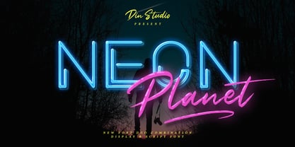 Neon Planet is a modern and futuristic font duo. Combining the neon shape design and the brush textured handwriting will make your design project more powerful. The font is suitable for any project that needs Retro, Modern, and Casual Vibes. Enjoy the Font! Features: Accents (Multilingual characters) PUA encoded Numerals and Punctuation (OpenType Standard)
 - HU Thegame KR by Heummdesign,
$25.00 'HU Thegame KR' was created with a game as a motif, and is a characteristic font with sharp and strong elements. The finishing of the same strokes gives the font a sense of unity and makes it look sharper and colder. This font is suitable for use as a headline. It contains Hangul, Korean.
 - Jasmine Bloom by Orenari,
$16.00 Jasmine Bloom is a semi-allcaps font with lovely and cute shape. This font has two styles, regular style and decorated style with jasmine flower decoration which spread from the bottom of each letter. Jasmine Bloom font is perfect for any design purposes. Mix and match some uppercase and lowercase to get lovely combining.
 - Valina by Khoir,
$15.00 Valina - Modern serif has an elegant impression and displays a unique shape in each letter but does not leave the readability of the font itself so this font is good for logos, quotes, posters, covers and many more. Valina Uppercase Lowercase 75+ Language Alternates Font So what are you waiting for? Thank you for seeing
 - Glamure by Fauzistudio,
$10.00 Glamure was inspired by the Myriad font which has been frequently used by technology companies and governments since the 1990s. Glamure is a clean, sleek and versatile font, by applying geomattric shapes to create a fantastic, modern and humanistic font. Glamure can function as a title, logo, body copy, subtitle, headline and so on.
 - Hermann by W Type Foundry,
$29.00 Hermann is one of our most readable typefaces so far. Since last year, the W Design team had been examining closely the possibility of developing a text font. Thus, we dug into concepts within some of our favorite novels, such as The Steppenwolf and Brave New World, written by Hermann Hesse and Aldous Huxley respectively. Ideas like duality, surrealism, and wildness mainly appeared. With these concepts in mind, we analyzed carefully the typefaces used in both Hesse’s and Huxley’s creations; Sabon and Garamond showed up catching our attention and, of course, awakening our admiration. Consequently, the challenge was to combine the key features of these fonts with the concepts already identified. At first, we made a text font which was suitable to compose long texts. However, we realized that we needed to refine some characteristics to convey all the ideas. A full set of capital discretionary ligatures was designed, which convert Hermann in a display font when is required. We also designed swashes (from A-Z) and final forms (in letters h, k, m, n, r and x in romans, and in letters a, d, e, h, i, l, m, n, r, t, u, x and z in italics), conveying more dynamism and versatility when it comes to composing visually. Hermann was designed not only to be accurate in terms of legibility but also to be wild and bold. That is why we took a big leap and designed from the beginning a font that is inspired by the world of 20th-century novels, using the name of one of its greatest exponents, Hermann Hesse.
 - Qiproko by Nootype,
$42.00 Qiproko is a typeface with semi-modular and geometric shapes. The squared curves remind the shape of the cathode ray tube monitor, giving a retro feel to the characters. It’s unusual stencil version makes a direct reference to the electronic circuit, which gives a very technological aspect. Each font includes OpenType Features such as Tabular Figures and Capital alignement. The fonts have an extended characters set to support Central, Eastern and Western European languages. Qiproko is perfectly suitable for headlines or epigraphs, but works in text too.
 - Channe by BaronWNM,
$16.00 Channe is a display serif font. a blend of straight and curved shapes that look contrasting and elegant. Channe has a unique shape on the capital letters "A, B, F, H, P, Q, and several other letters. It also has several ligatures with a unique blend. Channe font is very suitable for use on labels of cosmetics, fashion, jewelry products, and several other products. Also suitable for posters, magazine covers, book covers, business cards, invitations, and several other things that demand a formal and elegant impression.
 - Victorian by ITC,
$39.00Freda Sack and Colin Brignall collaborated to produce the Victorian typeface. Their work was inspired by late 19th century display letterforms, and they sought to create a new ornate font in the same style. Victorian superbly reflects the refinement of the late 19th Century. Victorian Inline Shaded was designed by Nick Belshaw. He was inspired by late 19th century display letterforms, and sought to create a new ornate font in the same style. Victorian Inline Shaded superbly reflects the refinement of the late 19th Century. - Brda by Linotype,
$29.99Brda originally designed by the Polish designer Franciszek Otto for the Powiat weekly newspaper. Powiat needed a new, dynamically drawn sans serif for its headlines, and Otto's Brda fit the bill. Combining traditional Grotesk letterforms with witty subtleties, like the notched-joint seen in the capital G, Brda displays a novel design that works best when set large. The typeface is named after the Brda river, which runs through Bydgoszcz, Poland, the city where Powiat is published. The Brda family includes three weights, each with a companion italic: Regular, Bold, and Extra Bold. The Brda family's Extra Bold weight was one of the winners selected in the 2003 International Type Design Contest, sponsored by Linotype GmbH. Franciszek Otto also teaches graphic design at the Secondary Art School in Bydgoszcz, where his typefaces rank among the students' favorites. - Baldufa Paneuropean by Letterjuice,
$139.00 Baldufa is a charming typeface with strong personality, which looks very comfortable in text. There is a search to obtain complicated curves and detailed features, which gives the typeface a touch of beauty and elegance. However, this is also a self-conscious design that claims through the rounded serifs and irregular vertical stems appreciation for quirkiness and human imperfection. The letterforms are inspired by the slight distortions and idiosyncrasies that came with old printing methods. It has distinct, features such as rounded serifs, irregular vertical streams, ink traps and extremely thin junctions. In the Italic, serifs have been removed to enhance movement and expressivity. These experiments in form have not come at the cost of legibility: The typeface remains suitable for both small and display text. Baldufa Paneuropean covers Eastern and Western Latin, Greek and Cyrillic Extended.
 - Magnum Sans by FontMesa,
$19.00 Magnum Sans is a strong neutral sans serif consisting of eleven weights with true Italic, Oblique and an alt upright set called Alfa. The definition of Magnum is a large wine bottle that's twice the capacity of one 750ml bottle, today the name is used in any product offering double the capacity, Magnum Sans achieves this by offering two slanted and two upright versions plus a standard and pro set. Designed to be highly readable Magnum Sans is ideal for text, signage, headlines and media broadcasting or anywhere else quick readable lettering is needed. This standard version supports characters sets for central and eastern European countries with code-pages of 1252 Latin1, 1250 Latin 2, 1257 Baltic and 1254 Turkish. Note: for additional language support, please see our Magnum Sans Pro family, which includes Vietnamese, PinYin and Greek.
 - Magenos Soft by Graphite,
$18.00 Magenos Soft is the rounded version of Magenos typeface family. It is a modern geometric sans serif family characterized by its simplicity and extensive functionality. With its open apertures, geometric architecture and low contrast strokes, it expresses a sincere tone with a modernistic, neutral, yet friendly personality. It has been designed to work well for a wide range of applications and is a reliable workhorse. Equally suitable for print and screen usage, it works well for both text and display at a wide range of point sizes. The addition of true italics gives the whole family a dynamic edge and flexibility. Magenos Soft comes with many OpenType features including stylistic alternates, standard ligatures, oldstyle and lining (proportional and tabular) numerals, slashed zero and a variety of symbols, making it a perfect choice for contemporary and professional typography.
 - Rigatoni by Sudtipos,
$39.00 Rigatoni is a didone display family with exceptional readability. Based on a German mid-century lettering specimen by Nerdinger, designer Alejandro Paul expanded the face into an extensive family, with 5 weights, italics, and a 2 weights stencil version. Its tall letterforms and sturdy serifs give it a noble bearing when set in all caps; in the lower case its large x-height and spacious counters imbue it with a welcoming tone. A plethora of alternate and swash characters let you create distinctive settings for identities, labels, titles, and headlines. Use the shorter ascender and descender variants for aesthetic effects, or to prevent collisions in tightly stacked text. Since we've imagined Rigatoni being used for restaurants, menus, and food packaging, Sudtipos asked to designer Esteban Diácono to create some 3D visualizations. Ale’s type has never looked saucier!
 - Kairos Sans by Monotype,
$50.99 Kairos Sans, designed by Terrance Weinzierl, is an octagonal sans serif influenced by 19th Century Grecians, with the weights and widths of a contemporary palette. The bold simplicity radiates in headlines and sub-heads, with suitable performance in text. Of course, it pairs perfectly with the slab serif companion, Kairos . Kairos Sans is available in 48 styles; 8 weights in 3 widths, all with matching italics. Condensed, Regular and Extended widths range from Thin to Black. There are 4 Rough styles as well, bringing the whole family to a total of 52 styles. It comes in Latin, Greek and Cyrillic scripts. It also comes with some extras and OpenType features: Small capitals, proportional and tabular figures, superscript and subscript figures, support for fractions, ornaments, arrows and Stylistic Alternates. It often looks athletic, industrial, and stern. Kairos Sans is stout, but has energy.
 - Twogether Sans by Sudtipos,
$39.00 Twogether Sans builds upon the achievements of Twogether Rounded, creating a more comprehensive system and positioning itself as a suitable choice for general text usage. By removing the rounded elements from each character, Twogether Sans gains increased flexibility and a broader range of possibilities for different types of projects. It retains the essential characteristics of its counterpart, such as proportions, x-height, small caps, ligatures, numerals, and the construction of the italic variant. This version also introduces distinctive alternate characters for "T," "Y," "y," and "a." However, in this case, the position of the "a" with an old-style eye has been adjusted to enhance legibility in this context. These details maintain consistency with the Rounded version while reinforcing Twogether Sans' unique personality. It remains an excellent choice for branding, editorial design, promotional materials, packaging, and digital applications.
 - Baldufa Greek Ltn by Letterjuice,
$78.00 Baldufa is a charming typeface with strong personality, which looks very comfortable in text. There is a search to obtain complicated curves and detailed features, which gives the typeface a touch of beauty and elegance. However, this is also a self-conscious design that claims through the rounded serifs and irregular vertical stems appreciation for quirkiness and human imperfection. The letterforms in the Latin are inspired by the slight distortions and idiosyncrasies that came with old printing methods. It has distinct, features such as rounded serifs, irregular vertical streams, ink traps and extremely thin junctions. In the Italic, serifs have been removed to enhance movement and expressivity. These experiments in form have not come at the cost of legibility: The typeface remains suitable for both small and display text. Baldufa Greek Ltn covers Greek and Latin.